Dulux Color Trends 2026: Tenderness & Connection Through Color
Dulux has released its much-anticipated Colour Forecast for 2026, spotlighting three distinct palettes: Ethereal, Elemental, and Evoke. Each palette reflects a global mood shaped by uncertainty, digital fatigue, and a growing desire for wellness and reconnection.
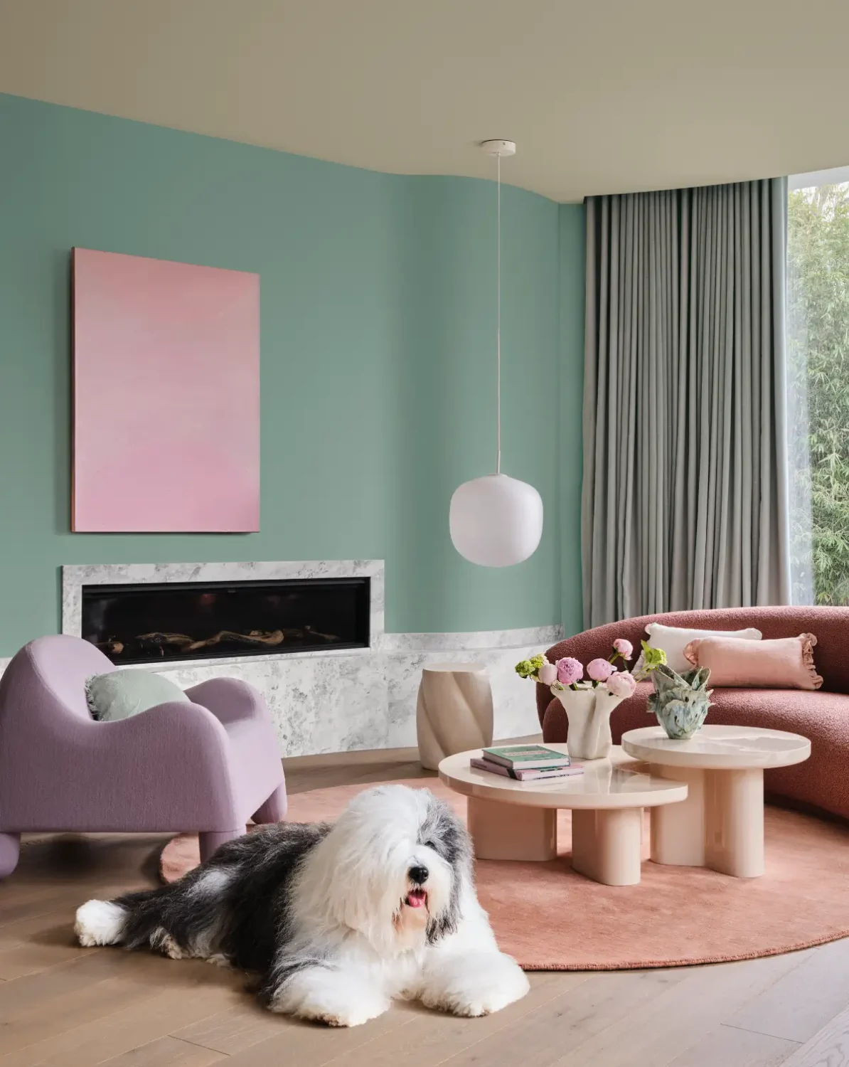
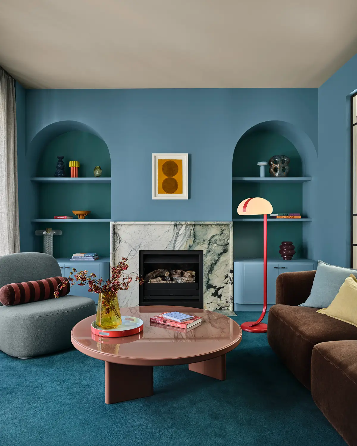
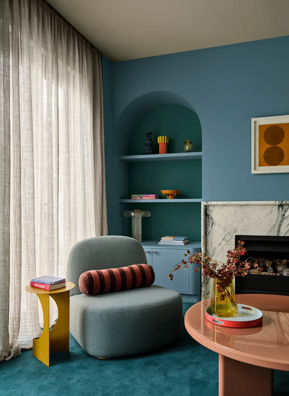
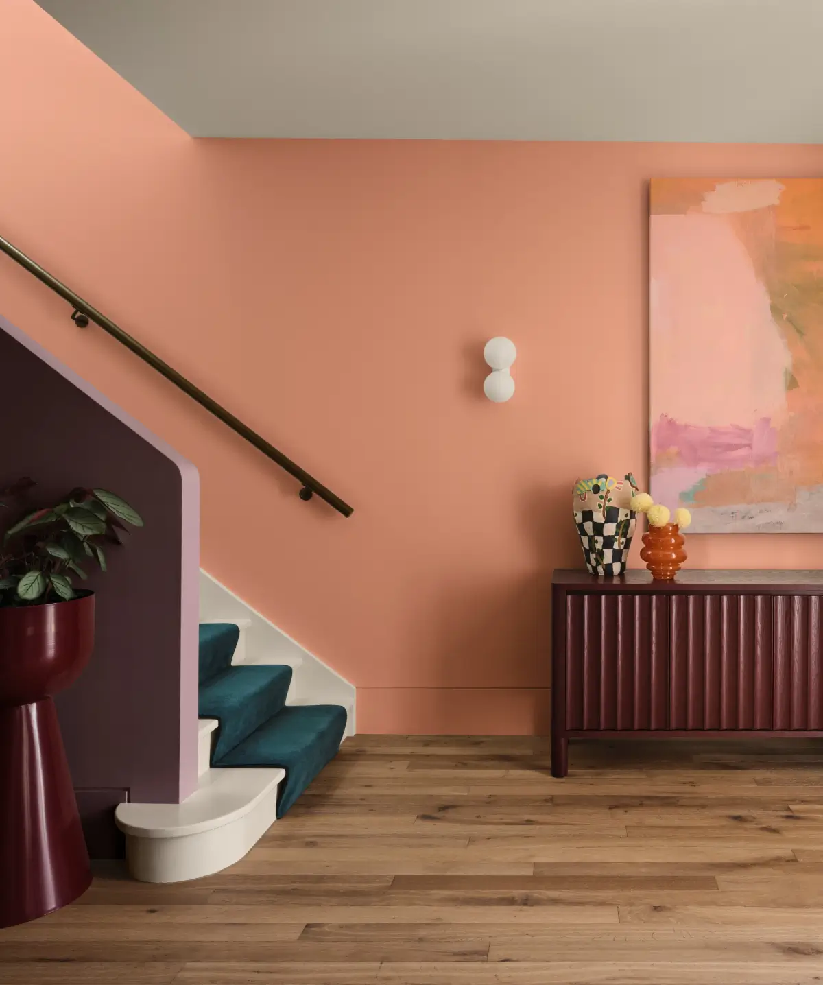
This year’s forecast embraces warm earth-based neutrals, rich burnt oranges, caramels, soft greens such as sage, moss, and spearmint, alongside romantic pinks, vintage rose tones, tender pastels, and muted berry shades.
While each palette tells its own story, they share a universal theme: creating spaces that feel calm, grounding, and emotionally restorative.
styling by Bree Banfield and photography by Lisa Cohen
New Trending Colors for 2026
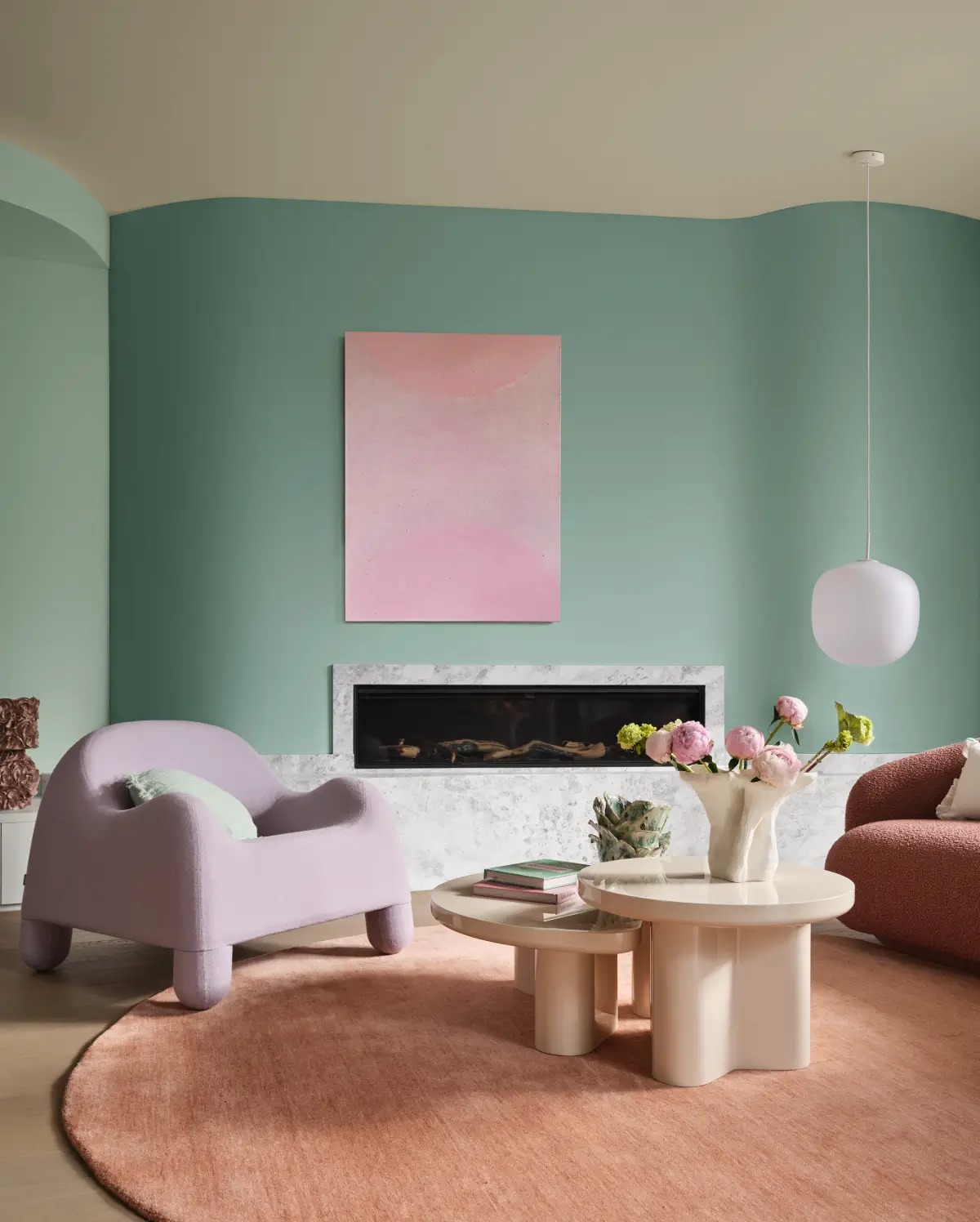
Among the standout shifts this year is the rise of spearmint green, paired with soft earthy pinks, browns, and burgundies. Playful berry hues and burnt oranges are used as accents – adding personality without overwhelming.
Treloar notes: “Each palette has been designed for flexibility, allowing people to mix and match confidently while staying within the palette family. This gives consumers the freedom to personalise their spaces in a way that reflects their lifestyle.”
Ethereal Palette
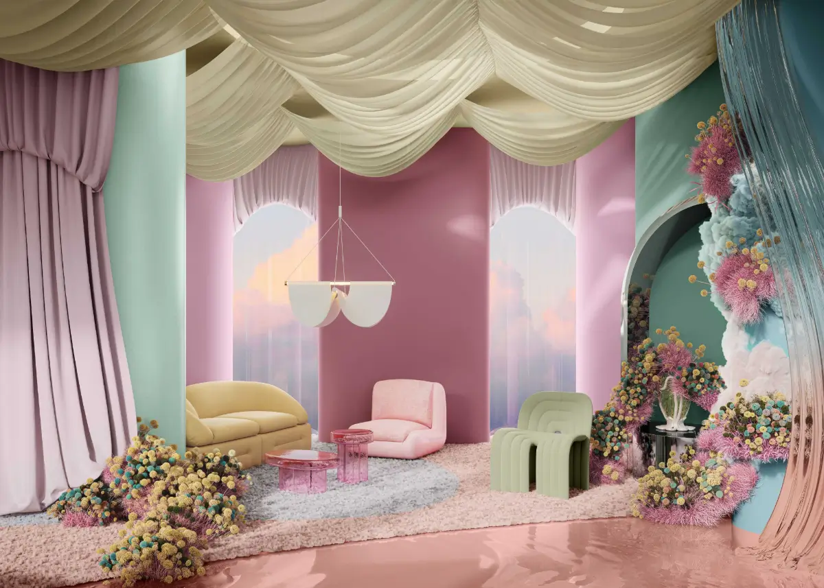
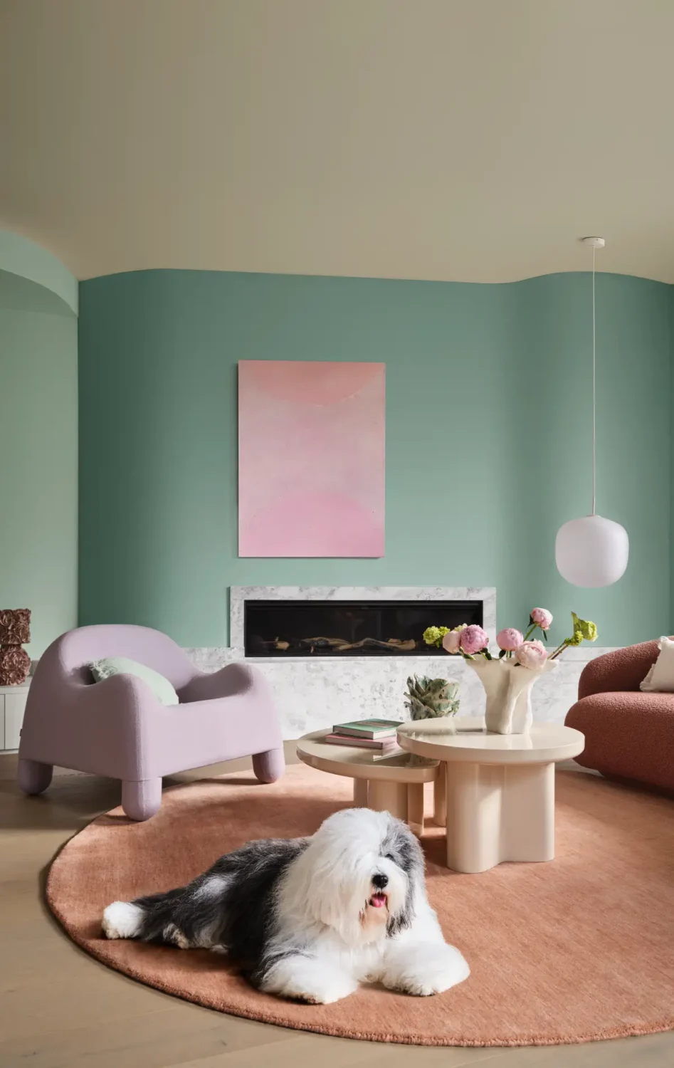
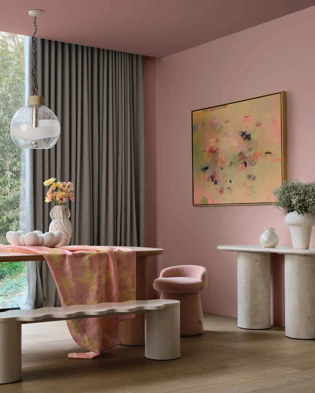
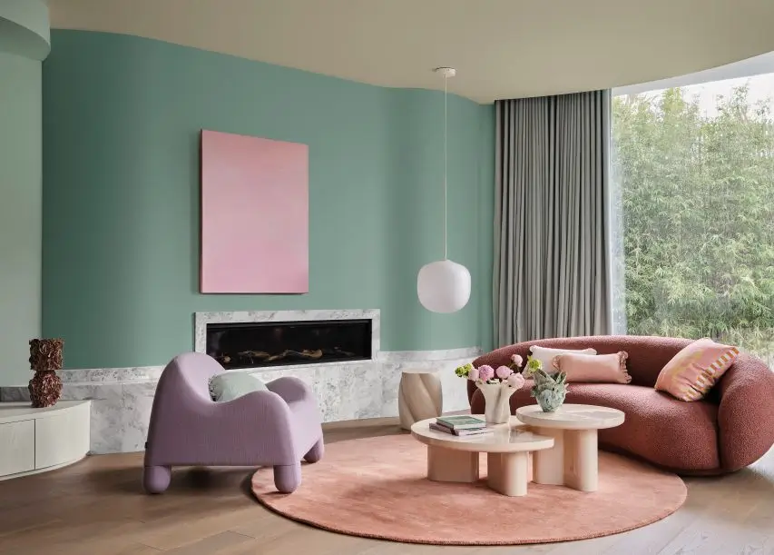
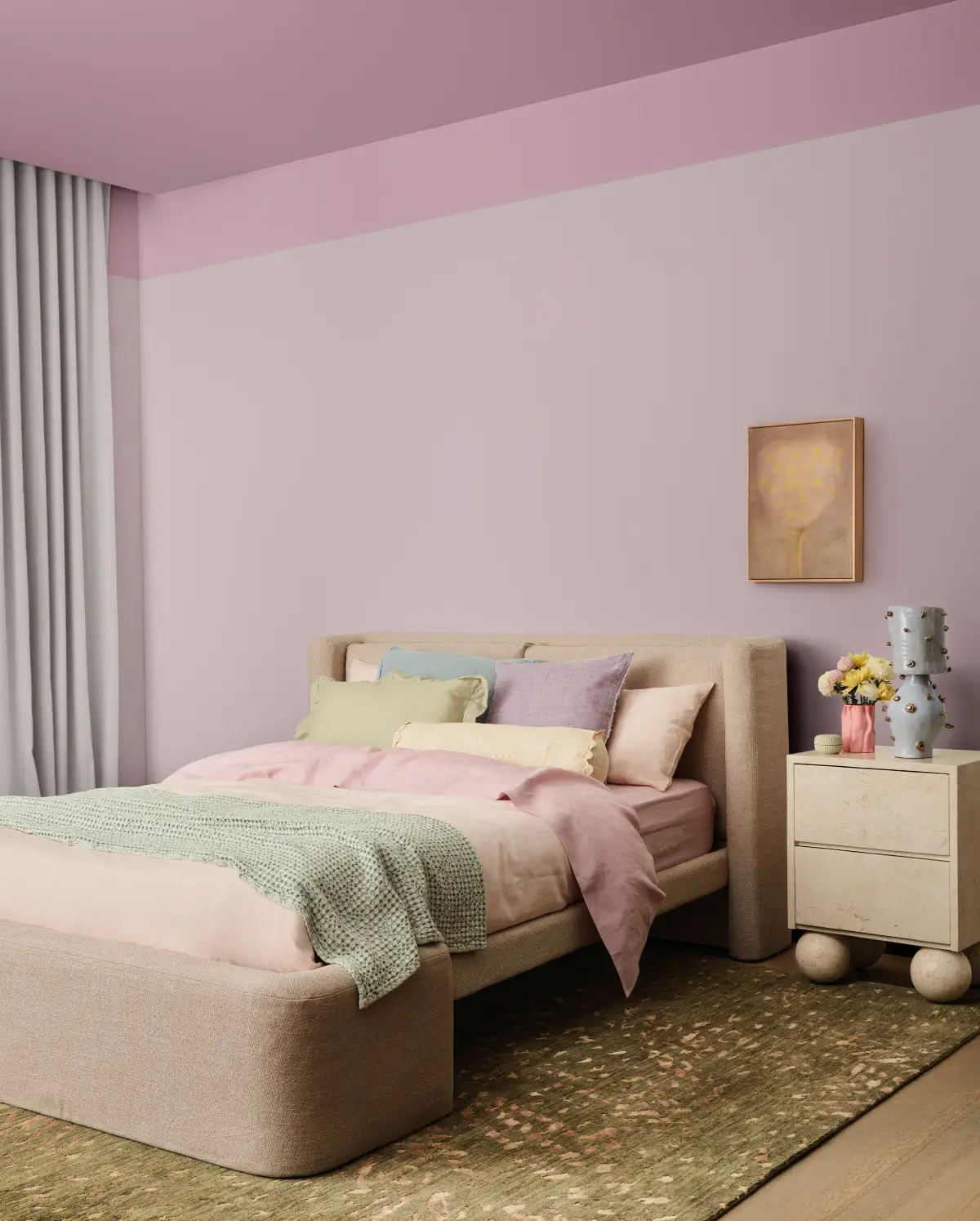
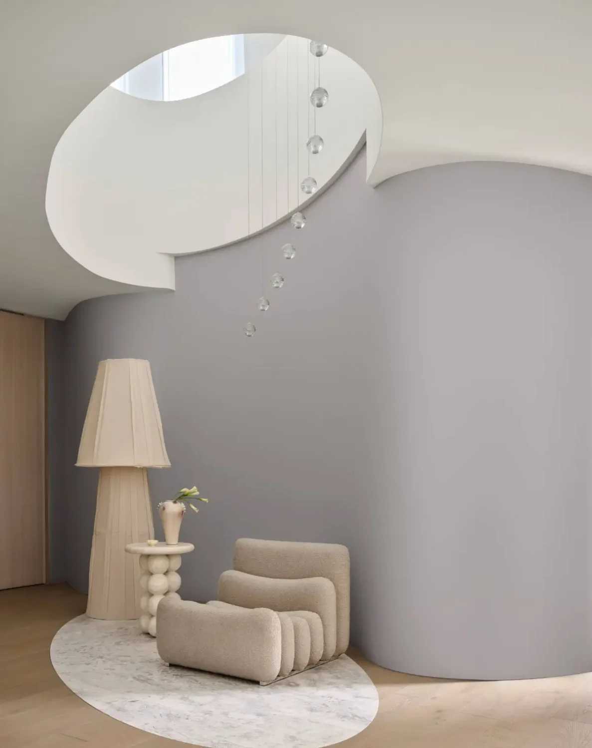
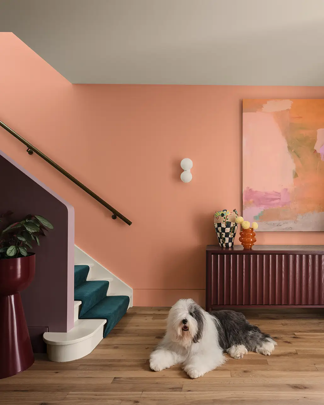
Soft, feminine, and whimsical, Ethereal celebrates the nurturing power of nature. Designed to soothe and uplift, it draws on themes of wellness, self-care, and quiet strength. Inspired by fantasy fiction and restorative rituals, the palette creates dreamy, comforting interiors.
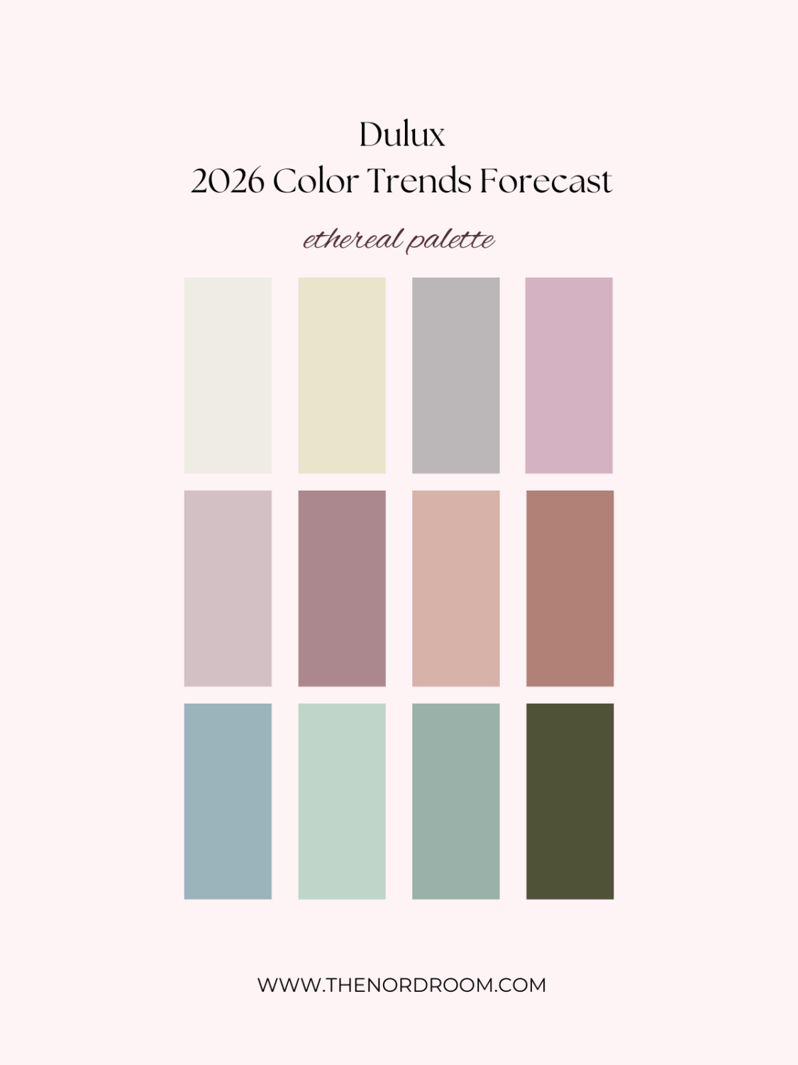
aroma – mask – different pink – savin
blue shell – soft fresco – tiamo – amazon depths
This palette is a refined blend of soft and mid-tone hues, including greens, mauves, and blush pinks, that feel both joyful and restorative, featuring vintage rose, warm buttercream, and gentle pastels.
These colors pair beautifully with materials such as soft oak, bleached wood, plush fabrics, and botanical prints, while glass and chrome add light and contrast.
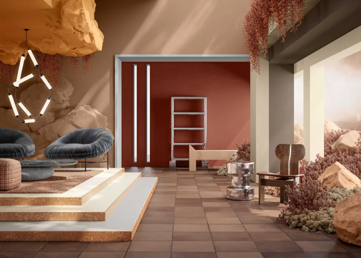
Elemental Palette
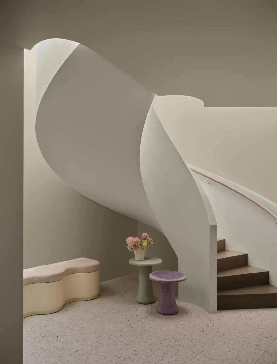
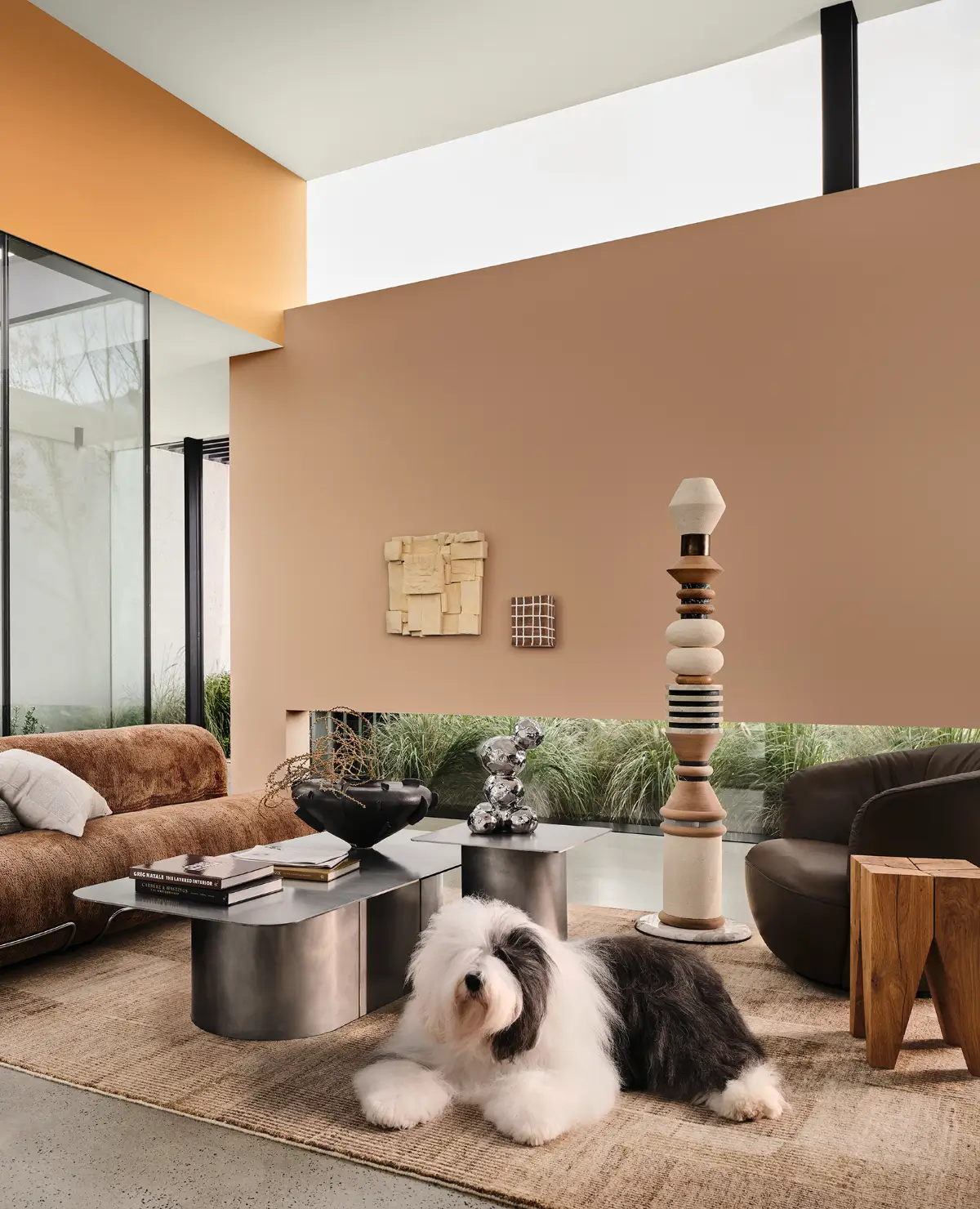
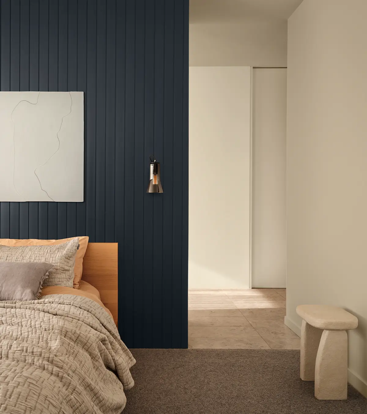
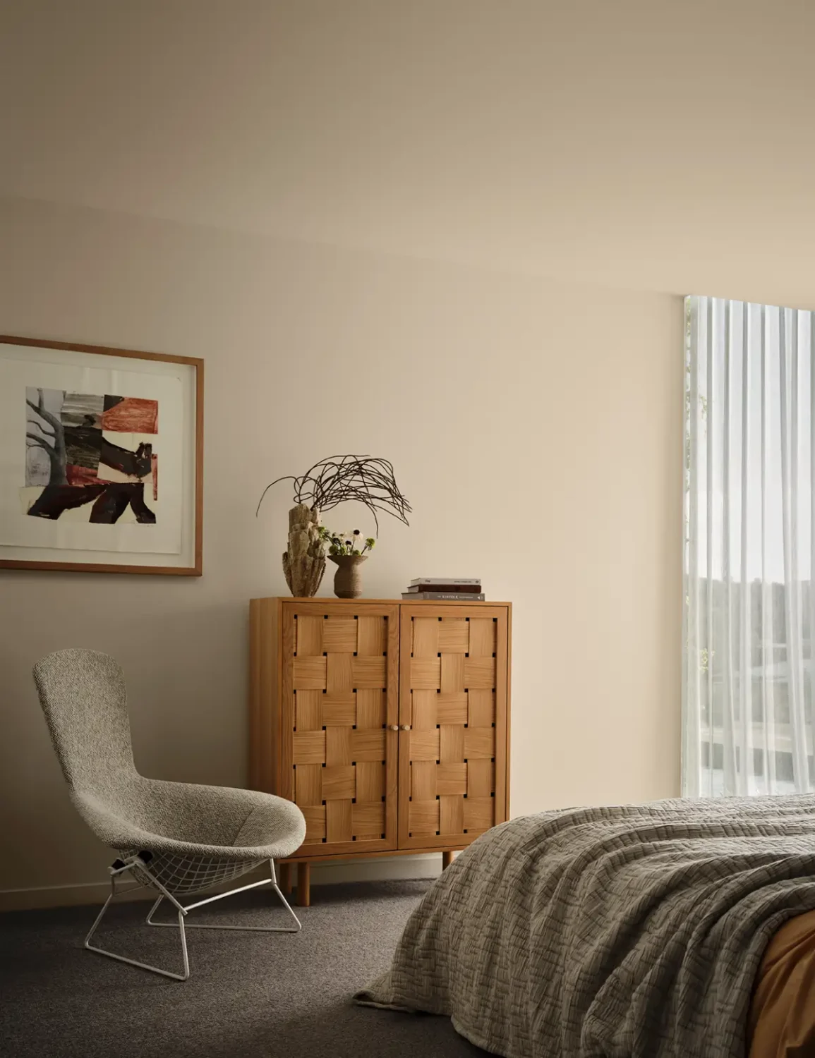
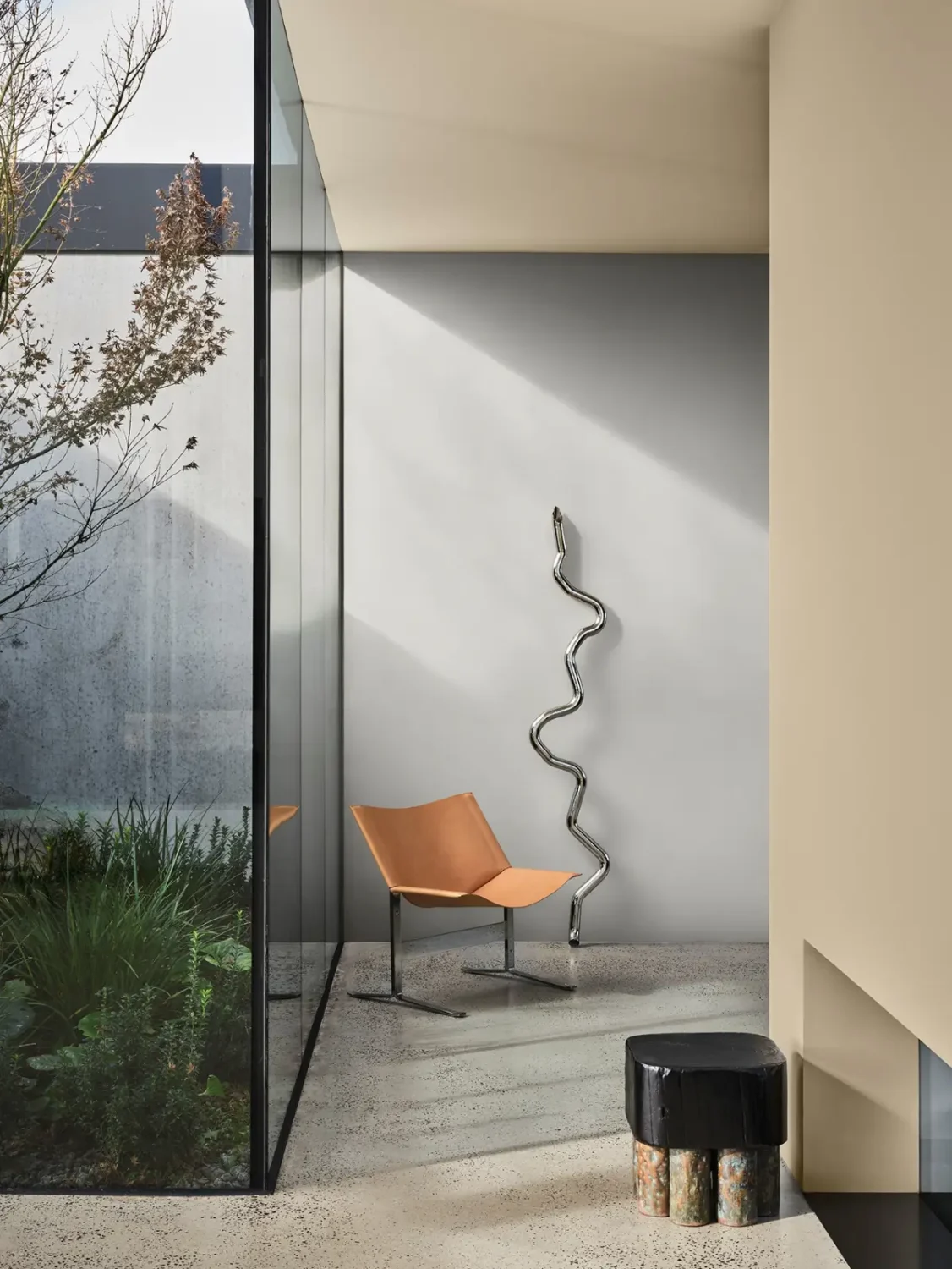
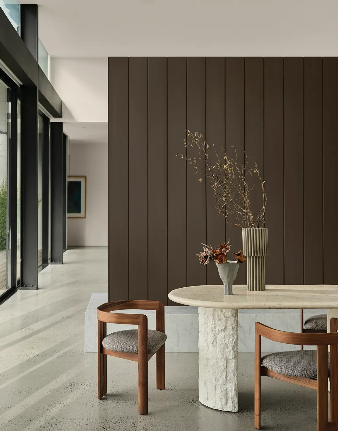
Grounded and timeless, Elemental offers a calm response to overstimulation and digital burnout. Inspired by brutalism and slow living, it’s tonal, minimal, and quietly confident.
Elemental is a tonal palette rich in warm whites and neutrals, deep chocolate, caramel, burnished red, and layered greys, creating a sense of structure and serenity.
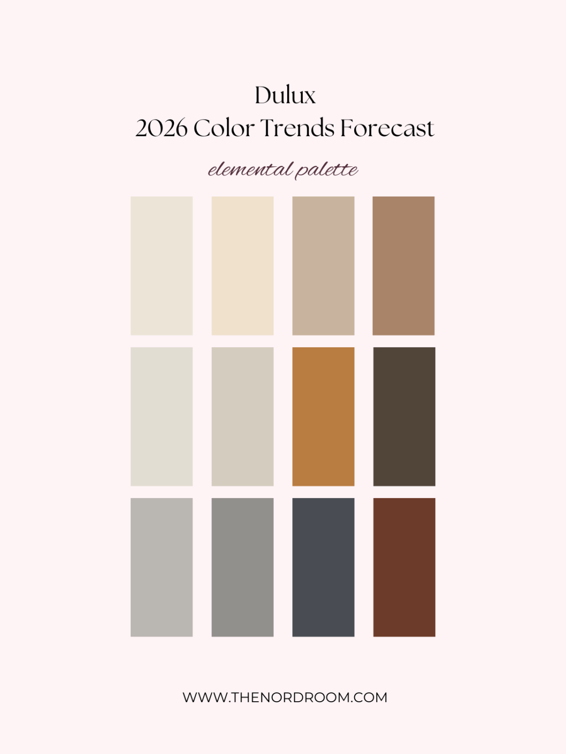
phantom beige – stone master – condiment – coffee dust
clear concrete – reckless grey – ticking – red mane
This palette pairs with durable, practical, and tactile materials such as raw concrete, polished marble, and clean linens, softened with warm tones and subtle metallics like chrome and copper.
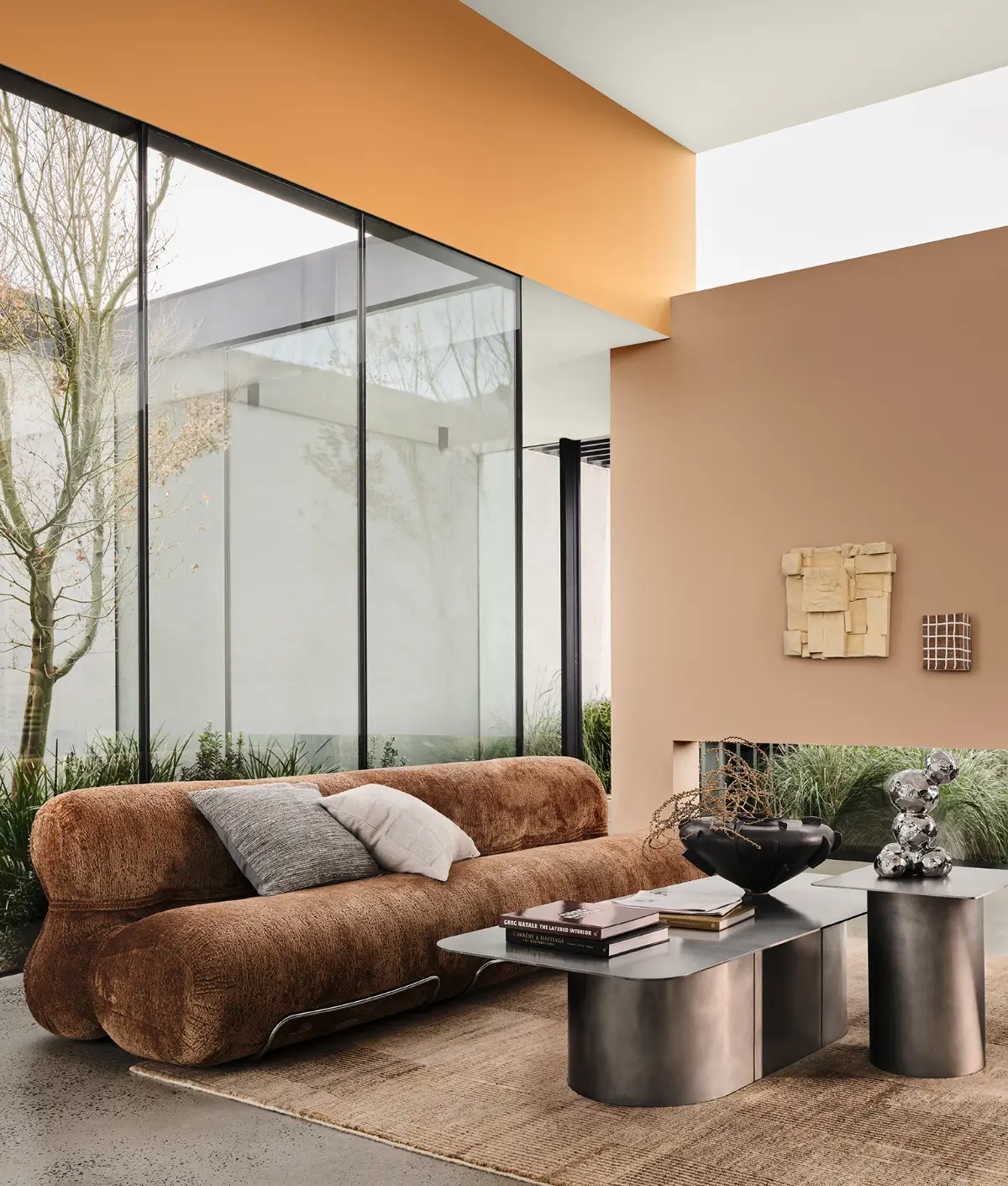
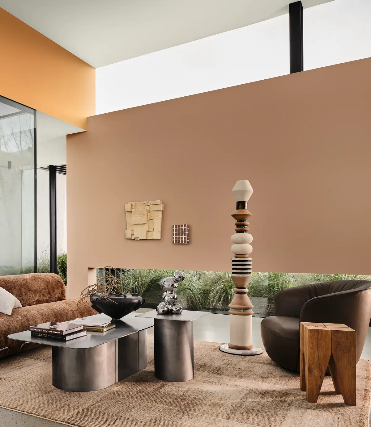
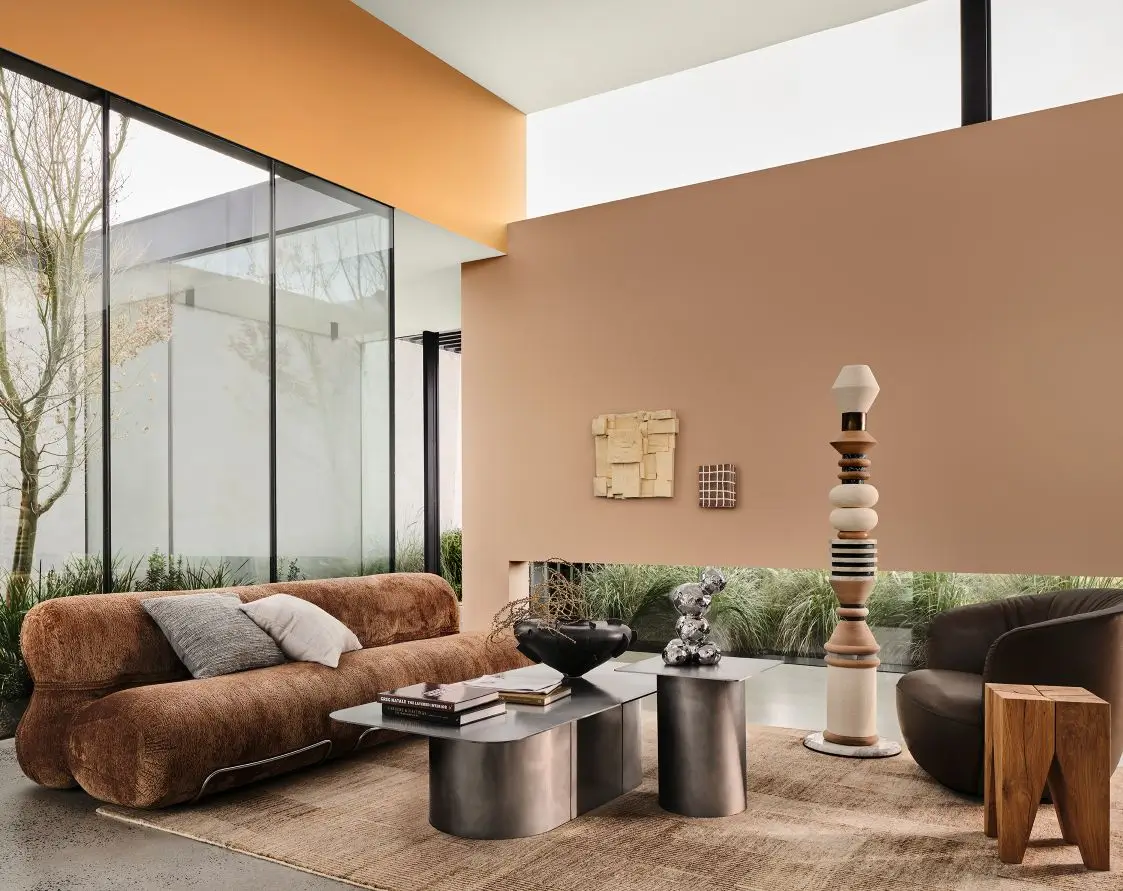
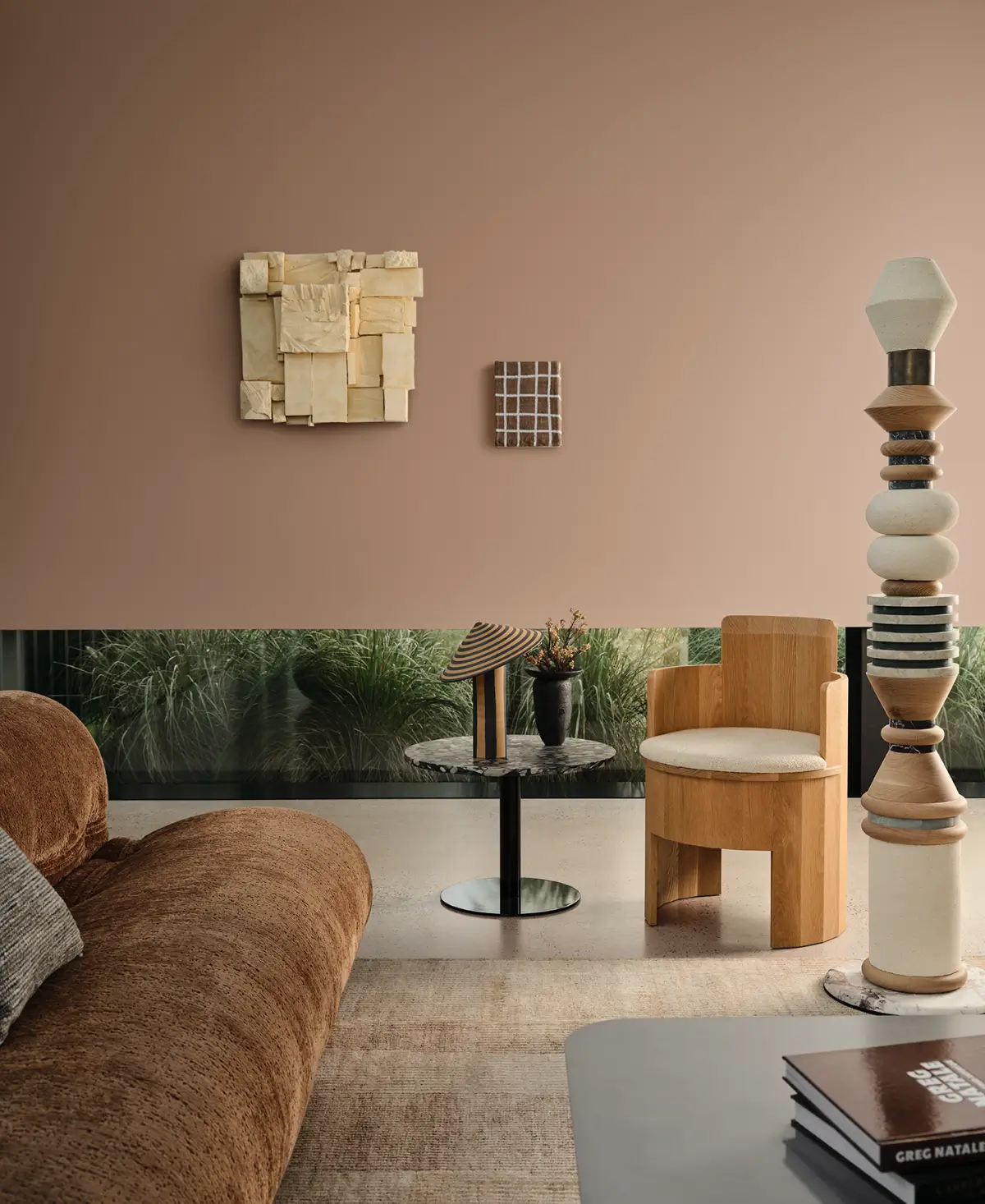
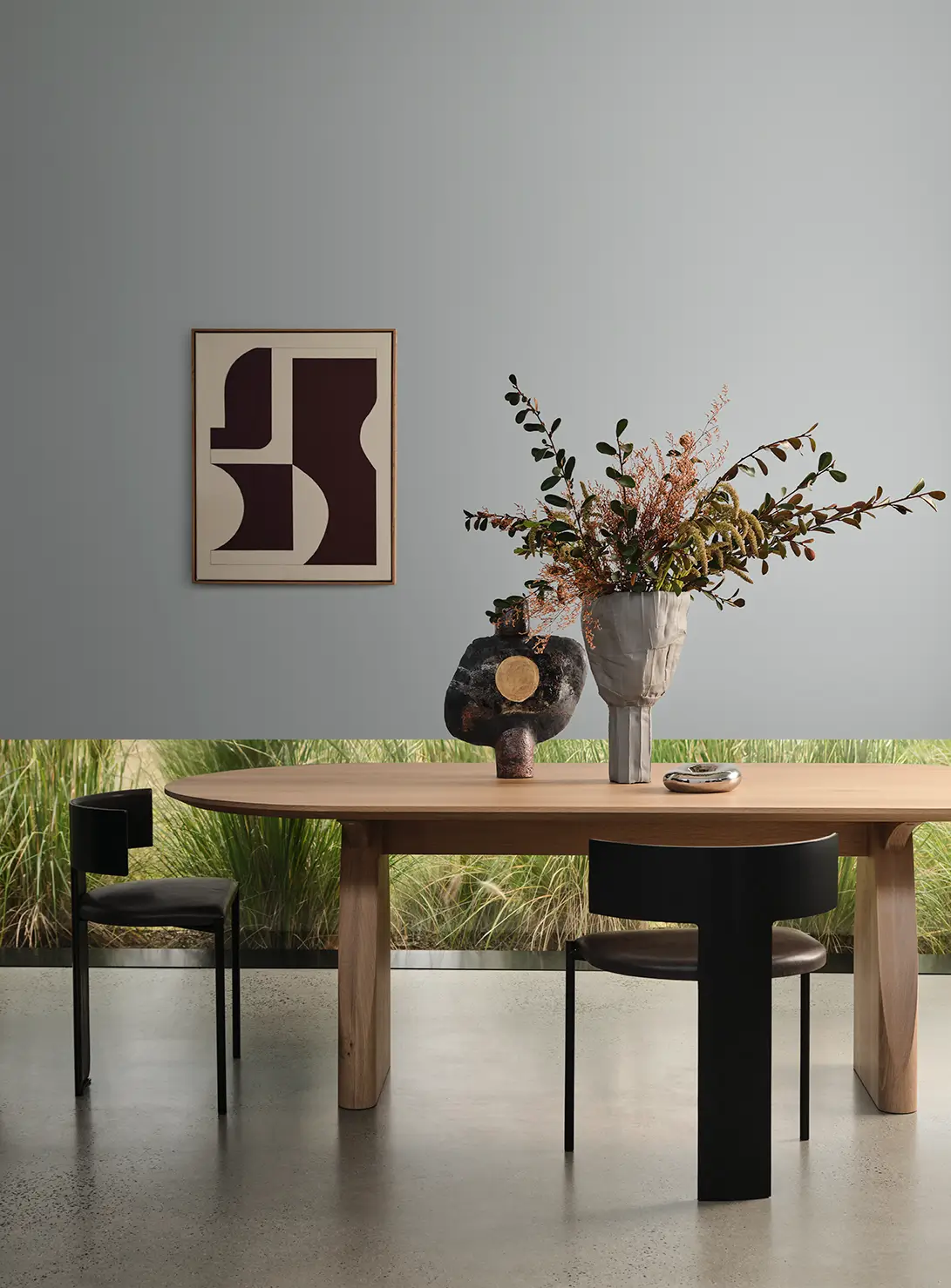

Evoke Palette
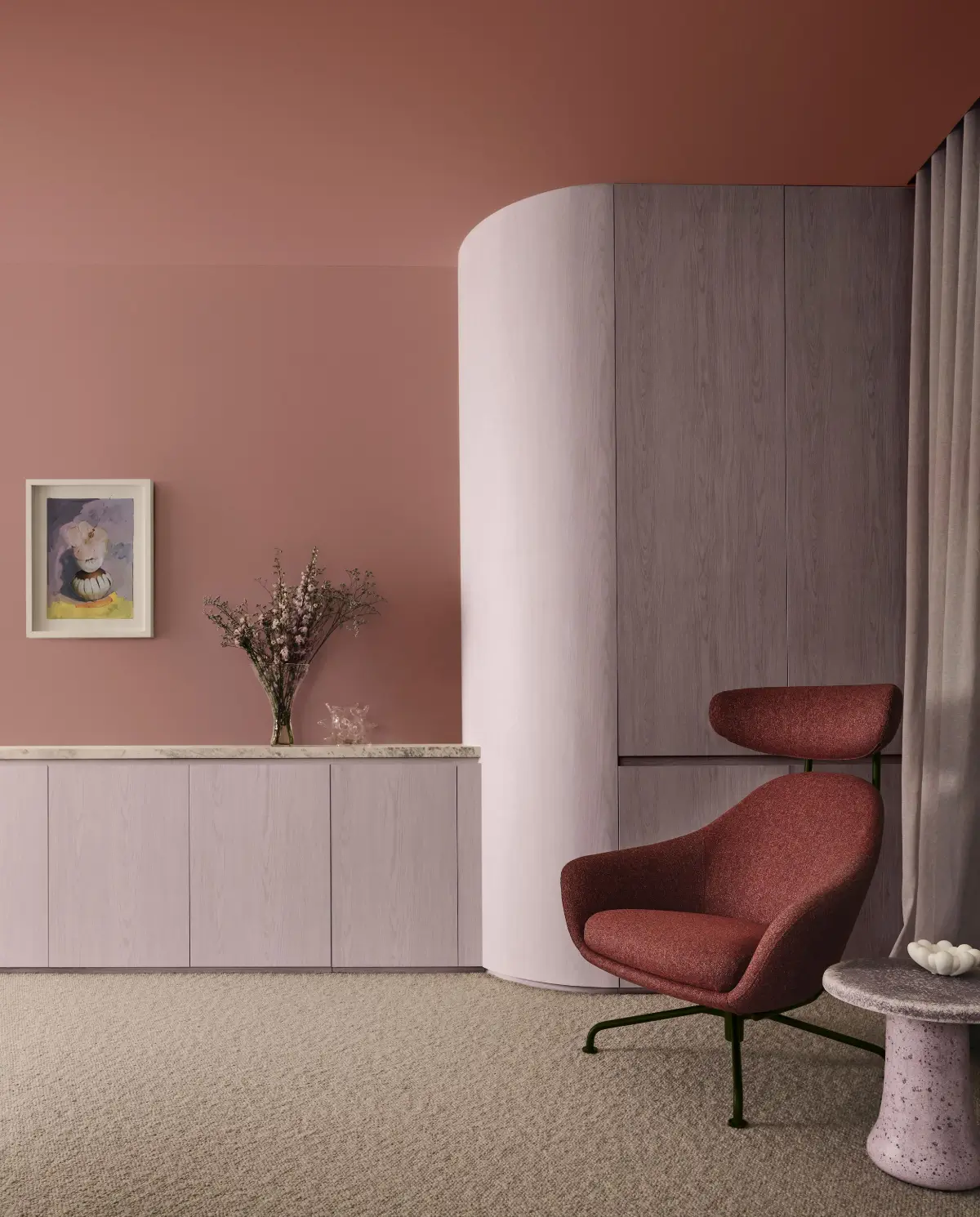
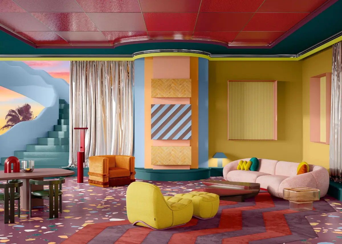
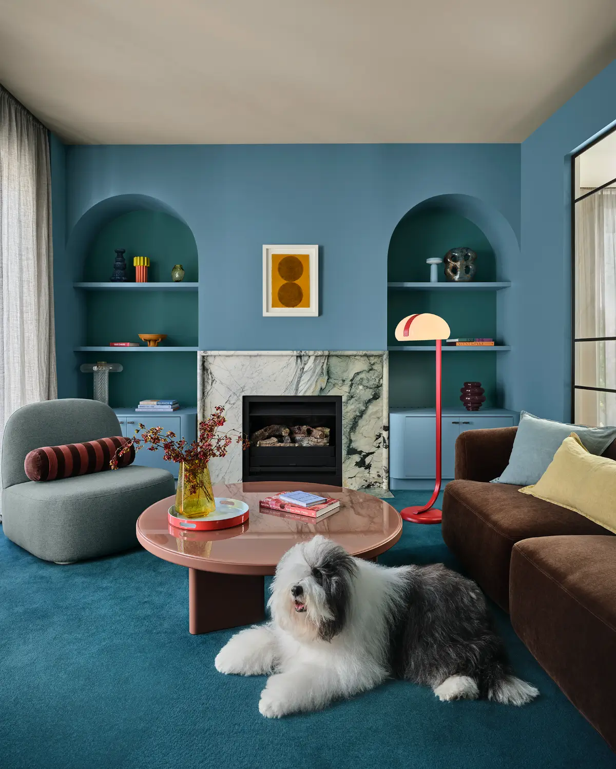
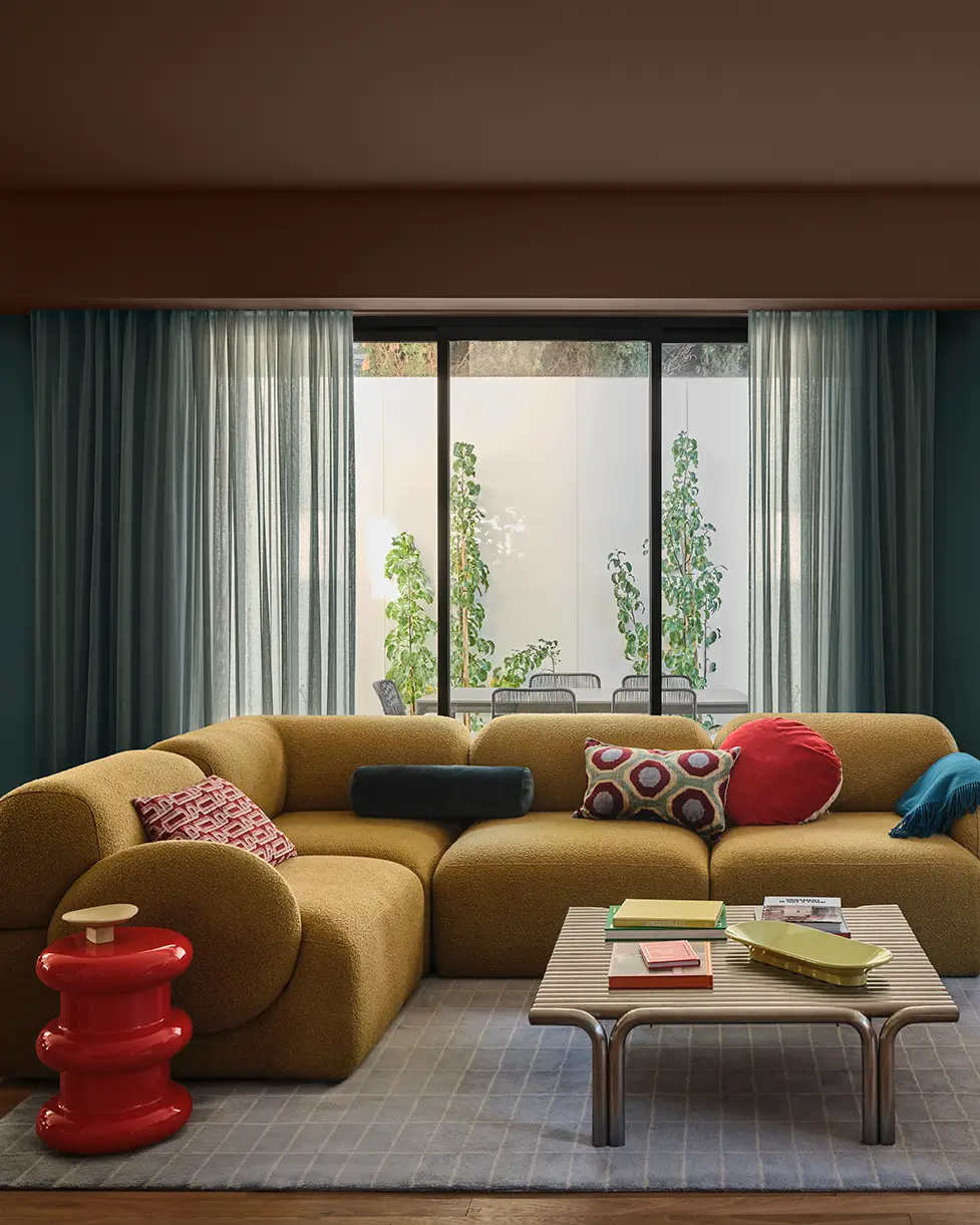
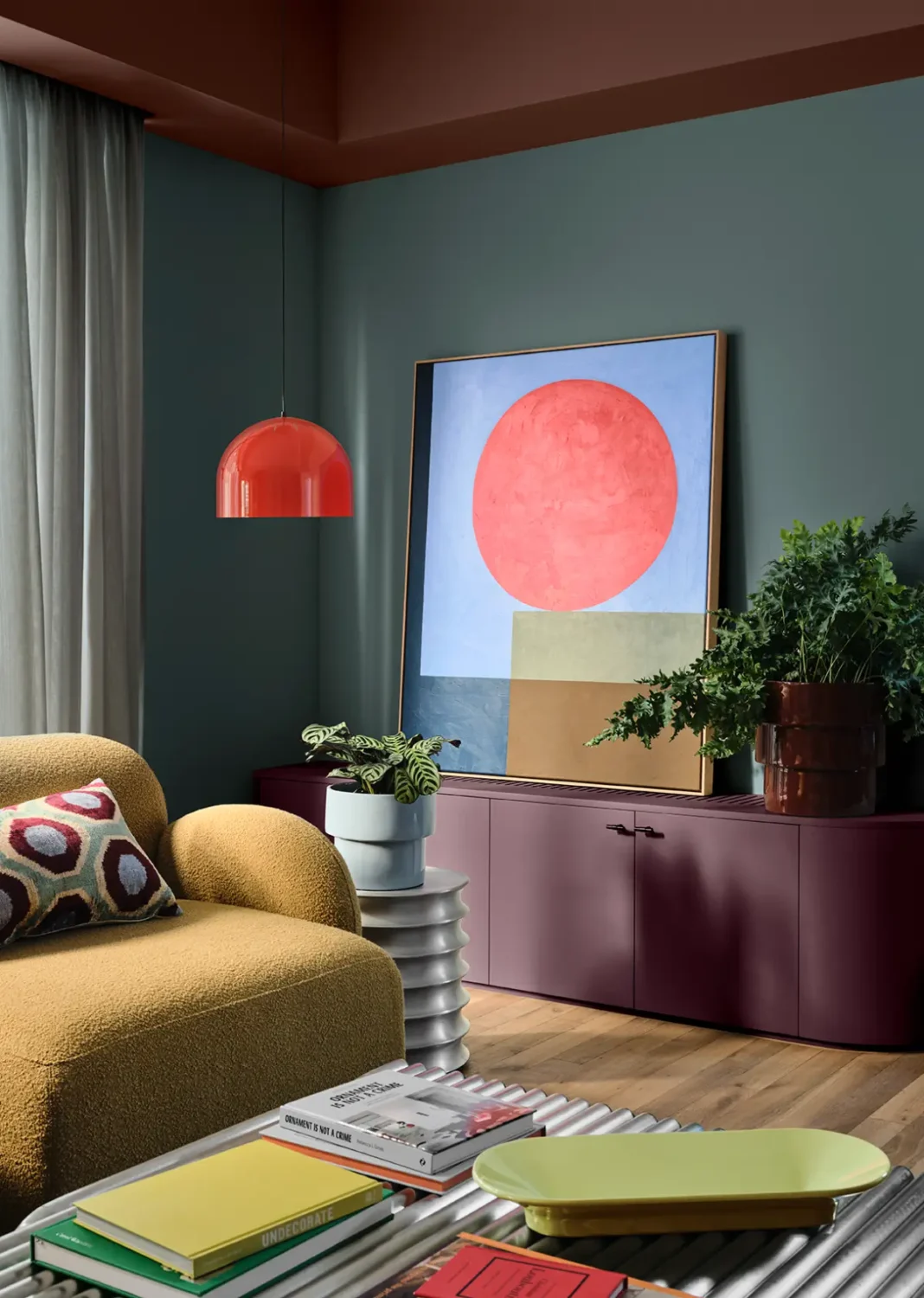
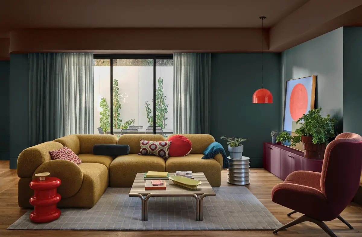
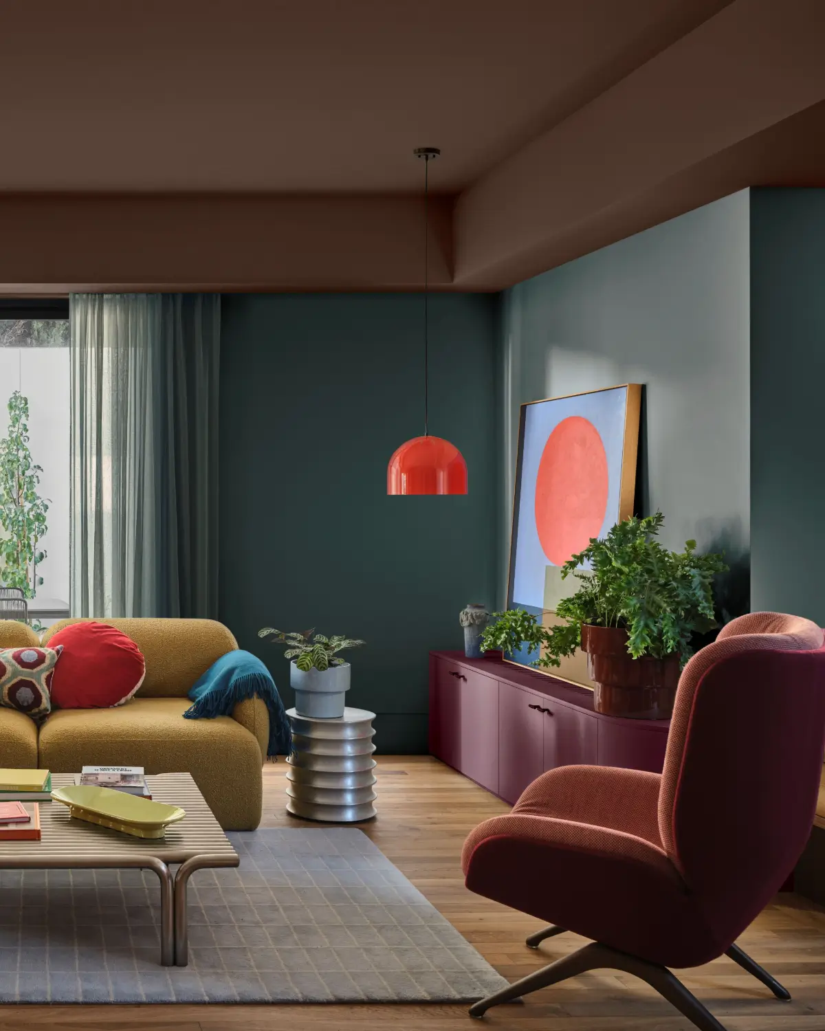
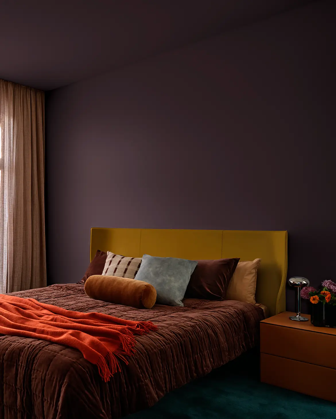
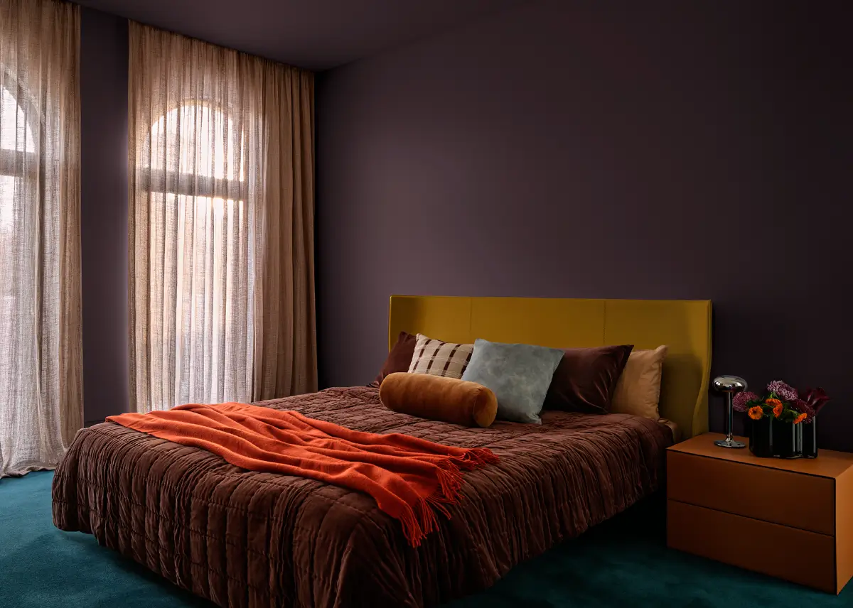
Bold, nostalgic, and full of personality, Evoke celebrates individuality and emotional warmth. With roots in maximalist interiors and vintage design, it champions sustainability and circular style, featuring antique finds and mid-century-inspired pieces.
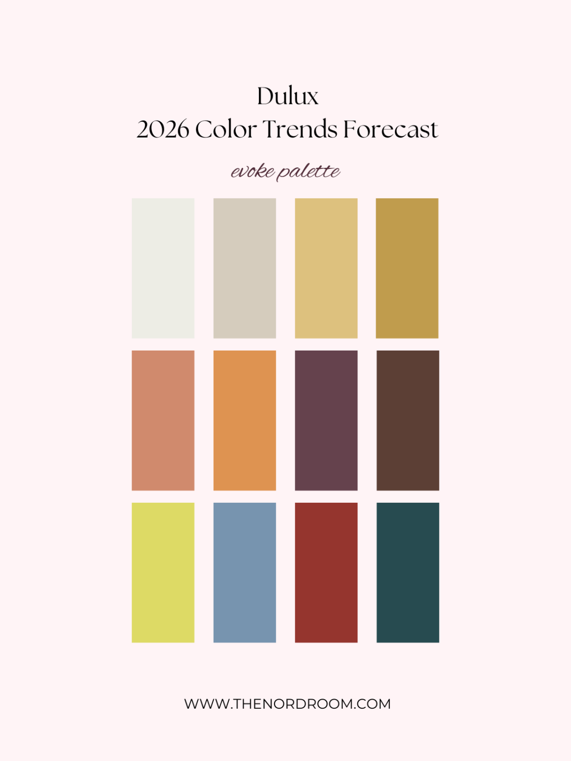
baked clay – magic melon – misty grape – chocolate treat
surcculent – wink – red jacks – deep aqua
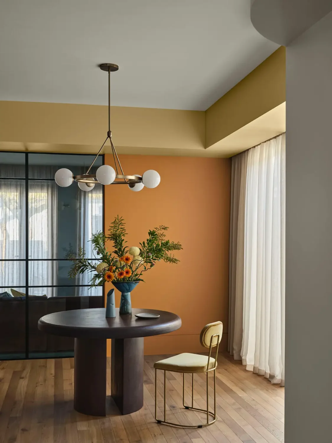
Evoke leans into rich, comforting tones, creating depth, character, and warmth. Earthy pinks, warm mustard/golds, and dramatic accents of grape, blue, and red to add contrast and a cultured edge.
Pair these colors with vintage-inspired, eclectic, and handcrafted pieces featuring chrome and aluminum finishes, clashing prints, and curated “character clutter” for a layered charm.


The Research Behind the Forecast
The Dulux Colour Forecast is the culmination of year-round research led by Colour and Design Manager Lauren Treloar and Colour and Communications Manager Andrea Lucena-Orr. Since 1999, it has served as a trusted guide for architects, designers, and homeowners.
“Our team works closely with international brands, attends global design shows like Milan Design Week, and collaborates across Dulux’s global network,” explains Treloar. “We also draw on insights from Color Marketing Group and forecasting firms to ensure our palettes reflect what’s ahead.”
Lucena-Orr adds: “In uncertain times, people seek stability and comfort. We’re seeing a strong preference for warm, reassuring colours that bring emotional balance and a sense of calm into our homes.”
