


Dulux 2027 Color Forecast Celebrates Personality, Joy, and Mindful Living
Dulux has unveiled its Color Forecast for 2027. I always look forward to this forecast because Dulux isn’t afraid to use bold color combinations, and their palettes are always stunning!
The forecast presents a vibrant mix of calming blues, botanical greens, playful pastels, and sophisticated jewel tones.
The forecast is divided into three palettes: Play, Treasure, and Sensory. It reflects a growing desire to create homes that feel personal, comforting, and unmistakably human.
As rising living costs and rapid developments in artificial intelligence continue to influence daily life, our homes are becoming increasingly important places of retreat and self-expression.
According to Dulux, people are looking for interiors that offer a sense of balance and belonging while providing relief from digital noise, overstimulation, and the sameness created by algorithms.
The 2027 palettes respond to this shift with colors designed to support creativity, individuality, and meaningful everyday rituals. Soft yellow-greens and blues with gray or purple undertones appear throughout the collection, bringing a grounded quality to interiors.
These gentler shades are joined by brighter berry, cherry, and orange accents that introduce personality and optimism without overwhelming a room.
Developed by the Dulux Color Team, led by Color and Design Manager Lauren Treloar and Color Marketing Lead Lilybet Holt, the annual forecast is informed by extensive international trend research.
The team studies developments across interiors, architecture, fashion, and product design, drawing inspiration from design fairs, runway presentations, global forecasting agencies, and events such as Milan Design Week.
The result is a collection of colors that can be adapted to suit different homes and personal styles. While each palette has its own identity, the shades have been selected to work cohesively, making it possible to introduce the trends through anything from a complete room makeover to a single accent wall.
Dulux Play Palette: Colorful, Creative, and Unpredictable
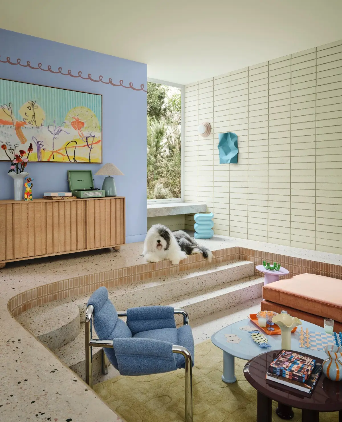
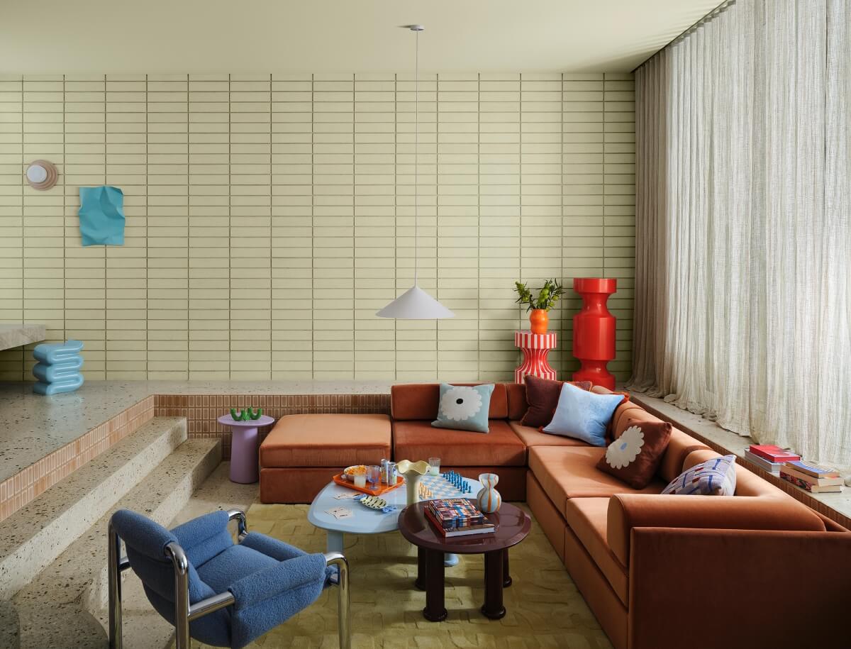
The Dulux Play palette brings a light-hearted energy into the home. Inspired by music, games, analog interaction, and the charm of imperfect everyday moments, it encourages a more relaxed and experimental approach to decorating.
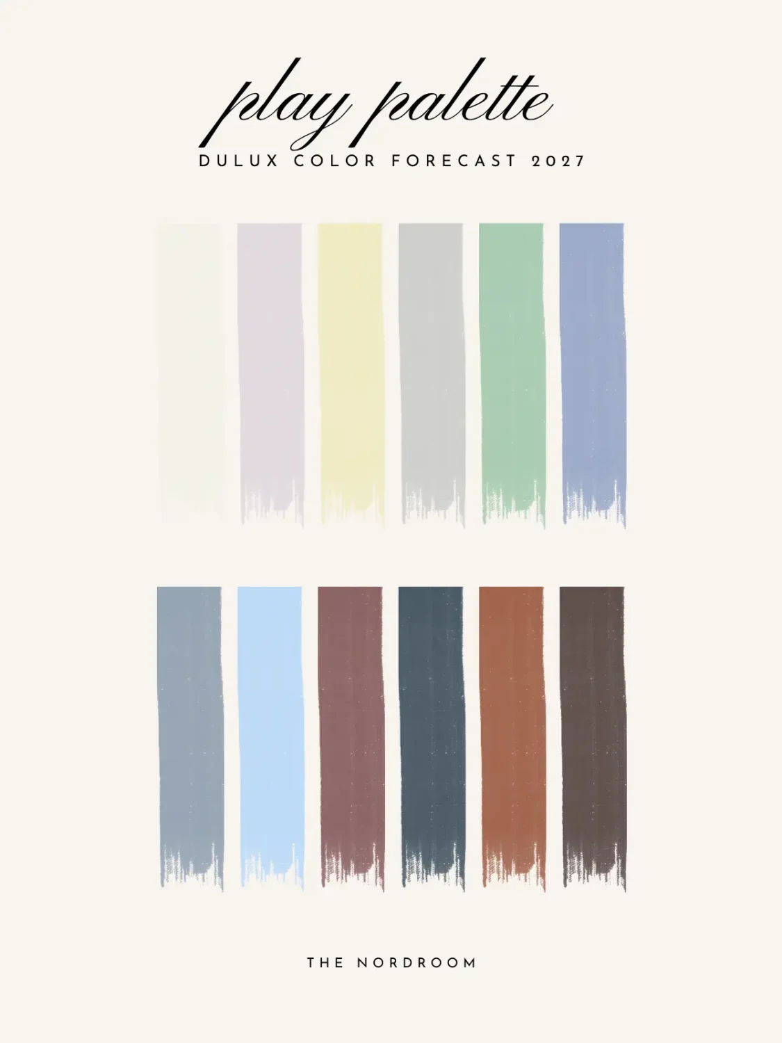
Soft pastels form the foundation of the palette. Muted lilacs such as Stately Frills sit alongside the calming Powder Blue Half and the fresh spearmint green of Catnap.
More energetic shades, including the zesty orange Temptress and rich Baca Berry, provide cheerful accents.
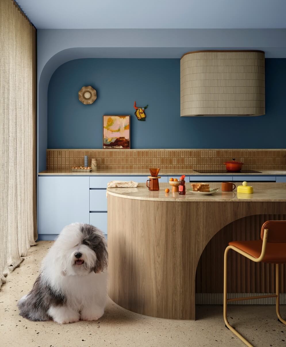
Rather than relying on perfectly coordinated rooms, the Play palette embraces contrast, movement, and creative freedom. These colors are imagined alongside contemporary timbers, modular furniture, and adaptable designs that allow spaces to change according to the needs of the people using them.
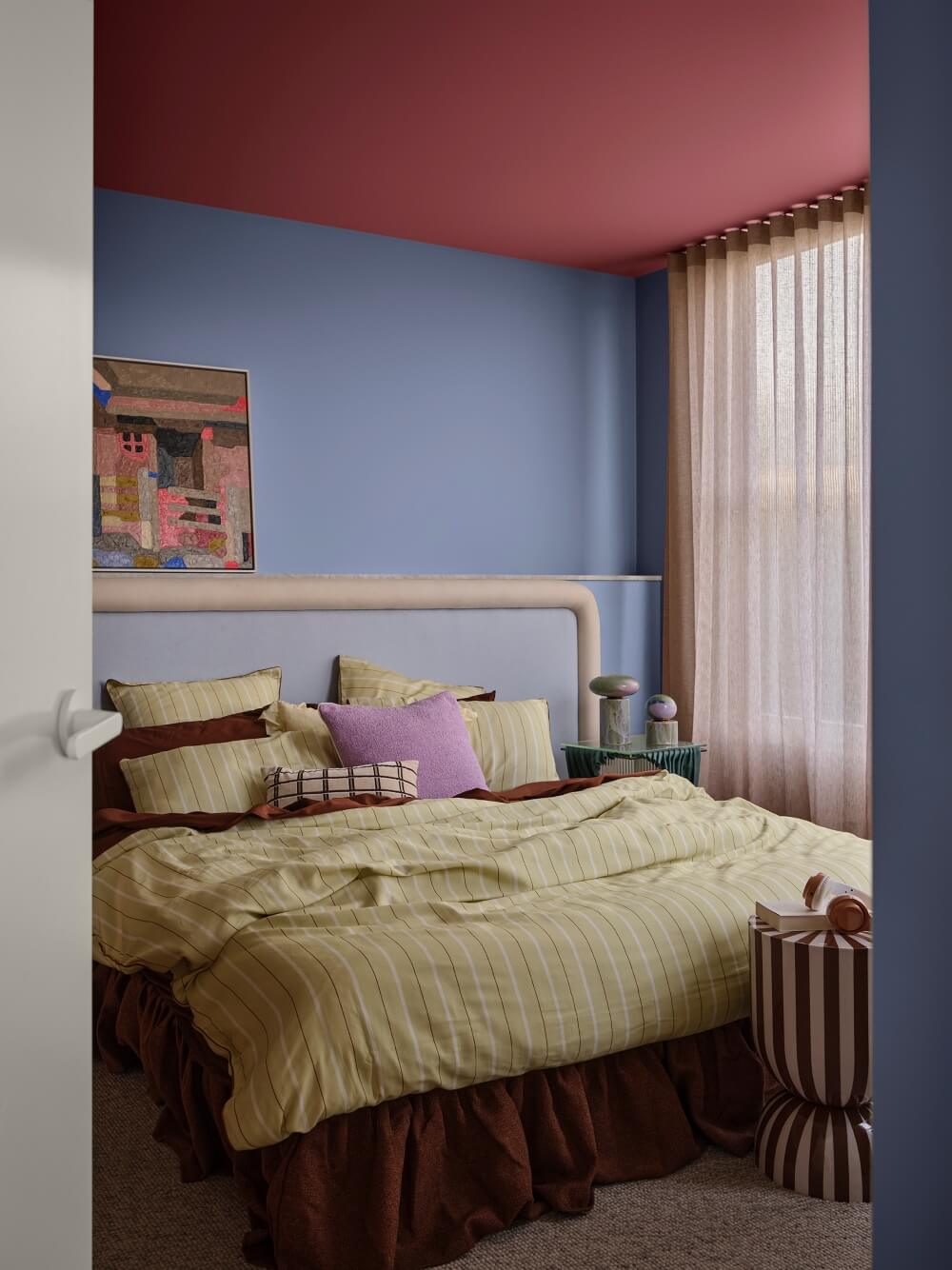
Playful patterns, asymmetrical forms, and imperfect embellishments reinforce the palette’s informal character. Rubber details and tactile surfaces add another layer of interest, resulting in interiors that feel approachable rather than overly styled.
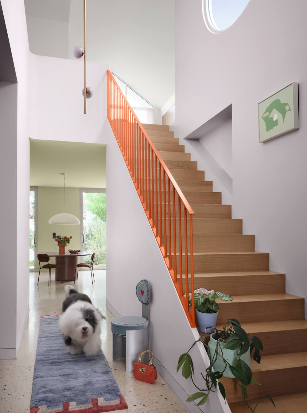
This is a palette for anyone who wants their home to feel lively and spontaneous. A lilac wall might be paired with mint-green furniture, while an orange lamp or berry-colored side table can add an unexpected burst of color.
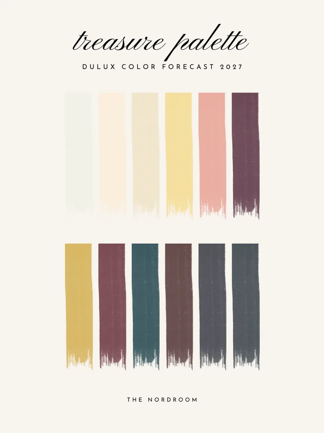
Dulux Treasure Palette: Rich Colors and Collected Interiors
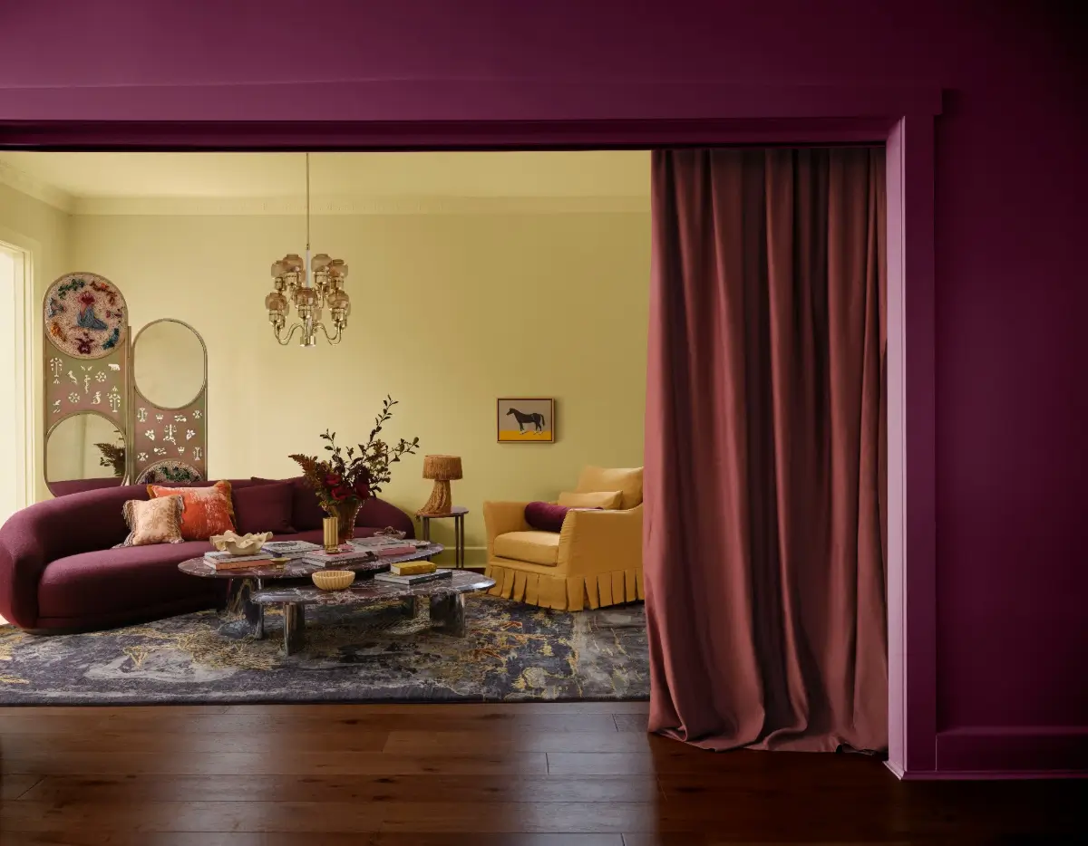
For those drawn to deeper, more atmospheric interiors, the Dulux Treasure palette offers a sophisticated combination of jewel tones, luxurious materials, and classical influences.
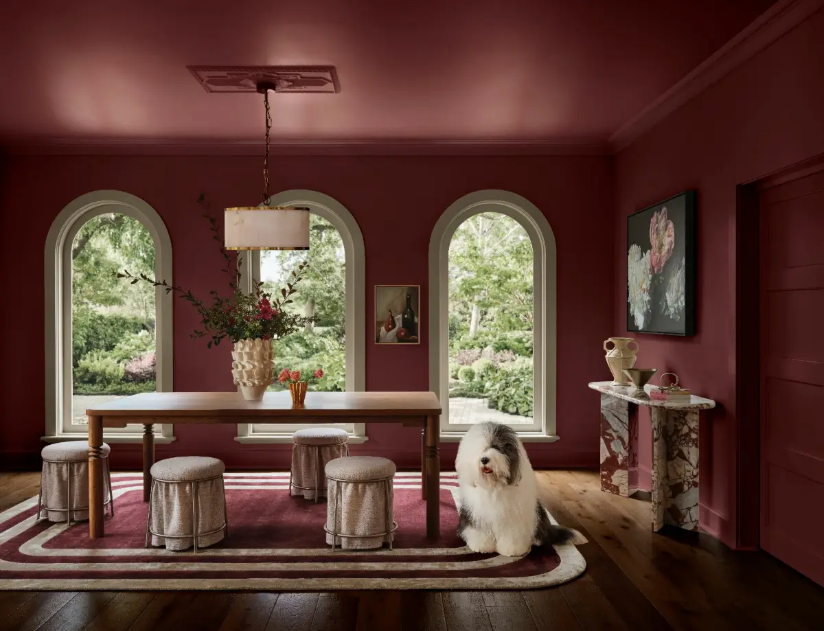
The palette reflects the continuing move away from stark minimalism towards a more restrained form of maximalism. Instead of filling rooms with unnecessary decoration, the focus is on tonal depth, beautiful materials, and objects with personal meaning.
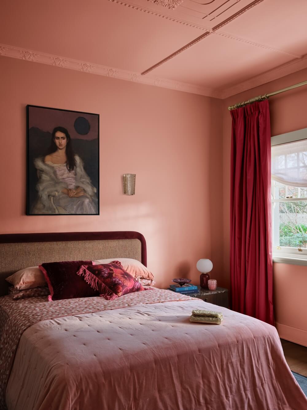
Deep blues such as Precision and Madonna create an enveloping backdrop, while Raspberry Fool and Rich Red Violet introduce crimson and berry tones. Together, these shades lend rooms a sense of elegance and intimacy.
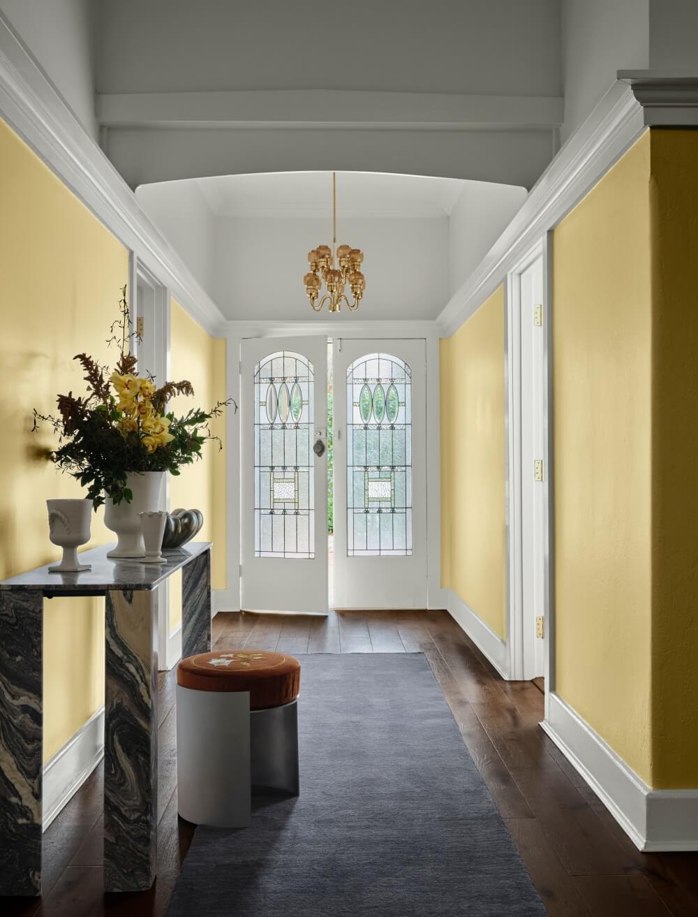
The Treasure palette is designed to work particularly well with expressive marble, high-gloss finishes, mixed materials, and richly grained woods. Weighty fabrics and layered patterns enhance the palette’s luxurious quality, creating rooms that feel established and collected over time.
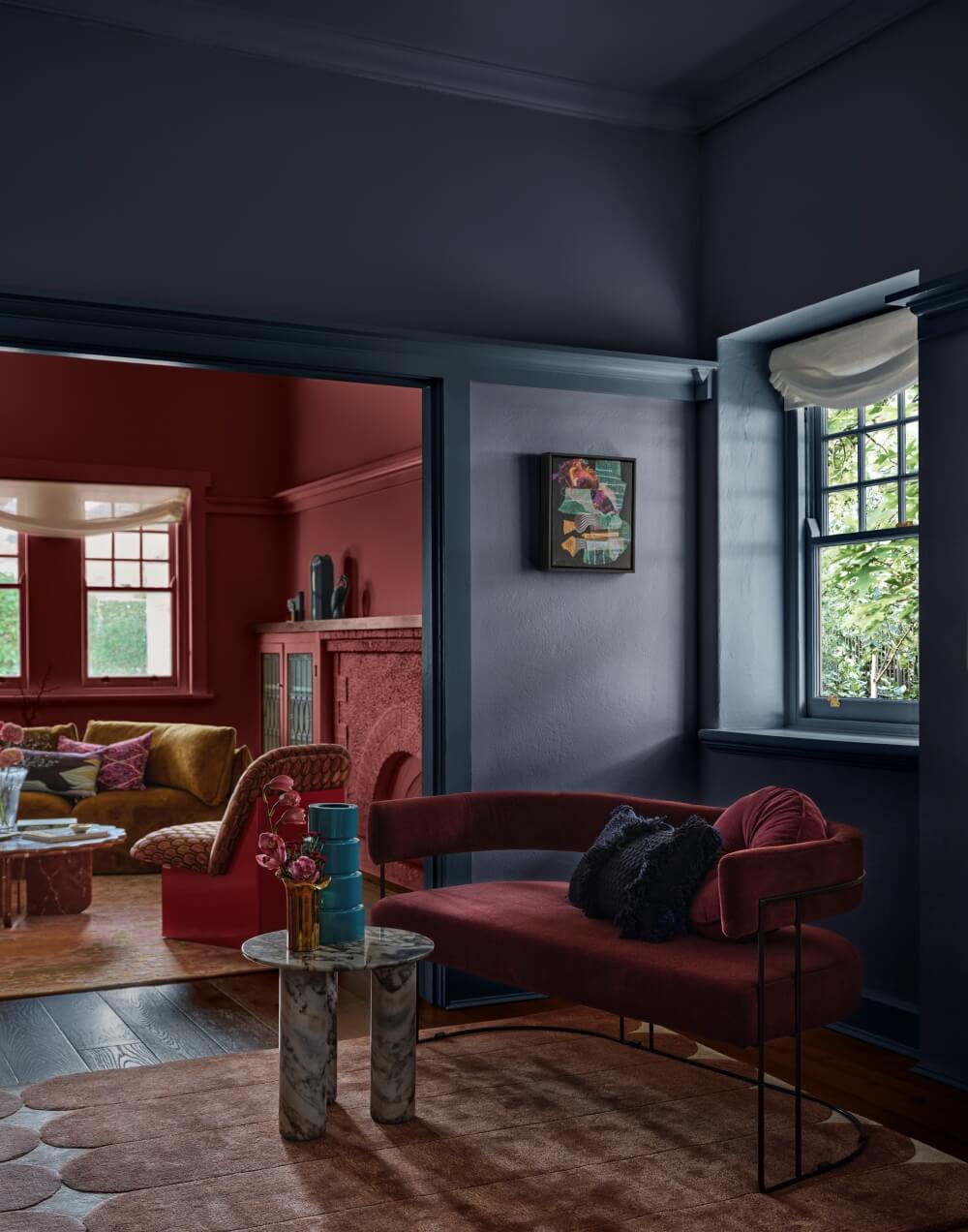
The look is opulent but not excessive. A deep blue dining room, for example, could be softened with warm timber furniture and aged metal accents. Berry tones might appear through upholstery, curtains, and a glossy painted cabinet.
Rather than following a single design era, the Treasure palette combined old and new. Antique pieces, inherited objects, and contemporary furniture can sit comfortably together, allowing the home to become a reflection of personal history and individual taste.
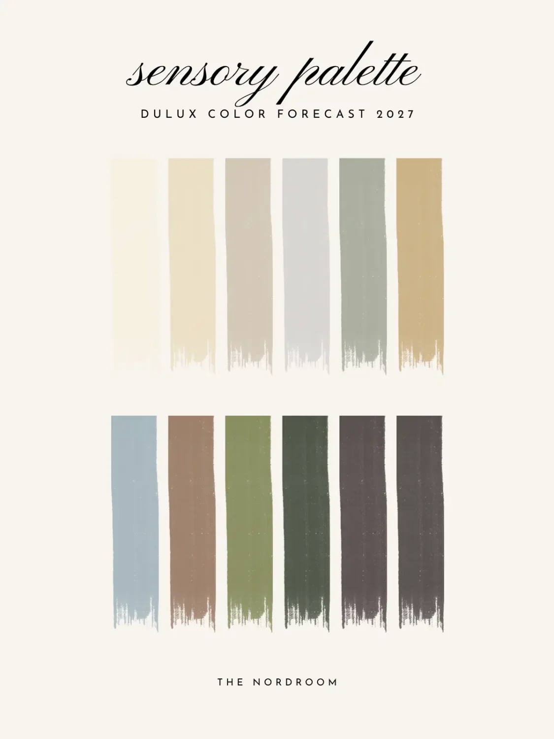
Dulux Sensory Palette: A Calm and Restorative Retreat
The Dulux Sensory palette takes a quieter approach, focusing on mindful living, natural materials, and the small rituals that bring comfort to everyday life.
Inspired partly by Japanese design and traditional craftsmanship, the palette combines warm neutrals, layered greens, and deep brown tones.
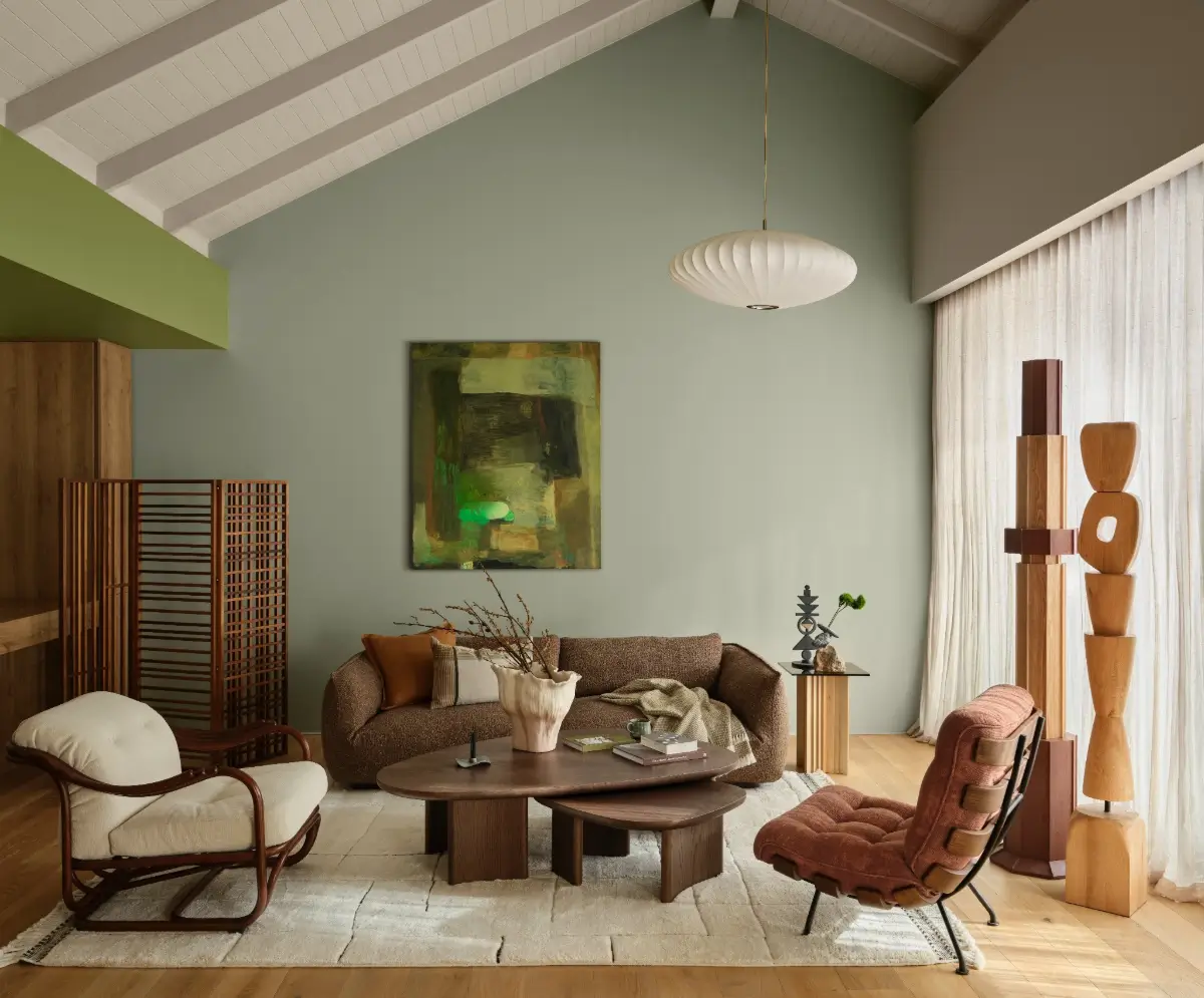
Field Maple and Moorland introduce softened botanical shades, while Buttercookie and Humble Fawn create a warm, understated base. Near-black browns such as Cocoa and Sweet Chocolate add depth and definition.
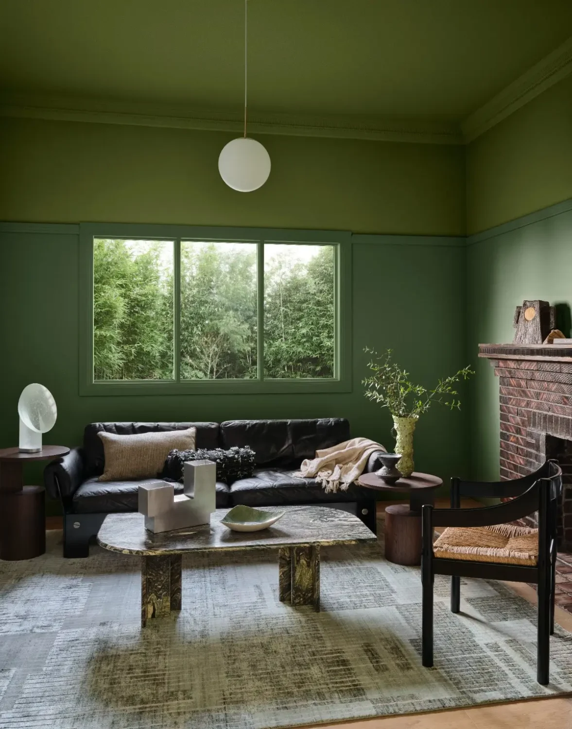
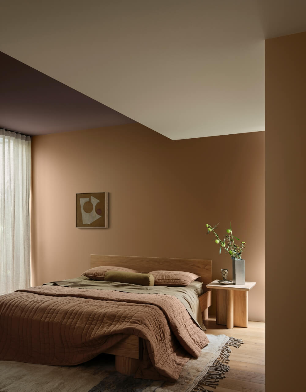
These colors are intended to create spaces that feel reassuring and restorative. Instead of making a strong visual statement, they provide a calm backdrop for daily activities.
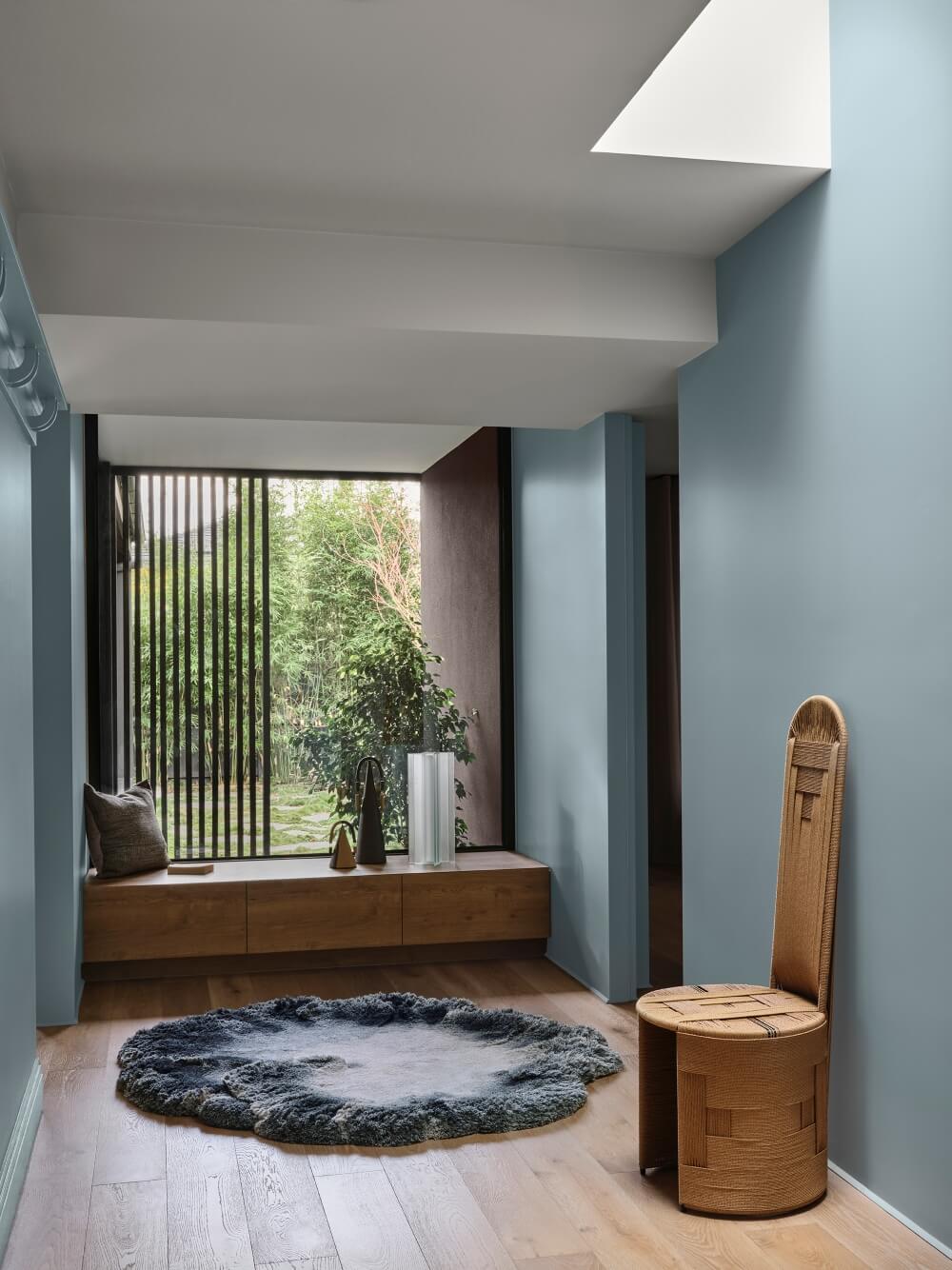
Materials are central to the Sensory look. Refined woven textiles, honed stone, smoked glass, aged brass, and weathered surfaces bring warmth and tactility to the palette. Organic curves soften the overall effect, while Japanese-inspired grids and latticework introduce a gentle sense of order.
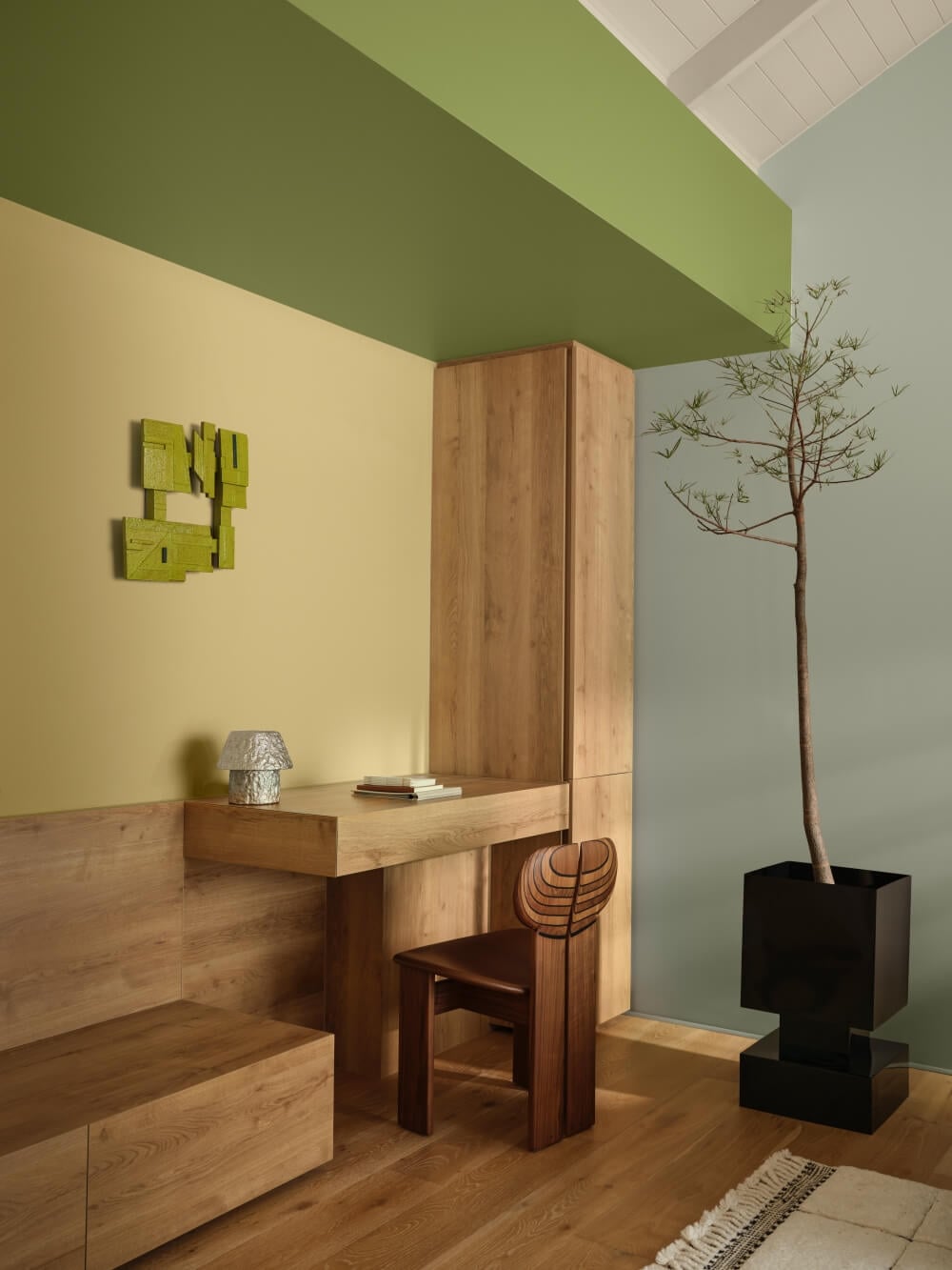
The result is an interior that feels considered without appearing rigid. Every object has a purpose, but comfort remains just as important as simplicity. Handmade ceramics, low seating, natural fibers, and softly diffused lighting can all help bring the palette to life.
Creating a More Personal Home in 2027
Although Play, Treasure, and Sensory have very different moods, all three palettes share a common goal: to make the home feel more personal and connected to everyday life.
What is your favorite palette from the Dulux Color Forecast?