

Little Greene Introduces 26 New Colors Across Two Updated Collections
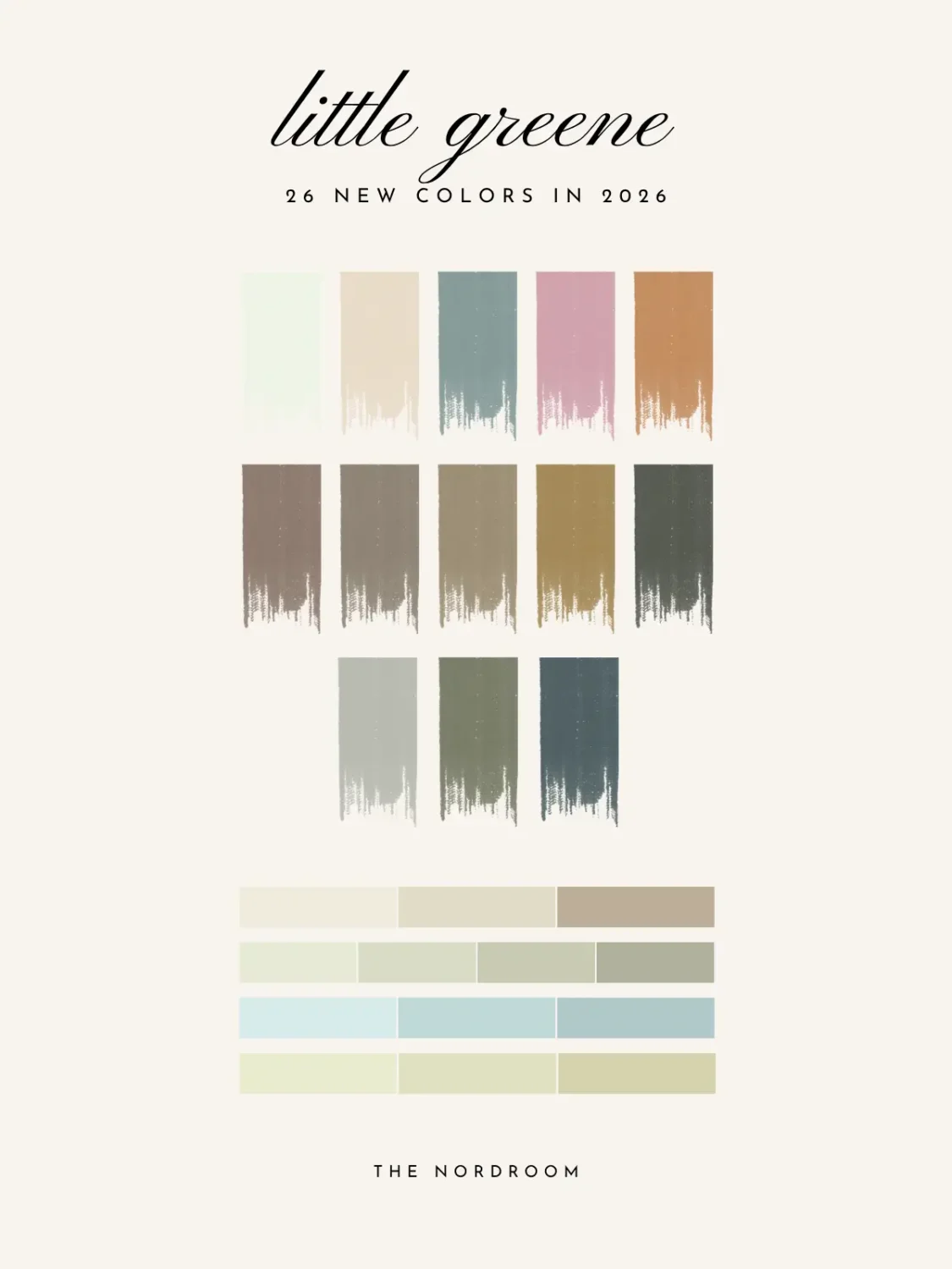
Little Greene has unveiled updated editions of its Colours of England and Colour Scales collections, introducing 26 new colors that reflect the changing ways people decorate their homes.
Spanning more than 300 years of decorative history, the refreshed palettes blend authentic archive colors with contemporary shades. The aim is to make choosing and combining paint colors feel more intuitive, whether the desired result is a quiet tonal interior or a scheme built around stronger contrasts.
“Our Colours of England and Colour Scales collections evolve in line with changing approaches to color in our homes,” explains Ruth Motteshead, Creative and Marketing Director at Little Greene.
“The popularity of colors changes over time; it’s an evolution rather than a revolution, with a movement towards different colors feeling like a neutral transition.”
How Color Trends Are Changing
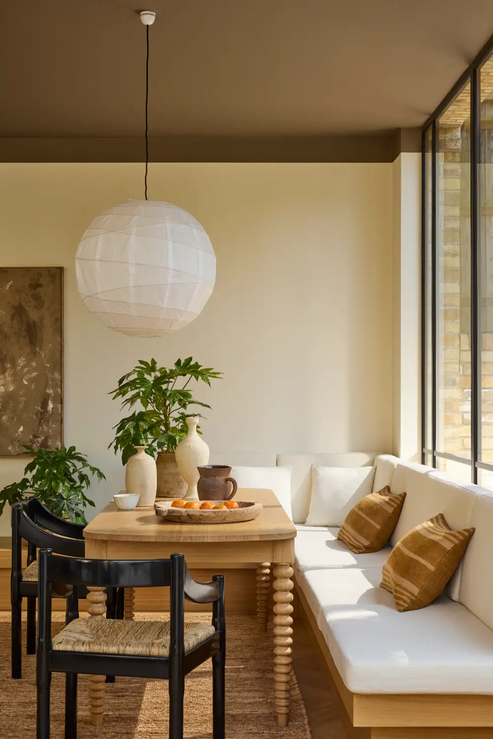
Over the past decade, interior color trends have gradually moved away from the cool grays and blue-based whites that dominated the early 2010s. Rich blues gave way to teals and gentle greens before warmer yellows, ochres, caramel tones, and deep browns became more prominent.
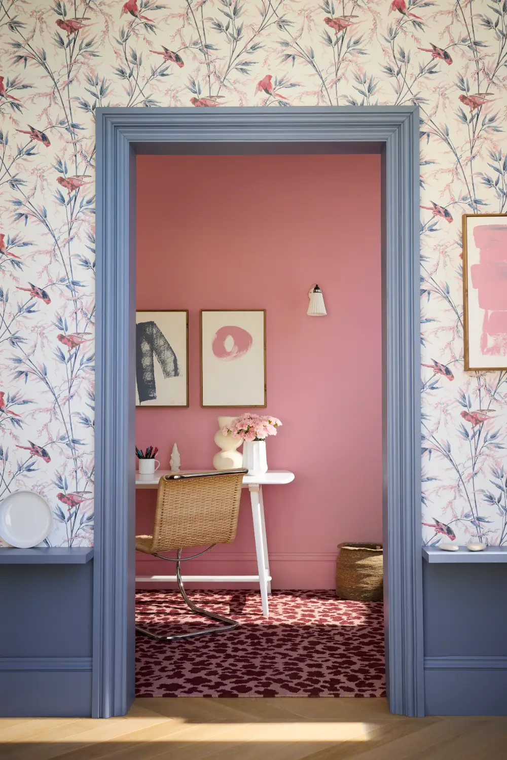
More recently, burgundy, aubergine, dark red, and muted pink have gained ground, bringing intimacy and restrained grandeur to the home. At the same time, interest has grown in soft pastels, balanced neutrals, and warmer interpretations of blue and green.
Rather than introducing colors that feel dramatically different from the existing Little Greene palette, the new collection responds to these gradual changes. Saturation has been softened, undertones have become more balanced, and several familial color families have been expanded.
Five New Colors Join Colours of England
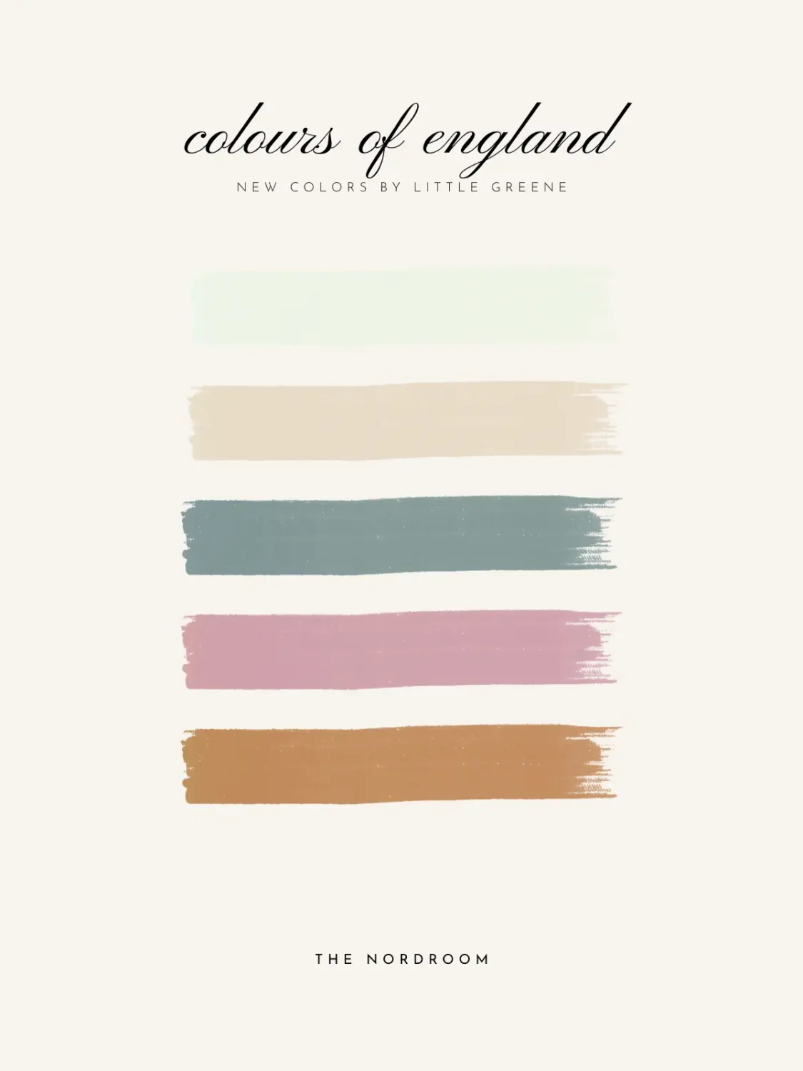
Little Greene’s updated Colours of England color card now contains 128 shades, including five new additions. The collection combines the brand’s signature colors with authentic shades inspired by important periods in British decorative history.
The new colors include Haye White, an easy-to-use warm white; Parlour, a delicate plaster-inspired neutral; Perpetual Blue, a historic mid-to-deep blue; Floss, a playful yet versatile pink; and Ashes of Marigold, a muted terracotta orange.
Haye White
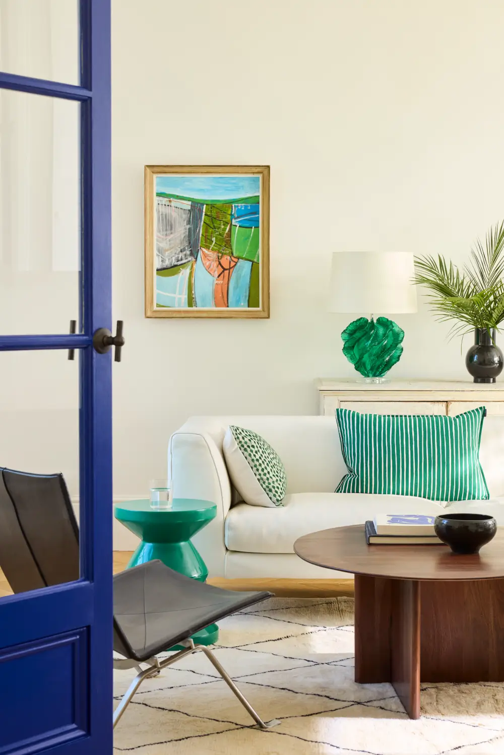
Created as an “everywhere white,” Haye White has a softly suffused brightness. A small amount of ochre gives it warmth without turning it into a conventional cream, making it a gentler alternative to the more umber-toned Slaked Lime.
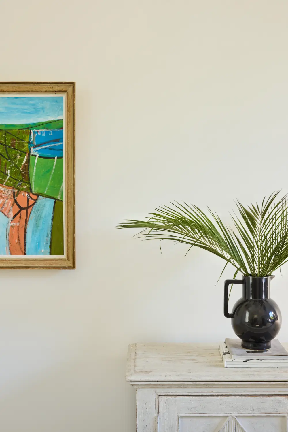
Its balanced appearance allows it to work across walls, ceilings, and woodwork, particularly in rooms where a brilliant white might feel too stark.
Parlour
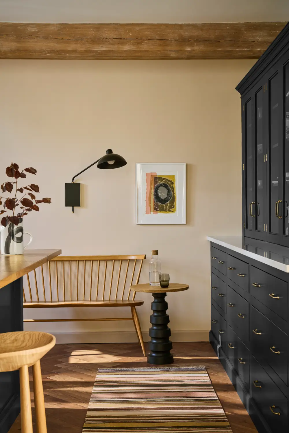
Parlour is a light, warm plaster shade with a subtle pink undertone. Similar in character to Castell Pink but noticeably fresher, it is based on a color once used in the north-facing “Slop’t Parlour” at Dyrham Park near Bath.
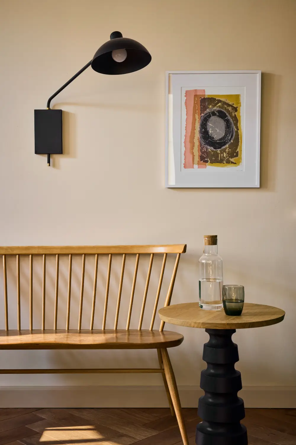
The soft, stony quality makes Parlour suitable as a warm off-white or as the foundation for a pale pastel scheme.
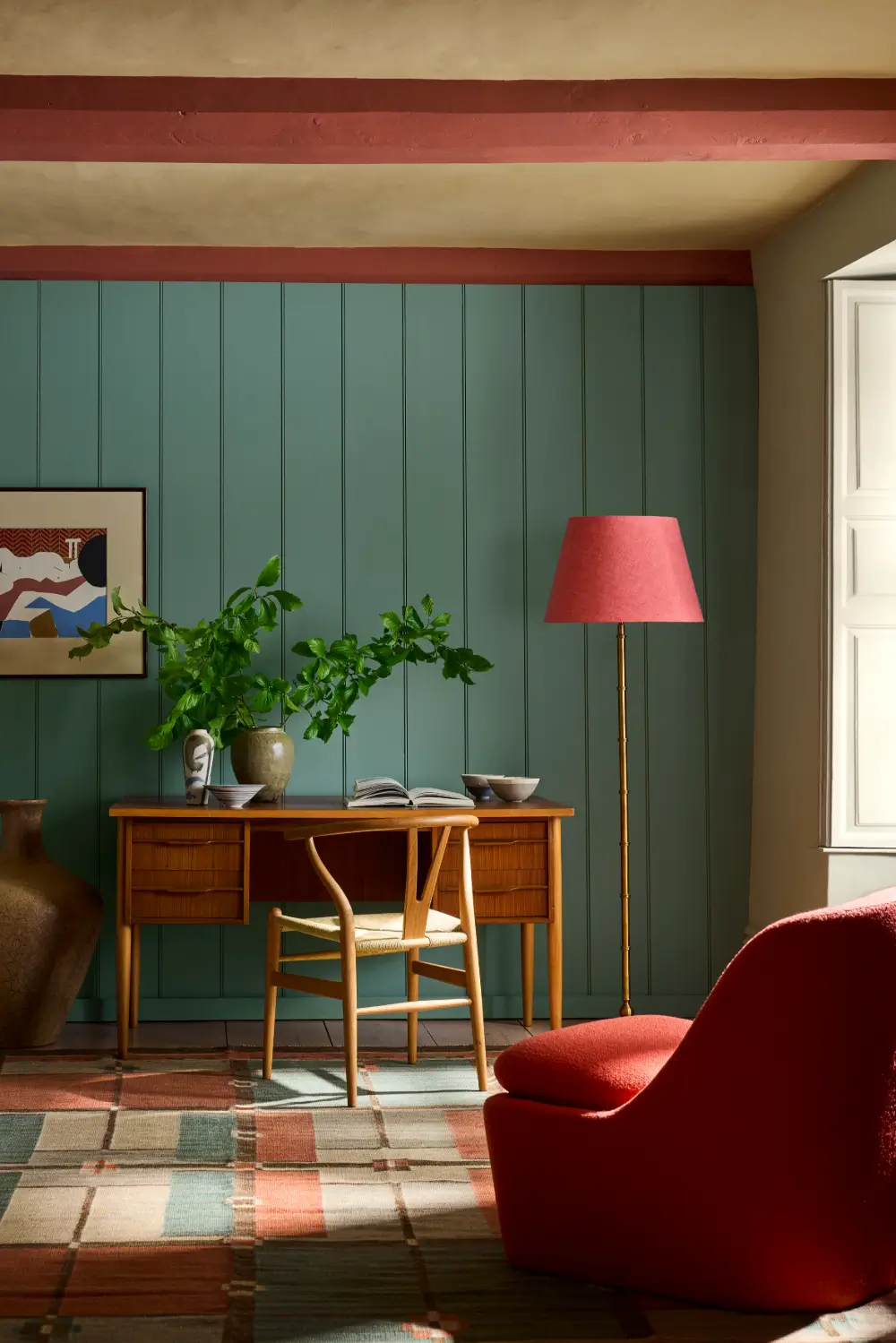
Perpetual Blue
Perpetual Blue takes its inspiration from a surviving paint palette used by Sir Winston Churchill in his studio at Chartwell in Kent.
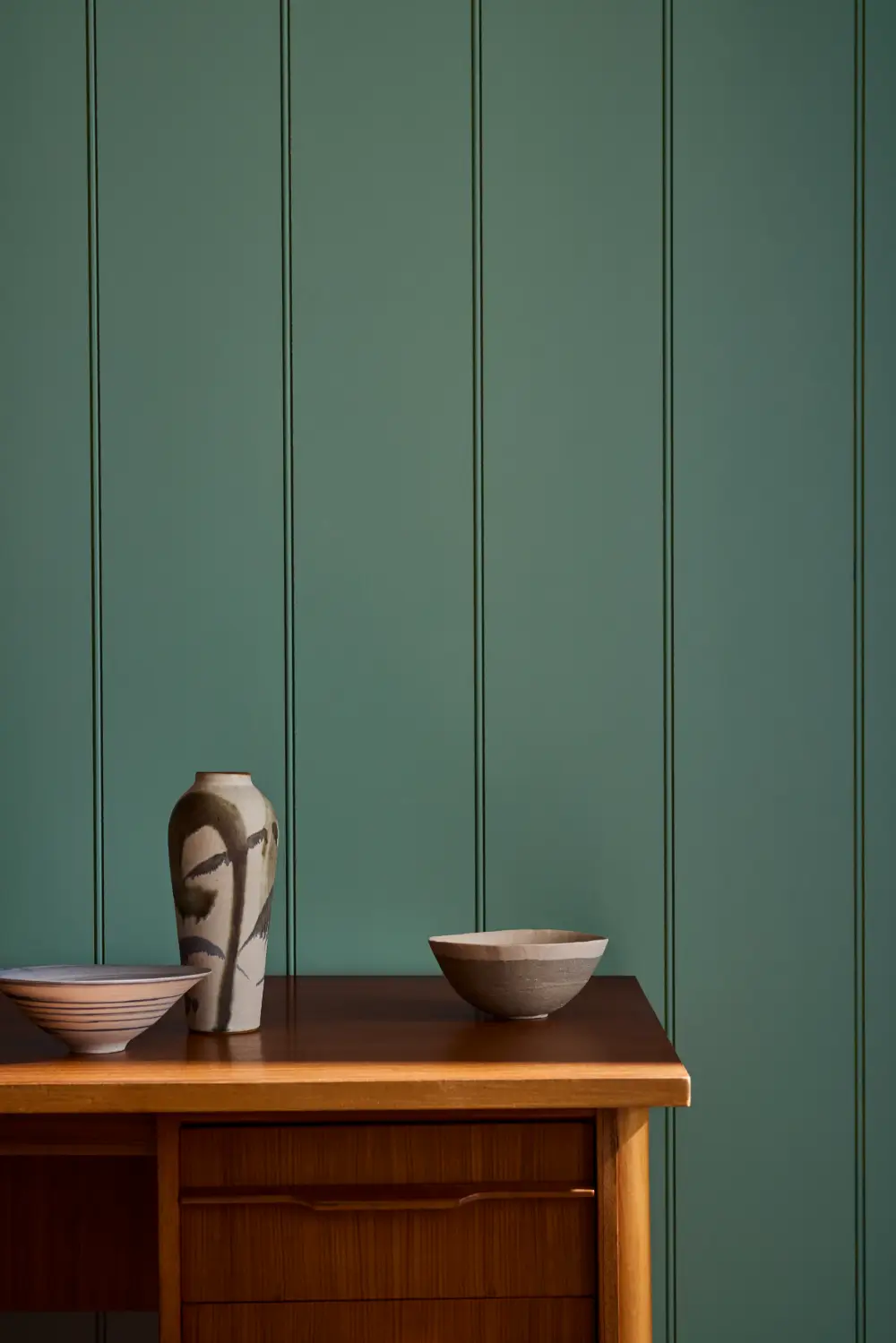
Similar to Celestial Blue but with greater depth, the shade combines blue with a slight green undertone that responds noticeably to changing natural light.
It can appear quietly atmospheric in shaded rooms and clearer and brighter in sunnier spaces.
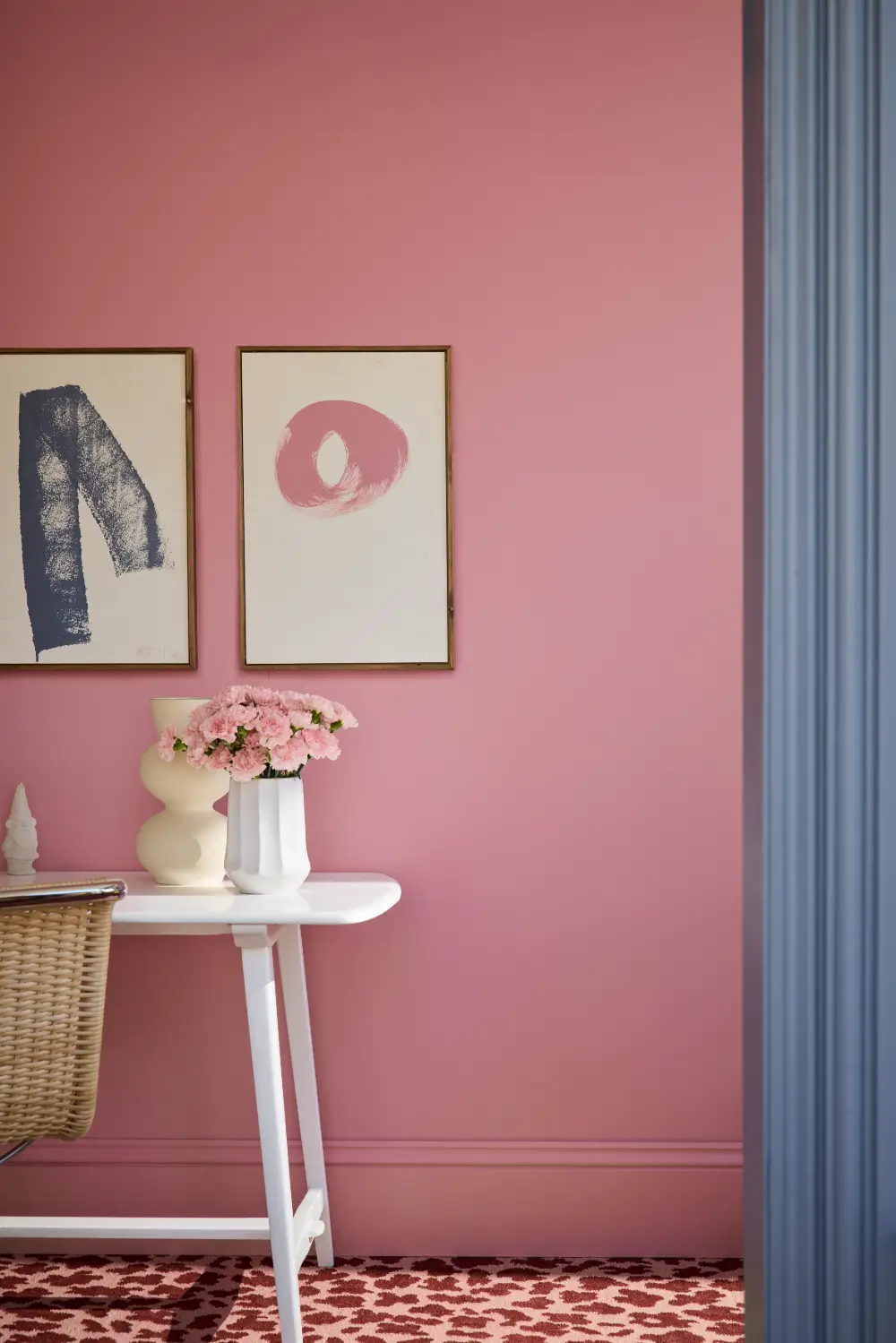
Floss
Floss shares its undertone with the stronger Carmine but has half the intensity. Used across walls and woodwork, it creates a confident pink interior. In smaller amounts, it can also introduce a fresh accent to schemes dominated by more restrained colors.
Ashes of Marigold
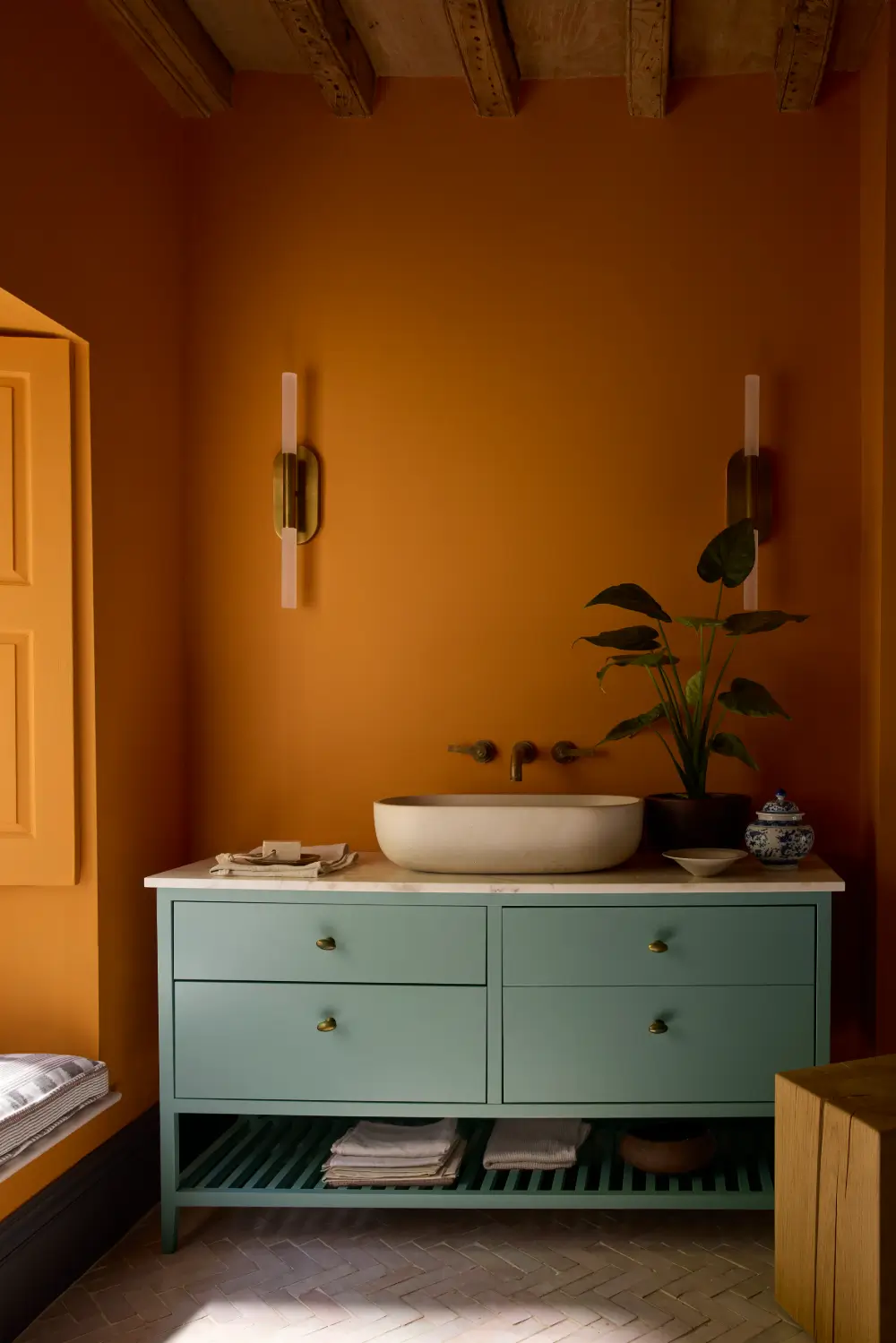
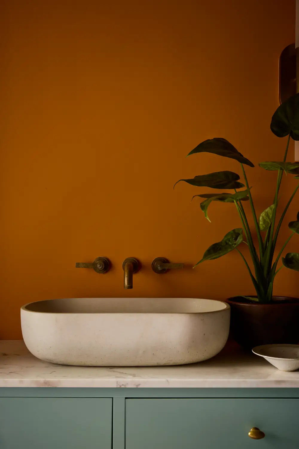
Inspired by Little Greene’s bold 1970s orange Marigold, Ashes of Marigold is a softer and more practical interpretation. The addition of black reduces the intensity, creating an earthy terracotta orange that retains plenty of personality without overwhelming a room.
A Simple Approach to Tonal Decorating
The new Colour Scales collection is designed to make tonal color schemes easier to create. It is organized into 18 graduated color families, with every root color accompanied by lighter and darker variations.
You can combine colors within the same vertical column to create a seamless tonal scheme. Moving horizontally across the card introduces shades of similar weight but with different undertones, allowing gently balanced contrast.
“These families of color allow customers to easily create harmonious schemes,” says Mottershead. “The varying shades can be combined to add discreet depth to a room, defining architectural features, or reduce the contrast of walls and ceilings.”
A lighter shade might be used on the ceiling, with the central color on the walls and a deeper variation highlighting woodwork, cabinetry, or architectural details. This creates definition while maintaining a connected feel throughout the room.
A New Generation of Balanced Neutrals
According to Little Greene, the latest neutral shades are neither noticeably cool nor especially warm. Instead, they sit somewhere in the middle, responding to demand for complex colors that are easy to use but still have a distinct personality.
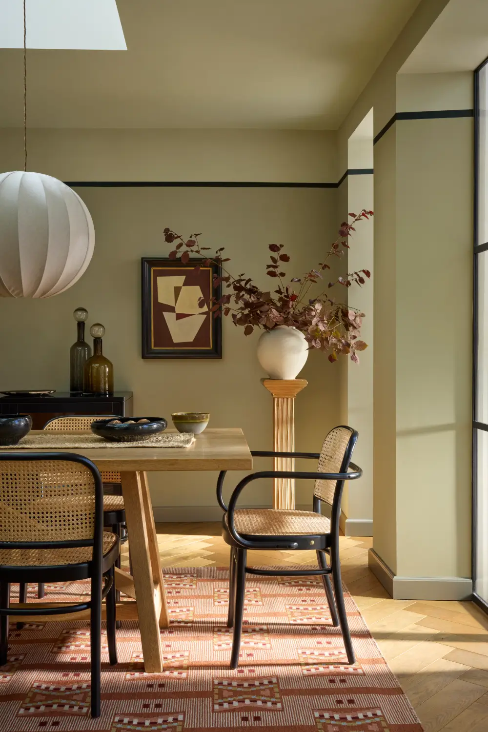
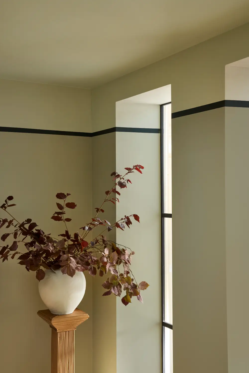
One of the most notable additions is Barge Stone, an evolution of the popular Portland Stone. It has a cooler green undertone despite containing no blue or green pigment. The resulting family of putty-like shades works particularly well with limestone, slate, and polished concrete.
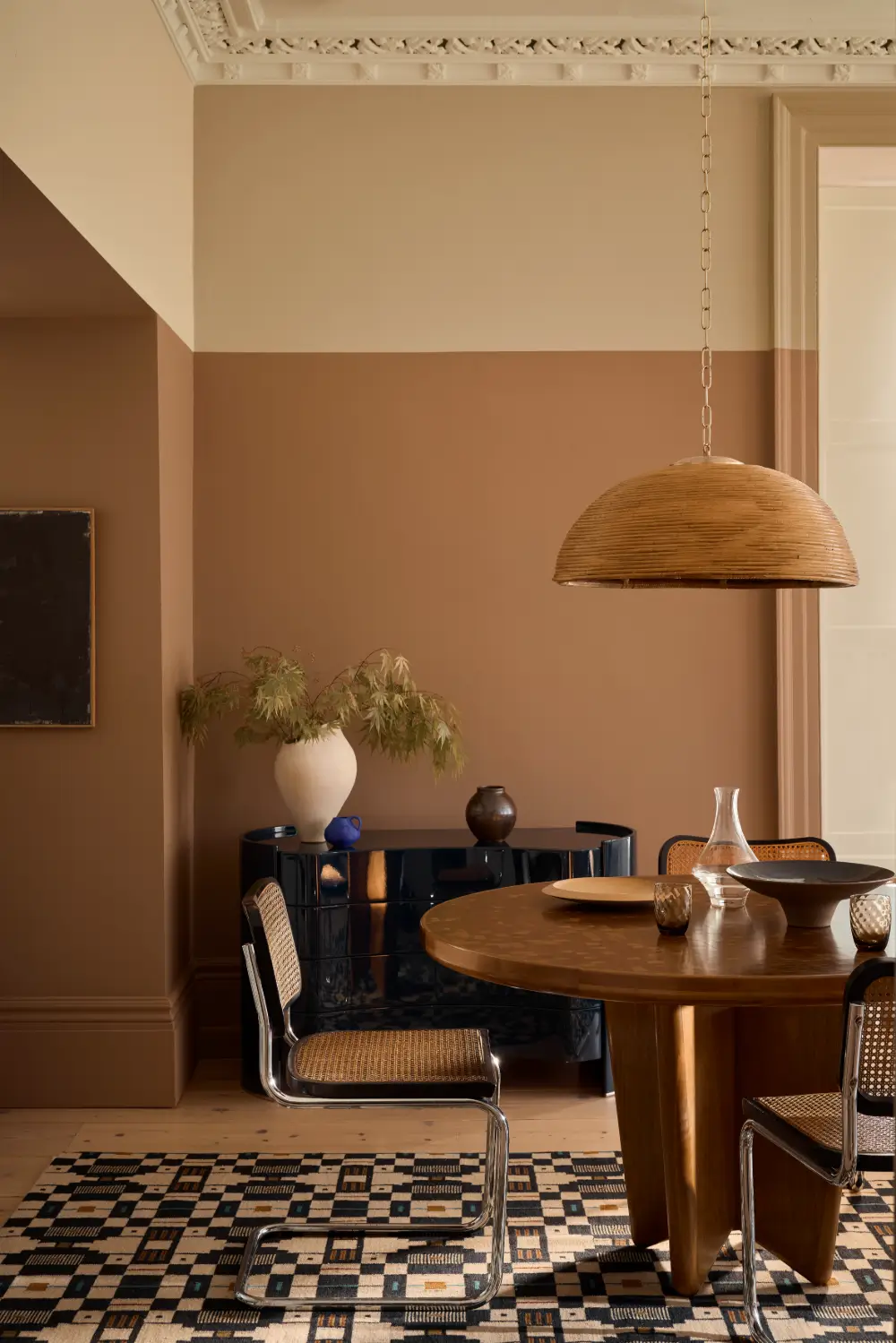
The warm, calico-inspired Hammock has also been extended into a full Colour Scales family. Historically, neutrals of this depth were often used instead of white on ceilings and detailing plasterwork in country homes. In contemporary interiors, Hammock can be paired with muted pinks such as Blush to create a soft, coordinated scheme.
Warmer Blues, Greens, and Pastels
The latest palette reflects a move away from cool shades, and in their place are warmer blues and greens with gentler yellow undertones.
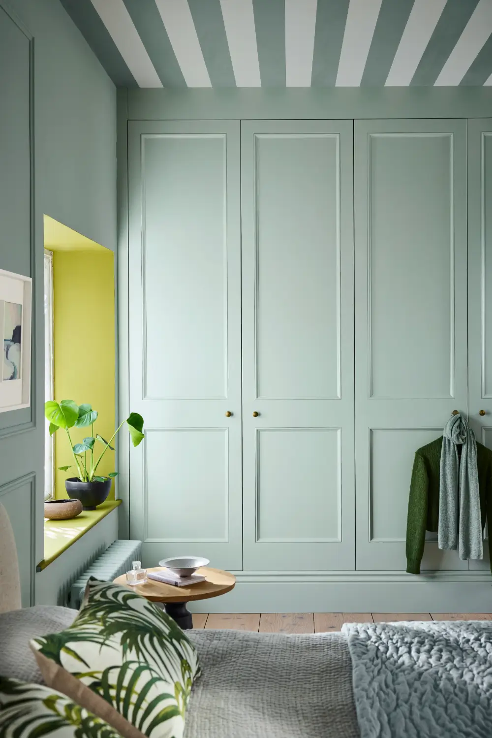
Celestial Blue, a versatile shade that can appear blue, green, or gray depending on the light, is now available as a graduated family. The original color was based on a dusky version of Sky Blue found on a surviving paint card dating back to 1807.
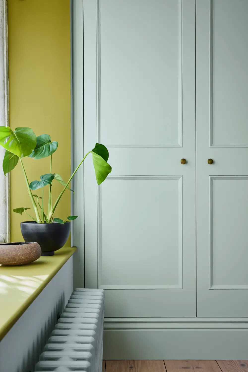
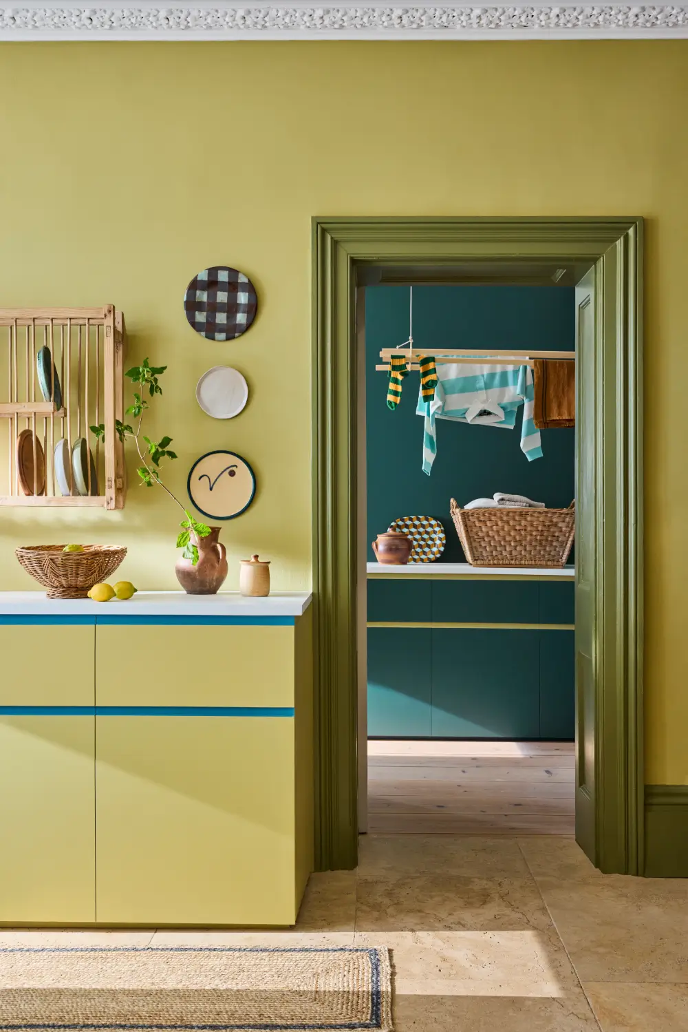
Boxington has also been expanded with lighter and darker variations. This soothing green combines reduced lime with red iron oxide, creating an elegant backdrop for living rooms, dining spaces, and hallways.
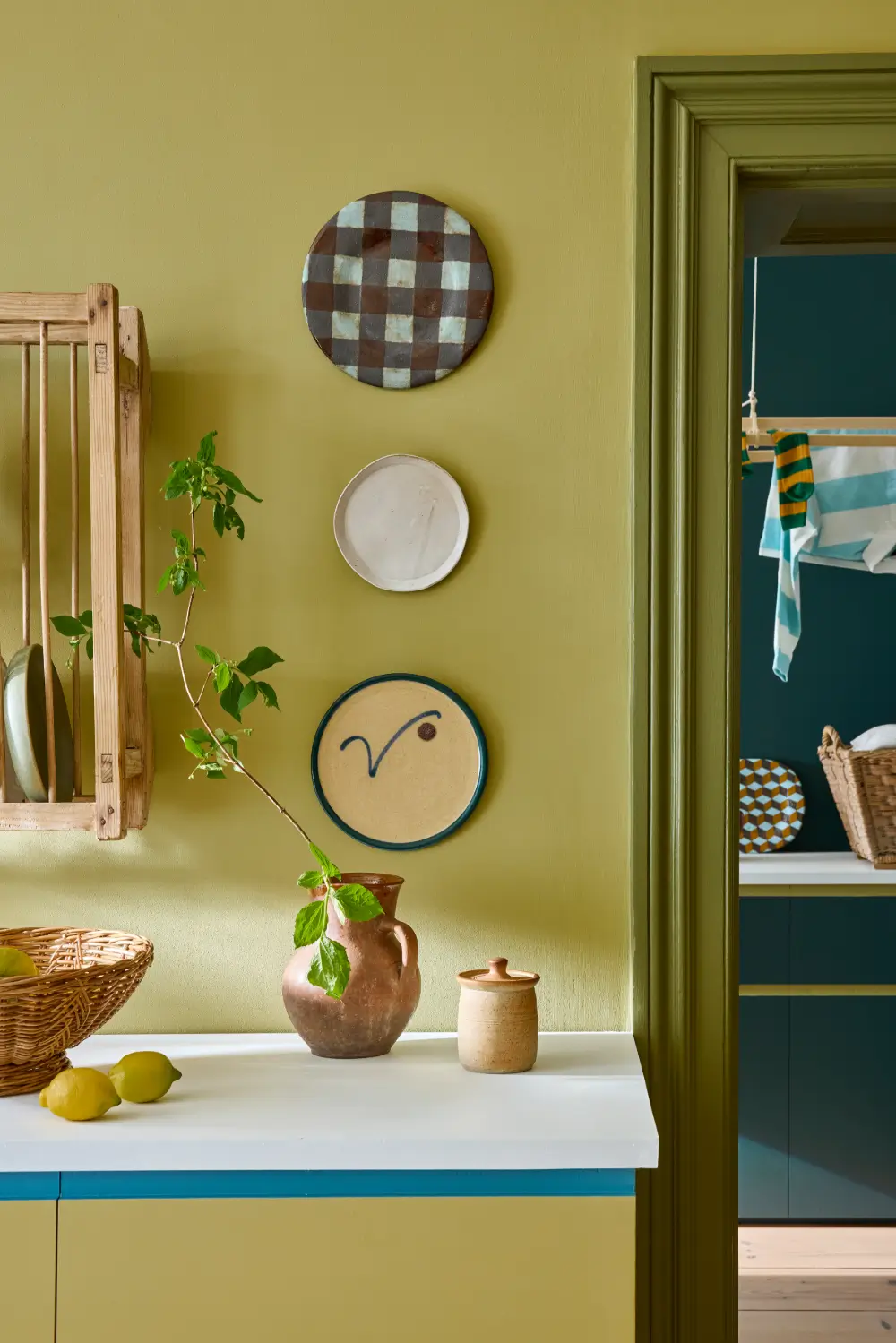
Pastel colors are becoming cleaner and more playful too. Shades such as Floss, Parlour, Boxington, and Celestial Blue bring color into a room without feeling overly bright or intense.
Stronger Colors with Greater Versatility
The Colorful Scales section introduces shades with higher chroma. These can be combined vertically for a tonal effect or selected horizontally to change the hue while maintaining a similar visual weight.
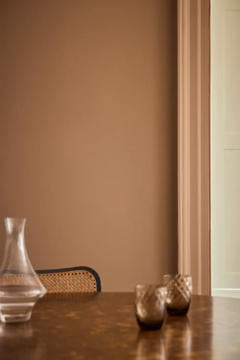
Among the new additions is Flight Pink, a historic shade found on the upper walls of the great staircase at Wimpole Hall in Cambridgeshire. Slightly more neutral than Split Pink, it is distinctly pink while remaining gentle enough to function as a warm neutral.
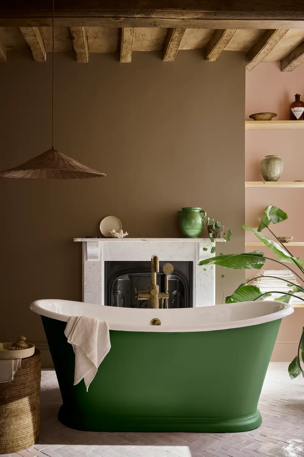
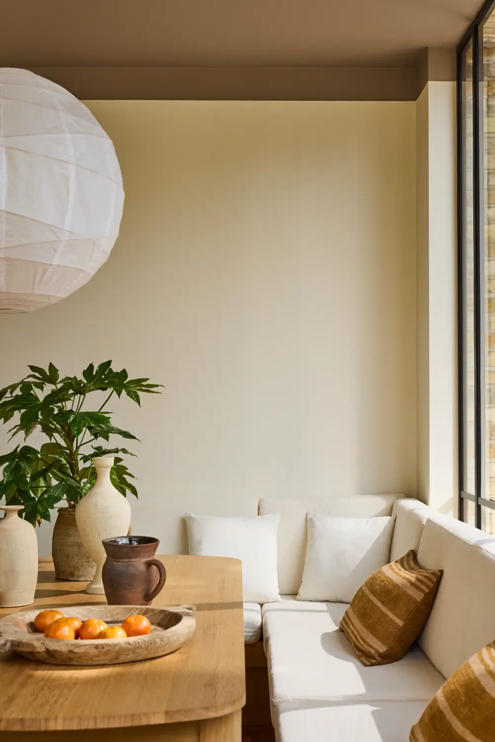
Marle is a comforting mid-tone brown made with yellow ochre, black, and a small amount of red oxide. Its carefully balanced formulation gives it a cocooning quality without appearing too heavy.
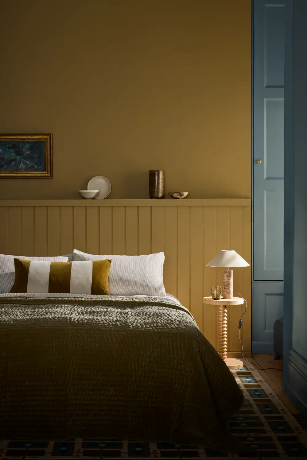
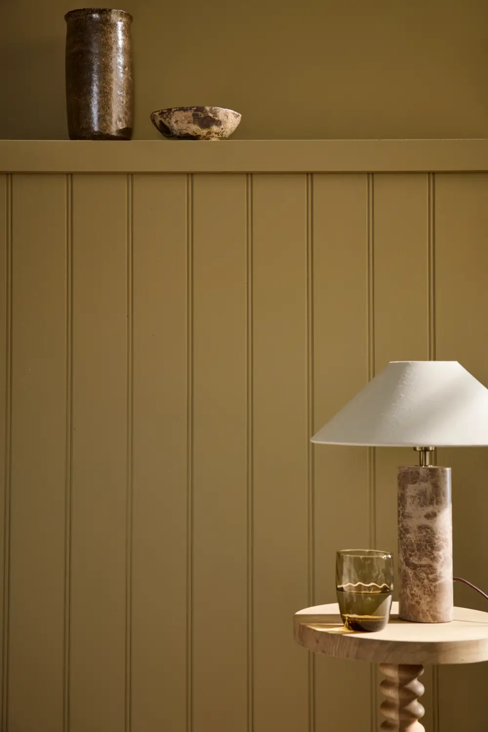
Elysian Yellow is a restrained neutral yellow originally found in the decorative scheme of the Chinese House at Stowe in Buckinghamshire. It offers warmth without looking overtly yellow, making it very adaptable.
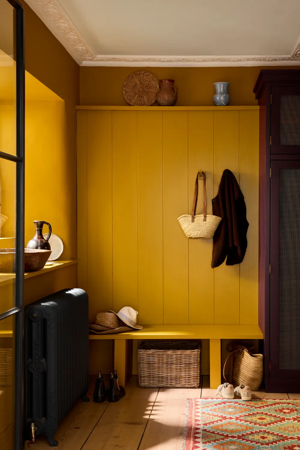
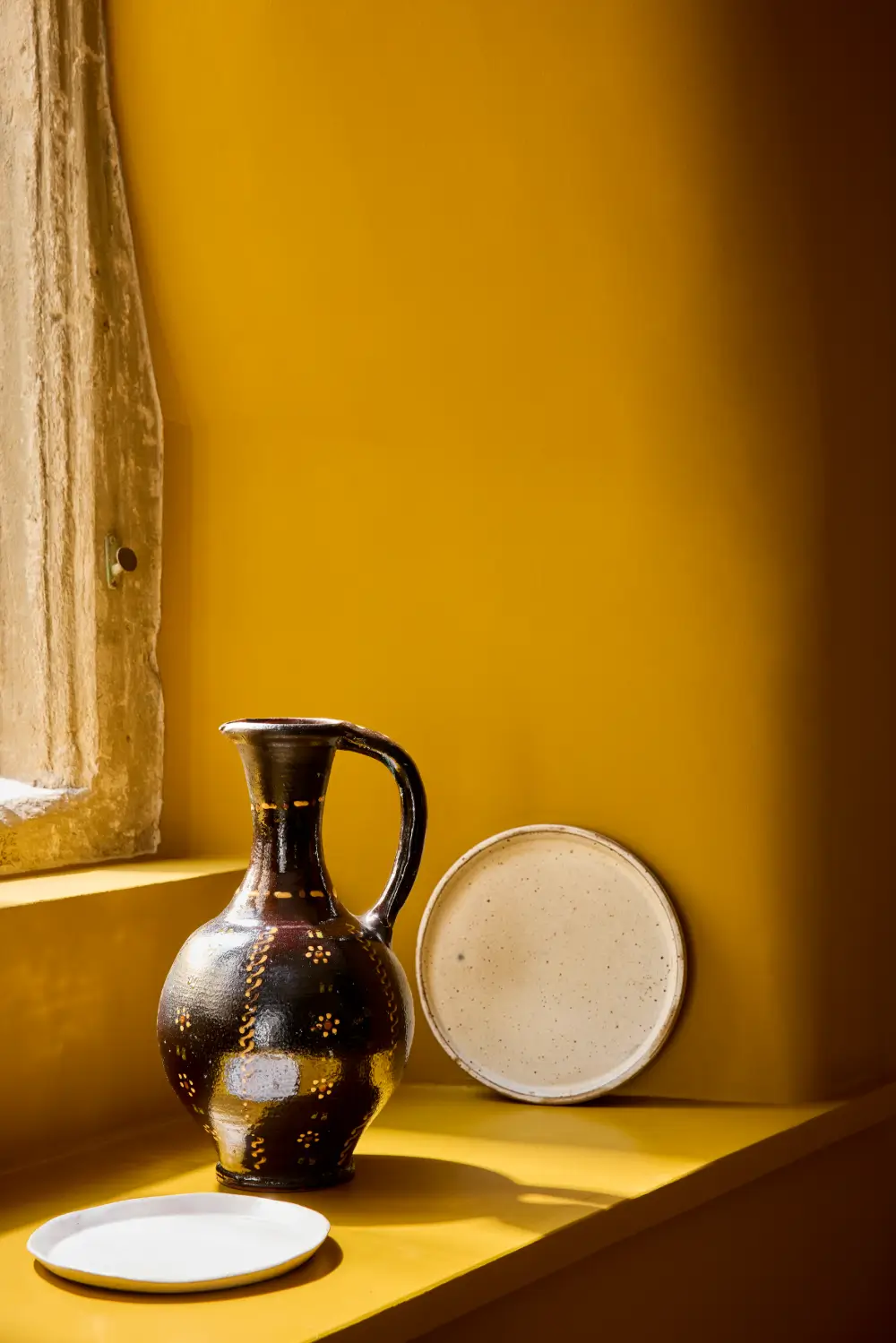
Brûlée moves into richer territory with its caramelized yellow tone. It can work as a deep neutral alongside brighter yellows or as a statement color among darker shades. Little Greene suggests pairing it with Bronze Red for a coordinated interior or Marine Blue for a stronger contrast.
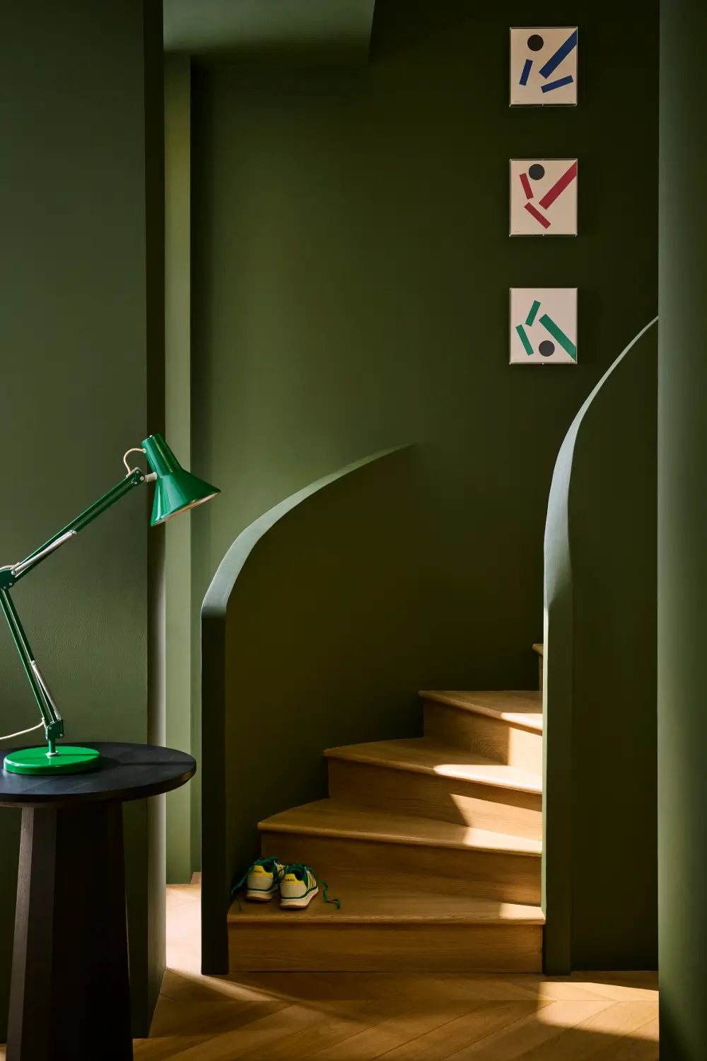
Oilcloth offers a characterful alternative to gray in a color-drenched room and can also replace black in a softer neutral scheme. Its muted green tone pairs naturally with wood, stone, and other organic finishes.
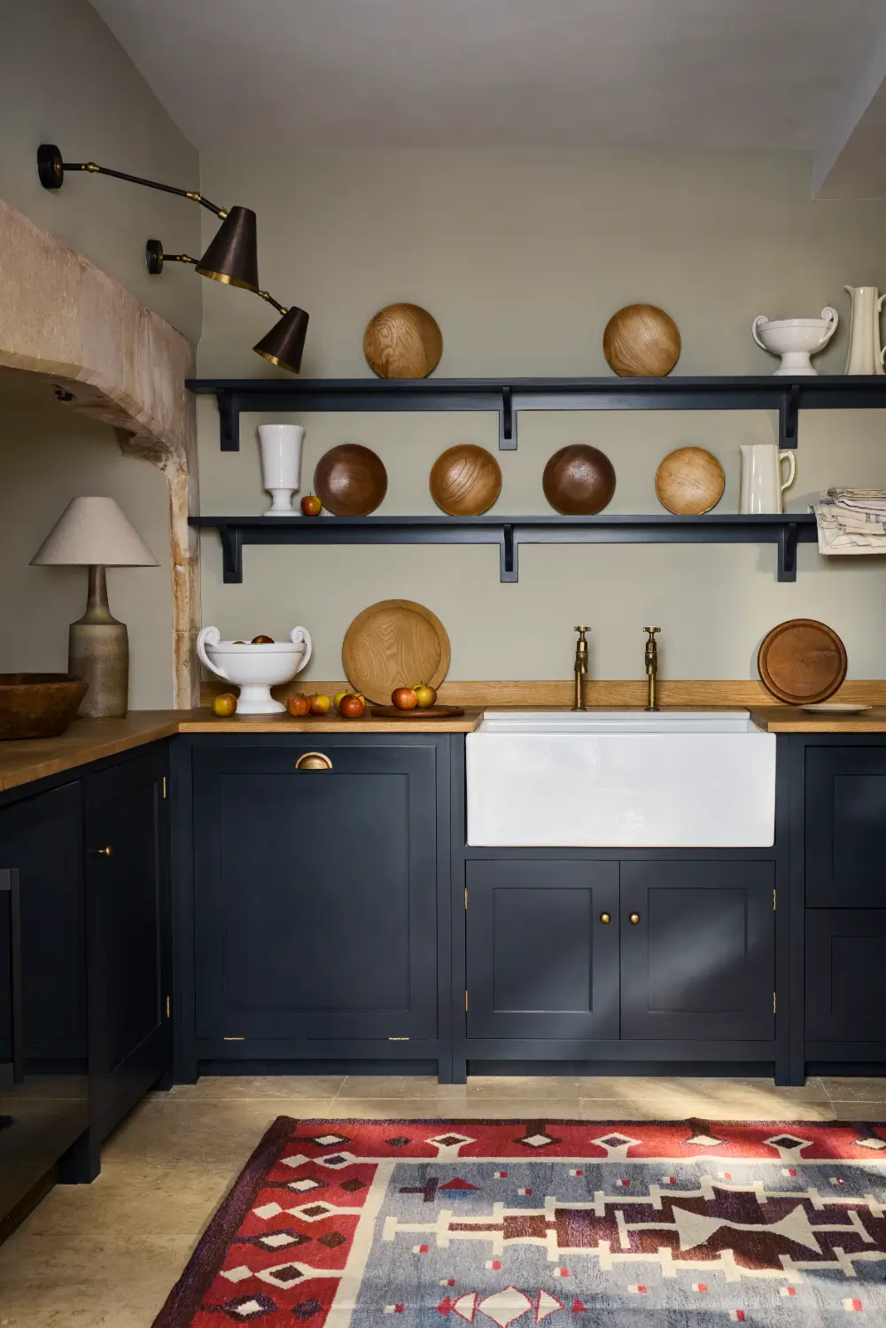
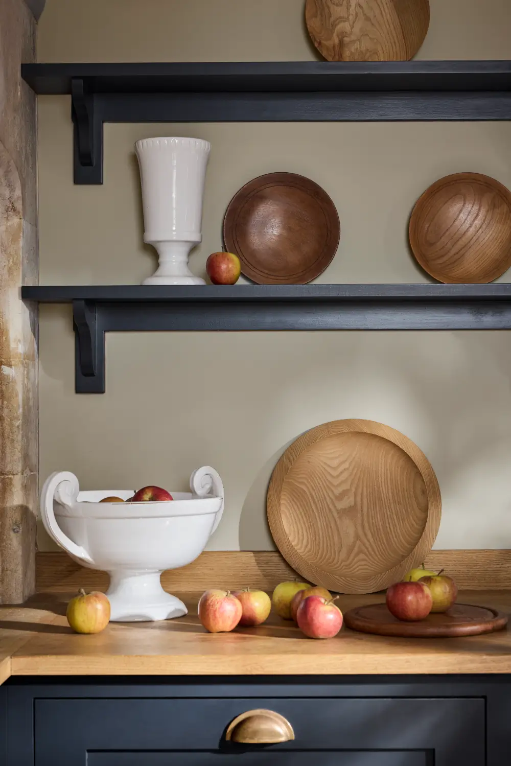
Cobble is a restrained, cool gray with a green base. Designed for both traditional and modern interiors, it can create a calm foundation in bedrooms, bathrooms, hallways, and living spaces.
Historic Greens and Deep Blues
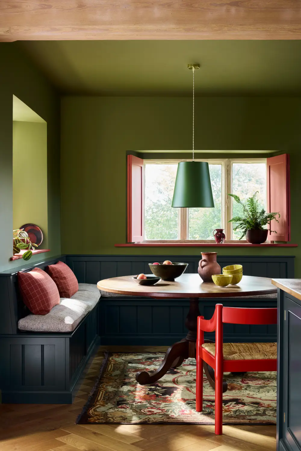
Hillside is a warmer interpretation of Sage Green, designed to bring warmth to cool living rooms and practical kitchen spaces.
The color has a particularly interesting history; it was discovered on sections of plaster in the library at Hughended Manor, the former Buckinghamshire home of Prime Minister Benjamin Disraeli.
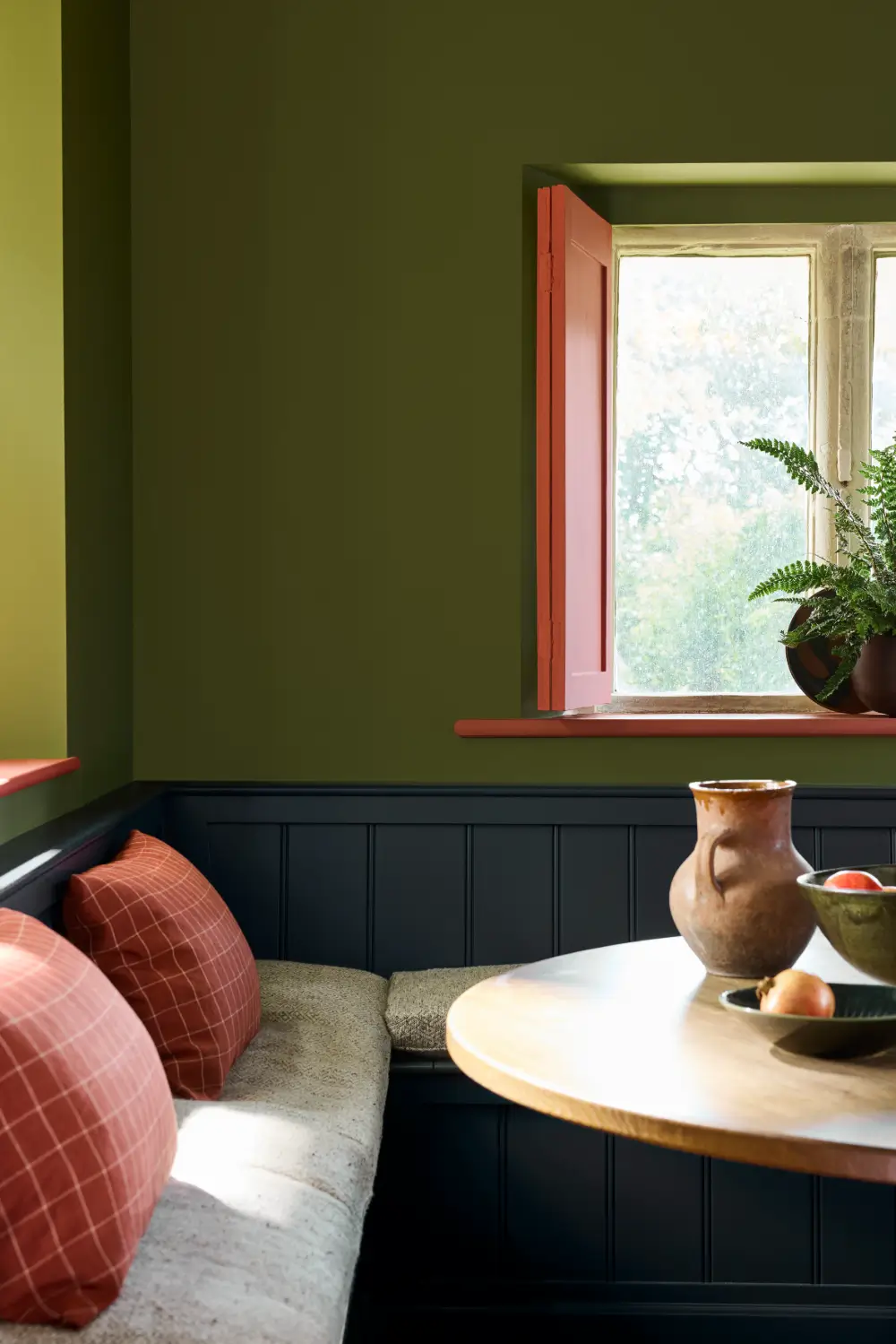
During the 1940s, the library became part of a secret wartime intelligence operation supporting the RAF initiative condemned “Hillside,” which gave the color its name.
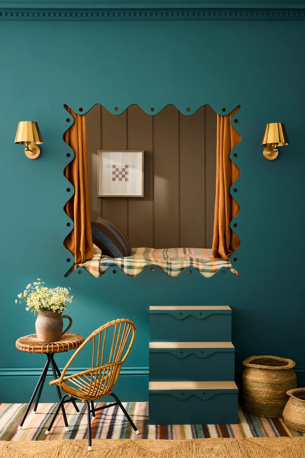
Rome is a deep, sophisticated blue with a prominent green undertone that stops short of turquoise. Close in depth to Hicks’ Blue, it takes its inspiration from Mount Stewart in Northern Ireland.
The color appeared across the walls and ceiling of a richly decorated guest bedroom named Rome, created during the tenure of Lady Edit Vane-Tempest-Stewart.
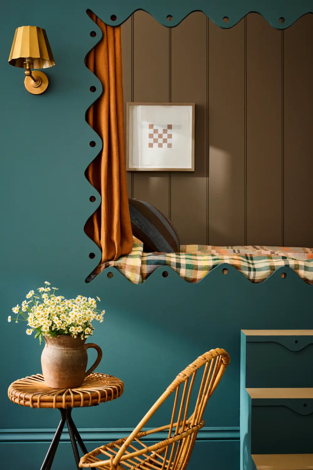
The new collections show how subtle changes in undertone can alter a room’s atmosphere. Whites have become warmer, pastels cleaner and more joyful, while terracottas, browns, and yellows have been softened to make them easier to use across large areas.
Produced at Little Greene’s factory in the foothills of Snowdonia, the company’s water-based paints contain zero added VOCs and are available in finishes for walls, ceilings, woodwork, floors and exterior surfaces. Their high pigment content gives the colors depth and lets undertones shift subtly as the light changes throughout the day.