


C2 Paint’s Color of the Year 2027 Is Pueblo, a Lovely Shade Between Pink and Terracotta
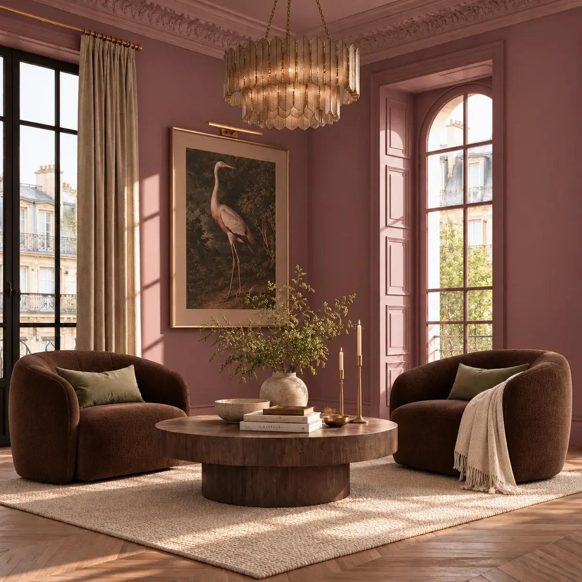
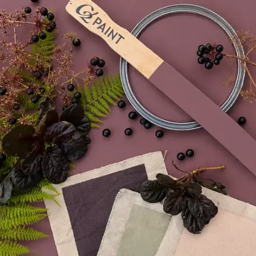
C2 Paint has named Pueblo its 2027 Color of the Year. Sitting between pink and terracotta, this earthy, mauve-toned shade warms interiors while revealing different qualities as the light changes throughout the day.
The choice anchors the brand’s Rural Renaissance theme, which explores a renewed interest in the land, the seasons, natural materials, and the pleasure of making things by hand.
After several years of treating home as a place to retreat and recharge, C2 is exploring how our surroundings can encourage creativity, connection, and more active engagement with everyday life.
A Color That Changes With the Light
Pueblo’s appeal lies in its complexity. In natural daylight, rosy, floral, and plum notes stand out more. As daylight fades, the shade takes on a deeper, warmer, earthier appearance.
C2 Paint Color Consultant Philippa Radon describes Pueblo as a shade that responds closely to its environment. That changing relationship with light was central to its selection: the color offers something different from morning to evening, bringing another layer of interest to a space.
The Idea Behind Rural Renaissance
Rural Renaissance builds on the desire for comfortable, restorative interiors, while turning attention toward the experiences those spaces can support.
Cooking, growing, gathering, and creating all inform the theme, alongside an appreciation for materials with texture and a visible connection to their origins.
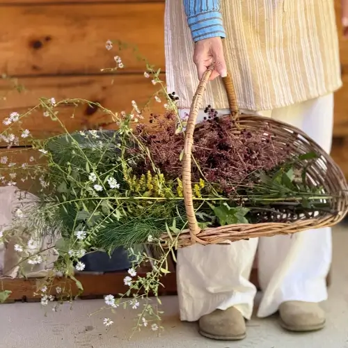
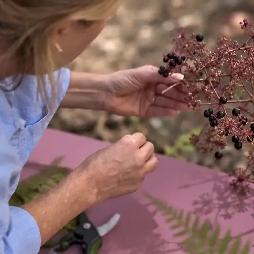
The emphasis is on participating in the physical world: noticing changing light, working with our hands, and enjoying the sensory qualities of everyday objects.
Pueblo reflects this thinking through its warmth and shifting undertones. It feels connected to the landscape, yet works comfortably in interiors that extend beyond a traditional country aesthetic.
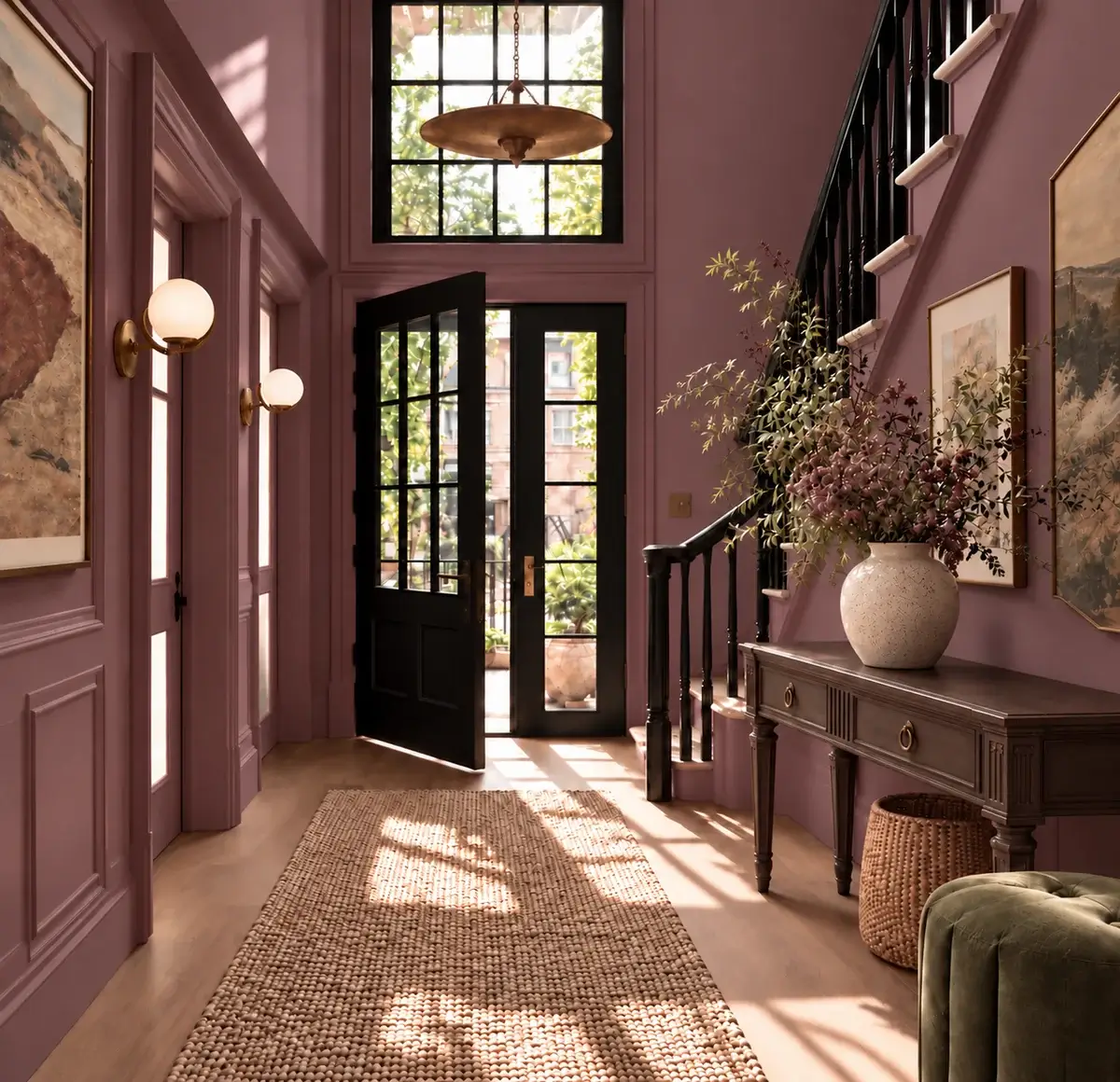
Paired with simple architectural details or contemporary furniture, it can bring an earthy quality to a room without making it feel overly rustic.
How to Use Pueblo at Home
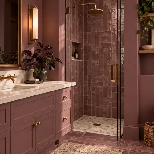
Pueblo suits dining rooms, kitchens, entrances, and living spaces, where its depth can add warmth and personality. Used across the walls, it creates a more enveloping setting. On cabinetry or architectural details, it offers a smaller but distinctive dose of color.
Its complexity becomes especially apparent alongside natural materials. Wood, stone, plaster, and woven fibers provide texture, while aged metals and handmade objects complement its earthy character. These combinations also connect the color to the broader Rural Renaissance theme, placing material qualities at the center of the room.
Pueblo can work outdoors, too. A front door or exterior detail provides an opportunity to introduce the shade, while larger applications can be considered in relation to the architecture and surrounding landscape.
The Rural Renaissance Color Palette
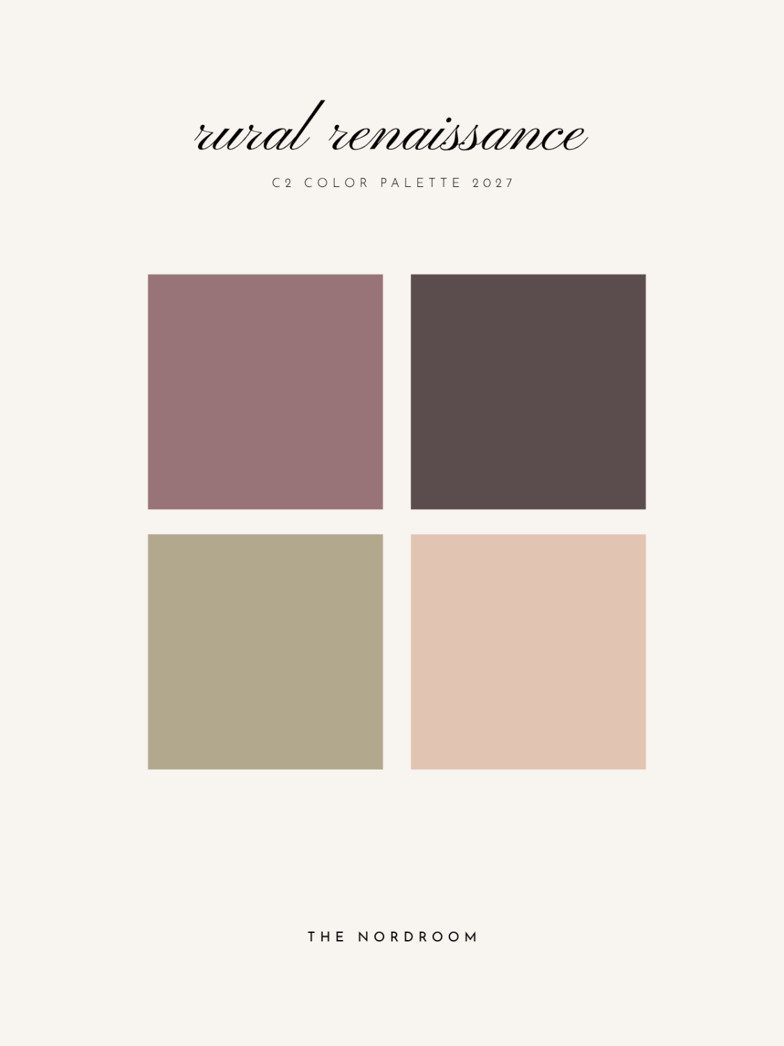
The accompanying palette brings together chocolate browns, warm neutrals, muted greens, and softened coral tones. Each pairing highlights a different aspect of Pueblo.
Death by Chocolate (C2-805) is a rich brown with violet undertones that emphasizes Pueblo’s deeper, earthier qualities. Element (C2-685), a soft, muddy green, highlights its botanical character. Ambrosia (C2-529) introduces a muted, blush-toned coral that adds warmth and brings its rosier side into focus.
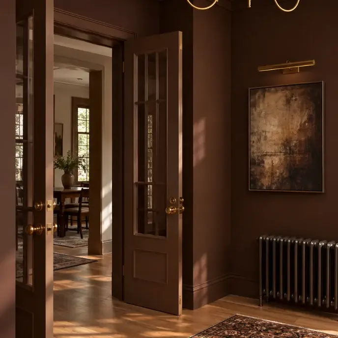
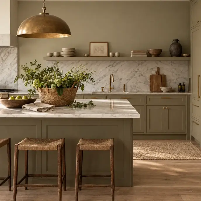
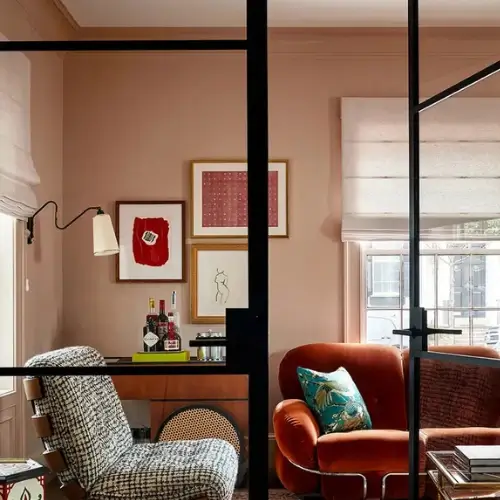
Together, these shades create a palette with room for variation. Depending on the surrounding colors and materials, Pueblo can appear softer and more floral or deeper and more grounded.
A New Chapter for Nature-Inspired Interiors
Pueblo follows Epernay, C2 Paint’s previous Color of the Year, which explored tradition, craftsmanship, and the restorative qualities of colors rooted in history and nature.
For 2027, the brand moves toward a more saturated and expressive shade. Creative & Marketing Director Tia Clarida describes the progression as a shift from restoration toward re-engagement, with greater emphasis on experience, creativity, and connection.