Dulux Colour Forecast 2025: Uplifting and Soothing Colour Palettes
We continue to look forward with an new color forecast that will inspire you to add new colors to your home. The Dulux Colour Forecast 2025 is a collection of uplifting and soothing colors, responding to recent periods of uncertainty. If your interior style includes bold colors, you’re going to love these color palettes.
The Dulux Color Forecast is divided into three color palettes: Still, Recollect, and Emerge. These palettes demonstrate how colors with warm, brown undertones play an important role in evoking a sense of nurture and positivity.

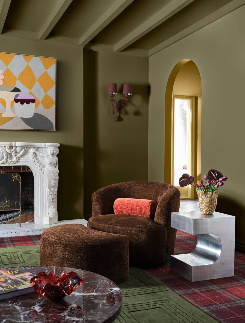
Dulux paint company (named Flexa in some European countries) predicts that rich burgundies and wine hues will dominate residential interior design, alongside green tones including olive, sage, and a vibrant yellow-green.
These colors are suited to any architectural home style and they will allow you to refresh your interiors with confidence and create an on-trend and positive change in your space.

“During times of instability, reduced consumer sentiment tends to see color trends shift less dramatically. However, color can be a powerful antidote to lift spirits and provide a sense of comfort and warmth, which is evident with the Dulux 2025 color palettes,” says Davina Harper, Dulux Colour Specialist
“One of the most significant shifts this year is the increase in warm neutral across the three color palettes. During uncertain times we often see a move towards muted colors and calming, softer hues that help make us feel grounded and provide a sense of relief form everyday stresses.”

Dulux Emerge Colour Palette
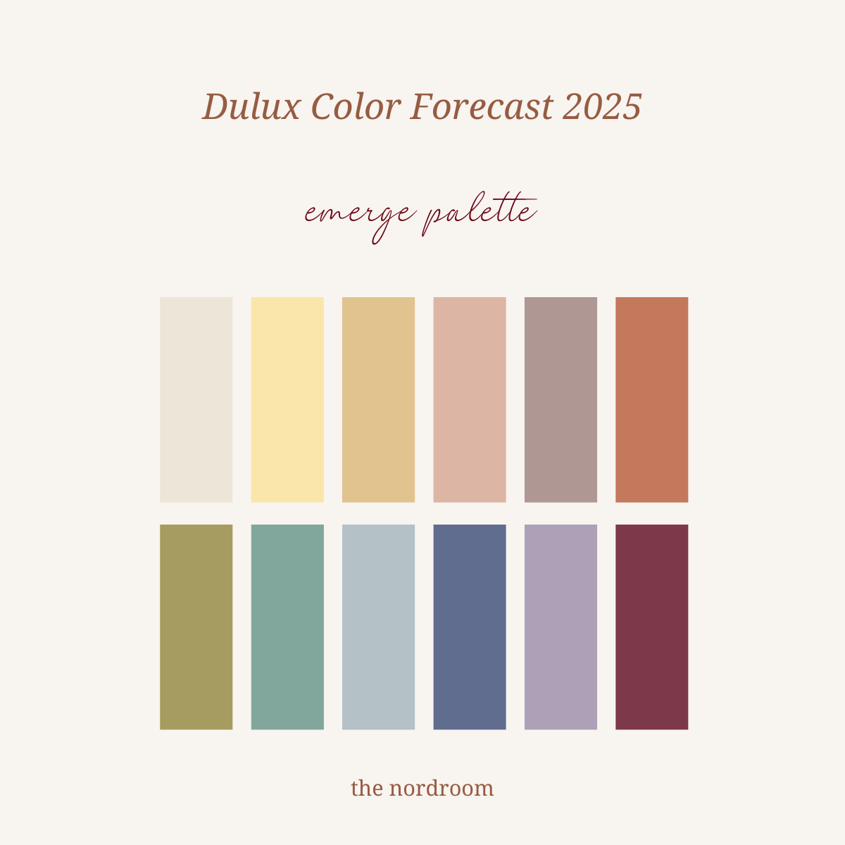
Emerge is an uplifting palette of pared-back pastels, soft greens, mauves, and a deep red to bring joy without overwhelming a space. The Emerge palette has a feel-good energy and steps away from clean and brighter shades.

bottom row: cornstalk – mokai canyon – puhoi half – lake tarawera – vintage lilac – ripe rhubarb
While each colour in the palette is conducive to walls, soft furnishings and fabrics or appearing as accents in decorative objects and artwork, the warm orange-based pink and biscuit shades, including Nile Street and Kereta or the greyed-off Vintage Lilac are stunning backdrops to accents such as Hagley Park and purple-based blue of Lake Tarawera.

Grayed-off lilac of Mechanics Bay with a hint of brown combined with the creative play on the ceiling with Piglet creates a stunning backdrop for lemony accents in this bedroom.

The muted colors of the Emerge palette are grounding an provide a warm, welcoming feel to any space in your home. In this dining room, the colors of the décor and furniture pieces are also taken from the Emerge color palette. It’s cheerful, colorful, but thanks to the muted tone on the wall, not overwhelming.


Yellow-green colours such as Cornstalk are emerging as a key trend, which is sure to add a relaxed feel to any room. This trend features soft rounded forms and expressive collections of décor crafted with modularity and curves. These shapes and free flowing lines add to its light hearted nature and whimsical atmosphere.
The furniture forms are playful and inviting, so add a colored boucle, soft velvet, and buttery suede to set a cozy mood in your space.


Cheerful biscuit yellow, warm orange based pink, and terracotta provide an uplifting and playful vibe in open spaces that emphasizes joy and creates a lighthearted mood.

Dulux Recollect Colour Palette
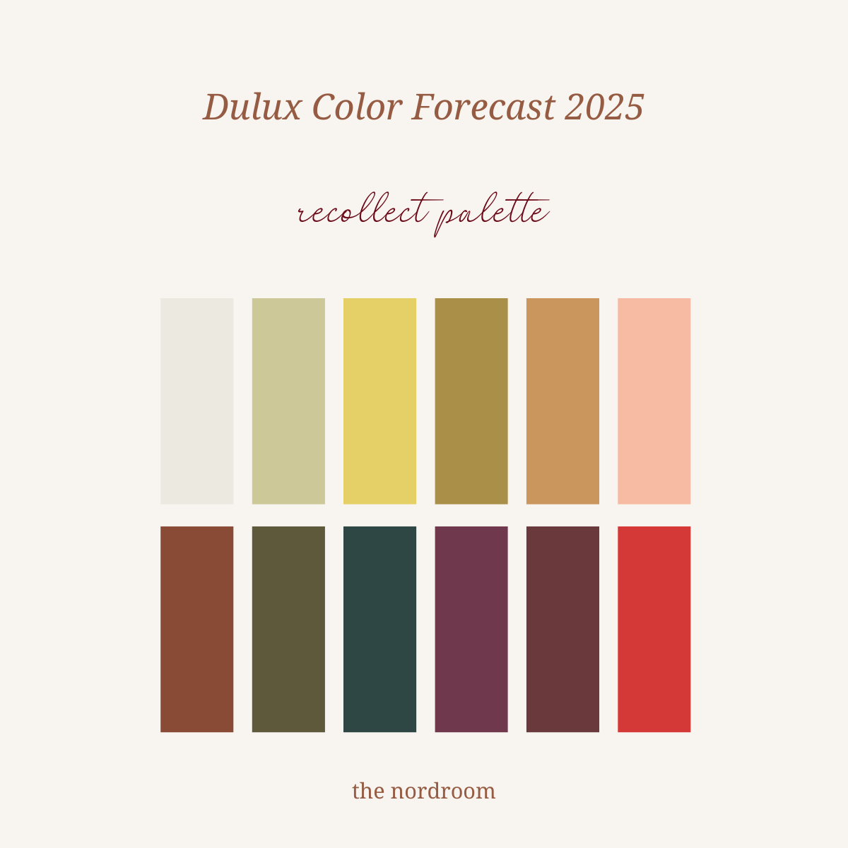
The Recollect color palette draws on our fondness for the simplicity of past eras, creating a feeling of connection to our heritage that provides a sense of meaning and continuity. While older generations find comfort in the past, young ones see newness and exciting opportunities to blend classic styles with modern décor, recreating the moods of their grandparents and parent’s homes while also expressing their own style.

bottom row: auburn flair – olive blend – black water – danseys pass – plum sauce – devils staircase
The palette evokes a sense of nostalgia, reflection and sophistication with yellow-based greens and deep olive shades paired with rich wine shades.

Purple, rich burgundies, and wine colors are predicted to be a strong color direction for 2025, evoking feelings op opulence and coziness. This sitting room shows that you don’t have to be afraid to add texture and opulent fabrics like crushed velvet, chenille, and damask in classic patterns to create an amazing space.

A second hand influence in key in the Recollect palette, reflecting both an appreciation for classic design and a commitment to sustainability.


This palette features a moodier curation of colors for those seeking comfort and security, with furniture and décor elements spanning from the 50s to the 90s integrated into an eclectic personalized style. Mirrored finishes and high gloss furniture pieces add a touch of modern glamour, perfect in combination with these colors.

The deep cinnamon of Earnscleugh creates a warm tonal interior that is brilliantly suited to uplifting furnishings in soft oranges and vibrant coral enhances by a playful burst of bright red on the door, painted in Devils Staircase.


Dulux Still Colour Palette
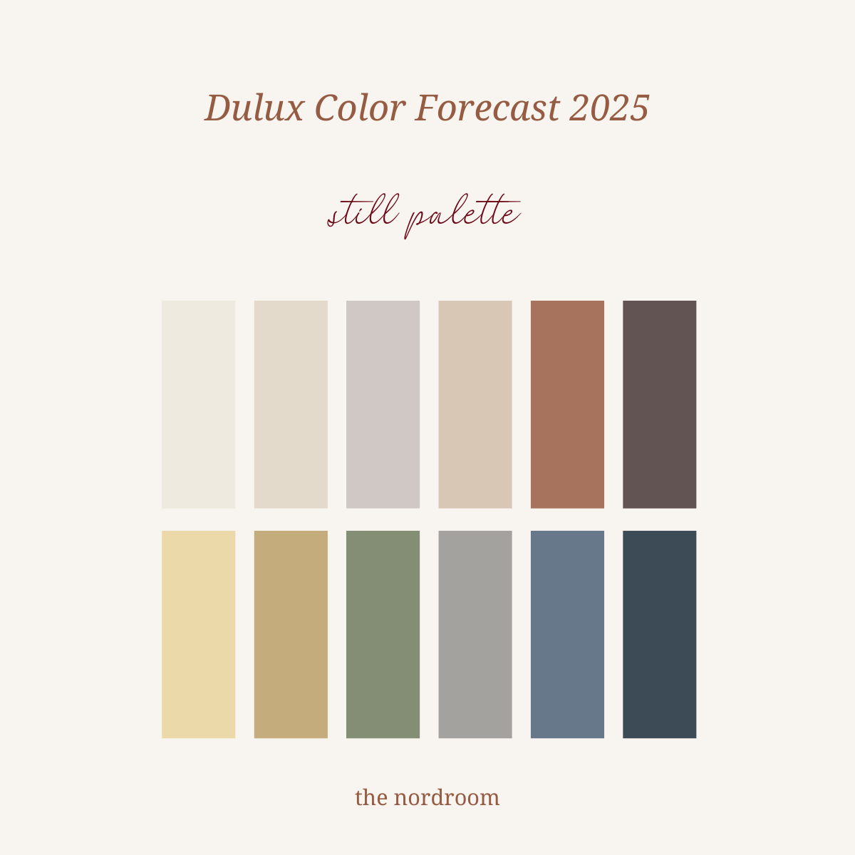
The subdued Still colour palette encourages a deeper connection with nature, and it is filled with calming neutrals and gray midtone shades as accents that exude warmth and a sense of ease.

bottom row: shelly beach – darfield – te aroha – bruce bay – urenui – lake mangamahoe
This palette is perfect for people who want to decorate their home with beautiful warm neutrals, muted darker tones, yellow based greens, and grayed-off blues.

The Still trend focuses on creating interiors that are serene and enriched with detail, encouraging a more intentional and sustainable way of living. Undyed textiles are selected for their natural colors and properties in wool, shearling, cotton, and linen that can be integrated alongside traditional materials like stone and ceramic.

The pale butter yellow Shelly Beach is a soft highlight in a neutral space and a warm and comforting shade for any kind of room.


Demonstrating a broader cultural movement towards sustainability and a renewed appreciation of traditional craftsmanship, the trend is full of thoughtful and considered materials choices. When you opt for midtone colors, try adding them on all four walls (just like the popular color drenching trend of the moment).


The lighter neutrals in this color palette such as Kaikorai Valley remind us of the need for a deeper connection with nature. The Still palette focuses on design that encourages sustainable living practices, integrating biophilia, the use of eco friendly and non toxic or natural materials, recycling or upcycling practices in furniture and décor as well as emphasis on circular manufacturing.

Use darker colors as accents for decorative objects, textures, and furniture against a neutral backdrop.
One of the colors in these three palettes is going to be the Dulux Colour of the Year 2025. What is your pick? you can see every 2025 Color of the Year by clicking on this link.

