HGTV Home by Sherwin-Williams Color of the Year 2025: Quietude
Paint brands are looking forward to next year and are revealing their color trends and color of the year for 2025. Today, HGTV Home by Sherwin-Williams has revealed its Color of the Year 2025, which includes an accompanying color collection with eight more hues.
HGTV Home has chosen hushed tones for its color trends, which align with creating a calmer interior with natural and warm color tones that will turn your home into a cozy and relaxing haven.
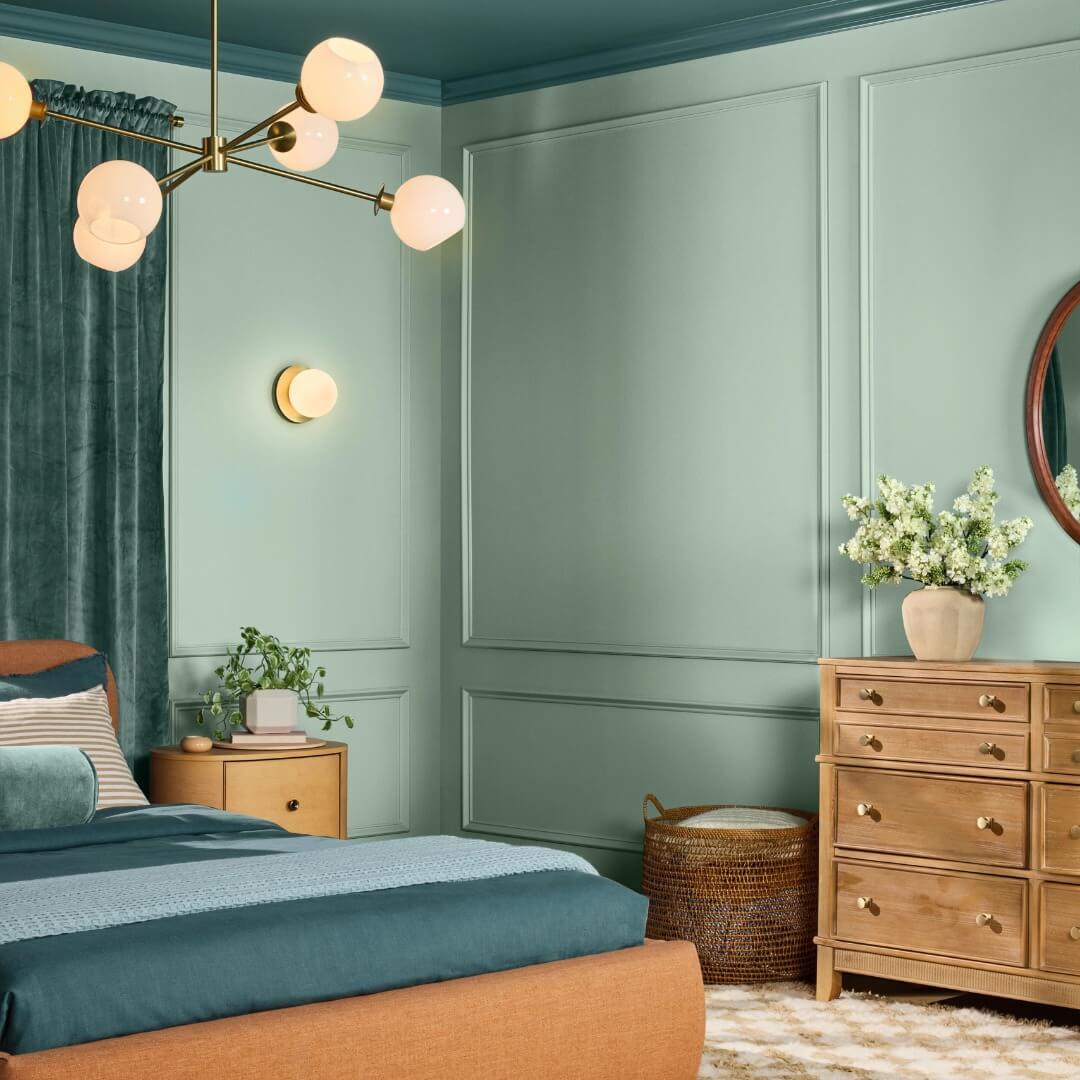
HGTV Home Color of the Year 2025
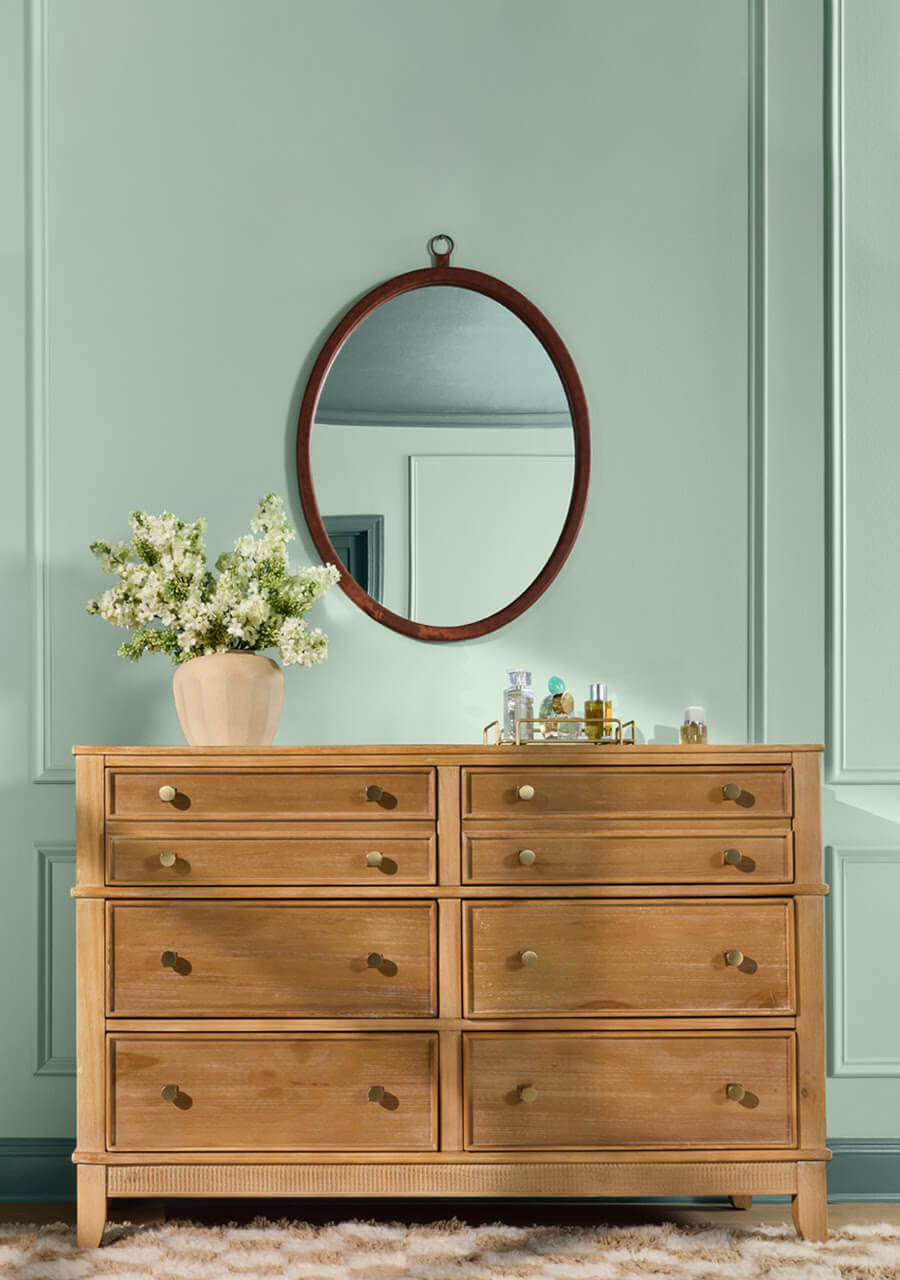
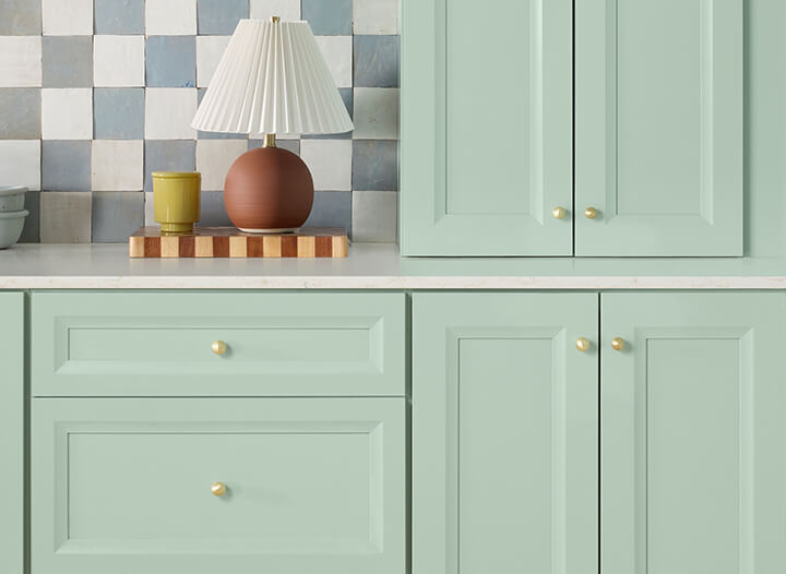
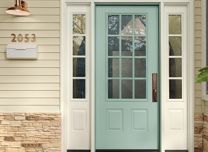
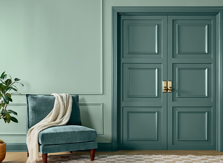
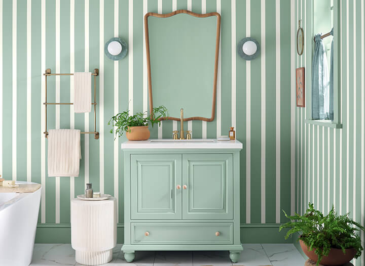
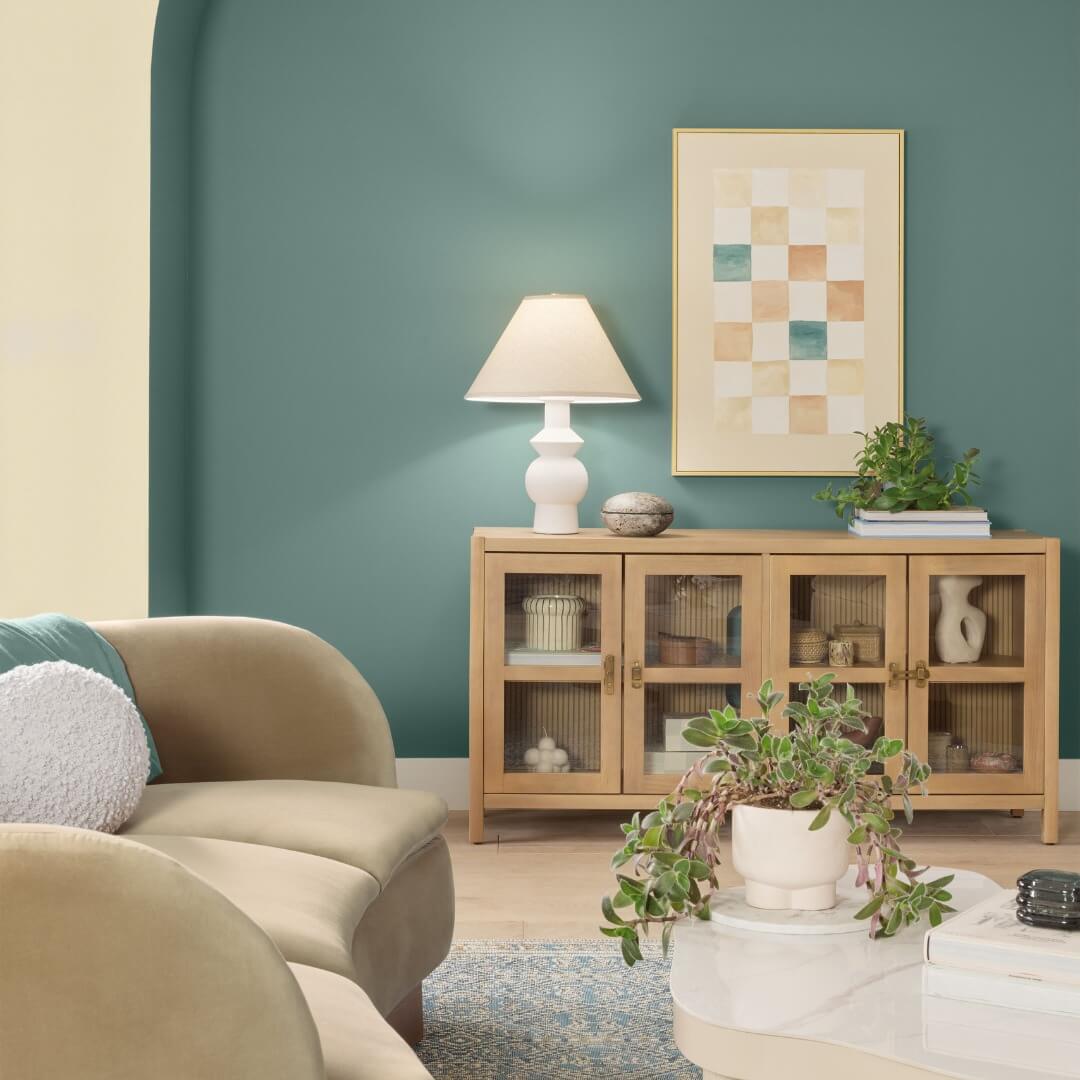
HGTV Home by Sherwin-Williams has chosen Quietude as its 2025 Color of the Year. Within a palette of hushed tones, Quietude derives its strength from its transcendent tranquility. This soft sage, subtly infused with a hint of blue, is an emerging color for enduring design, bringing a soothing presence to any space, indoors or out.
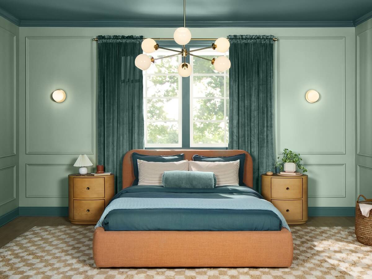
This cool shade embodies a restful environment in a traditional-meets-modern way. Quietude is an emerging shade with staying power for a look with longevity.
Take a Look at the All Color Trends for 2025
The Naturally Refined 2025 Color Collection of the Year
Simply being able to slow down and live quietly has become a luxury. Creating an environment that embraces peace and harmony and celebrates small, everyday moments gives us space to find happiness. This collection was curated to help you create that environment and enjoy a relaxing personal retreat.
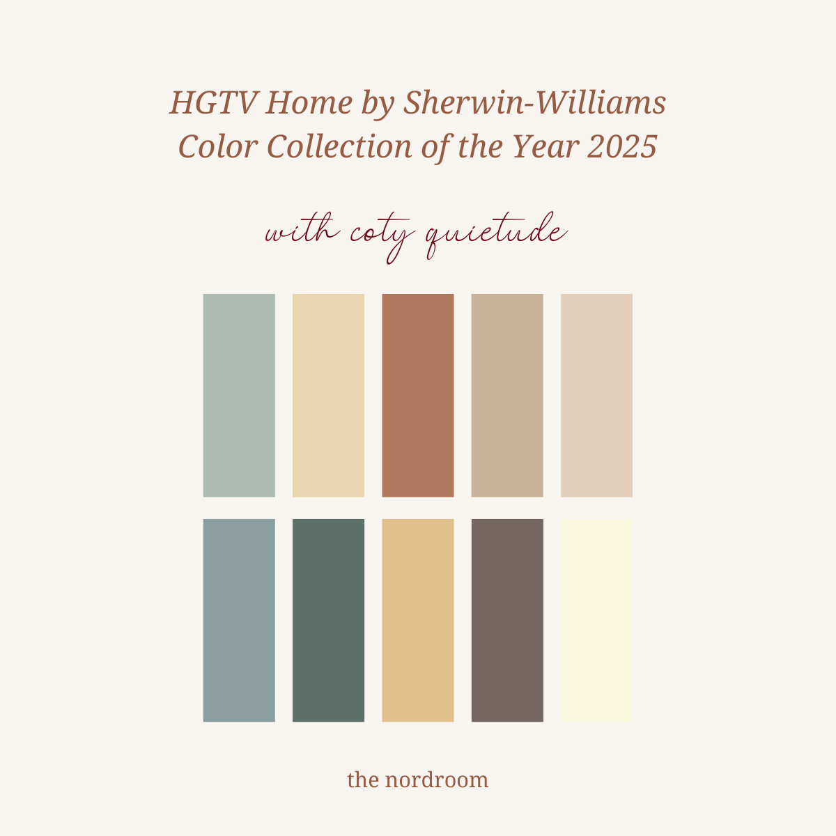
bottom row: delft – rocky river – sequin – nutshell – snowbound
Invest in your home in ways that are both elevated and effortless. Choose sustainability without sacrificing sophistication. Softened colors blend seamlessly with subtle contrasts, creating a visually comfortable and naturally refined space. Embrace a lifestyle beyond trends by designing a timeless home with hues from this cultured collection from HGTV Home by Sherwin Williams.
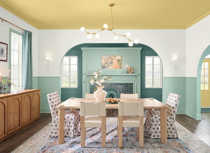
Alternating Quietude and Snowbound is a modern play on wallpaper.
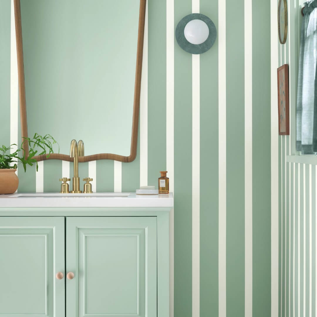
Color Trend: Pattern at Play
A youthful design for a nursery is achieved with unexpected natural refinement. Spiced Cider walls with Snowbound trim invite checkered upholstery and curtains to play. A Convivial Yellow door brightens the entrance to the enchantment.
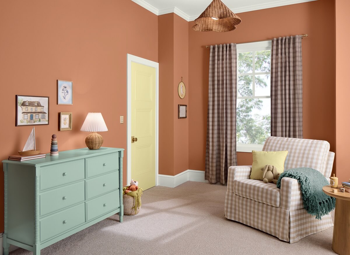
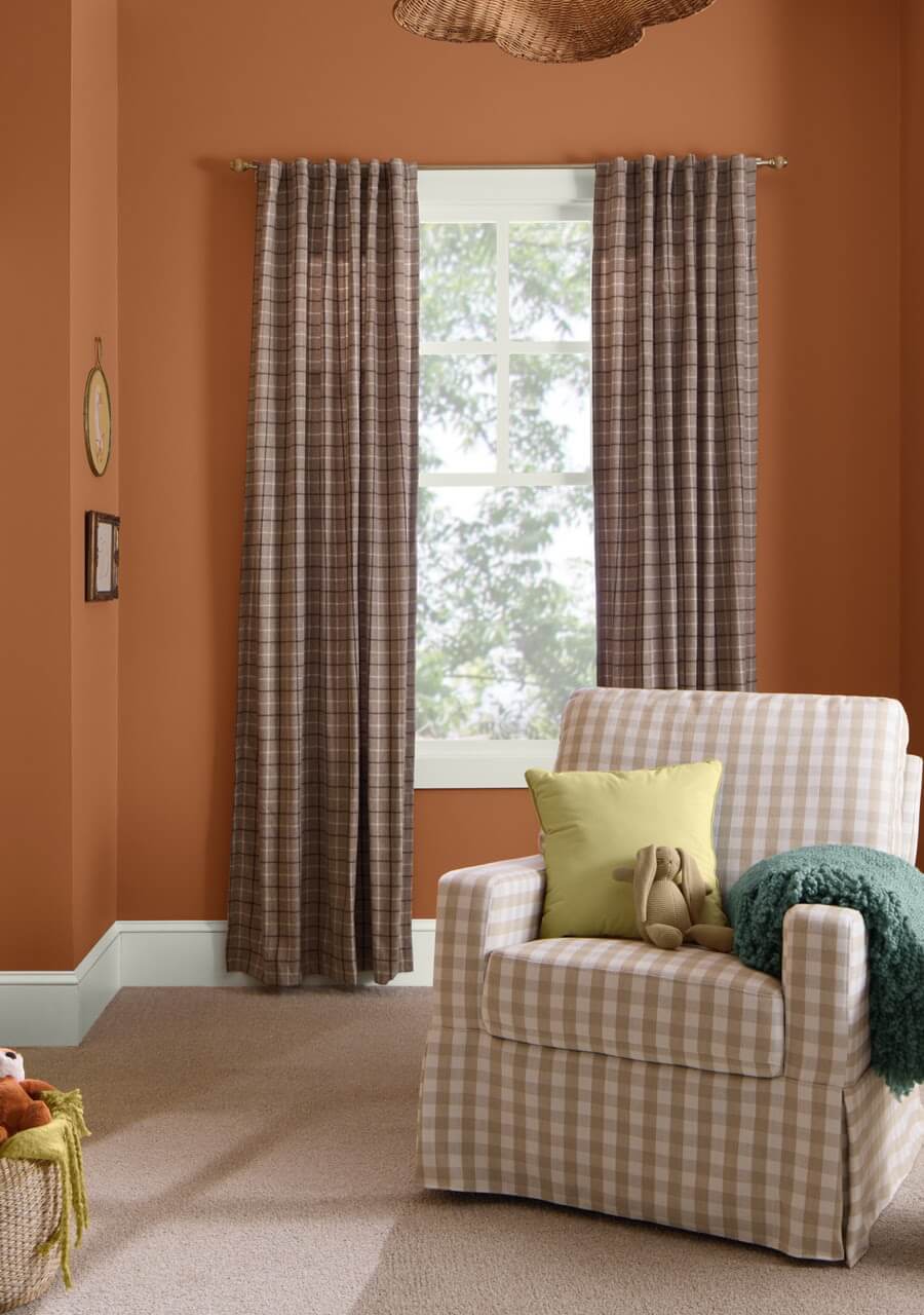
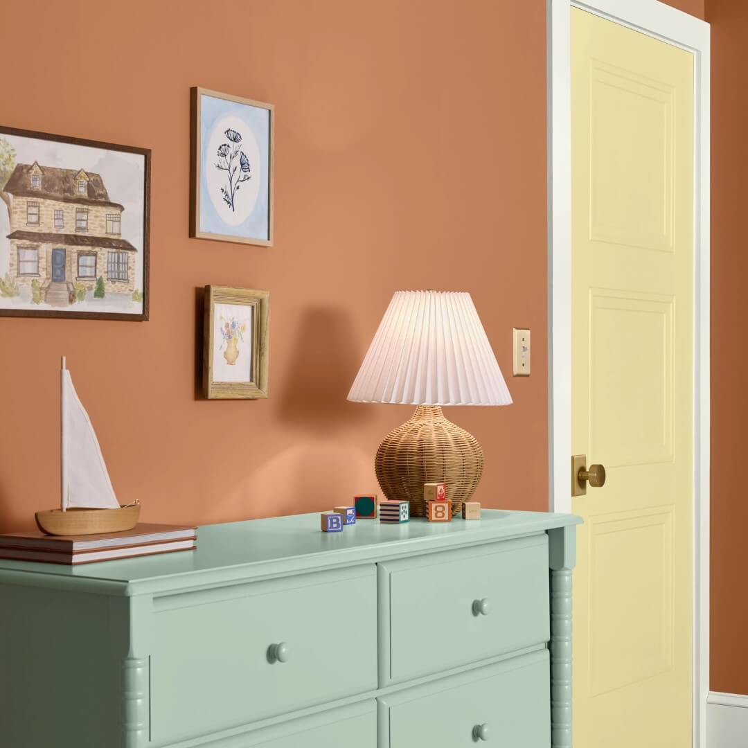
A Convivial Yellow door marks the entryway to a nursery where calm is promoted by Spiced Cider walls and playful check patterns in soft neutral tones.
Color Trend: Trendless Transition
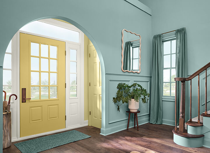
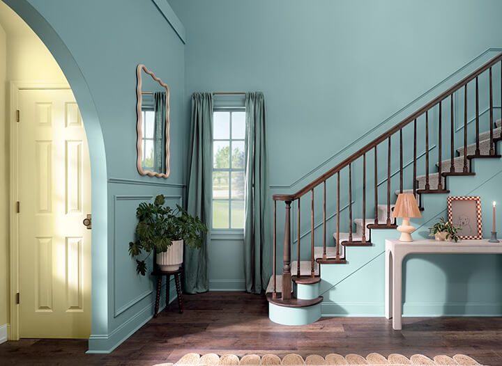
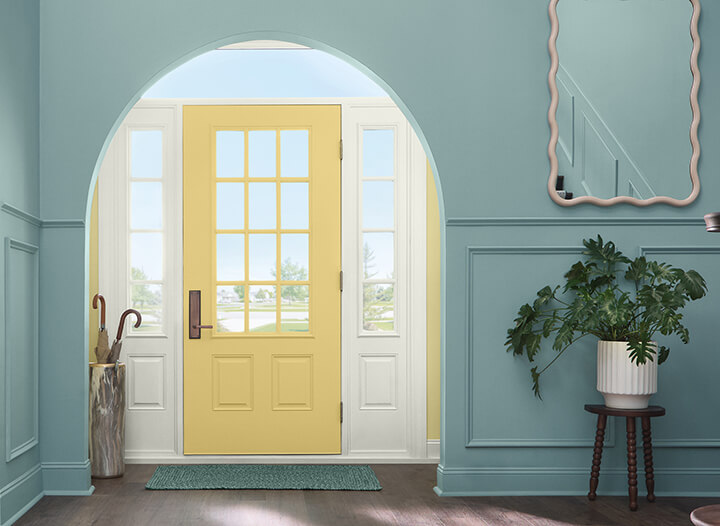
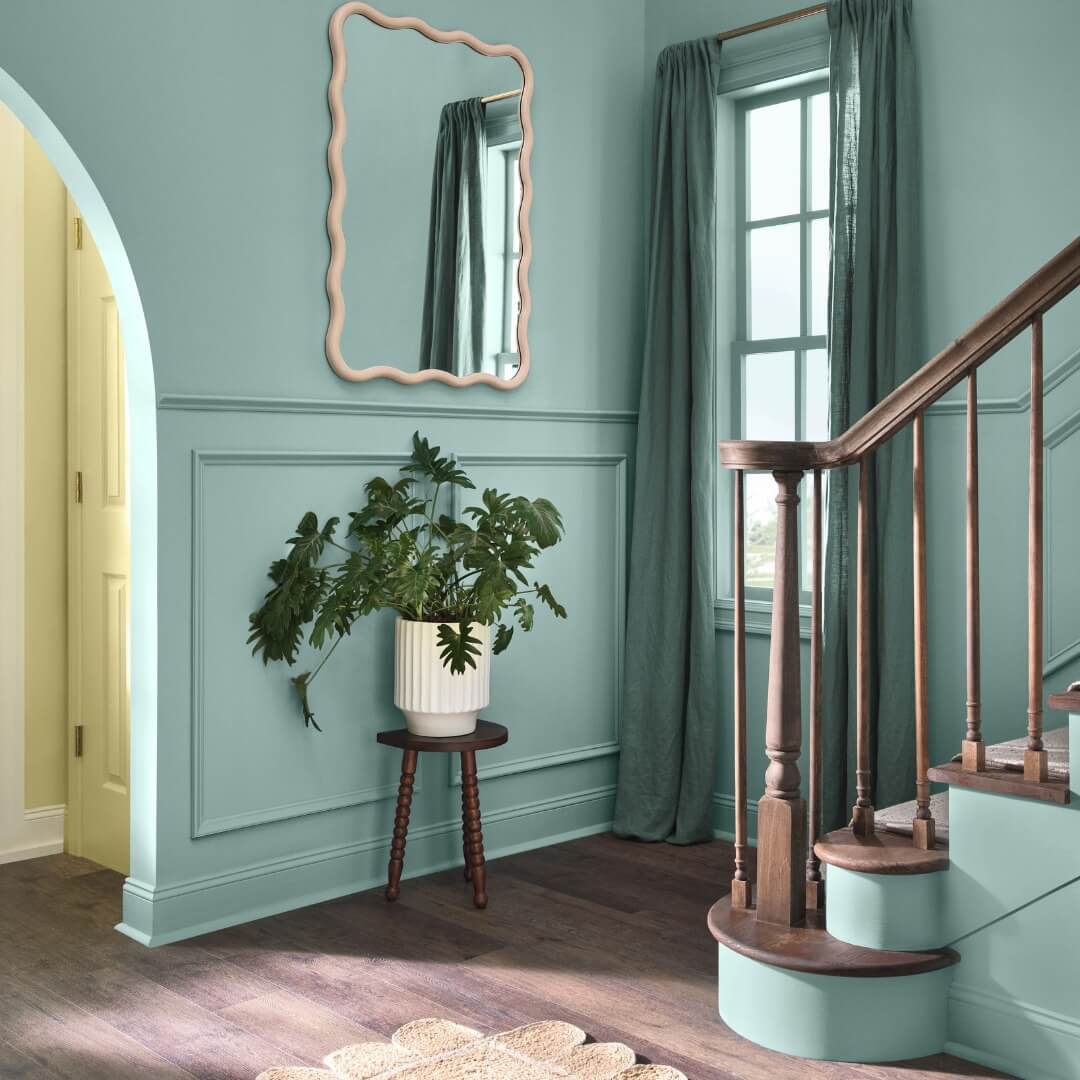
A Sequin entrance transitions to tall walls and a staircase in a smooth coat of Delft. With its undertone of slate gray, Delft adds a serene depth to this cool, relaxed, blue space.
An arched entrance takes the visitor on a color transition past a Convivial Yellow closet door to an enveloping Delft experience on the walls and staircase.
Color Trend: Arched and Curves
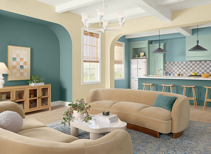
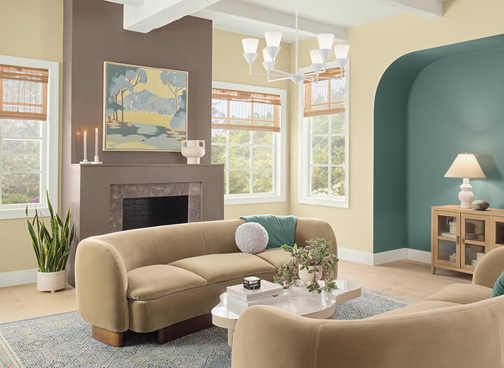
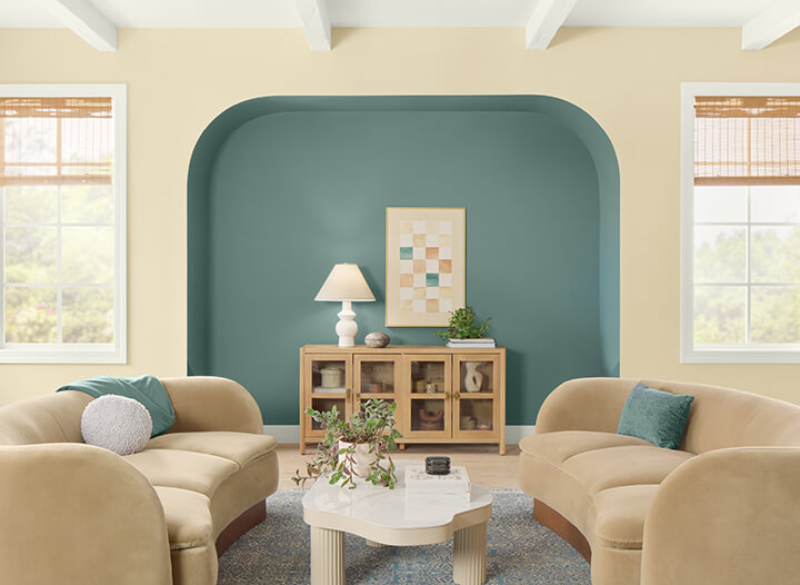
Rocky River destinations are defined beneath Stucco architectural archways. Furnishings and décor within the palette also add curves and cohesiveness. A Nutshell fireplace becomes a luxurious focal point in the living room.
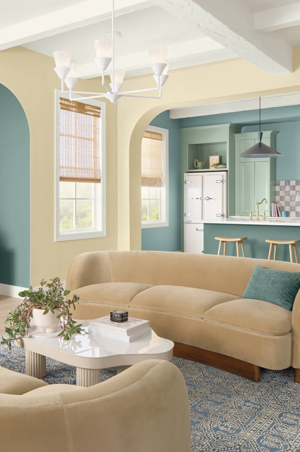
Stucco and Rocky River highlight the curves in the walls, sofas, and stools.
Color Trend: Waves of Green and Blue
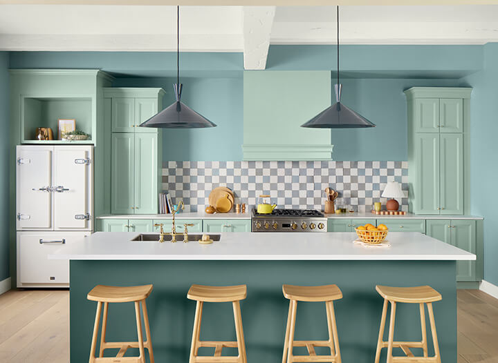
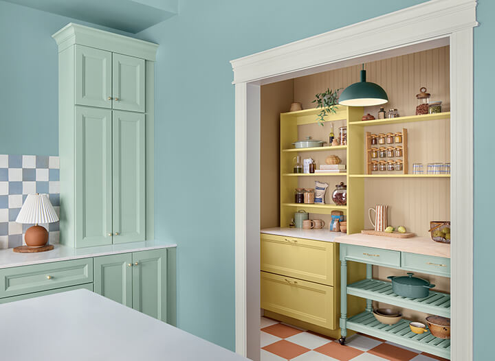
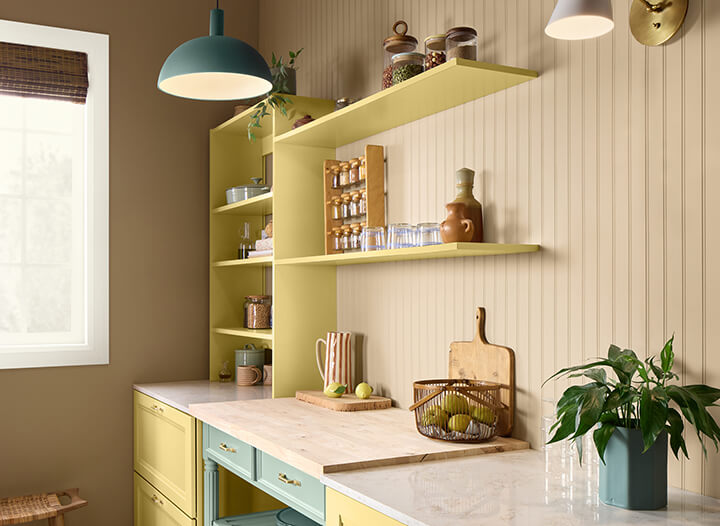
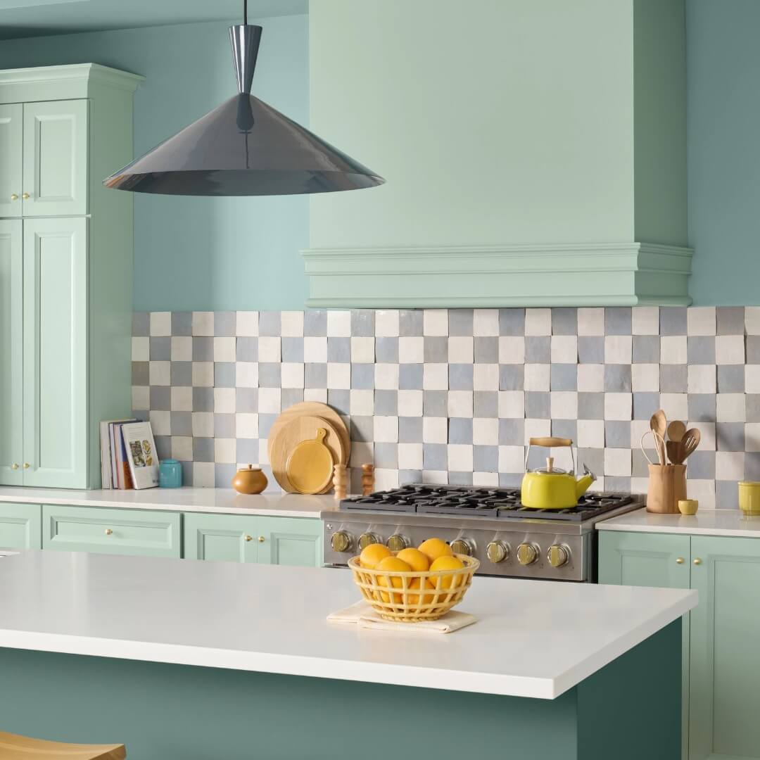
The kitchen and pantry ride waves of Naturally Refined color with Delft walls, a deep Rocky River island, and Quietude cabinets. The design continues to be a comfortable and welcoming pantry in Nomadic Desert and Sequin hues.
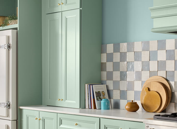
Rocky River, Delft, and Quietude bring a joyous harmony of blue and green tones to the kitchen with space for checkered patterns, too.
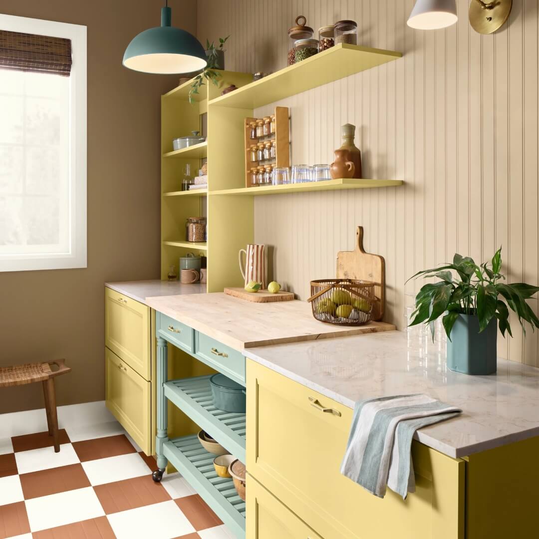
Nomadic Desert walls and Sequin cabinetry house a Quietude pantry cart.
Color Trend: Color Blocking Reimagined
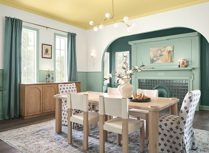
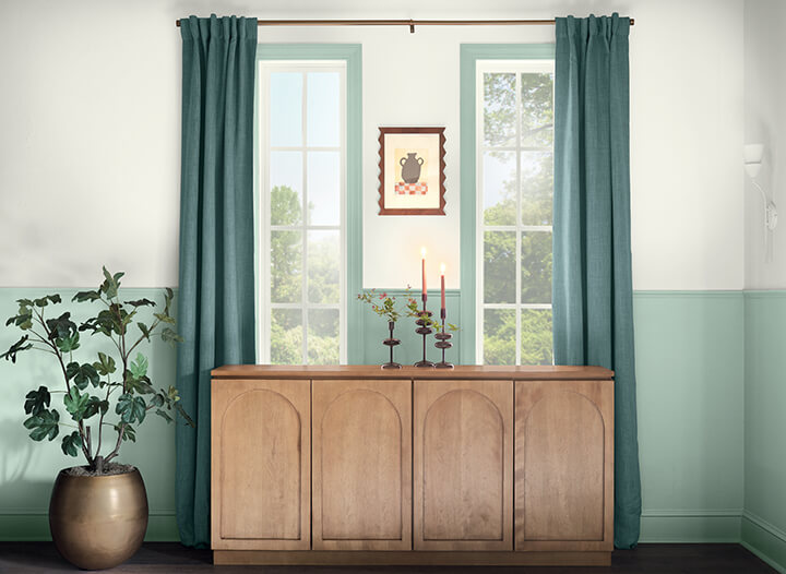
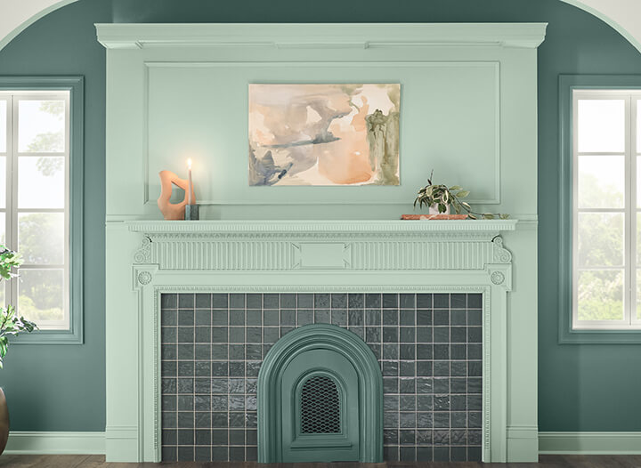
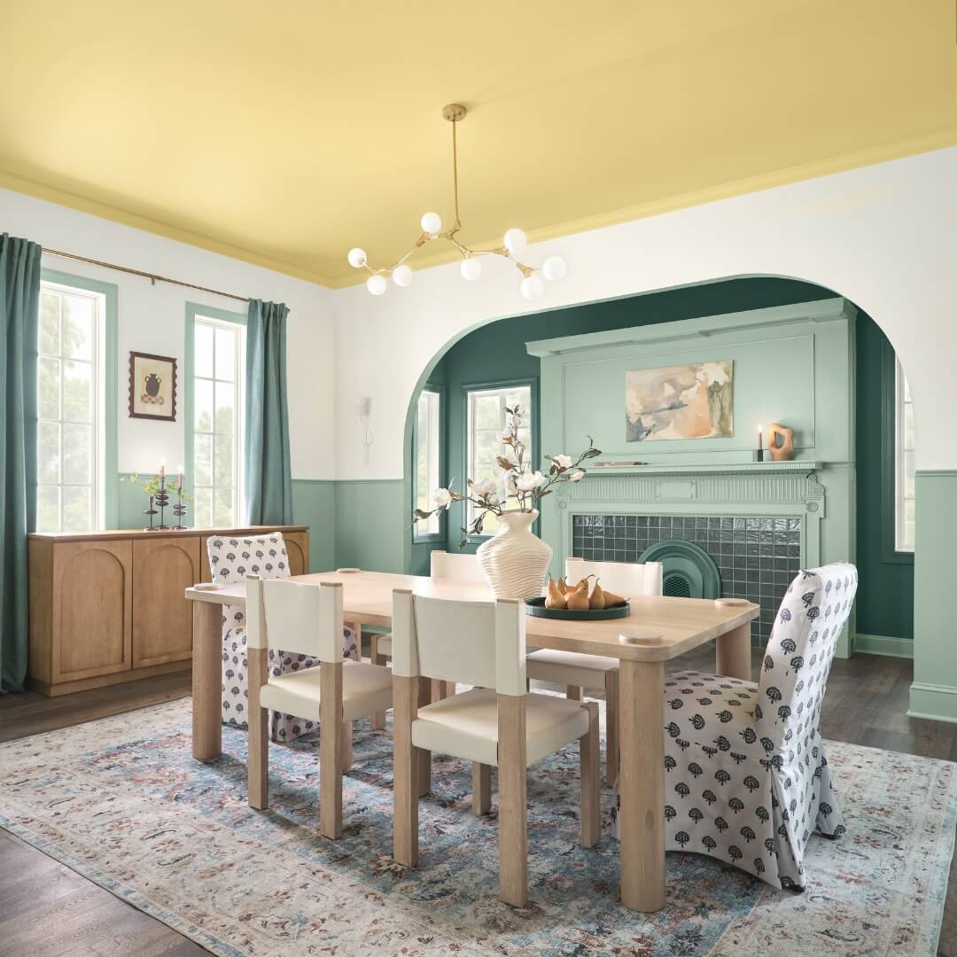
Broad bands of Quietude and Snowbound on walls help redefine and re-proportion spaces. A Sequin ceiling adds surprise, delight, and a little daring. Together; they frame a Quietude fireplace for a boldly muted color exploration.
Layer upon layer upon layer of color, with Quietude, Sequin, and Snowbound, build waves of peacefulness.
As we’ve seen for many years now, blue tones remain a popular choice for paint brands as their color of the year. What do you think of this soft blue shade Quietude?
