


Jotun Launches JOURNEYS: A New Color Collection for 2027
We are looking ahead to 2027 with a new color collection from Norwegian paint brand Jotun. Jotun is known for releasing beautiful color palettes and inspiring interior ideas, and this time is no different.
According to Jotun, our relationship with color often begins long before we become aware of it. The shades found in our childhood homes, the rooms where we first felt that we belonged, and the colors connected to our earliest memories all stay with us.
As life changes, these impressions follow us from one chapter to the next, influencing how we decorate the spaces around us.
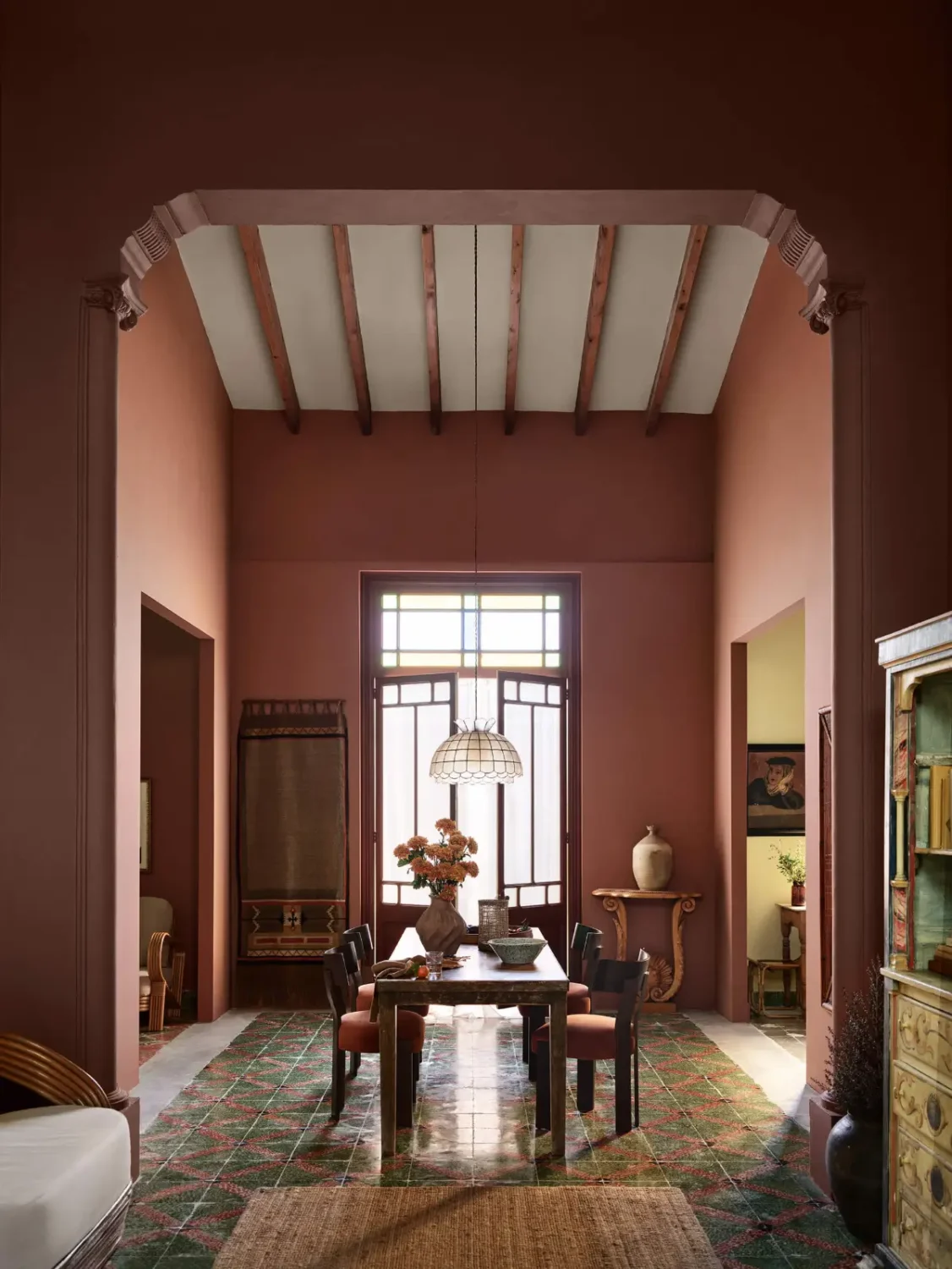
This idea lies at the heart of JOURNEYS, Jotun’s new Global Color Card for 2027. The collection explores how the colors we remember, encounter, and experience help shape both our identities and our homes.
Celebrating a Century of Color
Jotun has spent the past 100 years encouraging people to express themselves through color. By developing carefully balanced shades and high-quality paints designed to retain their appearance over time, the company has helped generations create homes that reflect their individual stories.
Throughout its history, Jotun has looked beyond borders for inspiration. Encounters with different countries and cultures have continually influenced its color collections, bringing new combinations and perspectives into homes around the world.
JOURNEYS continues this tradition while also marking a century of color creation.
The 2027 collection features 24 carefully selected shades divided into three complementary palettes: Memories, Discoveries, and Experiences. Each theme contains eight colors designed to work together, while still offering plenty of freedom for personal combinations.
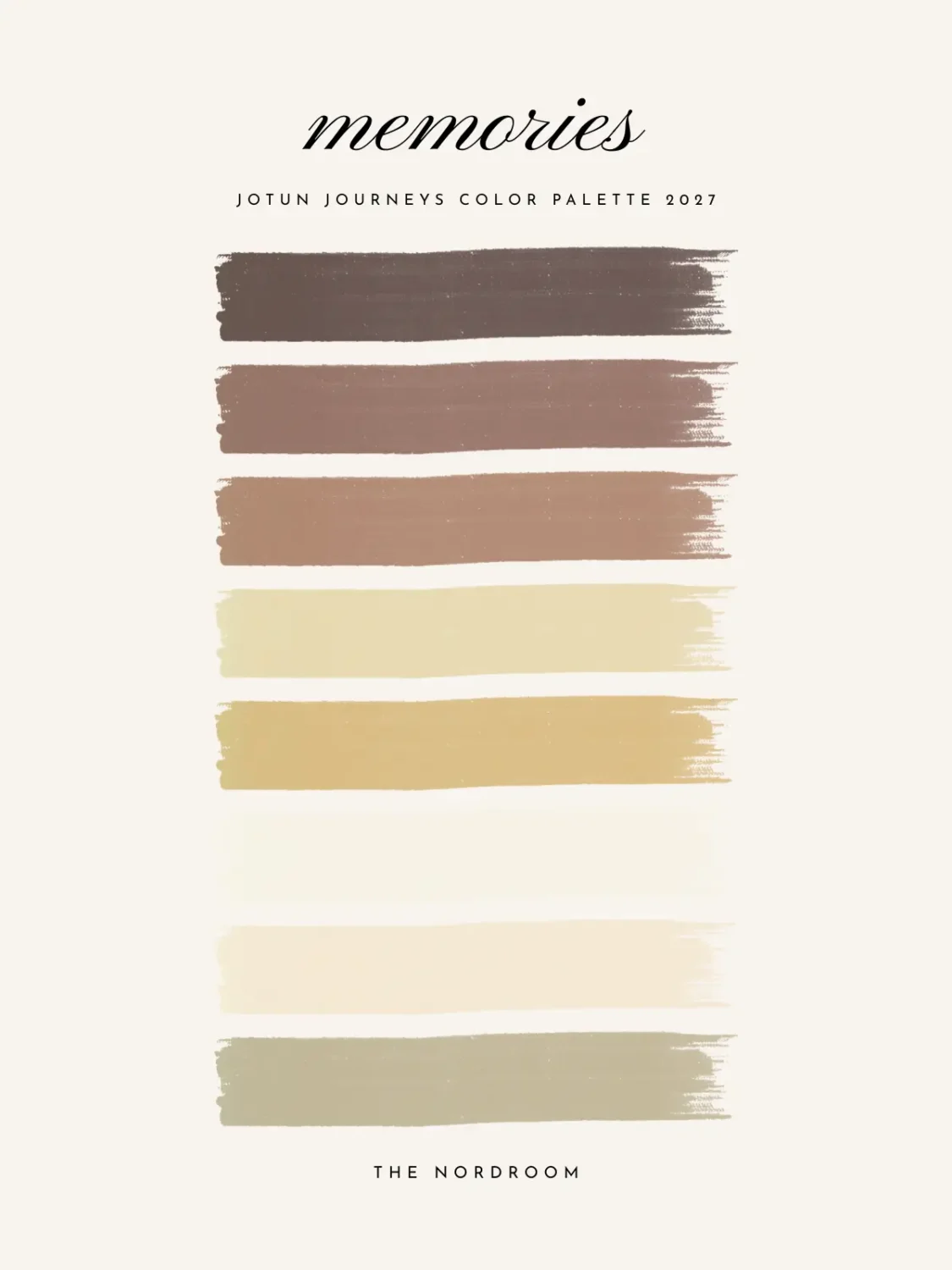
Memories: The Colors We Carry With Us
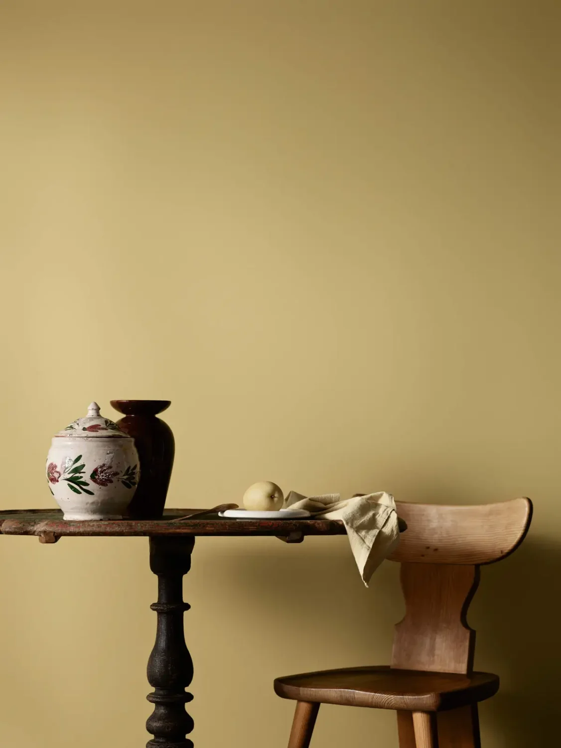
The Memories palette focuses on the familiar colors that create an immediate sense of comfort and belonging. Soft, earthy shades form the foundation of the collection, joined by warm terracotta, deep maroon, muted green, and a refreshing touch of yellow.
Together, these colors create interiors that feel grounded, welcoming, and connected to the past. The palette also serves as a tribute to Jotun’s 100-year history and the company’s long-standing commitment to the art of color creation.
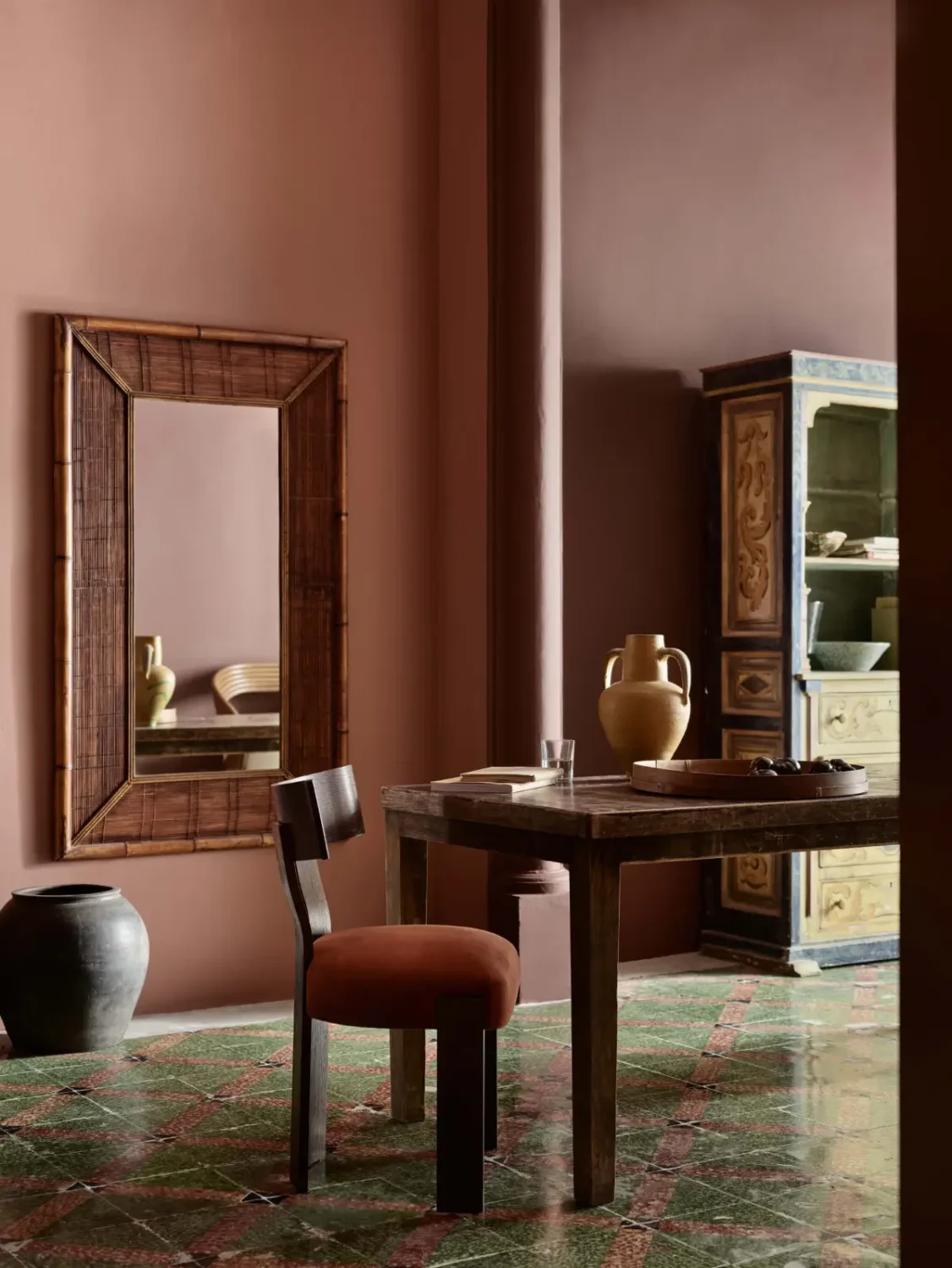
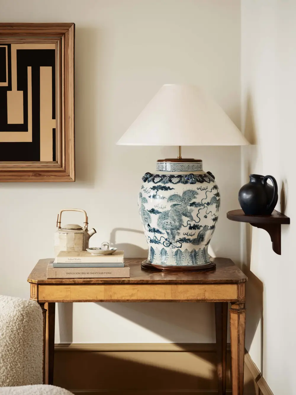
The traditional colors provide an ideal backdrop for objects and heirlooms that remind us of the moments and people that have shaped us.
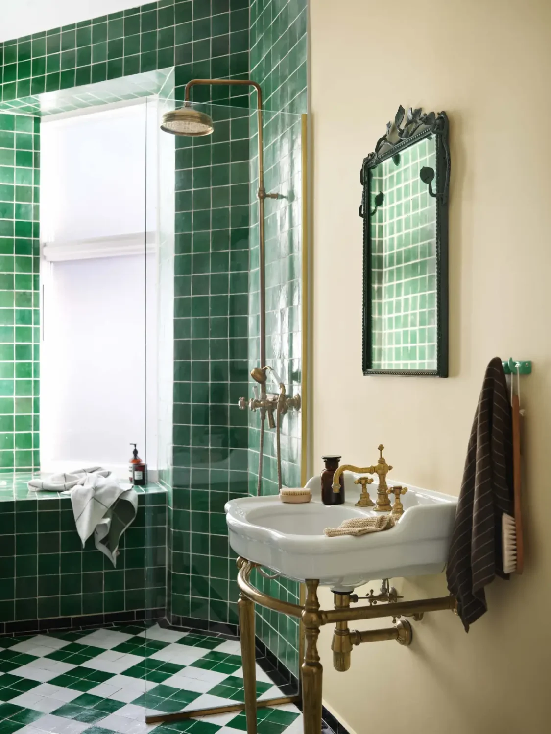
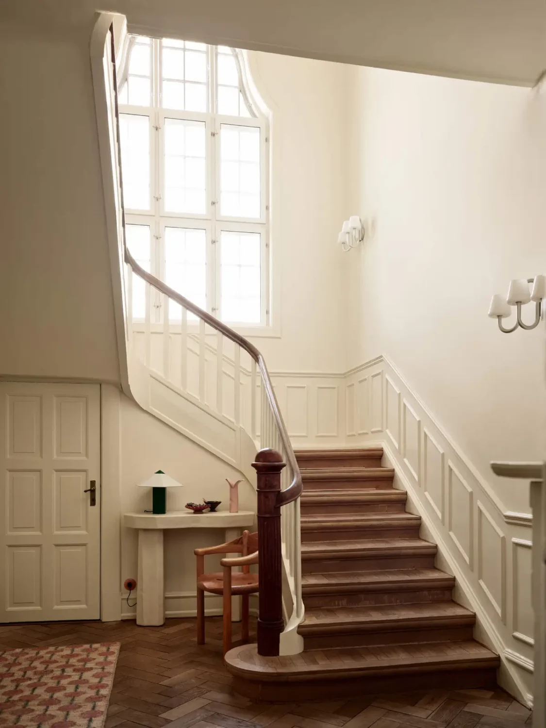
Beautiful, calm shades, such as Amber Red, Kilim and Biri, the latter a 1960s green rediscovered in Jotun’s archives, bring a relaxed comfort to the bedroom, living room or kitchen. This is the palette that brings you home.
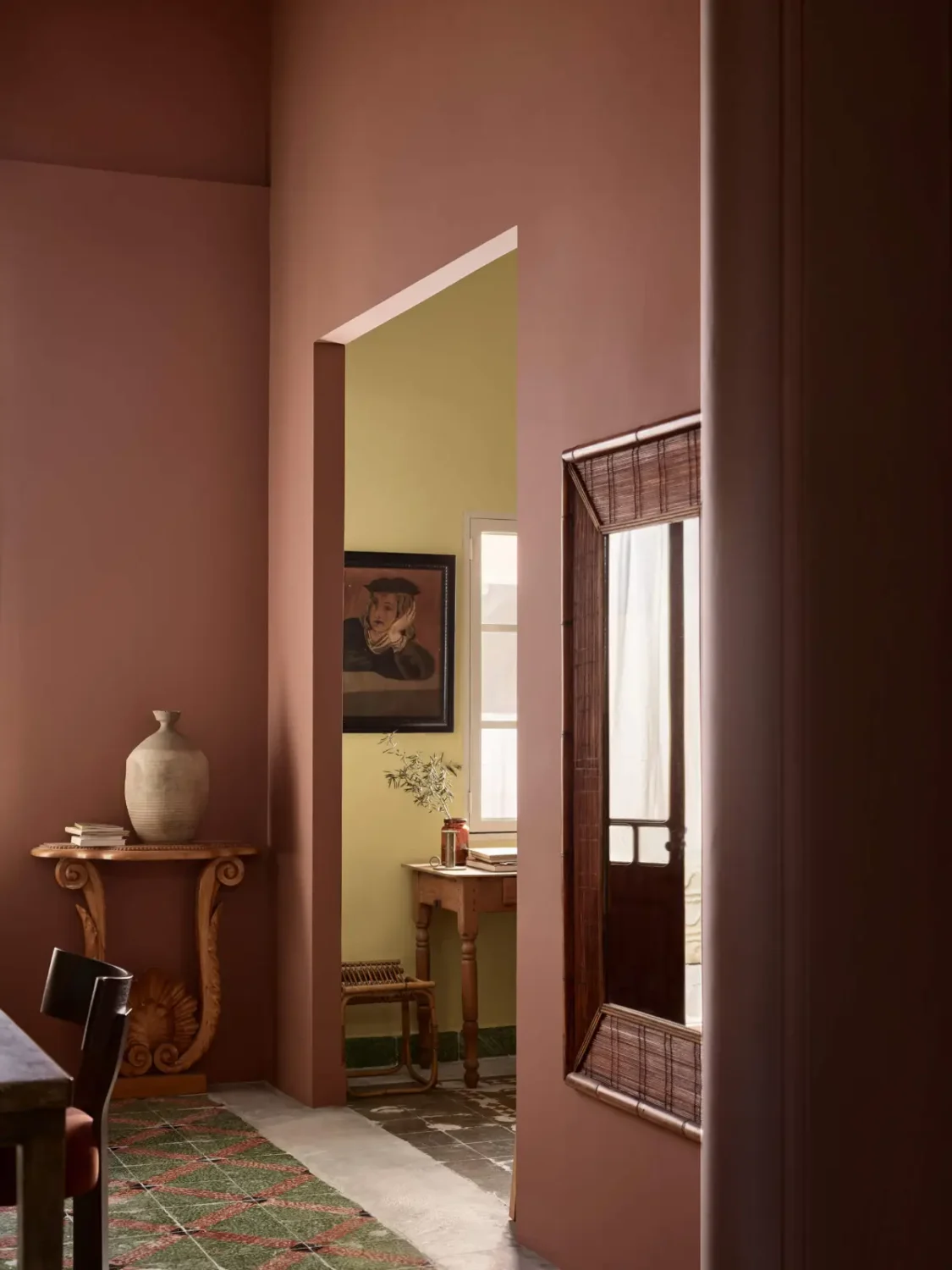
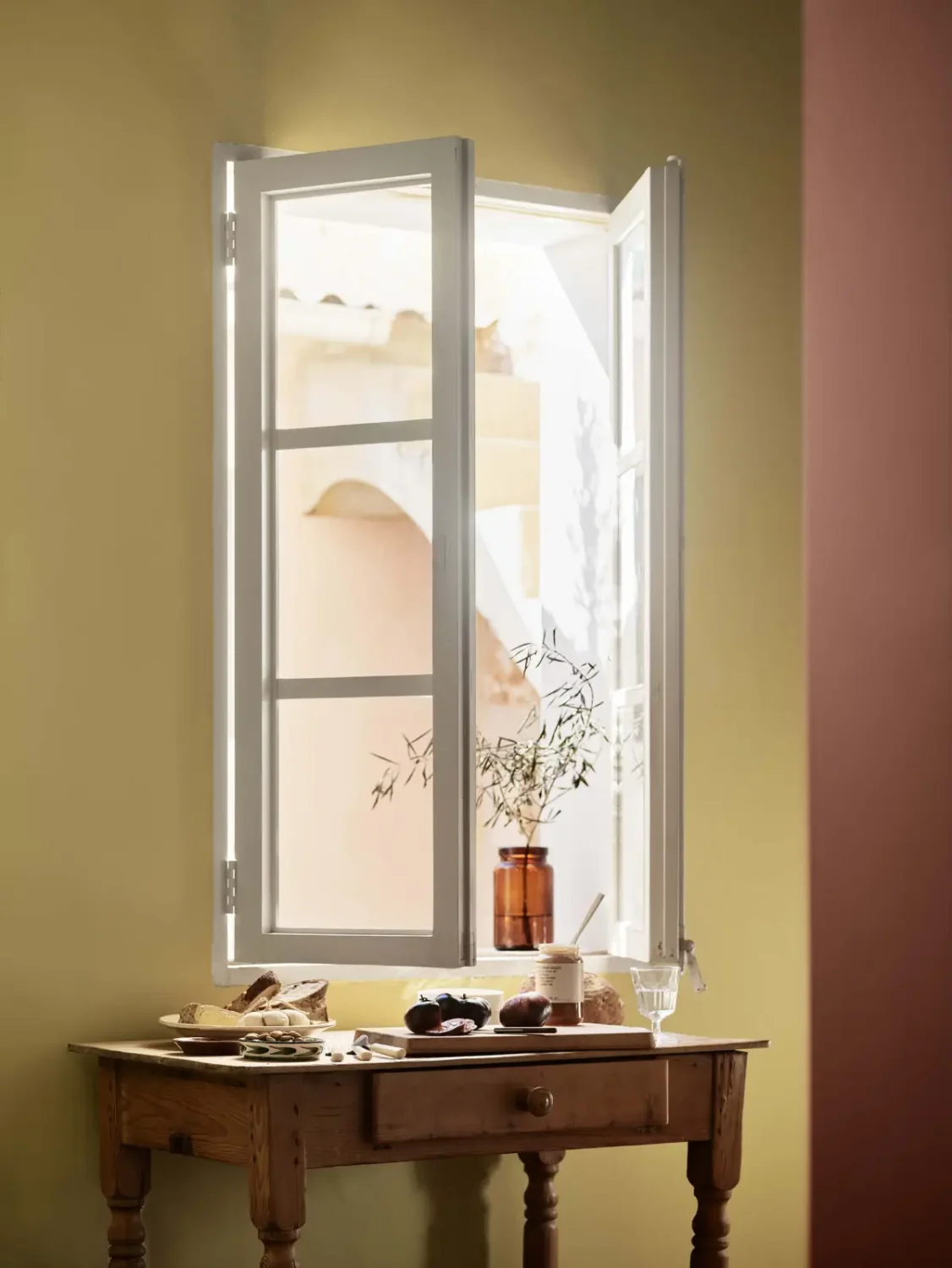
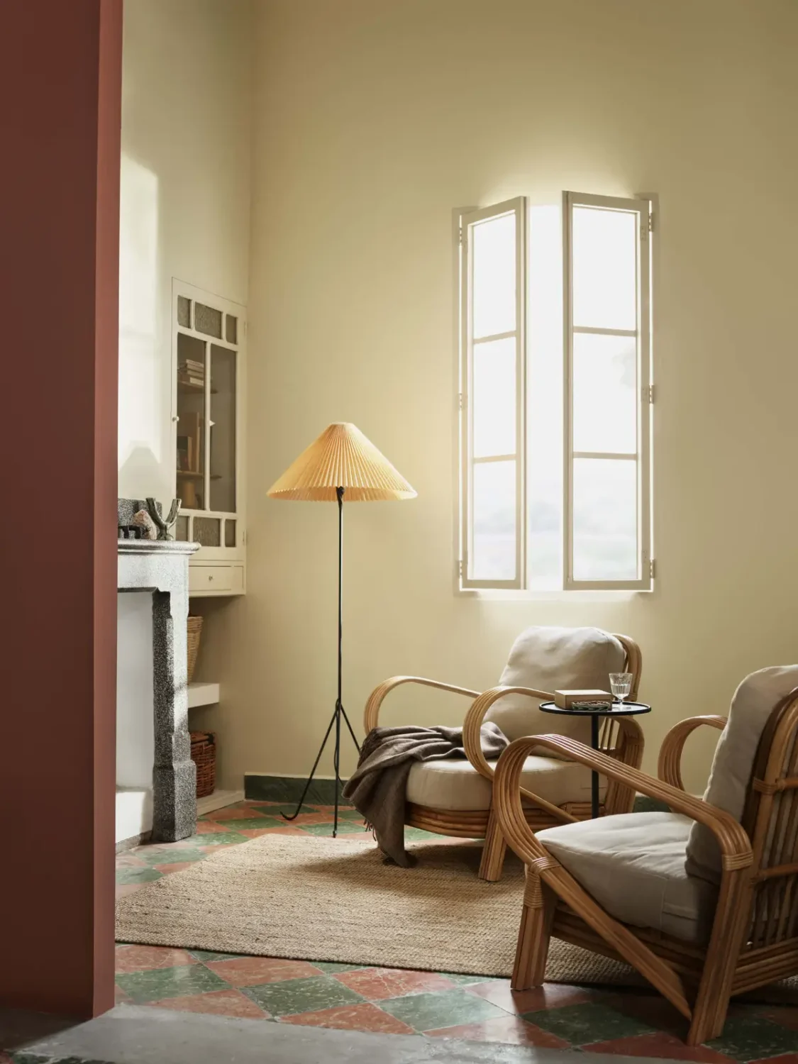
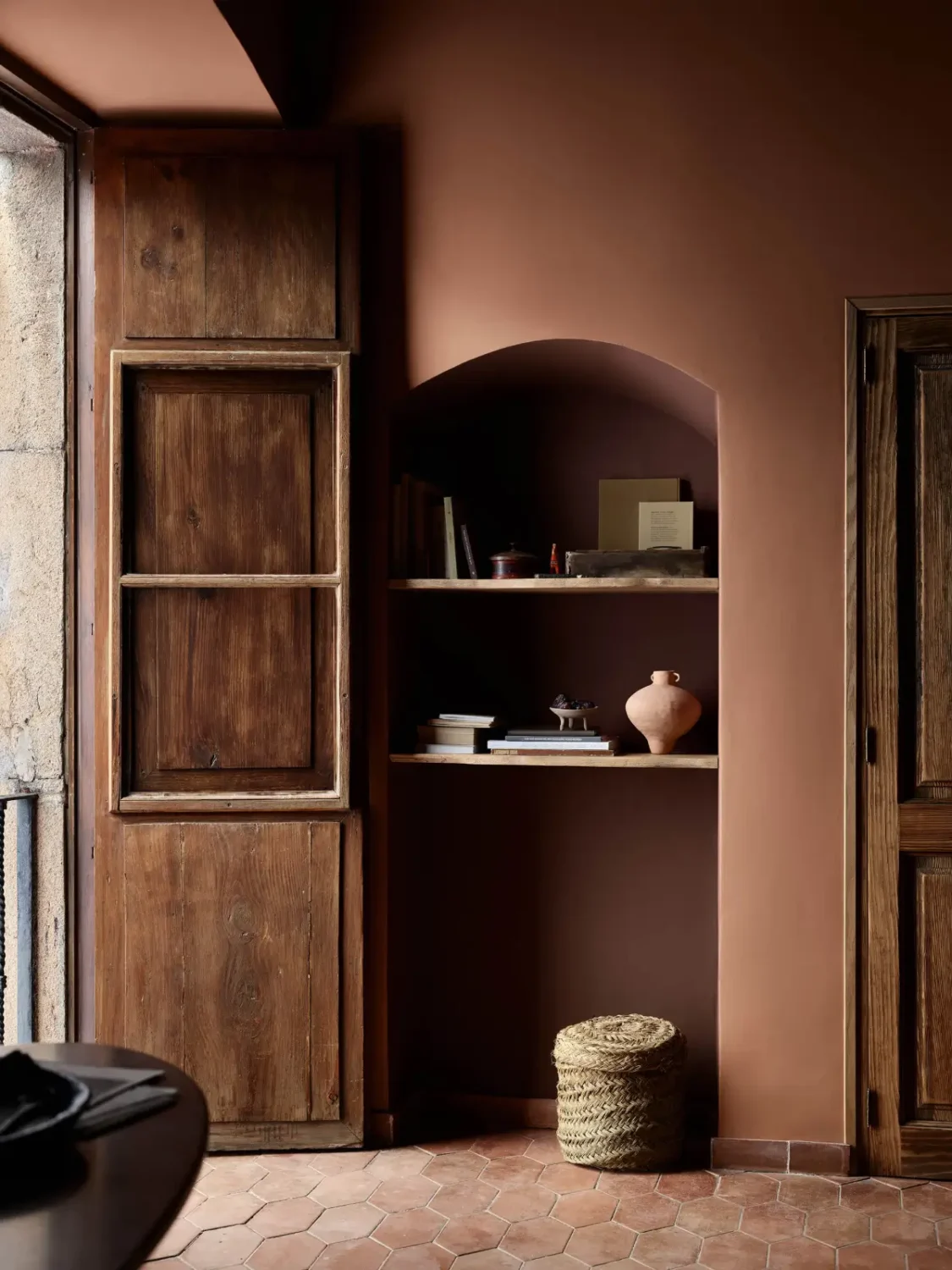
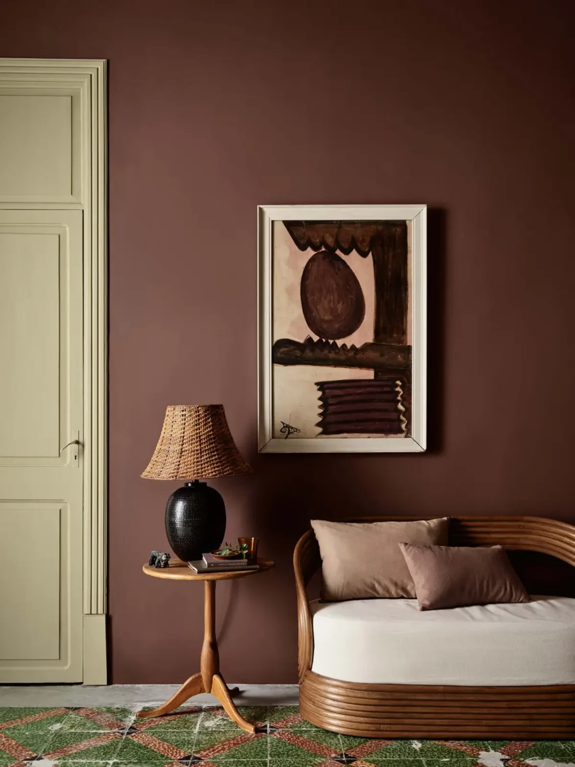
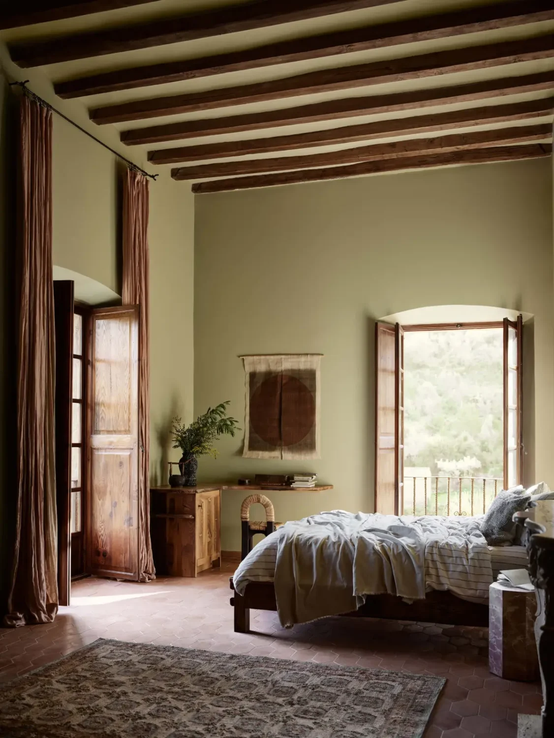
The carefully selected green tone Biri, from the Memories color theme, brings a warm, nostalgic feeling. Combined with Nostalgic Whisper, Century White or other colors from Jotun’s 2027 color chart, Biri creates a subtle, almost poetic presence.
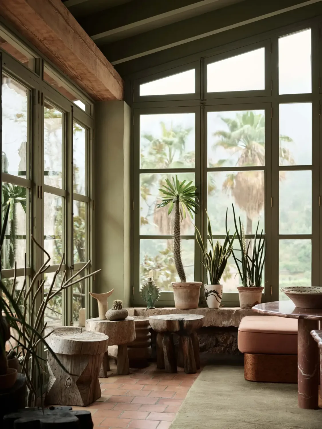
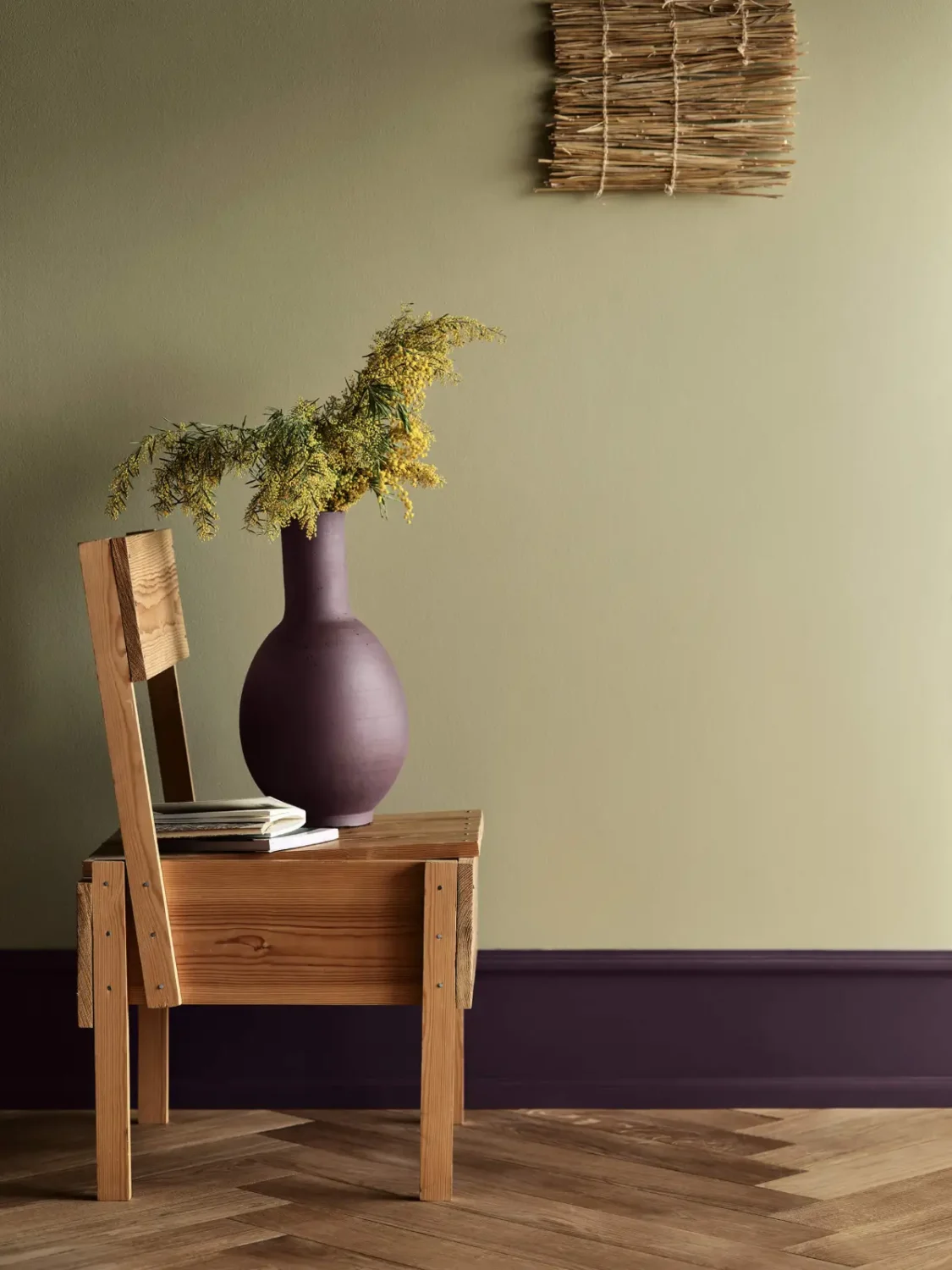
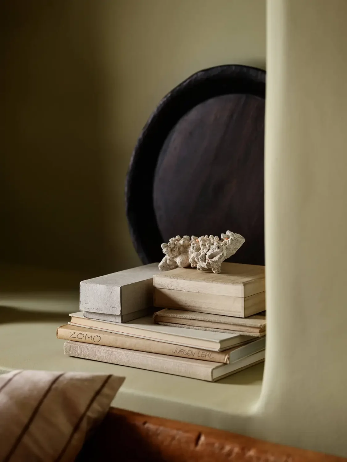
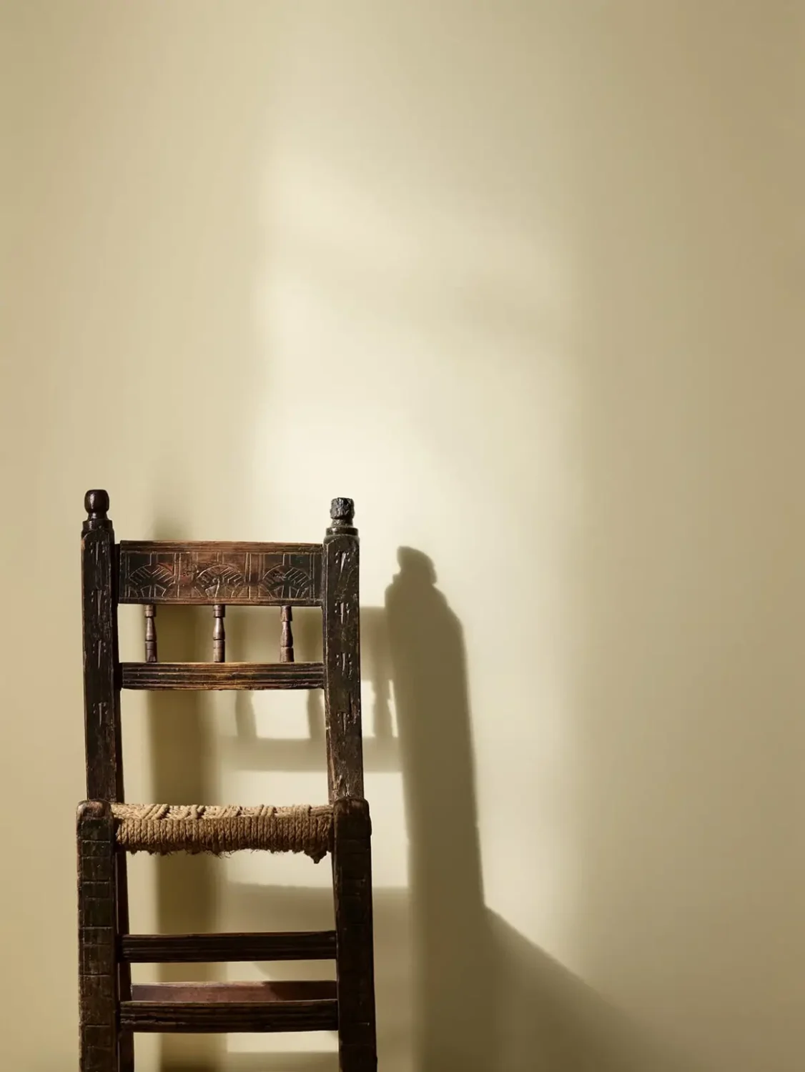
The colors change in response to the light. They shift with the passing of the day, and the room takes on new moods. A room in the morning appears from a different side at dusk. It is in the interaction with the light that the magic of color occurs.
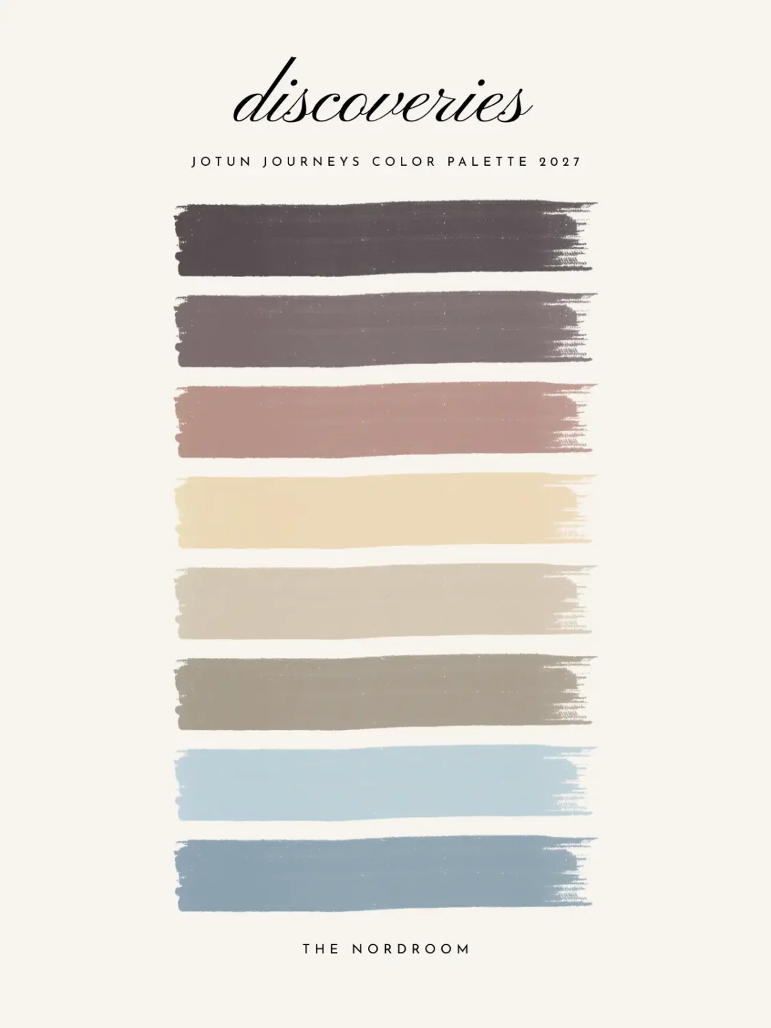
Discoveries: Colors That Offer a New Perspective
Travel, culture, and new surroundings can change the way we see color. A particular shade may remind us of a landscape, a building, a piece of art, or a memorable place, and eventually find its way into our homes as a visual souvenir.
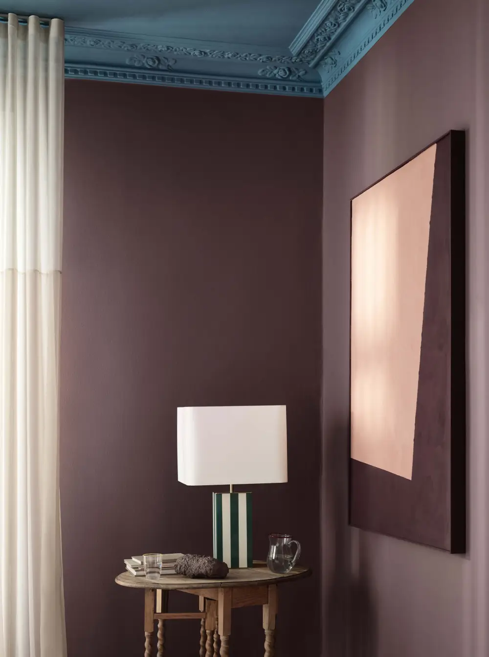
The Discoveries palette captures this sense of curiosity with expressive yet harmonious combinations. An uplifting blue is paired with soft plum, while a warm, timeless yellow sits alongside a playful golden pink.
These are colors that bring fresh energy into a room while reflecting the people, places, and ideas that influence us along the way.
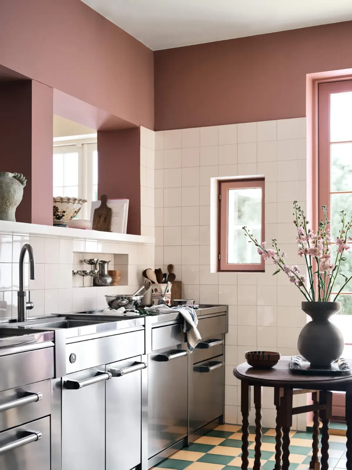
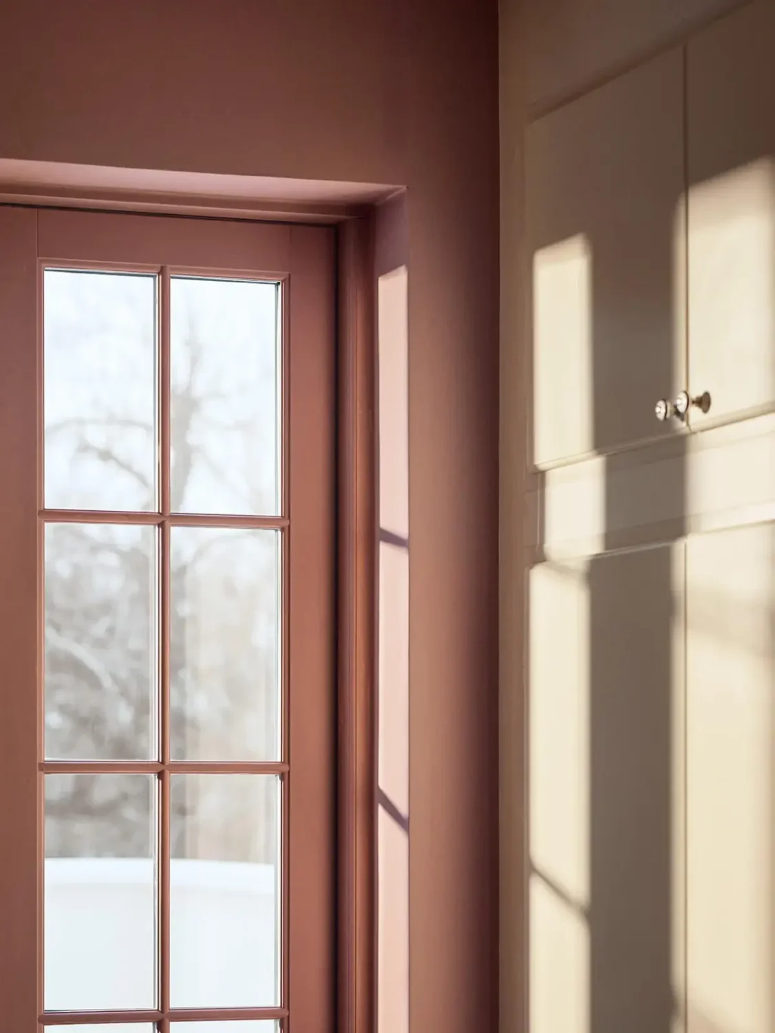
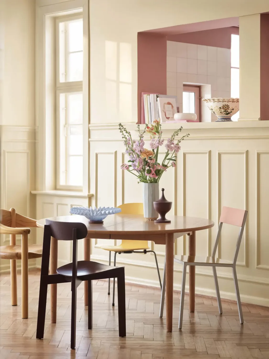
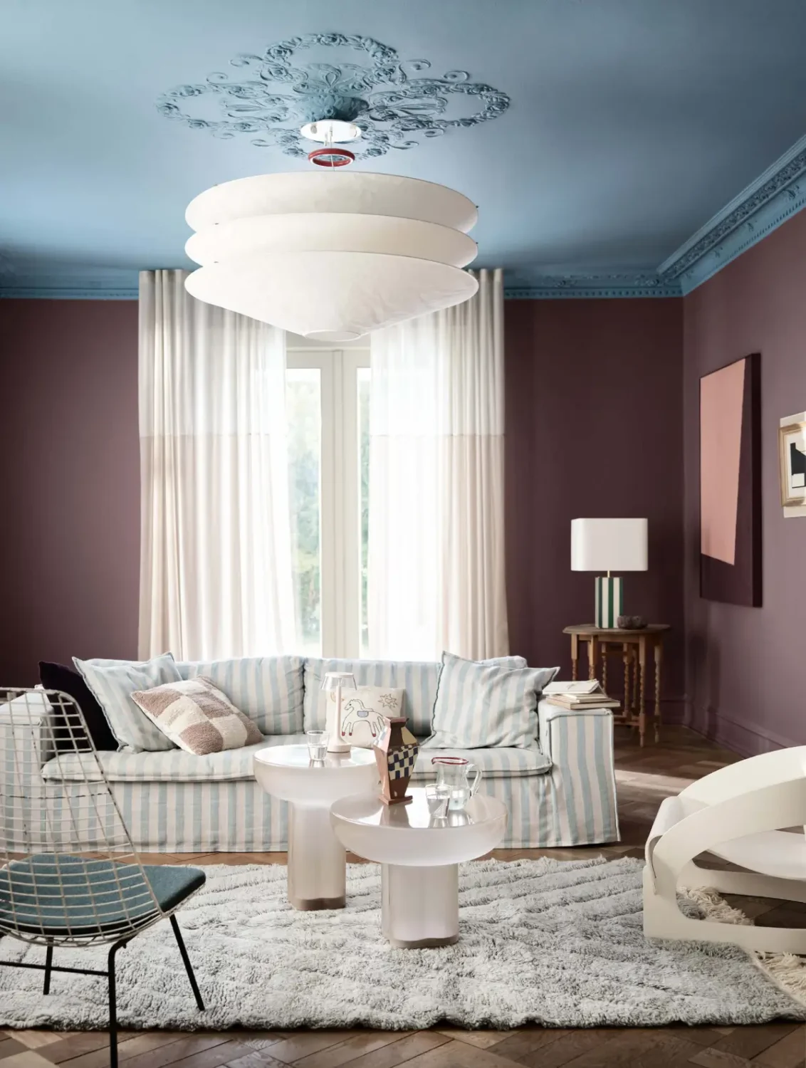
By mixing and matching different colors, you can create your own expression. Combine blue tones like airy North or fresh Sama with muted Morning Glow for a balanced expression. Or be bold, combine blue with plum tones, purples, or warm yellows for lively, expressive spaces.
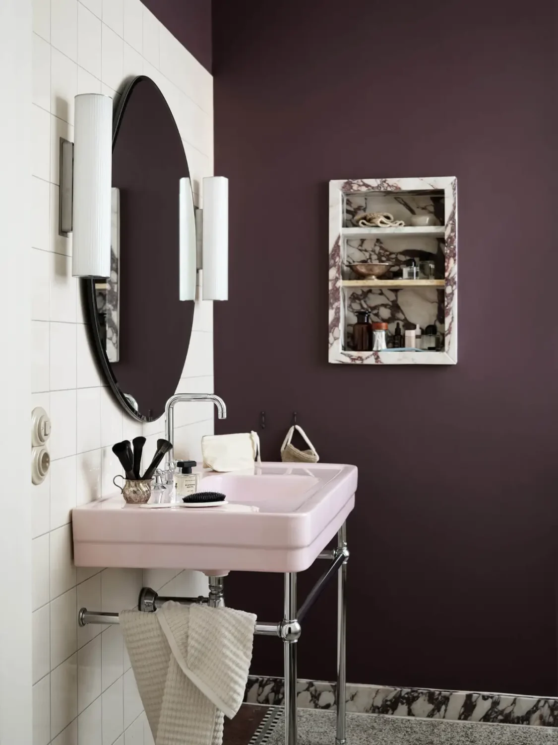
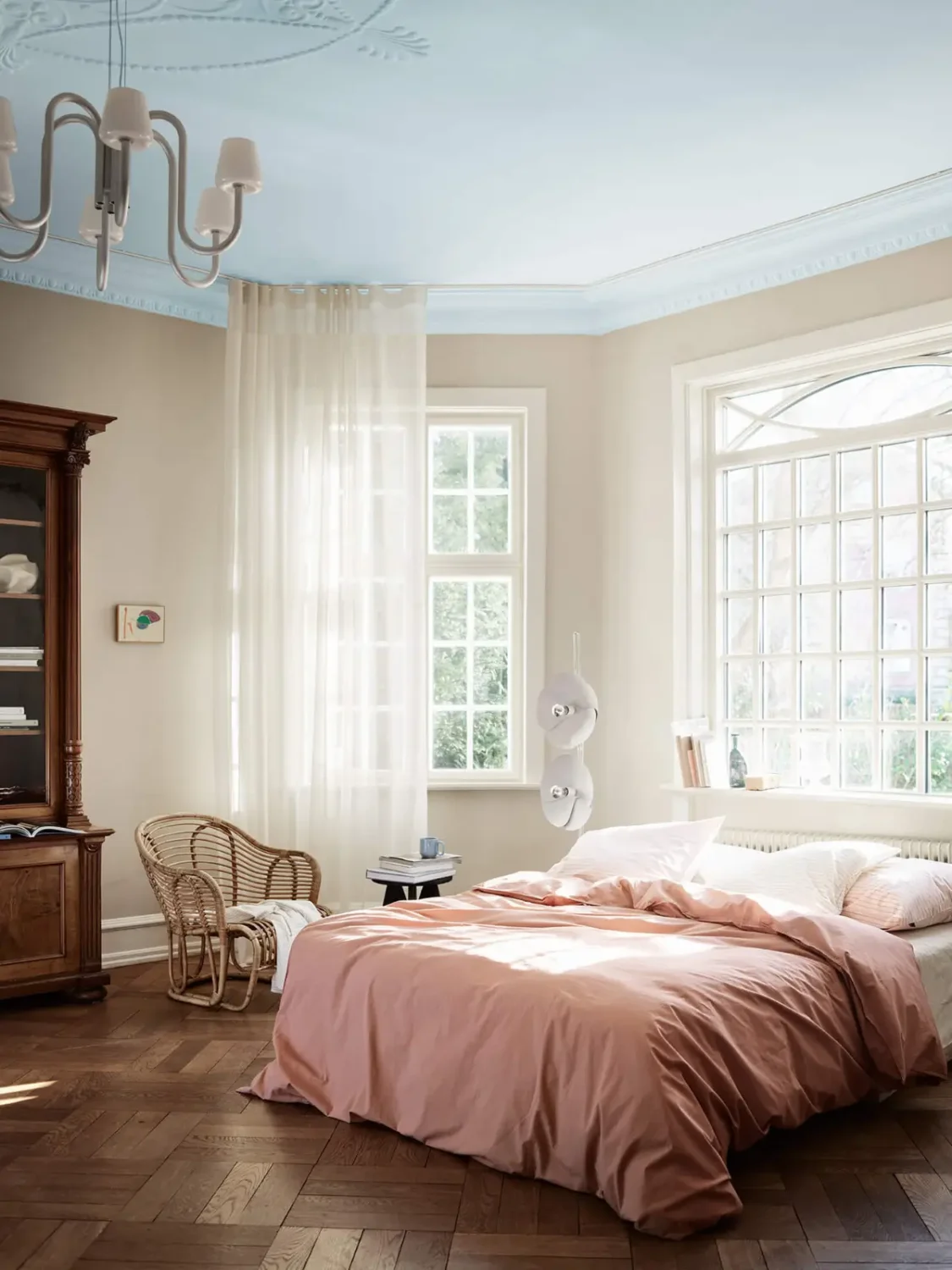
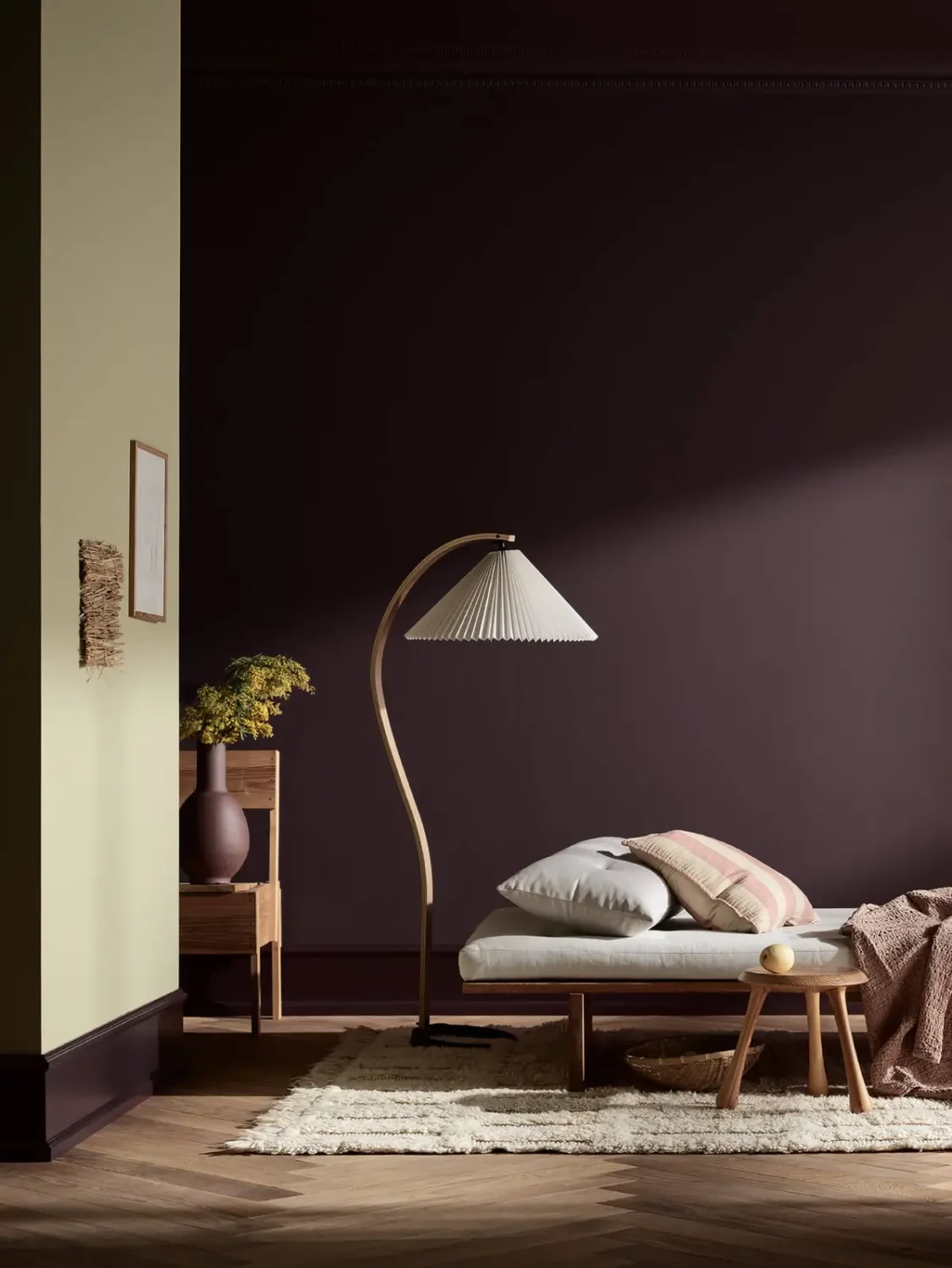
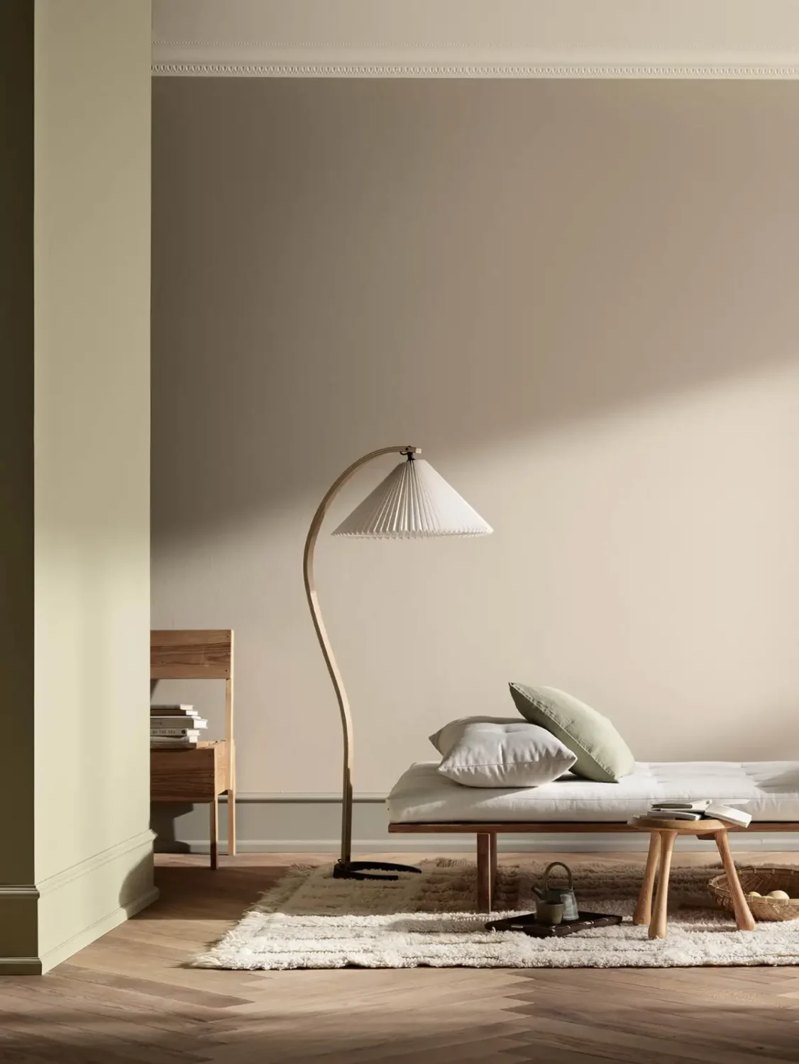
The ceiling doesn’t have to whisper quietly in white. Give it a clearer voice with well-chosen colors, and watch the room’s atmosphere change; what was previously overlooked becomes something completely unique. A painted ceiling adds character, personality, and uniqueness to the room.
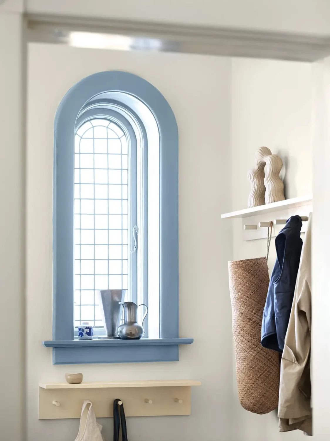
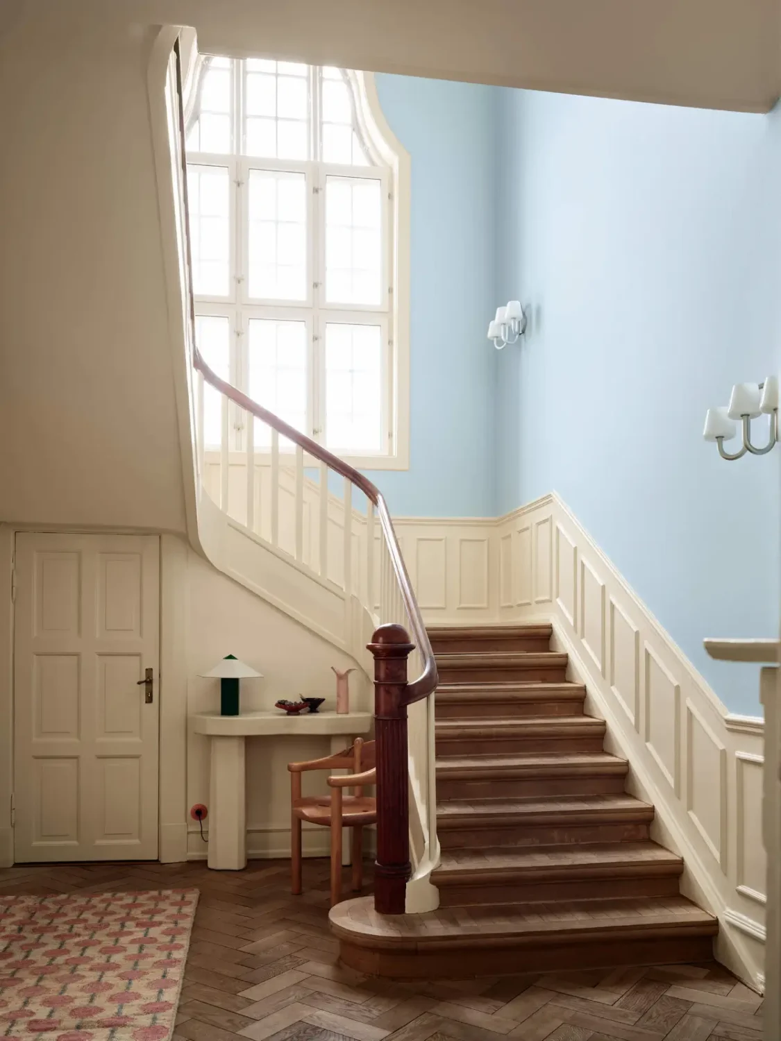
Same room, different colors: the color choice will change the look of the room. Create your own unique palette by combining different colors from the three themes in Jotun’s new Journeys color chart. Give your room character and make it your own with color.
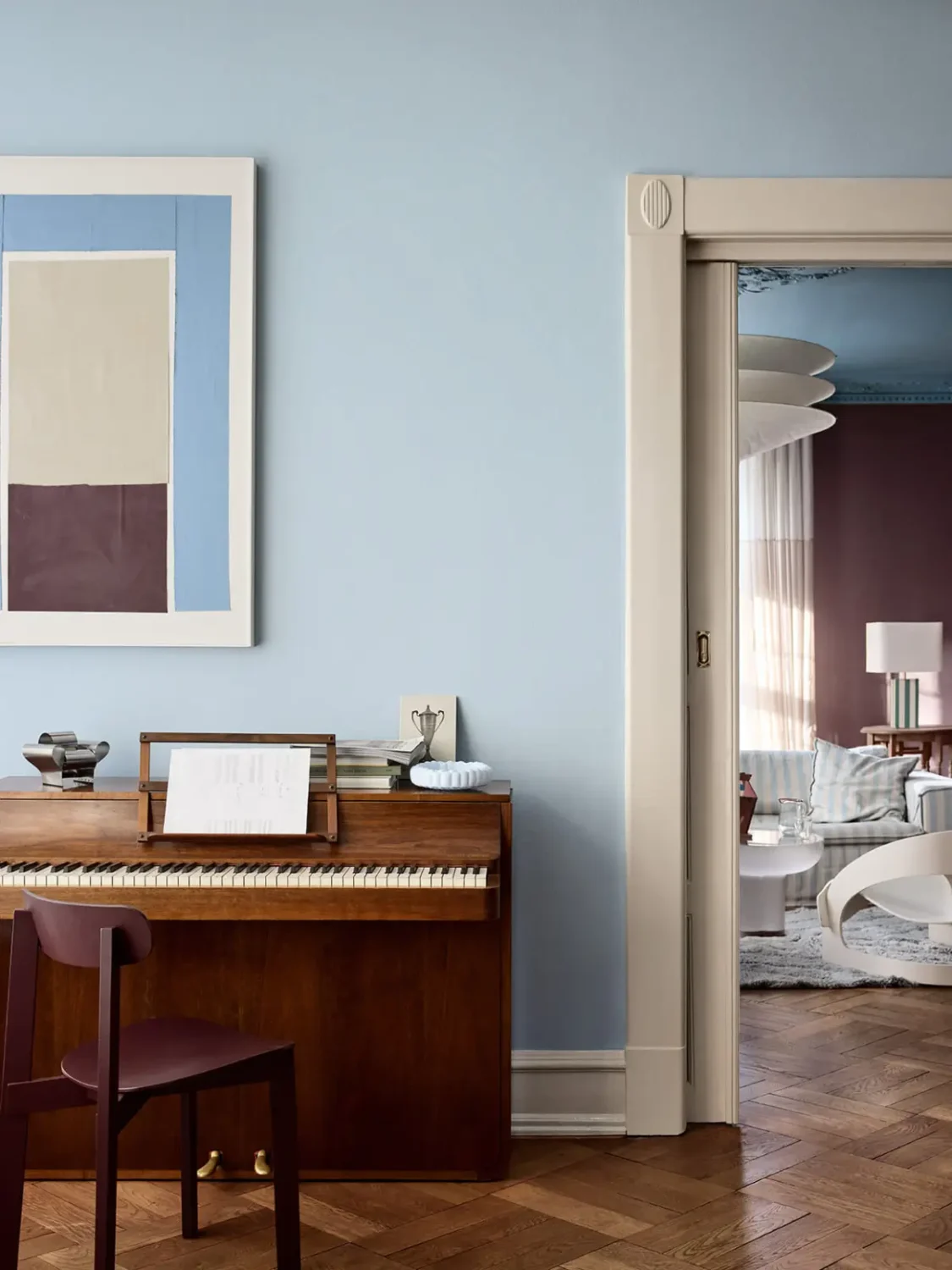
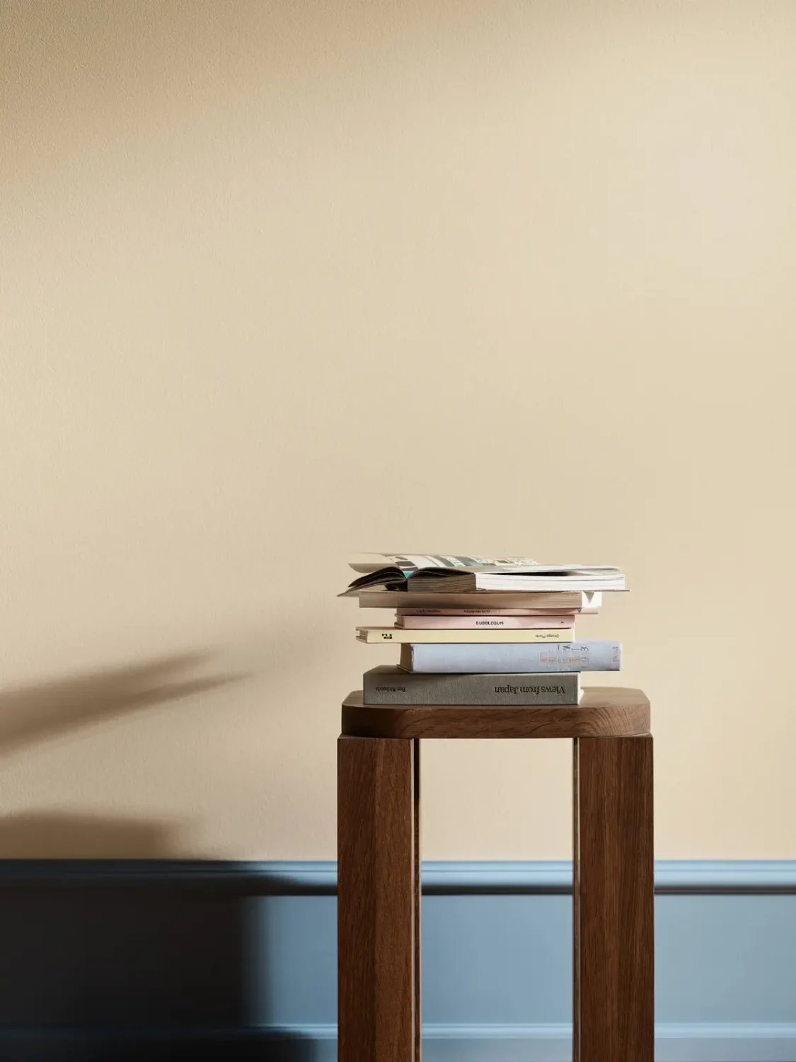
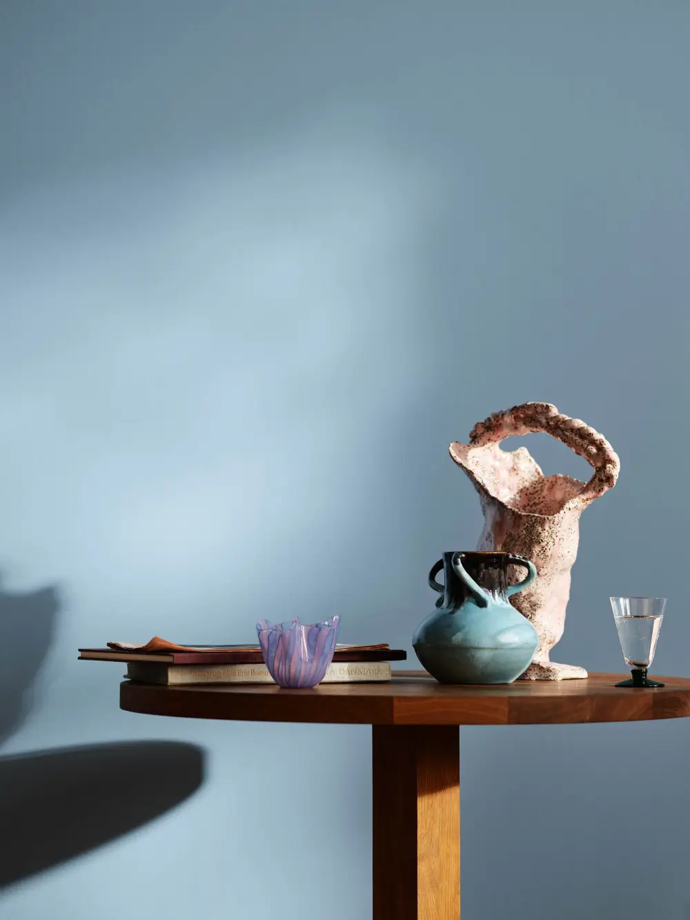
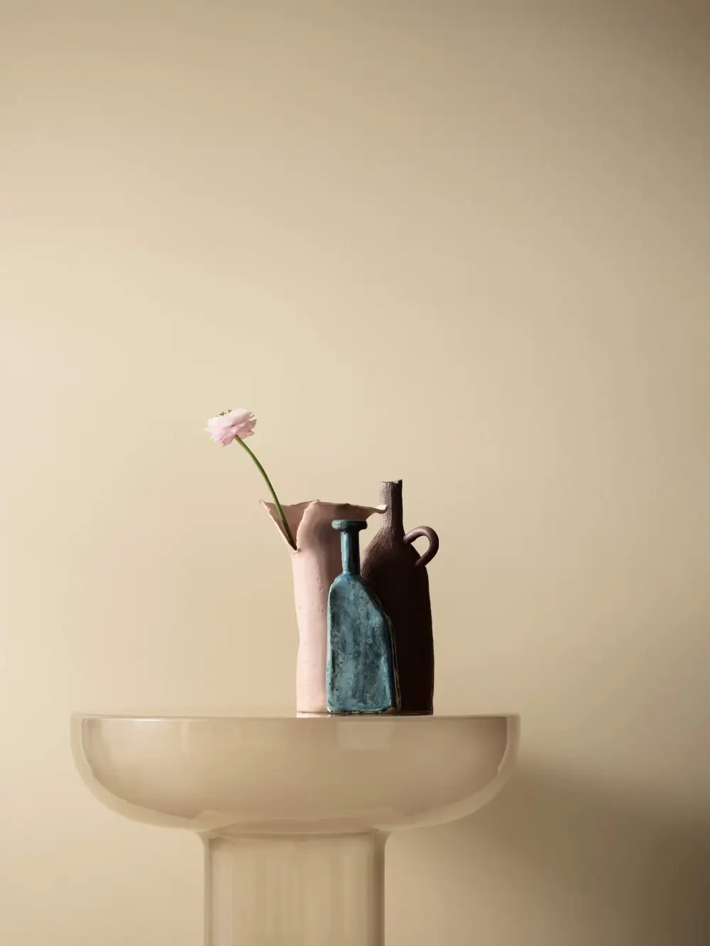
A new shade of blue is born: explore the color North, the perfect, vibrant baby blue tone.
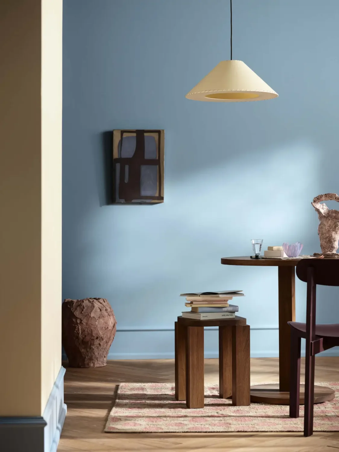
Experiences: Colors That Become Our Own
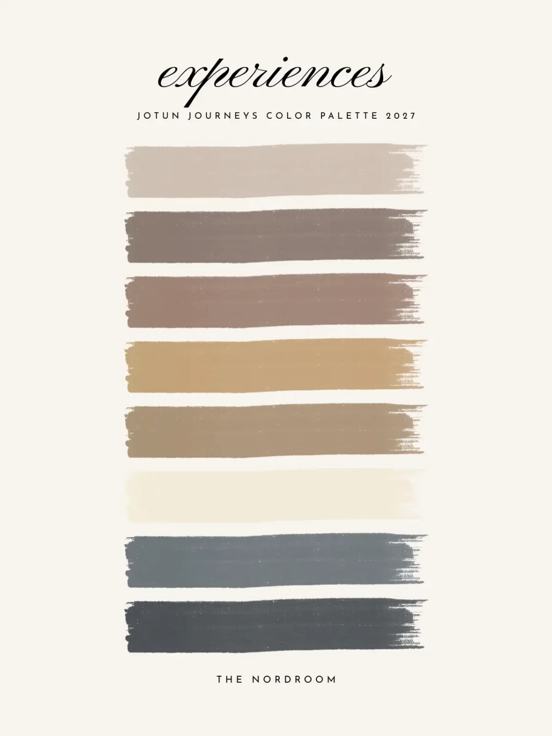
Experience often brings a stronger sense of confidence. We become more comfortable trusting our instincts and choosing colors because they feel right, rather than simply following a particular trend.
The Experiences palette reflects this confidence through balances, classic shades that add depth and harmony to the home. Midnight blue meets golden brown in a sophisticated combination, while the remaining tones create a feeling of relaxed elegance.
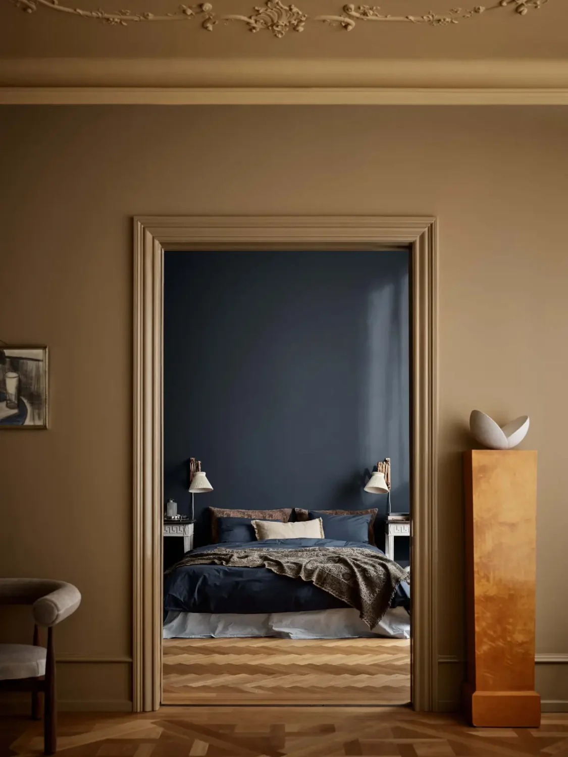
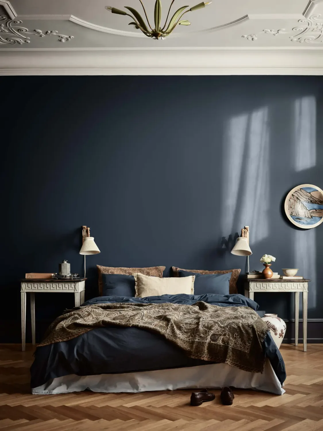
Muted, warm blue tones like Midnight Blue and Byge fill bedrooms and living spaces with a sophisticated calm. True elegance speaks in a low voice, creating an atmosphere that feels both cozy and sophisticated.
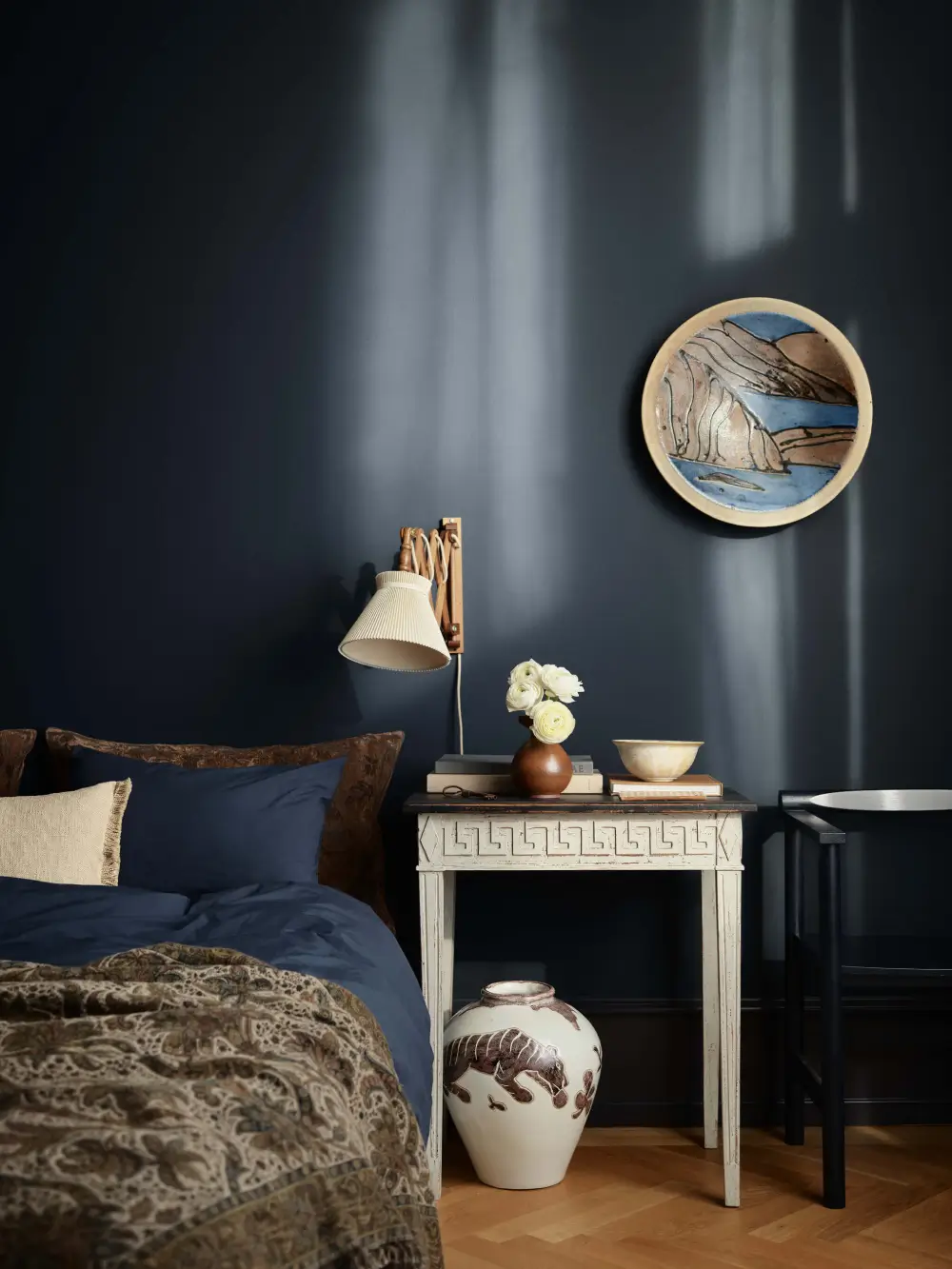
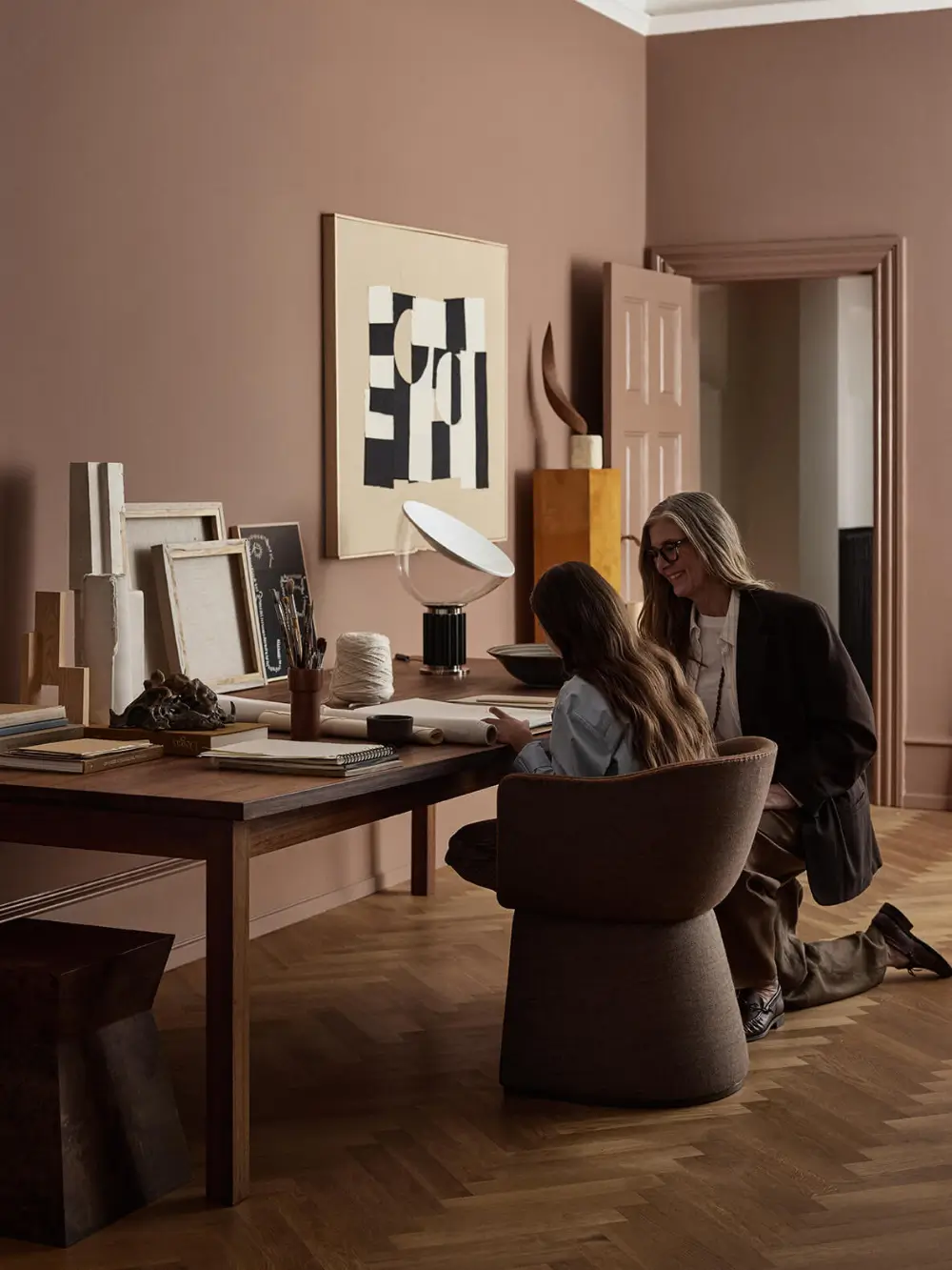
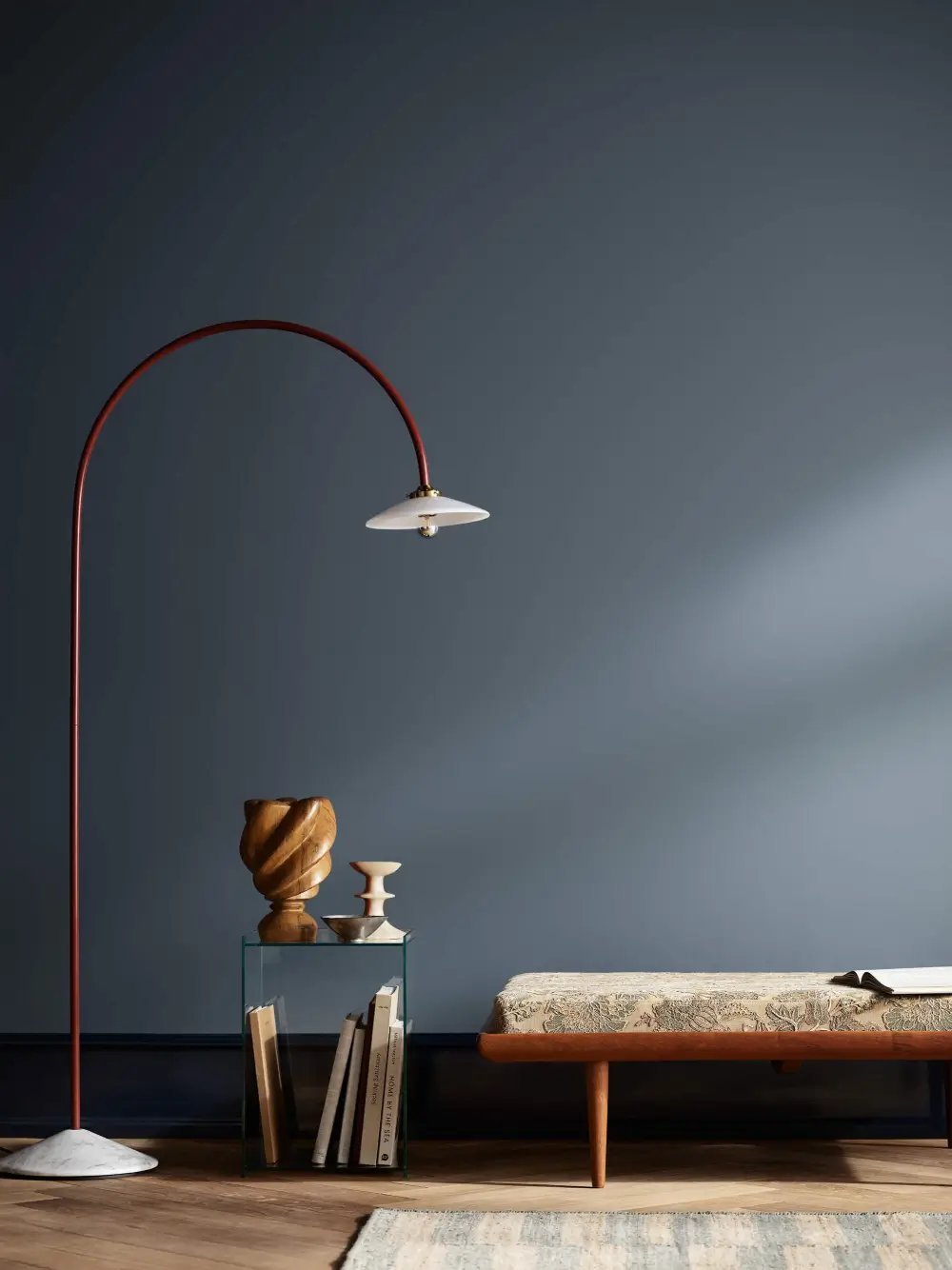
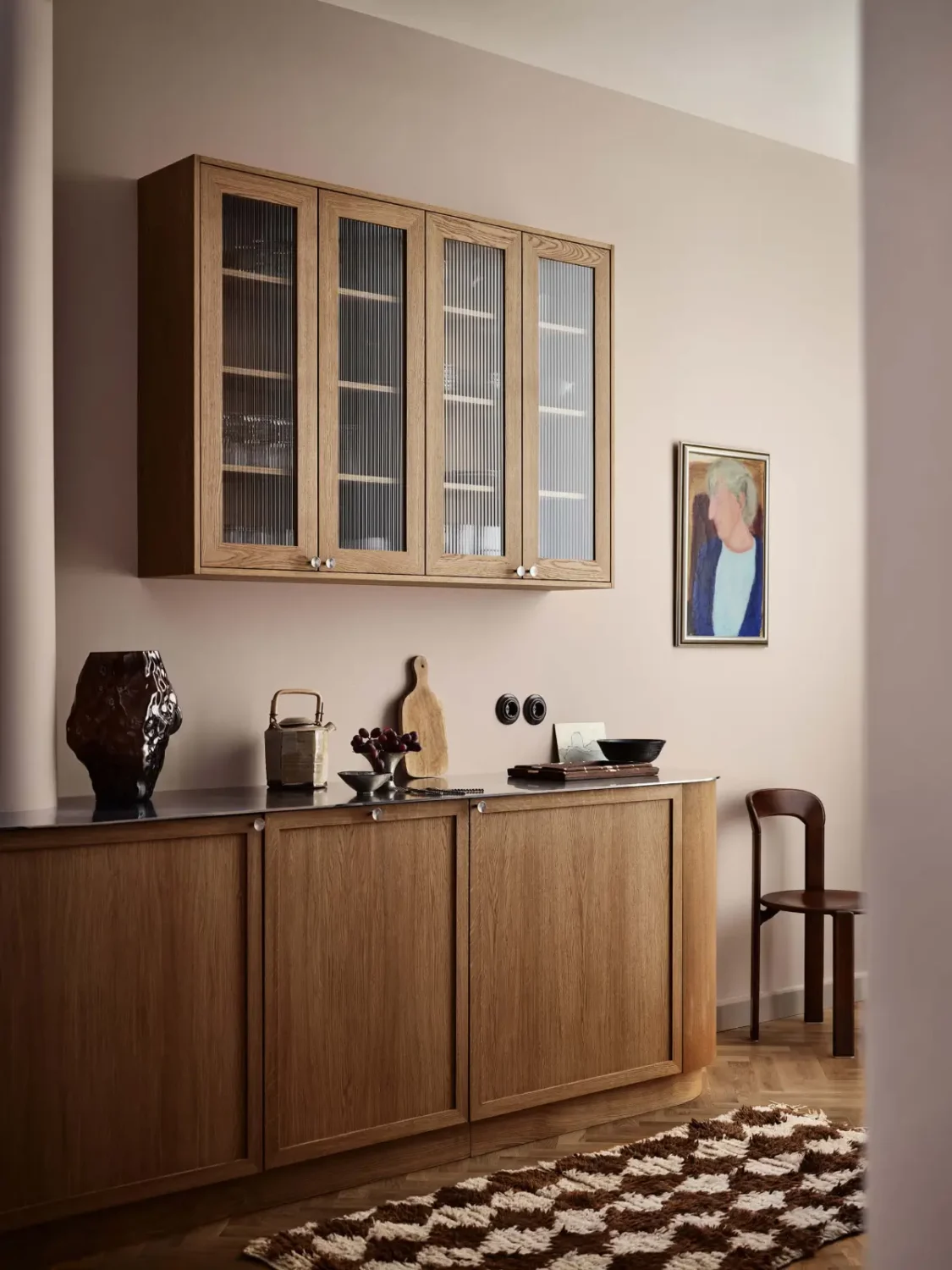
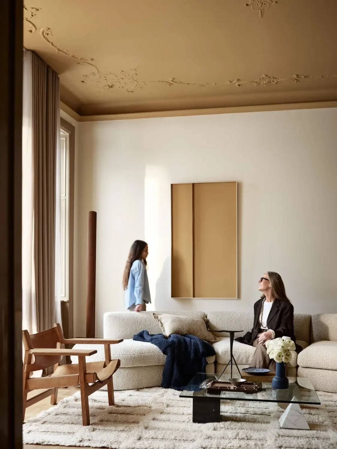
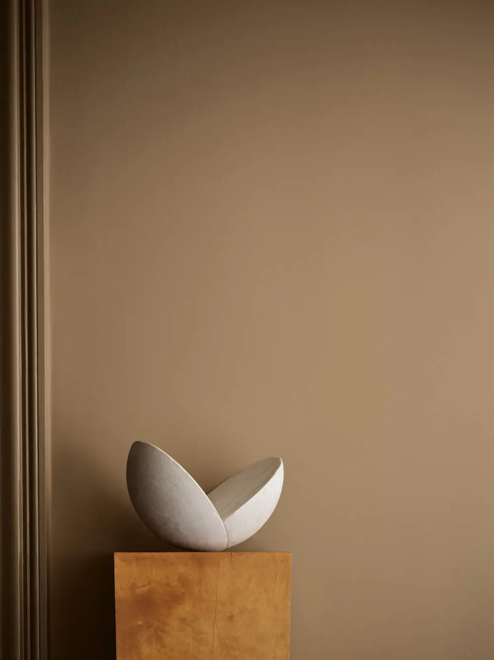
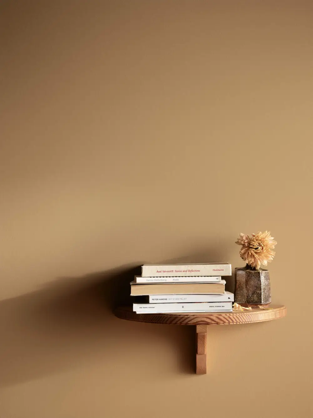
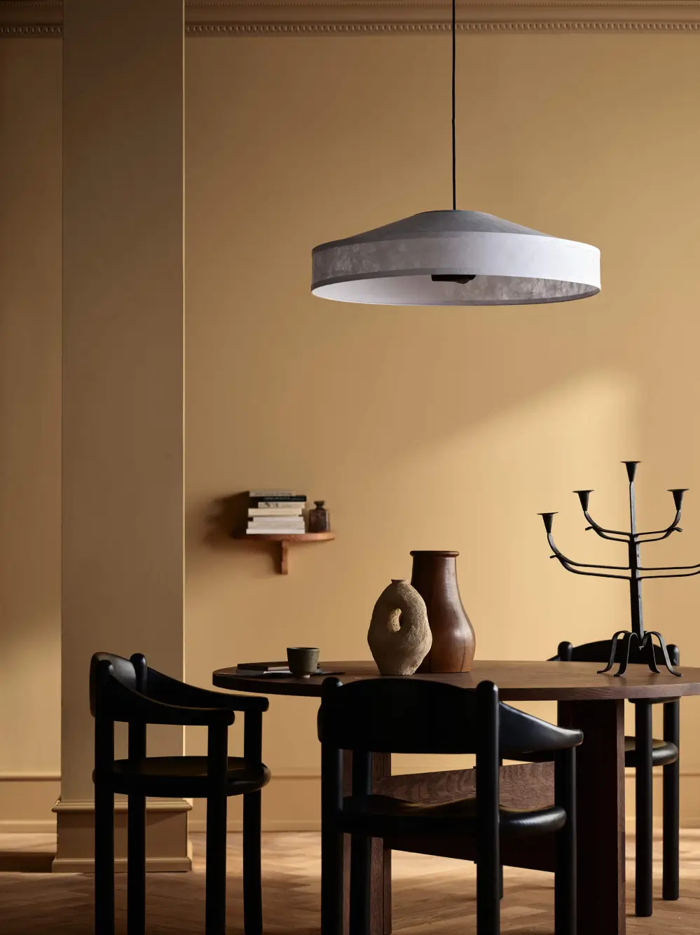
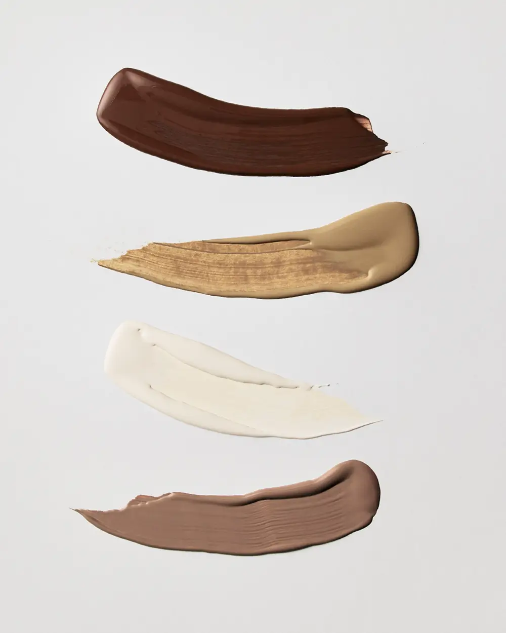
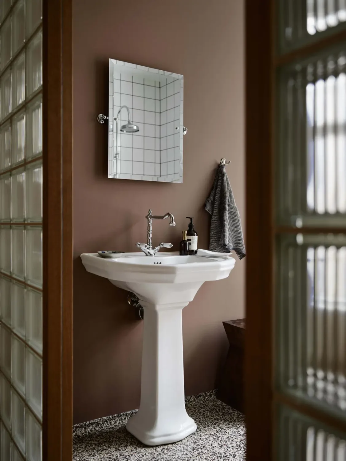
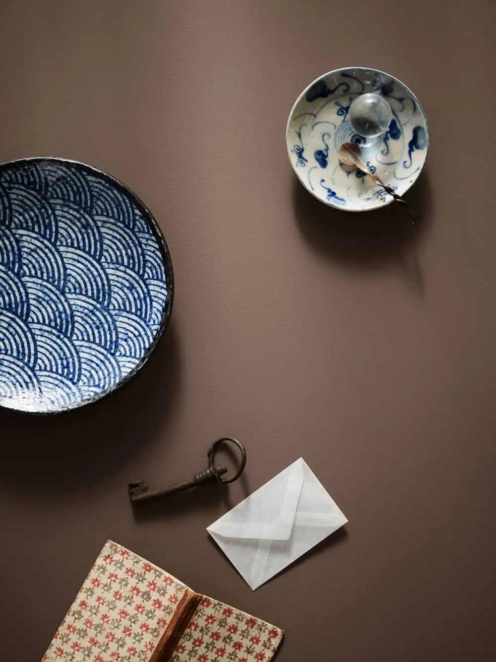
Earth tones are more than just colors; they are sensual anchors for a space. They soften hard edges, slow down the rhythm of a space, and create a sense of warmth and belonging.
Shades like Earthy, Mellow, and Chalky Charcoal add a sophisticated balance of comfort, whether used throughout a room or layered as subtle, warm accents alongside neutral favorites.
Creating a Personal Color Journey
Although JOURNEYS is organized into three themes, the collection ultimately invites experimentation. The palettes offer a helpful starting point, with shades chosen to complement one another, but there are no fixed rules.
You can mix colors across the three themes to create combinations that reflect individual memories, discoveries, and experiences.
“Our color chart, JOURNEYS, is a personal invitation to discover your own color journey. To return to your roots, relive your memories, celebrate your discoveries, and acknowledge the colors that have helped shape you,” says Jotun’s global color team. “Color choice is, after all, one of the most personal decisions we make, and one of the most universal languages we speak.”