Jotun LADY Color Palette 2025: Nuances
A website often featuring Scandinavian homes should also publish the color trends of a Scandinavian paint brand. Norwegian paint company Jotun doesn’t have a Color of the Year, but they have released a 2025 Color Palette called “Nuances.” Jotun’s color map celebrates and explores the subtle role of shades divided into six color palettes.
We are always influenced by the colors around us – consciously and unconsciously – and they affect our emotions and energy levels. Even shades that don’t look powerful or colorful will influence our lives. The Jotun 2025 Color Palette “Nuances” celebrates and explores these subtle nuances. It’s the small details, the nuances of everyday life, that help lift our spirits and shape our days.

The strong and more colorful colors have a clear visual effect, but even the most subtle shift in shade can affect the whole atmosphere. Consciously and unconsciously, we are touched by the colors and shades around us. In our homes, and on the walls, it is often the small nuances that make the big difference,” says Lisbeth Larsen, Global Color Manager at Jotun

The Jotun LADY Color Palette 2025 presents thirty colors divided into six color families: blue, green, gray, yellow, peach, and beige. Each color family consists of four shades of varying intensity, as well as an accompanying accent color.


This color palette is created to inspire and guide you in making personal color choices and putting together nice-looking color combinations. It is based on the basic principles of color theory, providing concrete recommendations for creating exciting depth in the interior. By using shades from the same color family in varying intensities, you can easily transform the atmosphere and depth of a room.
Jotun Lady Blue Color Palette
A lovely blue palette with bright, fresh – and dusty, greenish blue tones. The colors will give your home a lovely, cool feeling. The greenish undertones will give the colors a golden calm, which means that they do not appear too cool. Paint your home in beautiful layers of blue shades and get a feeling of a calm sea.
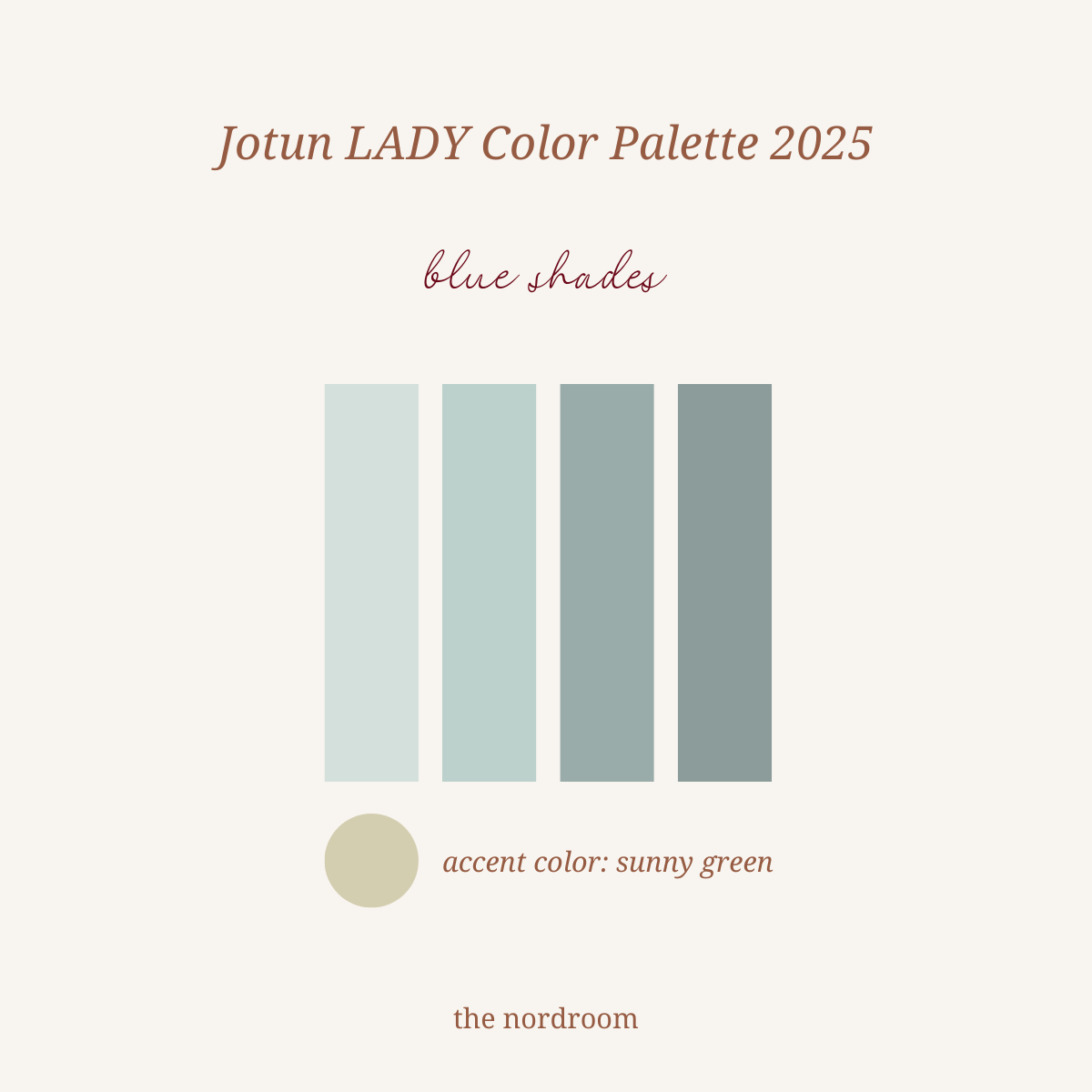
Sunny Green is a beautiful golden green colour, reminiscent of light filtering through green foliage on a sunny day. It’s soft and dusty, but it will give the atmosphere a lovely, lush feel. Sunny Green will light up the whole room by itself. Beautifully combined with white or it will make the greenish blue color shine.

A calm bedroom has been created using LADY’s 6236 Darjeeling, paired with a striped ochre yellow bedding and natural materials in the furniture.


Jotun Lady Green Color Palette
Soft, natural shades of green create a calm and unifying atmosphere, while leaving room for bolder accents and details to be highlighted. The background forms the backdrop that allows selected elements to shine.
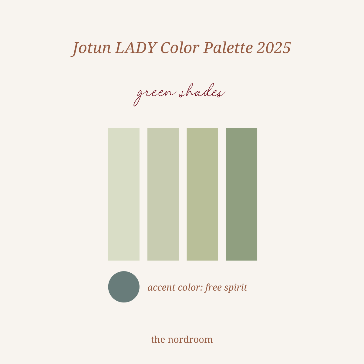
Free Spirit is a green-blue that brings freshness, liveliness and a touch of coolness to the home. It’s stunning on its own, but also works as an attractive accent color. If you want to play with contrasts and accents, look at colors like green, orange, peach, ochre, green and pale yellow.
It can also be used as a cool, darker contrast to a tone-on-tone green-blue palette, or as a nice touch to neutral colors such as golden gray or beige tones.

The living room is painted in JOTUN LADY 6167 Spring Breeze, 8596 Sunny Green, 7718 Secret Green, and 9918 Klassisk Hvit.
The moment you enter a room, the encounter of the senses with the surroundings will define your experience of the room. Muted neutrals and bright, natural green colors are both refreshing and calming. At the same time, they make room for more playfulness, bold accent colors and unique interior objects. The background sets the rhythm, the foreground carries the tone.


Jotun Lady Gray Color Palette
Monochrome color shades create a feeling of calm and focus. A single color in different shades and intensity opens up a world of possibilities. These gray tones are hand-picked for a discreet, soft and subdued atmosphere.
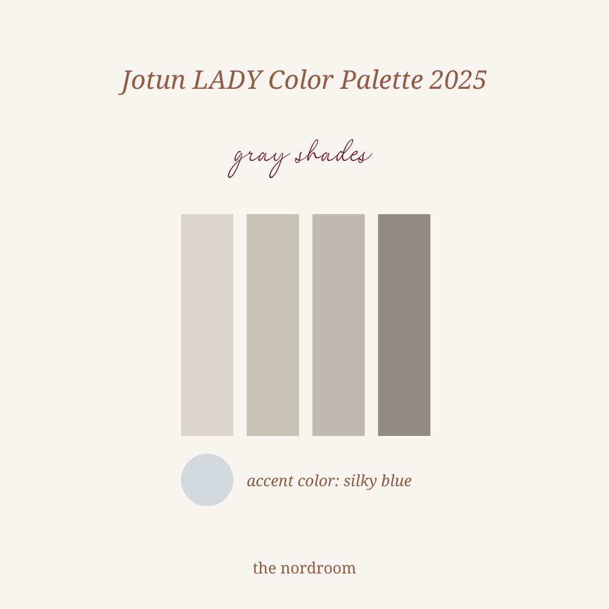
Silky Blue is a light blue color with a reddish undertone. It is silky and soft, yet clean and cool. It will freshen up an entire room or add some crispness as an interesting accent, or as a fresh contributor to a pastel scheme.

A living room painted in JOTUN LADY 12314 Grey Touch paired with a large jute rug, wooden floor, and white furniture.


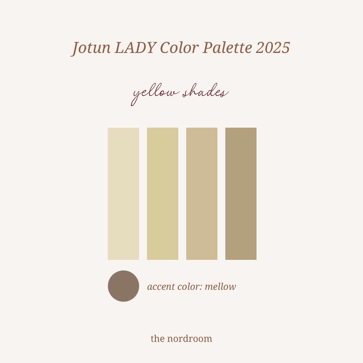
Mellow is elegant, soft and velvety – this is an enchanting blend of red and brown, reminiscent of muted plum. Mellow can create a refined contrast to the muted pinks, as well as being a companion to the muted yellows, but also bring depth and elegance to neutral colors such as warm gray and golden beige tones.


A dining room with walls painted in JOTUN LADY 6167 Spring Breeze, and the ceiling is painted in JOTUN LADY 8124 Malmo.


Jotun Lady Peach Color Palette
Rustic pink tones, peach, coral, and terracotta can fill the home with a sense of earthy stability – thoughtful, elegant, and unpretentious.
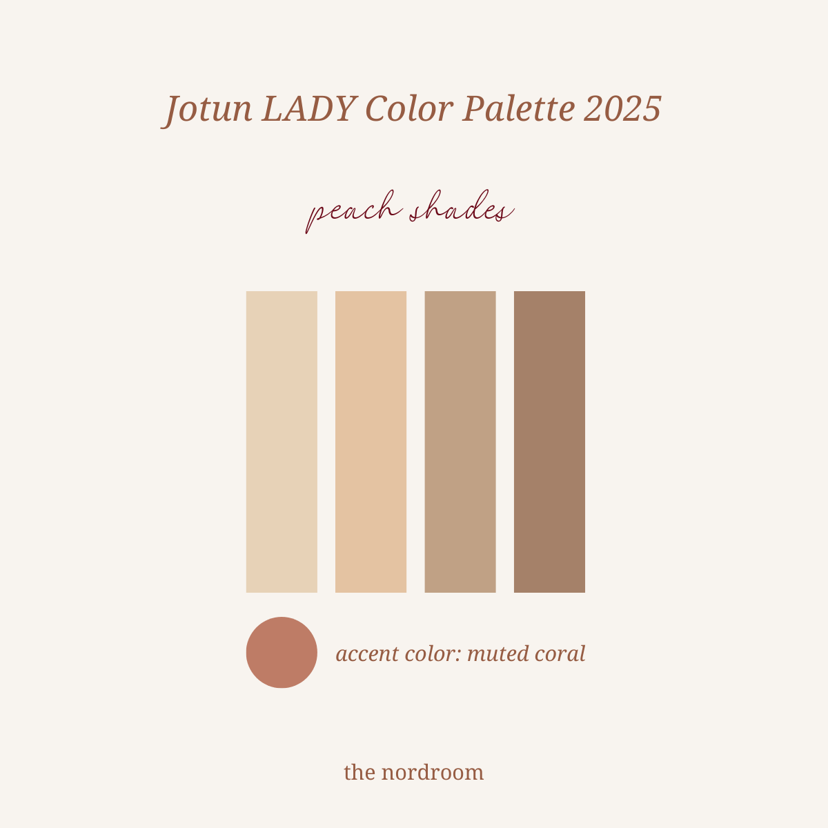
The color Muted Coral is an elegant, uplifting red color that brings energy into the room. Combine it with golden fresh tones, whites, greens, greys, rustic pinks and acid yellows to achieve a beautiful yet playful color scheme. Let Muted Coral sparkle your everyday life with its presence!


The bathroom features a JOTUN LADY 12074 Peachy ceiling.


A warm look for a bedroom painted in JOTUN LADY 12074 Peachy. Let the colors create an atmosphere of nurturing calm. Monochrome walls provide focus and contrast to furniture and interiors. Reddish peach shades are the perfect partner to sand colors and muted gray neutrals.

The peach shades color palette accent color: JOTUN LADY 20217 Muted Coral.


Jotun Lady Beige Color Palette
Beige shades are the perfect way to fill a room with warmth and softness – the ideal wall color in bedrooms for warm awakenings and in rooms where you want to combine comfort and relaxation.
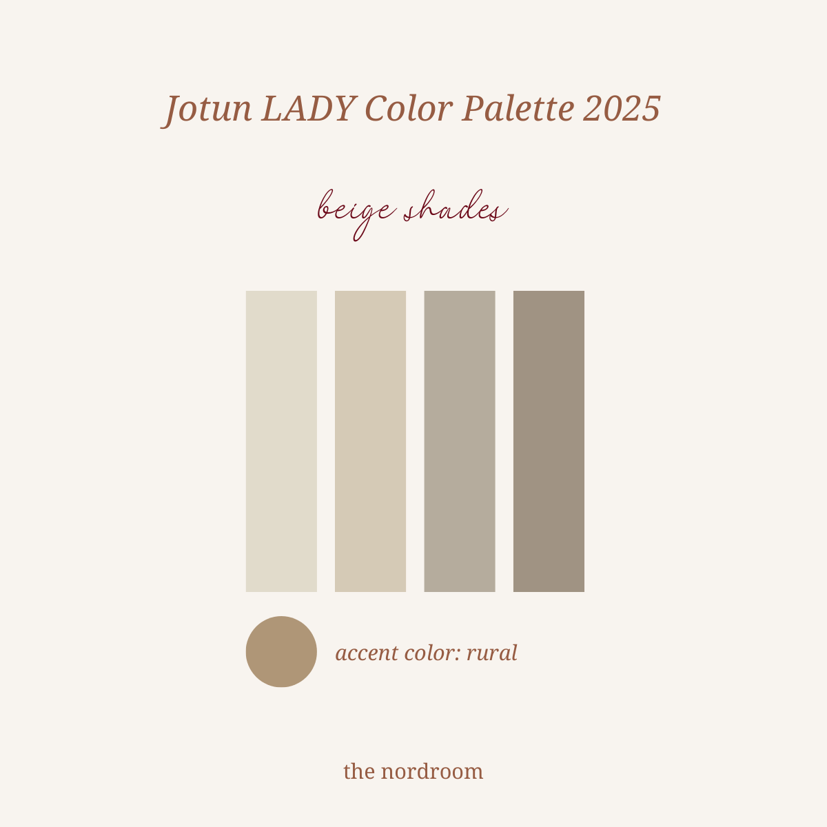
The muted golden color Rural is a grayish, rustic peach color. It is a wonderful addition to a neutral palette, such as golden beige or warmer grey. It will create a warm and rustic atmosphere, increase the feeling of earthiness and it will give the room a completely new dimension, in a beautiful and discreet way.


styling by Kråkvik & D’Orazio and photography by Anders Schønnemann and Morten Rakke
Are you looking for the Color of the Year 2025? The Nordroom has a handy blog post featuring every 2025 color that has been announced, which will lead you to their accompanying blog posts with more information and inspirational images.
