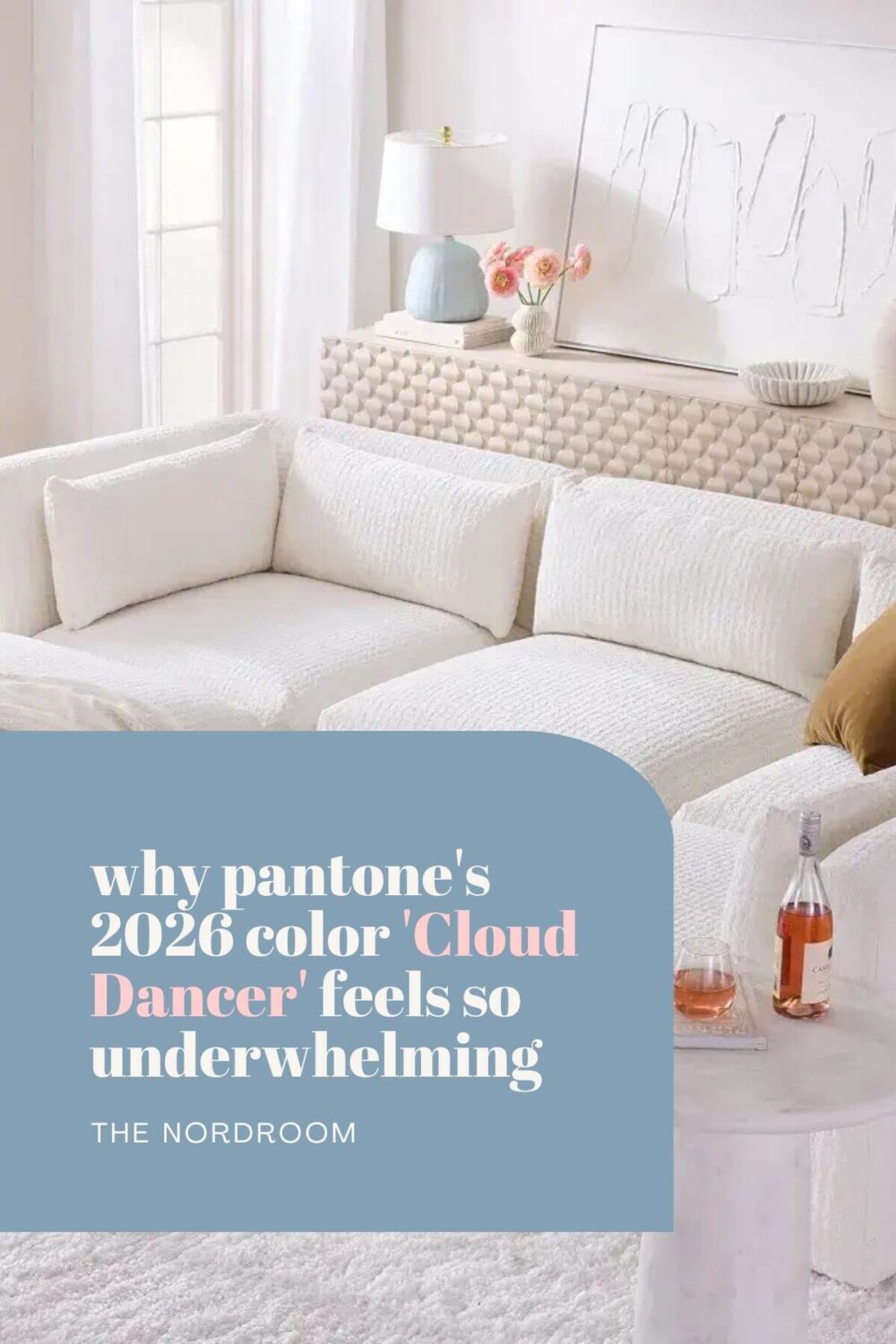
Why Pantone’s “Cloud Dancer” Feels Underwhelming as the 2026 Color of the Year
For more than two decades, Pantone’s Color of the Year has been a cultural moment, part forecast, part design directive, part public mood reading. Which is why the 2026 announcement left many of us disappointed.
While Pantone presents Cloud Dancer as a calming white, a “breath of calm in a noisy world,” a fresh start, a blank canvas for creativity, I find this choice disappointing on several levels. Or as Miranda Priestly would sarcastically say, Groundbreaking…
In a year where many other color authorities and designers are pushing for richness, warmth, and grounded expression, Cloud Dancer feels overly safe, bland, and curiously uninspiring.
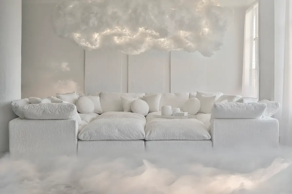
A Color of the Year That Doesn’t Feel Like a Color
Pantone describes Cloud Dancer as a symbol of serenity and a “blank canvas for new beginnings.” That sounds lovely. But in practice, Cloud Dancer feels like a retreat into safe territory, especially since the design world is moving toward more emotionally resonant palettes.
What the Broader 2026 Interior Trends Are Saying (and Why They Clash with Cloud Dancer)
According to The Nordroom’s 2026 trend roundup, as well as the color-of-the-year picks from several major paint brands, the overall direction for interiors in 2026 leans heavily away from stark whites and minimalism. Instead, the mood is:
- Warmth, earthiness, and grounding: neutrals inspired by sand, soil, and natural materials dominate.
- Rich, soulful tones that evoke nature, heritage, and emotional depth, like greens, ochres, soft browns, muted ochres, mineral-based hues, and verdant or organic shades.
- Textural, layered interiors over pared-back minimalism.
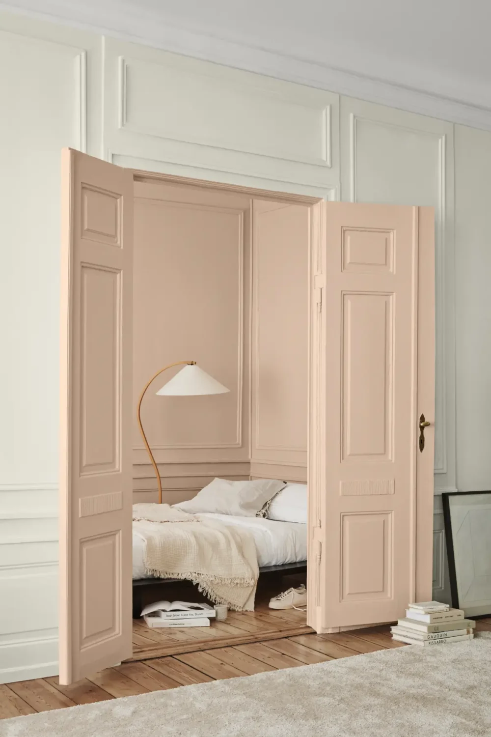
Take Sherwin-Williams’ Universal Khaki, a warm, timeless neutral that is grounded, earthy, and natural, offering a sense of comfort. Or if you prefer richer tones, Behr’s Hidden Gem is a smoky jade that resonates with the resurgence of natural and moody palettes.
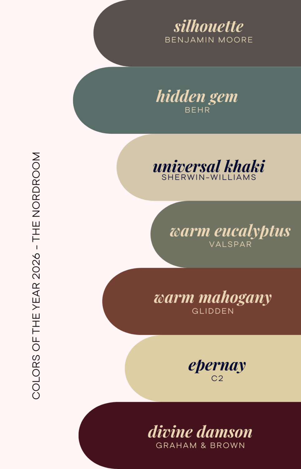
The color trend we’re seeing is a turn toward grounded calm, natural warmth, and quiet sophistication. Pantone’s Cloud Dancer feels like a couple of steps back, reminding us of the year of stripped-back gray/white minimalism that I certainly do not want back.
Why Cloud Dancer Feels Like a Missed Opportunity
- It misses the emotional depth many designers are chasing. The current trend is toward colors that ground, envelop, and evoke mood, like earthy ochres, mineral greens, and smoky blues, rather than an airy white that feels neutral to the point of forgettability.
- It feels like playing it safe. A white “canvas” doesn’t challenge or inspire; it empties rather than engages. In a year when many brands pick colors meant to nurture, calm, or express personality, white feels like the easiest, but also the least ambitious choice.
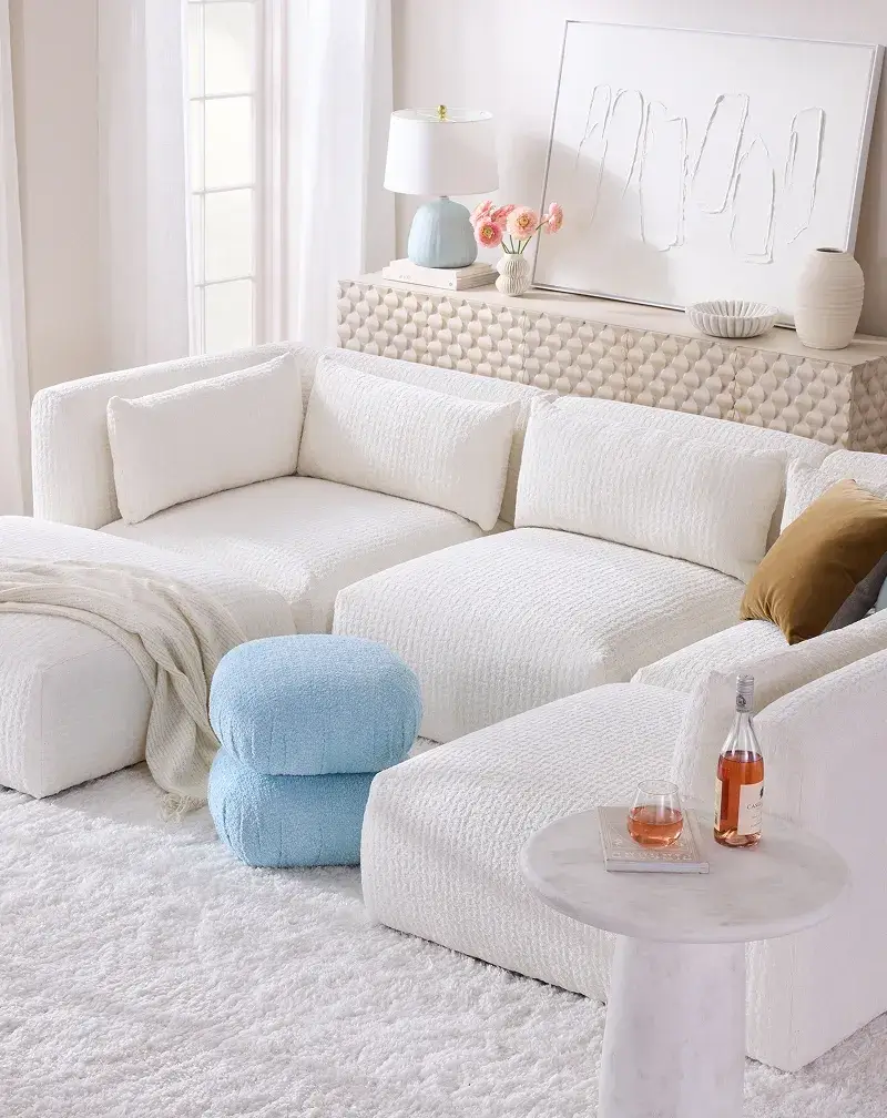
- It lacks warmth and a sense of place. Part of the appeal of the 2026 trend toward “grounded calm” is the tactile and sensual nature of warm neutrals and nature-inspired tones. Cloud Dancer feels cold and detached in comparison.
- It conflicts with the broader shift away from “cool minimalism.” Many design voices now steer away from crisp whites and greys, in favor of more human-centered, cozy, soulful atmospheres.
- It offers little visual identity. As a “blank slate,” Cloud Dancer doesn’t communicate personality or mood, leaving a space feeling more generic than expressive.
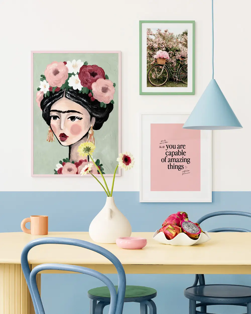
How Can You Make Cloud Dancer Work
Of course, you can use Cloud Dancer in any interior space; after all, white has been used forever in interior spaces. But make it supporting and not the star of the room.
Cloud Dancer can serve as a neutral backdrop in a layered, texture-rich interior space. Pair it with heavy textiles, wood, metal, and decor to let the other colors and materials shine.
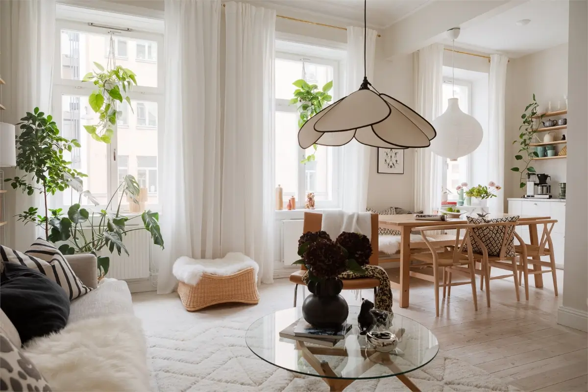
In small spaces or homes with limited natural light, Cloud Dancer’s brightness can help create a sense of openness and airiness, but make sure to pair it with warm materials and accent colors.
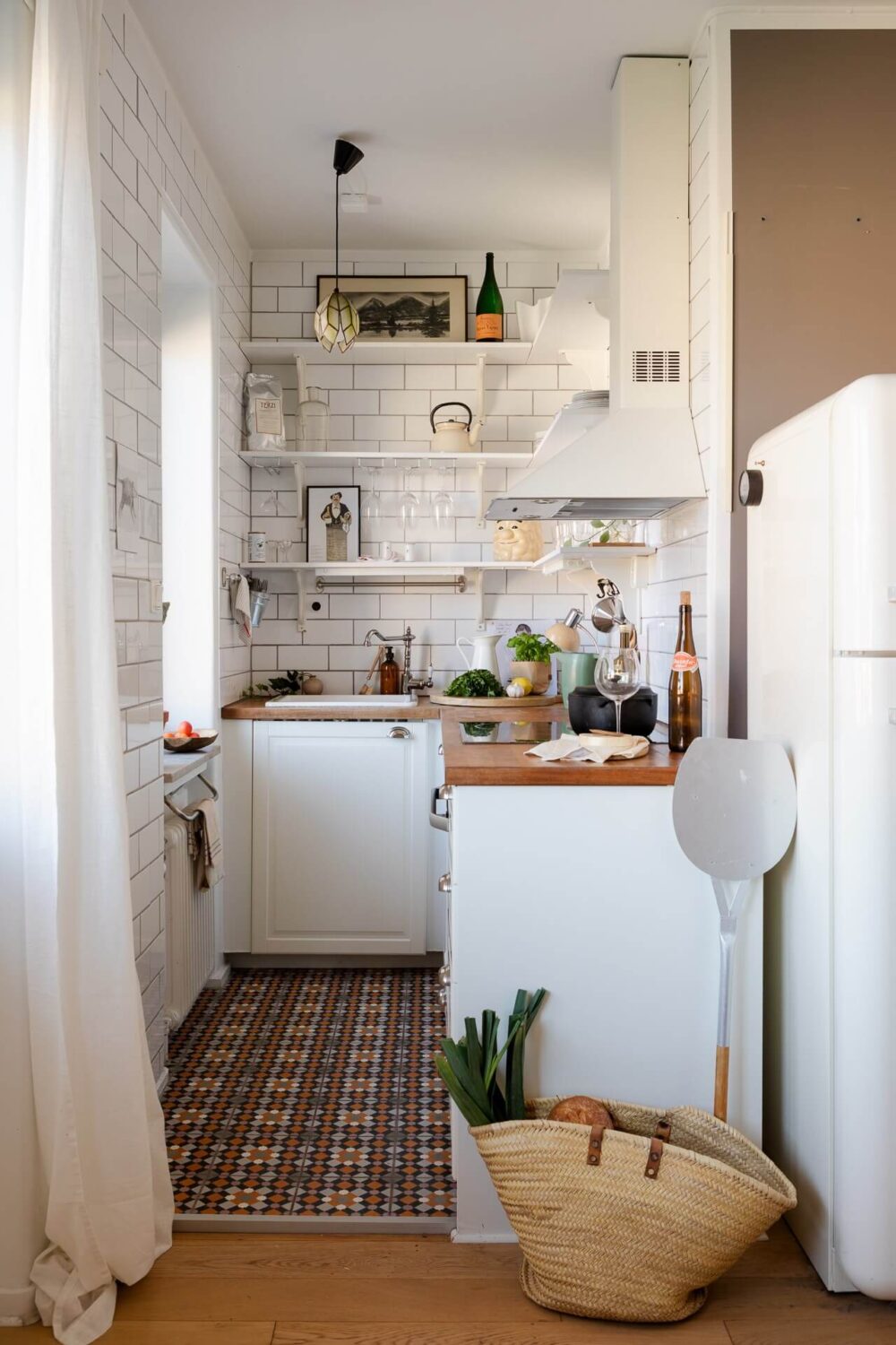
A white kitchen paired with earthy-toned and patterned floor tiles and a warm wooden countertop.
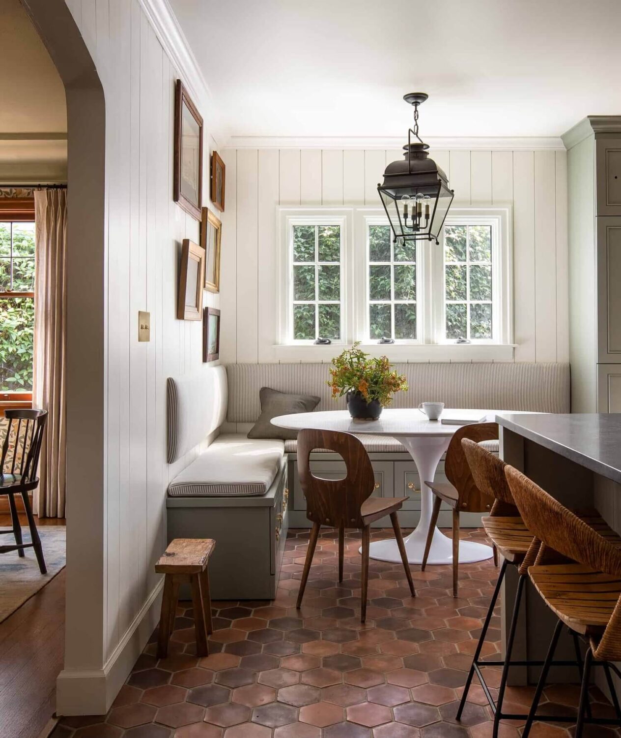
Designer Heidi Caillier paired fresh white paneling with warm terracotta floor tiles, wooden chairs, patterned bench cushions, and a sage green bench with brass handles. This is the perfect example of how you can use a shade like Cloud Dancer and make it rich, warm, and textured.
And do you long for the days when Scandi-minimalism was the height of interior design? Then Pantone’s Cloud Dancer will be right up your alley.
But Wait, It’s Not All Bad
Pantone may have chosen Cloud Dancer as their (underwhelming) color of the year 2026. But they also released seven color palettes (all of which include Cloud Dancer), with colors that may catch your eye, from powdered pastels to atmospheric blue tones and organic shades.
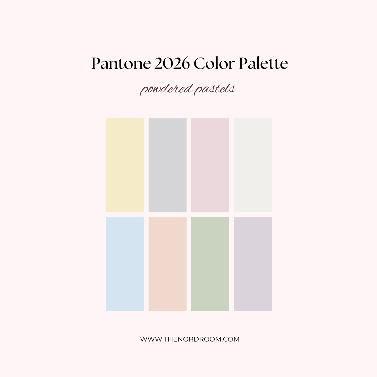
ice melt – peach dust – almost aqua – orchid tint
The Powdered Pastels palette features pastel and neutral tones compatible with Cloud Dancer, offering subtle, nuanced, pleasing, understated shifts in hue.
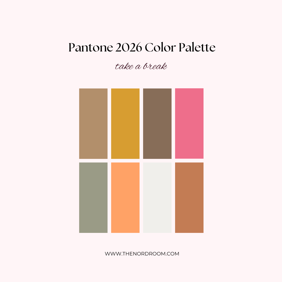
tea – papaya – cloud dancer – caramel
This playful palette includes a variety of hues that invite us to take a break (from Cloud Dancer, probably).
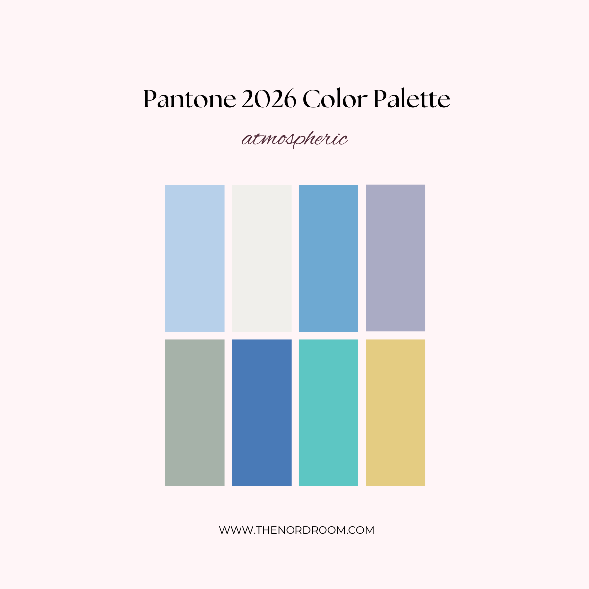
aqua gray – regatta – rinsing rivulet – dusky citron
This palette is inspired by clear breezy skies, a misty sunlight, and blue-green inspired by water.
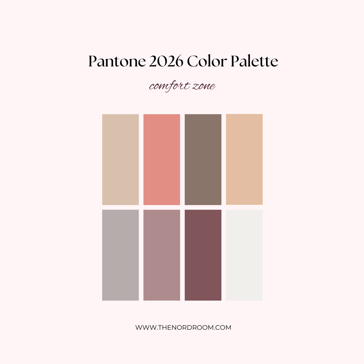
ashes of roses – woodrose – rose brown – cloud dancer
The natural and organic colors in the Comfort Zone palette are more in line with 2026 color trends; they are embracing, inclusive, and restful.
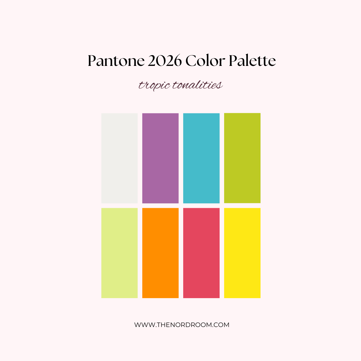
sunny lime – bright marigold – paradise pink – blazing yellow
The Tropic Tonalities palette is inspired by the tropics, featuring vivid colors like a turquoise ocean, a citrusy refreshment, bright florals, and exotic birds.
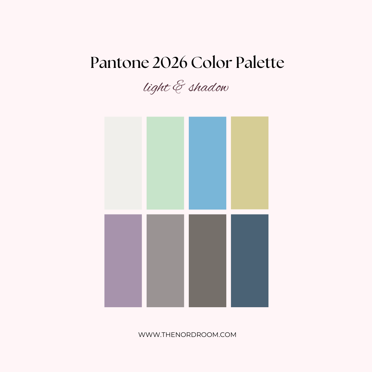
quiet violet – cloud cover – hematite – blue fusion
The Light & Shadow palette features softened hues that ultimately dissolve into shadowy shades, producing an easy and effortless contrast in color.
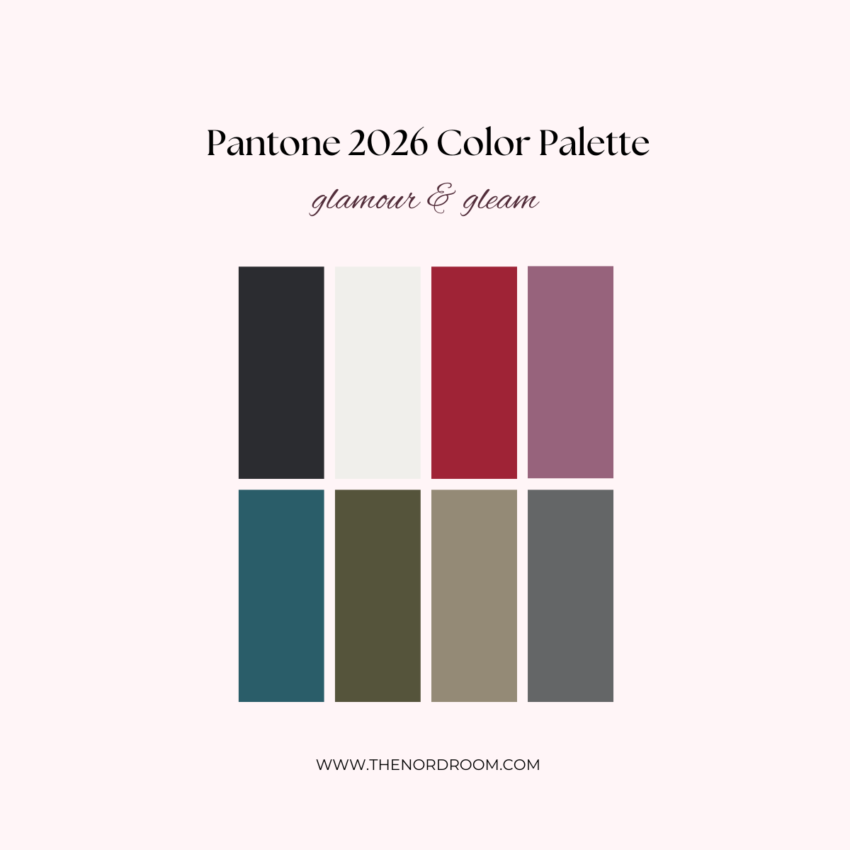
dragonfly – graphite – satin slipper – micron
The yin of white inevitably meets the yang of black, accented by a sultry lipstick red. The glamour is heightened by vintage wine and teal, glimmering graphite, shimmering grey, and a silvery satin metallic.
It will come as no surprise that I think Pantone’s Color of the Year 2026, Cloud Dancer, is not a bold and visionary choice but a step back in color design. Where other color institutes or paint brands opt for warmer, grounded, deep, and nature-inspired hues, Pantone’s Cloud Dancer is, in my opinion, a boring and safe choice.
That said, if you’re drawn to minimalist, light, airy spaces, or you want a neutral base for stronger accent colors, it might still find a place in your home.
