The 2026 Color of the Year (with Color Palettes & Inspiration)
We’re heading toward the new year, and while the color trends for this year are still fresh in our minds, we are going to look at the 2026 colors. This year (2025), we are surrounded by muted, earthy tones and rich, vintage-inspired shades that are a nice balance of warm, natural, and sophisticated. But I want to look forward to 2026 and see if we can predict the 2026 Color of the Year.
It is always an exciting time when leading paint brands and Pantone announce the new Colors of the Year. These colors are often paired with beautiful color palettes, complementing the trending colors and helping you create a beautiful, harmonious color palette in your home.
Note: This article shows the color of the years when all the paint brands announce them. I have also created a prediction for the 2026 colors and palettes. This prediction (based on fashion trends and previous interior color trends), with colorful interior inspiration, is found after the announcement of the 2026 COTY’s.
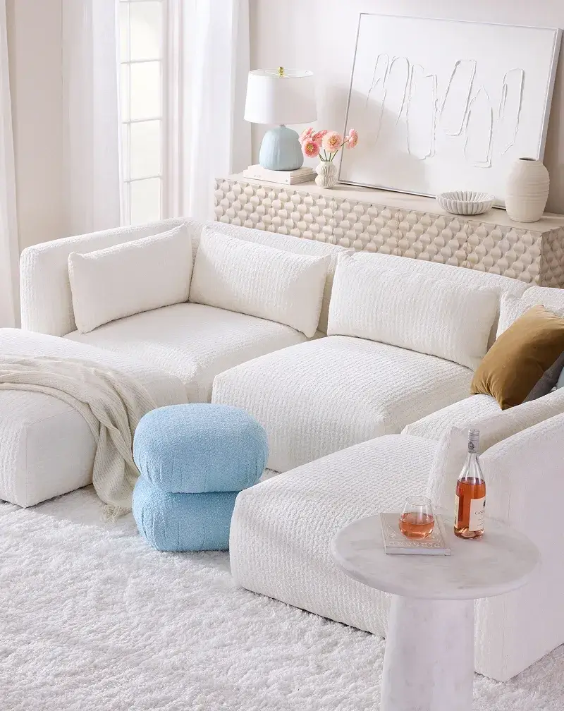
Pantone Color of the Year 2026: Cloud Dancer
Pantone has announced “Cloud Dancer” as its 2026 Color of the Year. They describe the colors as “a breath of calm in a noisy world,” a fresh start, a blank canvas for creativity. I can say a lot about this color that isn’t even a color, and you can read more about that in this article.
All I will say here is that it’s a huge disappointment. Is this a clear indicator that a recession is to come? Or are the color experts at Pantone just completely uninspired? I don’t have the answer, but where other color experts go for rich, warm, and grounded hues (as you can see in this article), Pantone opted for bland, uninspiring, and cold, and that’s the last thing we need right now.
Read more: Why Pantone’s “Cloud Dancer” Feels Underwhelming as the 2026 Color of the Year
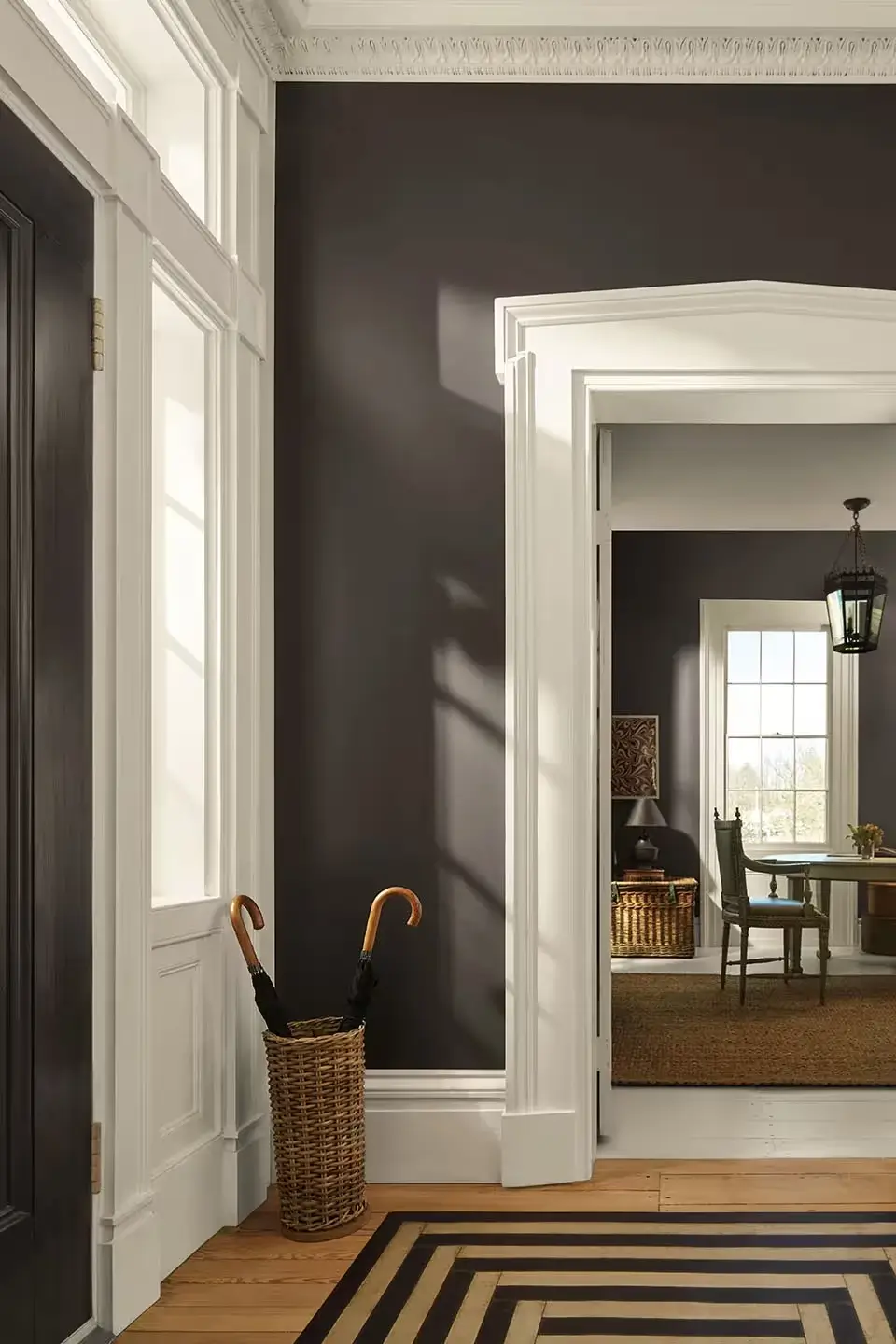
Benjamin Moore Color of the Year 2026: Silhouette
Benjamin Moore has chosen Silhouette as its Color of the Year 2026. Silhouette is a deep color that is an alluring mix of rich espresso hues with subtle notes of charcoal.
The color bridges classic refinement and modern edge, inspired by the renewed appreciation for tailored fashion, craftsmanship, and enduring style. Silhouette is part of the color trends 2026 palette, consisting of eight hues, showcasing a perfect balance of enchanting pales and handsome midtones.
Read more: Benjamin Moore’s 2026 Color of the Year: Silhouette Brings Sophisticated Depth to Every Space
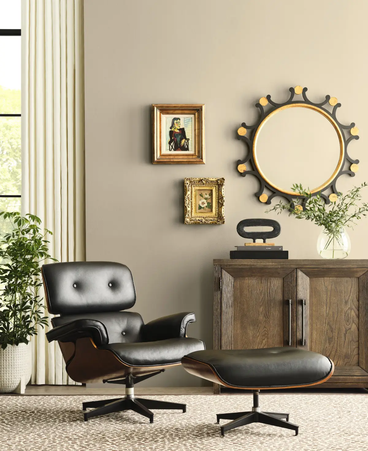
Sherwin-Williams Color of the Year 2026: Universal Khaki
Sherwin-Williams and HGTV Home by Sherwin-Williams have collaborated to choose Universal Khaki as their Color of the Year 2026. This warm, grounded neutral embodies timeless elegance and everyday versatility.
Read more: Universal Khaki: Sherwin-Williams’ 2026 Color of the Year Is a Grounded Neutral For the Future
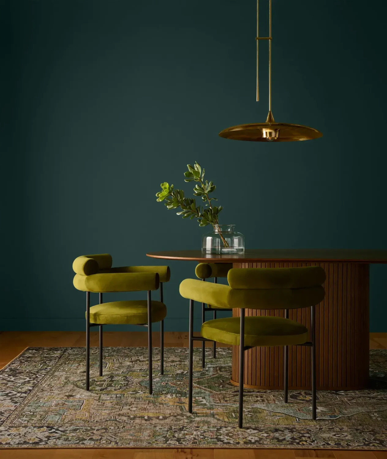
Behr Color of the Year 2026: Hidden Gem
Behr is the first paint company to announce their 2026 color of the year. After the neutral shades from 2023 and 2024 (Blank Canvas and Cracked Pepper) and the bold 2025 color “Rumors” they have opted for another rich and deep hue in Hidden Gem.
BEHR’s Hidden Gem is smoky jade with an air of mystery and sophistication, creating spaces that feel grounded and alive. It is a versatile color that works well as a stand-alone color pop or in combination with other hues, which you can see in the color palette created by Behr.
The blue-green shade also pairs beautifully with natural materials like wood and leather or with metallics like brass, making it a perfect shade for the kitchen.
Read more (with interior inspiration): Behr Color of the Year 2026: Hidden Gem
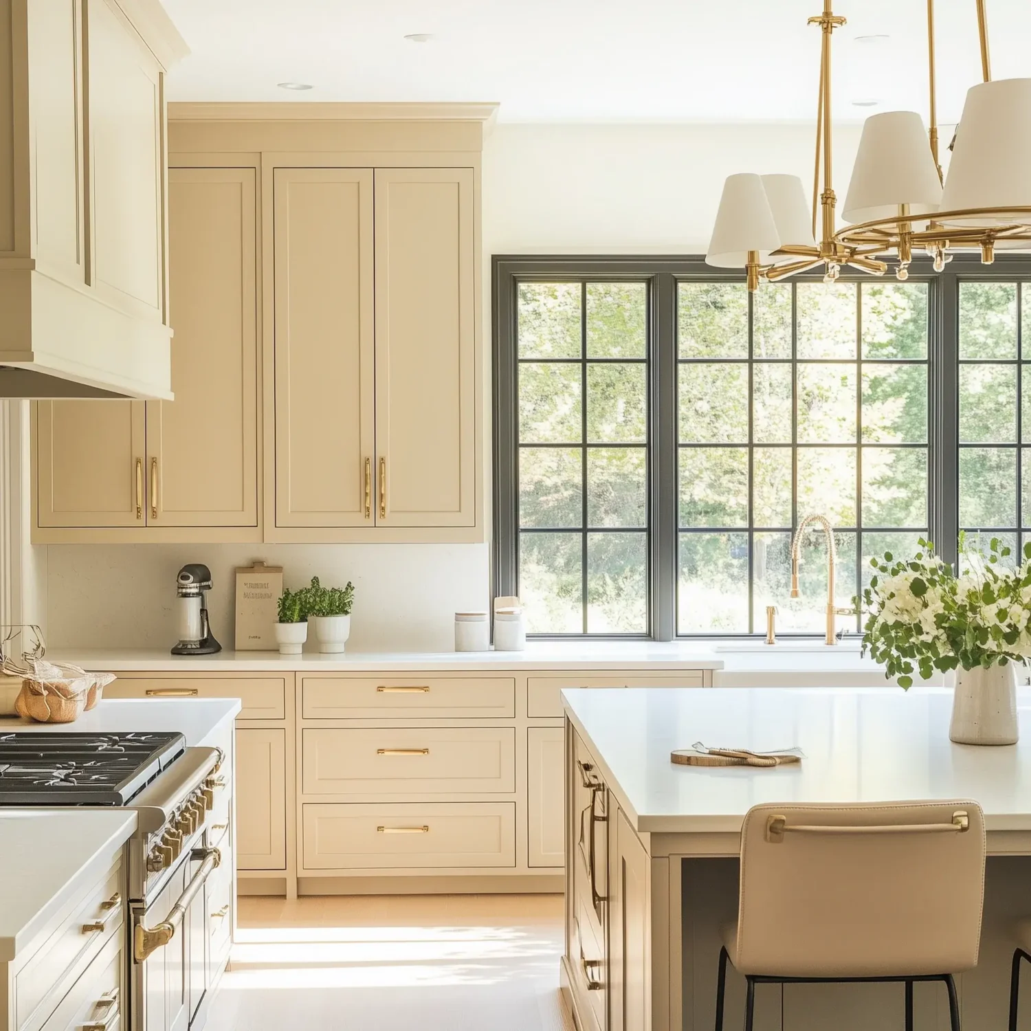
C2 Color of the Year 2026: Epernay
C2 Paint has announced Epernay as its 2026 Color of the Year. This refined, earthy soft ochre with hushed mineral undertones feels both rediscovered and eternal.
Epernay channels the warmth of golden stone, the muted richness of vintage textiles, and the celebratory sparkle of champagne. It is at once opulent and understated, a color that brings a sense of quiet luxury to any space.
Read more: C2 Color of the Year 2026: Epernay
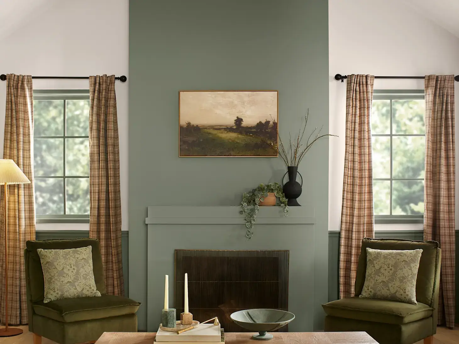
Valspar Color of the Year 2026: Warm Eucalyptus
Valspar is the second paint brand to have chosen a green hue as its Color of the Year 2026. After the blue shades Encore and Renew Blue, they have selected another classic, natural hue in Warm Eucalyptus.
Warm Eucalyptus is an earthy and elegant green shade that is considered to be a “new neutral”. The color is easy on the eyes and soothing to the soul, and can be used for indoor and outdoor spaces.
Read more: Valspar Color of the Year 2026: Warm Eucalyptus

PPG & Glidden Color of the Year 2026: Warm Mahogany
PPG & Glidden continue with their desire to add more warmth to your interior spaces with their 2026 color of the year, “Warm Mahogany,” a rich, grounded red that’s bold enough to draw immediate attention and reserved enough to make a timeless statement.
Following Glidden’s 2025 color Purple Basil, the paint company has chosen another warm hue. This time, we go from purple to a deep red shade that adds warmth to any room in the house.
Read more: Glidden & PPG Color of the Year 2026: Warm Mahogany
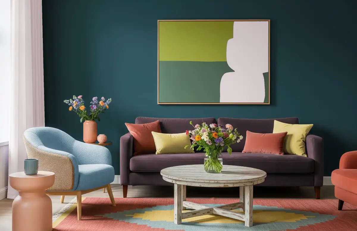
Dunn-Edwards Color Trends 2026
Dunn-Edwards Corporation announced its 2026 Color Trends, a curated palette featuring nine trending hues and eight versatile neutrals.
Drawing inspiration from the natural world, the collection blends warm and cool tones to create balance, harmony, and a sense of quiet joy within any space.
Read more: Dunn-Edwards Color Trends 2026: A Quiet Joy
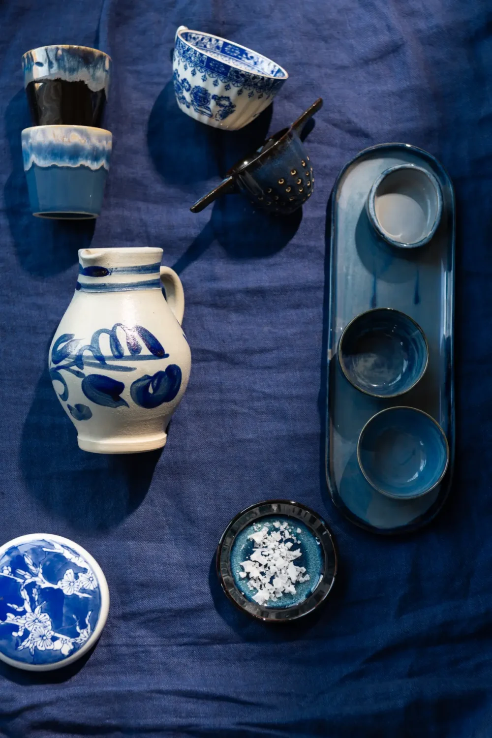
Dulux Color Family of the Year 2026: Shades of Blue
For 2026, the AkzoNobel paint company Dulux (Flexa in some countries) hasn’t chosen one color of the year; instead, they have opted for a color family for 2026, and they have chosen blue.
Their Color Family of the Year 2026 highlights three shades of blue: a deep blue, a light and airy blue, and a vibrant blue shade. These shades come with complementary color palettes, helping you to create a colorful and timeless home.
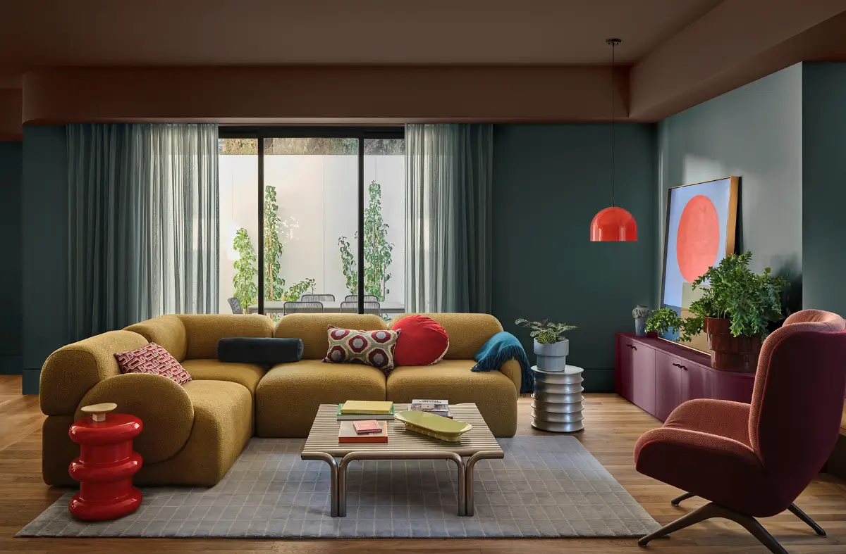
In addition, Dulux has also created a color trends 2026 forecast, including three color palettes reflecting a global mood shaped by uncertainty, digital fatigue, and a growing desire for wellness and reconnection.
Read more: Dulux Color Family of the Year 2026: Shades of Blue or Dulux Color Trends 2026: Tenderness and Connection Through Color
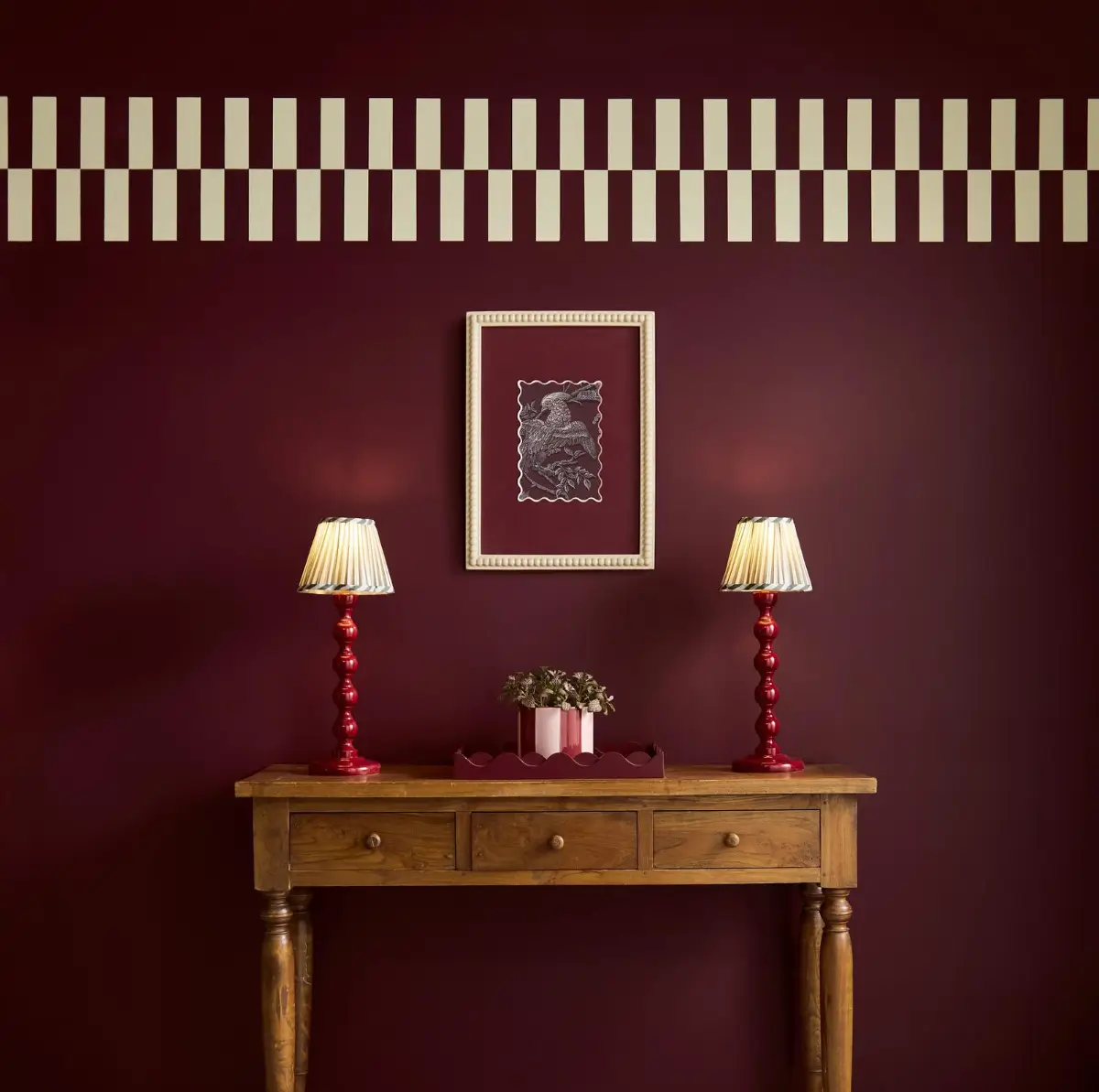
Graham and Brown Color of the Year 2026: Divine Damson
Graham and Brown have announced their Color, Design, and Mural of the Year for 2026. For the Color of the Year 2026, they opted for Divine Damson, a deep, luxurious damson hue inspired by the lush tones of ripe figs and plums, offering a rich pigment that evolves with the light.
Read more: Graham & Brown Color and Design of the Year 2026
See also: The Color Trends for 2026: A Return to Nature, Balance, and Grounding
The Nordroom’s 2026 Color of the Year Prediction
Before we discuss the color prediction for 2026, let’s examine the prediction for 2025, which showed a correlation between the Fashion Week color palettes and interior color trends.
The Color of the Year 2025
Last year, I looked at the color trends reports from New York and London Fashion Week to determine the color trends for the upcoming year. The result was clear: there is a huge correlation between fashion and the interior world, and this includes the overall color palette.
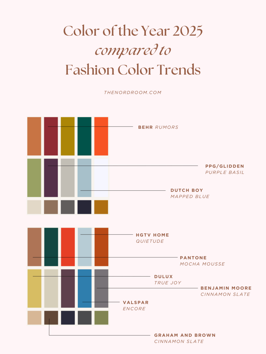
Almost every Color of the Year chosen by leading paint brands like Sherwin-Williams, Benjamin Moore, and the Pantone Color Institute was shown in the New York and London fashion week color trend reports.
The color palettes also share a lot of similarities, which suggests that the design world is heading toward a specific color trend.
The 2026 Trending Color Palettes
Let’s move on to next year. What will be the trending colors for 2026? As we look at the color trends emerging from London Fashion Week (LFW) and New York Fashion Week (NYFW), they tell a story of contrast, heritage, and innovation. For 2026, we see a dynamic interplay between familiar, grounding hues and bold, expressive tones that encourage personal creativity and reinvention.
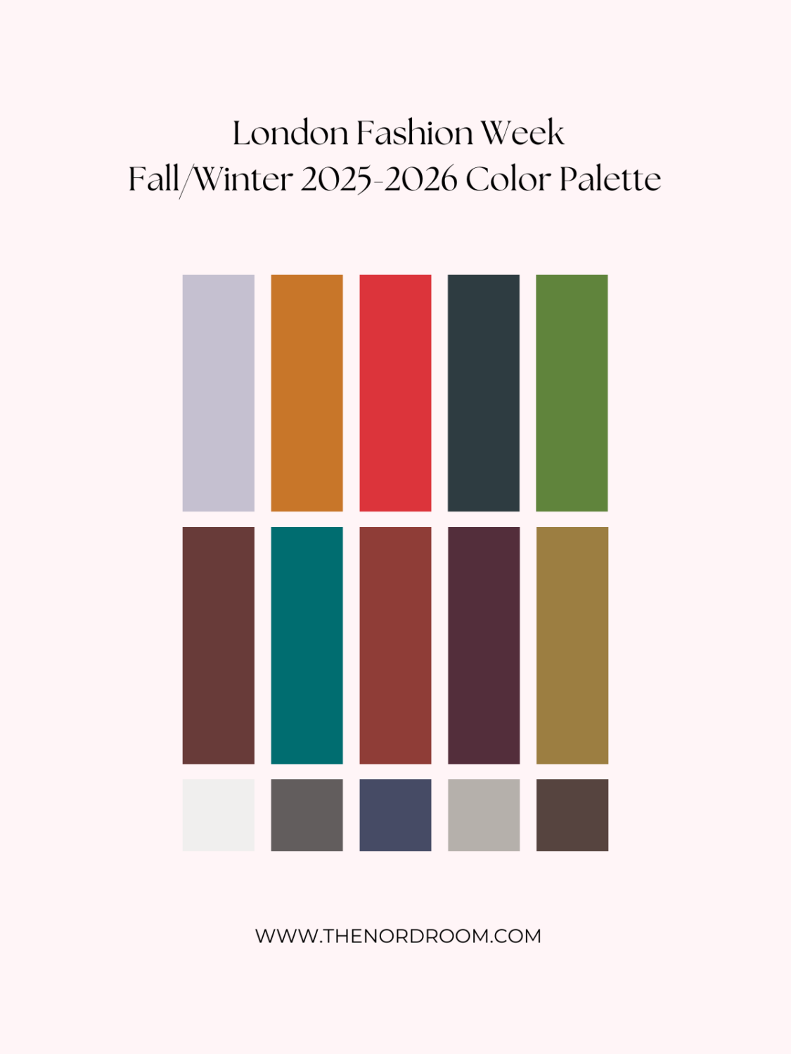
middle row: Hot Chocolate – Fanfare – Chili Oil – Fig – Bronze Mist
bottom row: Whispy Clouds – Dark Gull Gray – Crown Blue – Cumulus Cloud – Chocolate Martini
According to the Pantone Color Institute, the LFW Autumn/Winter 2025-2026 palette harmonizes creativity, heritage, and change. The trending colors of 2026 reflect a deep, moody atmosphere enriched by elegantly grounded earth tones and ethereal, vaporous whispers of tinted whites and lavender blues. The addition of brighter reds and eco-inspired blues and greens injects vibrancy, enhancing the seasonal story with an aura of innovation.
The key color trends for the London Fashion Week Color Palette
- Rich, Earthy Tones: Deep burgundy, warm rust, mustard yellow, and dark olive provide a foundation of timeless sophistication.
- Muted Neutrals: Soft grays, creamy whites, and deep browns balance the intensity of richer hues.
- Bold Contrast: Striking reds and moody greens bring a sense of drama and depth to the palette.
The London color selection is all about depth, contrast, and an invitation to experiment with a refined yet adventurous approach to color design.
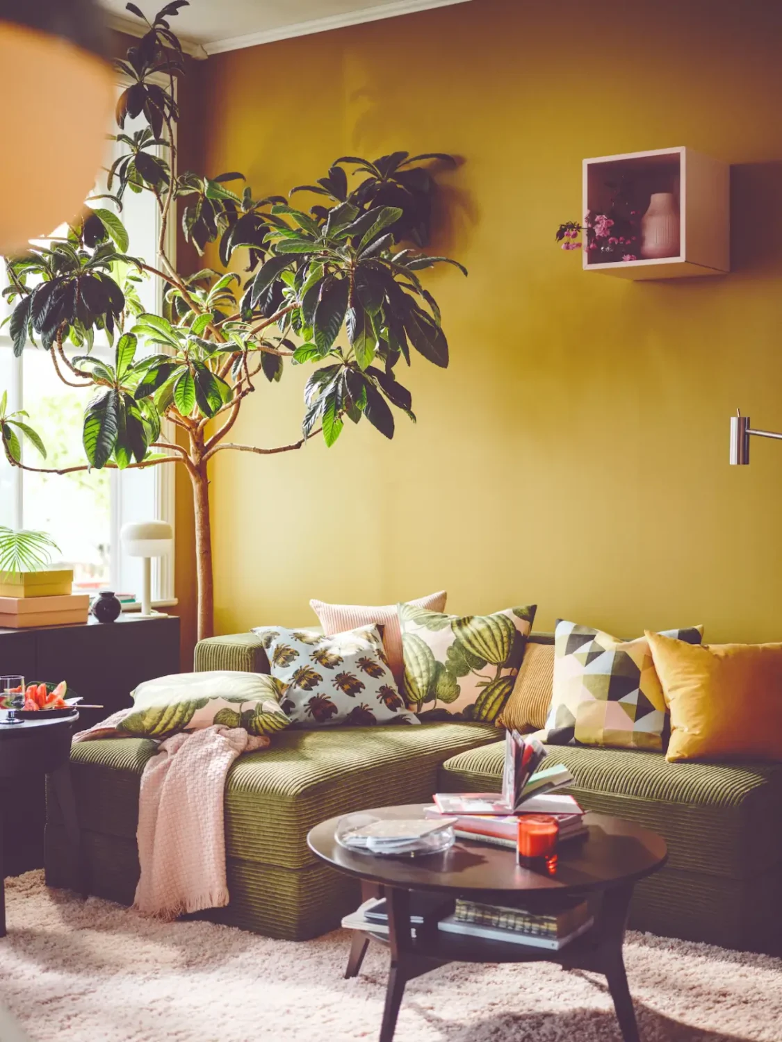
A golden yellow like Bronze Mist adds a warm and luxurious look to your interior, as pictured here in this IKEA living room, where it’s paired with a green corduroy sofa and colorful cushions.
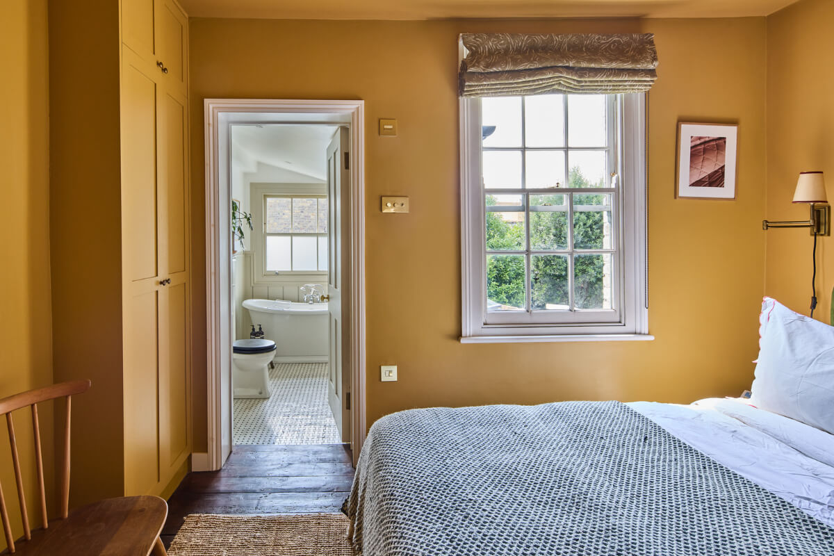
Farrow & Ball’s ‘India Yellow’ is one of the most popular paint colors for interior spaces. This bedroom in a London cottage is color-drenched in this golden yellow hue, creating a warm and rich bedroom space.
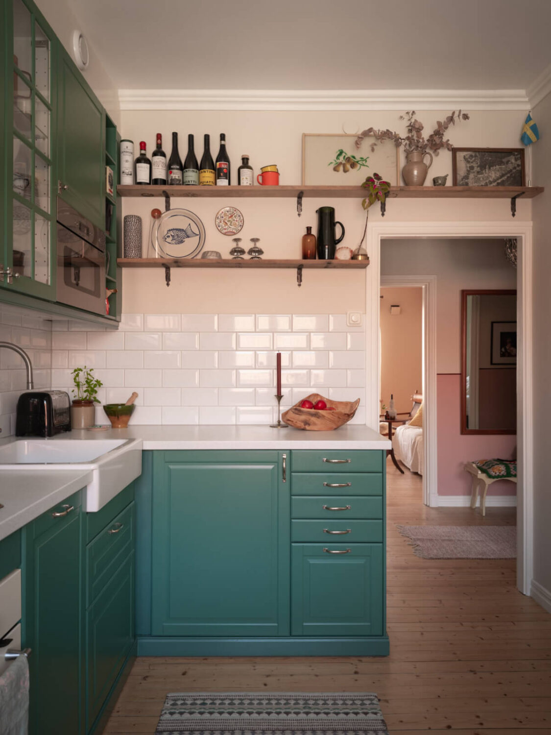
Green never goes out of style, and the London color palette features a lovely teal green shade that will look great in your kitchen.

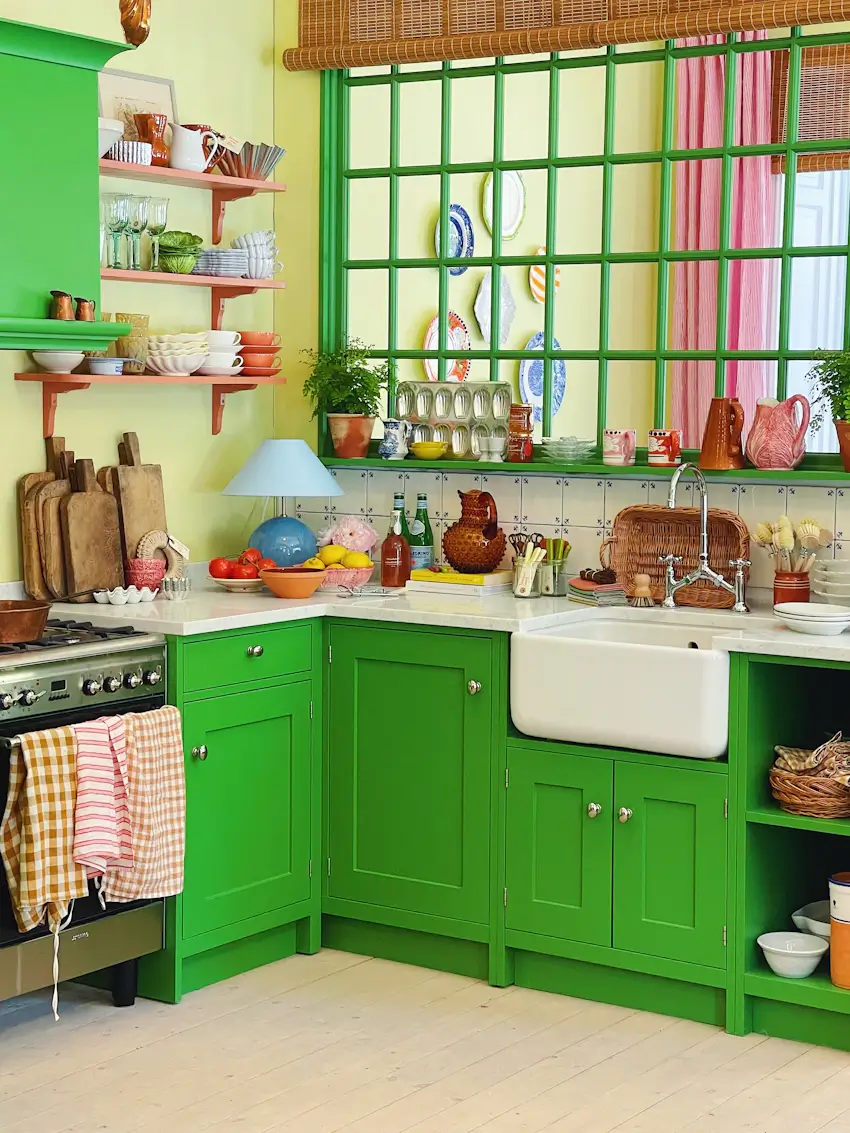
But you can also go bolder. The London color palette features the Salted Lime color, a bolder green shade.
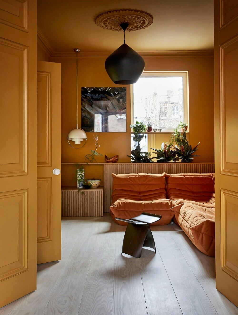
The deep, earthy orange shade Dessert Sun adds a warm atmosphere to your home. Go all-in by painting the walls and ceiling or use it as a warm accent color.

The London palette features deep, earthy shades that can easily be incorporated into your interior by adding new textiles. This Swedish bedroom with earthy-colored bedding creates an instant cozy vibe.
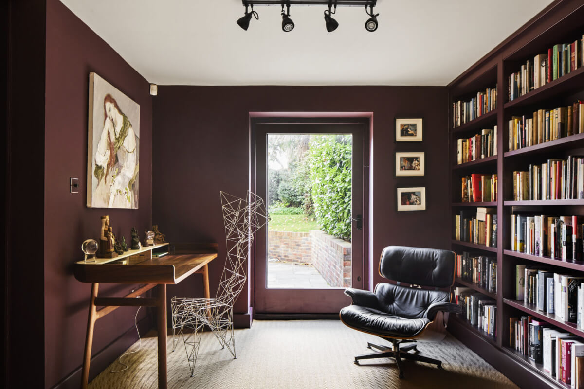

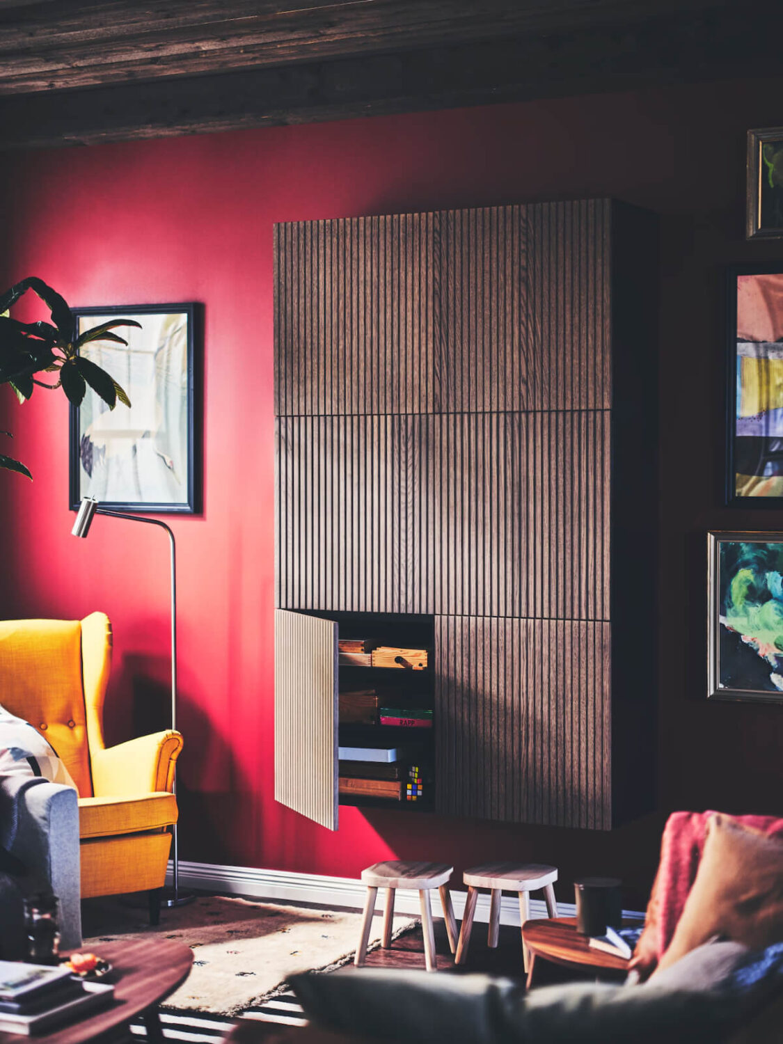
Both palettes feature the cheerful orange-red shade Poppy Red. This is a wonderful accent color, as you can see in this kitchen, where the inside of the cabinets is painted in a similar orange-red shade.

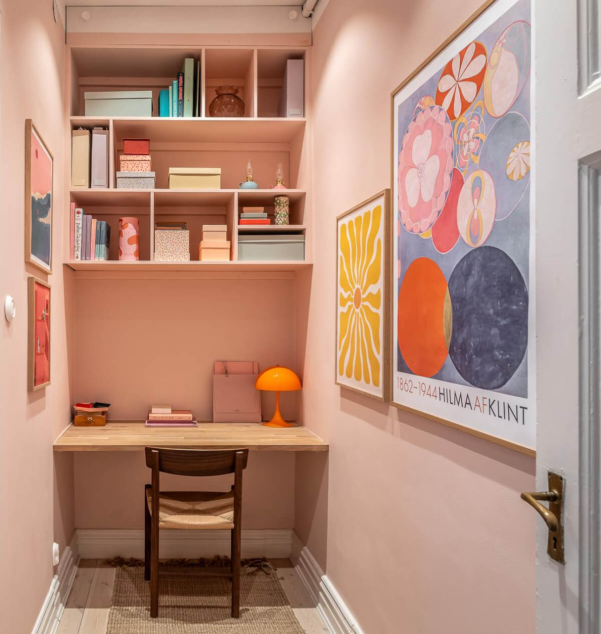
An orange-red library room in an art-filled Scandinavian apartment.
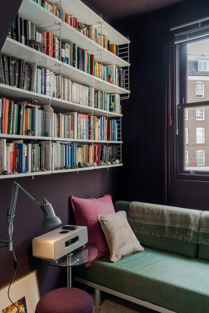
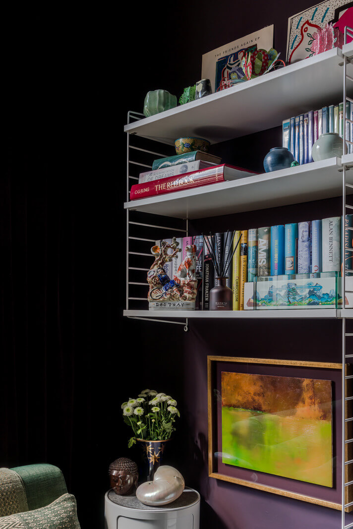
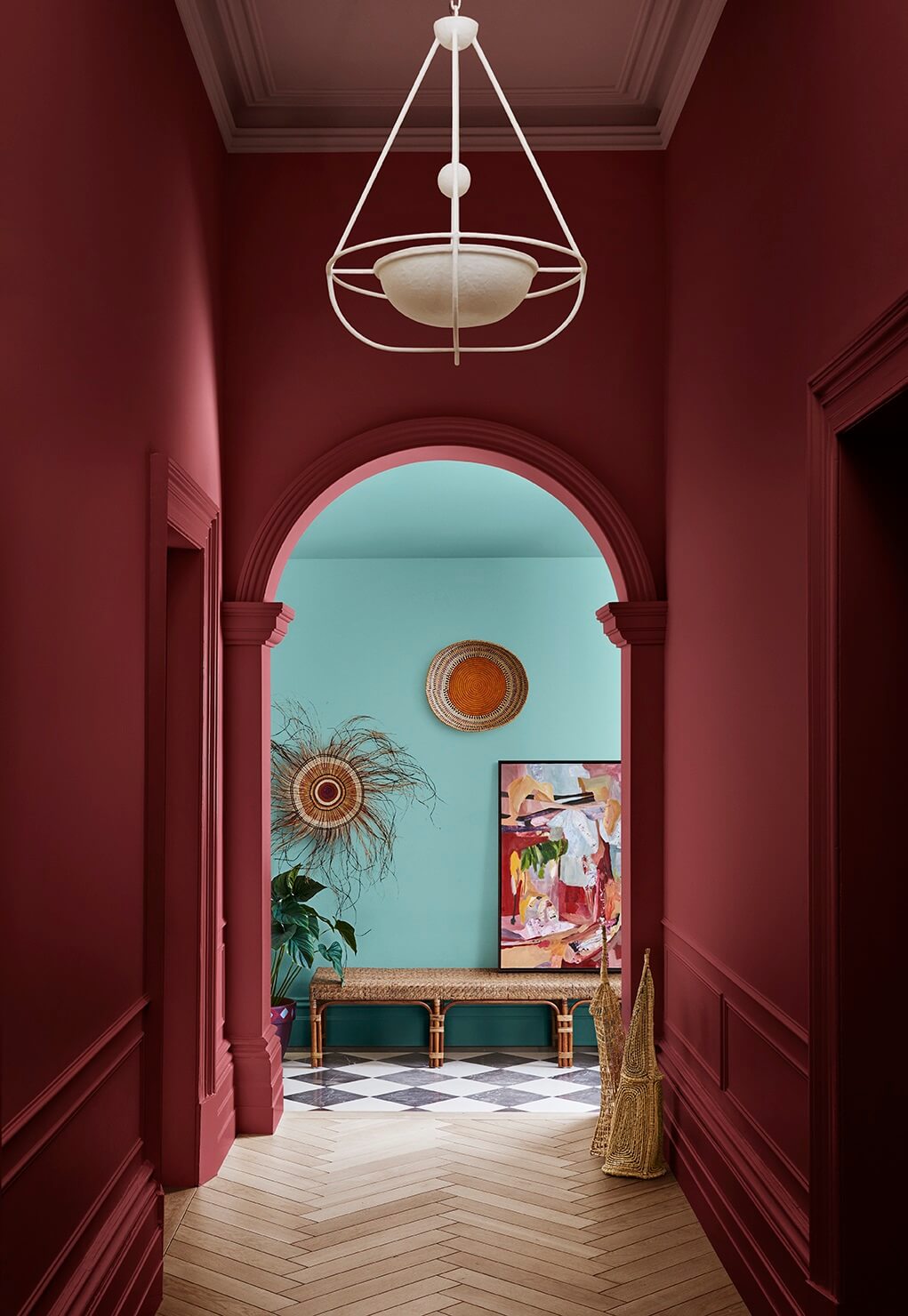
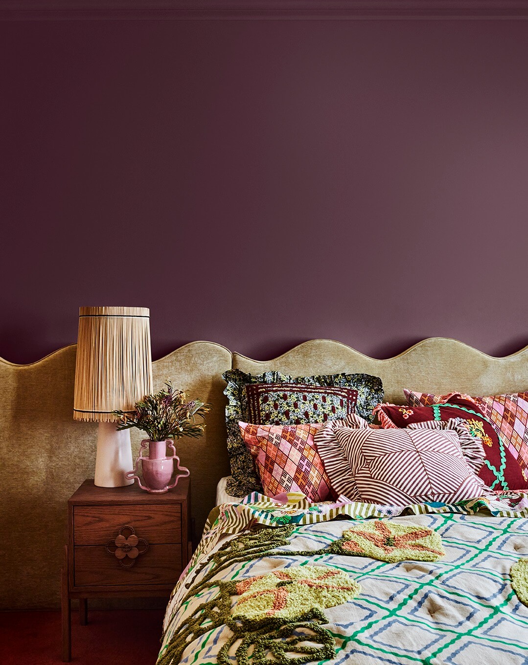
Even a tiny room can handle a deep and dark shade. This tiny sitting room in a narrow London home is painted in a deep purple shade similar to Pantone’s Fig.


middle row: Winterberry – Hot Chocolate – Chili Oil – Poppy Red – Bronze Brown
bottom row: Bright White – French Roast – Vapor Blue – Crown Blue – Mauve Wine
The first two rows consist of the new standout colors, while the bottom row consists of seasonless shades that are classic and luxurious neutrals. In contrast to London’s moodier palette, NYFW Autumn/Winter 2025-2026 presents a more poetic and nuanced approach to color.
Pantone Color Institute describes this season’s New York colors as embodying a mix of casual relaxation and subtle elegance. The color story features traditional neutrals balanced against deep, dramatic hues, encouraging a personal journey toward authenticity and meaningful living.
The key color trends for the New York Fashion Week Color Palette
- Vintage Warmth: Soft pinks, muted yellows, terracotta, and rich browns offer a comforting, nostalgic feel.
- Deep, expressive tones: Dark blues, rich reds, and purples create drama while maintaining an air of elegance.
- Layered Sophistication: A mix of warm and cool neutrals allows for seamless layering and versatility.
New York’s palette reflects a fusion of tradition and modernity, helping you explore personal creativity while embracing familiarity.
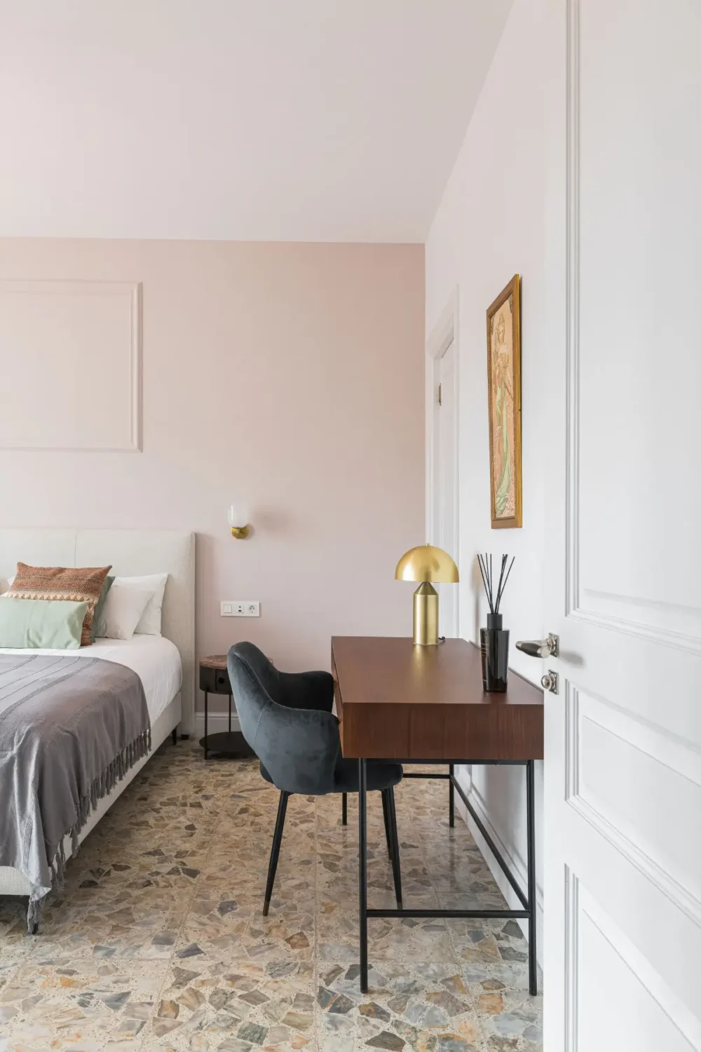
The New York palette features more romantic colors like light pink, purple, and a lovely reddish pink. Light pink is a classic and looks good in any room. If you want to create a soft, romantic vibe in the bedroom, you should add this color.
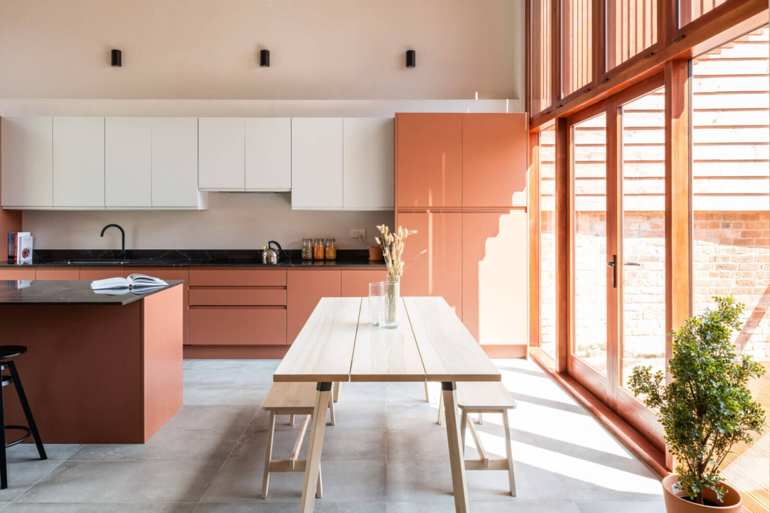
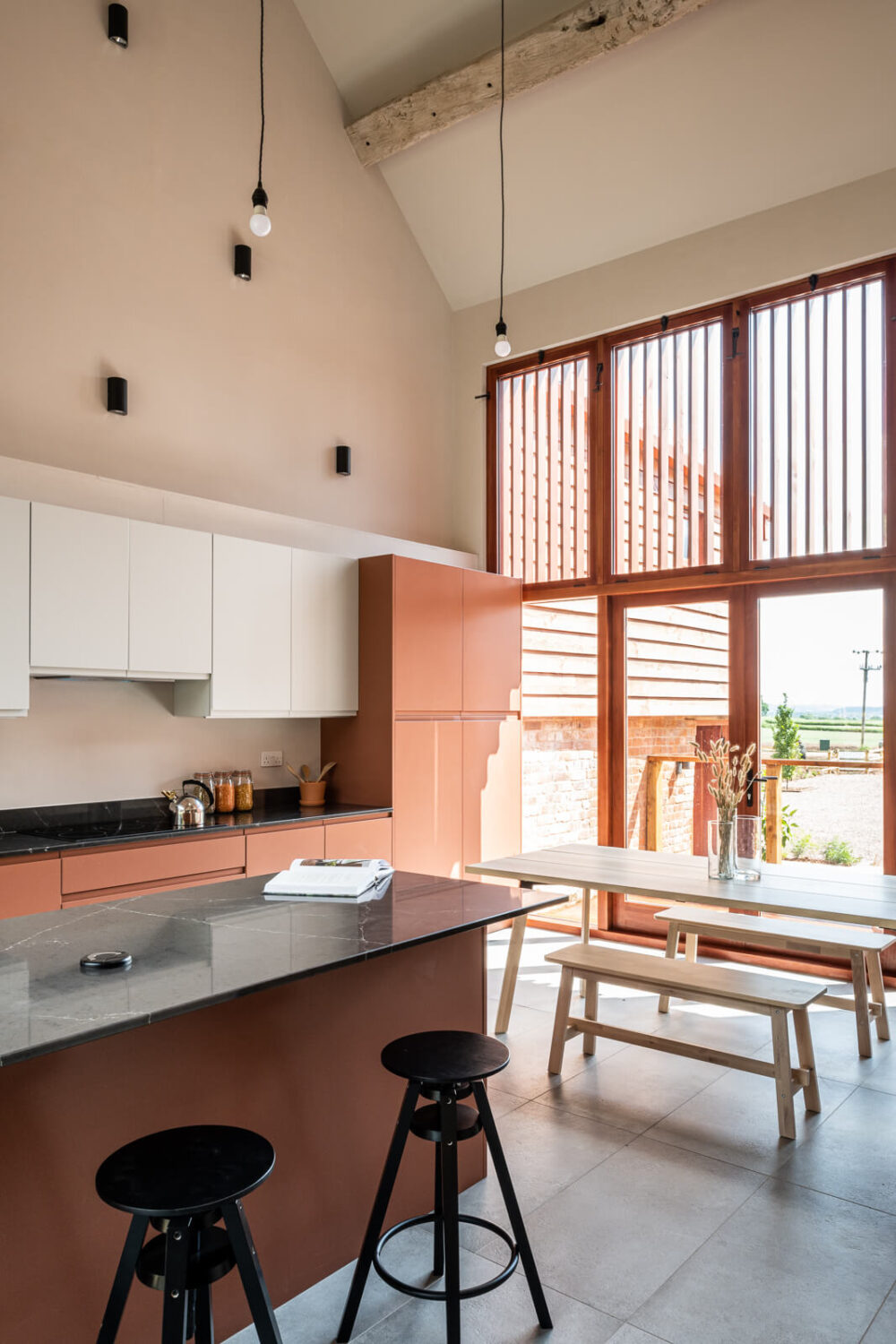
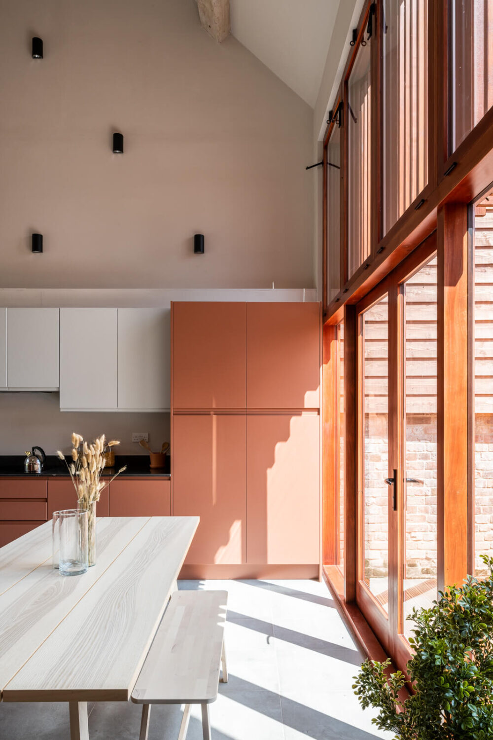
The New York color palette features Brandied Melon, a soft and muted orange shade that adds the right amount of warmth and color to your interior space.

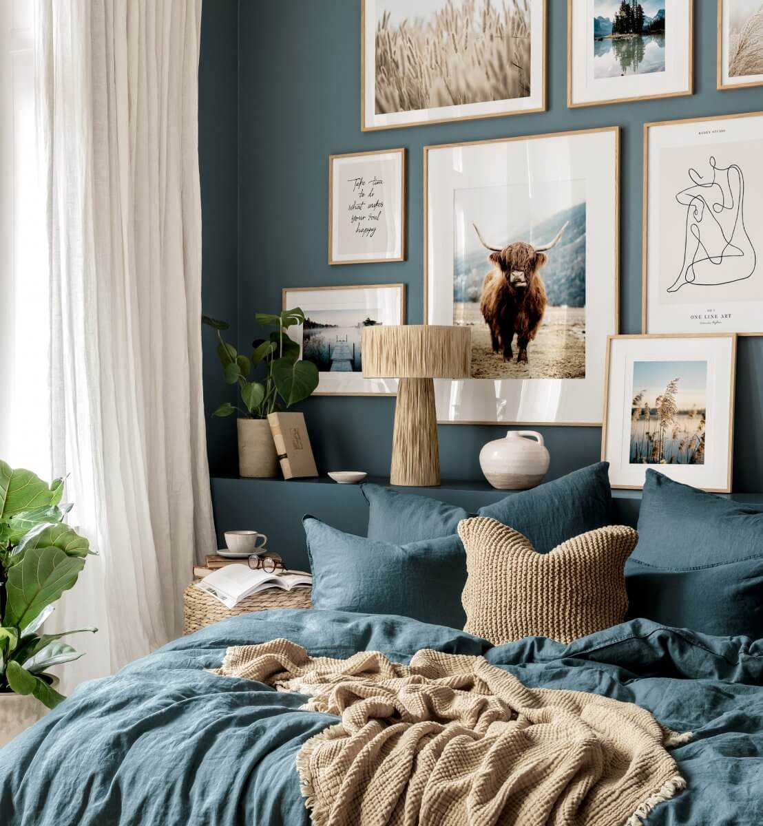
Dark blue, like Pantone’s Crown Blue, is a classic color for the bedroom. It creates a cozy and relaxing atmosphere in the room where you need to get your rest. It can be paired with neutral tones, but also with a soft pink for a more romantic touch.
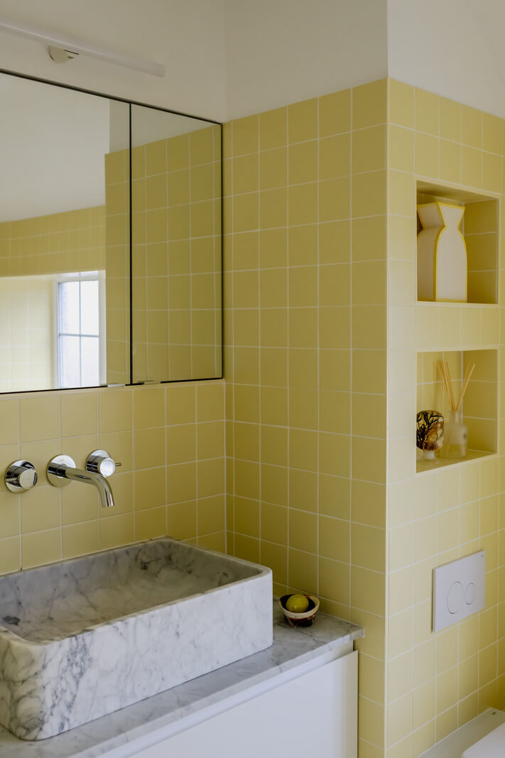
Mustard yellow is a shade we have seen a lot in recent years, but the New York palette shows a lighter yellow shade, ‘Lemon Grass,’ which will add a nice subtle color pop to your interior. This bathroom shows that it also works well in the form of tilework.
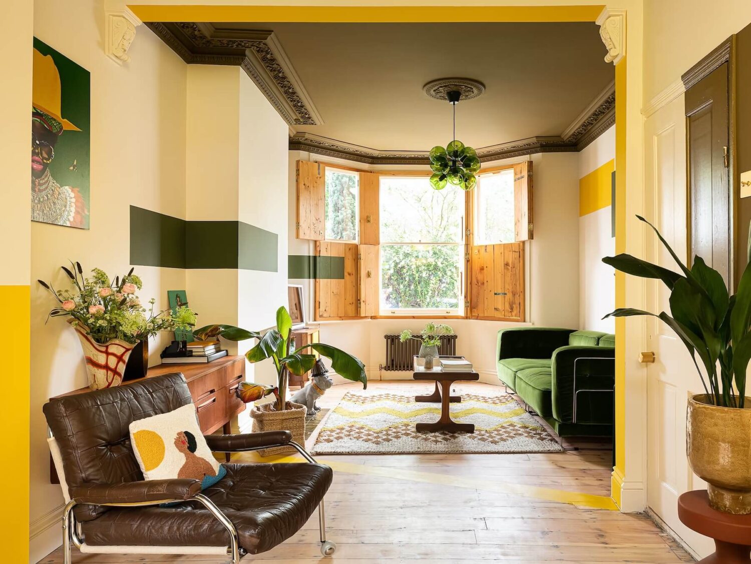
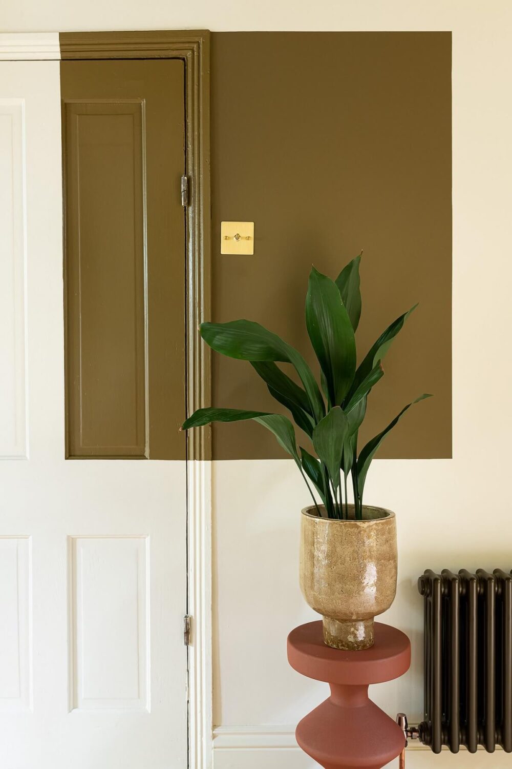
A bronze ceiling in Natasha’s (@untillemonsrsweet) color-blocked house.
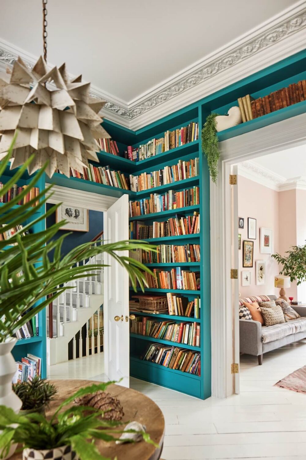
A couple of years ago, PPG/Glidden already chose a teal green shade as their color of the year, and it looks like the color is making a comeback as both color palettes feature this color. This light Victorian townhouse already showed the strength of this color in their library room.

The New York color palette features a lovely terracotta orange shade that can be used in home accessories or as a warm, natural shade on the walls.
What Will Be the Color of the Year 2026?
We can see from last year’s prediction that the color of the year 2026 will probably be one of the colors mentioned in these color palettes. But to know which hue Pantone, Benjamin Moore, Sherwin-Williams, or any other paint company chooses, we will have to wait till autumn.
But these color palettes show a shift toward classic, timeless tones that offer stability while also incorporating modern expressions of bold color to spark individuality and innovation. Deep reds, browns, and mustard yellows suggest a return to heritage hues, while deep greens and blues blend the past with the future.
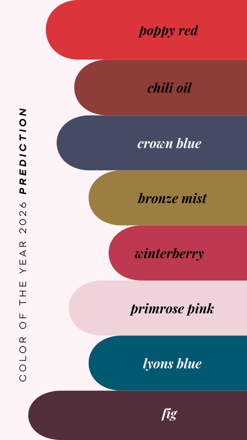
It is also interesting that both color palettes feature Poppy Red, Hot Chocolate, and Crown Blue. As 2025 has been the year of brown and in previous years, we’ve seen an abundance of blue, perhaps 2026 is the year for a cheerful orange-red shade!
But whether it’s the rich, dramatic contrasts seen in the London palette or the softer, poetic blends from New York, in 2026, we will embrace color in a way that feels authentic and meaningful—highlighting balance, creativity, and personal expression.

