Dulux Color Forecast 2024: Bold and Positive Colors
Paint company Dulux (Flexa in some countries) has released its color forecast for 2024. This year, the color trends reflect an inner desire for positivity and home spaces that nurture. The Dulux color trends 2024 feature warm colors with hints of yellow, clay tones touched by pink, deep reddish-brown, olive green, and subtle accents of light blue and vibrant yellow.
The Dulux color forecast is divided into three color palettes: Solstice, Journey, and Muse. Each color palette has its own story and inspirations, which are showcased in beautiful interiors.
The Dulux color forecast is part of the Color Trends for 2024. Read The Nordroom’s article on color trends for more trending colors by leading paint brands.
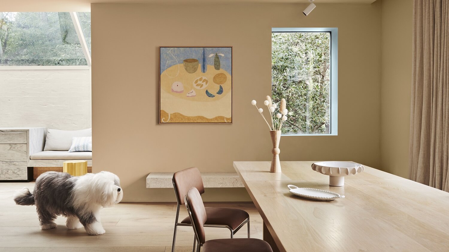
Solstice Color Palette
The Solstice palette draws its initial inspiration from the minimalist Scandinavian design. But it also integrates elements from Mediterranean and desert aesthetics, spanning from the Australian outback to the African savannah. This color palette melds warm shades with cooler highlights, enriched with details like braiding and primitive sculptural designs.
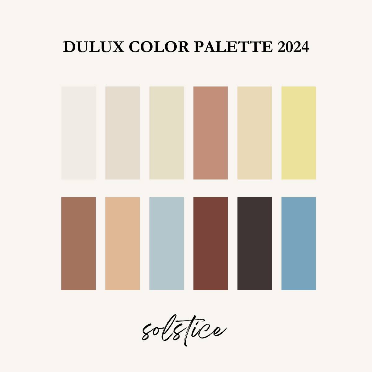
Bottom row: tan wagon – lama – pure blue – reddy brown – empty stage – ocean surf
The palette is designed to transform your home into a soothing retreat. The color palette of rich and organic hues can cocoon us and help evoke feelings of strength and joy.
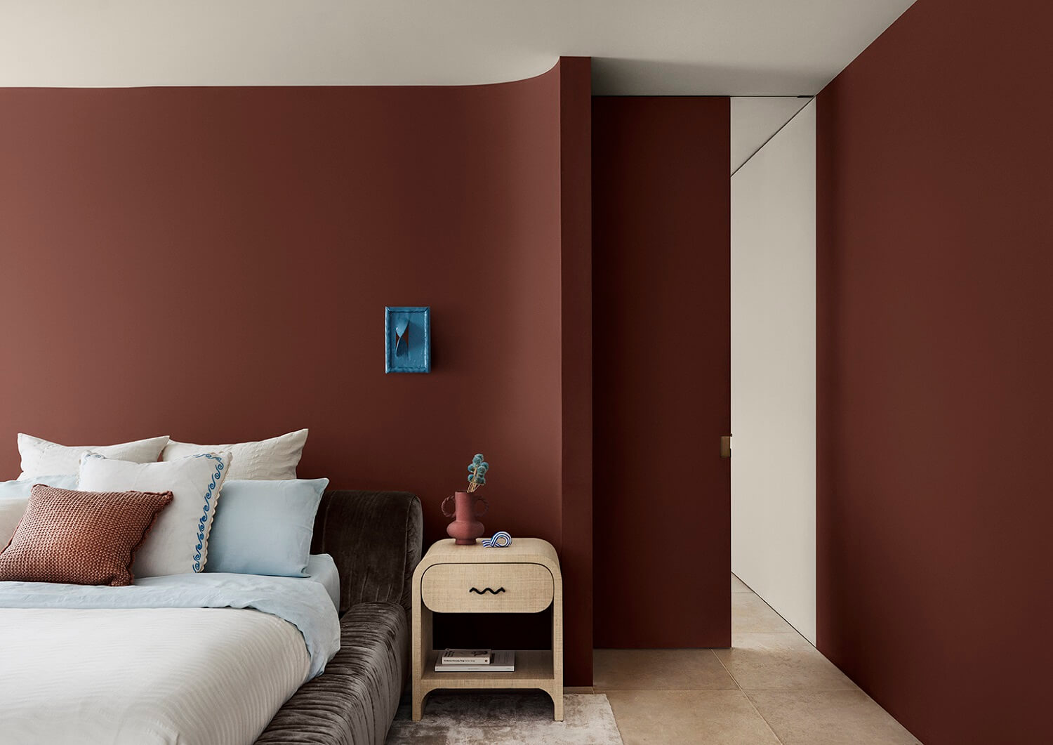
Nurturing Hues
The toasty palette of rich browns, clay, and warm neutrals is designed to evoke a comforting, familiar, and inviting feeling to make you feel safe and at home.
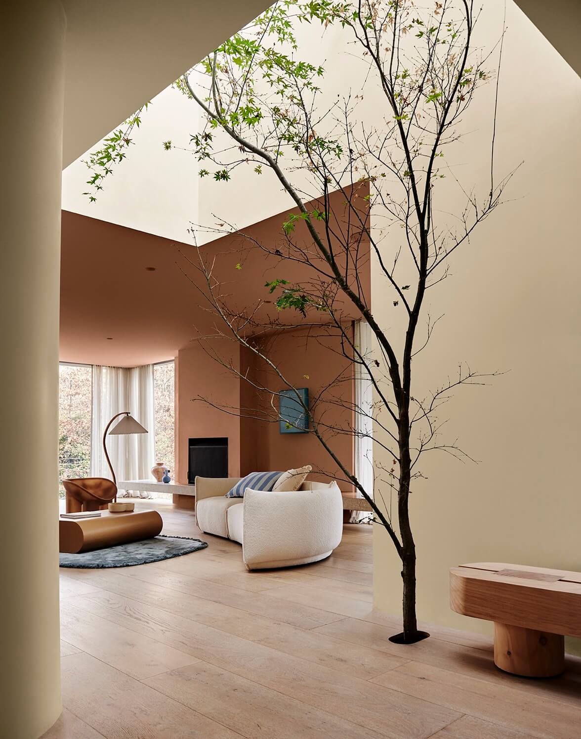
Desert Inspired
From the Australian outback to the African savannah, this palette brings together warm colors with cooler accents and tactile details, such as braided textiles and sculptural forms.
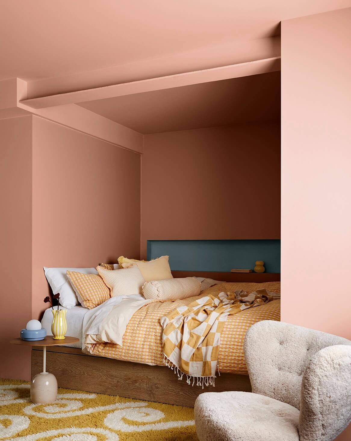
Sunsoaked Warmth
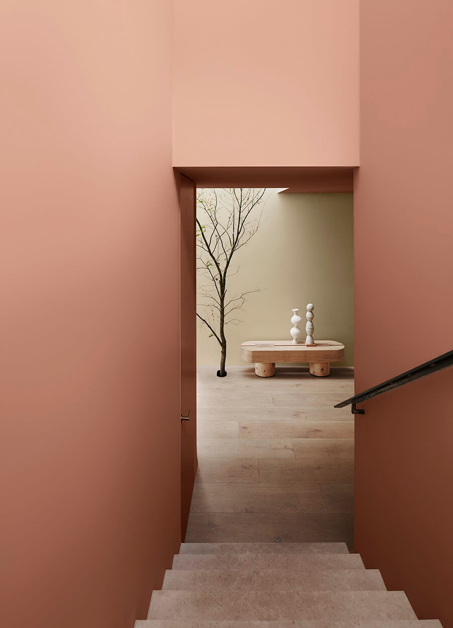
Walls predominantly feature clay shades with red undertones, such as Potter’s Pink in this palette, which opens the opportunity for striking accents in midtone blues such as Ocean Surf and sun-loving citrus yellows.
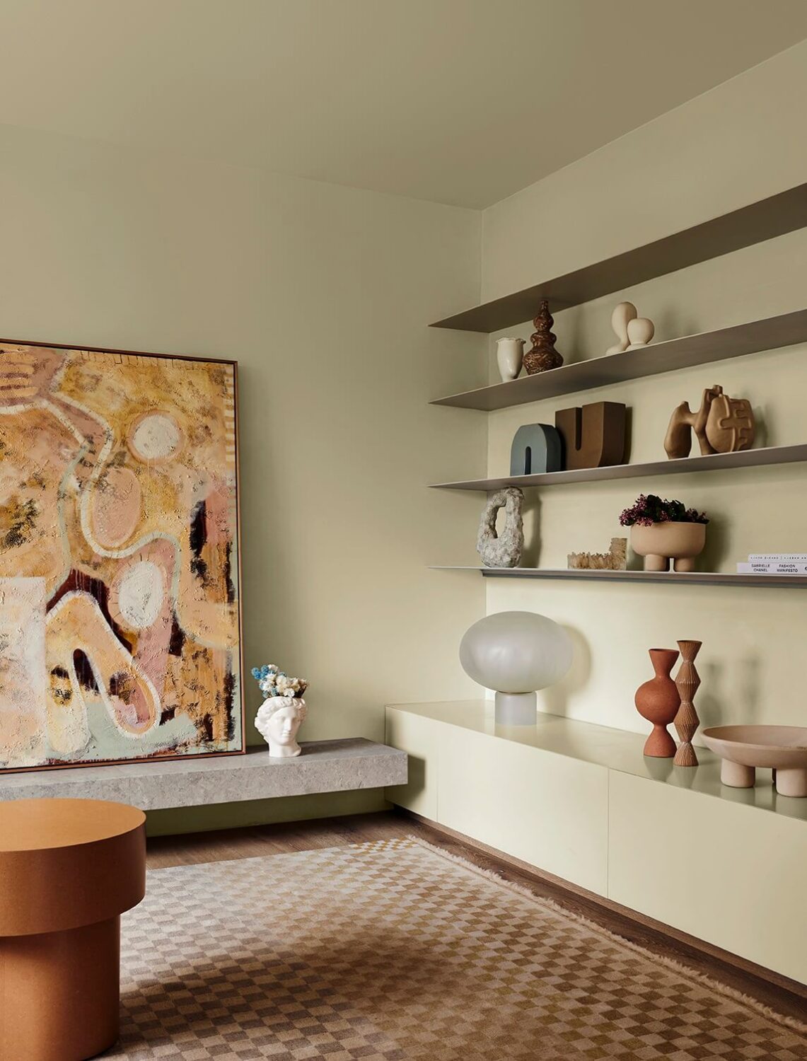
Warmth Through Color
A melting pot of Mediterranean, Scandinavian, and African influences, the Solstice palette serves as a reminder that when the days grow longer, there are better days ahead. The trend is rich with organic colors that wrap warmth around us to evoke feelings of security and strength.

Block Color Comfort
Sure to appeal to a broad audience with its restorative warmth, Solstice can create joyful, cozy spaces to provide comfort and form the perfect backdrop for gatherings and entertaining spaces that are complemented by highly textured fabrics and curved elements.
Outside Influence
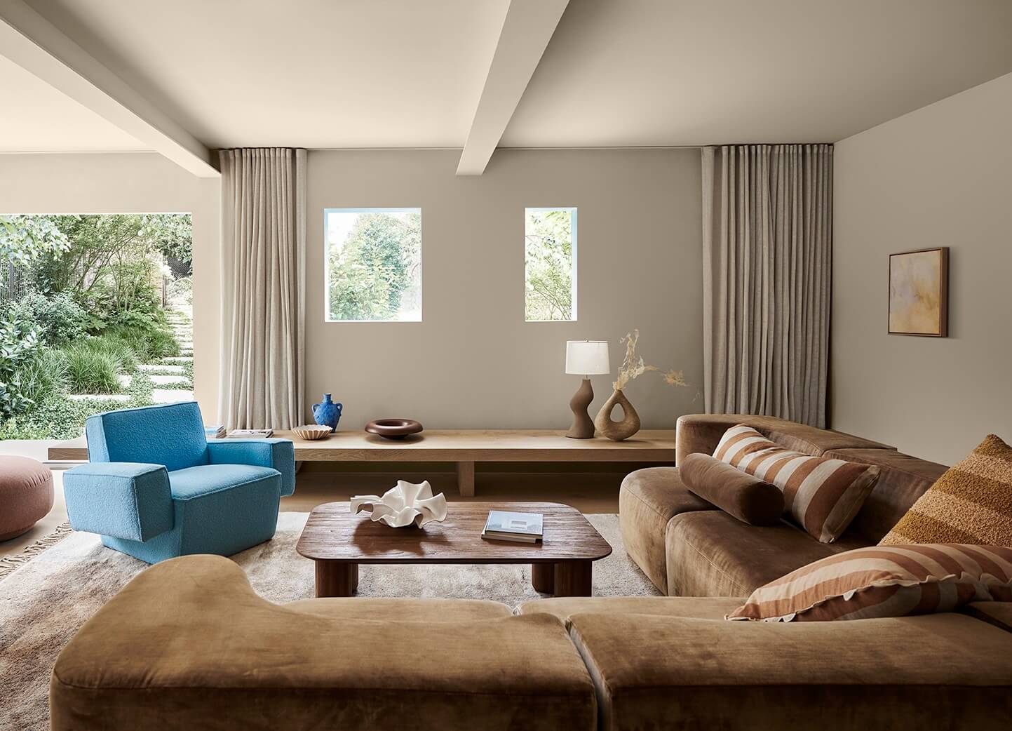
Bask in comforting neutrals with a touch of depth that is infused with baked, sun-soaked warm colors and influenced by a soft glow.
Imperfect Perfection
This trend is rich with organic and primitive shapes with colors that wrap warmth around us and promote feelings of security and strength. Hard surfaces are softened using highly textural fabrics with imperfect slub effects and tactile suede and velvet. Adding high-pile carpets or rugs featuring tassels and fringing invites you into spaces to wind down and relax.

Natural style
This color trend embodies a harmonious blend of cozy and calm styling elements. Details inspired by Grecian motifs are harmonious with furniture and sculptural decor made of raw and unfinished materials such as natural stone, concrete, terrazzo, terracotta, clay, and lava stone.
Journey Color Palette
The Journey palette delves into the narrative of interior spaces, merging global inspirations from our travels and honoring the legacy of our ancestors through cherished heirlooms and artifacts. Embodying a maximalist essence, this color trend showcases a diverse and eclectic palette.
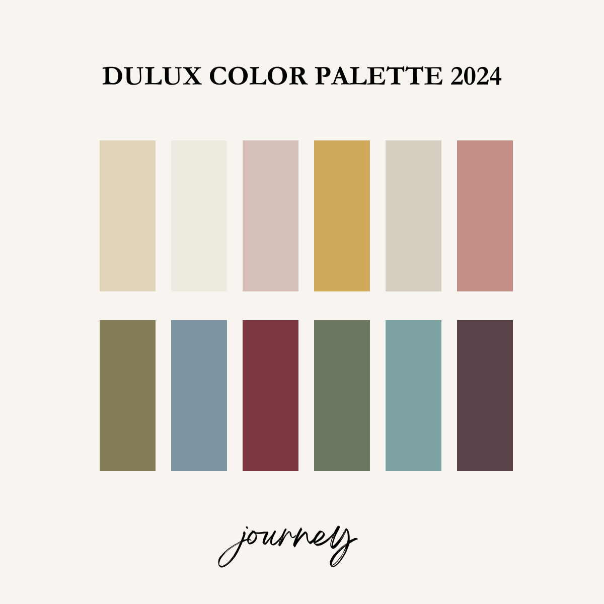
Bottom row: xena – clouded sky – carmen – bean counter – Swedish blue – bruised burgundy
Travel, cultural differences, bohemian charm, and the craft influenced the Journey color palette. This palette features mid-tone colors for a maximalist and eclectic feel in our homes.
Overarching warmth
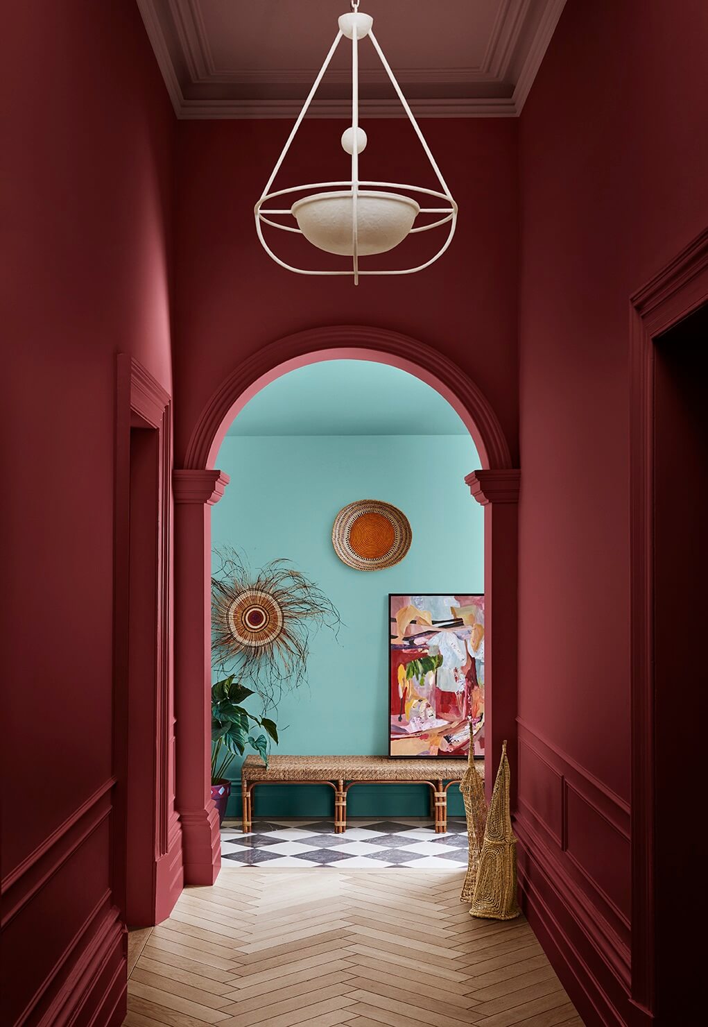
The Journey palette beckons you in with bohemian charm, eclectic allure, and the art of craft. Rich reds and plums, including Carmen and Bruised Burgundy, lead you through this trend, adding a decadent contrast to the palette.
Eclectic Allure
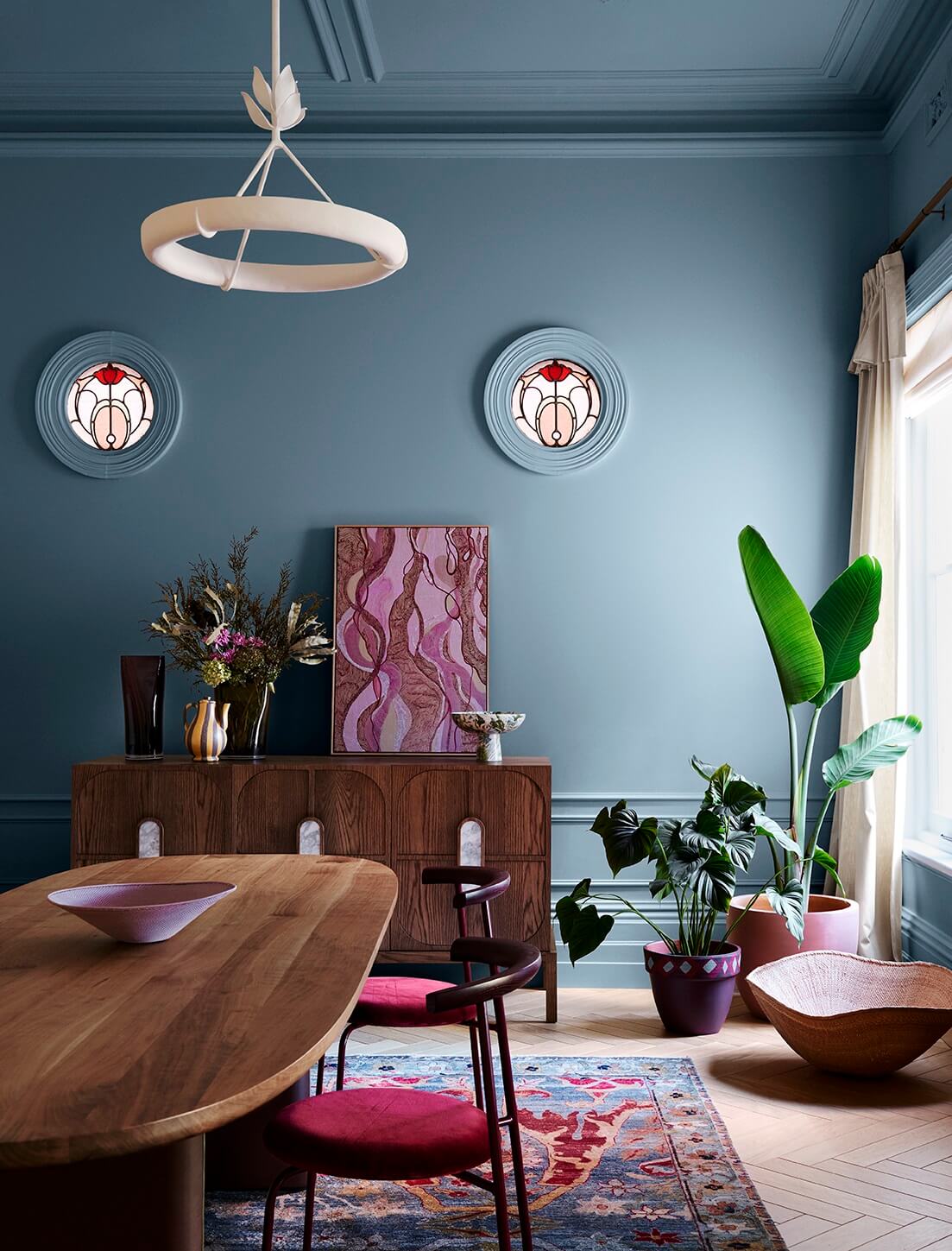
A maximalist and pattern-heavy palette, Journey is about the story of an interior with a focus on the objects and items handed down and the rich ancestral heritage they represent.
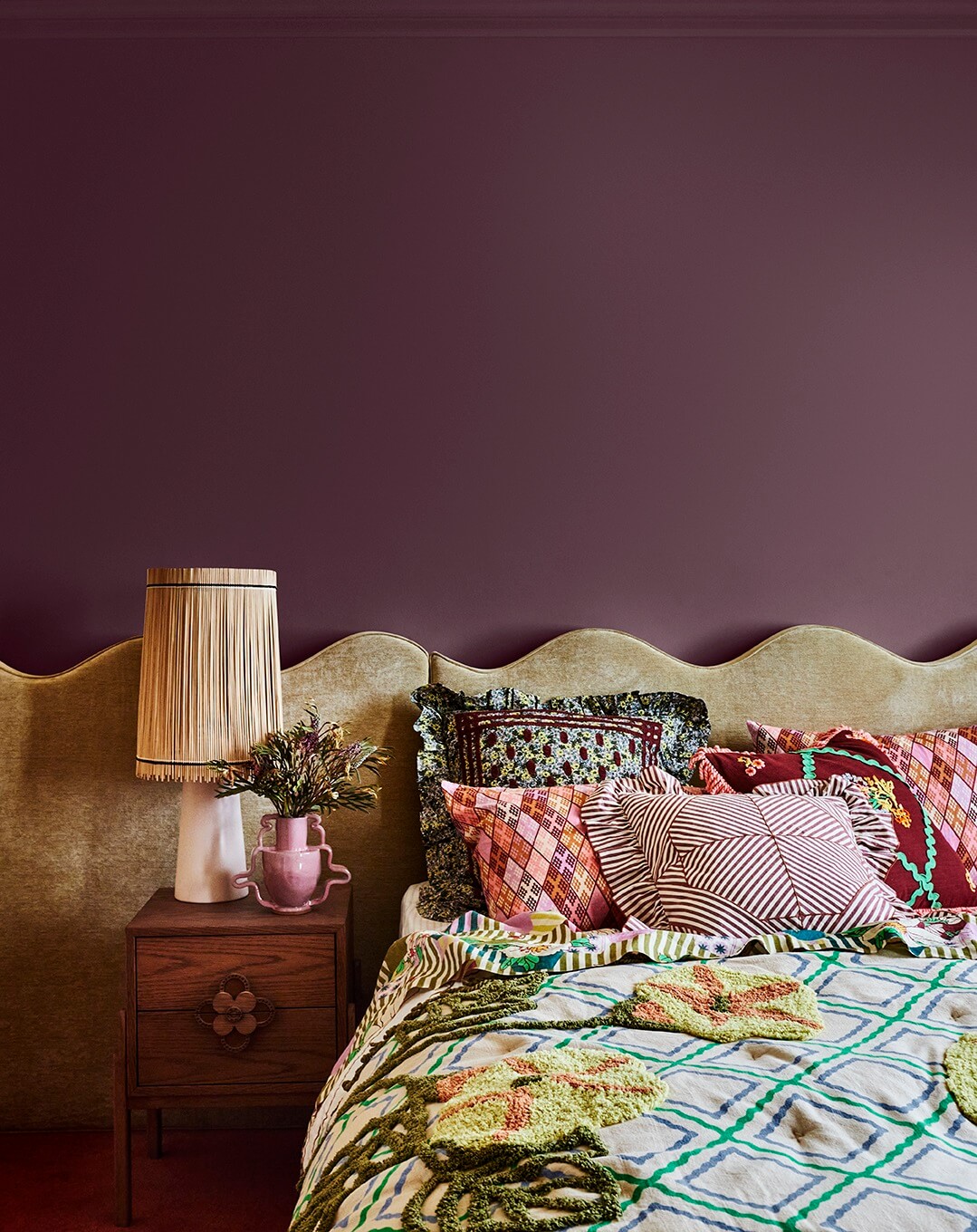
Depth of Color
Taking influence from our travels, folk traditions, and cultural differences, the Journey palette weaves together elements of bohemian charm and eclectic allure often revealed in furniture and fabrics that are heavily patterned and textured.
We are seeing the characteristic spirit of our era manifested in sustainability attitudes and aspirations. This leads to caring for our future by using vintage furniture and turning to sustainable options for decor, such as fibre-embellished lampshades.
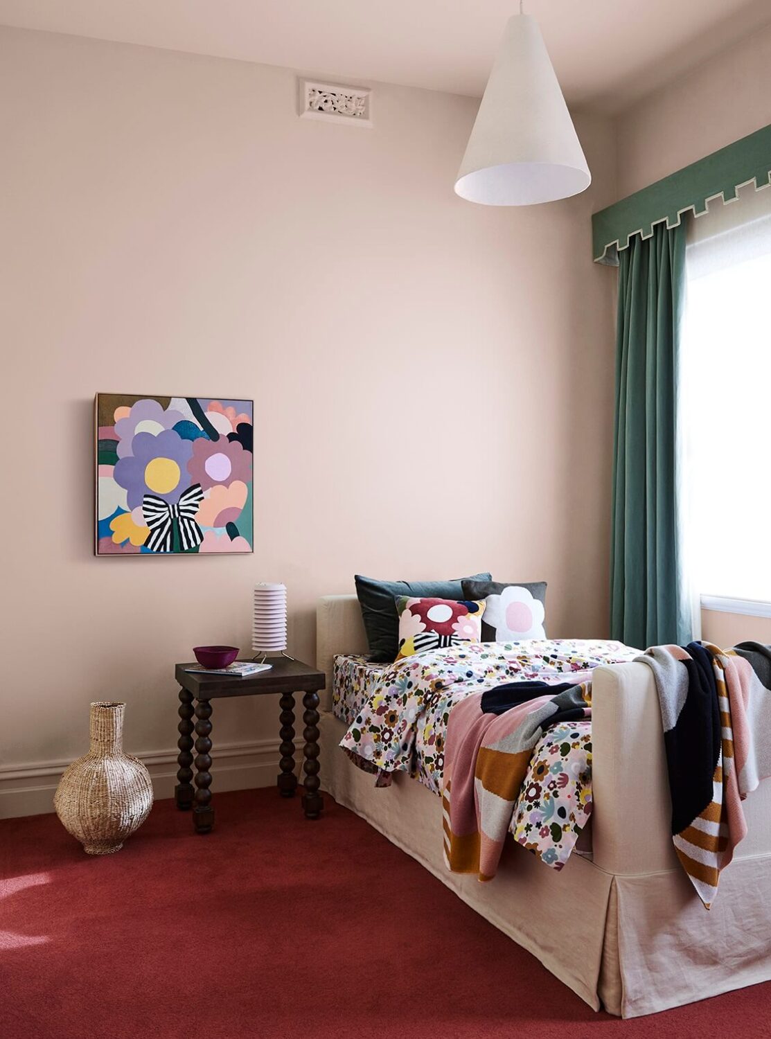
Honoring Memories
Embracing the significance of preserving traditions and treasuring heirlooms, Journey beckons you to weave together the past with the present.
Similar to the rich and diverse tapestry of our own lives, the Journey palette brings together rich mid-tone hues, with yellow-greens, such as Xena and Bean Counter, and blues like Swedish Blue and Clouded Sky, alongside rich reds and plum, including Carmen and Bruised Burgundy for contrast.

Green with envy
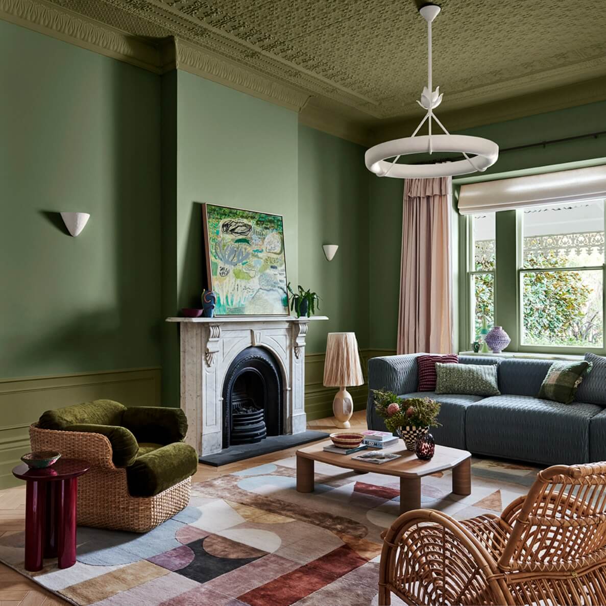
Striking design nested within traditional spaces provides a gracious nod to our past. Statement pieces such as a wicker armchair softened with plush velvet pair easily with décor in contrasting colors.
The rich yellow greens of Xena and Bean Counter provide the base for layer-upon-layer of greens throughout the space, from nature to artwork. The blue column painted in Clouded Sky provides a gentle break in the living room’s solid hue range.

Celebrating an Open Divide
Color is the perfect mechanism to delineate spaces and add layers of depth in a harmonious manner without introducing closures.
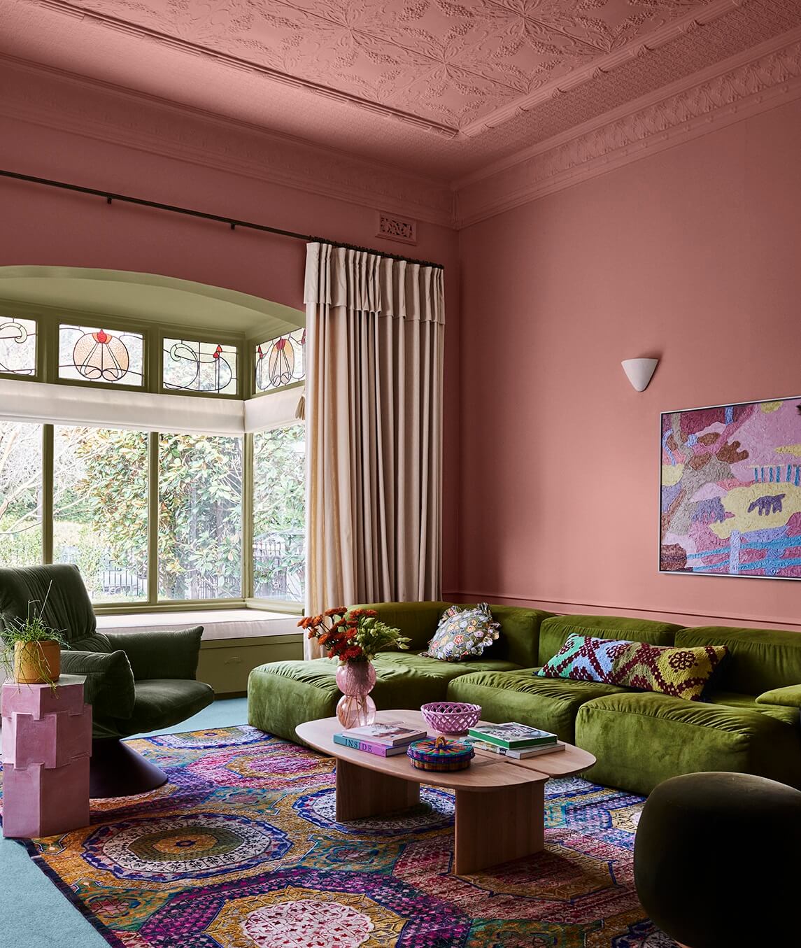
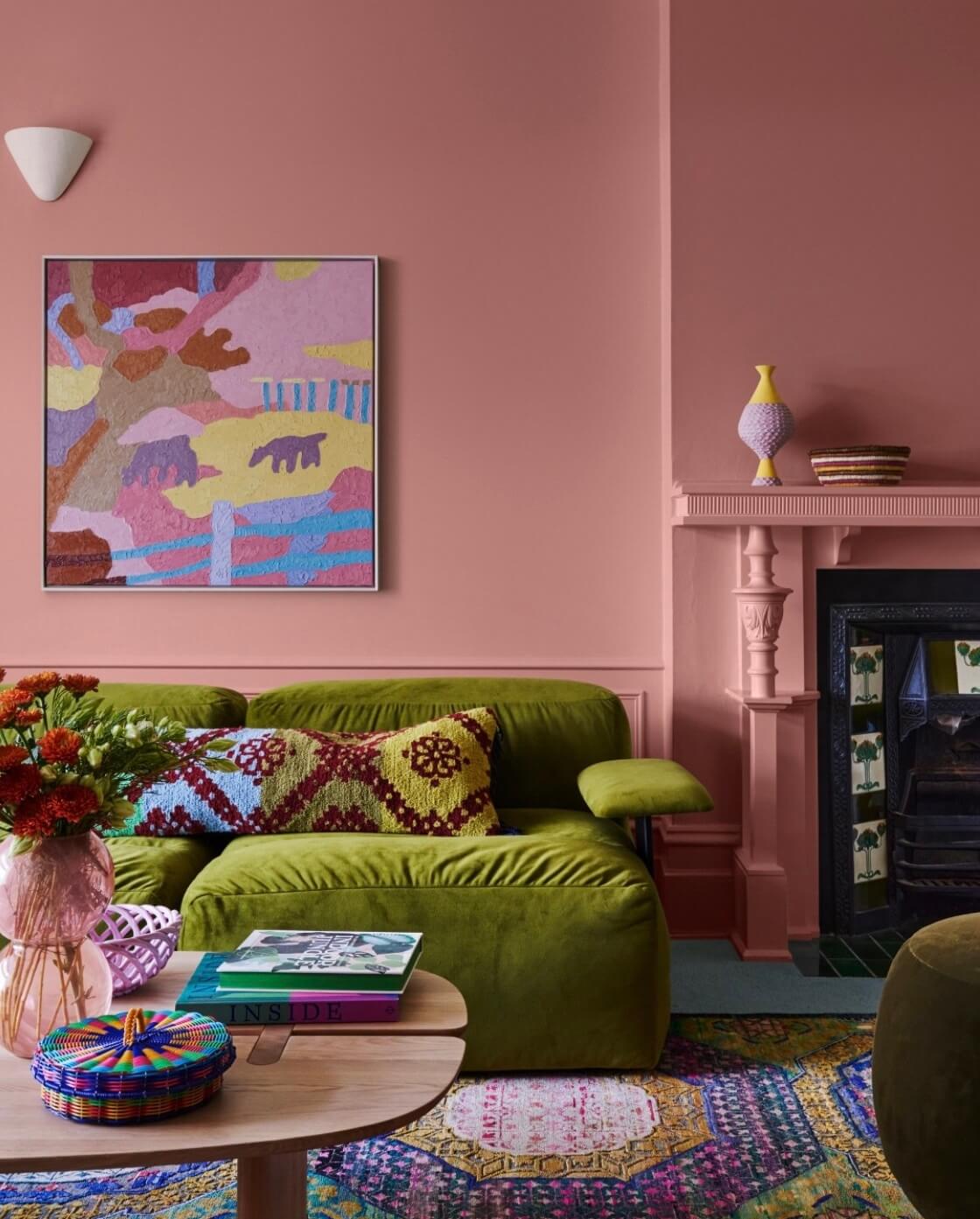
Pretty in Pink
The startling pink of Evening Blush is subdued by decorative elements such as multi-colored trinkets, heavily patterned textures, and time-worn rugs adorned with geometric shapes. Vintage finds such as side tables are given a new lease on life with fresh coats of color, reflecting the world’s desire for more sustainable design choices.
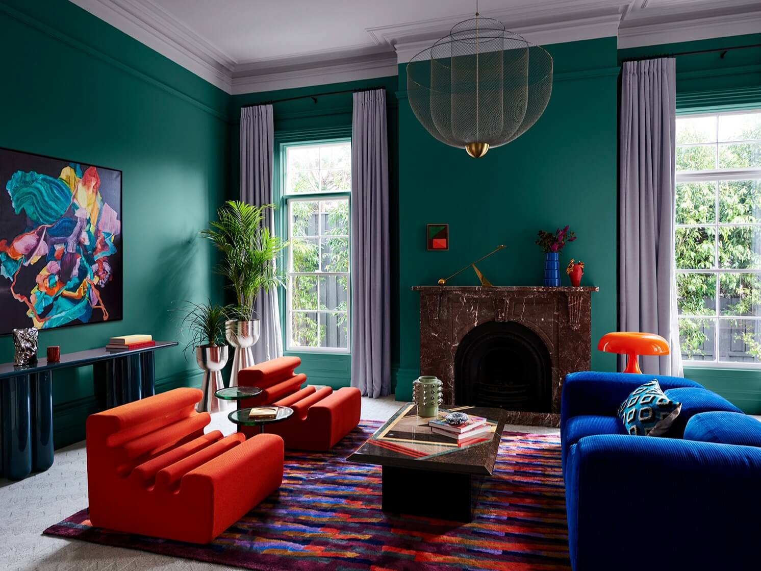
Muse Color Palette
The Muse palette seamlessly blends nostalgia with modernity, creating timeless and distinctly contemporary spaces. Drawing significant inspiration from the ’70s yet infused with contemporary nuances, Muse honors the iconic designs of the past.

Bottom row: decoration blue – surf green – guitar – passionate blue – hidden depths – fluorescent fire
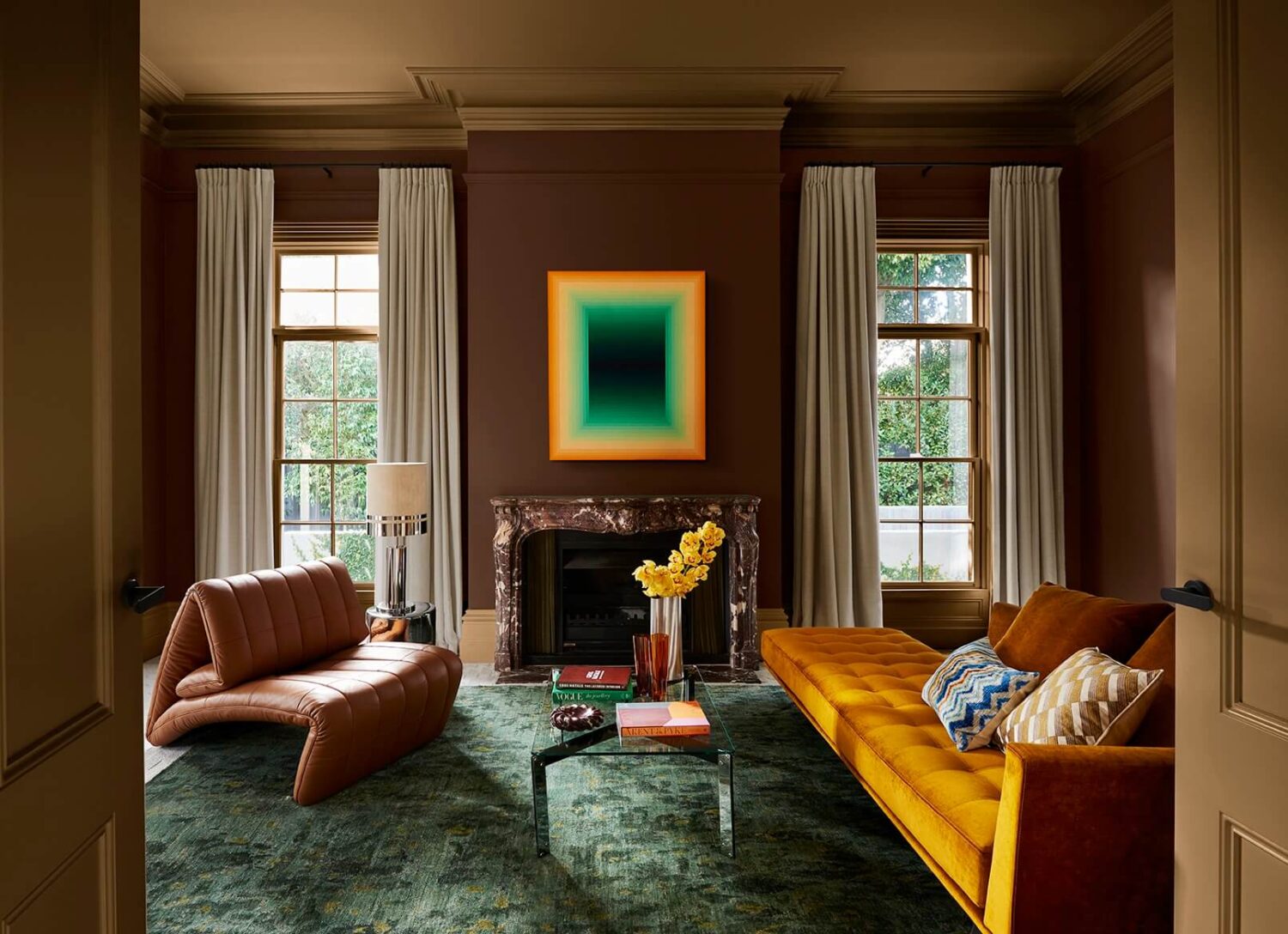
Sophisticated Glow
The bold, rich tan, and russet brown colors of Fantan and Guitar provide a perfect backdrop for adding to the fun and relaxed mood of this trend of low-slung furniture, sumptuous velvet upholstery, and chrome detailing.
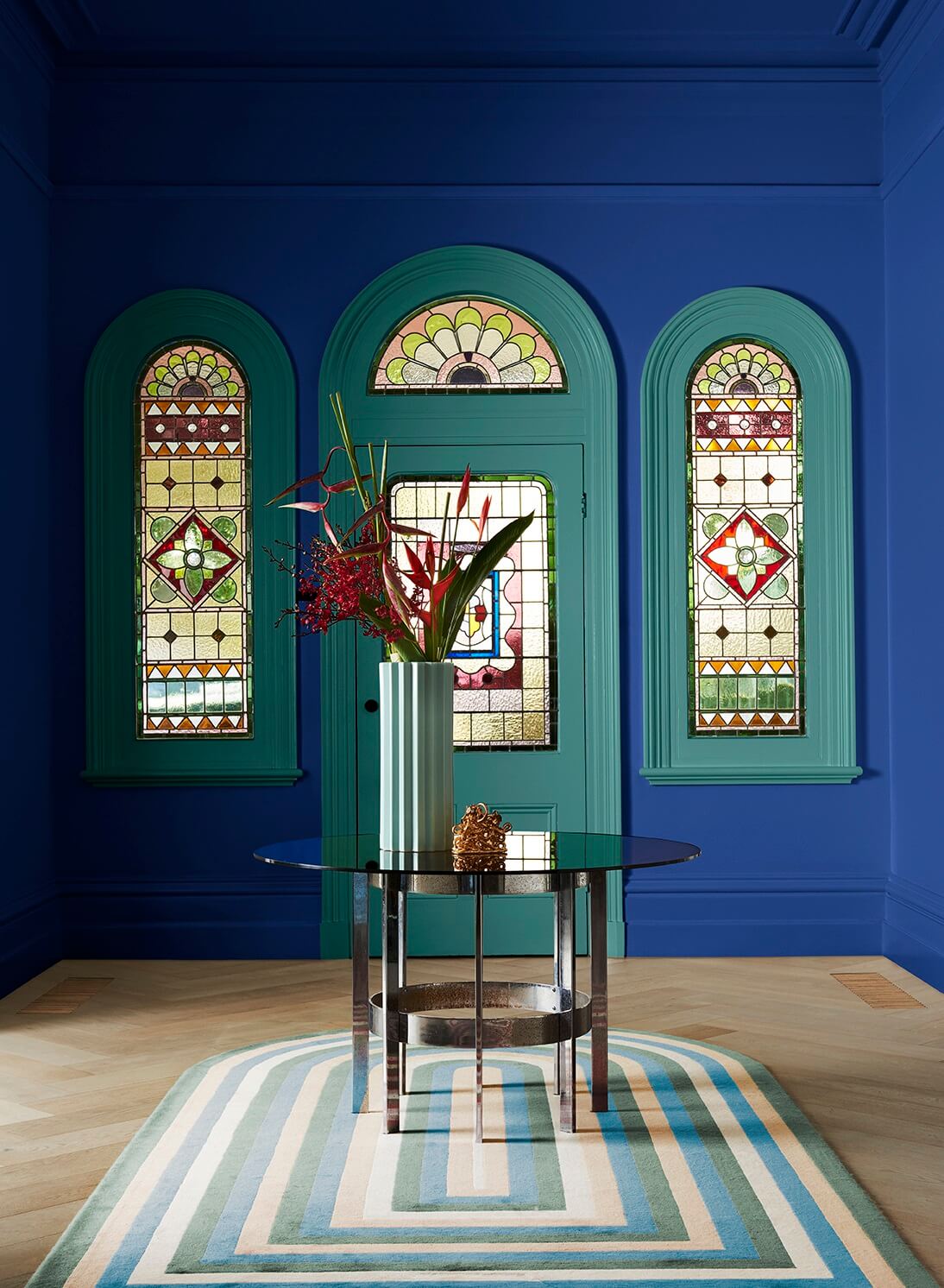
New Take on Traditional
The depth of Passionate Blue paired with Surf Green accents bolsters the architecture of this traditional home and carefully complements its stained glass windows. The stunning look is enhanced by material details such as glossy surfaces, luxe flooring, smoked glass, and modern decor.
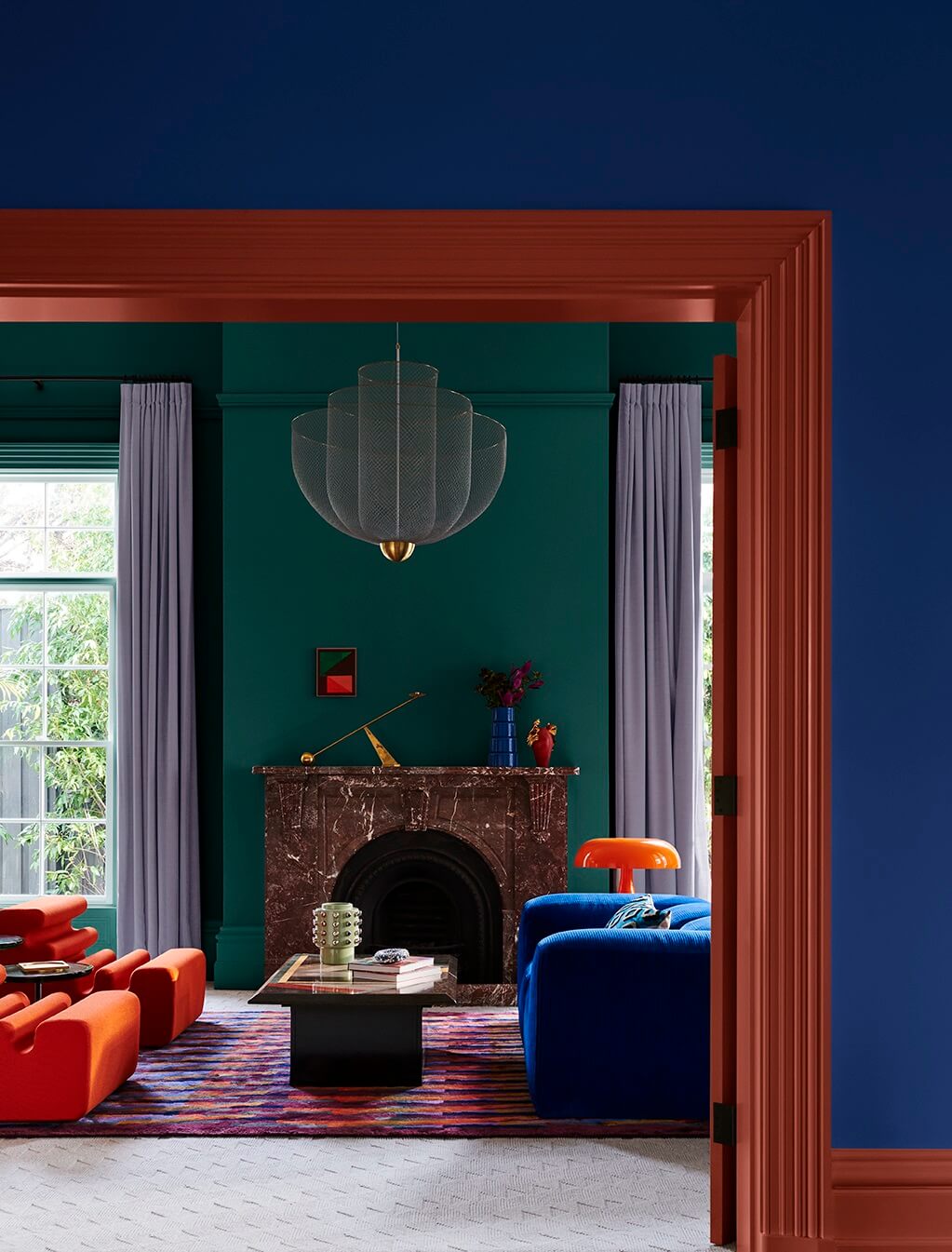
Passionate expression
Deep mid-tone colors such as Surf Green, Passionate Blue, and Fluorescent Fire evoke sentiments of warmth, nostalgia, and self-expression. The character and intrigue of these colors are enhanced with dramatic décor in curved form paired with the classic mushroom lamp in glossy orange-red.
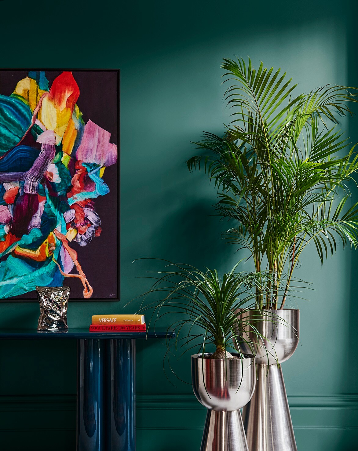
Retro Feel
The palette’s colorful array of hues creates a distinctly modern interior fused with nostalgic design references reminiscent of the ’60s to the ’80s and the textures and glamour from the ’70s. While many of us lived through these design periods, the allure of the ’70s and ’80s is a new influence embraced by younger generations.

Timeless Interiors
With contemporary design at its heart, this palette’s warm browns, such as Tuscan Sunset and Guitar, offer an ideal backdrop for materials and textures in cooler blues to inspire a feeling of unlimited creativity.
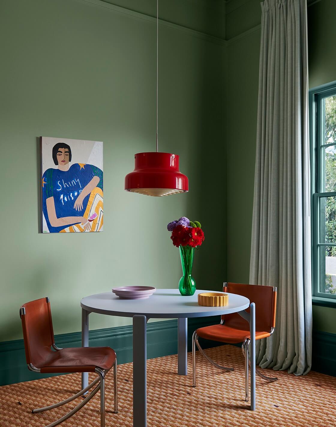
Honoring Our Past
This trend strikes the perfect balance between the expressive colors featured in postmodern interiors and the emerging modern hues in contemporary design, resulting in timeless interior spaces that pay homage to design icons from the past.
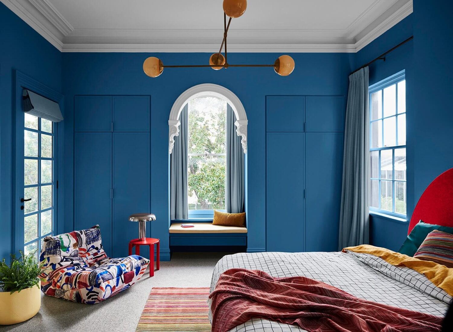
Personality Plus
Muse strikes the perfect balance between the expressive colors of postmodern interiors and the emerging modern hues in contemporary design.
What is the Dulux Colour of the Year 2024?
Dulux has announced Sweet Embrace as their 2024 colour of the year. Sweet Embrace is a pastel pink shade that can be used as a soft neutral base or as an accent color in every room of the house. You can read more about Sweet Embrace, the Dulux Colour of the Year 2024, in this Nordroom article.
