The Color Trends for 2024: Comforting Neutrals & Positive Accents
A new year means new trending colors, and in this article, you will read all about the color trends for 2024. Color can be used in many ways in our homes and is a great way to show personality and style while also giving your home a fresh new look.
Every year, the color experts from the world’s leading paint brands share their Color of the Year and a Color Forecast. The Color of the Year is accompanied by a trending color palette with color hues that complement the chosen trending color.
From the fashion world to graphic design, these color trends are visible in every art form, so you can expect to see these color trends appear in fashion and interior stores alike. Will we see neutral colors or add bold tones to our interiors? Keep on reading to find out.
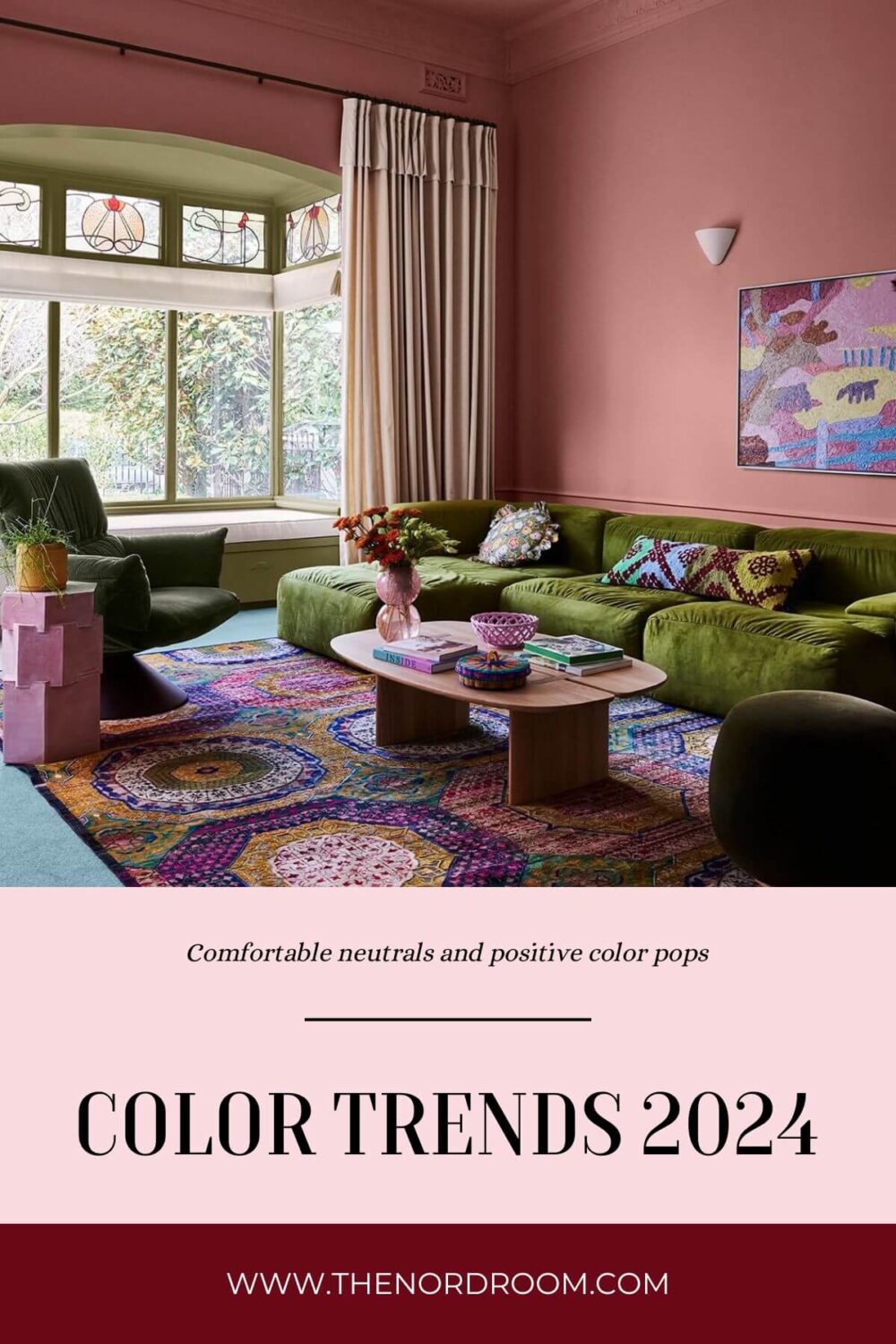
In this post, you will find a complete list of all the paint colors of the year 2024. Each 2024 color will also get its own blog post with a more in-depth look at how you can use these trending interior colors in your home.
This post will get updates when more paint companies release their color of the year. Make sure to bookmark this article, check back regularly for updates, or subscribe to the newsletter to stay up to date.
What is the Color of the Year 2024?
There is not one Color of the Year, as every leading paint brand chooses its own trending color. But there is often a common theme in the chosen colors from large paint brands like Sherwin-Williams, Behr, Benjamin Moore, or PPG and Color Institute Pantone. In 2024, the paint companies have chosen timeless and comforting colors that are versatile, warm, and create a calm atmosphere in your home.
In this article, you will find every color of the year 2024 and their complementing color palettes. The colors shown above give you a sneak peek into the 2024 paint color trends.
see also: Can We Already Predict The Color of the Year 2025?
Pantone: Peach Fuzz
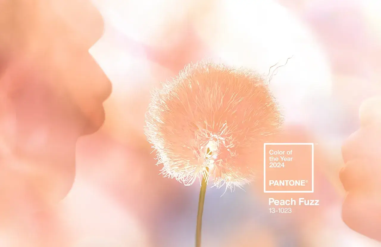
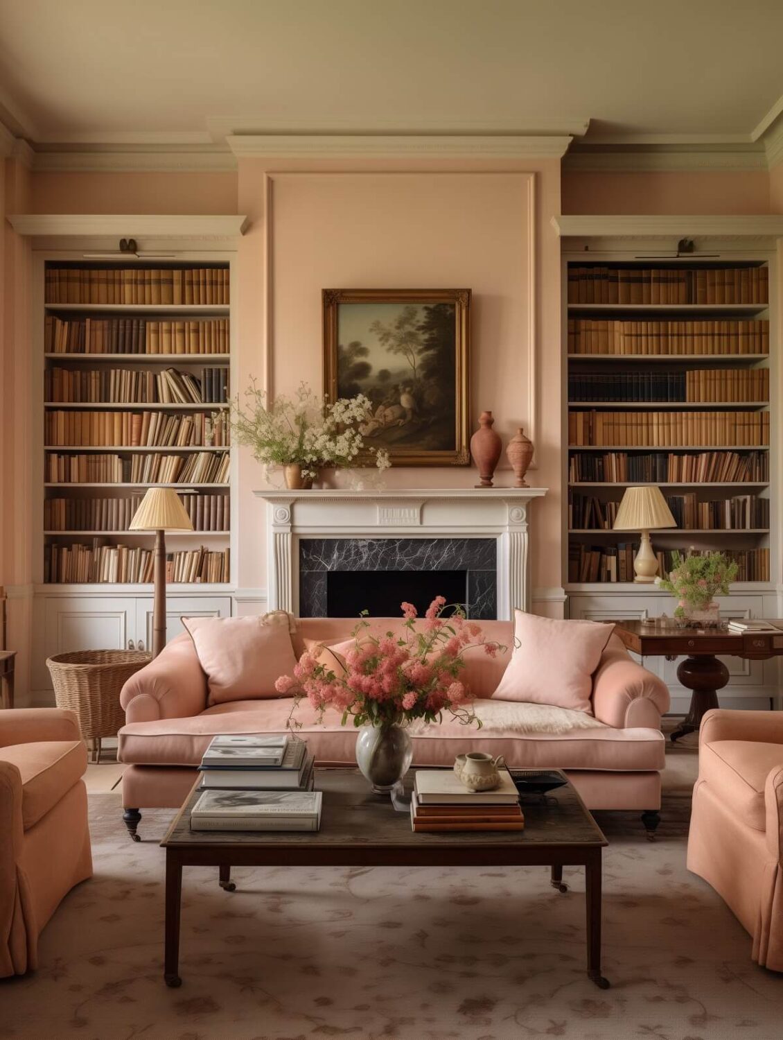
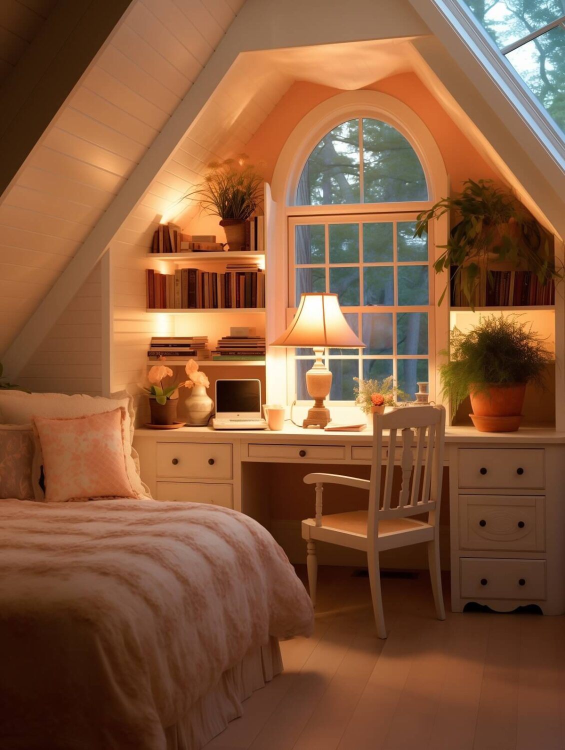
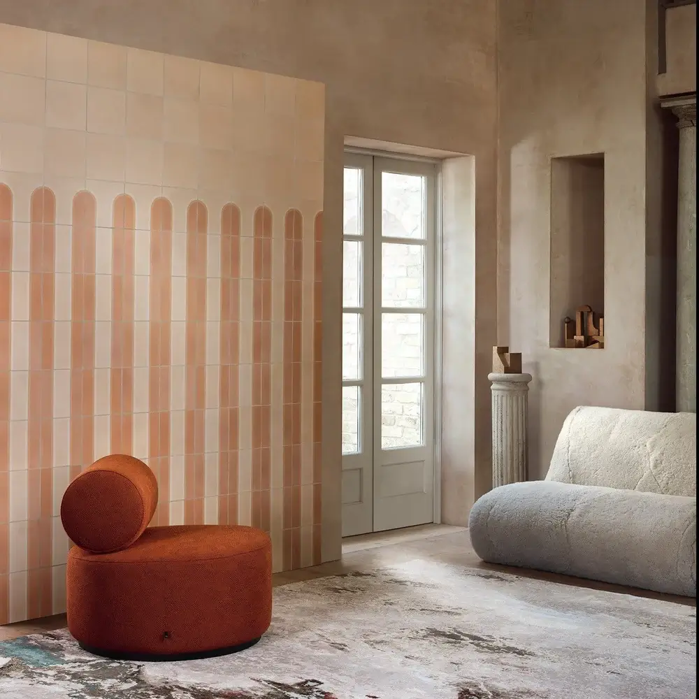
Color Institute Pantone has chosen Peach Fuzz as their Color of the Year 2024. Peach Fuzz is an appealing peach hue, softly nestled between pink and orange, that captures our desire to nurture ourselves and others.
“In seeking a hue that echoes our innate yearning for closeness and connection, we chose a color radiant with warmth and modern elegance. A shade that resonates with compassion, offers a tactile embrace, and effortlessly bridges the youthful with the timeless,” says Leatrice Eiseman, Executive Director, Pantone Color Institute™
Pantone Color Palettes
Pantone has created five color palettes that will help you combine Peach Fuz with complimenting colors. From a monochrome peach look to bold colors in combination with the light and warm peach neutral.
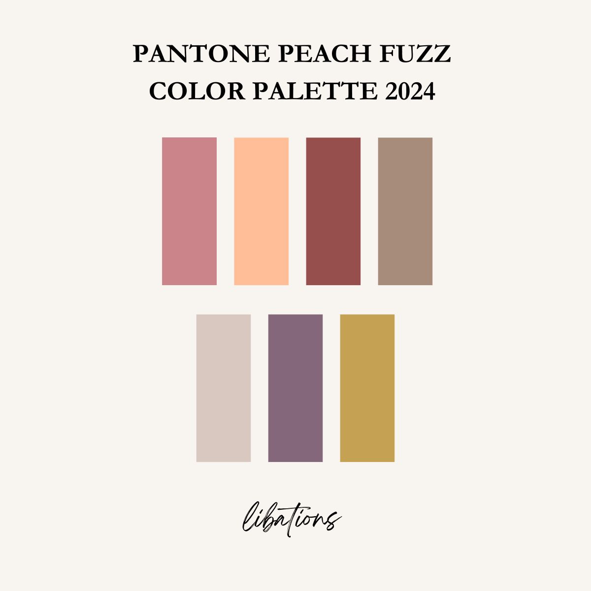
almond peach – grapeade – sauterne
Comprised of a medley of tempting treats, Libations speaks to sophisticated and urbane tastes.
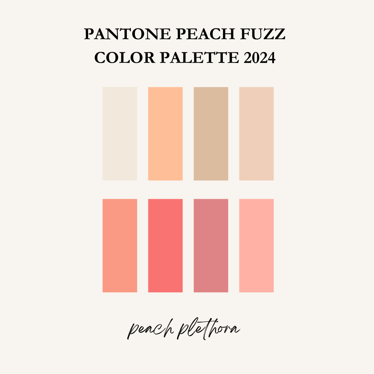
peach pink – georgia pink – peach blossom – peach pearl
Peach Plethora is a monochromatic collection of colors embracing the whitest of peach tones and barely beige to a peachy-pink, and a luscious Georgia peach, creating a warm and welcoming ambiance.
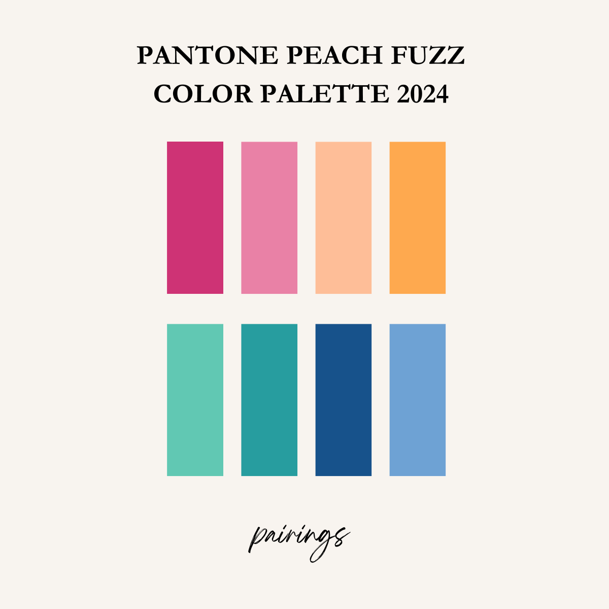
bermuda – baltic – nautical blue – little boy blue
Pairings is a friendly mix of tonal color pairings including two variations from the pink, orange, blue-green, and blue families happily and harmoniously couple with each other.

peach fuzz – sun-dried tomato – jade green – porcelain
Hybrid Hues is a palette of hues exhibiting a dichotomy of varied tones, all seemingly discordant, yet at the same time, harmonious.
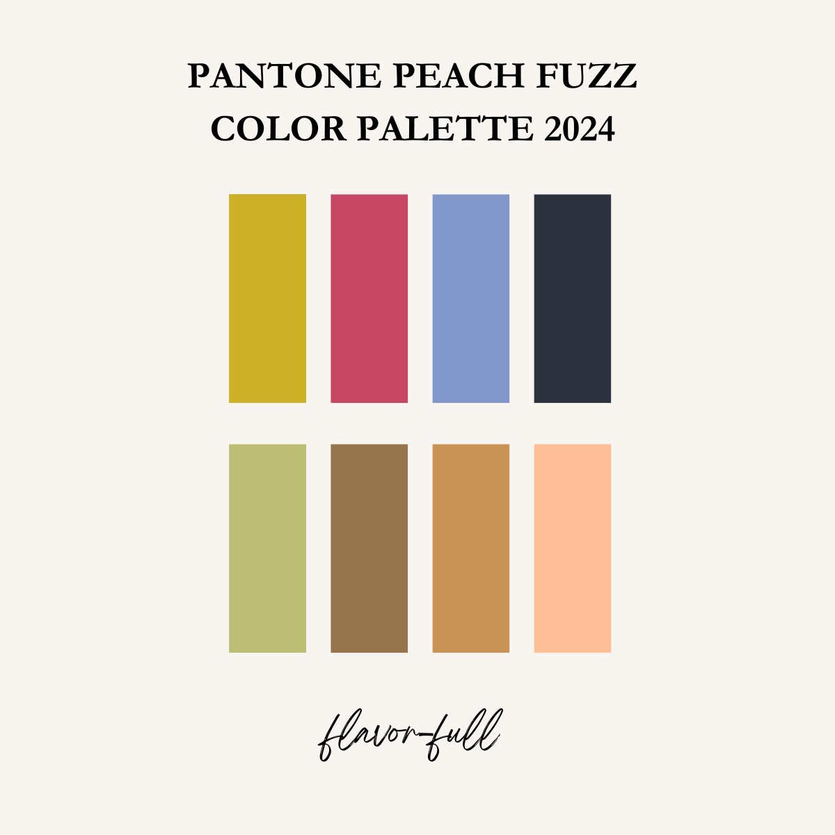
green banana – dijon – honey yellow – peach fuzz
Flavor full is a group of tasteful shades whose distinct and striking appearance lends itself to complex and engaging color combinations.
Read more about the Pantone Color of the Year 2024: Peach Fuzz
Benjamin Moore: Blue Nova
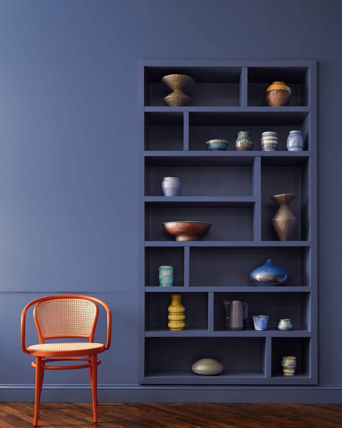
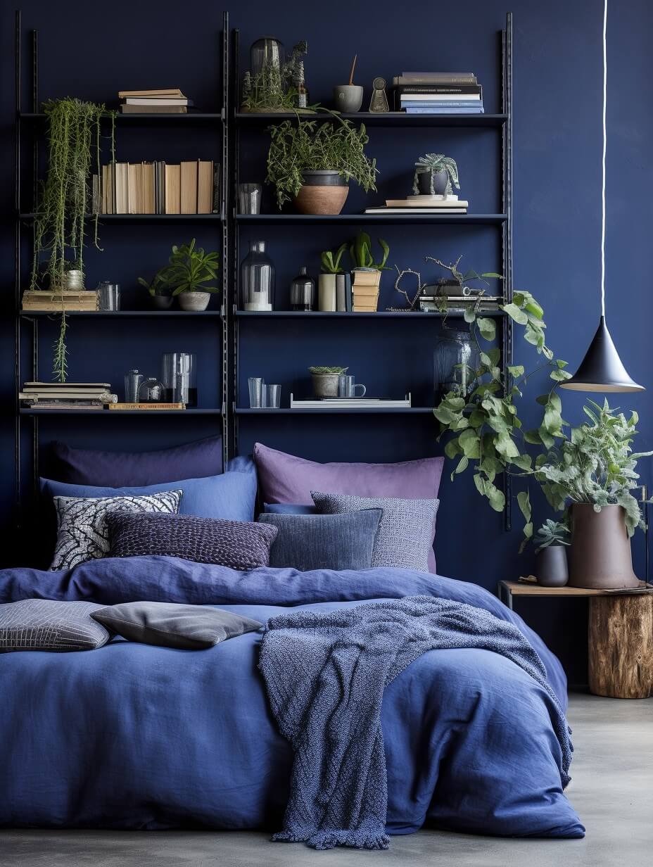
Benjamin Moore has chosen Blue Nova as their Color of the Year 2024. Blue Nova is a mixture of blue and violet, inspired by the brilliance of a new star formed in space.
“Blue Nova is an alluring mid-tone that balances depth and intrigue with classic appeal and reassurance. The Color Trends 2024 palette tells a story of duality – juxtaposing light against dark, warm and cool, showcasing complementary and contrasting color pairings.” says Andrea Magno, Color Marketing and Development Director at Benjamin Moore
Benjamin Moore Color Trends 2024 Palette
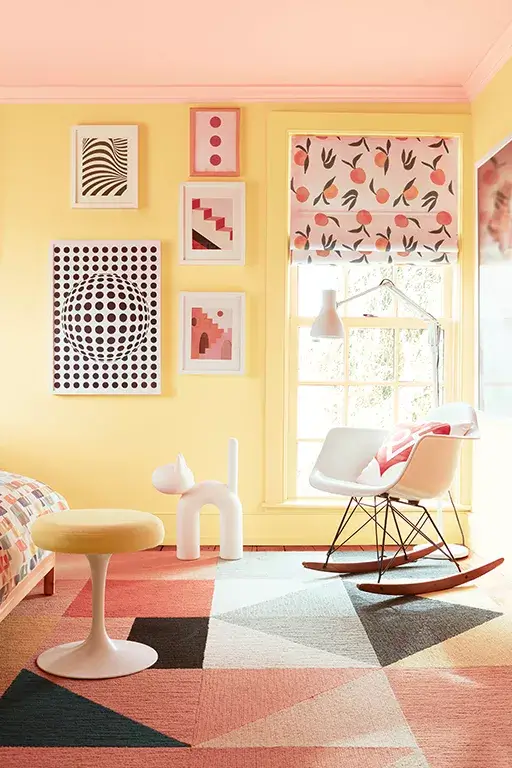
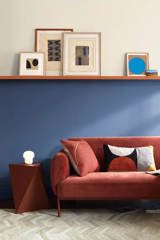
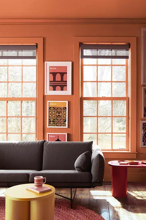
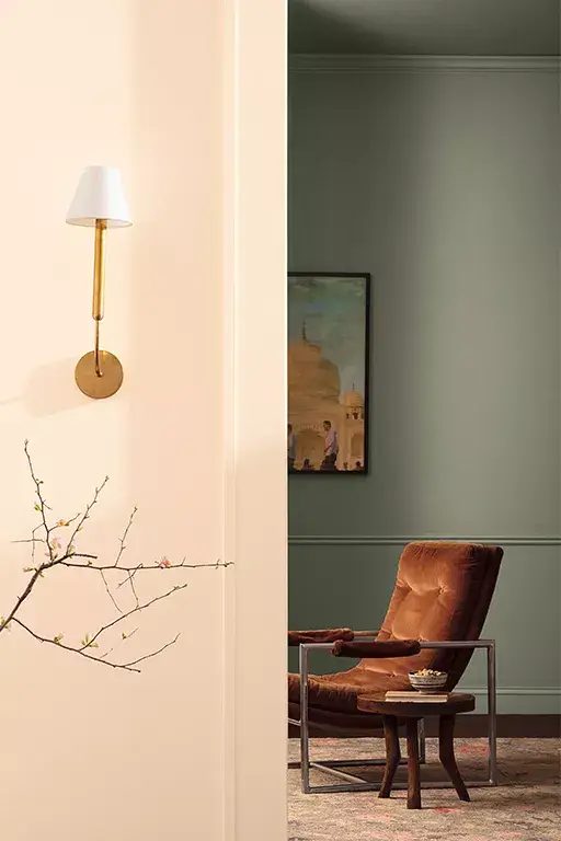
Benjamin Moore has also created a trending color palette with ten beautiful shades. This Color Trends 2024 Palette is all about subtle colors and playing with contrasts. Apart from the 2024 Color Blue Nova, the color palette includes beautiful neutrals like the classic White Dove and colorful accents like a soft yellow and a terracotta shade.
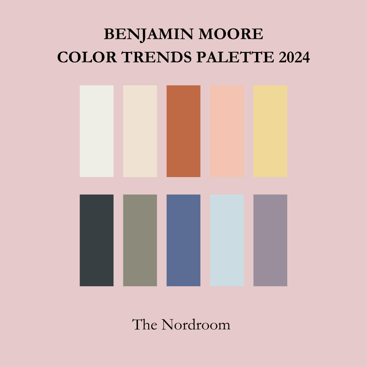
Regent Green – Antique Pewter – Blue Nova – Polar Sky – Hazy Lilac
Read more about the Benjamin Moore Color of the Year and Color Trends
Sherwin-Williams: Upward
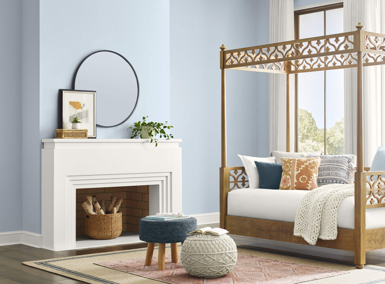
Paint company Sherwin-Williams has chosen a positive blue shade as their Color of the Year 2024. “Upward” is a breezy and blissful blue that evokes a sense of peace that you also find when slowing down and taking a breath.
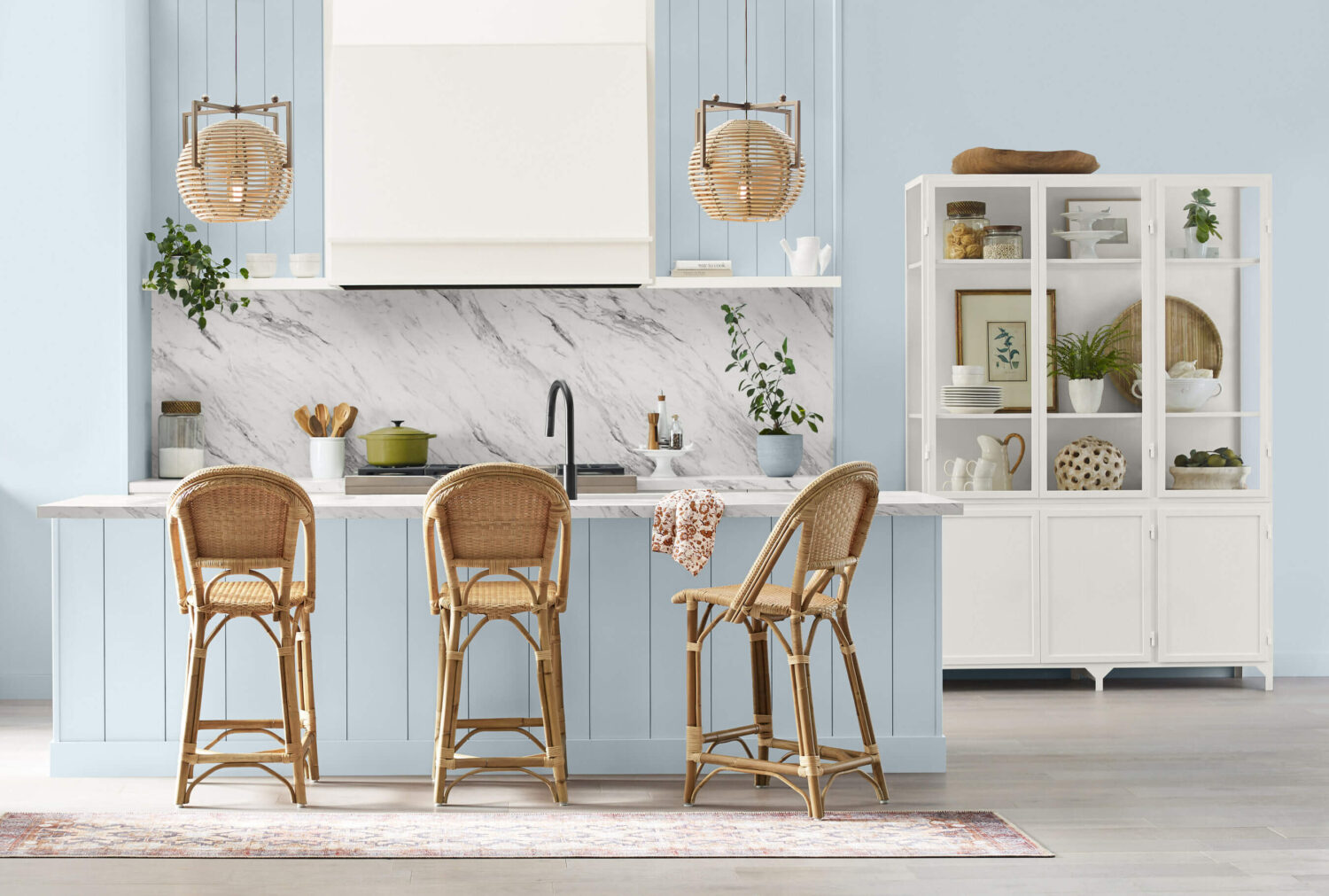
With this color, Sherwin Williams invites their consumers to take a pause and infuse a new sense of ease and possibility into their spaces. One that doesn’t overwhelm but establishes meditation and tranquility.
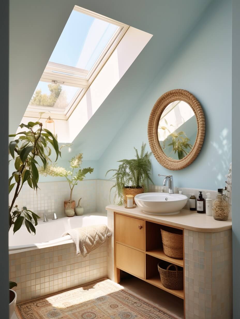

Sherwin-Williams Colormix® Forecast 2024
Sherwin-Williams 2024 color Upward is one of 48 hand-selected hues from the Colormix Forecast 2024. The color forecast is divided over four color palettes organized by color family: blues and greens, reds and purples, deeps and darks, and delicate tints.
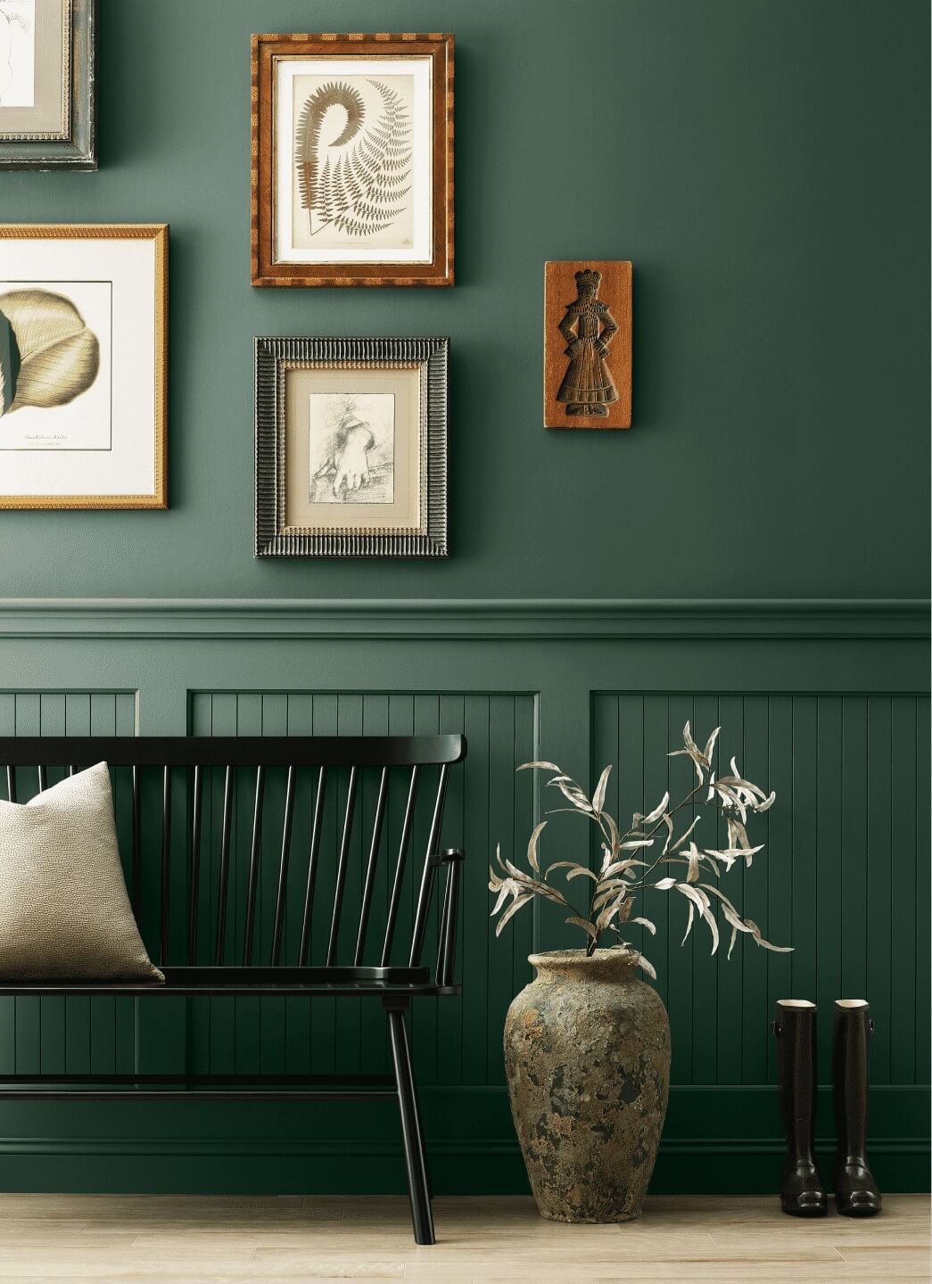
Palette No. 1: the convergence of blues and greens
This palette revolves around the color connection between blues and greens, shared across a range of organic, calming-yet-invigorating hues.

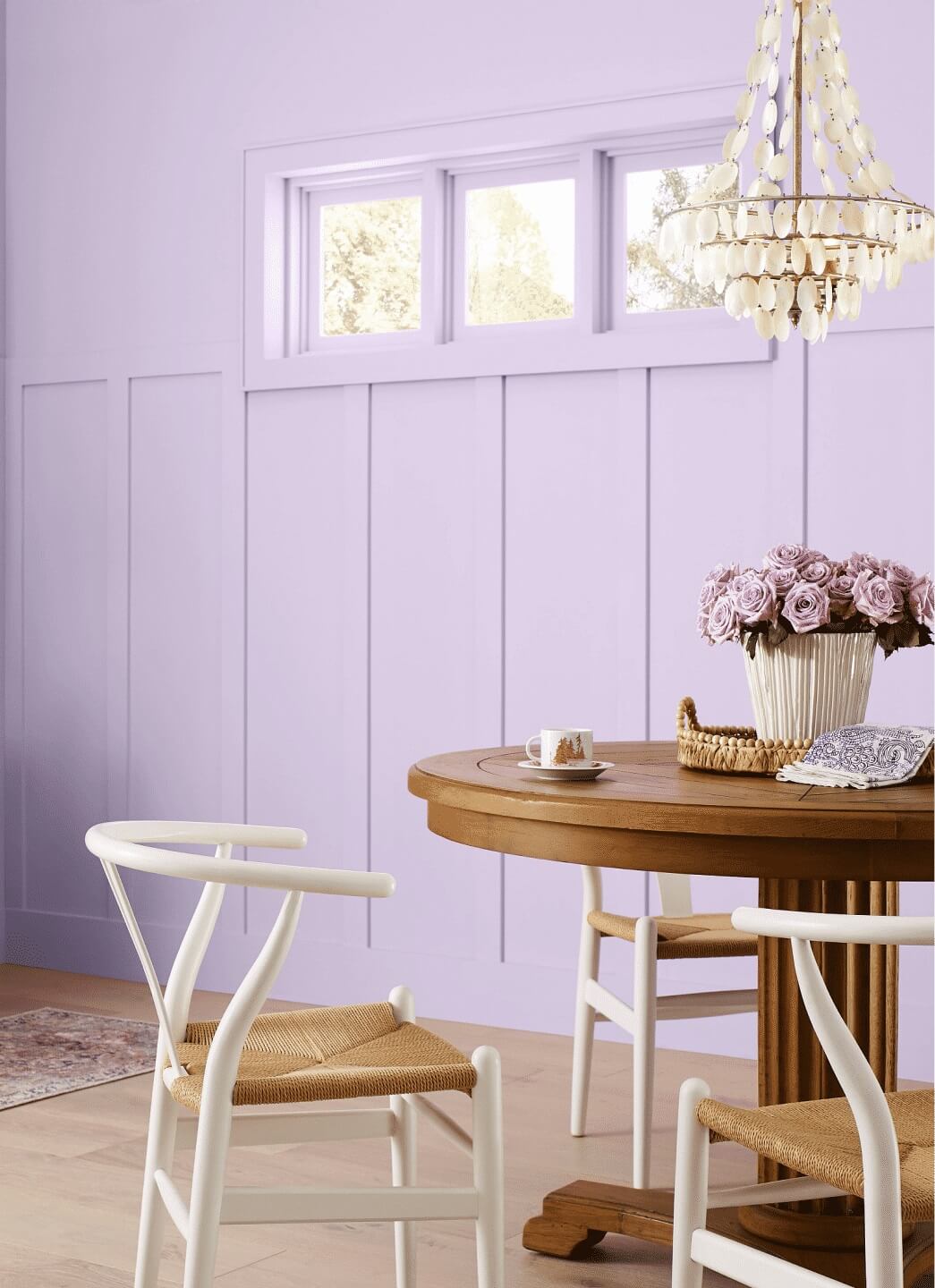
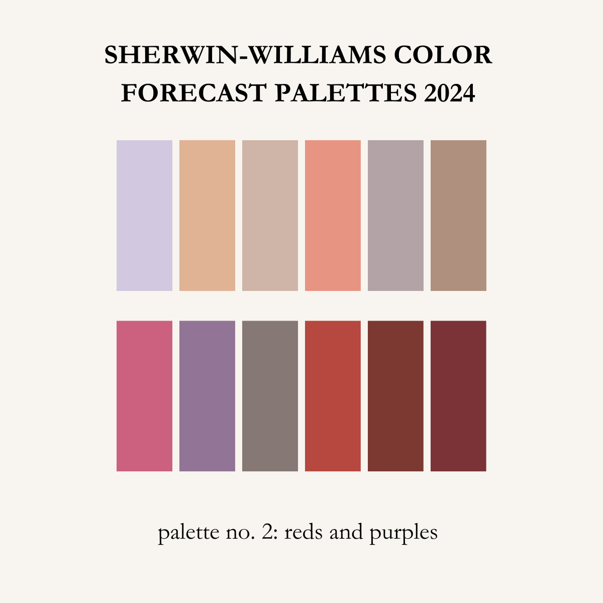
Palette No. 2: the poetry of reds and purples
Get creative with this palette of reds and purples made for maximalism – a group of warm, saturated hues paired with understated neutrals.
Palette No. 3: a gathering of deeps and darks
Escape into a restful retreat with this palette of deep, dark colors. A range of dramatic hues that introduce powerful contrast and a little mystery.


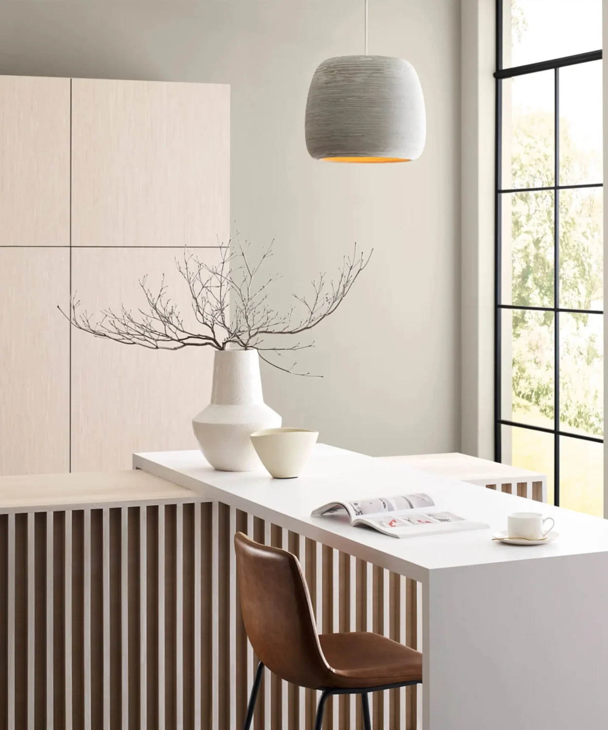
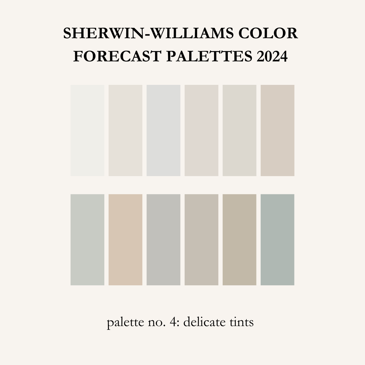
Palette No. 4: a study in delicate tints
In a palette that’s both hushed and harmonious, airy tints intermingle with soft whites to deliver elevated, minimalist style.
Read more about the Sherwin-Williams Color of the Year 2024 and Color Forecast
Behr: Cracked Pepper
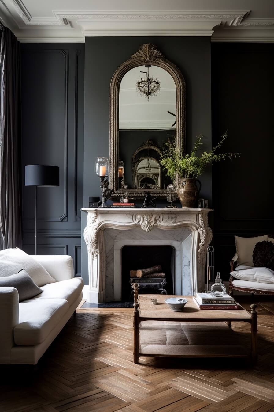
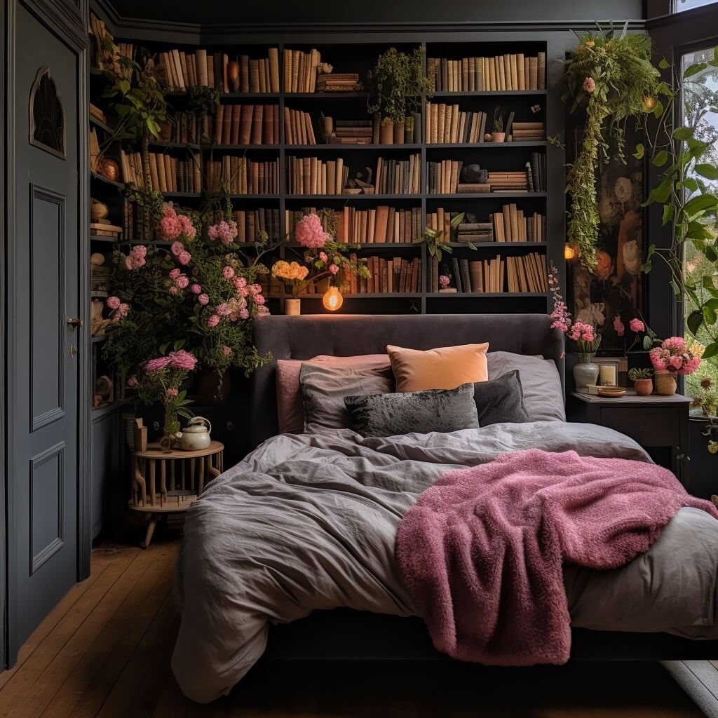
Behr Paint Company has chosen “Cracked Pepper” as their Color of the Year 2024. Cracked Pepper is a neutral, timeless, and modern shade that awakens the senses and exudes confidence.
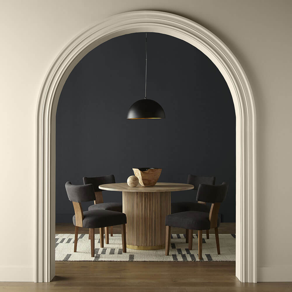
“As we look into 2024, creating a sense of comfort and belonging will continue to drive design decisions—but now, as life returns to its more familiar rhythms, it’s time to allow our senses to come alive, from heightening the aromas of a dining room to feeling the softness of a living area, Cracked Pepper enhances the natural expression in any space,” says Erika Woelfel, Vice President of Color and Creative Services at Behr Paint Company.
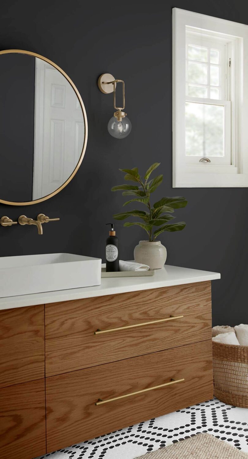
The versatile dark gray hue works in any interior style and on any surface. From the walls to furniture and accessories, Cracked Pepper adds a stylish tone to your interior, and it can easily be combined with other colors.
Behr Color Trends Palette 2024
The color of the year is one of fifteen colors in the Behr Color Trends Palette for 2024. The palette ranges from light neutrals to bold colorful shades.
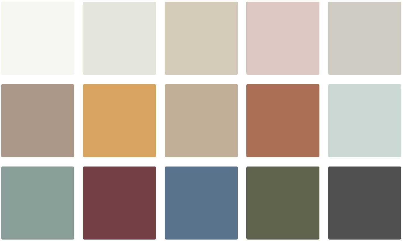
Middle Row: Chic Taupe – Amber Brew – Riviera Beach – Orange Flambe – Offshore Mist
Bottom Row: Provence Blue – Rumors – Laguna Blue – Mountain Olive – Cracked Pepper
Read More: Behr Color of the Year 2024: Cracked Pepper
PPG & Glidden: Limitless
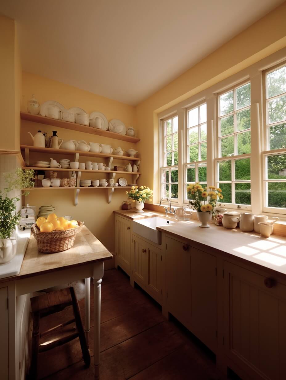
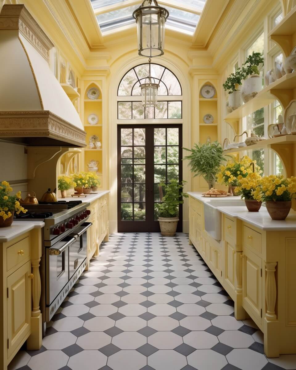
PPG and Glidden Paint have chosen a combined color of the year. Limitless is PPG’s and Glidden’s Color of the Year 2024. Limitless is a honey beige color that offers infinite design possibilities.
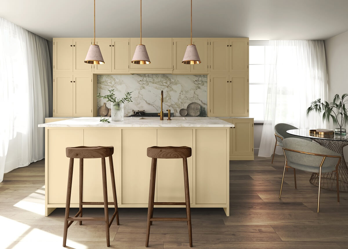
The calm and sophisticated color is a shift toward a desire for warmer interior spaces and less saturated colors.
PPG and Glidden Color Palettes
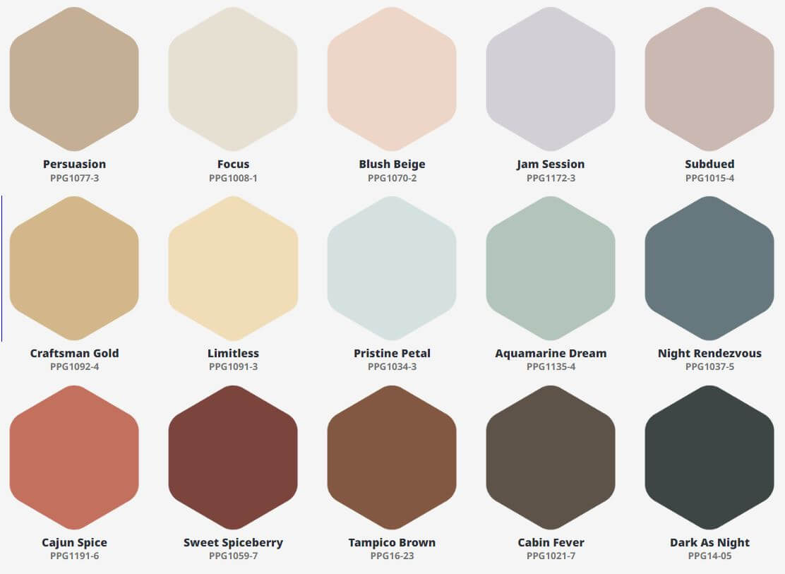
Together with the color of the year, PPG and Glidden have created three color palettes with forty complementary hues that will help you decorate with Limitless. Combined with these colors, Limitless feels warm, soothing, curated, and elegant.
Volume I
Calming, soothing, and softening tints and tones are offset by warmed earthen and cooling twilight shades. Volume I is about checking out of the world at large and tuning elsewhere.
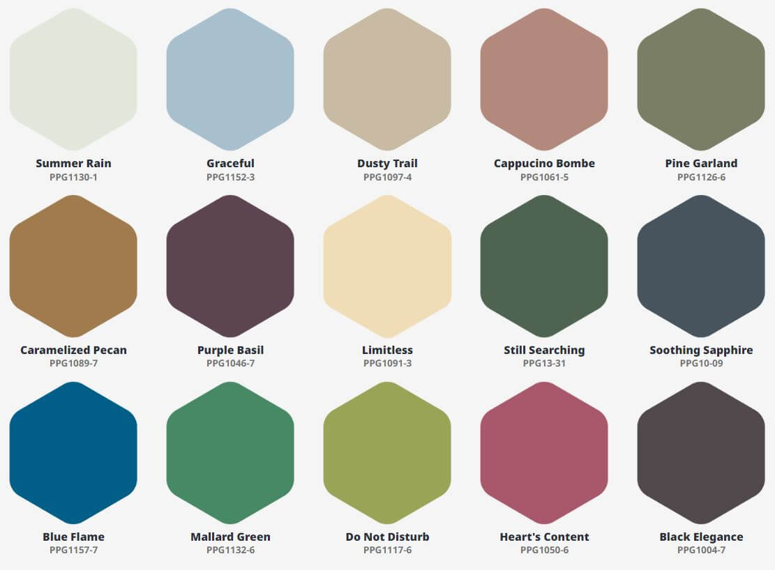
Volume II
A generous range of earthy and natural greens pair with a bouquet of warm and floral hues – further energized by vivacious blues and kept in balance by dark neutrals. Volume II is all about transforming the world at large into a place of wonder and awe.
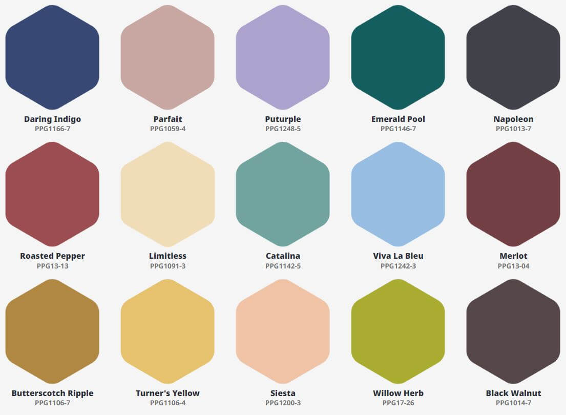
Volume III
Referencing popular hues from the Baroque, Renaissance, Art Deco, and Pop Art periods, this palette combines the best of the best. Volume III is all about defying and reinventing the world at large.
Read More: Glidden and PPG Color of the Year 2024: Limitless
Valspar: Renew Blue
Valspar has taken a simplified approach to their Color inspiration. Usually, the paint company chooses twelve trending colors, but for 2024, they selected only one Color of the Year.
Renew Blue is the Valspar Color of the Year 2024. Renew Blue is balanced blue with a touch of grayed sea green that focuses on wellness and comfort. The color sets a restful and meditative mood in any room of the house.
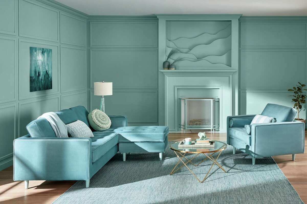
The 2024 color is carefully selected by the Valspar color experts as they concluded that consumers seek consistency in their homes and work to find balance where it matters the most. With a renewed focus on self-care and personal well-being, homeowners are looking for ways to make their houses an uplifting place to relax, recharge, and entertain.
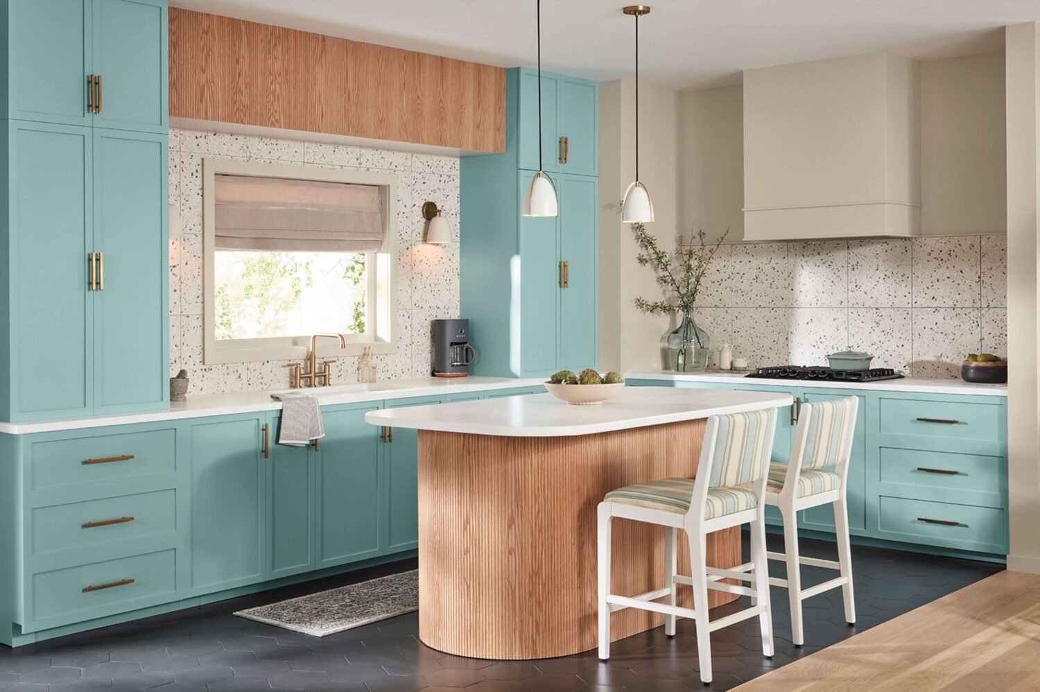
See more: Valspar Color of the Year 2024: Renew Blue
Dulux: Sweet Embrace
Dulux has chosen a soft pastel pink shade called Sweet Embrace as their color of the Year 2024. Soft feathers and evening clouds inspired the Dulux color Sweet Embrace. It is the perfect shade for creating a calm and welcoming space that so many of us crave.

The refined and optimistic color is a warm and practical stand-alone shade, but it is also a great base color to combine with many other hues. The subtle color warms north-facing spaces and softens sunlit rooms.

Dulux Color Palettes
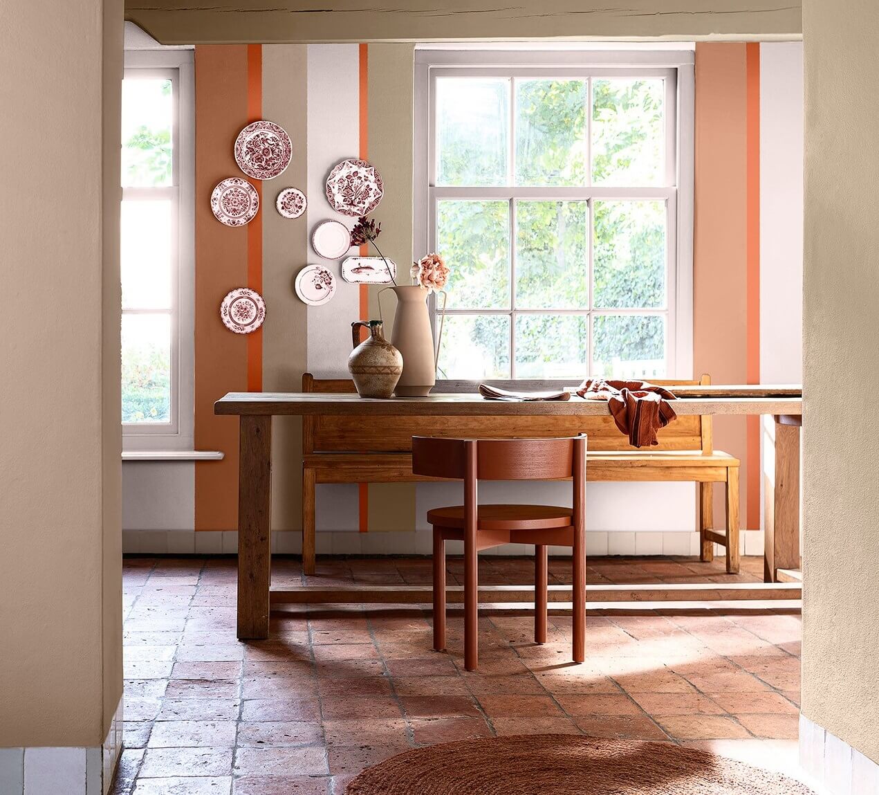
Three color palettes (warm, uplifting, and calm) have been designed around Sweet Embrace to help you choose trendy and harmonious wall colors that reflect your unique personality.
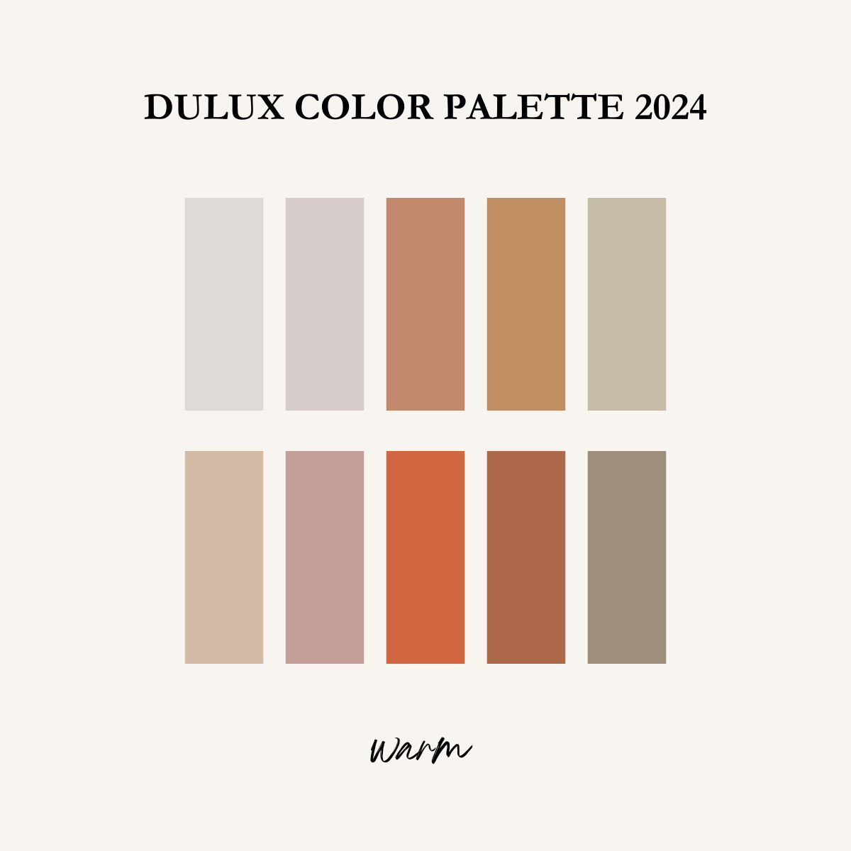


The warm palette reminds you of home, a place that feels comfortable and safe. The warm palette combines shades of stone, earth, and clay.

The calm color palette evokes thoughts of nature and the essence of life by bringing together the soft greens and blues of the forest and the sea.

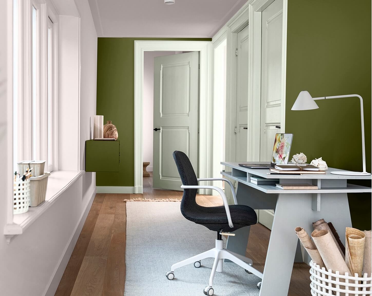
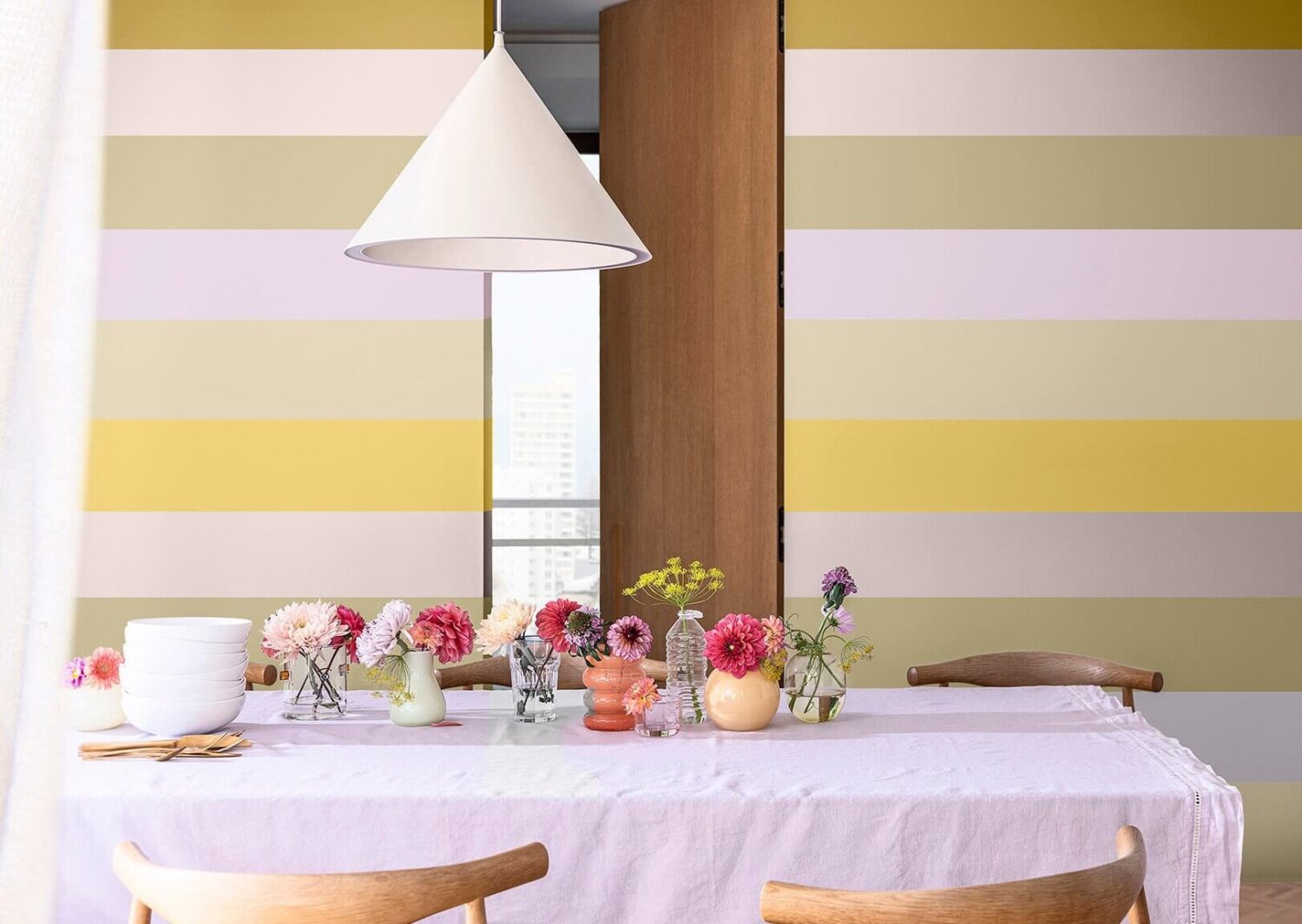
The uplifting color palette puts a smile on your face with dreamy lilac tones and modern yellow shades.


Dulux Color Forecast
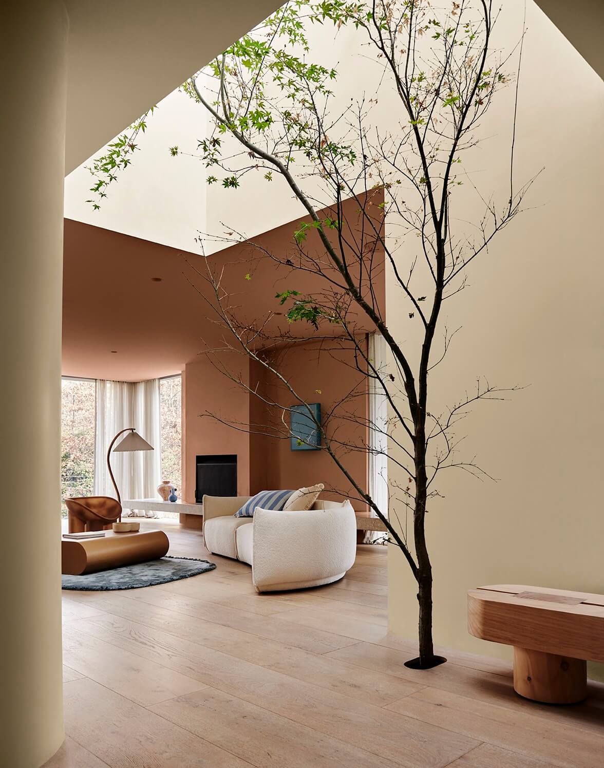
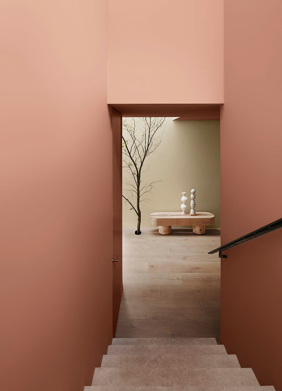
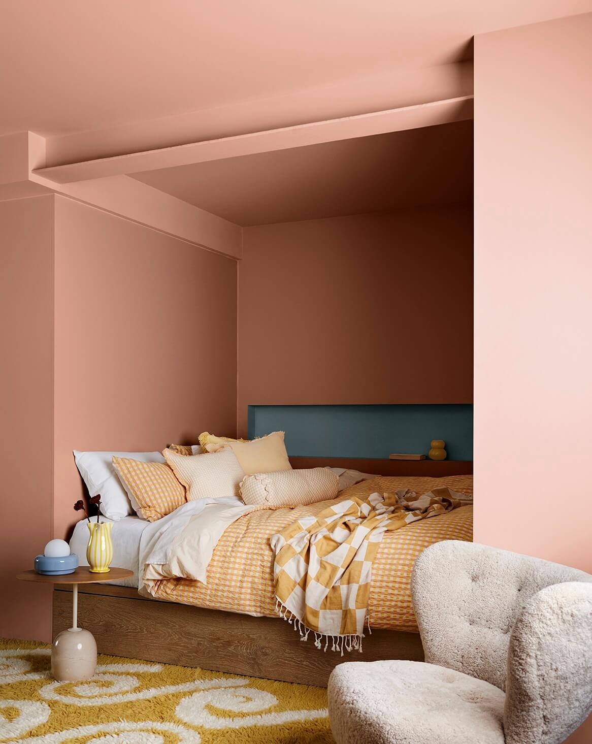
Paint company Dulux (Flexa in some countries) has released its color forecast for 2024. Their color trends reflect an inner desire for positivity and nurturing home spaces. The Dulux color trends 2024 feature warm colors with hints of yellow, clay tones touched by pink, deep reddish-brown, olive green, and subtle accents of light blue and vibrant yellow.
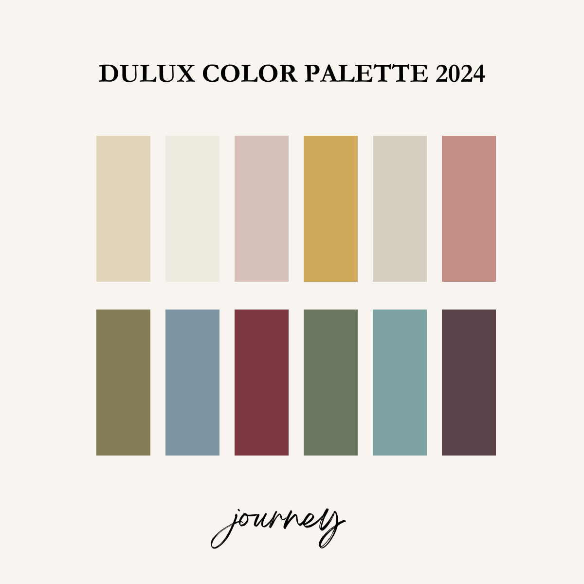
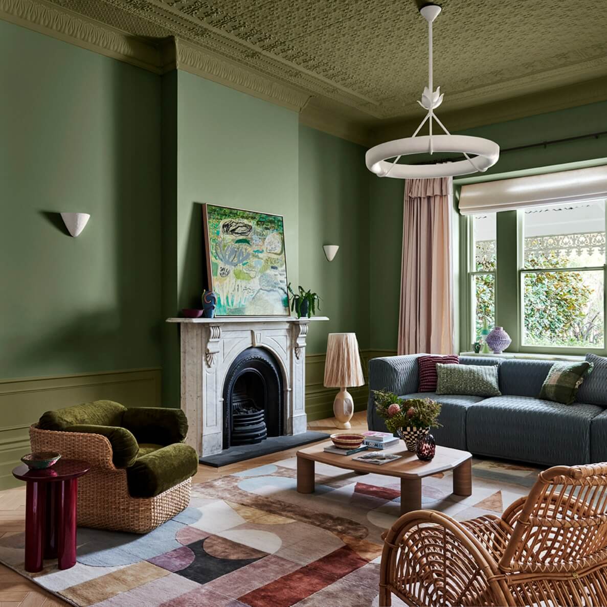
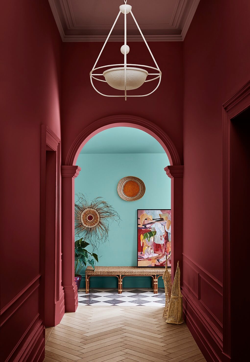
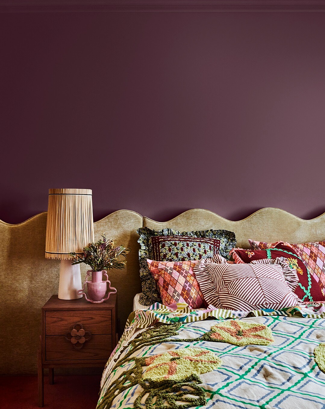
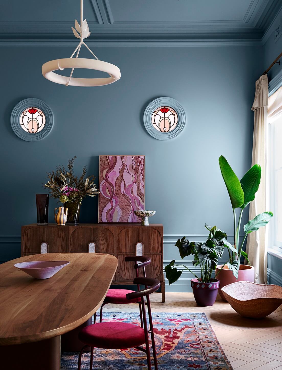
The Dulux color forecast is divided into three color palettes: Solstice, Journey, and Muse. Each color palette has its own story and inspirations, which are showcased in beautiful interiors.
Solstice
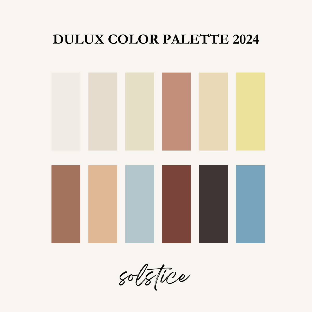
The Solstice palette draws inspiration from the minimalist Scandinavian design. But it also incorporates elements from Mediterranean and desert aesthetics. This color palette melds warm shades with cooler highlights, enriched with details like braiding and primitive sculptural designs.
Journey
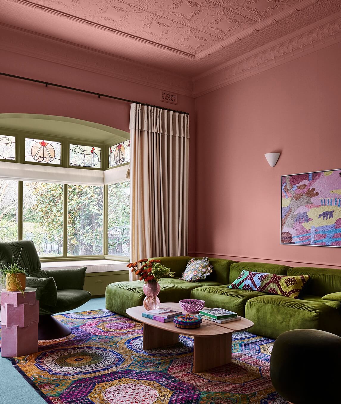
The Journey palette delves into the narrative of interior spaces, merging global inspirations from our travels and honoring the legacy of our ancestors through cherished heirlooms and artifacts. Embodying a maximalist essence, this color trend showcases a diverse and eclectic palette.
Muse
The Muse palette seamlessly blends nostalgia with modernity, creating timeless and distinctly contemporary spaces. Drawing significant inspiration from the ’70s yet infused with contemporary nuances, Muse honors the iconic designs of the past.

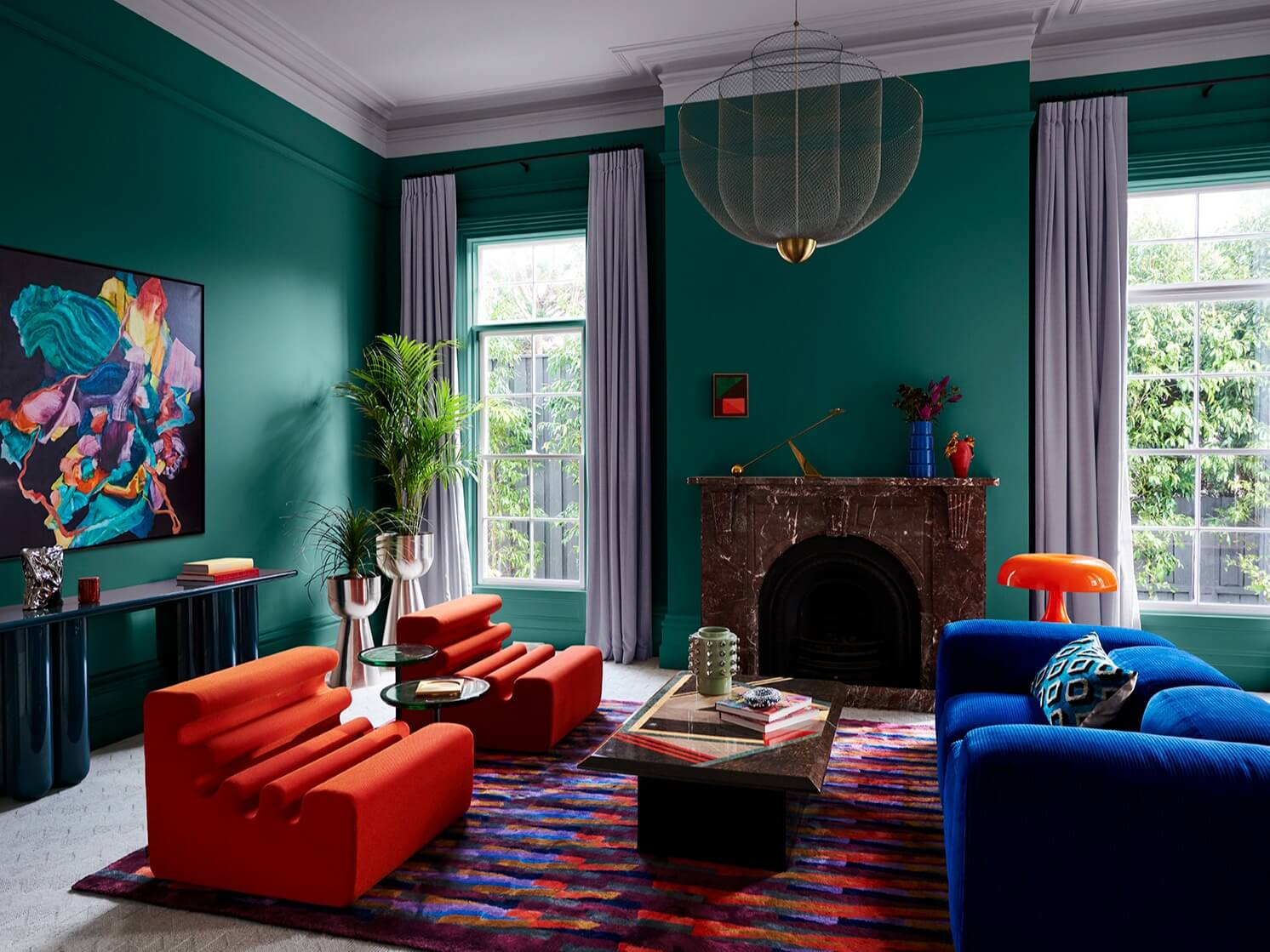
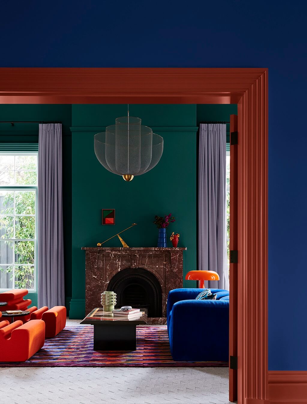
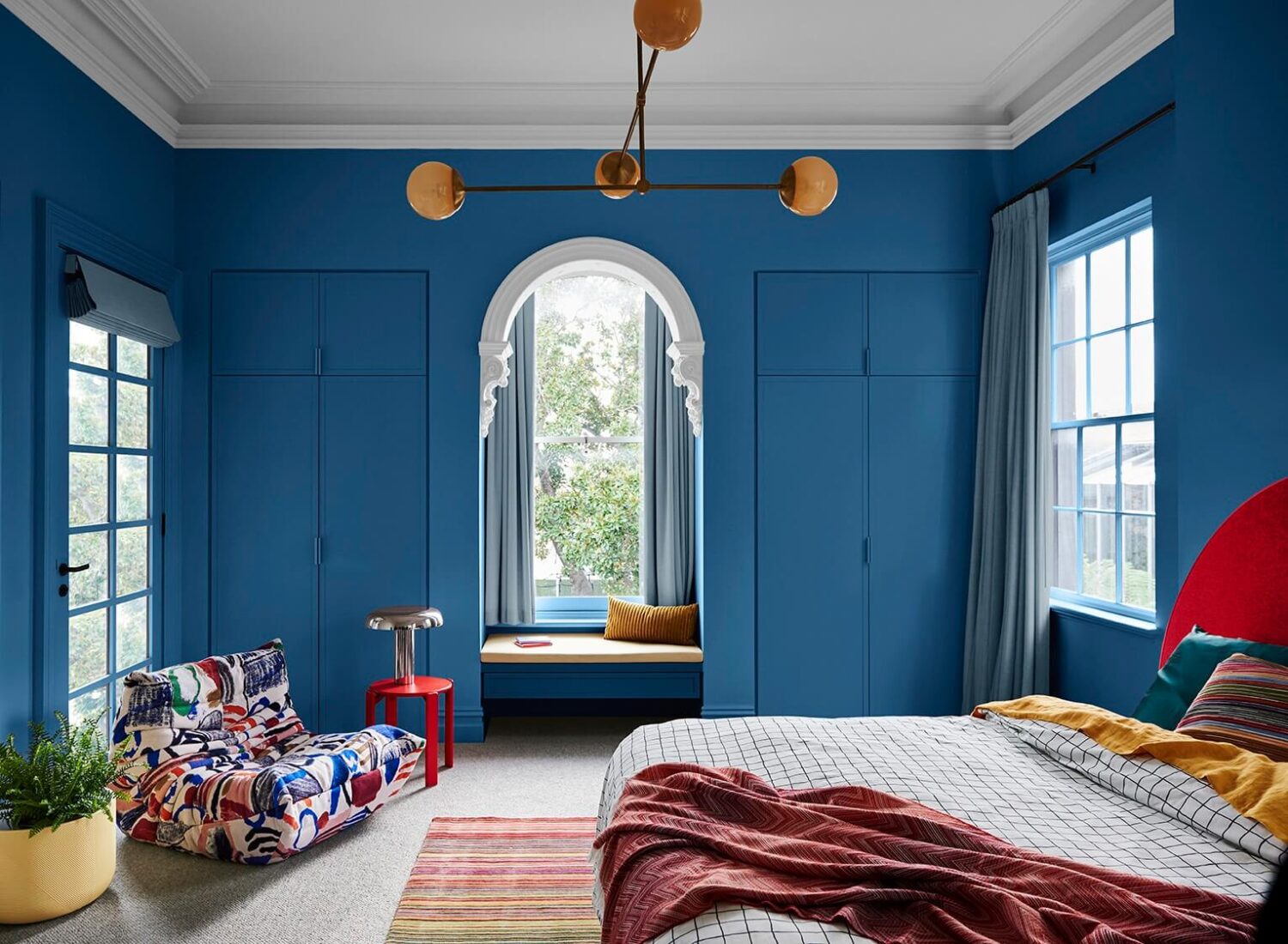
Read more about the Dulux Color Forecast 2024 including more inspiring colorful interiors
HGTV Home by Sherwin-Williams: Persimmon
HGTV by Sherwin Williams has created a 2024 Color Collection called Renewed Comfort. The ten colors in this collection feature the HGTV by Sherwin-Williams Color of the Year 2024: Persimmon.
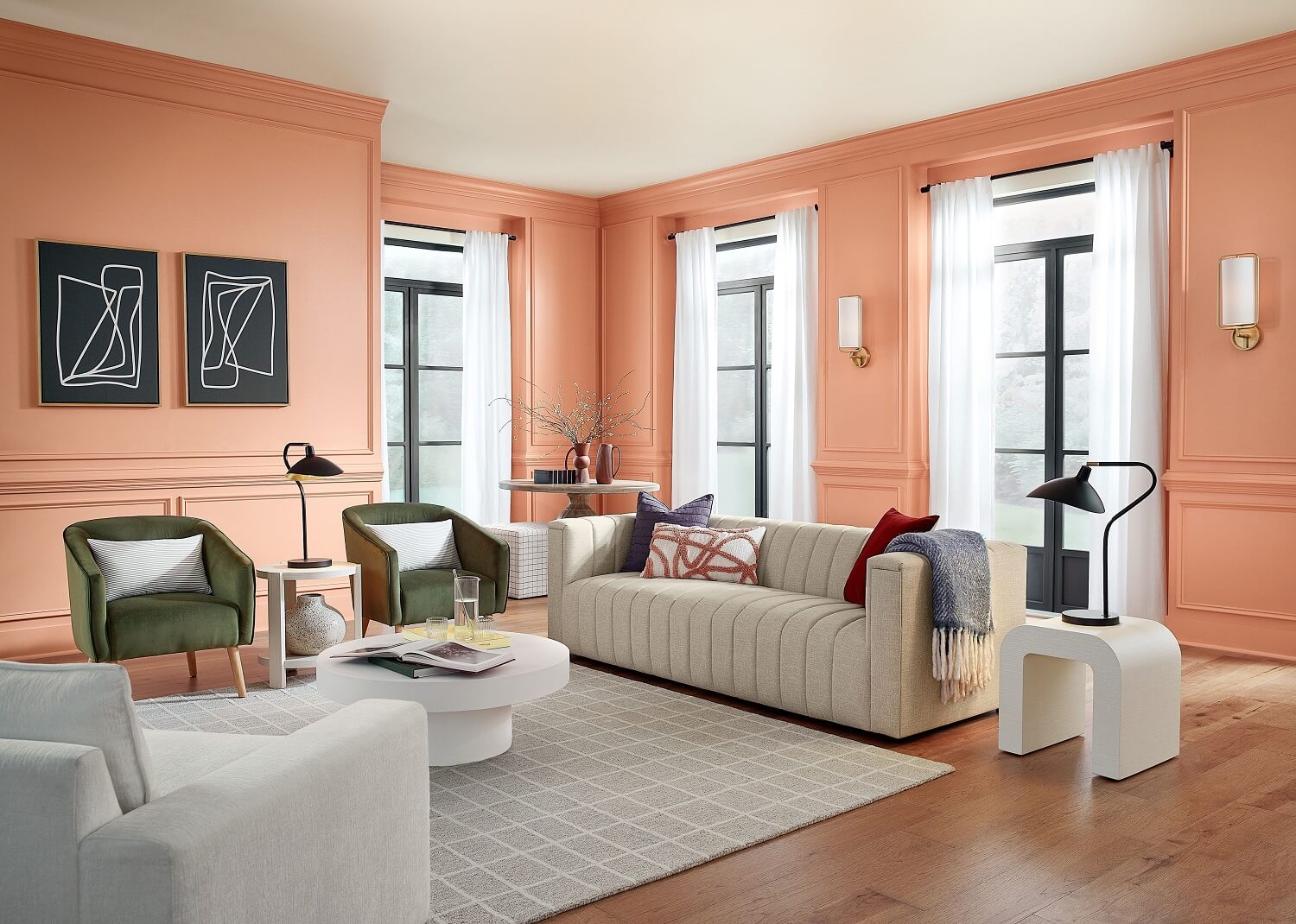
Drawing from its grounded and earthy origins, Persimmon presents a hue that feels uplifting and refreshing. With hints of tangerine infused into an earthy terracotta base, such naturally derived shades, exemplified by the exquisite Persimmon, are being used to soften interior spaces and add a personal touch to a home.
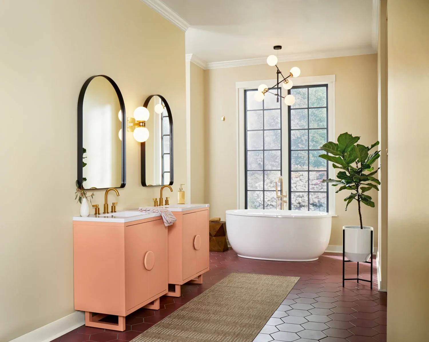

HGTV Home by Sherwin-Williams Color Trends
The Color of the Year is paired with five color trend palettes that each create their own unique colorful interior.

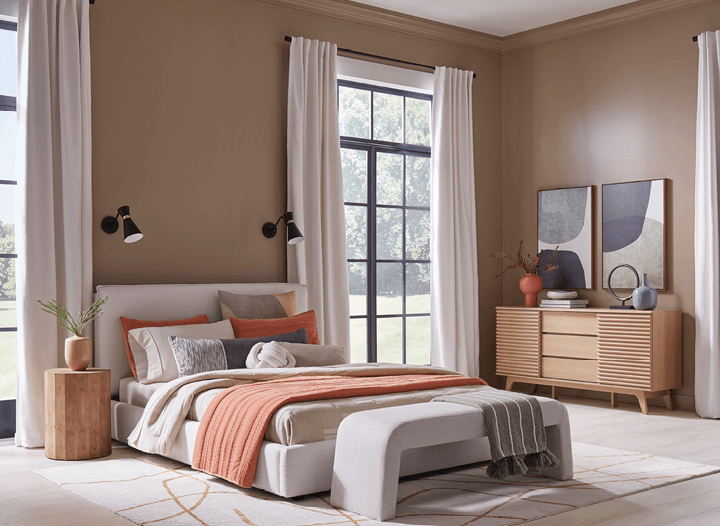
Return to the Cocoon
Relaxing neutral and layers of texture persuade us to slow down and unwind. Plush, upholstered bedframe, headboard, and gently curved bench beckon us to a favorite restorative space -our own Utaupeia, if you will.
The colors in this palette: Utaupeia, Pearly White, and Cyberspace
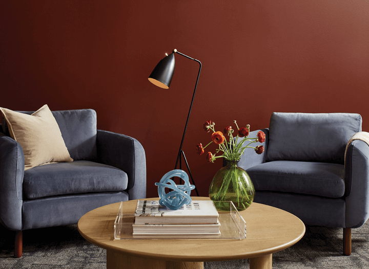
Create Space for Gathering
If you build it, they will come. And if you carve out that space in a deep charcoal and envelope it in a rich burgundy, they will gather. Social nooks are places to find inspiration in friends and family.
The colors in this palette: Dark Auburn and Cyberspace
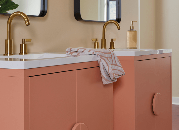
Embrace Curves for Softness and Comfort
Sharp angles give way to curves in the Renewed Comfort color palette designs. Traditional gold tones complement tan and white neutrals in quietly colorful contours.
The colors in this palette: Persimmon, Softer Tan, and Pearly White
Play with Personality
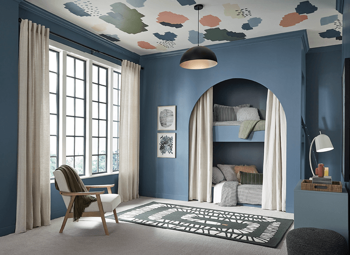
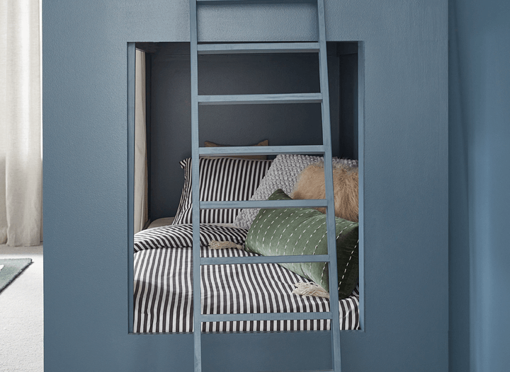
Finding your sense of self in design brings an important level of comfort. Complementary hues of blue are interrupted with playful moments of personality on the floor and ceiling.
The colors in this palette: Waterloo, Cyberspace, and Stardew
Infuse Joy into Rooms for Work
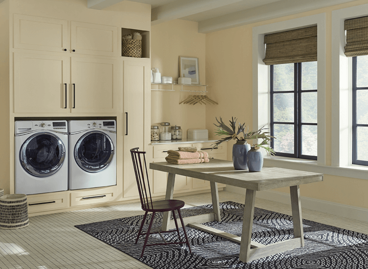
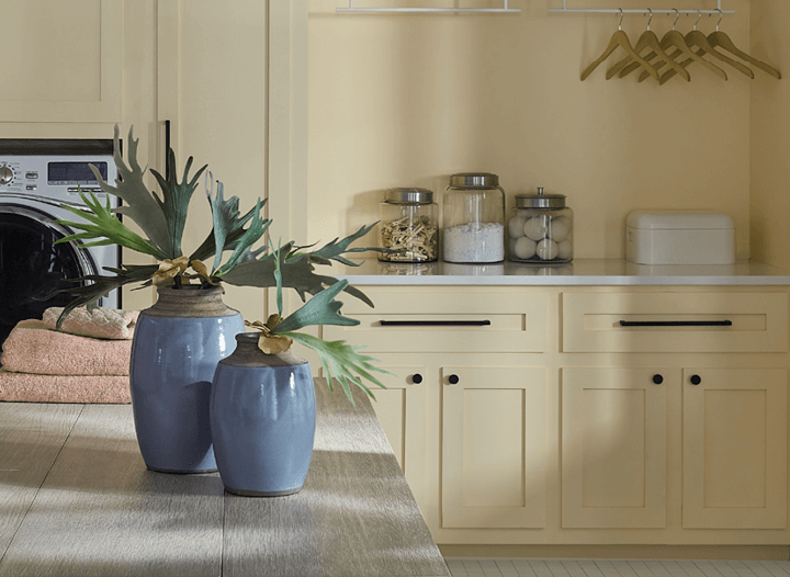
Utility spaces work harder than most. Select colors that infuse a sense of happiness and well-being, like a soft yellow combined with white tones.
The colors in this palette: Friendly Yellow and Pearly White
Dunn-Edwards 2024 Color + Design Trends
Dunn-Edwards has released a 2024 Color + Design Trends collection of 48 hues across four inspired color palettes: New Dawn, Time of Comfort, View to Wonder, and Cinematic Heritage.
The expert-curated palettes project confidence and optimism for the future with misty, ethereal mid-tones, quirky brights, and strong earth-drawn colors. Every year, Dunn-Edwards color and design experts immerse themselves in emerging movements across fashion, technology, art, and popular culture to find key design themes and color stories reflecting the coming year.
For 2024, Dunn-Edwards predicts the promise of a new era reflected in interior design – being set free from temporal, geographic, stylistic, and technological boundaries to escape into new, colorful worlds of peoples’ own creation. This year’s trending palettes romanticize the mundane, nourish a softer approach, and merge the magic of nature with technology:
“People have a newfound appreciation for life and the promises it holds, and as a result, we predict 2024 will be the year to break free from the traditional dos and don’ts of interior design. These color palettes invite coziness, romance, escapism, and youthfulness, inspiring us to break the mold and transform our spaces in a meaningful way.” said Sara McLean, Color Expert + Stylist at Dunn-Edwards.
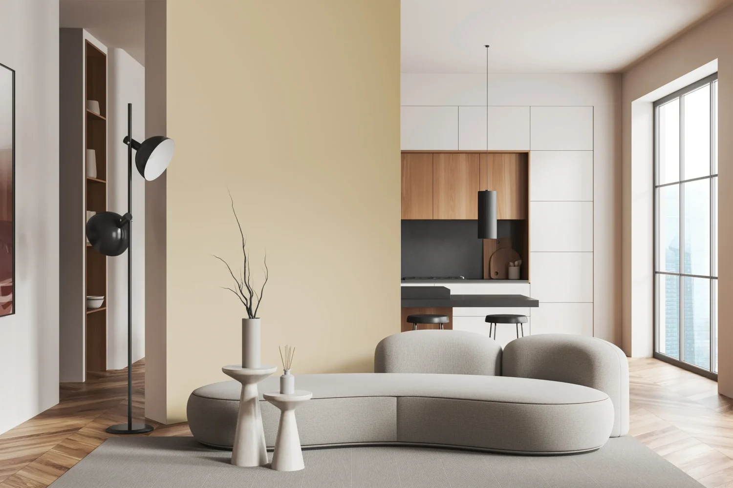
New Dawn Color Palette
This uncluttered, nature-inspired palette creates space for quiet reflection amidst the chaos of an always-on, always-caffeinated world. Made up of ethereal pastels, misted mid-tones with a touch of grittiness, grounded earth shades, and colors that feel like glimmering sunlight, New Dawn both calms and energizes with colors such as Lake Placid, Bay Fog, and Boxwood.

Time of Comfort Color Palette
Warmth is central to this palette that feels like home with tried-and-true colors spanning bread-like neutrals to garden greens, floral brights, and blues reminiscent of a day at the beach. Time of Comfort evokes a cozy retreat safely tucked away from the chaos of the rest of the world, including hues such as Cloistered Garden, Peach, and Roseberry.


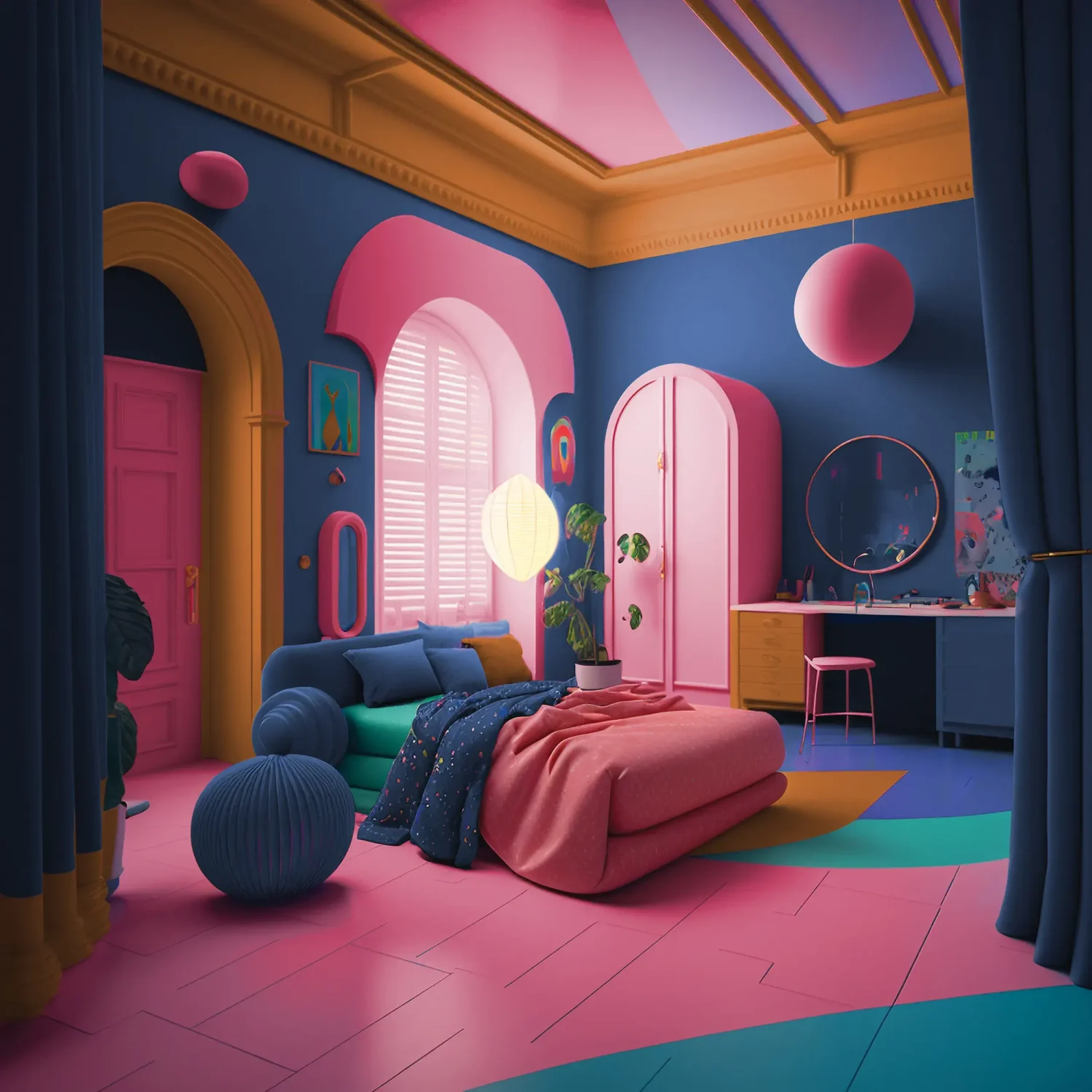
View to Wonder Color Palette
Autumn and spring collide in this escapist palette filled with warm, saturated hues and the hypnotic power of brights and sugary pastels. View to Wonder is cosmic glam meets alien chic, evoking a sense of techno-fantasy and optimism with its microbiology and multiversal influences featuring colors Pink Dahlia, Desert Spice, and Nightshade.

Cinematic Heritage Color Palette
In a fast-paced world, this palette encourages the slow romanticism of everyday rituals by combining mauves, browns, and greens with bright reds, blues, and fuchsias for a playful balance of vintage and modern. Cinematic Heritage celebrates both the past and present with hues Ochre Revival, Red Maple Leaf, and Mauve-a-Lish.

Dutch Boy: Ironside
Translating global trends from fashion, culture, and media, paint brand Dutch Boy has chosen Ironside as their 2024 Color of the Year. The deep, comforting green is a richly dimensional hue that soothes and reassures.
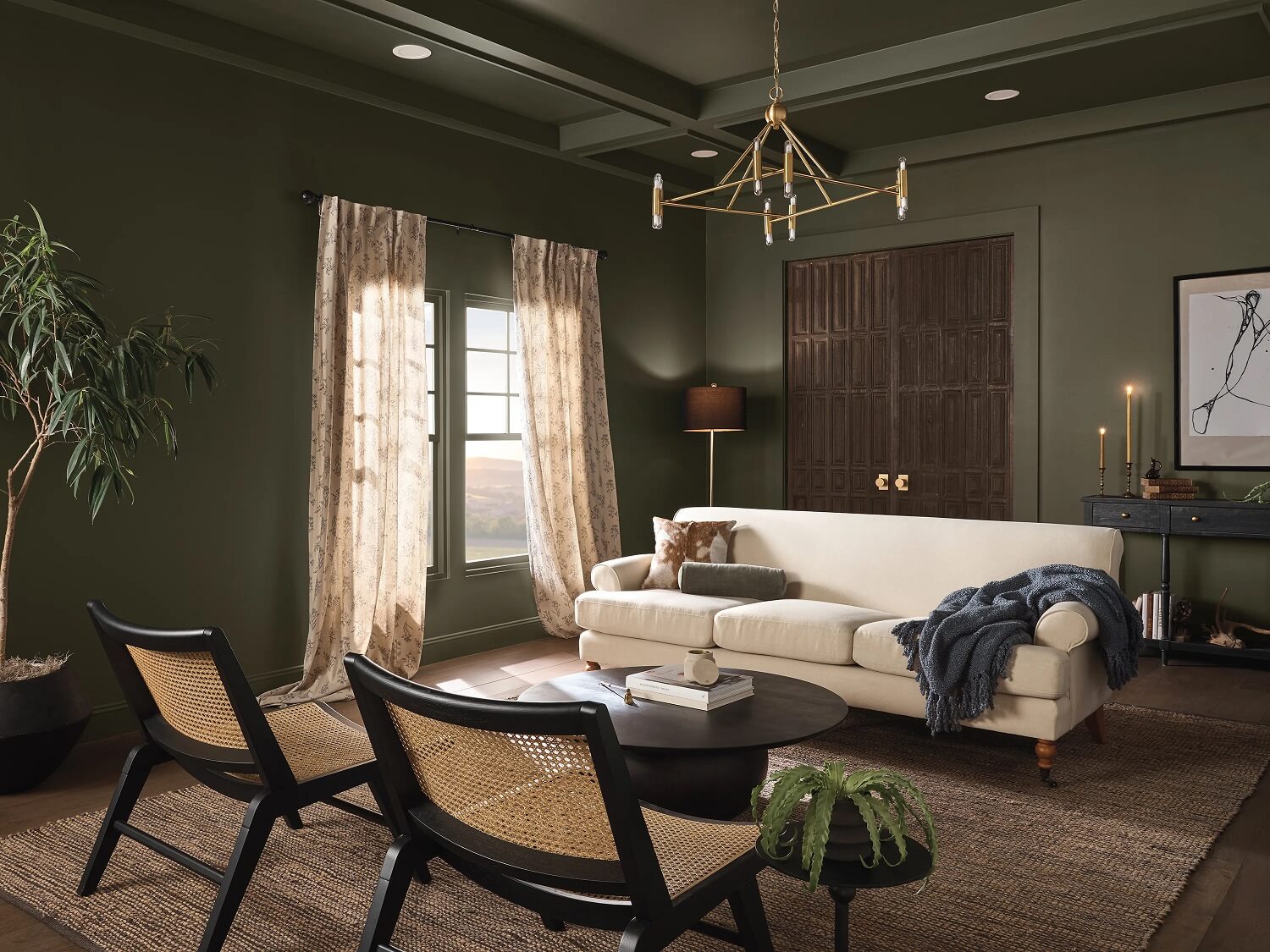
“Creating a space for wellness should be a driving factor in everyday life. That’s why taking a natural approach to healthy living and safe spaces is a pivotal part of the current landscape; Ironside incorporates all the above in one bold color and can be applied in one single coat,” said Ashley Banbury, Dutch Boy Paints’ color marketing manager.
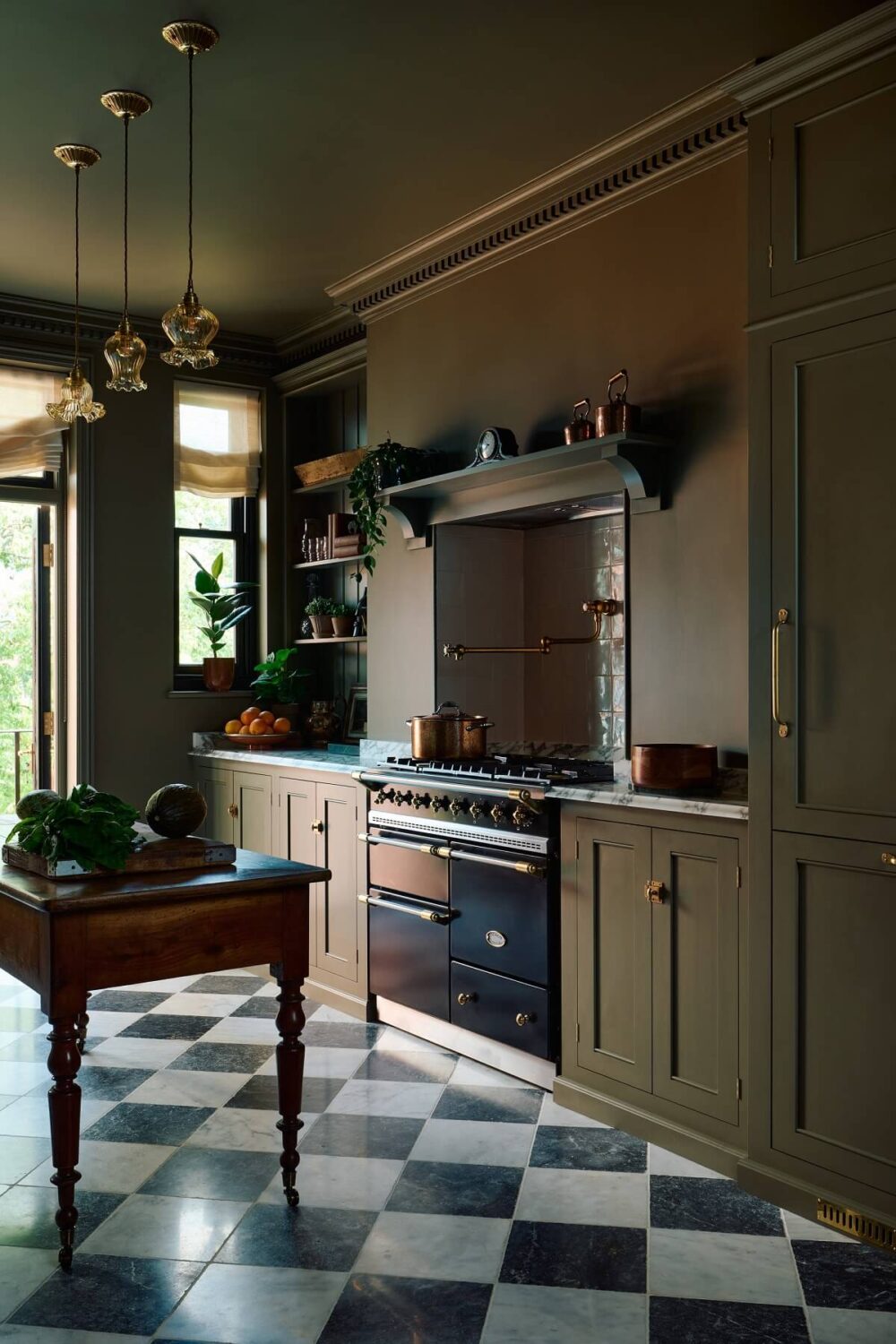
Ironside is one of Dutch Boy’s One-Coat paints designed to provide full-color coverage with just one coat of paint. Ironside is paired with three color palettes; combining them brings a sense of sophisticated comfort.
Embrace Color Palette
The Embrace Palette elevates a room as consumers make their homes a primary place for self-care and wellness. The calming hues paint the picture of a retreat to rest and recharge with shades including Antique White, Whale’s Tail, and Heritage Brown.
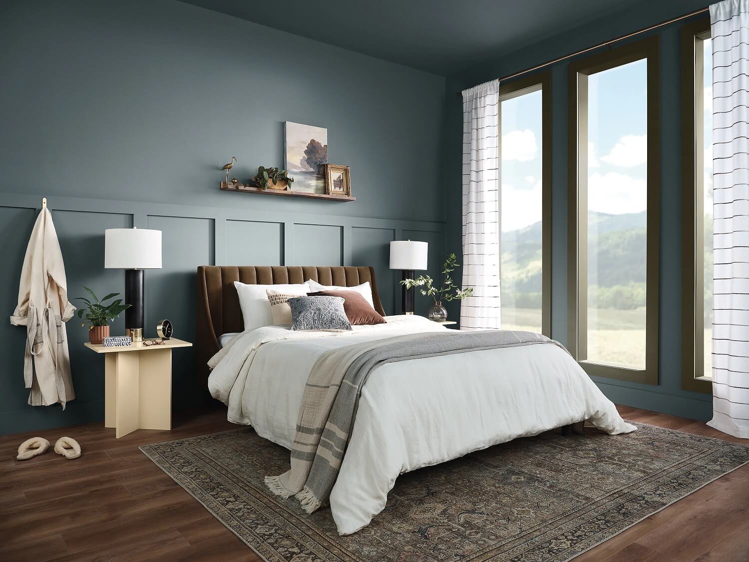
Retreat Color Palette
The Retreat Palette gives us peace of mind to explore new life angles as we take extra time for ourselves. Ironside is the color that ties Sanded Grout, Wild Orange, and Antiquated Olive together, bringing both cleanliness and warmth to the home.

Inspire Color Palette
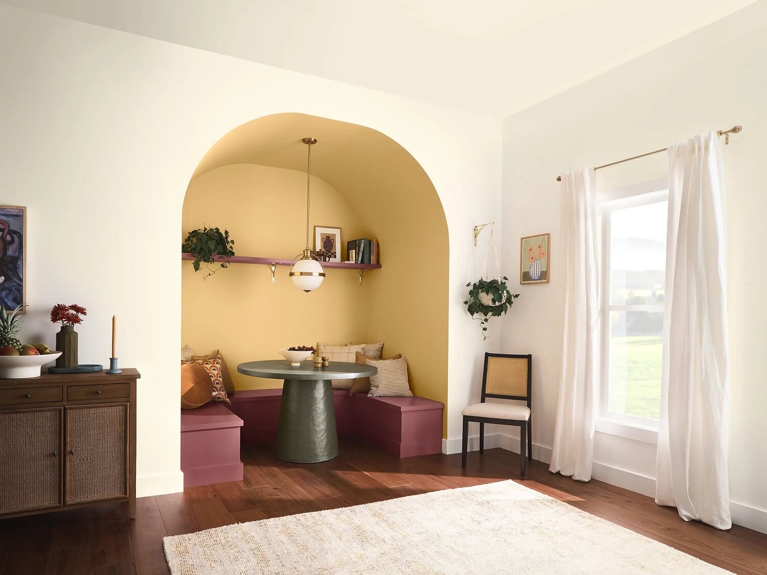
Explore color through the Inspire Palette by combining shades like Ultra White, Pineapple Flan, and Strawberry Shade.
Read more: Dutch Boy Color of the Year 2024: Ironside
Graham & Brown
Every year, British paint and wallpaper company Graham & Brown chooses a Color of the Year ánd a Design of the Year. This year, Graham & Brown celebrates a Decade of Design. Their in-house design studio has focused on their Utopia trend and created a utopian space that exudes a warm sense of hospitality for everyone who enters the house.
Everything has been developed from the trend that the boundaries between spaces are blurring: they can be both indoors and outdoors and form a beautiful backdrop for conviviality.
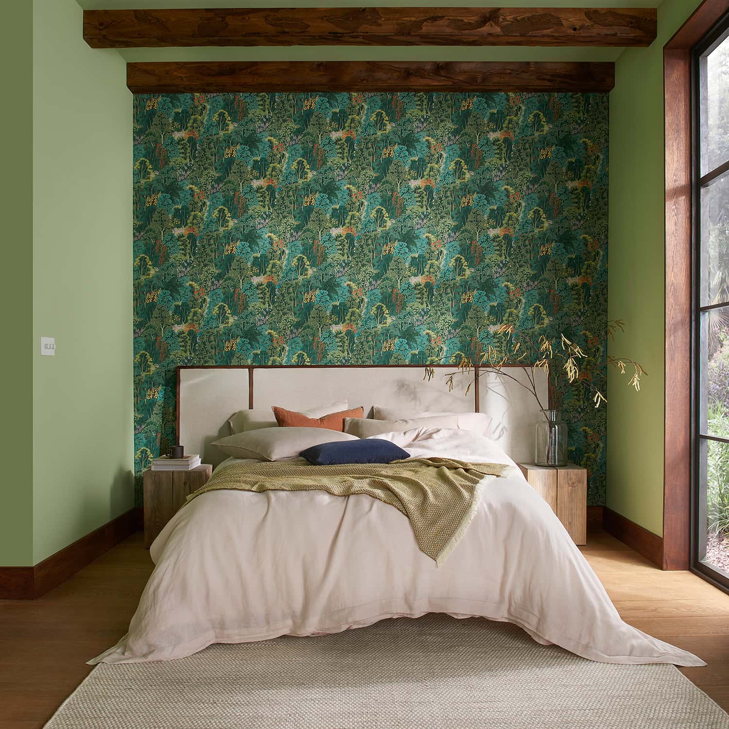
The Design of the Year is inspired by the Japanese concept of Omotenashi and created to provide a welcoming atmosphere and ultimately create a perfect ambiance in the home. The Utopia trend encourages people to open their homes to others, let the outside world in, and make guests feel at home.
Graham & Brown Color of the Year 2024: Viridis
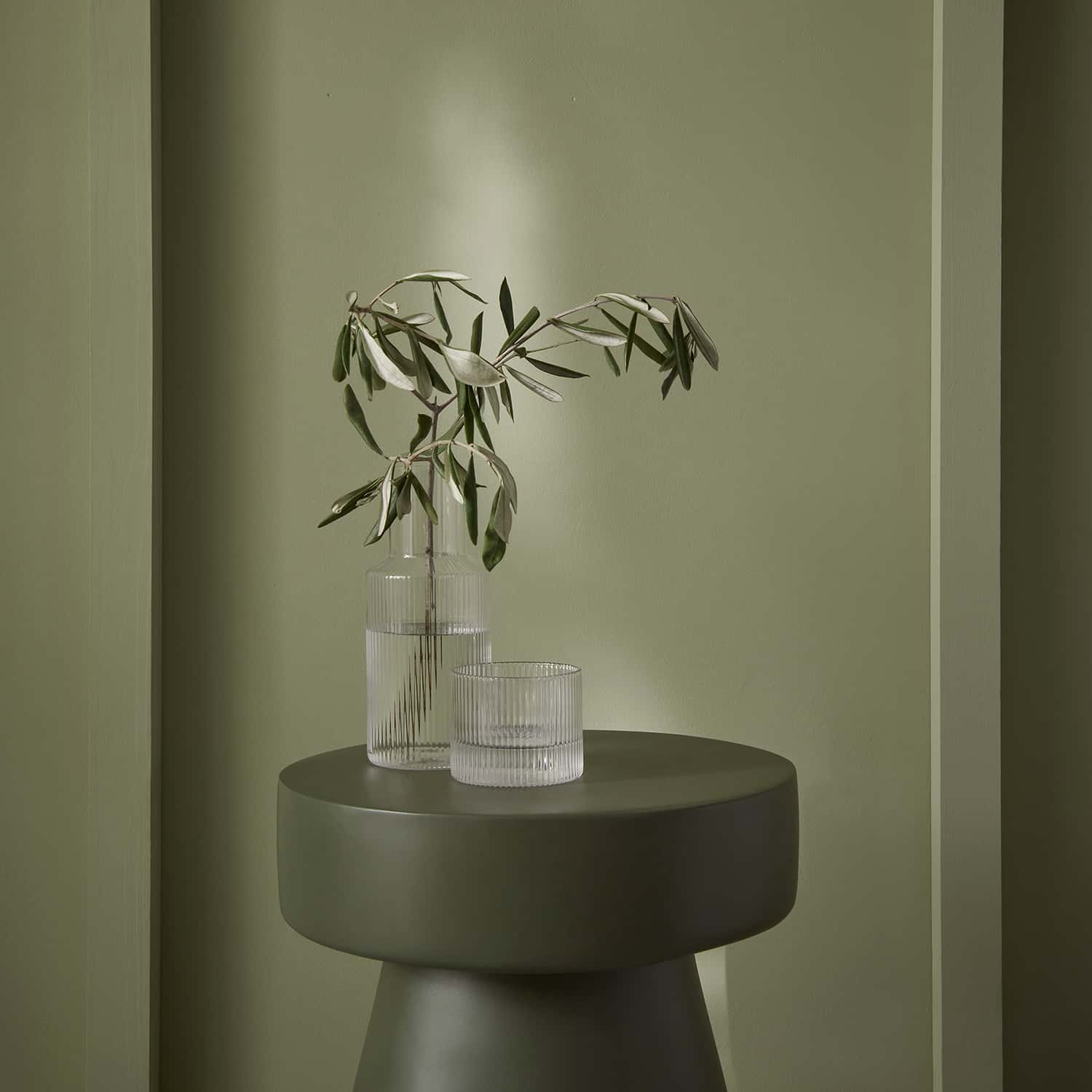
The Graham & Brown Color of the Year 2024 “Viridis” is a beautiful, subdued shade of green that has been carefully curated to create warm and inviting spaces that provide a soothing atmosphere for guests.


Viridis is a perfect embodiment of the fertile green hills surrounding us. The color is especially perfect for hallways and dining rooms where outdoors and indoors come together.
Graham & Brown Design of the Year 2024: New Eden
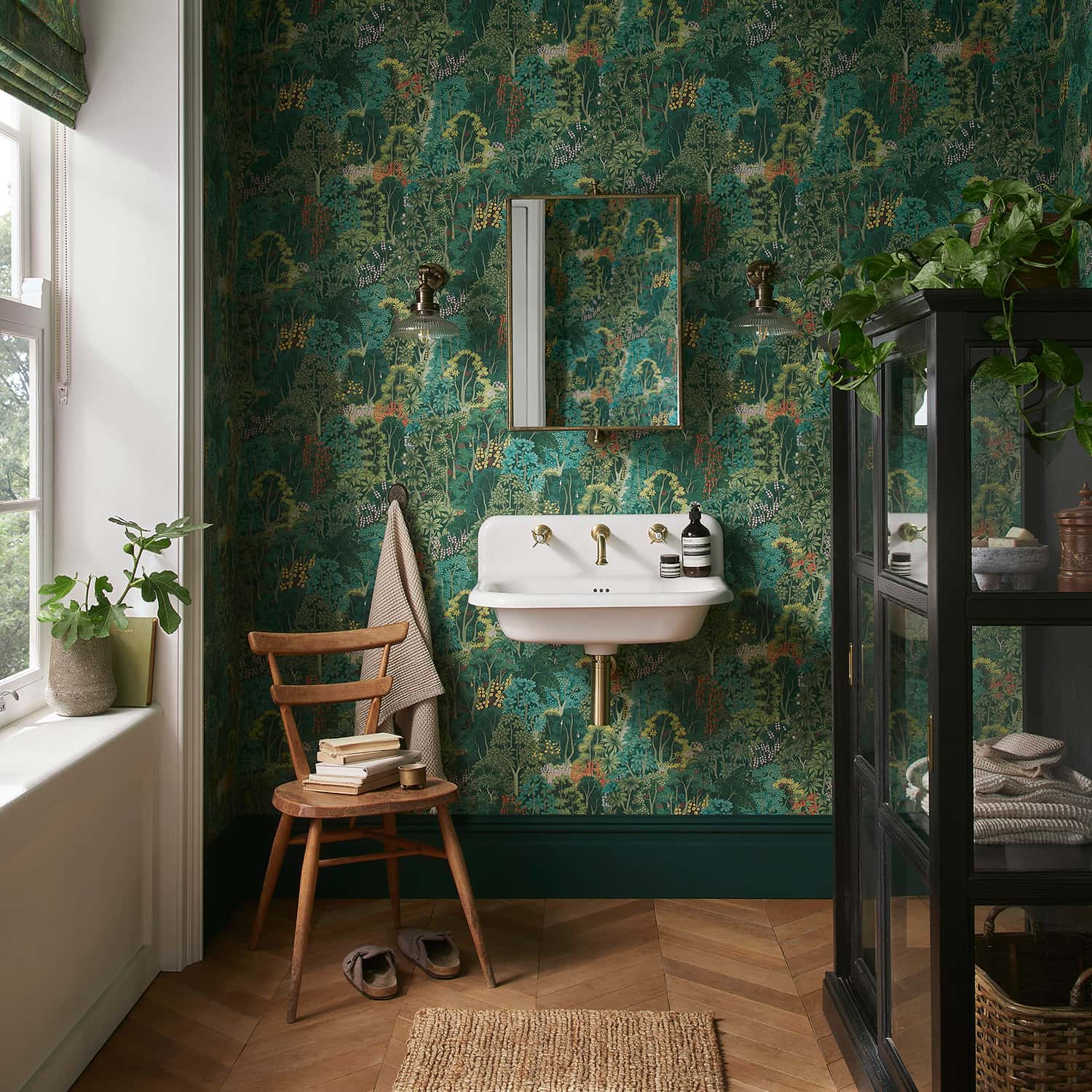
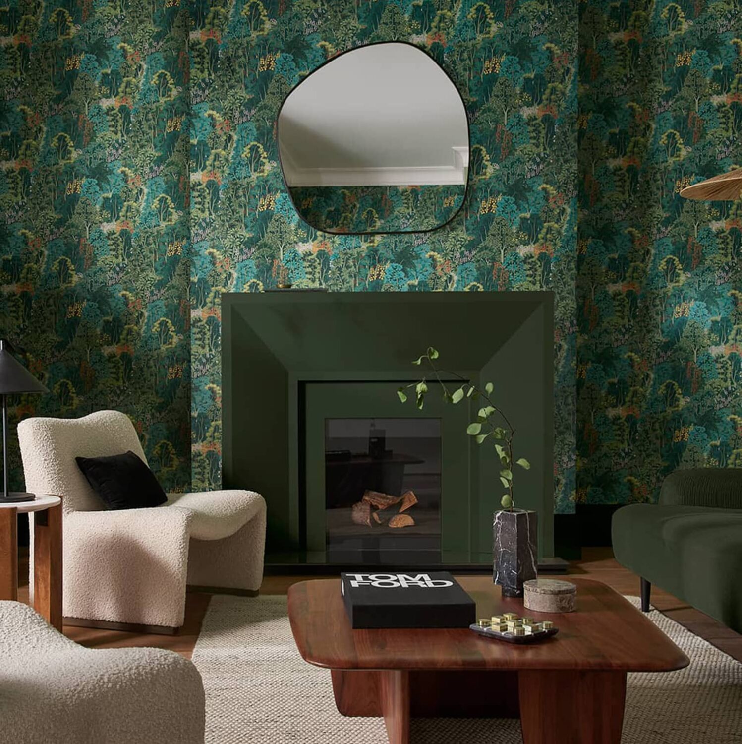
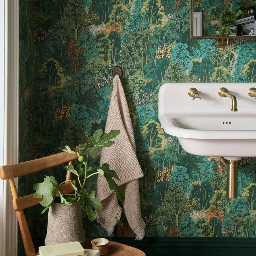
New Eden is the Graham & Brown wallpaper of the year 2024. This spectacular forest landscape is full of hidden treasures and all kinds of yellow, orange, and pink accents that contrast with the emerald-green treetops. This wallpaper gives every room a new vibe.



What is your favorite color of the year? Do you prefer the moody tones from Behr or Dutch Boy, or are you going for lighter shades like Sherwin-Williams “Upward” in your home?


