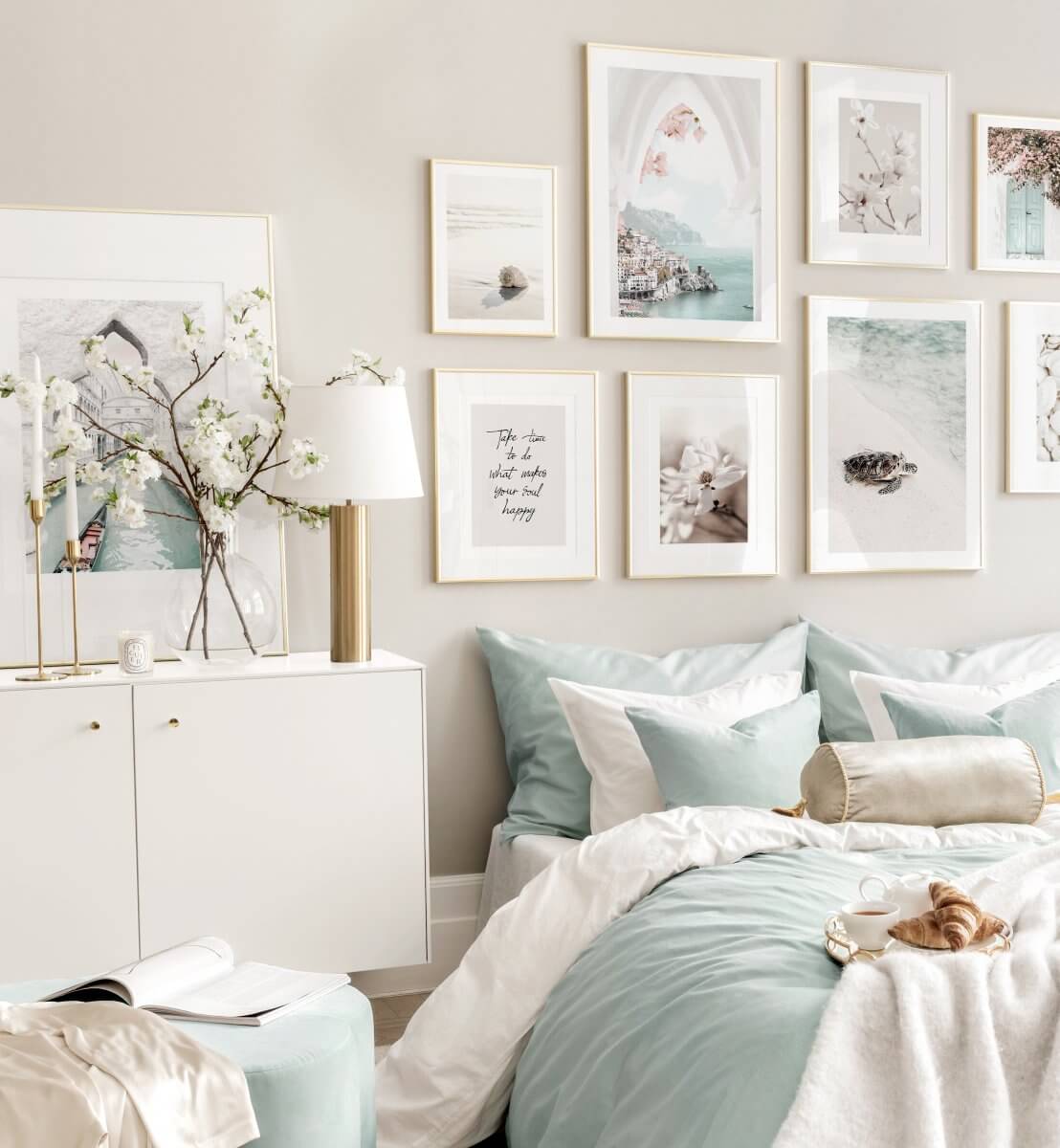
Sherwin-Williams Color of the Year 2024: Upward
Paint company Sherwin-Williams has introduced Upward SW 6239 as their Color of the Year 2024. Upward is a breezy and blissful blue shade that evokes a sense of peace found when slowing down, taking a breath, and allowing the mind to clear.
Upward represents a gentle forward momentum in all our lives. It rings to life that carefree, sunny day energy that elicits a notion of contentment and peace. With this color, Sherwin Williams invites their consumers to take a pause and infuse a new sense of ease and possibility into their spaces. One that doesn’t overwhelm but establishes meditation and tranquility. Says Sue Wadden, director of color marketing at Sherwin-Williams.
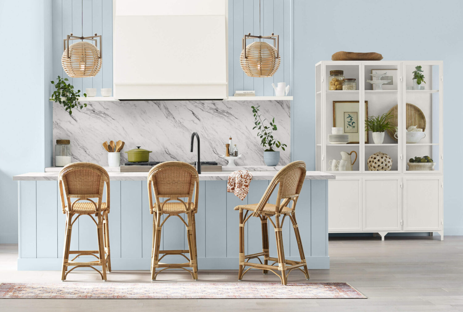
Evolving from the grounded hue of 2023’s Color of the Year, Redend Point SW 9081, Upward SW 6239 introduces a serene, airy tranquility. It beckons us to embrace a celestial serenity that’s always there, reminding us to always lift our gaze.
“As we play with color, it’s essential to consider their interactions thoughtfully. Warmed-up blues might lead to hues that appear muddled and lackluster, which is why preserving the crisp edge and magnetic allure of cool blues is vital. It’s in these subtle nuances that create spaces that are timeless and inspired. We’re excited to share this beautiful color and, craft interiors that exude harmony and evoke a sense of enchantment.” Says Sue Wadden
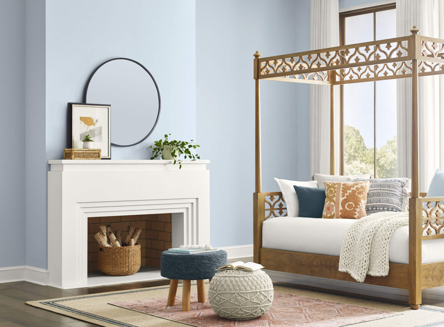
Upward can be used to inspire meditative spaces and absolute peace in residential and commercial spaces. From classic coastal to casual Nordic interiors, this airy blue shade emerges where the softest blue meets a touch of silvery brilliance.
“Used as an accent or all over, on both interiors and exteriors, Upward SW 6239 (224-C1) clears the way for lightweight open-mindedness when used in commercial settings,” says Wadden. “The hue serves as a reminder to pause and ponder limitless possibilities that can be unlocked in our work, dining, educational spaces and beyond.”
See also: The Color Trends for 2024: Comforting Neutrals & Positive Accents
Sherwin-Williams Colormix® Forecast 2024, Anthology: Volume One
Guided by Director of Color Marketing Sue Wadden, Sherwin-Williams’ international color and design team dedicates itself to uncovering and understanding pivotal color trends. Based on these insights, the group crafts the yearly Colormix® Forecast, highlighting the year’s most on-trend hues.
With the Colormix® Forecast 2024, Anthology: Volume One, the company introduces a biennial rhythm to their trend analysis, alternating annually with the signature style narratives Sherwin-Williams is celebrated for.
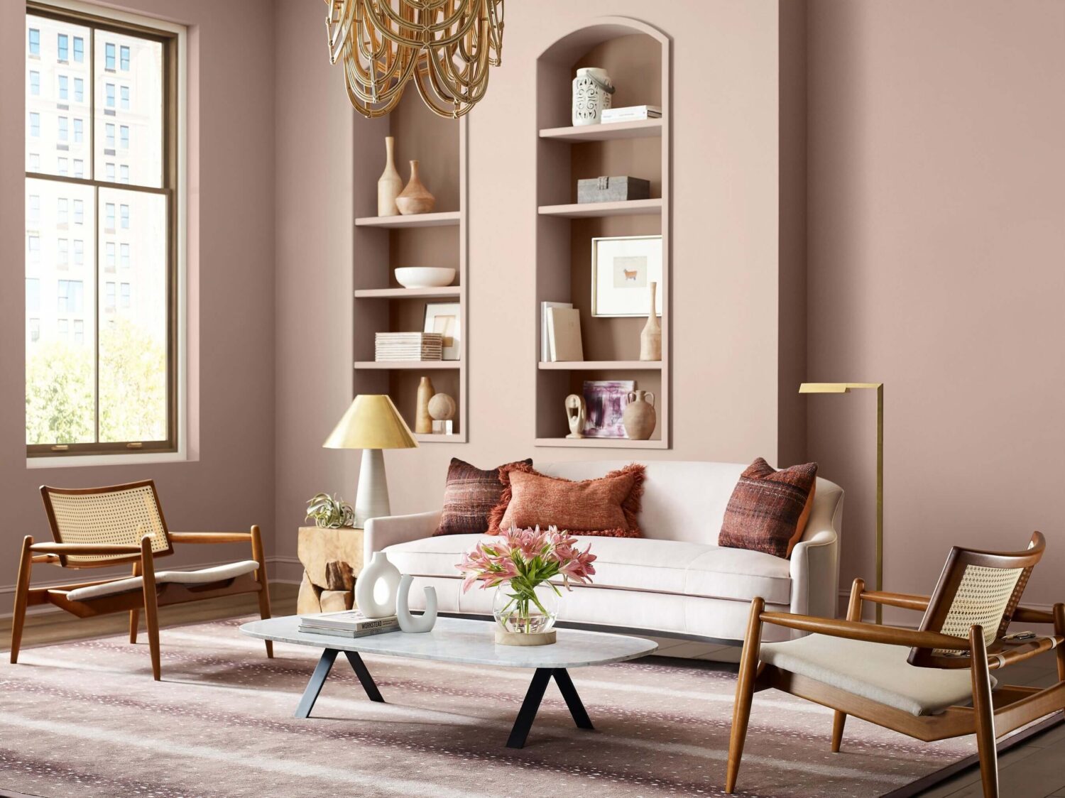
This first Anthology series delves into the evolutionary paths of four chromatic color families – exploring the essence of each hue, their impact on modern design, and their anticipated trajectory. From the Colormix® Forecast, the annual Color of the Year is selected – this year, Upward was chosen as the 14th Color of the Year.
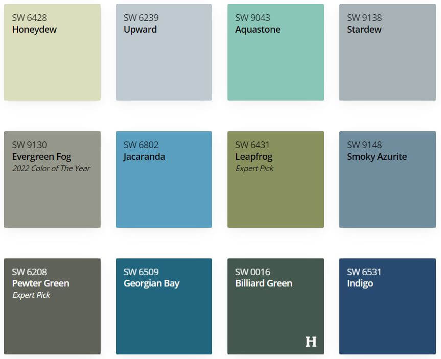
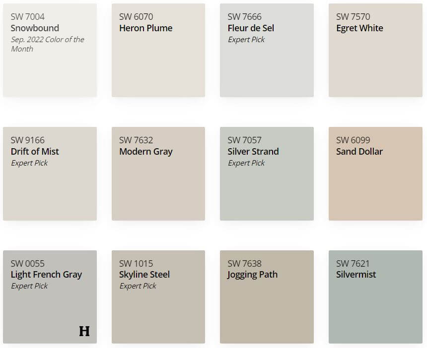
Sherwin-Williams’ 2024 color “Upward” is a distinct blue that is part of Palette No. 1 in the Sherwin-Williams Colormix® Forecast 2024, Anthology: Volume One. Upward can be combined with blues and greens, deep and dark hues, and delicate tints like Snowbound, Drift of Mist, Gale Force, Tricorn Black, Honeydew, Palm Leaf, and Antiquarian Brown.
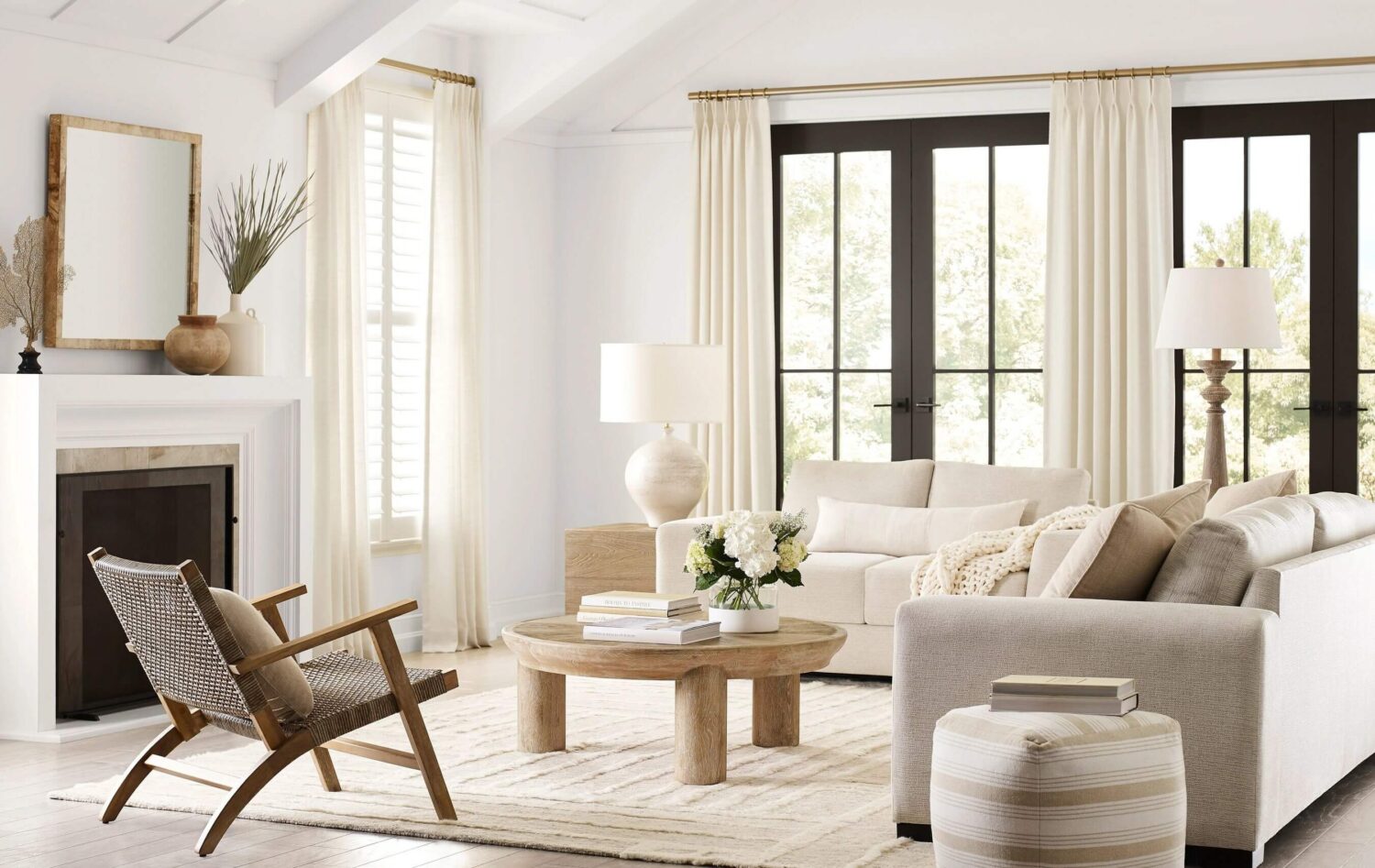
The Sherwin-Williams Colormix® Forecast 2024 consists of 48 hand-selected hues, the expertly curated collection will explore four palettes: blues and greens, reds and purples, deeps and darks and delicate tints. Organized by color family, Anthology is an easy-to-use reference for designers, homeowners, and industry professionals alike.
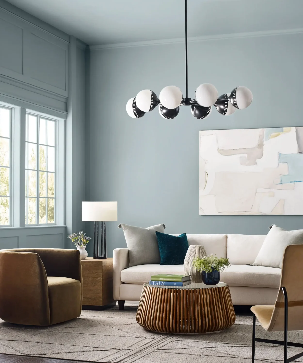
Palette No. 1: the convergence of blues and greens
From barely there to bold and bright, this color palette revolves around a global color story that harmoniously blends across a range of organic gray-blues to bluish-greens. The natural influences create a calming-yet-invigorating flow from soft to dark tones.
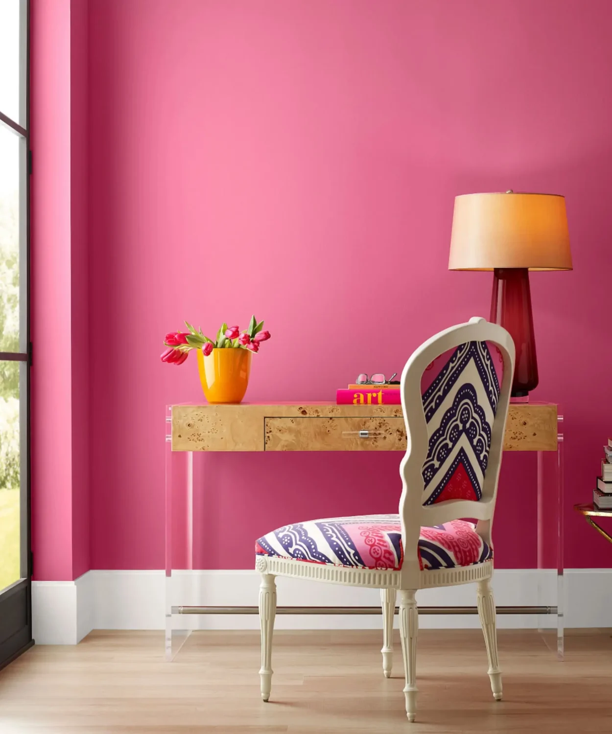
Palette No. 2: the poetry of reds and purples
A display of dynamic and nostalgic pops, the palette ranges from warm red tones to soft and cheerful pinks and purples. Balanced by natural, earthy pigments, maintaining popularity from 2023, the palette offers muted and expressive hues to uplift any space.
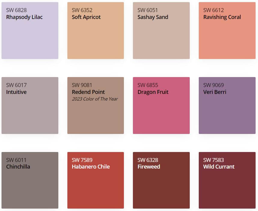
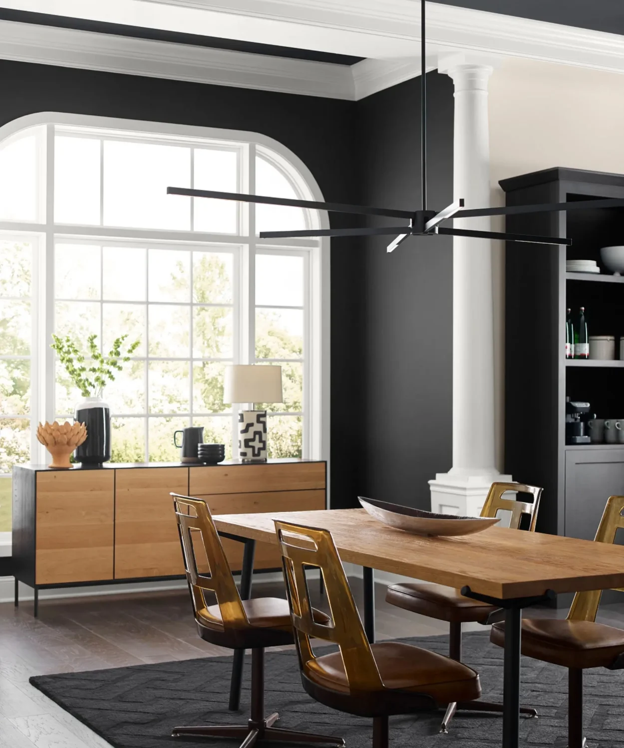
Palette No. 3: a gathering of deeps and darks
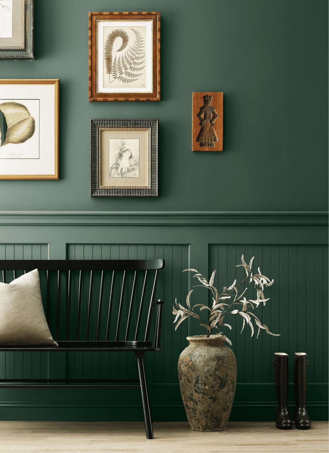
For a daring and powerful atmosphere, utilize this range of dark and dramatic hues as contrast with colored light or gilded metallic accents. While the deeply saturated dark tones will invite mystery and intrigue, they also create a restful retreat.


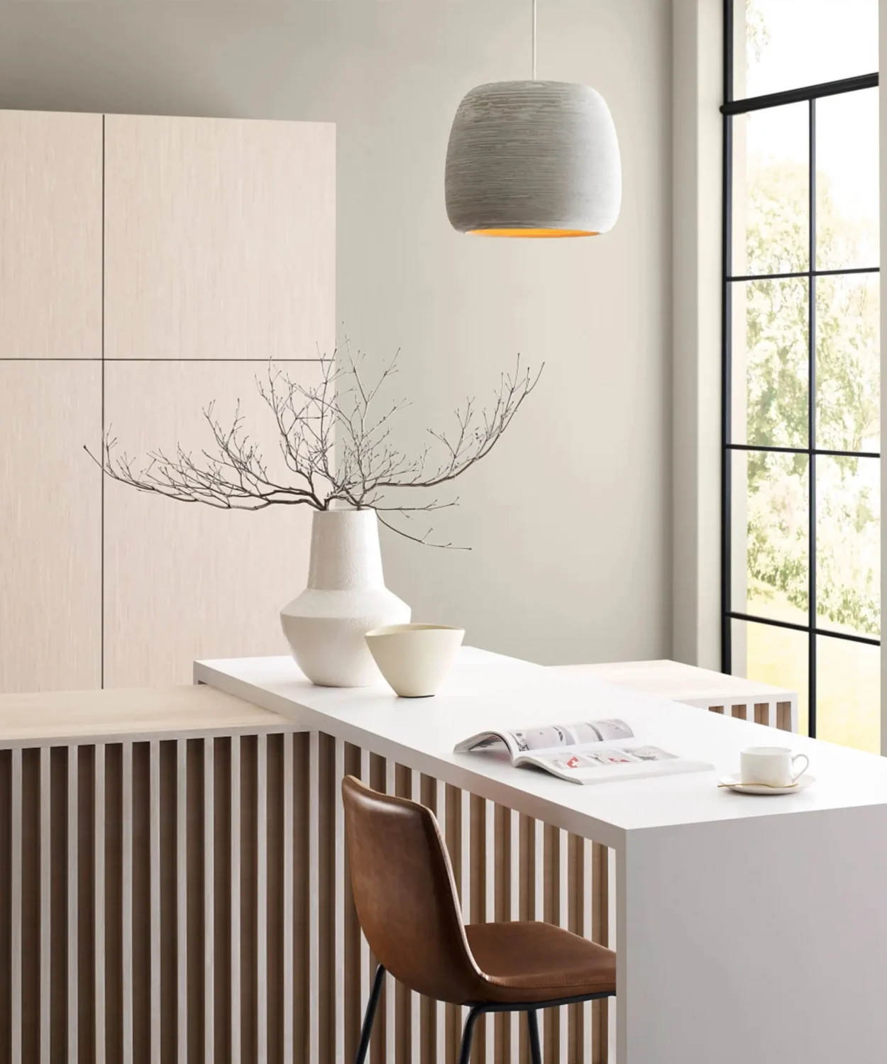
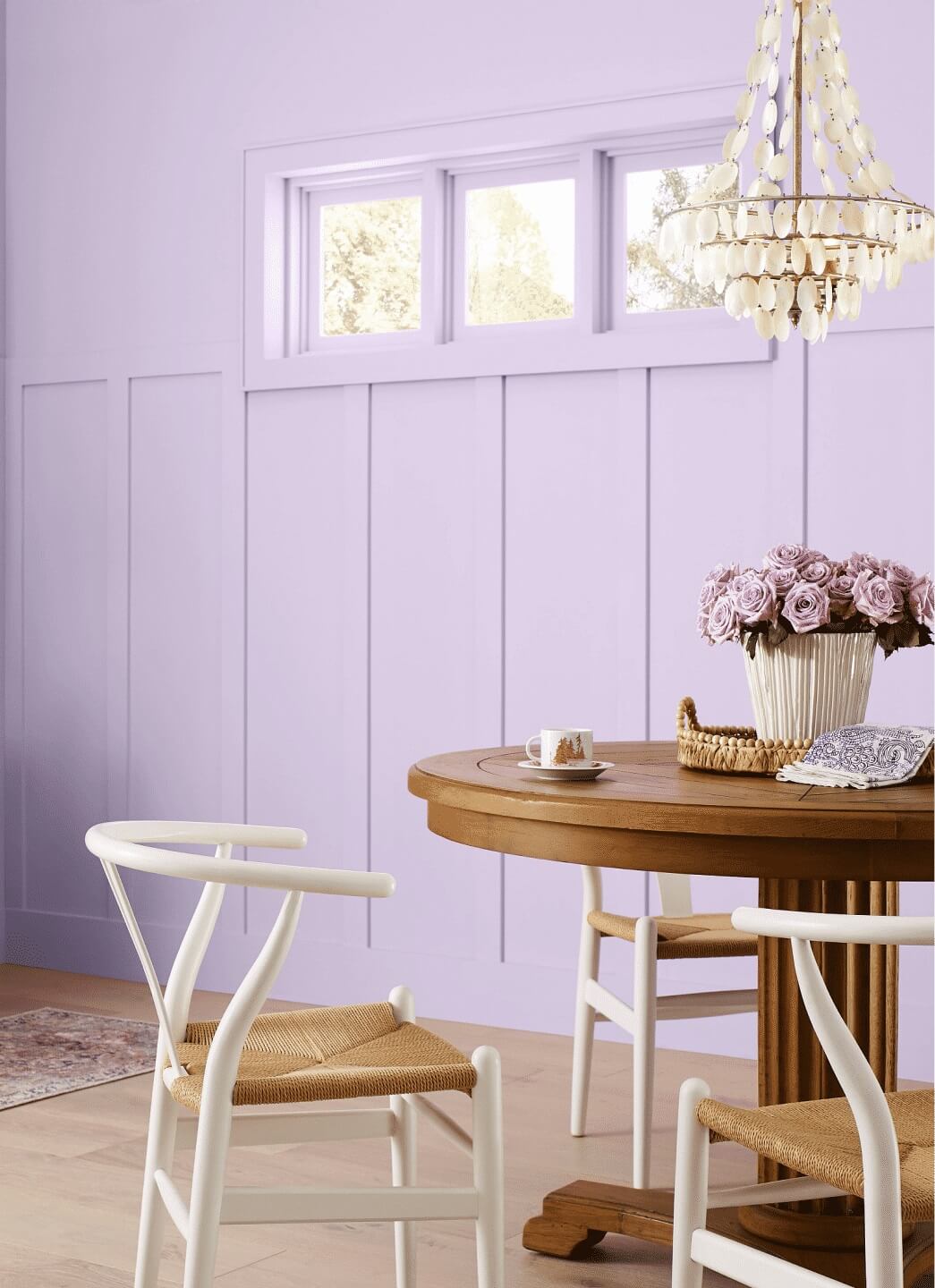
Palette No. 4: a study in delicate tints
To escape the constant distractions and demands on the senses, step into this palette of hushed and airy hues – a minimalist’s delight. The soft tints, balanced by warm and cool undertones, create a serene sophistication.
How To Decorate with Upward
Sherwin-Williams Color of the Year Upward is a versatile silvery-blue shade that works in any room of the house. You can add it to your walls as a subtle colorful neutral or you can incorporate Sherwin-Williams Upward in your home accessories for a fresh but subtle color accent.
Upward in the Living Room
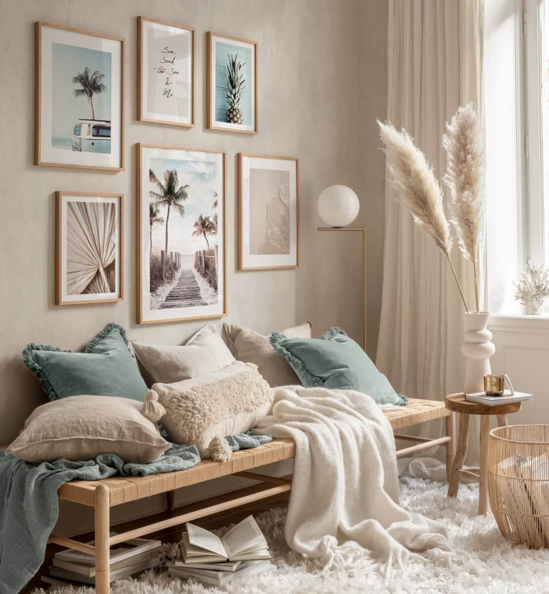
You can add Upward to your walls for a fresh and natural color base. In the living room it adds a nice peaceful atmosphere to your space.
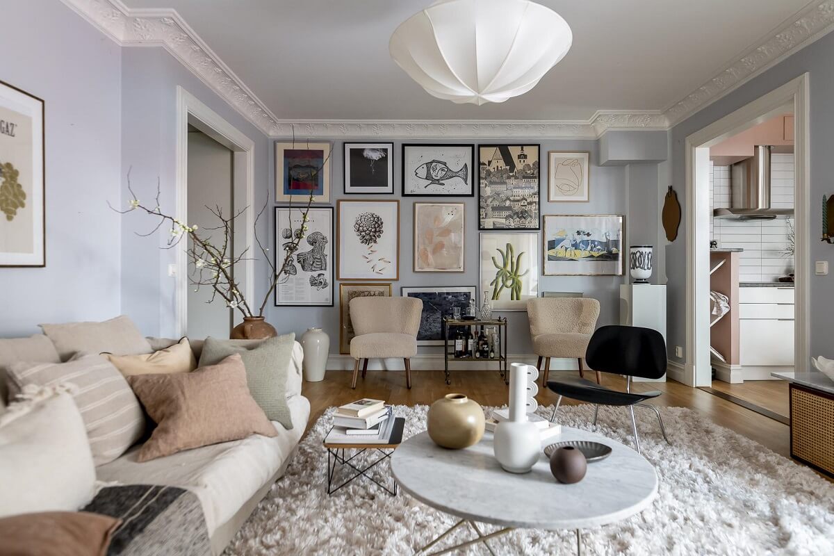
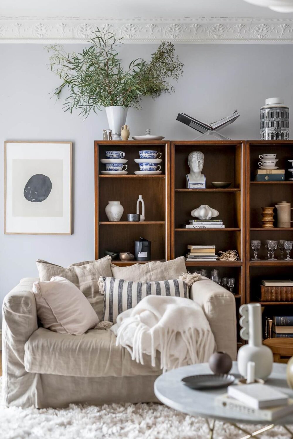
The fresh blue walls in this Nordic apartment are paired with cozy textures in light shades to add warmth.

Create a home office in the living room by painting the desk in the same blue shade as the walls. It makes it blend in and it’s less intrusive.


Upward in the Kitchen
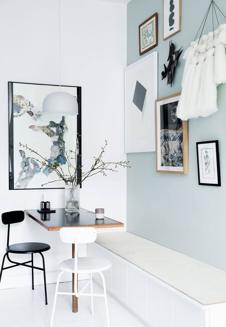
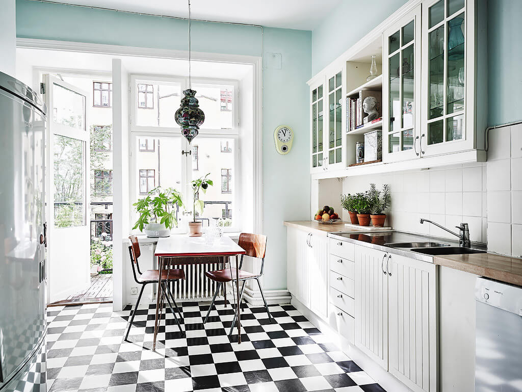
Of course you can paint the walls in this light blue shade but painting the kitchen cabinets in Upward also looks very beautiful.


This fresh kitchen design combines white with light blue tiles and accent wall. Very Scandinavian and very beautiful.
Upward in the Bedroom
Natural tones in the bedroom can greatly improve your sleep and health. Therefore adding a light blue shade like Upward to your bedroom is a great idea.
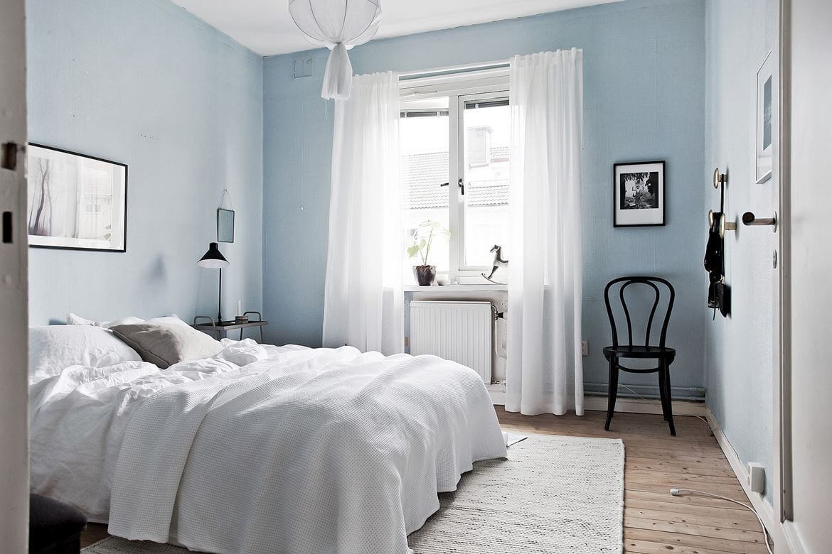

If you want to create a warm look to your room, you can pair the fresh Upward with earthy tones like in this bedroom with earthy bedding and William Morris wallpaper on the wardrobe doors.
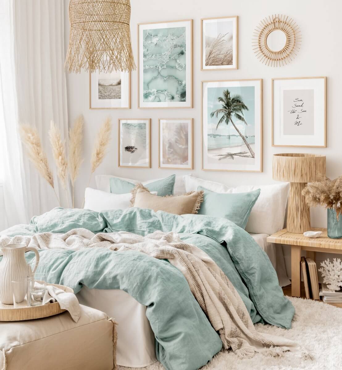
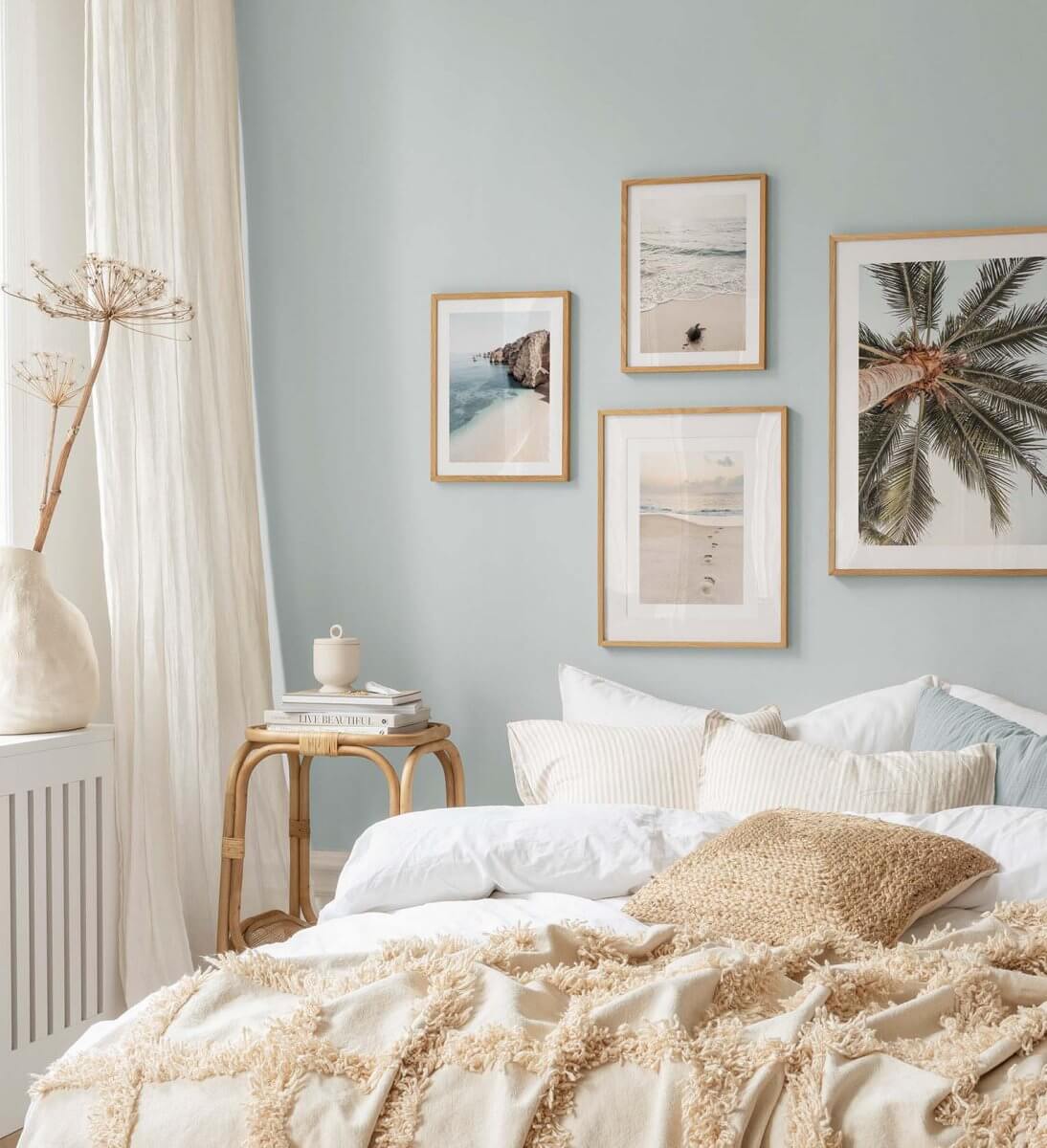
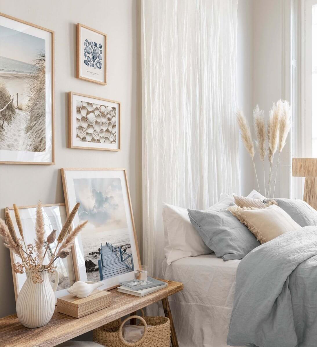
This bedroom is decorated in a light color scheme with blue bedding. I like the curtain that serves as a headboard, you can also add a silvery blue curtain instead for a nice color accent.


Upward in the Bathroom
Did you know that a light blue bathroom can increase the value of your home? A study by real estate site Zillow suggests that prospective buyers are willing to pay 1.6 percent more than expected. On an avarage American home, this means nearly $5,000 added value by just adding light blue paint to your bathroom.
Sherwin-Williams Color of the Year Upward is a lovely light blue shade that will elevate your bathroom. The easiest option is to paint the walls, but you can also think about a bathroom design with light blue tiles.
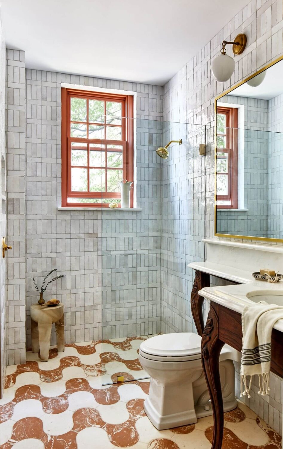
A bold colored Washington Pied-à-Terre features a small bathroom with light blue shower tiles and wavy floor tiles in an earthy color. This room is a perfect blend of cool and warm tones.
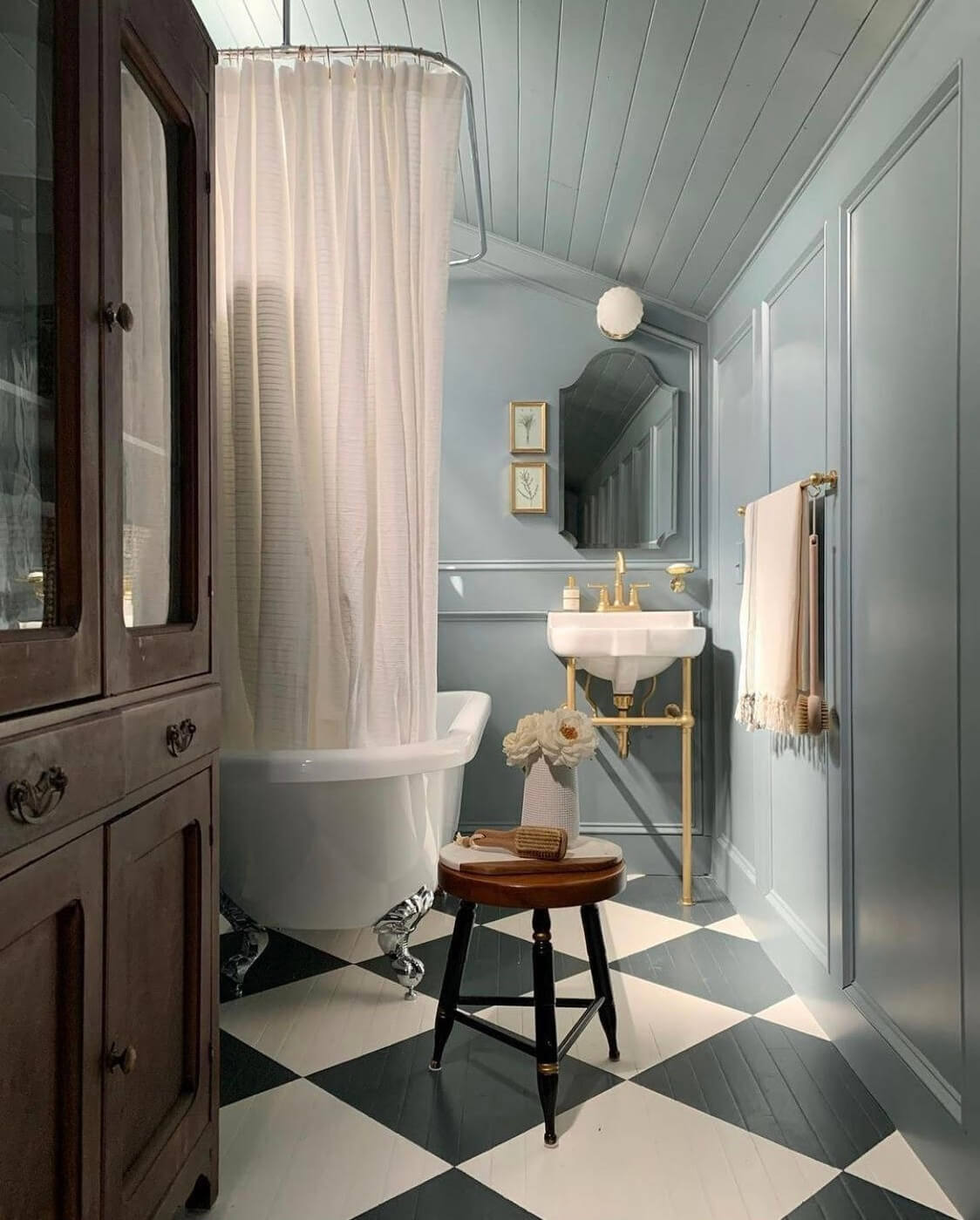
The silvery blue Upward looks good in modern and classic designs. This bathroom shows how beautiful this paint shade looks in combination with classic bathroom fixtures and a checkerboard floor.
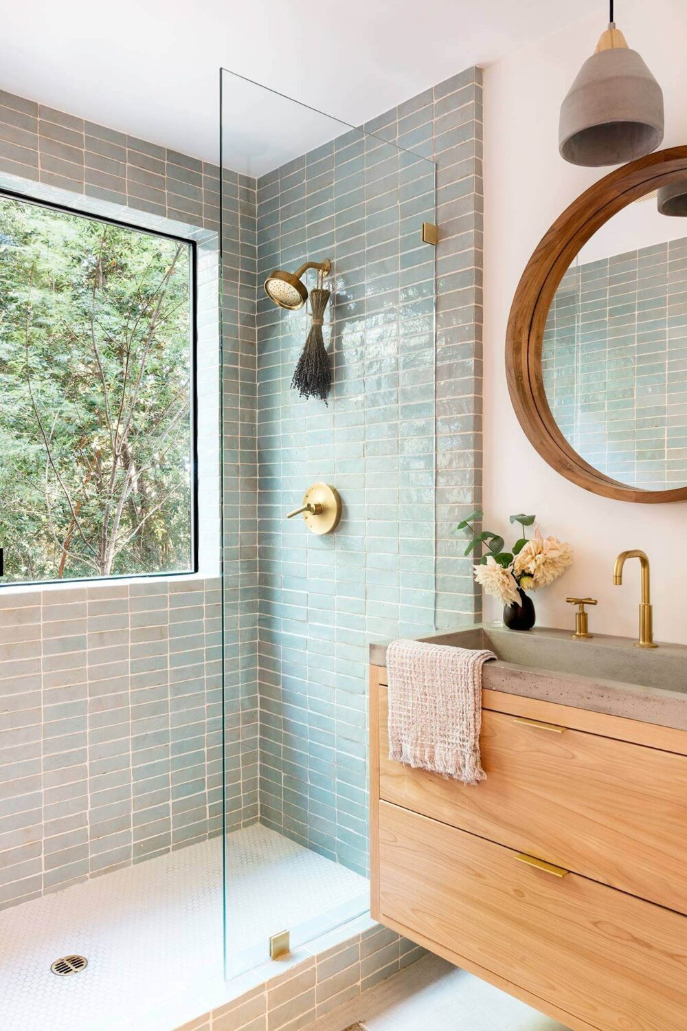
This light and modern bathroom combines light tones with warm accents in the fittings and wooden elements. It’s fresh and stylish.
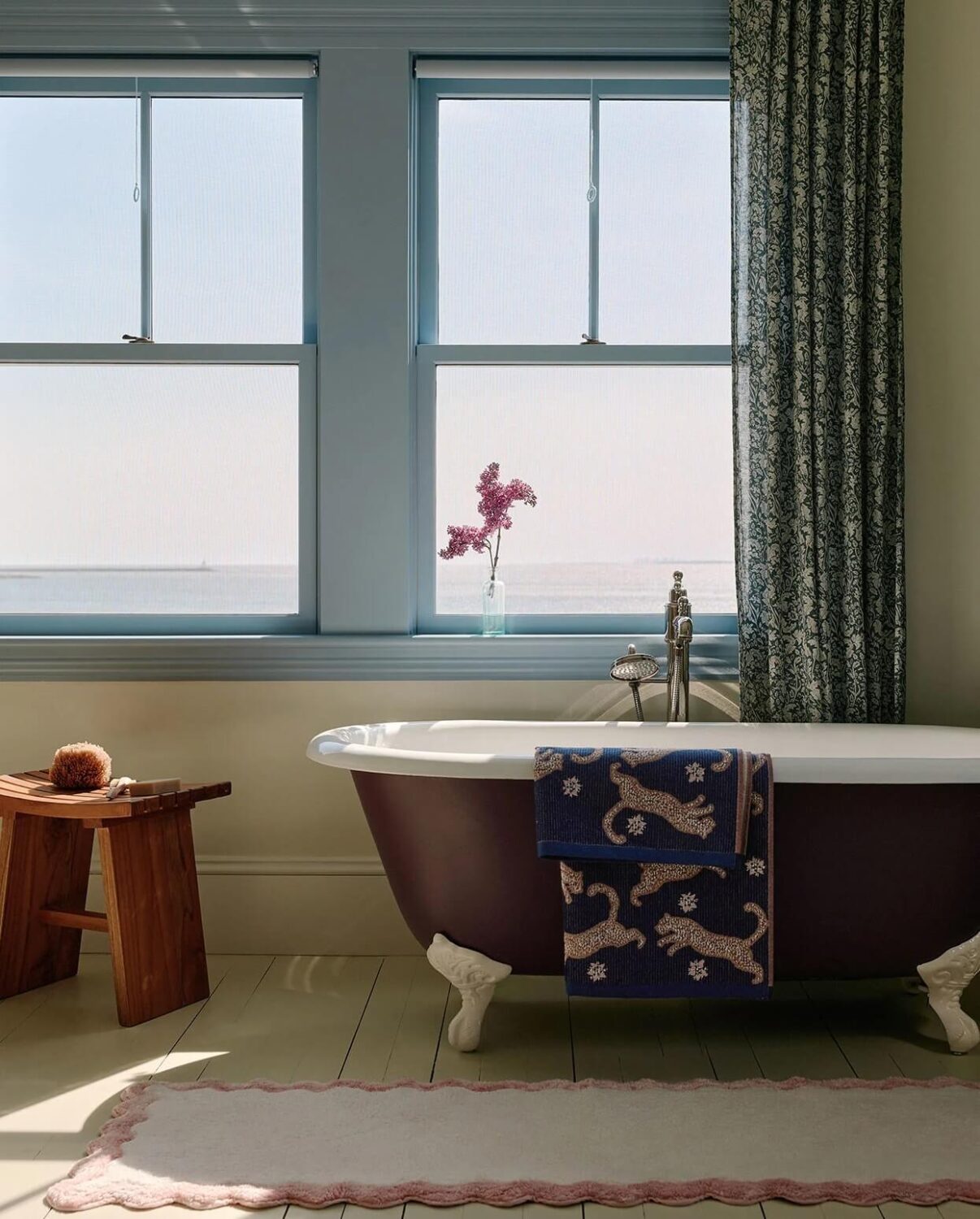
Think outside the box and paint the window frames as you can see in this bathroom from the Anthropologie Fall Home.
Upward Home Accessories
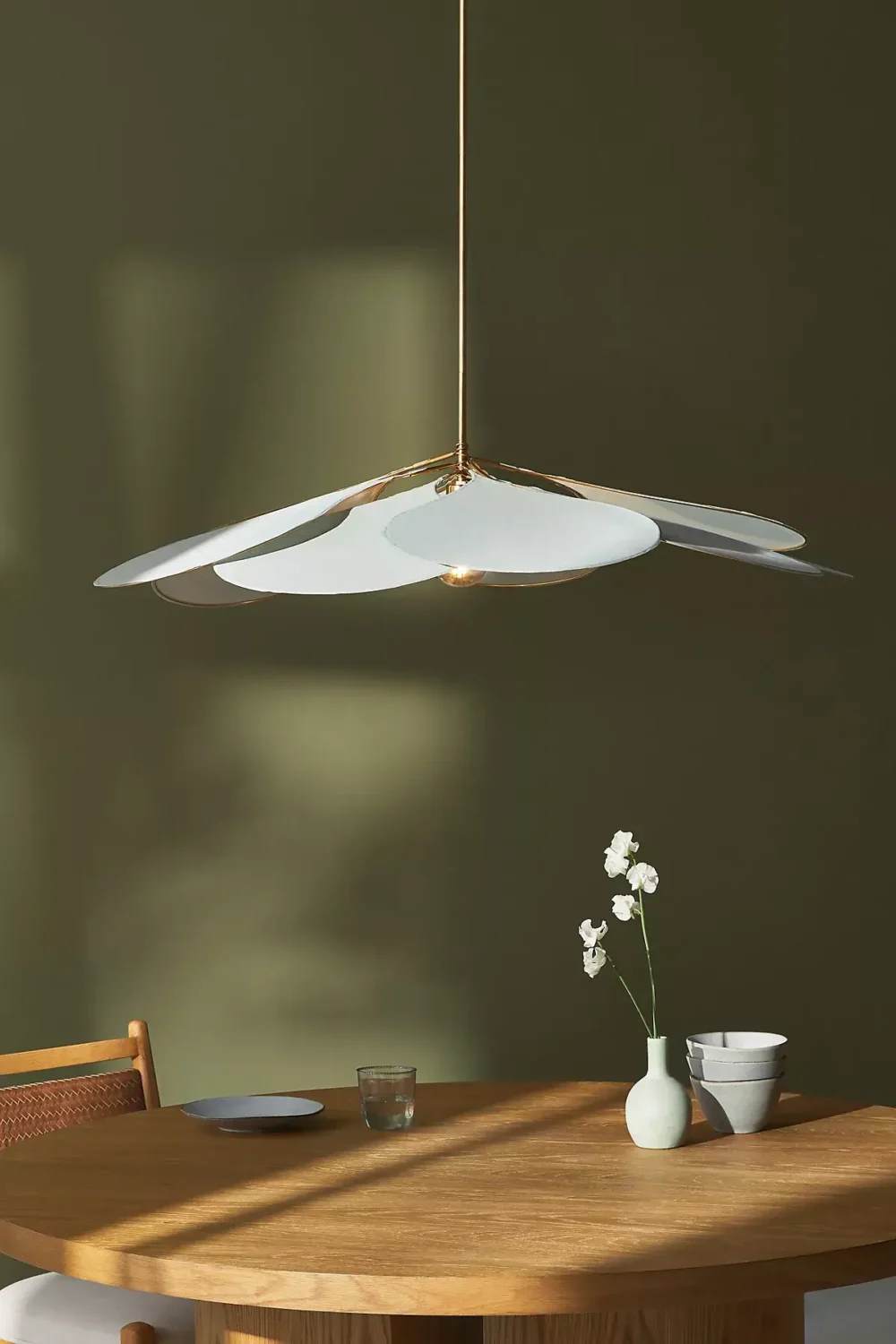
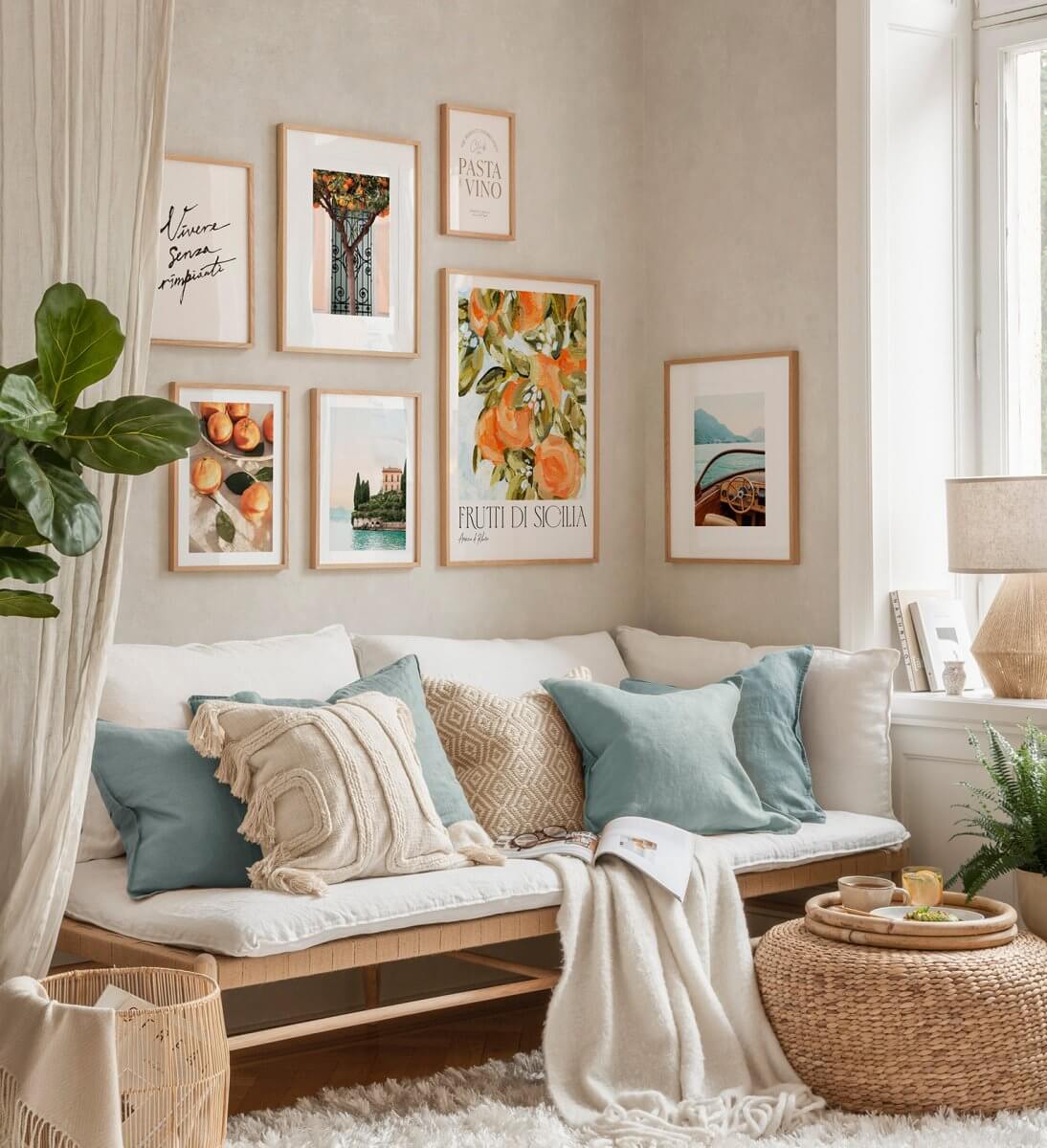
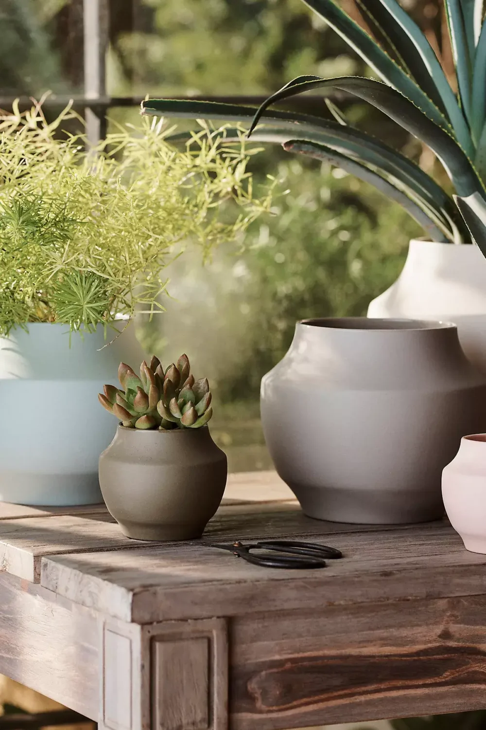
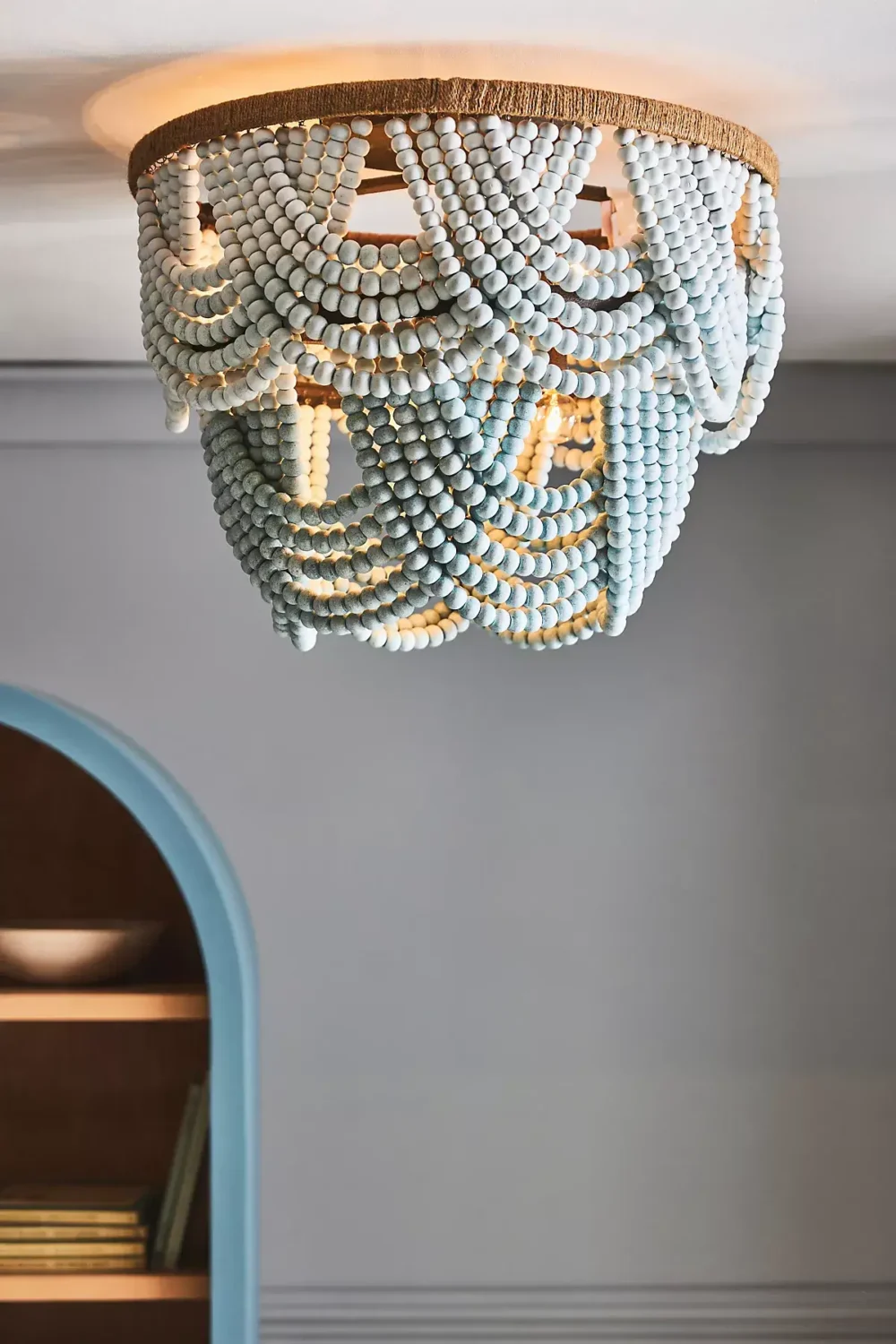
The easiest way to incorporate new colors to your home is by changing home accessories. A new lampshade, vushions, or bedding can make a great difference to your home look.

