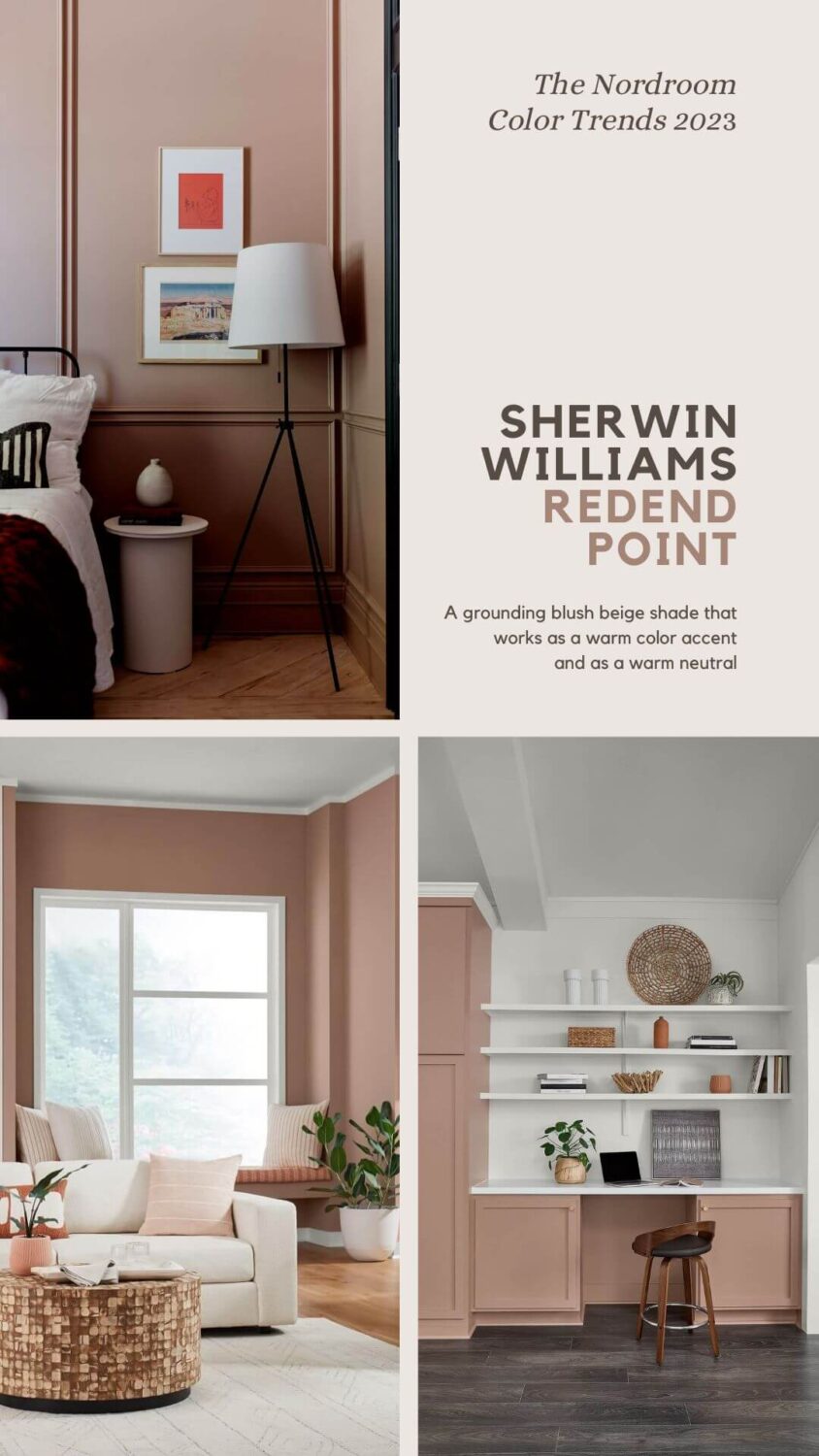
Sherwin-Williams Color of the Year 2023: Redend Point
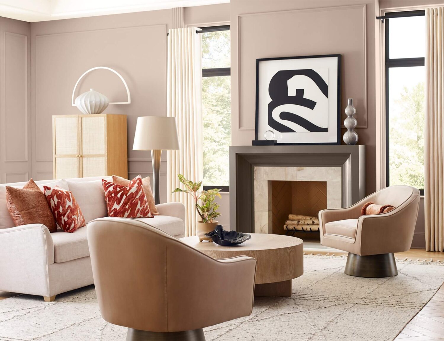
Sherwin-Williams have chosen Redend Point as their Color of the Year 2023. Redend Point is a warm blush shade that will look beautiful in any interior.
Redend Point is a soft, soulful color that is very diverse. This mauve pink color can work as a warm neutral base for a room, or you can pair it with cooler colors, and then it will add a warm color accent to your interior.
In addition, Sherwin-Williams has released their Color Forecast for 2023 named Terra. This color forecast consists of 40 colors, divided over four color palettes that are inspired by the natural interweaving of ourselves and our spaces.
These Sherwin-Williams color palettes help you find a color to combine with Redend Point. In this post, you can read how to style your home with a warm blush-beige color like Sherwin-Williams’ Redend Point.
Sherwin-Williams Color Forecast 2023: Terra
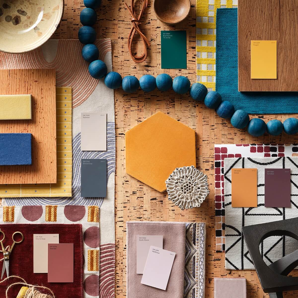
The 40 colors in the Sherwin Williams Color Forecast help us connect with nature. The colors range from natural neutrals to rich or vibrant shades. The colors are divided over four color palettes that each tell their own story.
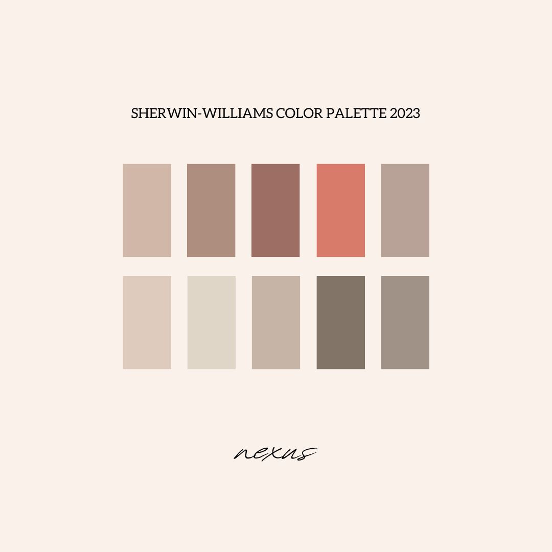
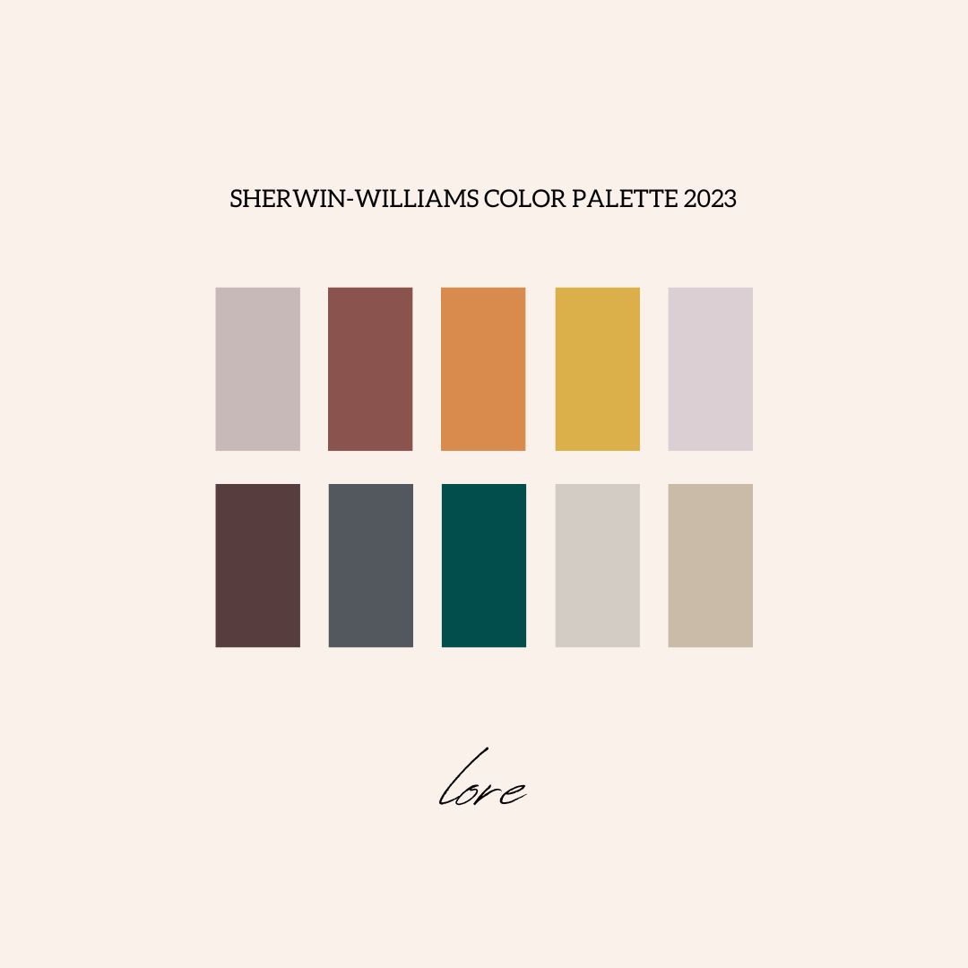
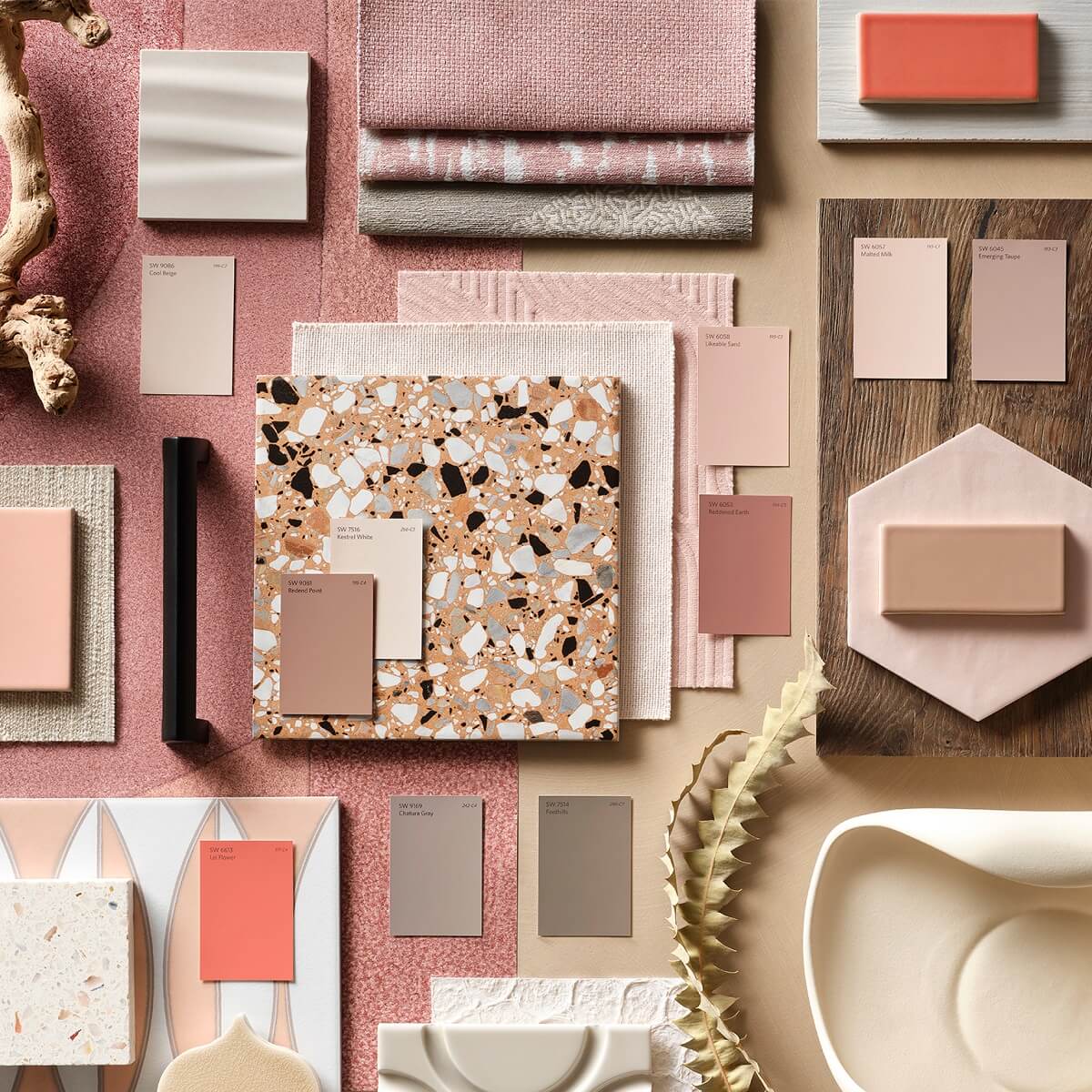
Nexus Color Palette
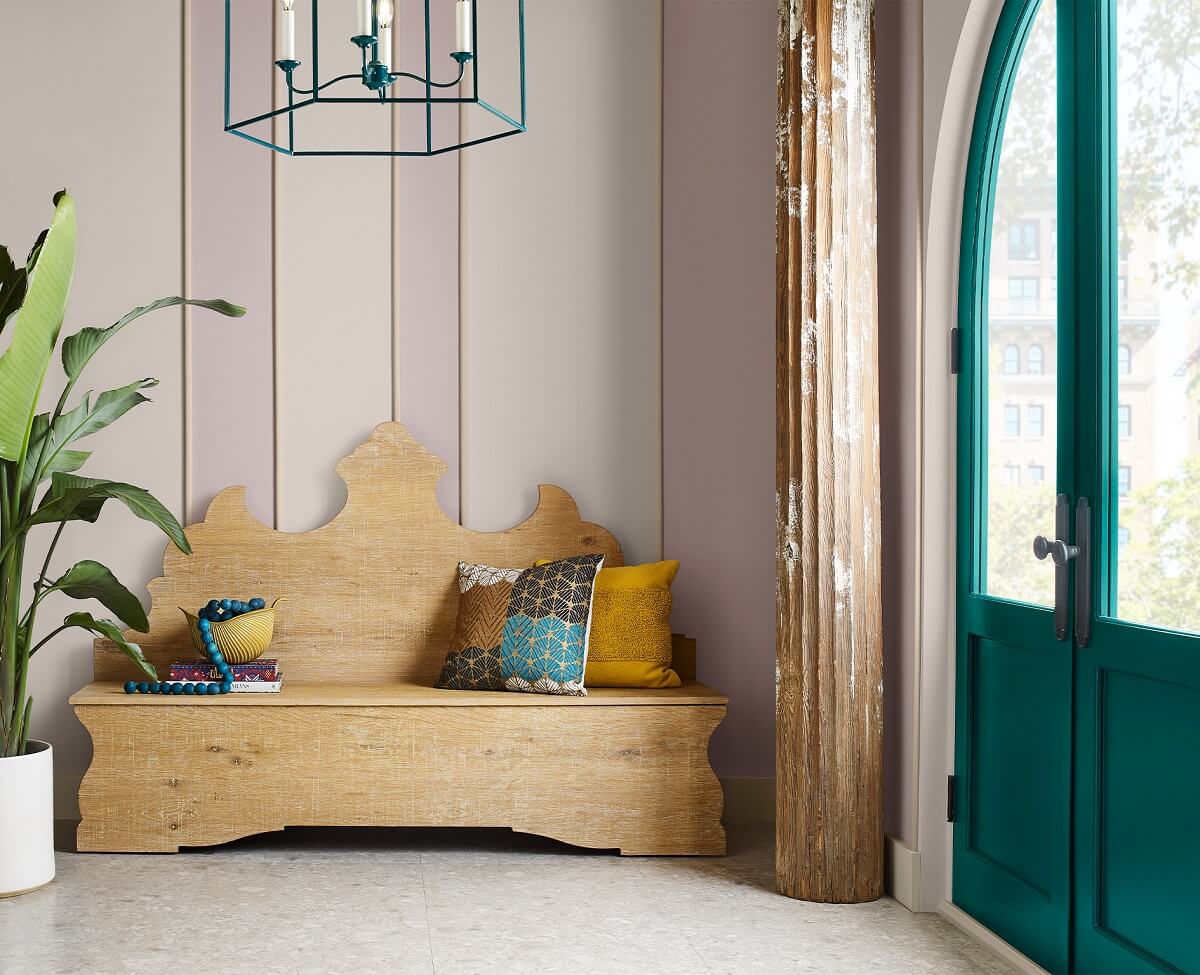
If we look carefully, we find a quiet place of healing, a realm where the energy we give is returned to us tenfold, where the warmth of loving kindness reminds us what it feels like to come home. Enkindle a sense of support and serenity with a potter’s palette of natural clays and sunbaked desert sands, grounding brown, and soft, soulful white.
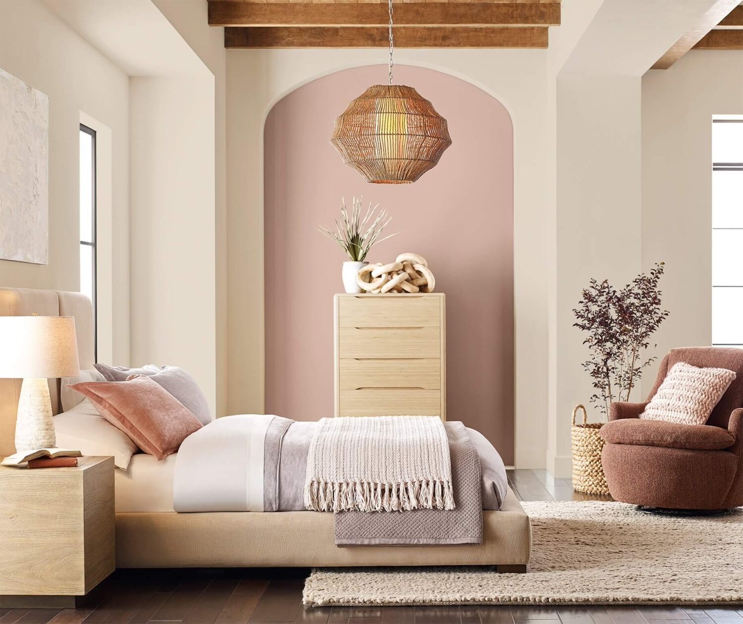
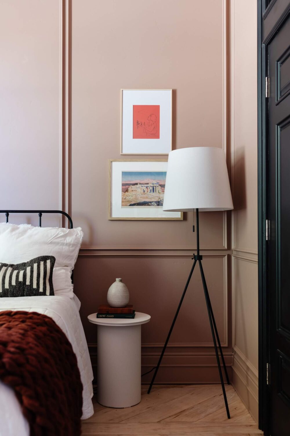
The arch in itself is already a wonderful architectural feature in this bedroom. But by painting this wall a blush pink shade you make it the center piece of the room.
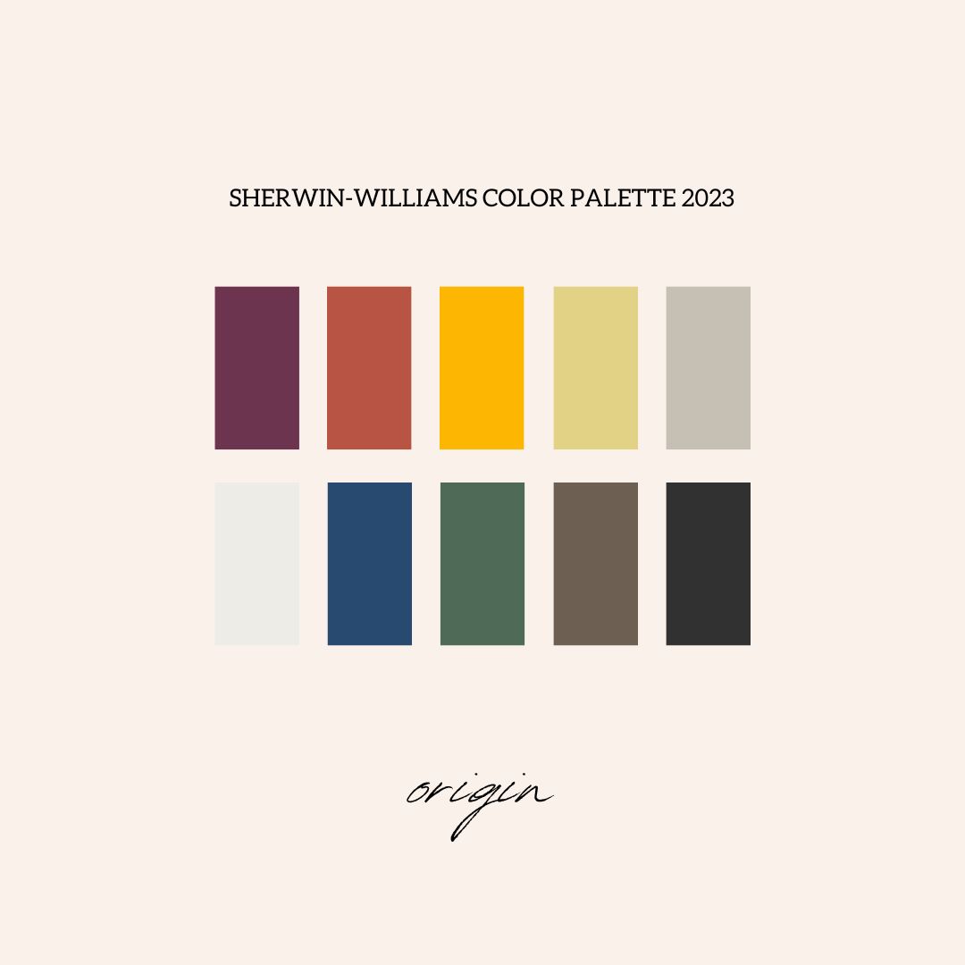
Origin Color Palette
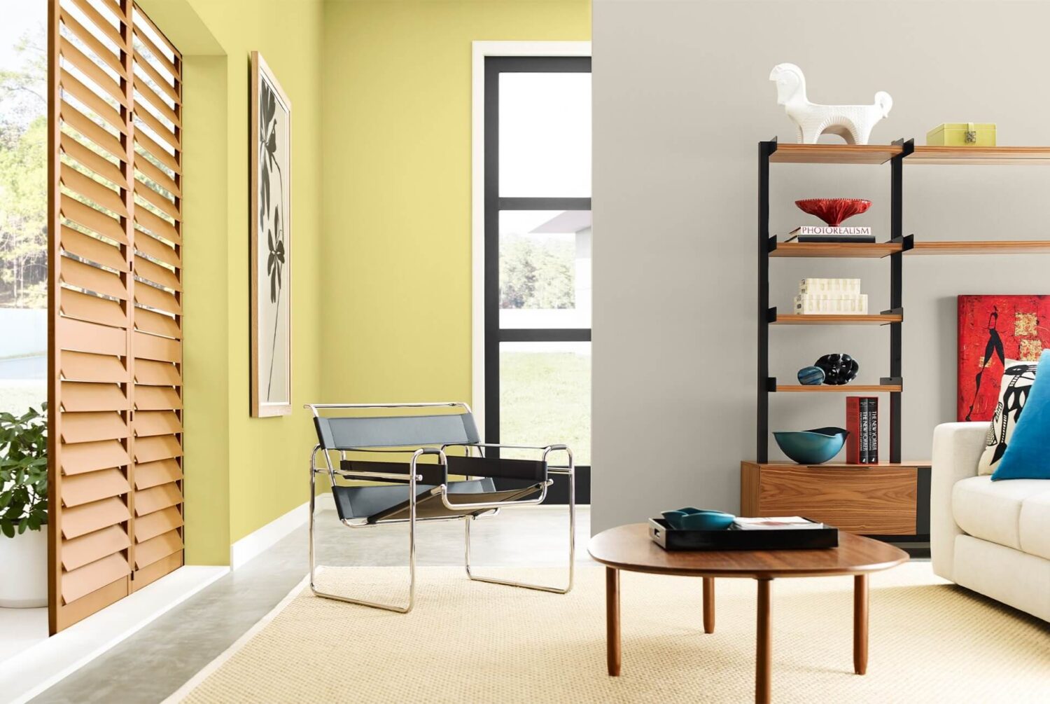
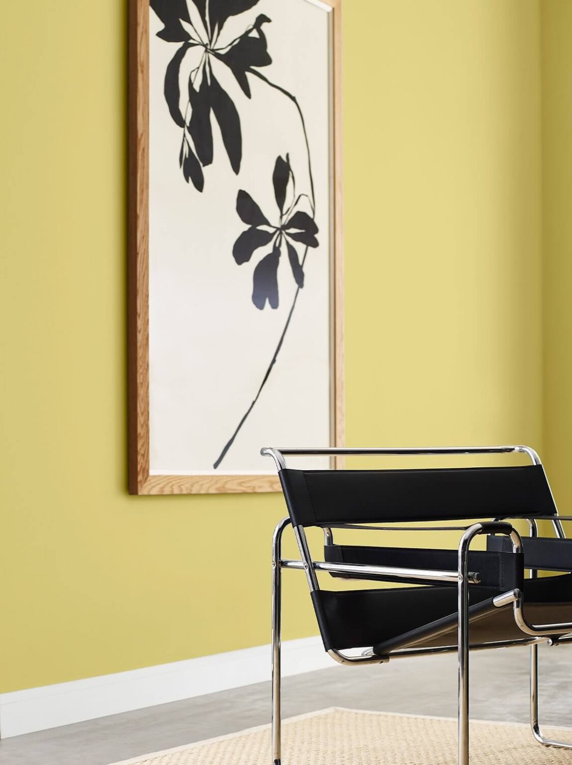
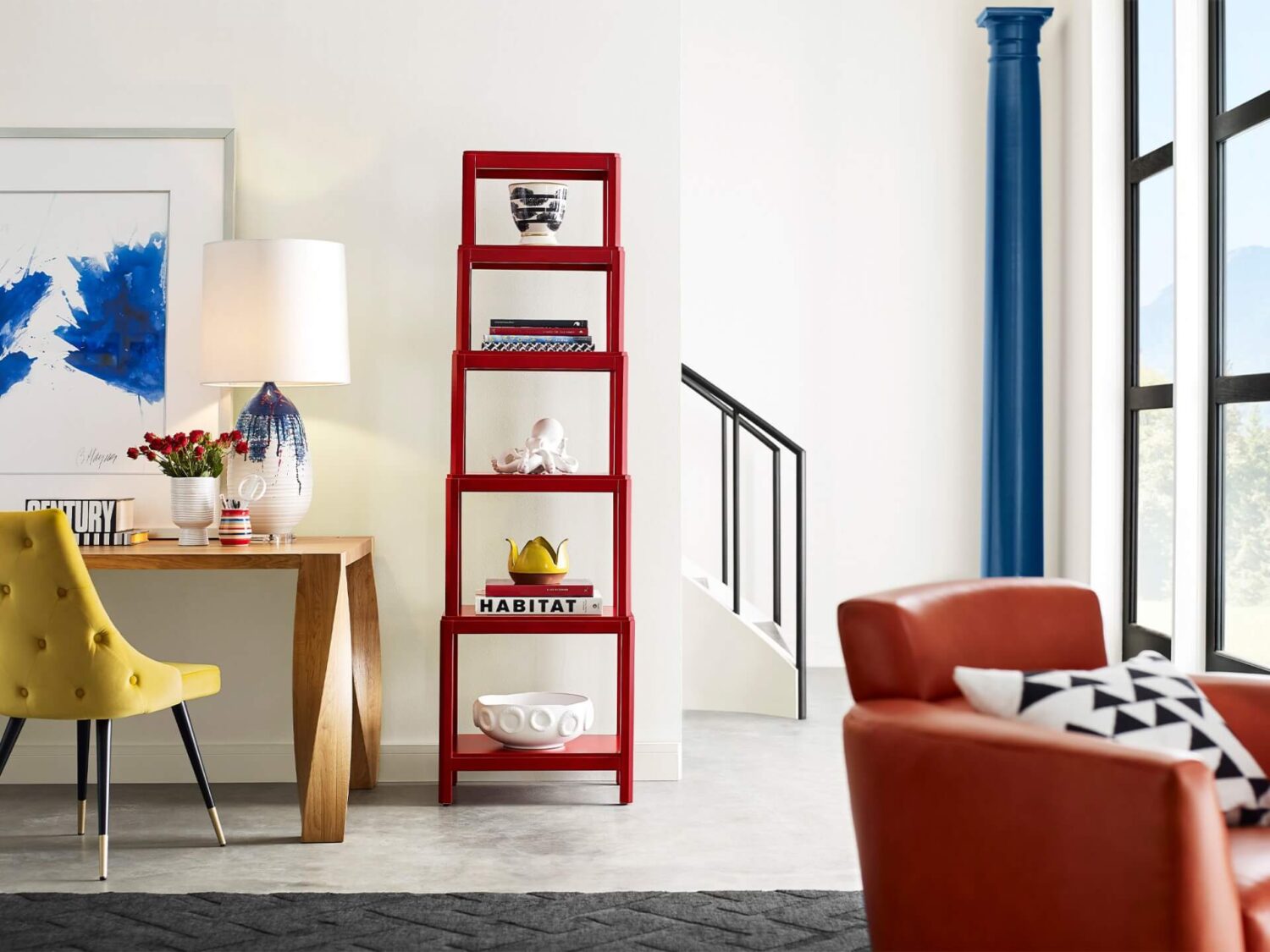
To chart a path through the wild and wonderful landsape of our lives, we begin within. By layering our fondest memories and future hopes, we create vibrancy and joy in the present moment. Recharge with color that keeps making a comeback— free-spirited brights, magnetic deeps, and a whisper of restful neutrals.


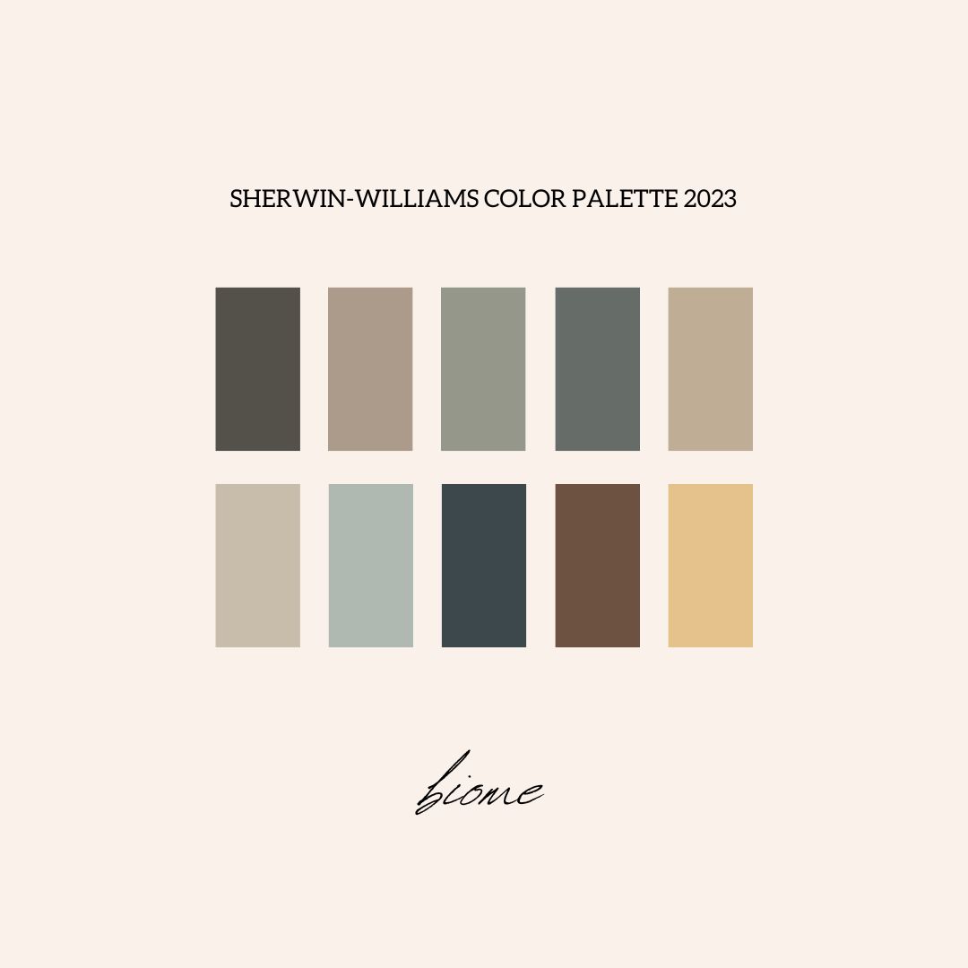
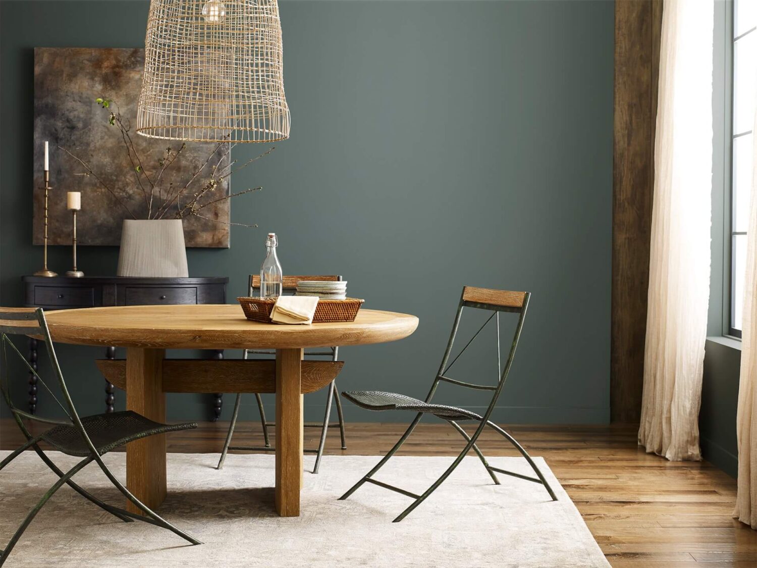
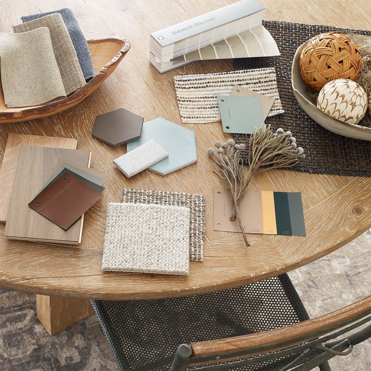
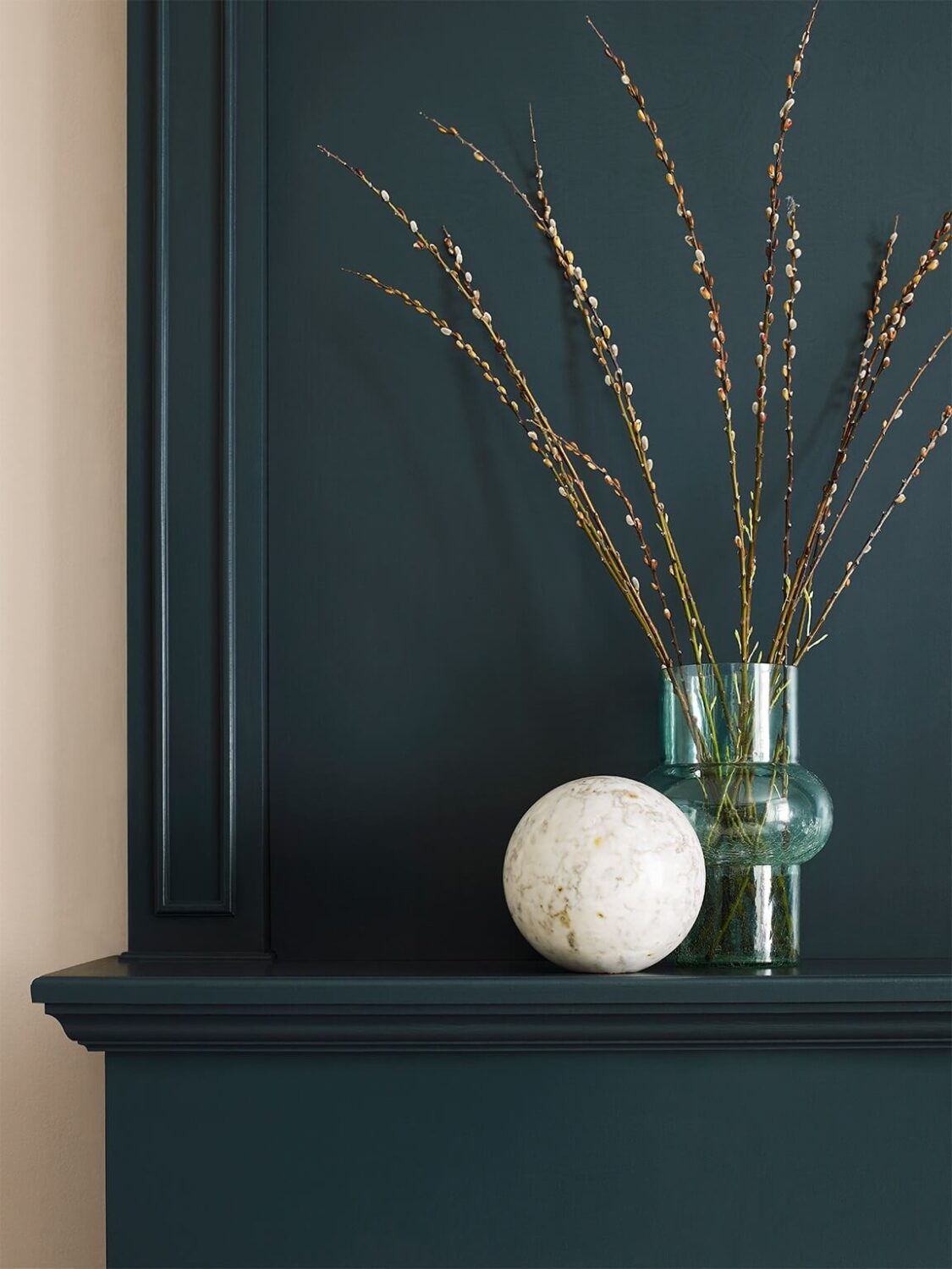
Biome Color Palette
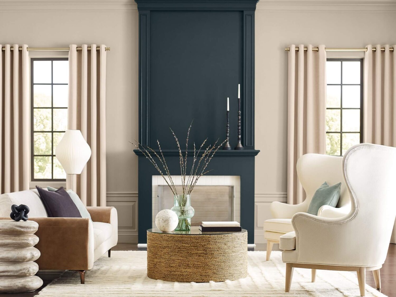
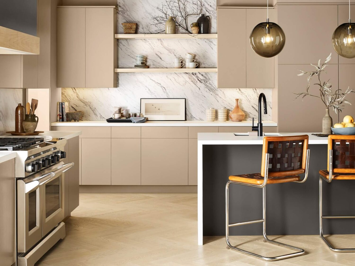
In the vast wilderness of our imaginations, we cultivate a new consciousness. As this abundant earth provides, we seek perfect balance with the existing, everchanging ecosystem. Preserve peace in an atmosphere of delicate mushroom taupe, lichen gray, rich earth tones, and the colors of our sky’s cloud-studded canopy.
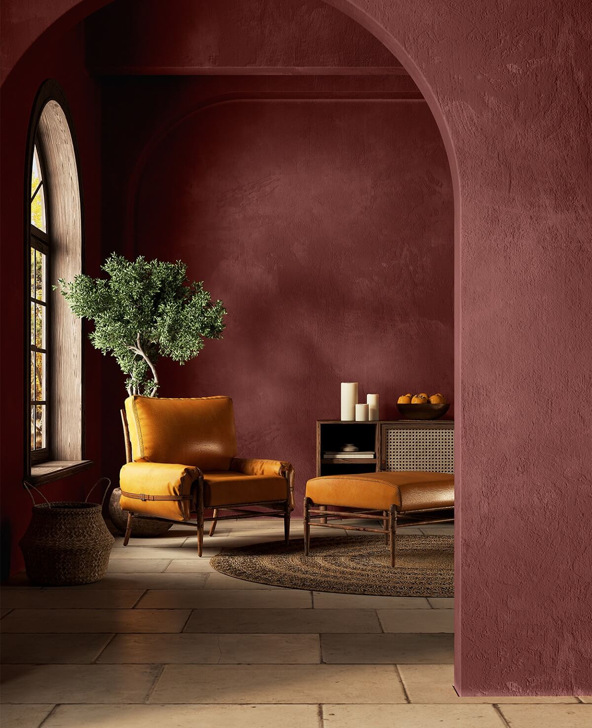
Lore Color Palette
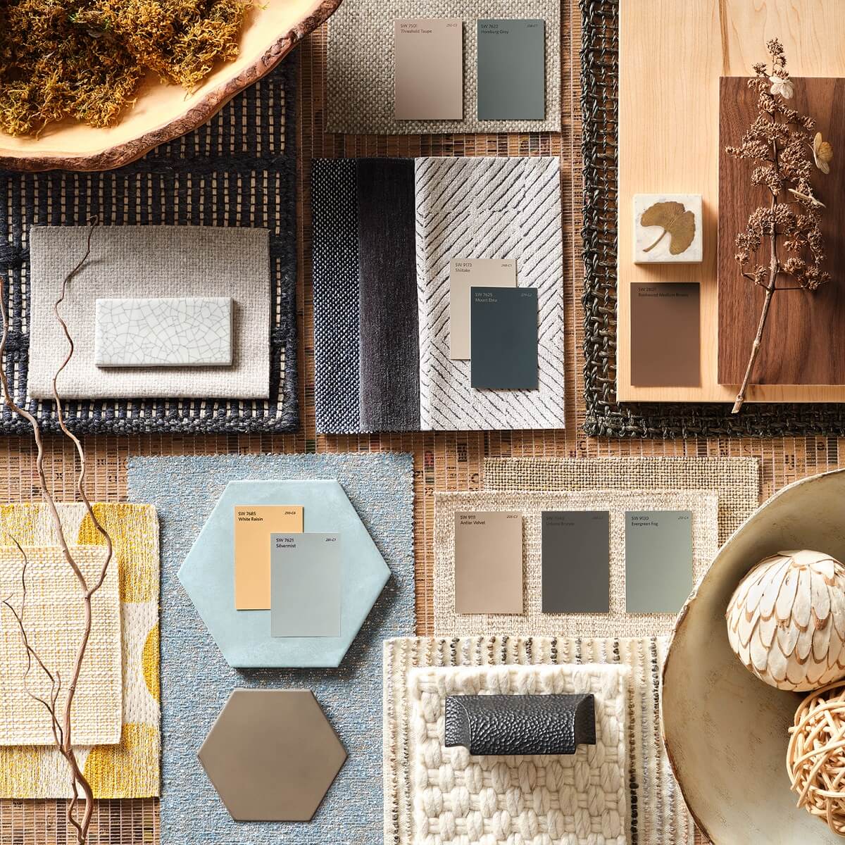
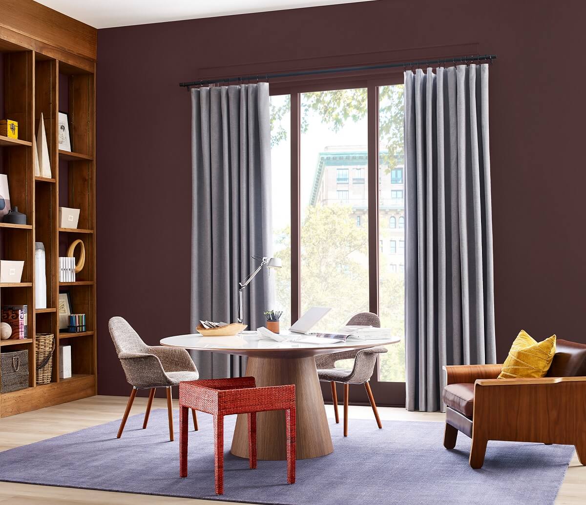
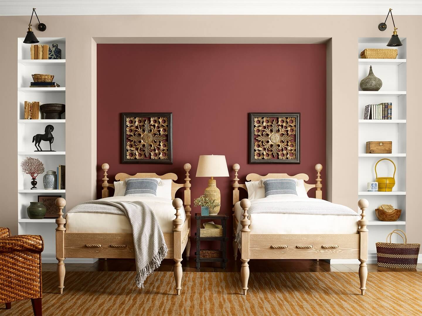
The call to create is woven into the fiber of our being, present in the very air we breathe, binding us together in a community of makers that spans centuries and crosses cultures. Reconnect with an intricate mix of ancient reds, powdery pastels, and a bevy of bejeweled tones—and embrace the transformative power of passionate creativity.
How To Decorate with Redend Point
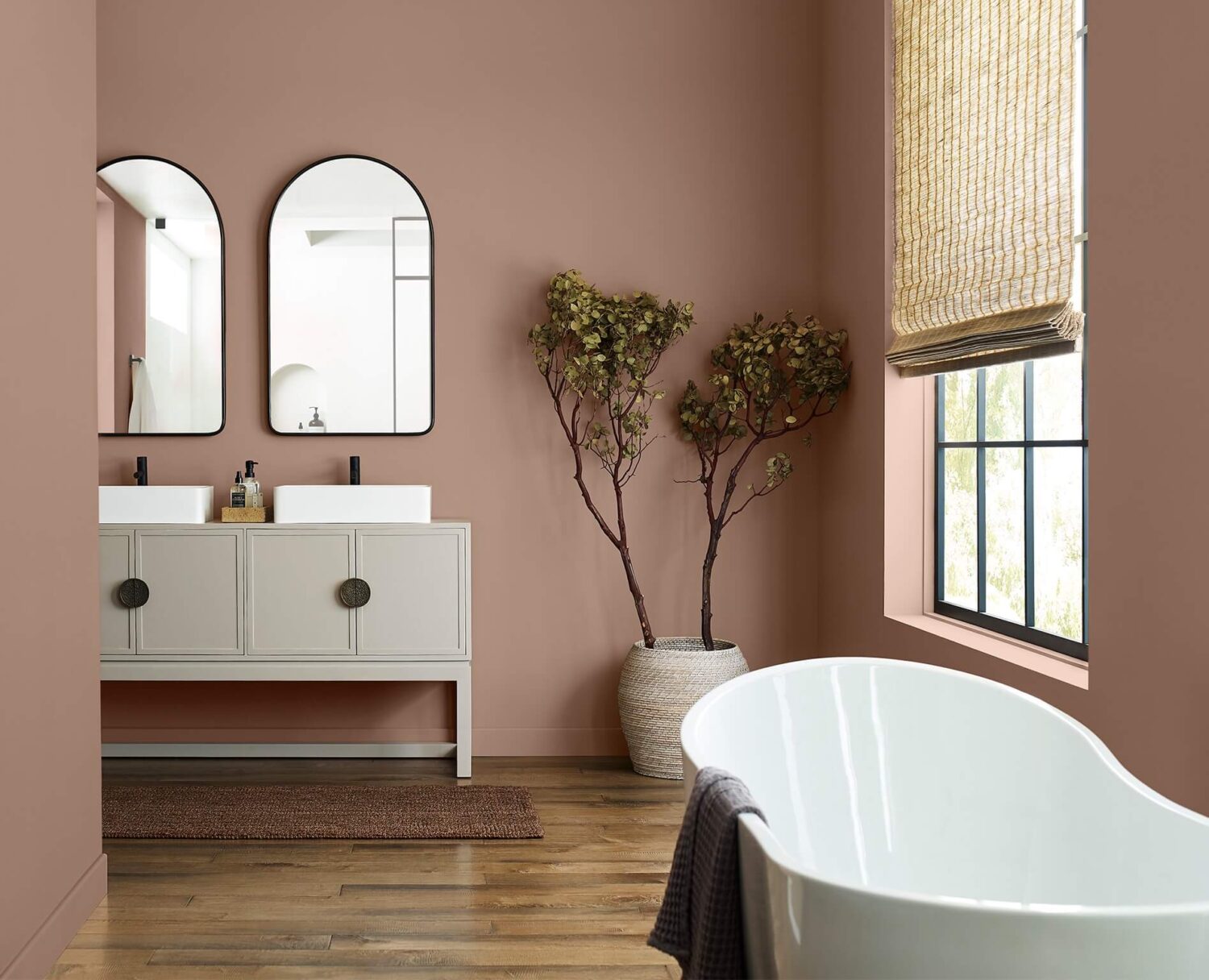
Sherwin-Williams Color of the Year Redend Point is a warm mauve shade that is so versatile that you can use it in any room of the house. You can use this shade as a warm paint color on the walls but you can use this color in more ways.
Redend Point Walls
Redend Point can be used as a neutral color base in any room. By painting the walls in this warm shade you create a soft, soulful atmosphere to your home.
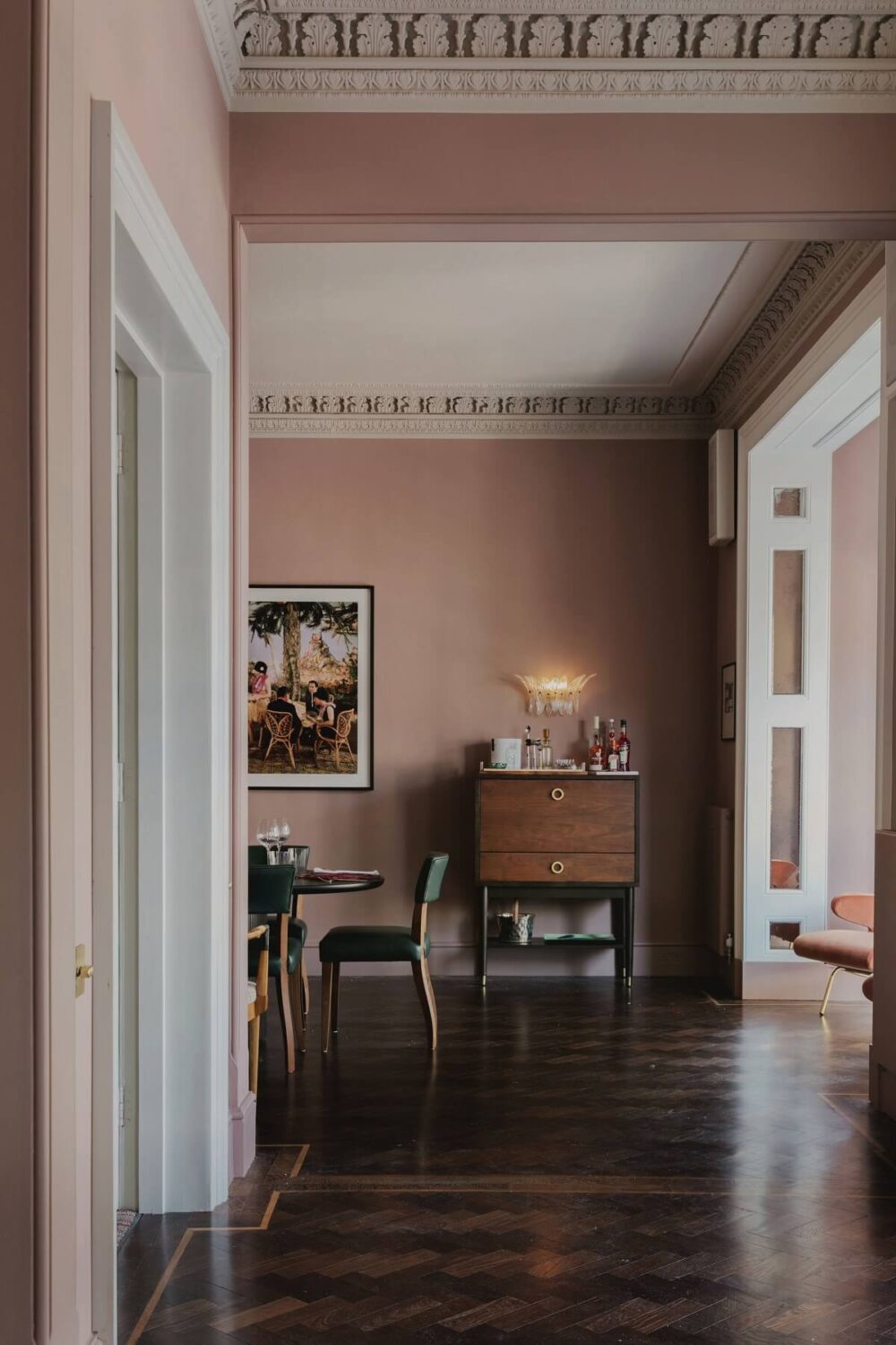
The dining room in this London home designed by Studio Duggan features a warm pink shade on the wall similar to Redend Point. This warm pink is a classic color shade that works perfectly with the historic features in this room. The warm wooden floor adds to the warm look in this space.
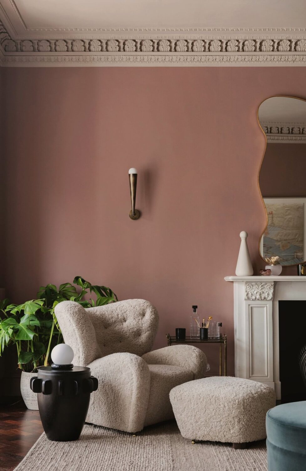
You can also add more warmth by choosing the right textures as you can see in the sitting room above. Though the colors are light, it gives a warm look.
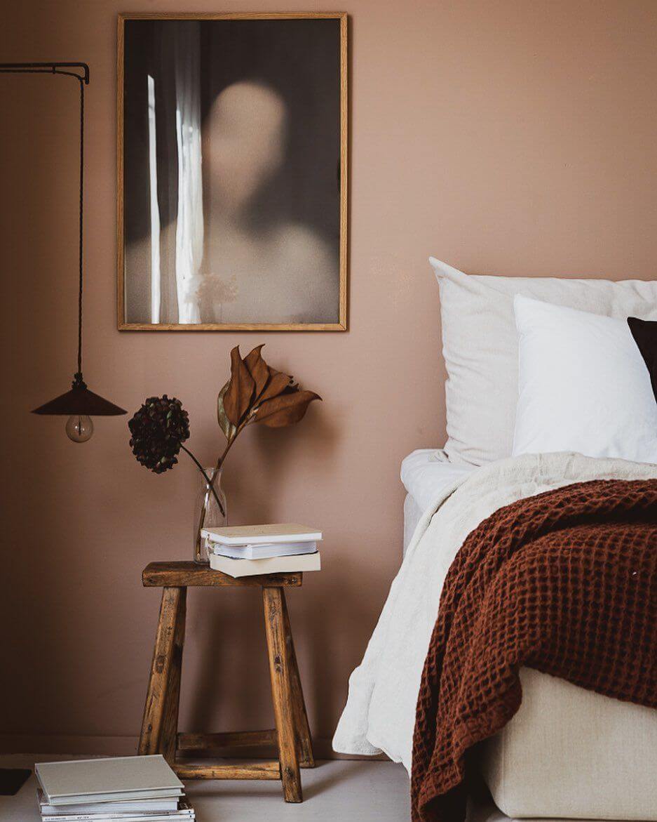
The bedroom of Niki Brantmark of My Scandinavian Home has a warm pink wall. She combined this with crisp white bedding and a rustic stool. A deep red throw add layered warmth.


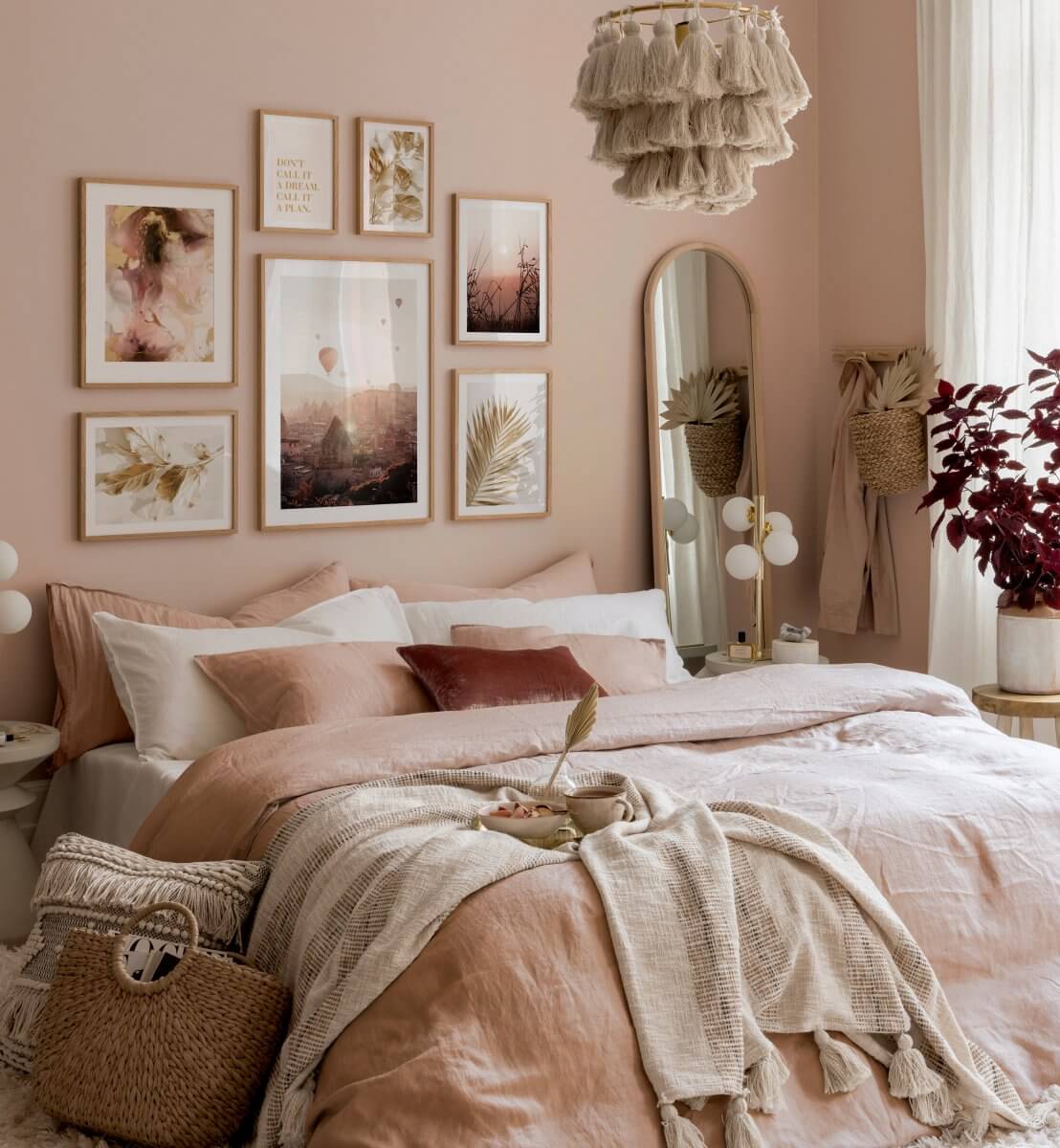
You can use various pink shade to create a layered pink look as you can see in this bedroom where different pink shades are used in the bedding, art, and wall paint (and even the plant is in a deep pink shade).

Redend Point looks perfect in combination with simple plywood, like this minimalistic kitchen.
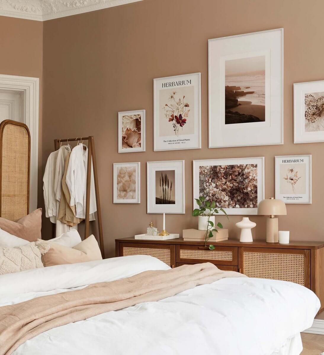
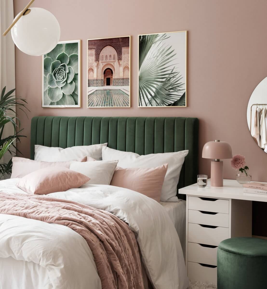
Green and blush is a wonderful color combination as this bedroom shows. A velvet green headboard really pops against the blush wall.
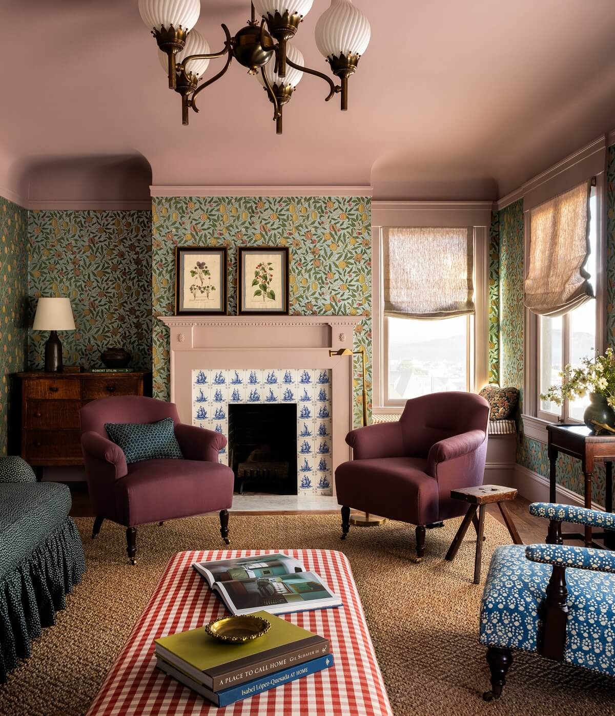
Not the wall but the ceiling is painted in a lovely blush shade in this San Francisco living room designed by Heidi Caillier. The shade continues in the woodwork and the fireplace (where it’s combined with Dutch tiles). A unique way to add a color accent.
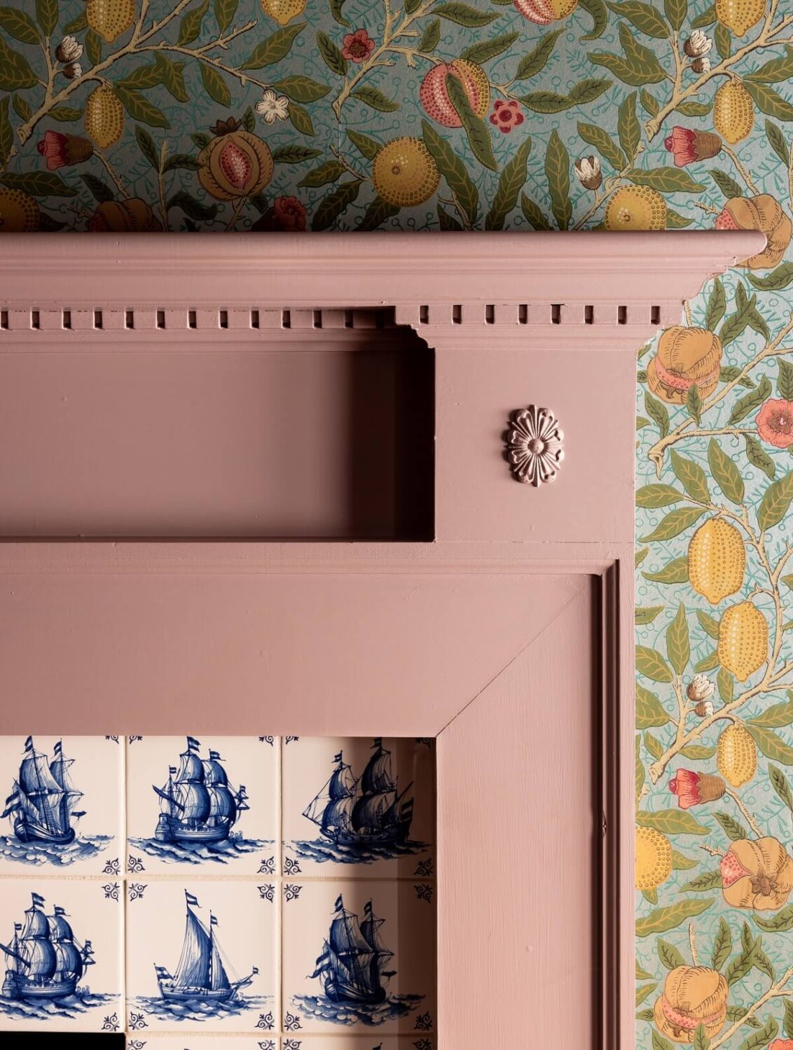
The blush pink fireplace detail with Dutch tilework and William Morris wallpaper.
Redend Point Tiles
A bolder option to add color to a kitchen or bathroom is by using mauve pink tiles.
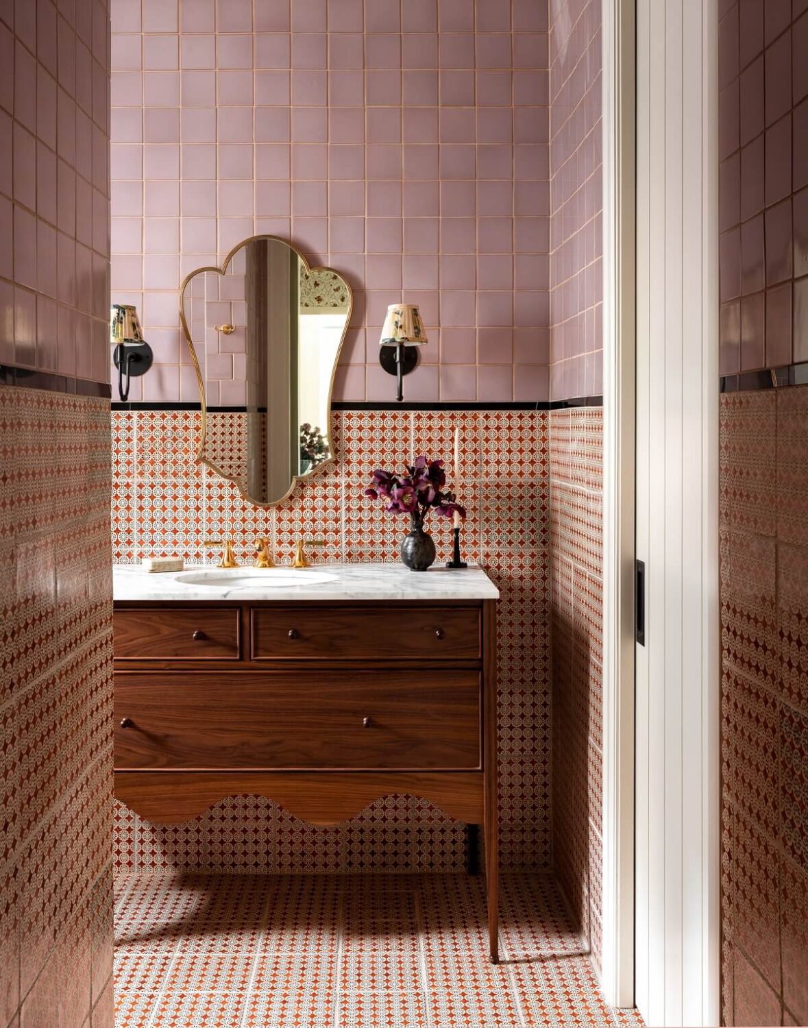
Interior desginer Heidi Caillier used mauve pink tiles in the master bathroom of a Fox Island home. The Fireclay tiles are combined with with Neisha Crosland’s Frieda terra-cotta design for De Ferranti.
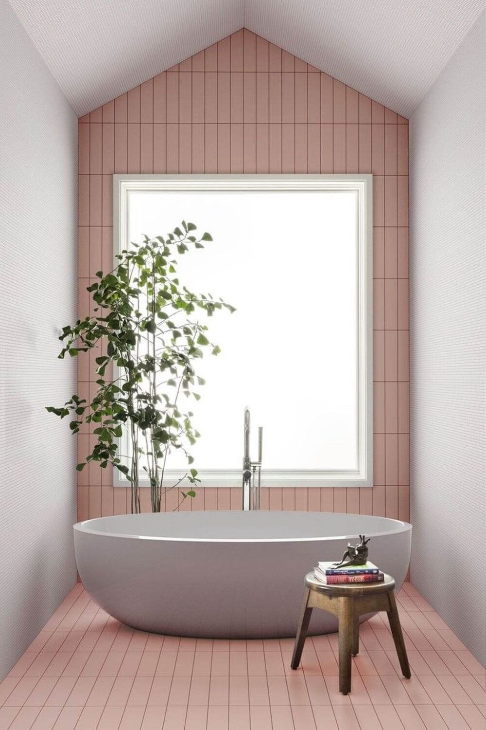
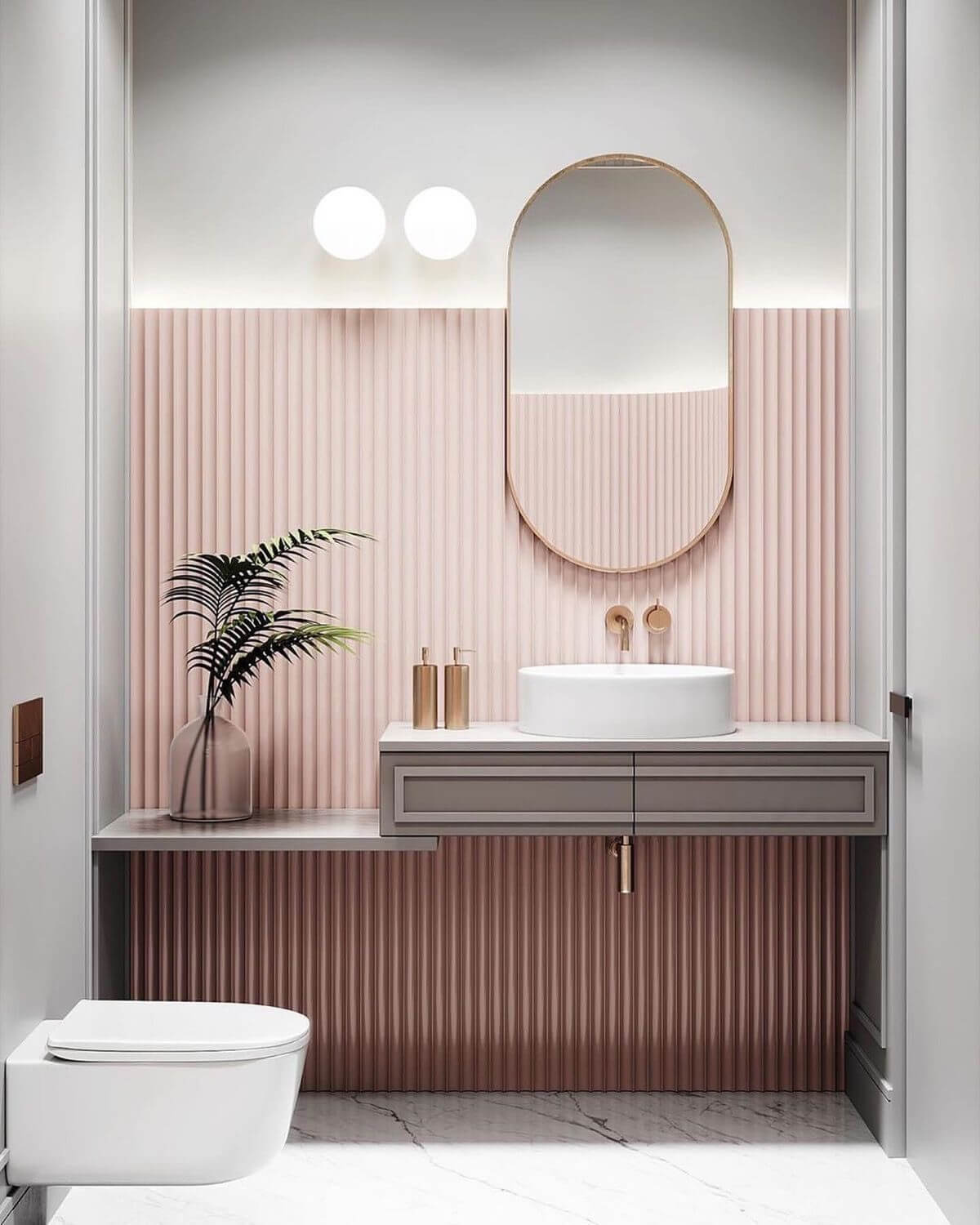
This beautiful powder room combines cool gray shades with a warm blush feature wall.
Redend Point Home Decor
The easiest and most affordable way to implement a new color in your home is by changing the decor in your home. Add subtle color accents to your home by adding cushions, throws, or wall art.
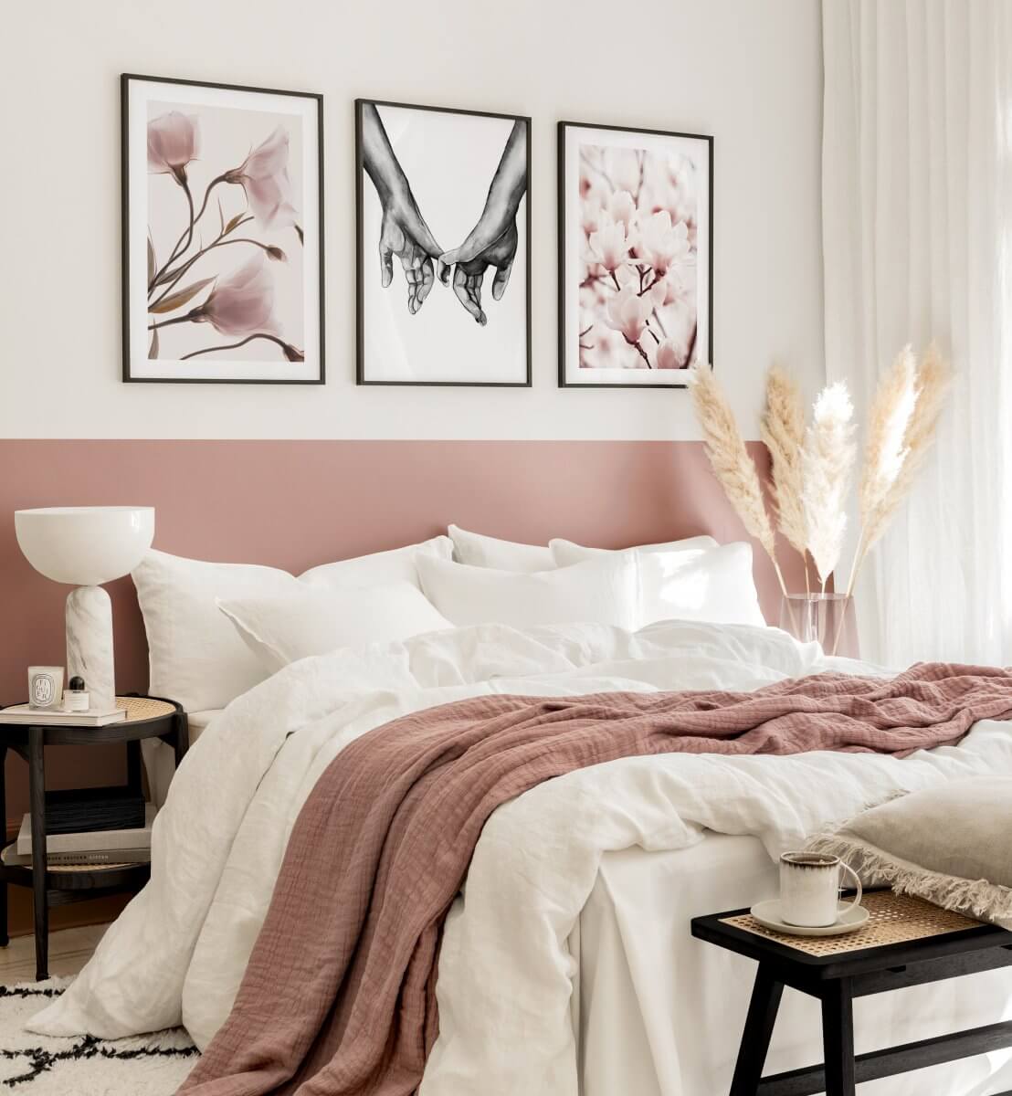
Matching color shades with the half-painted wall that creates the optical illusion of a bed headboard and the pink throw.

If you prefer to keep the color accents minimal then this is a great living room example. Subtle pink accents are added in the cushion and art.
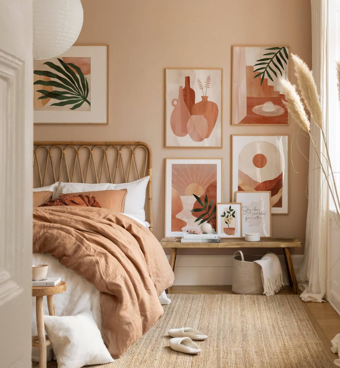
This warm bedroom with rattan headboard uses a palette of pink shades in the bedding and artwork. This earty pink color scheme is combined with light neutrals in the jute rug and wooden bench.
As you can see there are various ways in which you can use Sherwin-Williams Redend Point in your home. It’s a beautiful mauve pink shade that adds warmth to any room. Take a look at the Color Trends for 2023 to see more inspiring color inspiration.
