The Best Classic Paint Colors For A Timeless Living Room
Choosing the right wall color for your living room is a difficult task. The living room is a multifunctional room where you relax, entertain, enjoy family time, and perhaps also have dinner.
You want a living room that feels warm and comfortable. But you also want it to feel fresh and show your personality. If you don’t want to follow trends, you can choose one of many classic paint colors to use in your living room. Don’t think that white walls or neutral shades are boring. These traditional paint colors are often used by leading interior designers for a good reason.
And you can play around with different shades in your living room. You can add a bright color for an accent wall. Or play around with darker shades as an accent color on the walls or even the ceiling.
The right paint color will do wonders for your room. Especially when you room doesn’t get much natural light, you want a paint color that makes the room feels fresh, light, and warm.
This post will show you classic living room paint ideas that have been tried and tested many times by the world’s leading interior designers. These are the best paint colors for a timeless and classic living room style.
White, Cream, and Beige Living Room Colors
The most popular living room colors are still white, cream, and beige tones. And that’s not surprising because these warm neutrals or bright whites form a perfect backdrop for a room. By using neutral colors you have every option in terms of furnishings and décor. And you can easily change things up by adding or changing accent colors in your décor.
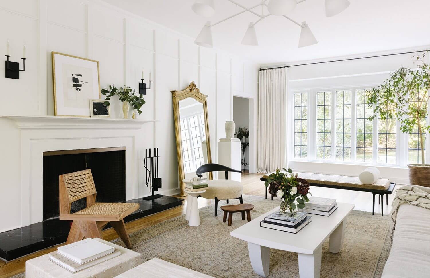
photo: Havenly
Benjamin Moore: Simply White
Benjamin Moore’s Simply White is a bright off-white color with a yellow undertone. This bright white hue is the right shade if you have a room that’s naturally dark and you want to make it lighter.
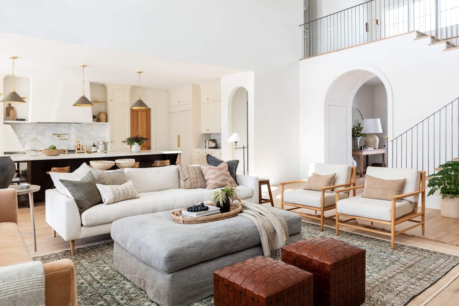
photo: Studio McGee
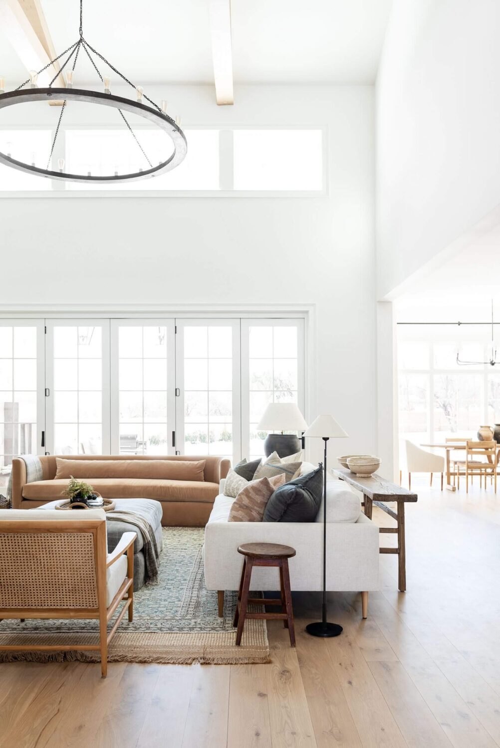
photo: Studio McGee
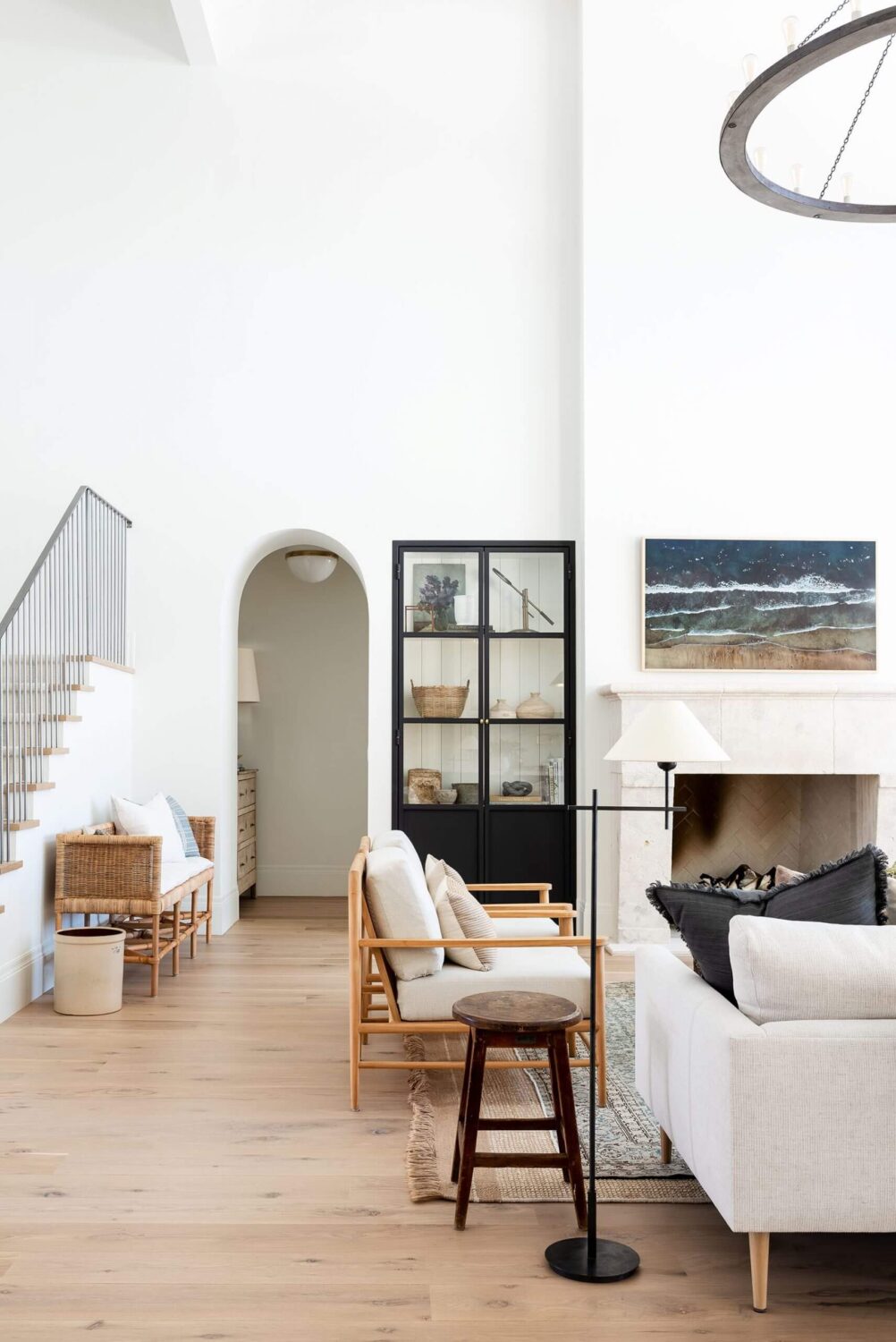
photo: Studio McGee
Benjamin Moore: Swiss Coffee
Benjamin Moore Swiss Coffee is a soft white color that is a popular choice for a living room. The designers of Studio McGee used Swiss Coffee for their home.
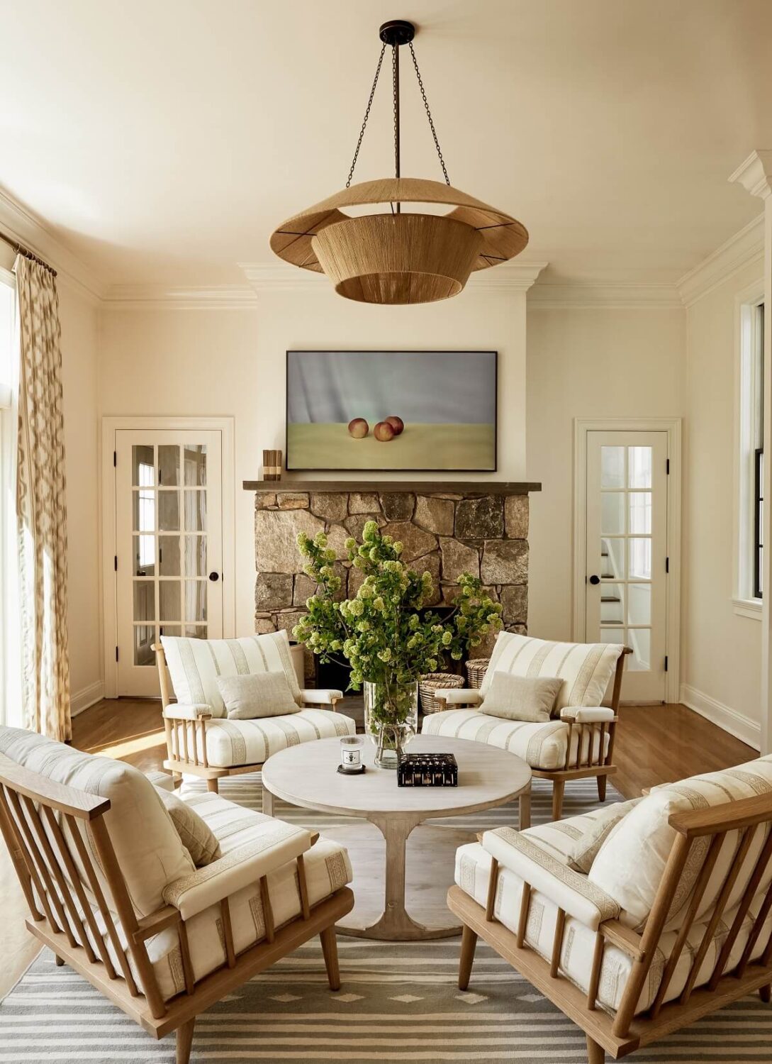
photo: Rikki Snyder
Benjamin Moore White Dove
Interior designer Becca Casey of Becca Interiors used Benjamin Moore’s White Dove on the walls of this living room. It’s a lovely warm white or creamy white shade for a classic living room color.
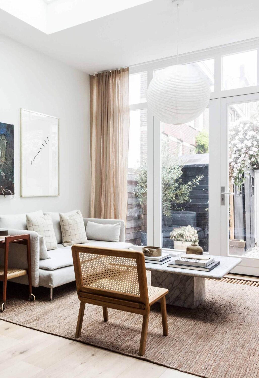
photo: Holly Marder
Farrow and Ball: Strong White
Interior designer Holy Marder of Avenue Design Studio used Farrow and Ball’s “Strong White” as paint color for her living room walls. This white has a light gray undertone and is part of the Contemporary Neutrals collection of Farrow and Ball.
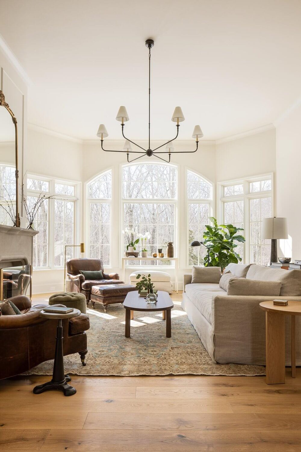
More classic white paint colors: “Snow Fall” by Behr is a favorite of designer Sarah Sherman Samuel. “White Opulence” by Benjamin Moore is frequently used by Jessica Helgerson. “Ammonite” by Farrow and Ball. “Westhighland White” by Sherwin-Williams is a lovely warm white. “Decorator’s White” by Benjamin Moore.
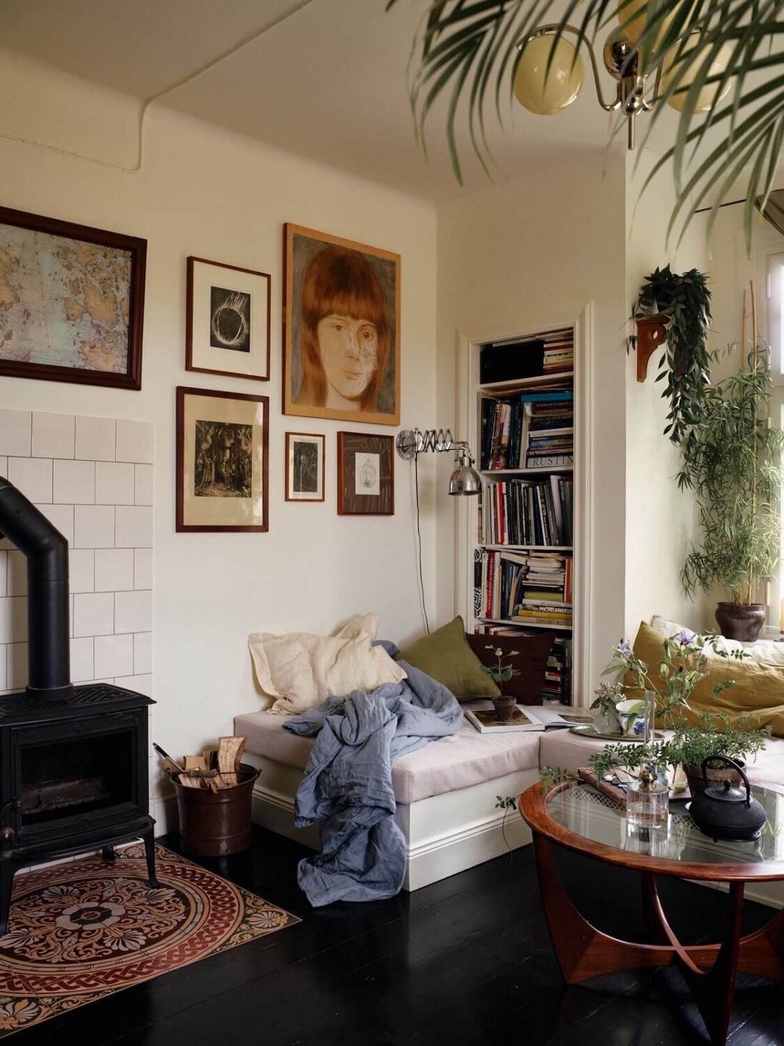
Gray Living Room Colors
If you prefer a moodier look for your living room then you can choose a gray hue as a living room wall color. Gray, the same as white and beige, is an extremely timeless color for any room of the house and it can easily be combined with other accent colors. Though most grays are considered cool colors, there are shades that add warmth to your living space.
Benjamin Moore: Classic Gray
Benjamin Moore’s Classic Gray is a warm tone gray color that is also used as off-white. While many gray hues have blue or green undertones, Classic Gray does not. Instead, it has slight pink or purple undertones which give it is warm tone.
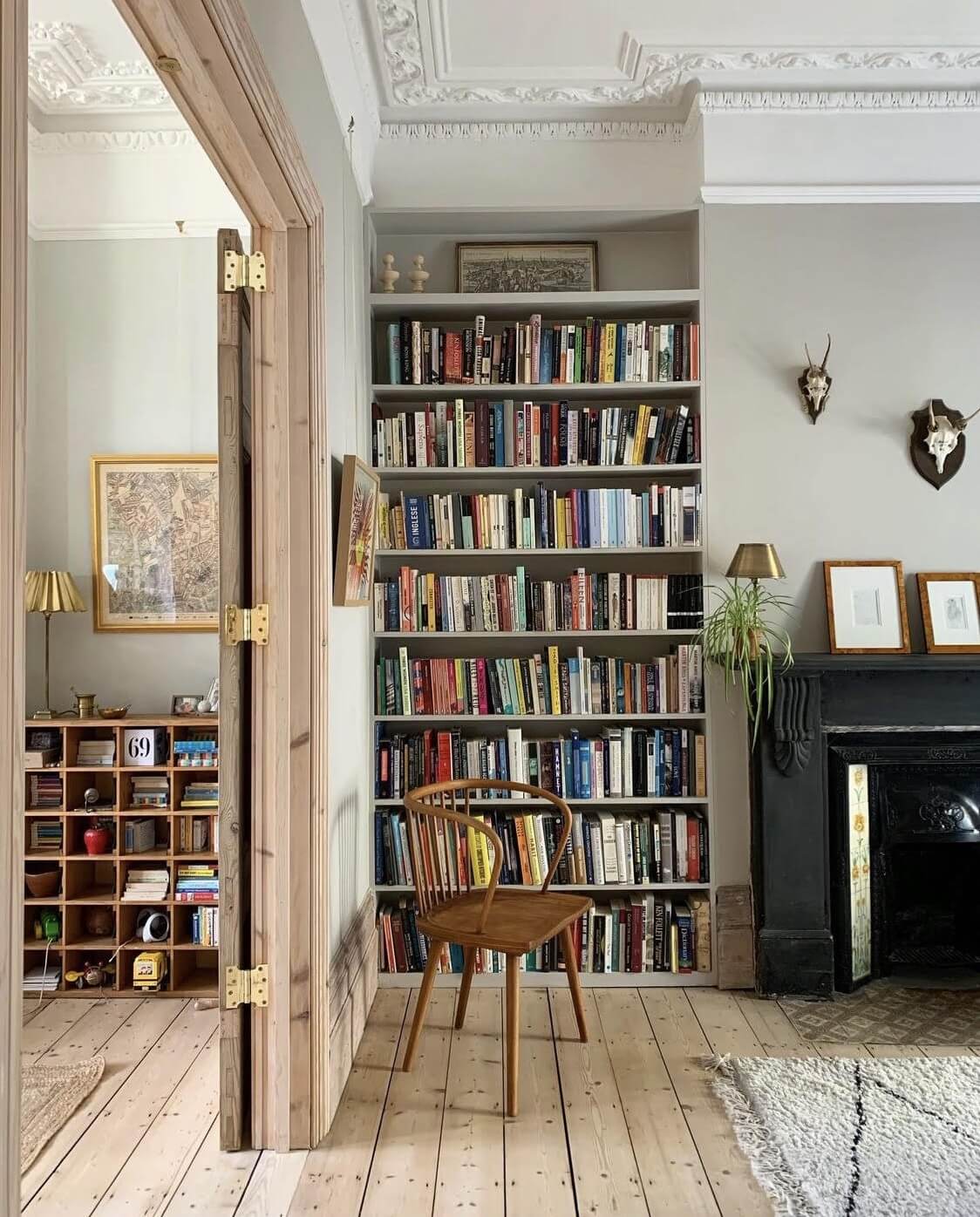
photo: Good Bones
Atelier Ellis: Quiet Grey
Leanne, who is renovating a Victorian townhouse in London which you can follow on her instagram account Good Bones, chose a light gray shade for her living room walls. She opted for “Quiet Grey” by Atelier Ellis, a soft and timeless gray that changes with the direction of the light. The shade is soft but also has depth which makes it a perfect neutral.
Farrow and Ball: Lamp Room Gray
Farrow and Ball’s “Lamp Room Gray” is a soft gray hue with a slight blue undertone. It’s a strong color in a small room, but in larger rooms it softens and creates a timeless look.
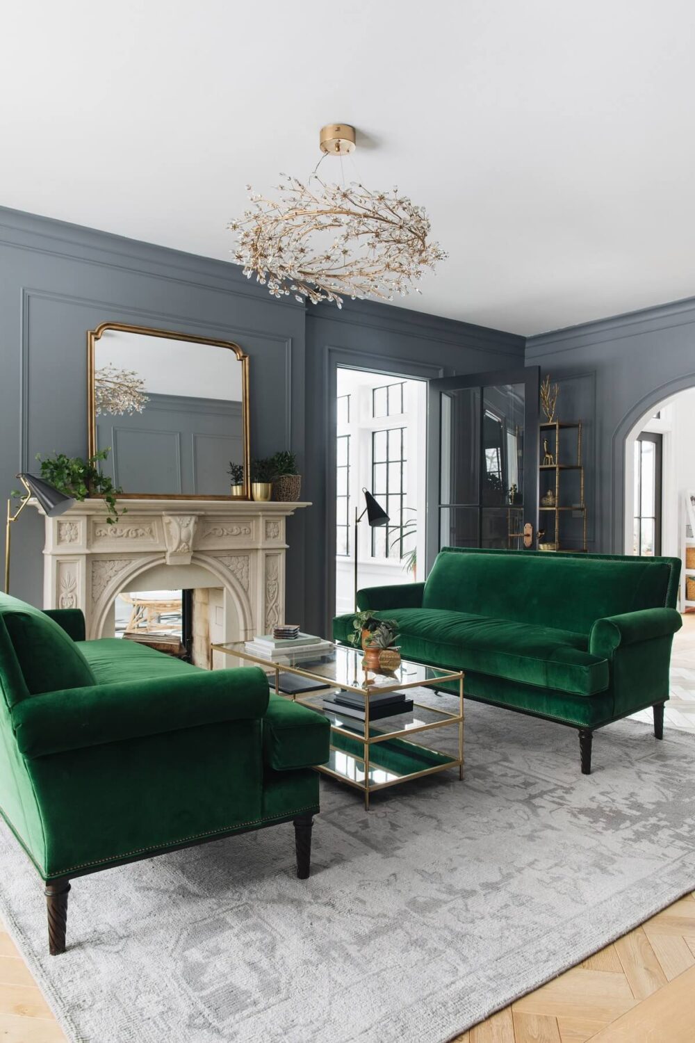
Benjamin Moore: Englewood Cliffs
Englewood Cliffs is a darker gray shade that will add depth and a timeless look to your living room. Jean Stoffer combined this dark gray shade with velvet emeral green sofa’s.
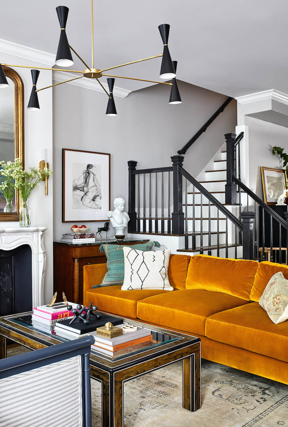
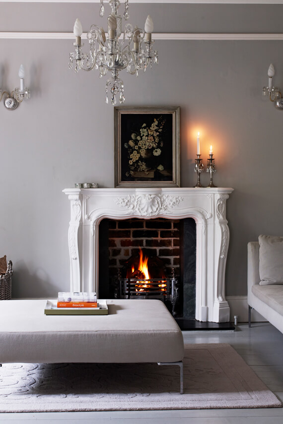
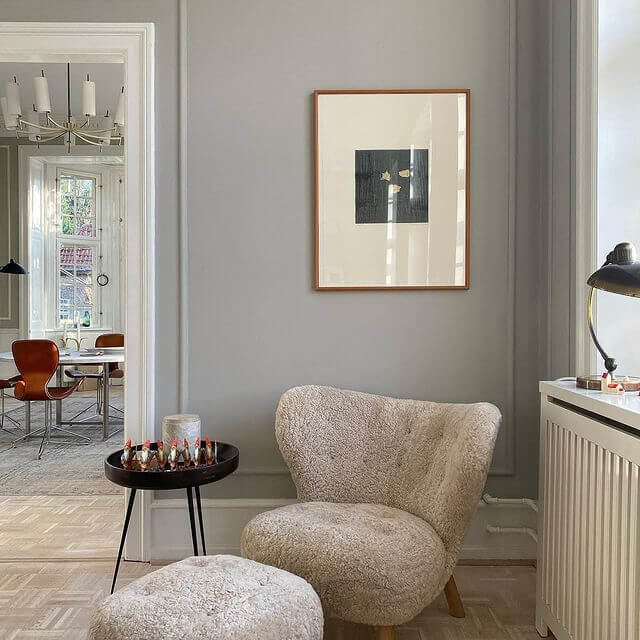
Farrow & Ball: Pavilion Gray
Pavilion Gray is a classic mid gray that is a reminiscent of an elegant 18th century Swedish color. This gray hue has a blue undertone which gives it a contemporary touch and a sense of spaciousness.
Blue Living Room Colors
Blue is perhaps the most classic paint color besides white hues. Several paint brands have chosen a light blue tone as their color of the year. But for a classic look you can pick a darker shade. Contrary to what you might think if you have a small living room or one with little natural light you can still choose darker colors for your living room walls.
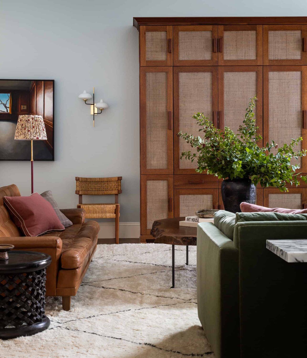
Designer Heidi Caillier painted the walls in a light blue hue in this classic living room. Light blue adds freshness together with a subtle color touch. The exact color used in this room is unknown. But great light blue color choices are: “Borrowed Light” by Farrow & Ball, “Breath of Fresh Air” by Benjamin Moore. And the two blue colors of the year 2022: “Breezeway” by Behr and “Bright Skies” by Dulux.
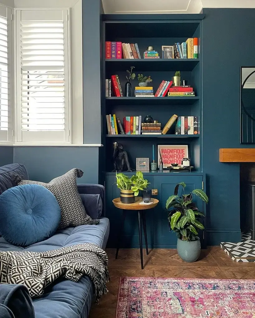
photo: Sushma/@house_on_the_way
Farrow & Ball: Hague Blue
Hague blue is a strong blue with green undertones that is name after the colored woodwork often used by the Dutch. It’s a timeless and dramatic blue shade that works perfectly for ground skirtings or as an accent wall. Farrow and Ball recommends you combine Hague Blue with Borrowed Light.
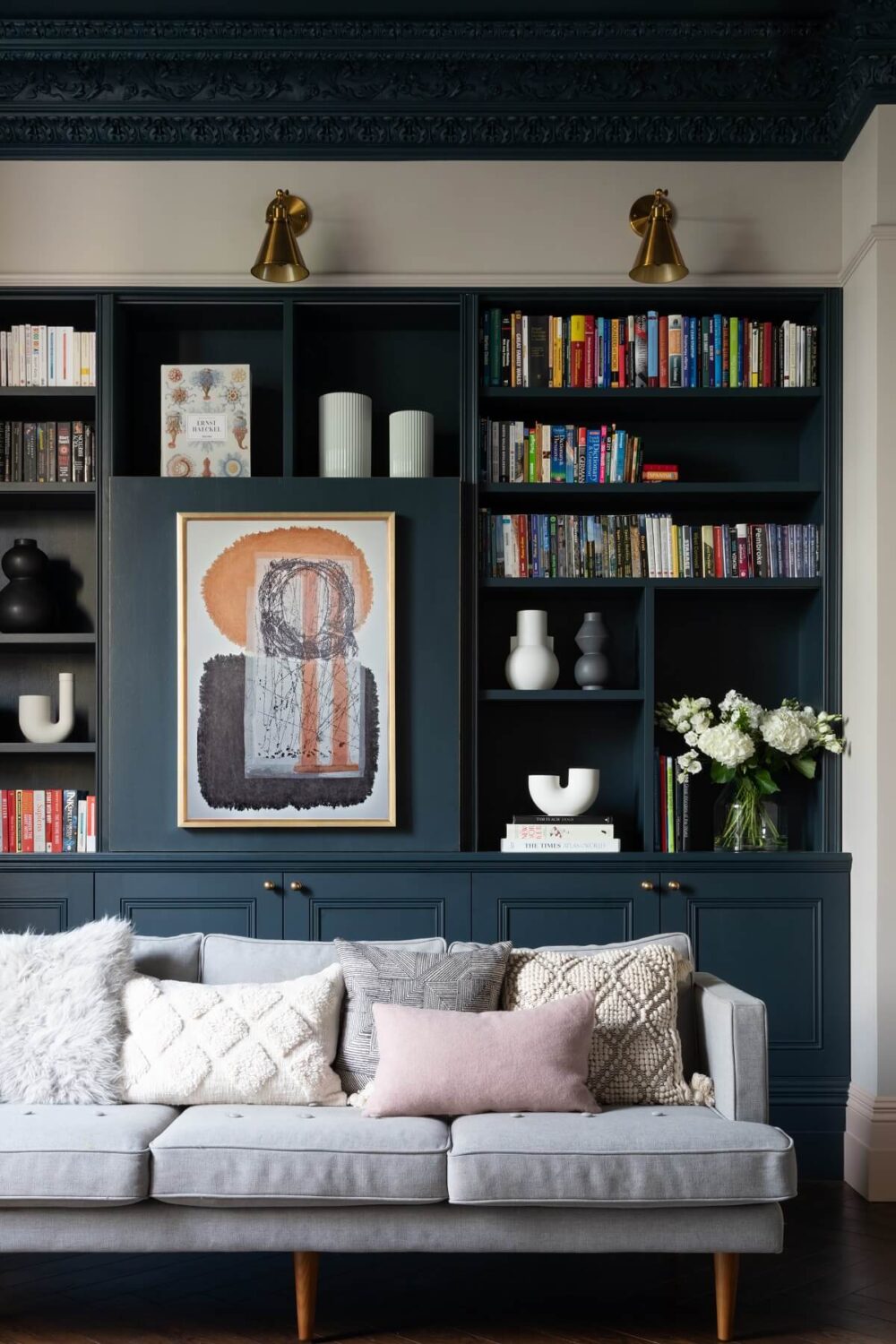
photo: Paul Craig
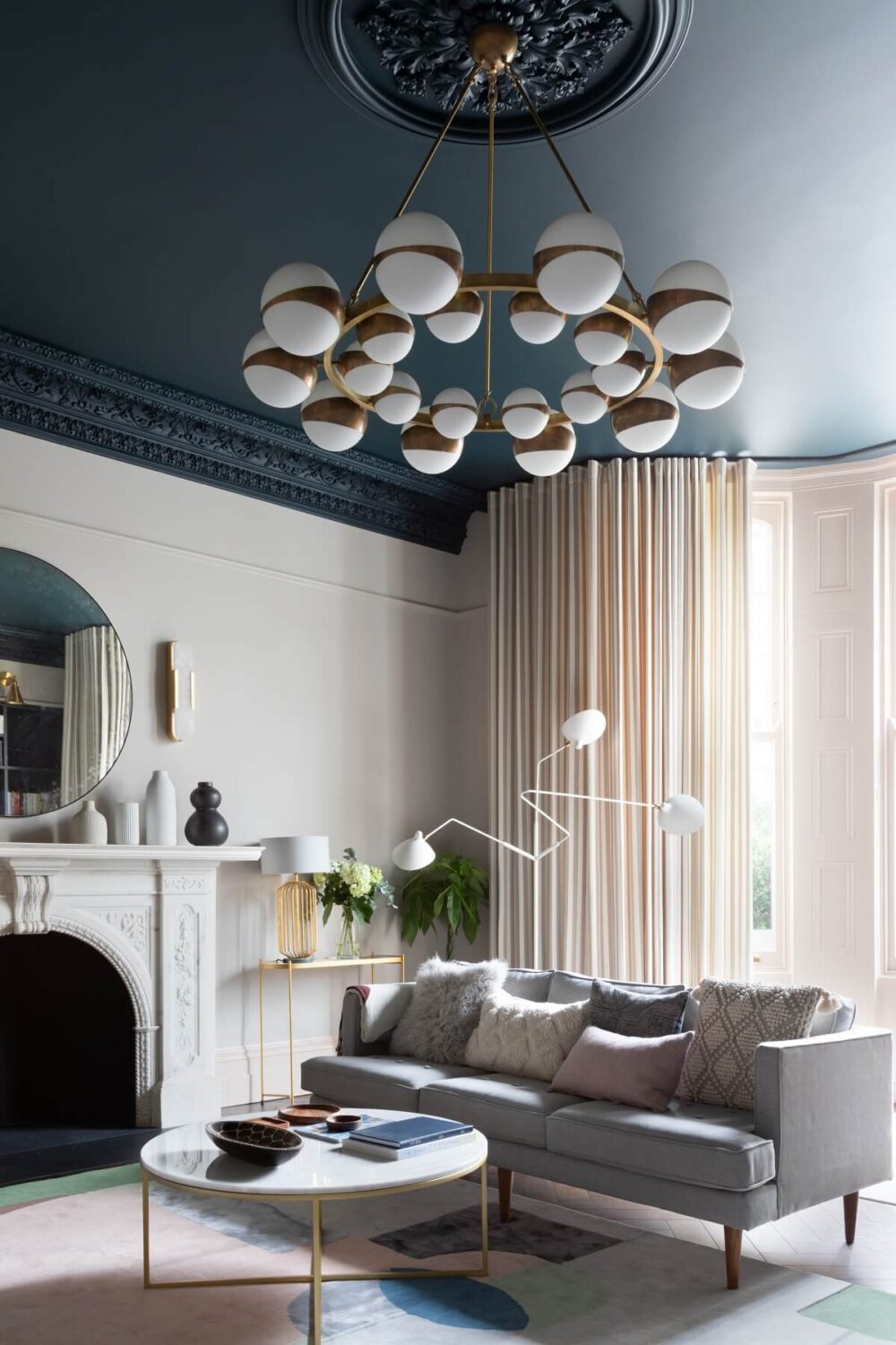
photo: Paul Craig
Paint & Paper Library: Kigali
The designers of Frank and Faber were creative with the use of blue paint in the living room of a Victorian townhouse. The ceiling and built in bookcase are painted in a dark blue shade called “Kigali” by Paint & Paper Library. They used dark blue as an accent color which they combined with very soft pink walls.
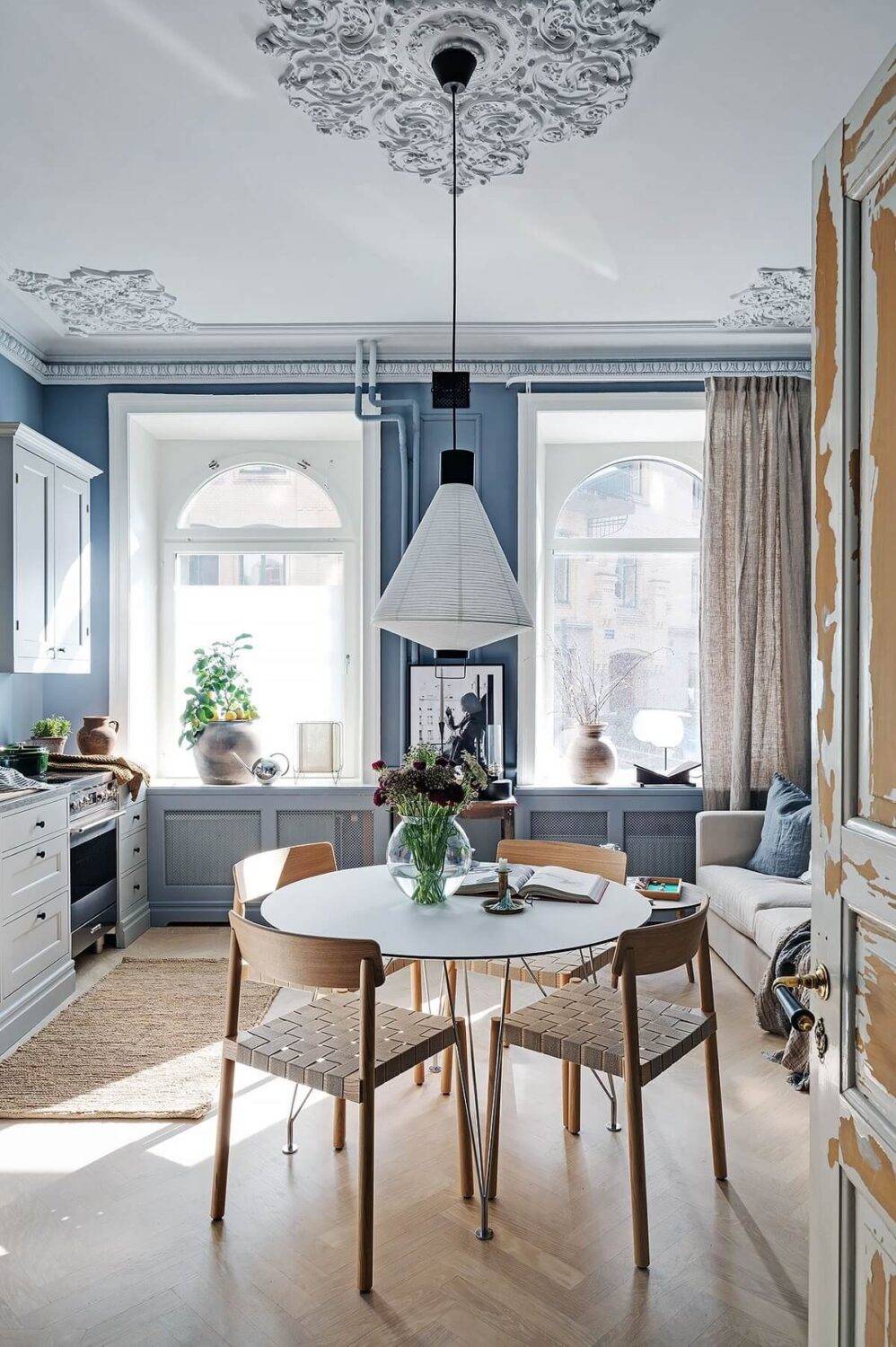
photo: Alvhem
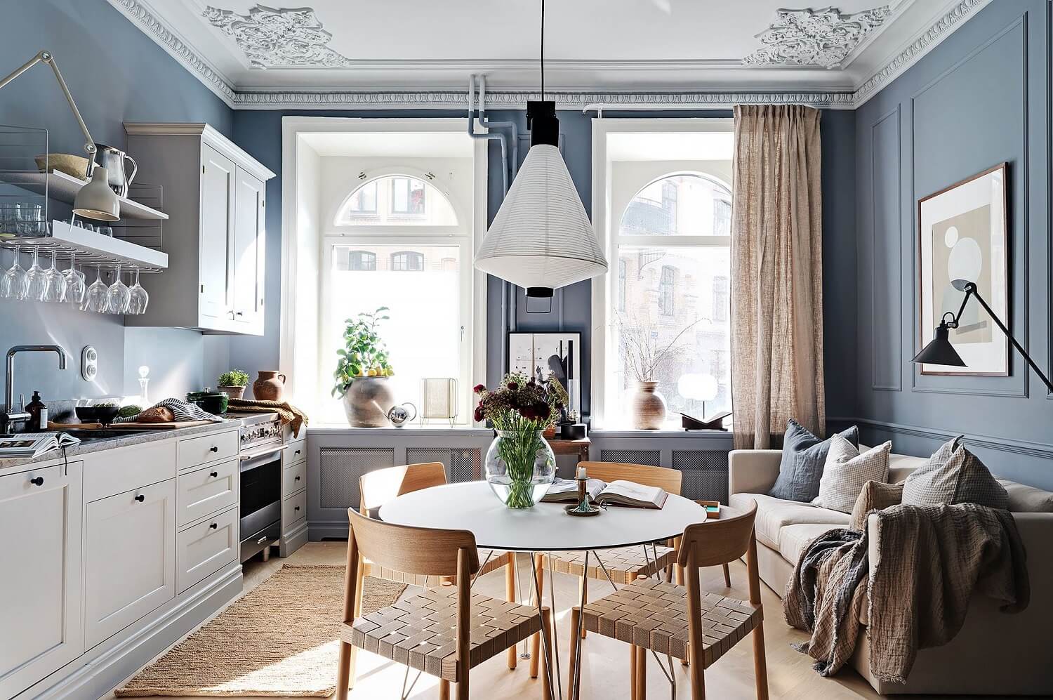
photo: Alvhem
Jotun: Shadow Blue
This Nordic home with an open floor plan where the living room, dining room, and kitchen are all combined in a small room is painted in a muted blue shade called “Shadow Blue” by Jotun. The muted blue shade is combined with warm neutrals for a classic look.
design: Heidi Caillier – photo: Haris Kenjar
Portola Paint: Wellfleet
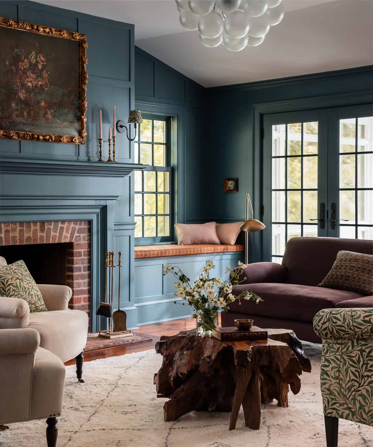
Interior designer Heidi Caillier used this classic blue shade in the living room of a Bedford period home. It’s a lovely shade between light and dark that adds a classic touch to the room.
Two more dark blue shades that are classic living room paint colors are “Old Navy” and “Midnight Dream” by Benjamin Moore. Both can be viewed in this London home tour.
Green Living Room Colors
Several paint companies have chosen a green color as their color of the year. But even though green is a very trending color at the moment. It’s also a great option as a timeless living room paint color. Green adds a calm, natural look to your room.
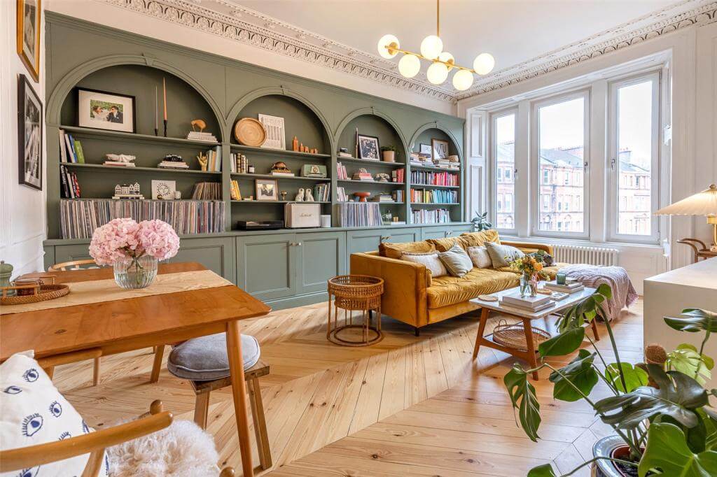
Benjamin Moore: October Mist
October Mist is a calm sage green hue that is now often used as a classic neutral. October Mist can easily be combined with other paint colors for either a vibrant or a neutral home look.
The exact color of the bookshelves in Kate Spiers’ Glasgow flat (pictured above) is unknown. But October Mist is a similar sage green hue.
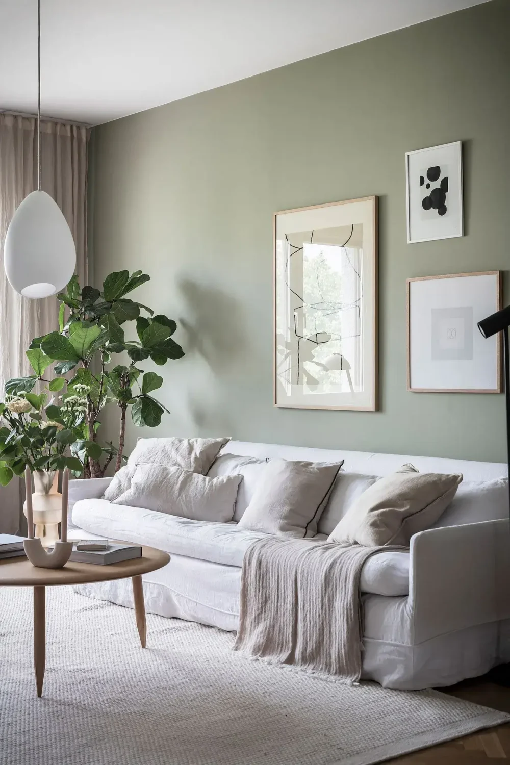
See also: How To Decorate with Benjamin Moore Color of the Year 2022: October Mist
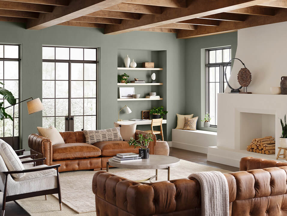
Sherwin Williams: Evergreen Fog
Evergreen Fog was choses by Sherwin Williams as their Color of the Year 2022. This green hue with gray undertones in a popular choice for adding a neutral, colorful touch to your home.
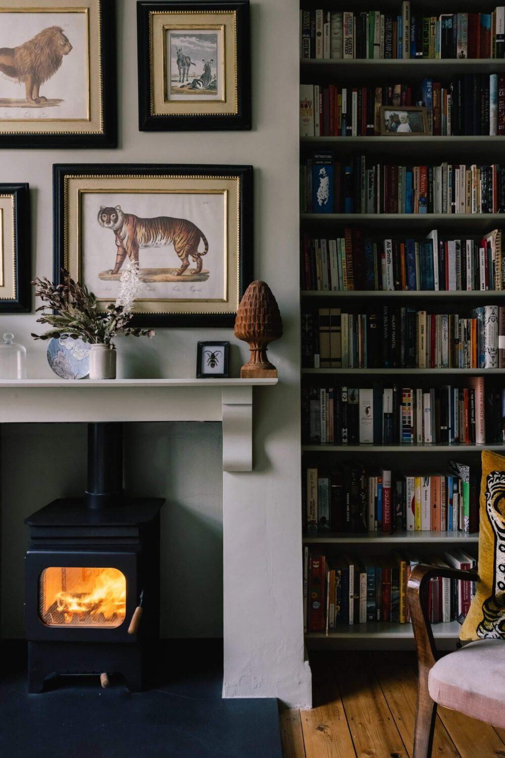
design: Parsnip Interior Design and photo: Mark Anthony Fox
This living room pictured above is painted in a classic gray/green hue called “Wattle” by Paint & Paper Library. It gives the living room in a London home a peaceful look.
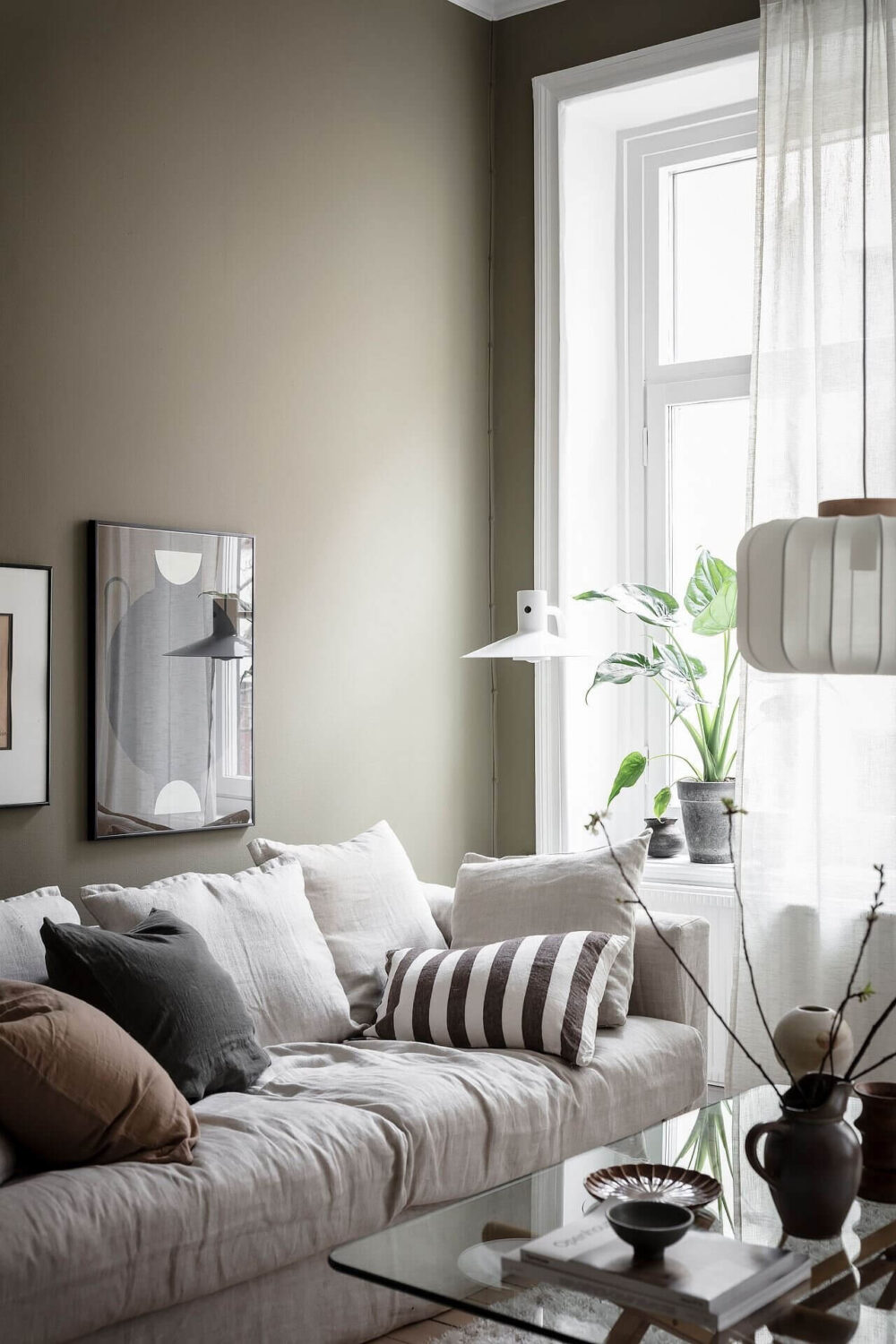
styling: Emma Fischer and photo: Anders Bergstedt
Jotun: Organic Green
Organic Green by Norwegian paint company Jotun is just like “Evergreen Fog” and “October Mist” a calm green hue that works perfect in a living room. The olive green shade adds a natural color touch to your living room.
Pink Living Room Colors
Pink is on the rise as a neutral living room color, especially if you want a warm shade on your living room walls that still feels neutral.
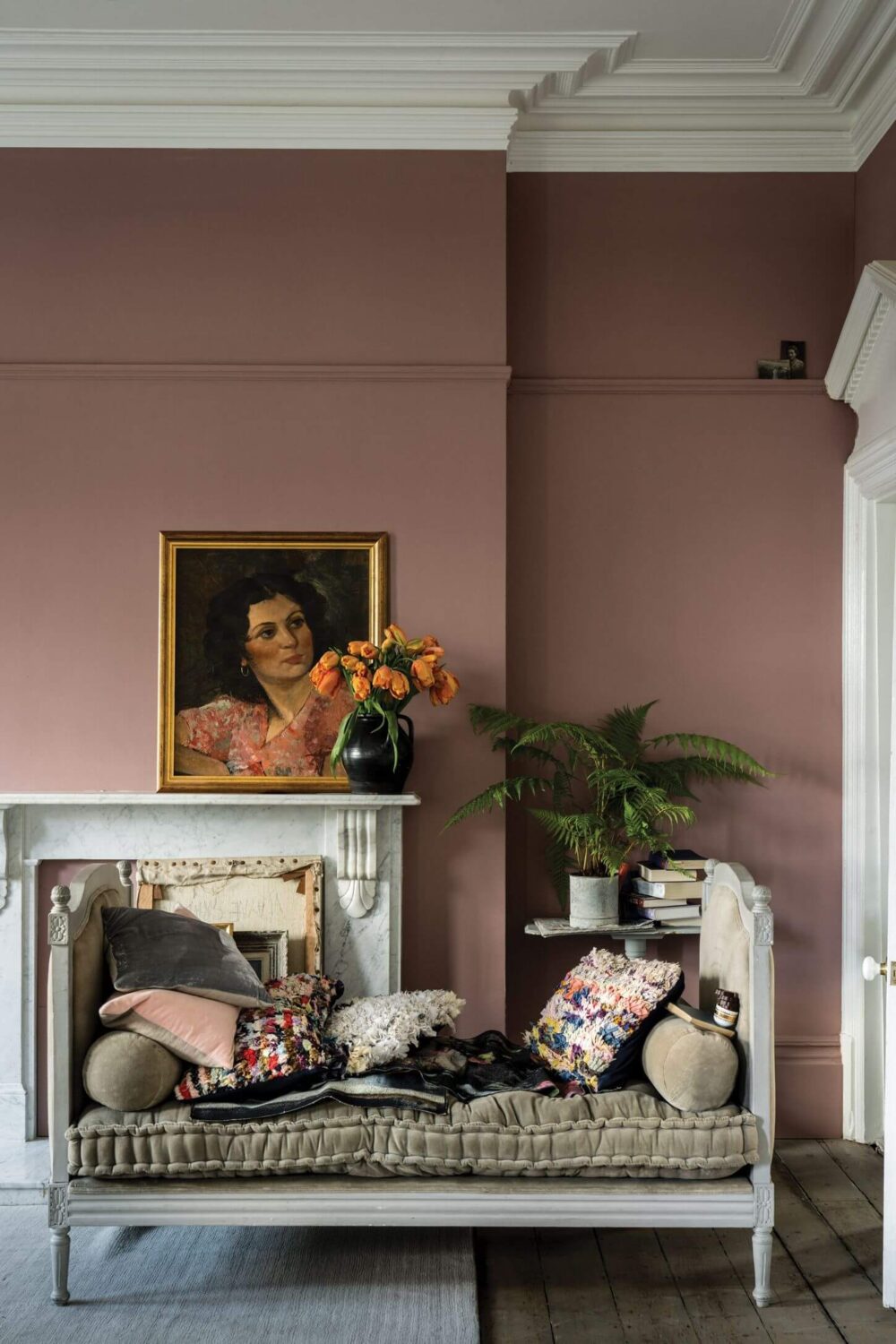
Farrow & Ball: Sulking Room Pink No.295
Sulking Room Pink by Farrow & Ball is a muted rose shade that gives your living room a warm and soft feeling.
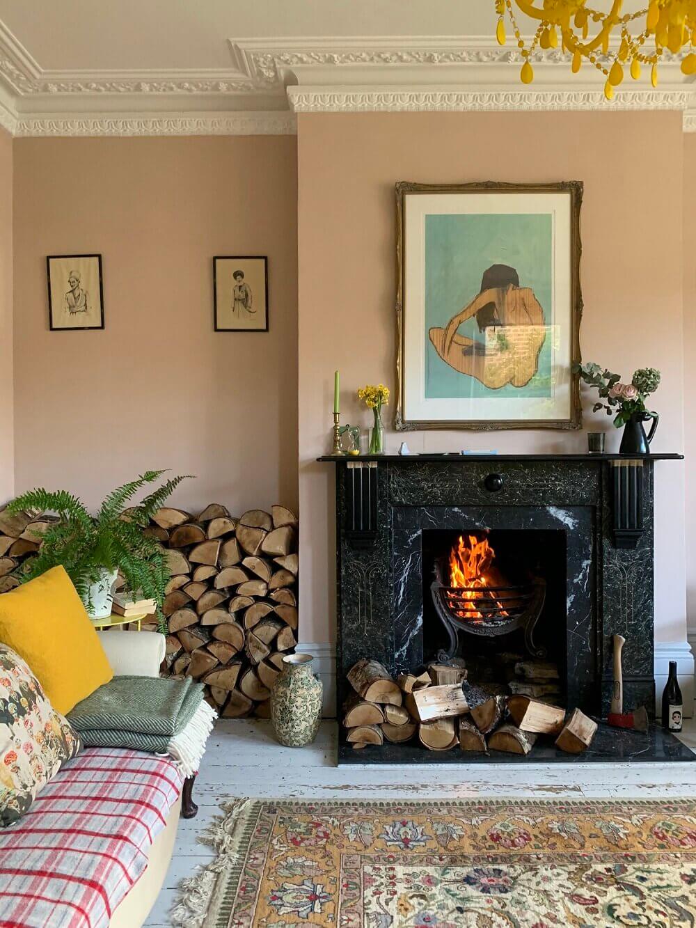
Edward Bulmer: Jonquil
Chris Graves of Clarence and Graves painted his historic sitting room in Jonquil by Edward Bulmer. Jonquil is a timeless color that hovers between beige/yellow and pink. This plaster pink works both in a period home as you can see above but also in a modern home.
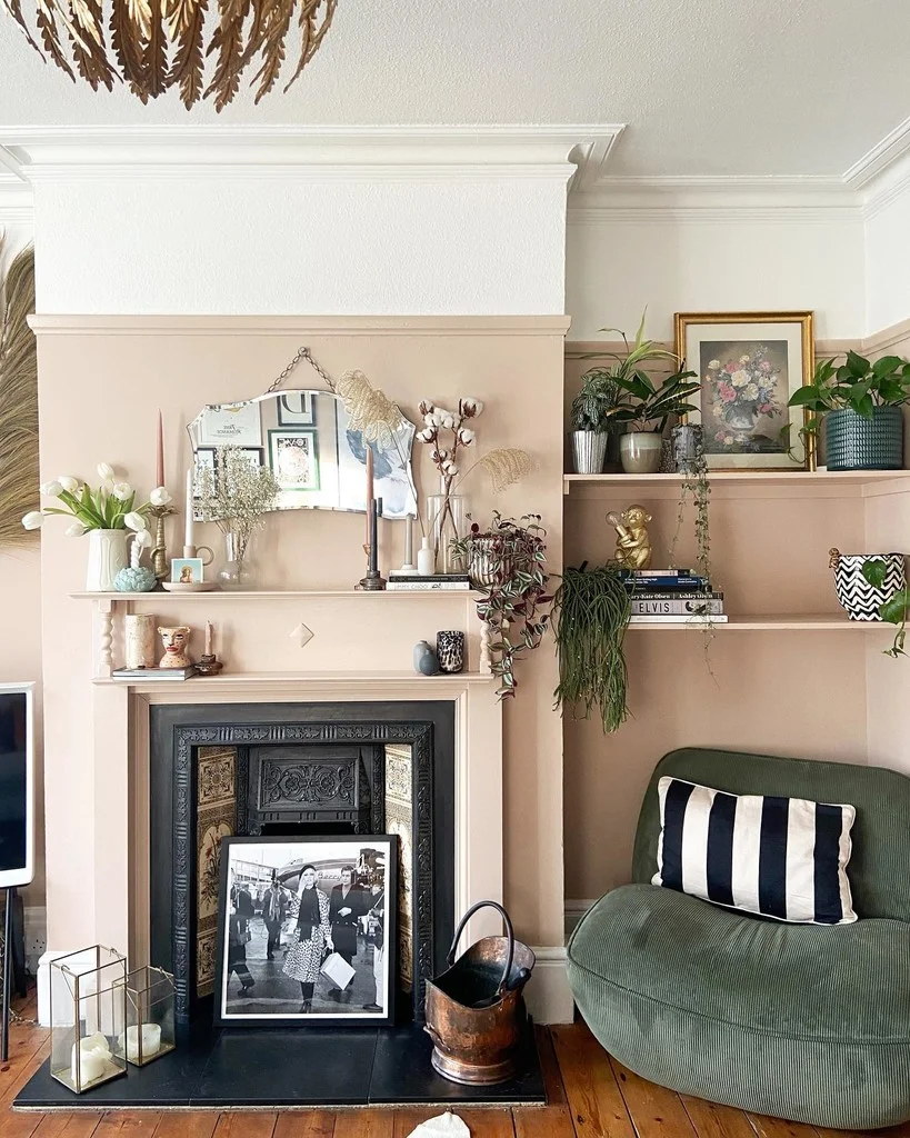
photo: @leopard_print_stairs
Farrow & Ball: Setting Plaster
Setting Plaster is a dusty pink hue which has a softness to it thanks to the inclusion of yellow pigment. It’s a great backdrop for both period homes and modern homes.
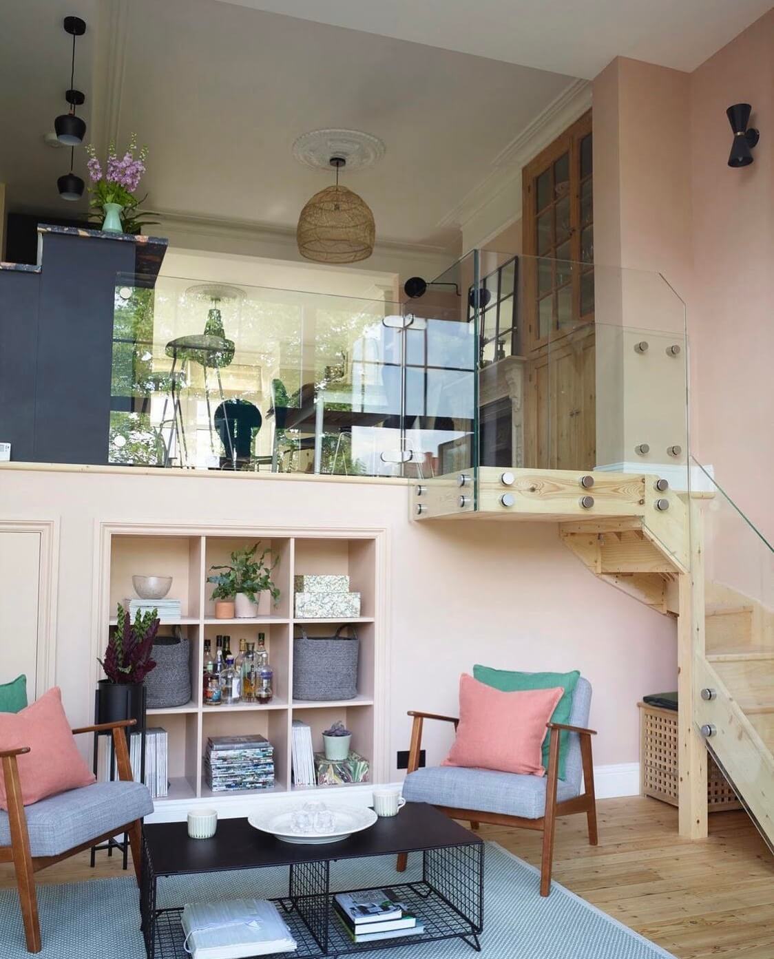
photo: Rachael Smith & design: Linnéa Interiors
Interior designer Alex Higginson of Linnéa Interiors used Setting Plaster by Farrow & Ball in this modern split level home in London. It shows that Setting Plaster is a beautiful classic color for homes in all styles.
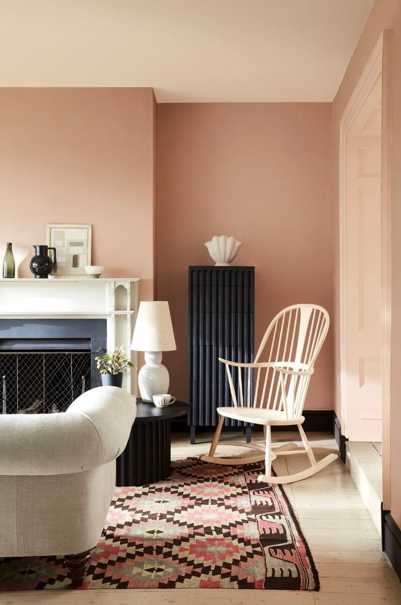
Little Greene – Masquerade
Masquerade by Little Greene is a powder-like pink hue that works perfectly as a natural and timeless color in your living room. Combine it with classic architecture and decor or with sleek modern pieces (or both).
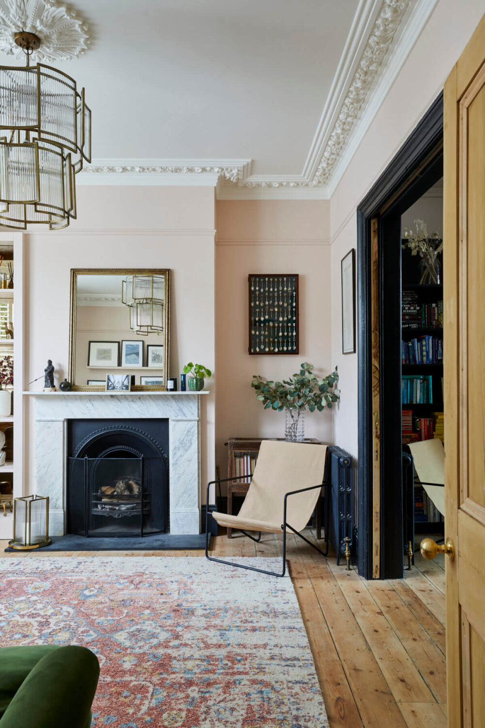
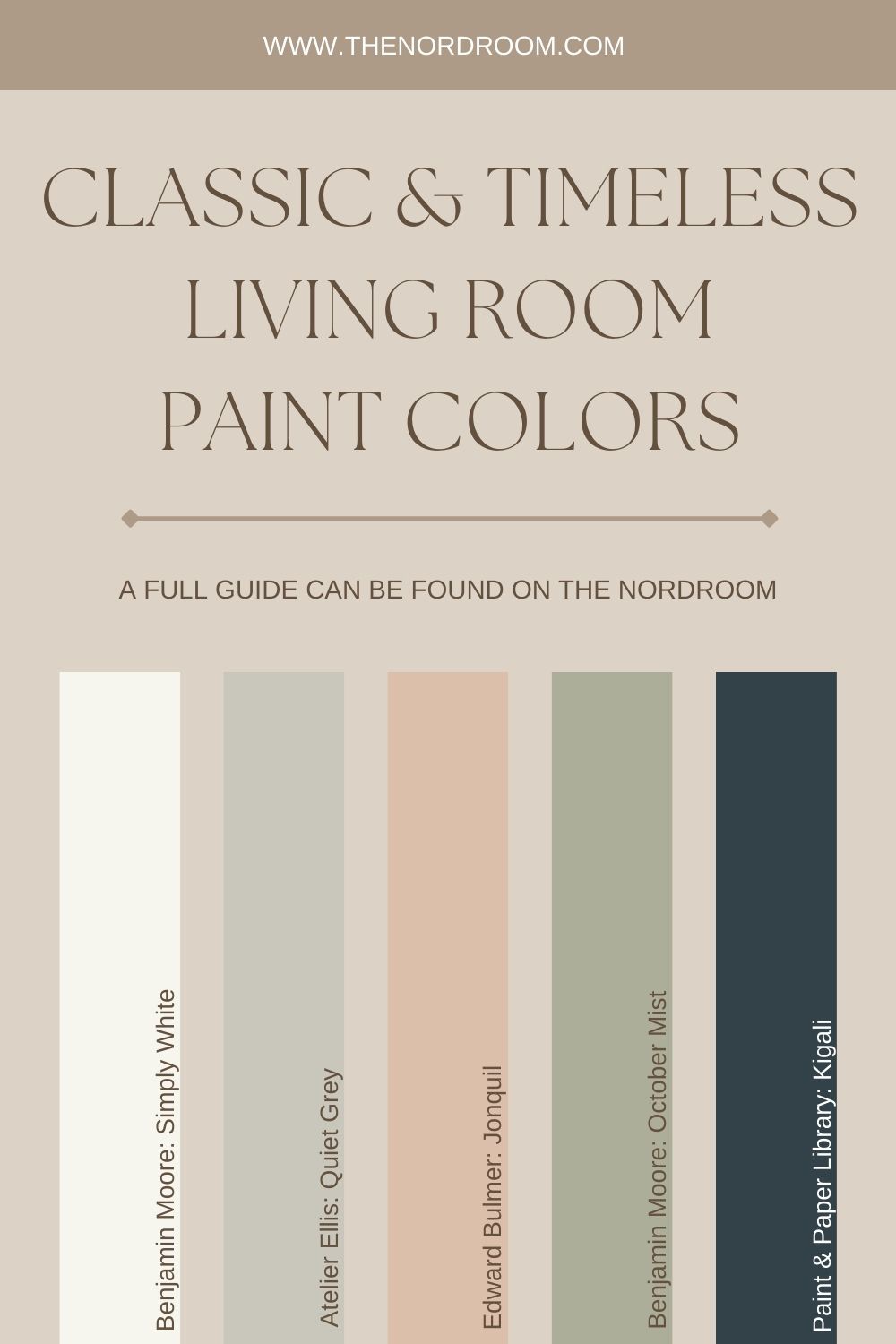
I hope this post inspired you to choose your classic living room paint color. There’s no perfect paint color for a living room. It all depends on the layout of your house, the natural light, and the interior look you want to achieve. But whether you want your home to have a modern look or a more classic one. These popular living room paint colors will help you create your dream home.
