The Color Trends for 2023: Rich & Warm Natural Hues
It’s time to look at the color trends for 2023. The colors we use in our homes strongly reflect our personalities and style. While some people gravitate towards timeless and classic paint colors others want to go a bit bolder by adding vibrant color tones to their homes.
Each year, the color experts from all the leading paint brands in the world chose their Color of the Year and publish their Color Forecast. Often choosing one trending color accompanied by a color palette with hues that perfectly compliment the Color of the Year.
These trending paint colors don’t only show up as wall colors in our homes. But they are visible in every art form, from fashion to graphic design and even technology. This year we see richer color tones compared to last years color trends, but we’re still getting color inspiration from nature.
This post will show an overview of every paint color of the year 2023 chosen by the leading paint companies. In addition, The Nordroom will make its own color prediction about the 2023 paint color trends. Many 2023 colors will get a separate blog post with more tips on how to style your home with that trending color. The link to that post will be highlighted in this color trend post.
This post will get updated when more paint companies release their color of the year.
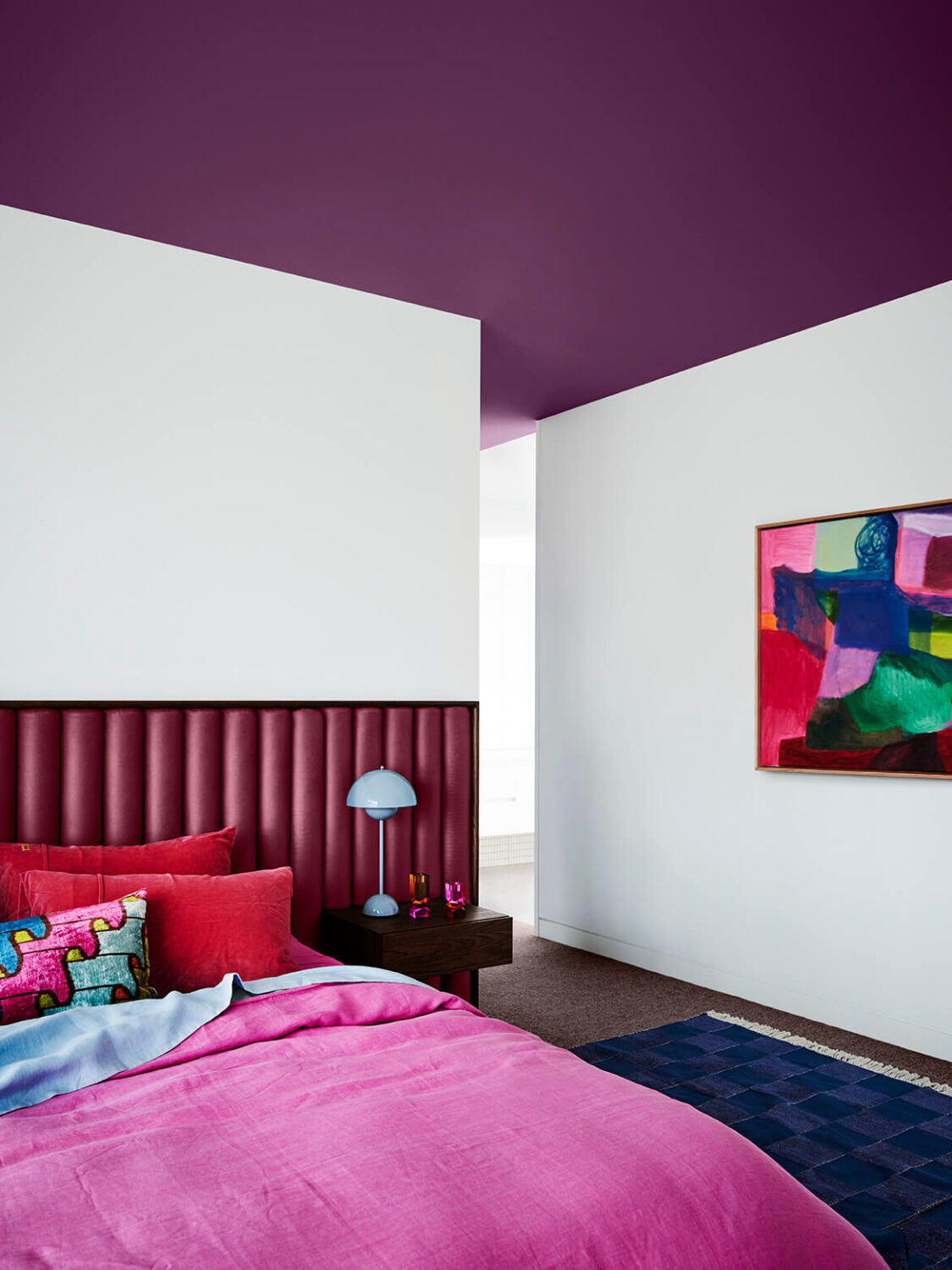
Pantone: Viva Magenta
Paint company Pantone has chosen Viva Magenta as their color of the year. Viva Magenta is a bold pink shade that is described as brave and fearless. The color is part of the red color family, the shade is rooted in nature and expressive of a new signal of strength.
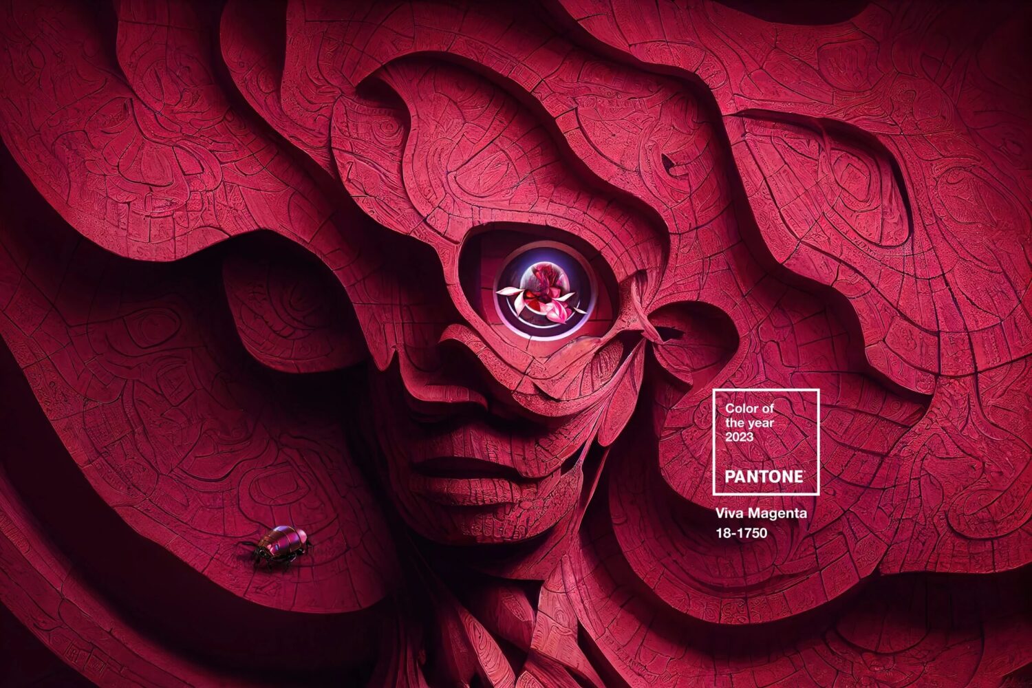
The new color of the year by Pantone is powerful and empowering. This new red shade revels in pure joy and encourages experimentation and self-expression without restraint. Viva Magenta is meant as a bold statement color in your home.
This color pink is already popular in the fashion and beauty world and now it is making its way to the interior world. you can expect to see a lot of this color which is great as a bold color pop through decorative items but you can certainly go bolder and include hot pink in furniture or as a statement wall.
Read More: Pantone Color of the Year 2023: Interior Design Inspiration
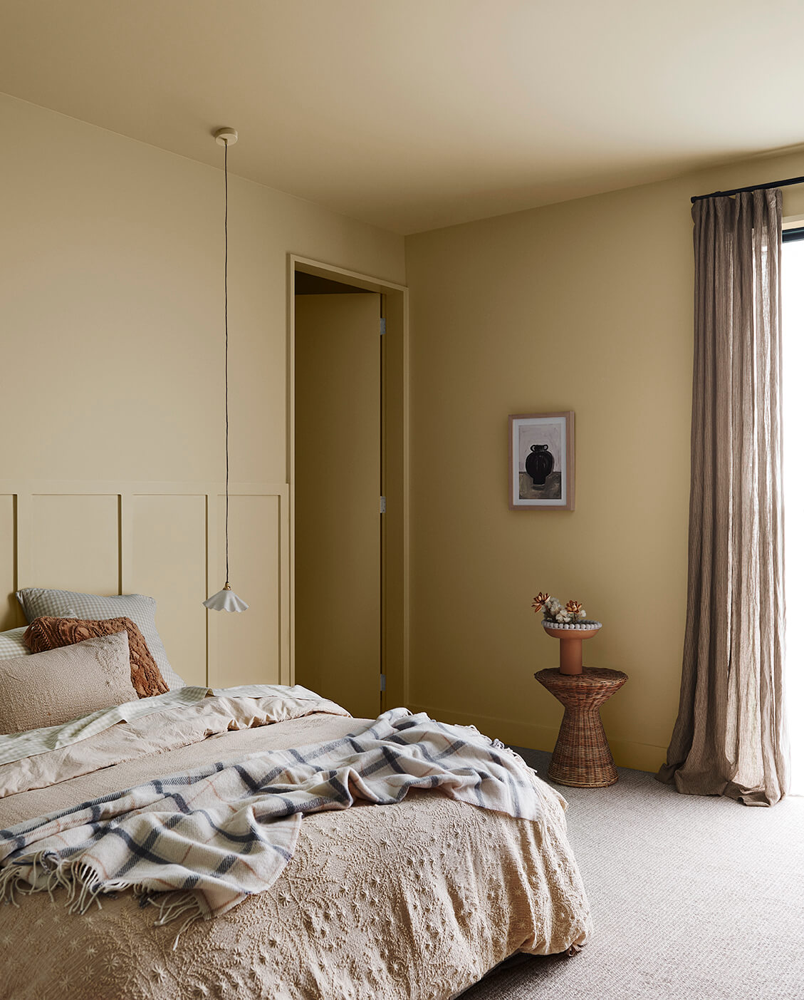
The Nordroom’s Color Trend for 2023: (Warm) Yellow
As editor of The Nordroom, I see many beautifully styled homes and trending interior design. The time we live in at the moment is rather uncertain. And this is reflected in the interior design and colors we choose to surround ourselves with. And for 2023 I see strong gravitation toward warm colors, especially warm yellow tones.
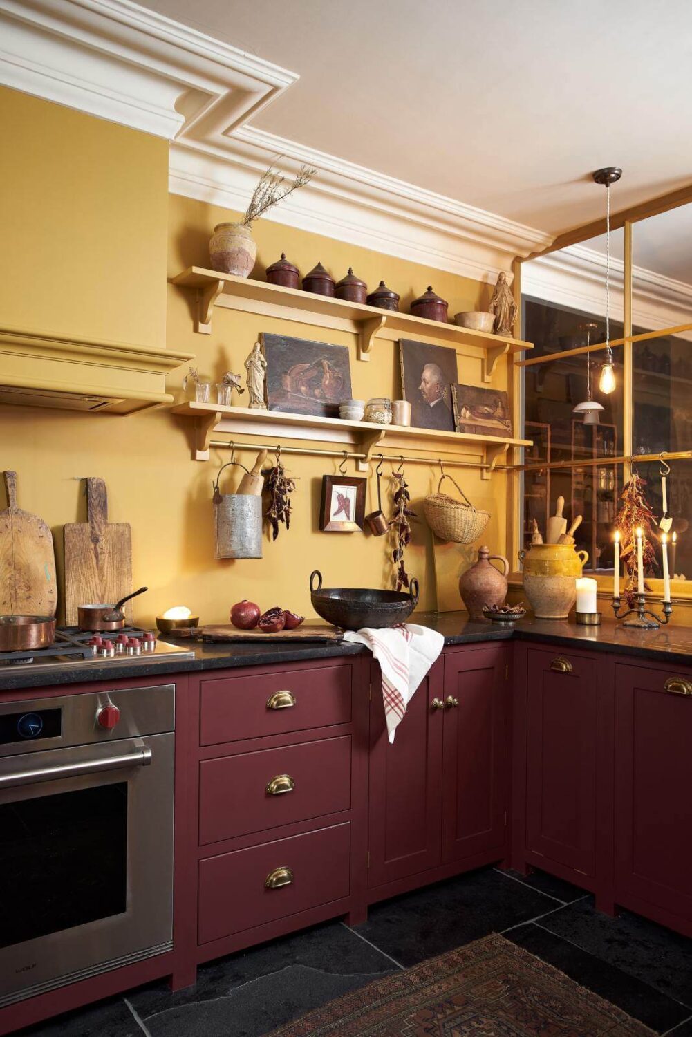
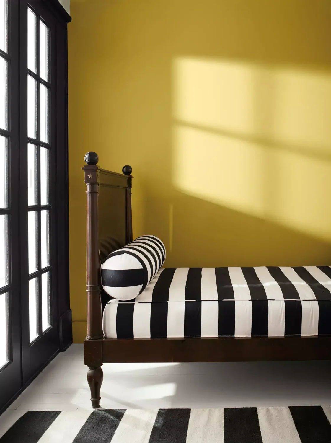
Yellow – as any color – comes in many different color shades. From the very light pastel yellow to a deep ochre yellow. And it’s the warm yellow tones that are popping up more frequently in homes around the world.
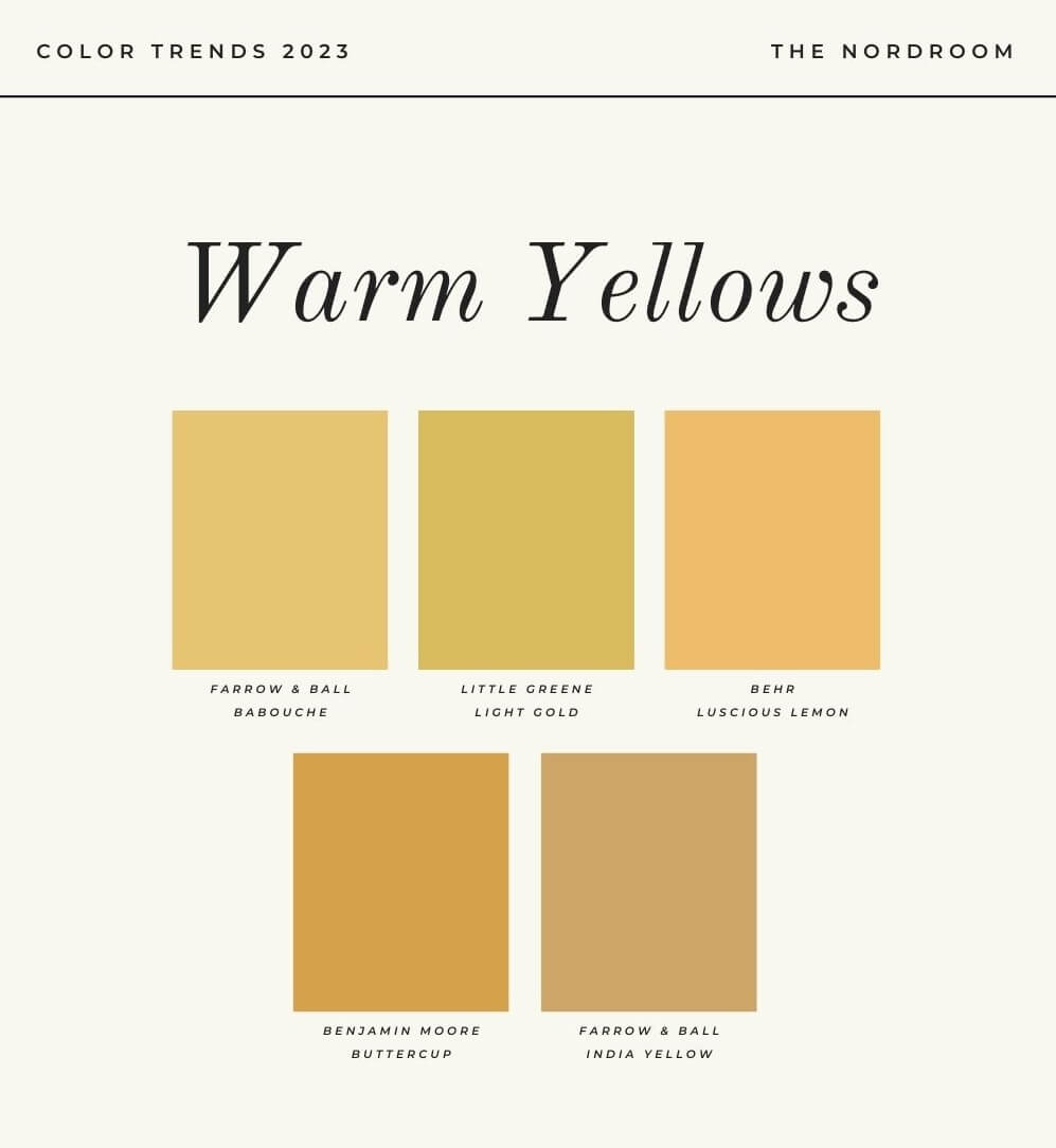
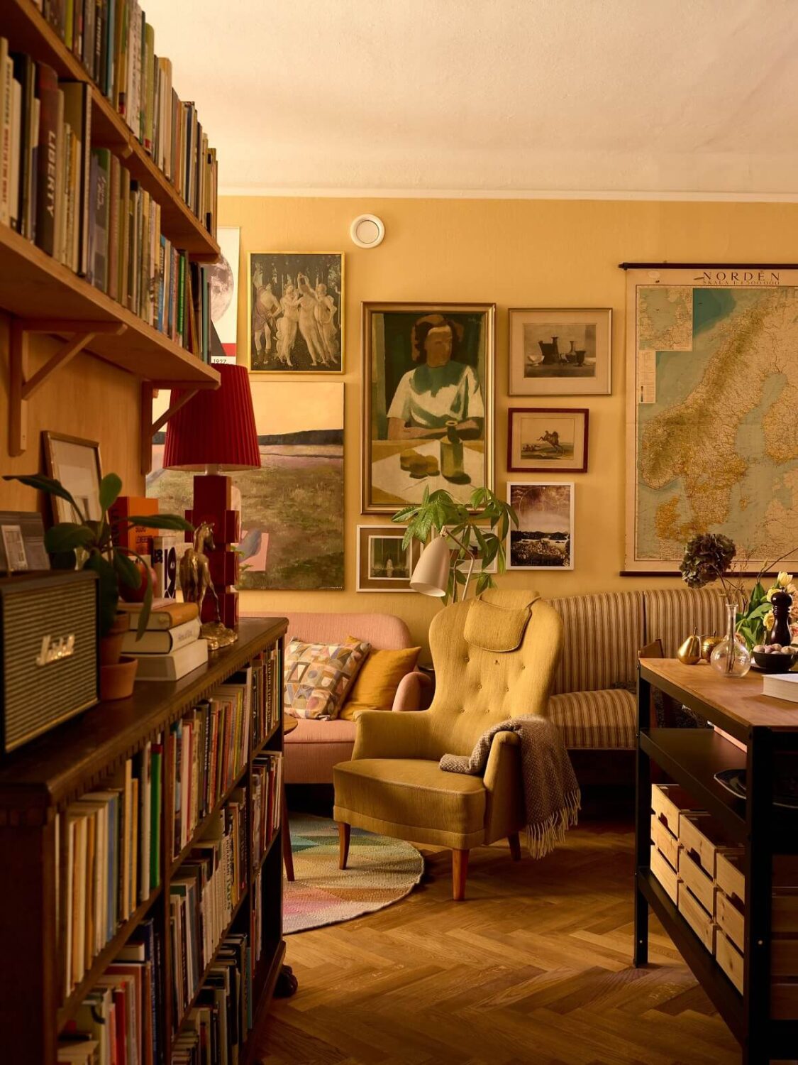
These deep and rich colors add a warm and slightly earthy tone to a room. A warm yellow is also very versatile. In modern homes, it adds warmth and color. And for period homes it enhances the historic feeling of the home as it’s a shade that has been used in homes for centuries.
Benjamin Moore: Raspberry Blush
Benjamin Moore has chosen Raspberry Blush as their Color of the Year 2023. Raspberry Blush is a cheerful coral shade tinged with pink. It is a very bold and charasmatic color that will make a great statement in your home. And the statement is up to you, you can add this shade as a bright color accent but you can also go bold and paint an entire room in this vibrant shade.
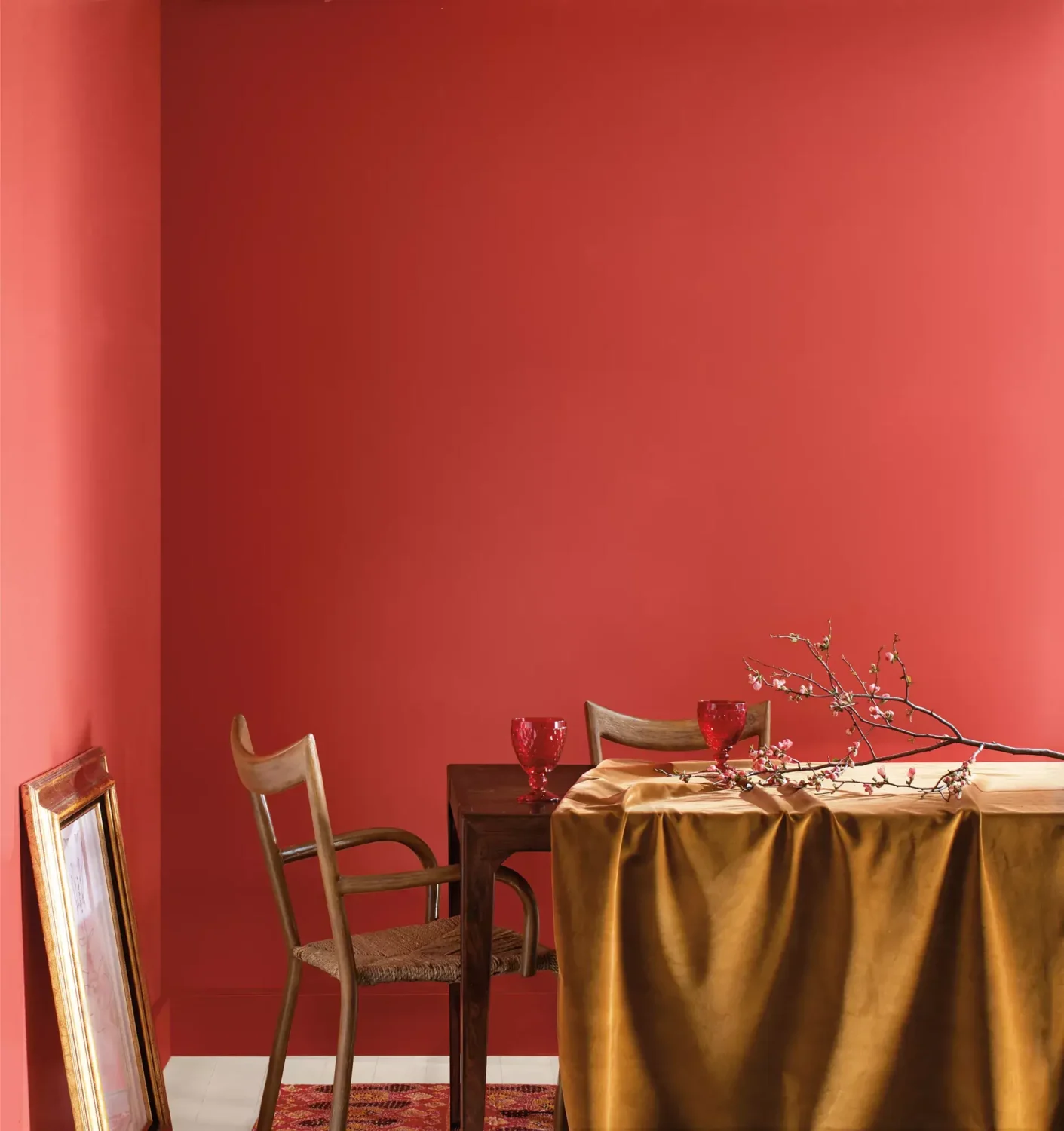

Read more: decorate your home with Benjamin Moore’s Raspberry Blush
Benjamin Moore Color Trends Palette 2023
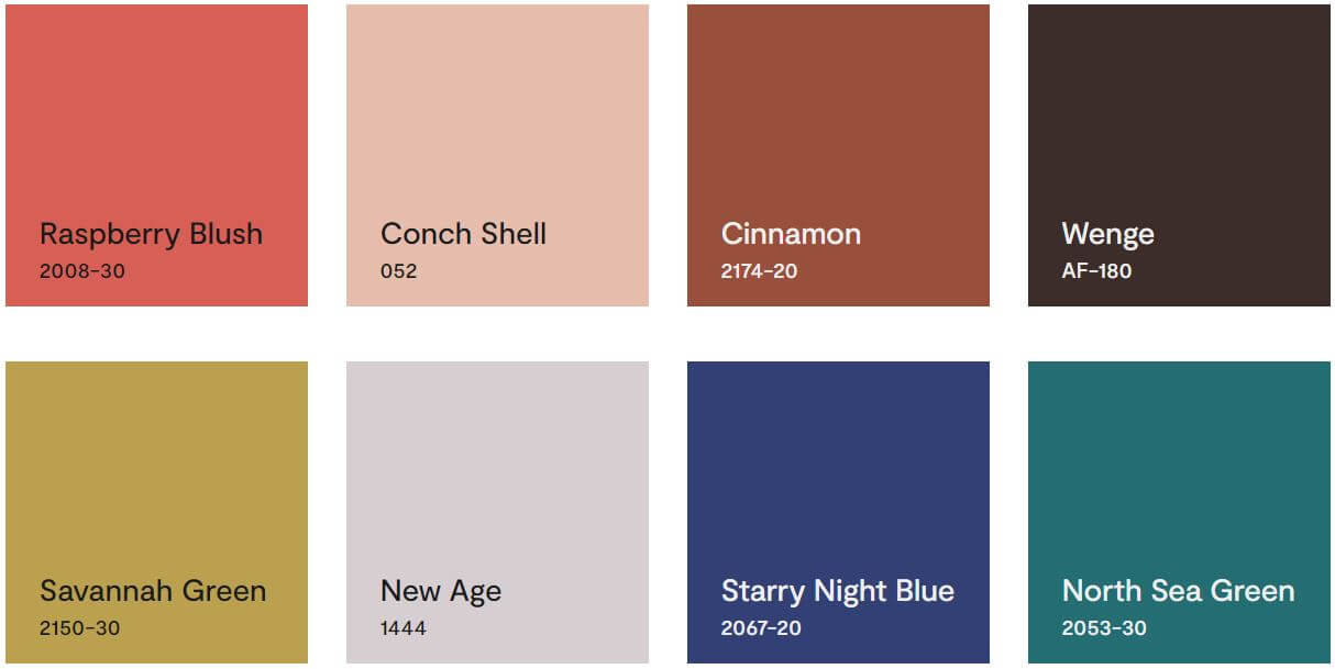
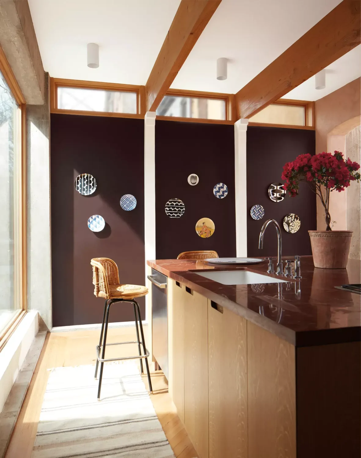
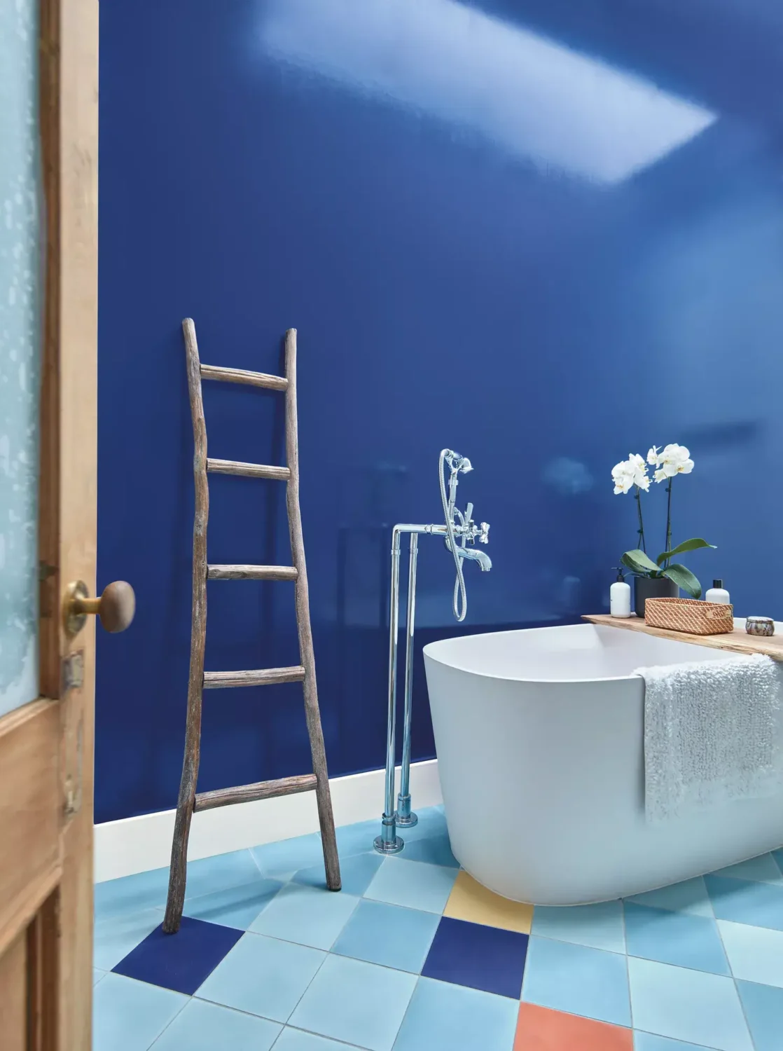
Benjamin Moore has also created a color palette with eight colors that compliment their Color of the Year. The Color Trends 2023 palette was chosen for its distinct presence and personality. Each of these eight confident hues offer inspiration and creativity, while encouraging a push beyond the traditional to experience truly exceptional color.
PPG & Glidden Paint: Vining Ivy
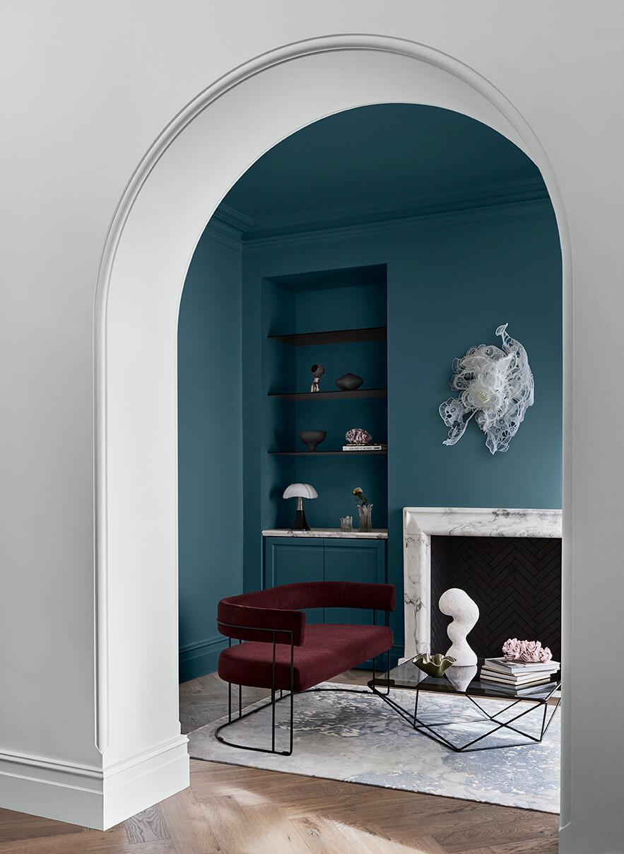
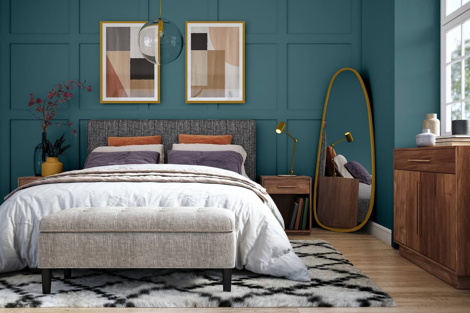
PPG and Glidden Paint by PPG have chosen “Vining Ivy” as their Color of the Year 2023. Vining Ivy is a versatile teal shade that combined bold blue and refined green into a jewel-toned hue. The color can be used to set a calming mood in spaces, as its blue communicates feelings of tranquility while the emerald evokes feelings of balance. When paired together, these two undertones create an ultra-rich, uber-trendy color.
Ashley McCollum, Glidden color expert says: “Consumers are seeking to simplify in this era, as the past two years have shed a new light on the importance of serenity and little moments. Vining Ivy embodies this vibe perfectly. It is energizing yet grounding, and it works in literally any space. Its versatility takes the guesswork out of design, leaving consumers with more time to indulge in the things that matter most to them.”
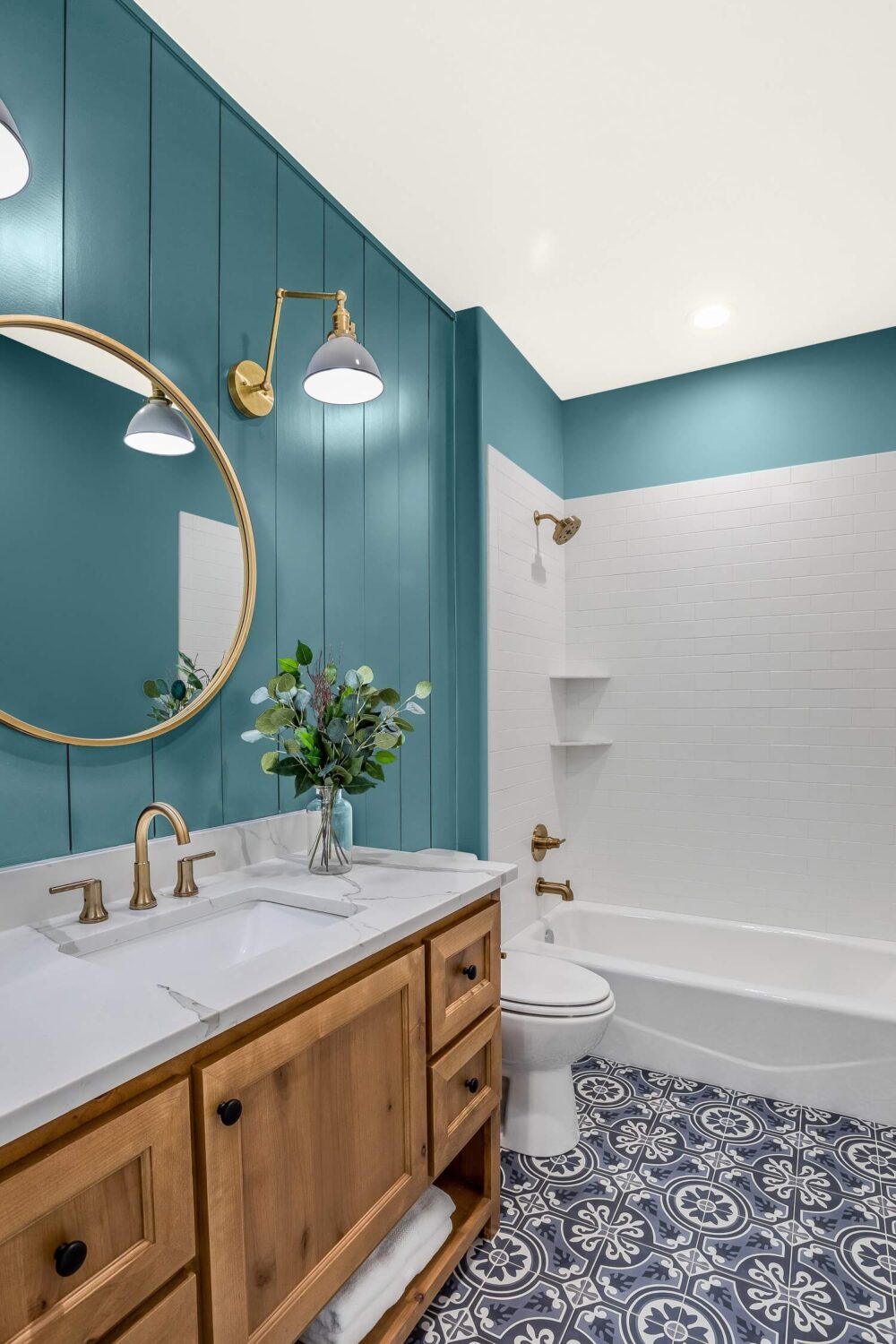
Read more: how to style your home with teal, like PPG & Glidden’s Vining Ivy
PPG & Glidden Color Trends
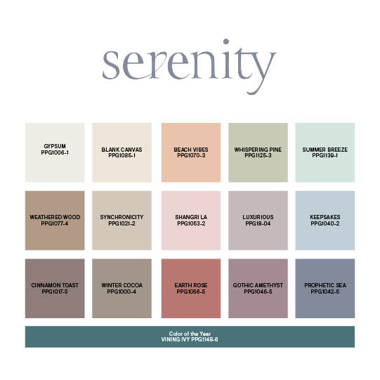
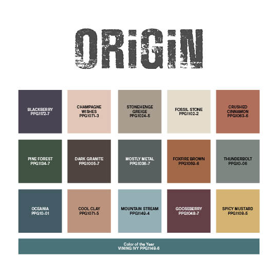
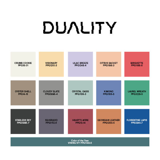
PPG and Glidden have also chosen four color palettes that compliment the new color of the year. Serenity is a graceful palette of milky pastels, watery tones, and warm neutral. Origin is an earthy and well balanced color palette. Duality is a color palette filled with constrasting color tones. It’s an extroverted palette of brights, clean pastels, and strong neutrals. Glidden’s color palette is very similar to the Origin palette with warm earthy and natural colors.

Sherwin Williams: Redend Point
Sherwin Williams have choosen Redend Point as their Color for 2023. Redend Point is a warm blush beige shade that works as a warm color accent in combination with cooler color tones. But it can also be used as a warm neutral for any room in your house.
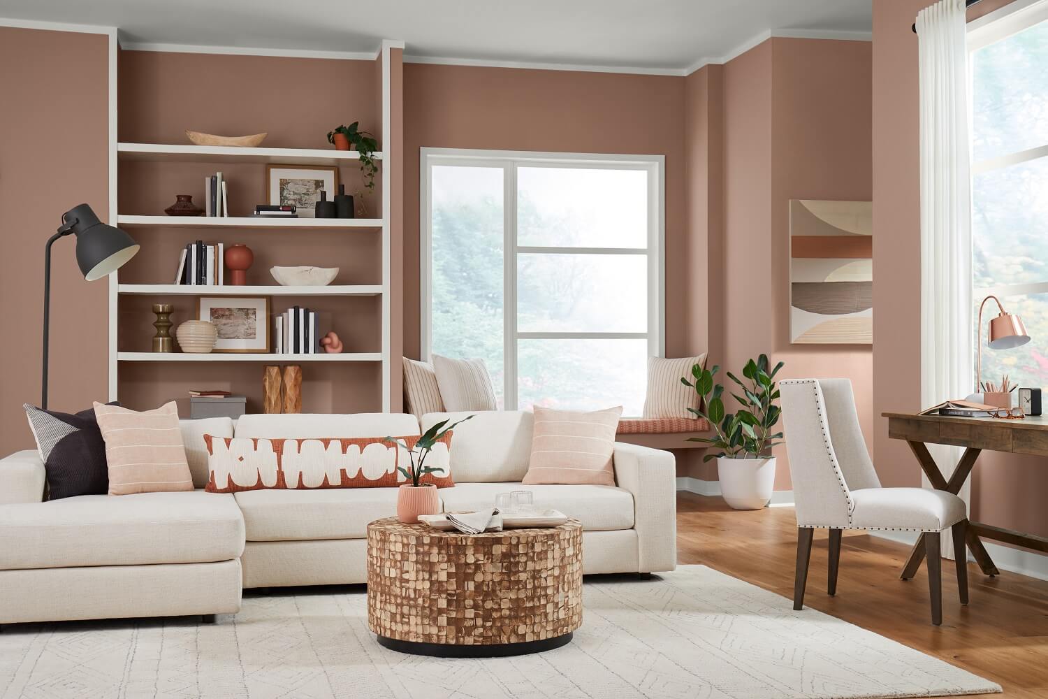
The color is defined as not too light or too dark, not too moody or too sweet. It is therefor a perfect mid-tone neutral color to use in a home. Redend Point is a minimal, calming, and intriguing color that embraces a spirit of connection with the world around us.
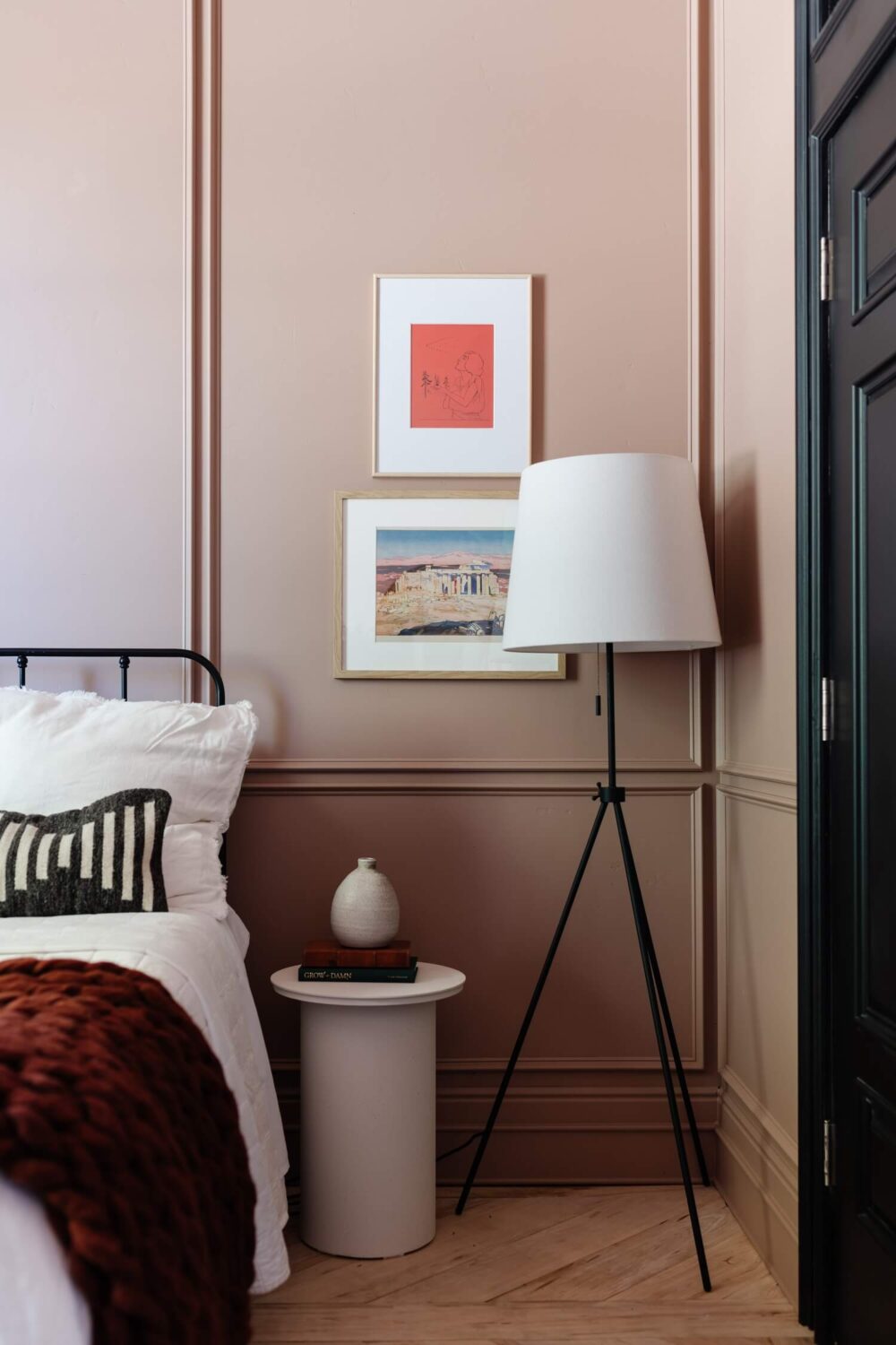
Mandi Gubler painted the bedroom in this beautiful warm pink shade.
See also: The Best Paint Colors for a Warm Bedroom
In addition, Sherwin Williams has collaborated with Etsy with the release of a home decor collection that coordinates with their 2023 color.
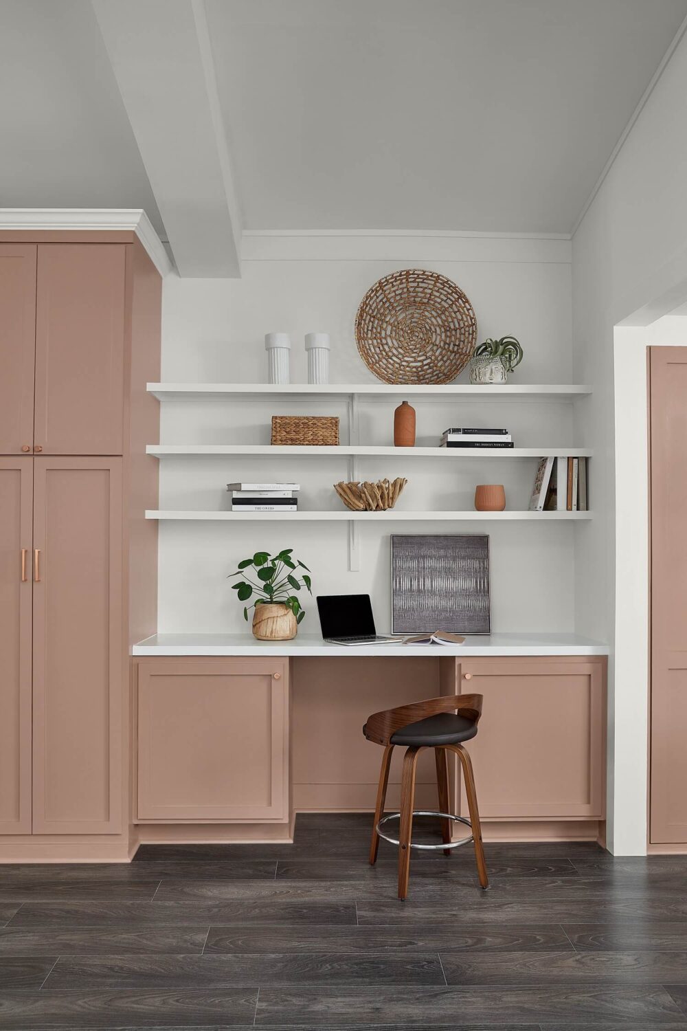
Read more: How To Style Your Home with Sherwin-Williams Redend Point
Dulux: Wild Wonder
Paint company Dulux has choosen Wild Wonder as their Colour of the Year 2023. Wild Wonder is a natural yellow hue that will help you bring the outdoors in.
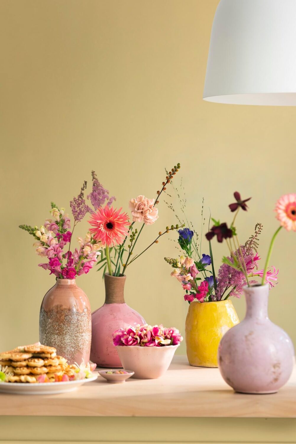
Wild Wonder refers to the feeling of freedom in nature (Wild) and the natural magic that surrounds us (Wonder). Nature is at the heart of the 2023 Dulux colour trends as they have also chosen four complimentary color palettes packed with (natural) shades that can be combined with Wild Wonder.

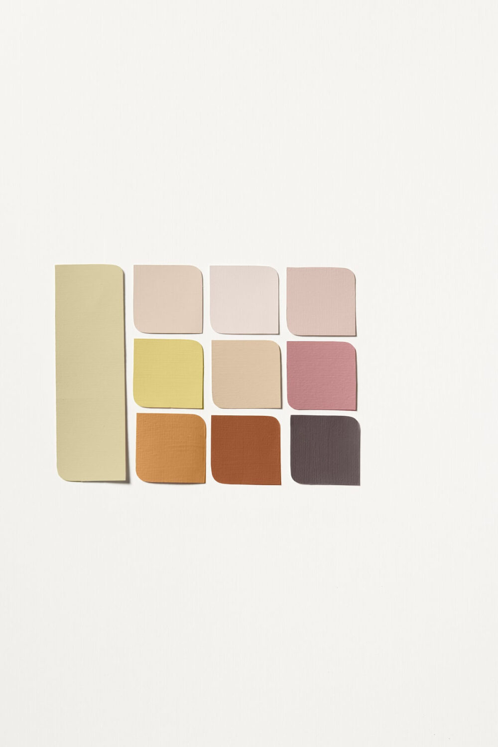
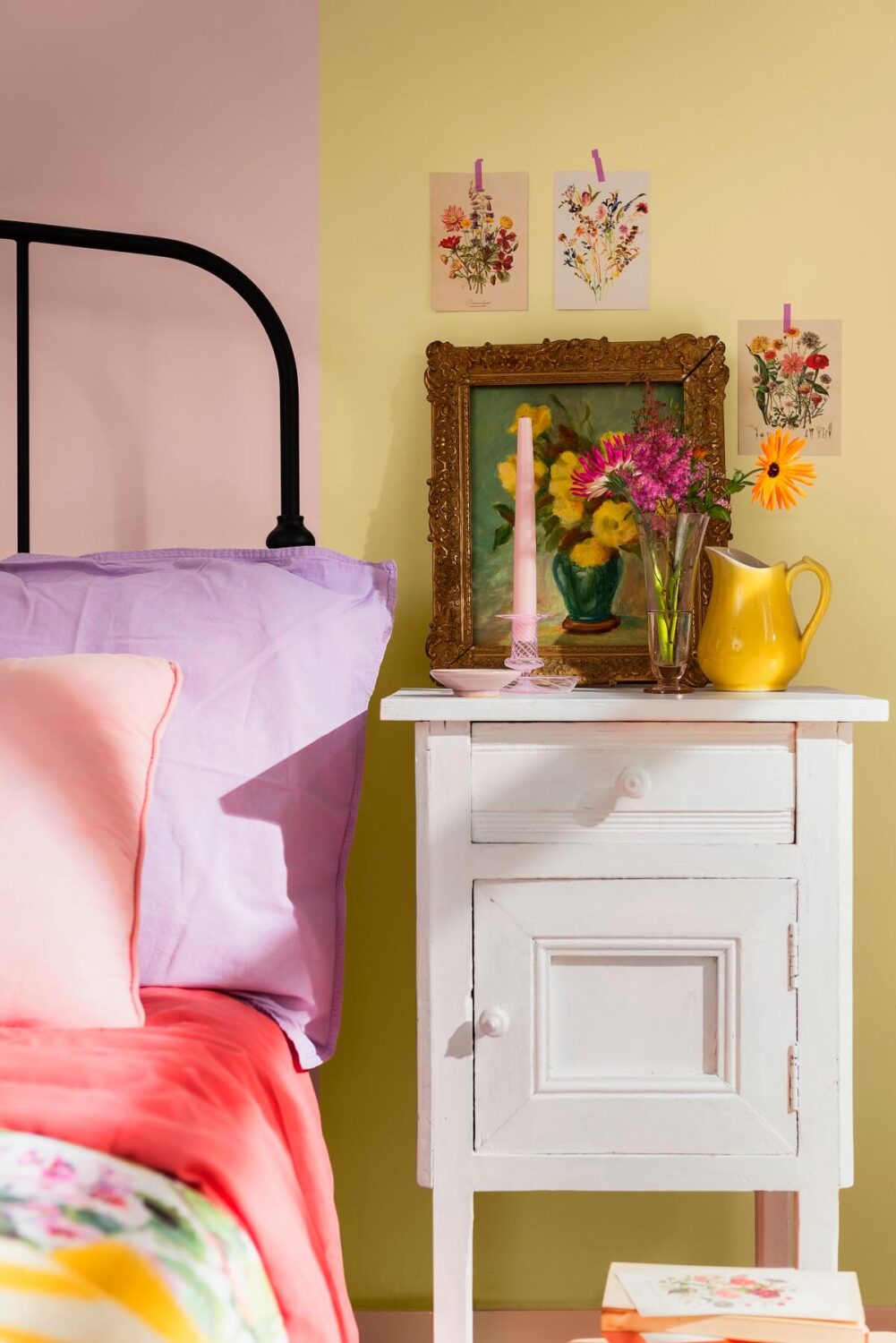
A bedroom painted with Wild Wonder and the Buzz colour palette
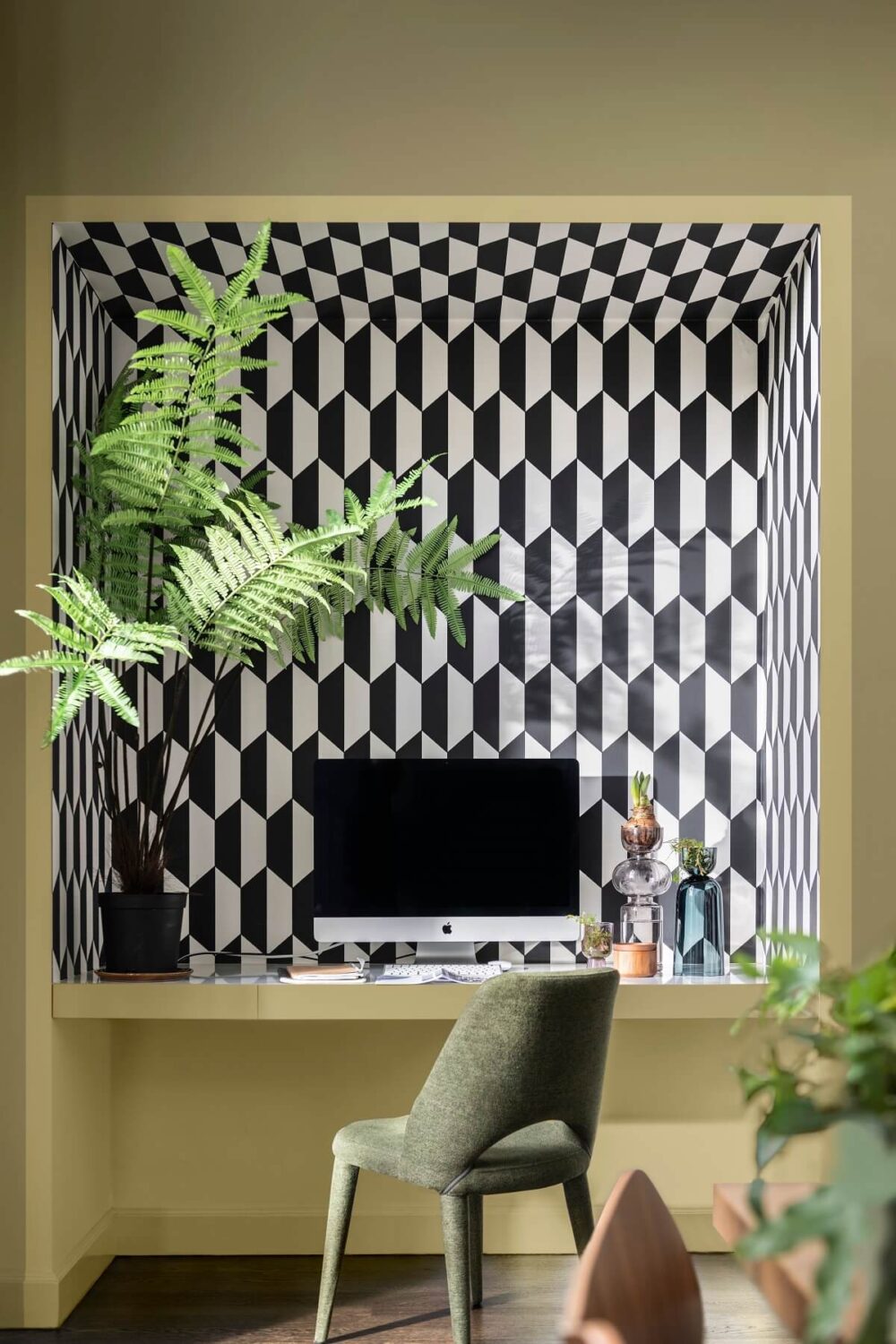
A wonderful home office painted with the Lush colour palette.

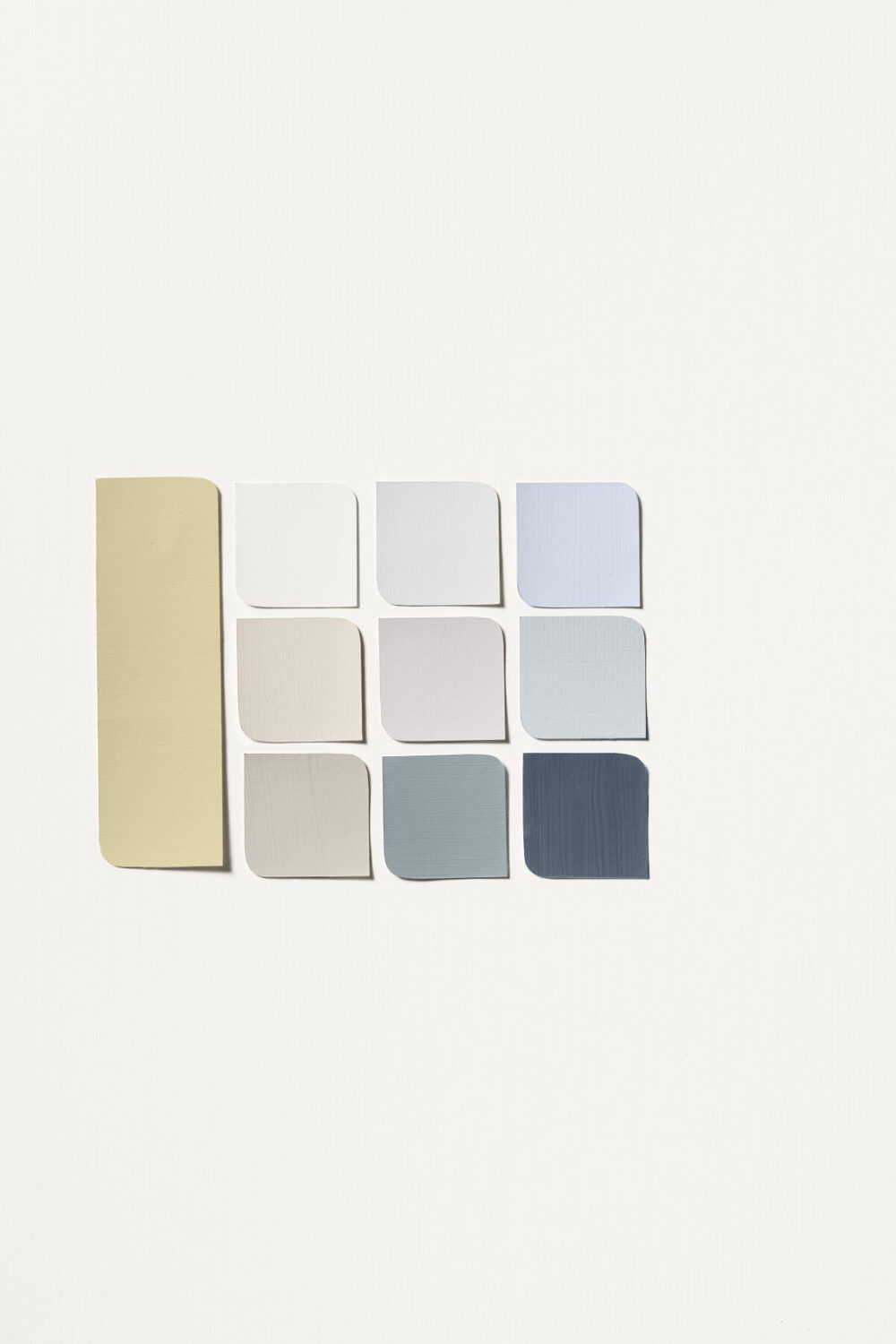
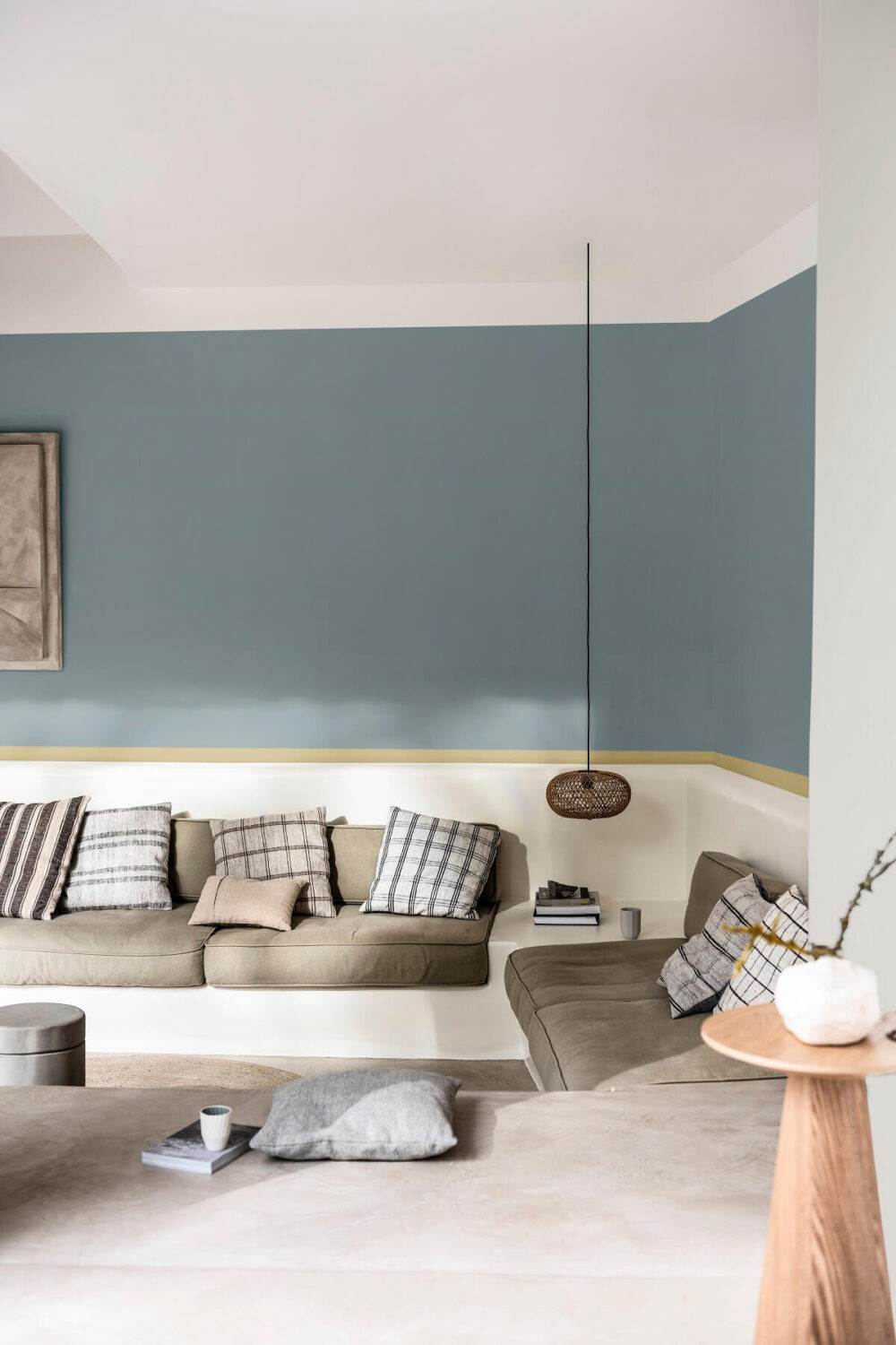
Read more: Dulux Colour of the Year: Wild Wonder & Dulux Colour Trends
Dulux Colour Trends
Paint company Dulux have chosen three color palettes packed with beautiful colors that transform your home into a sanctuary. The Dulux Colour Forecast 2023 consits of three palettes inspired by our connection to nature, a desire for balance and calm, and revitalising our spirit with joy and play.
Balance
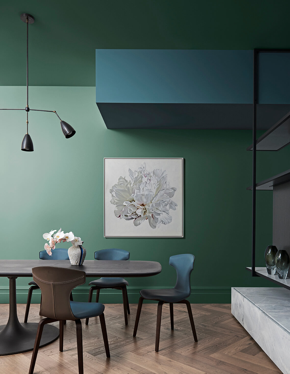
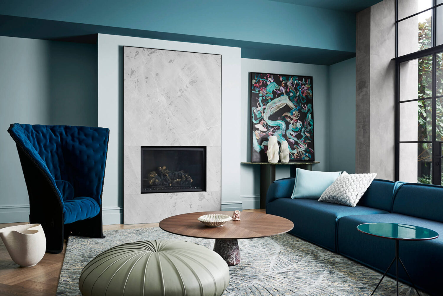
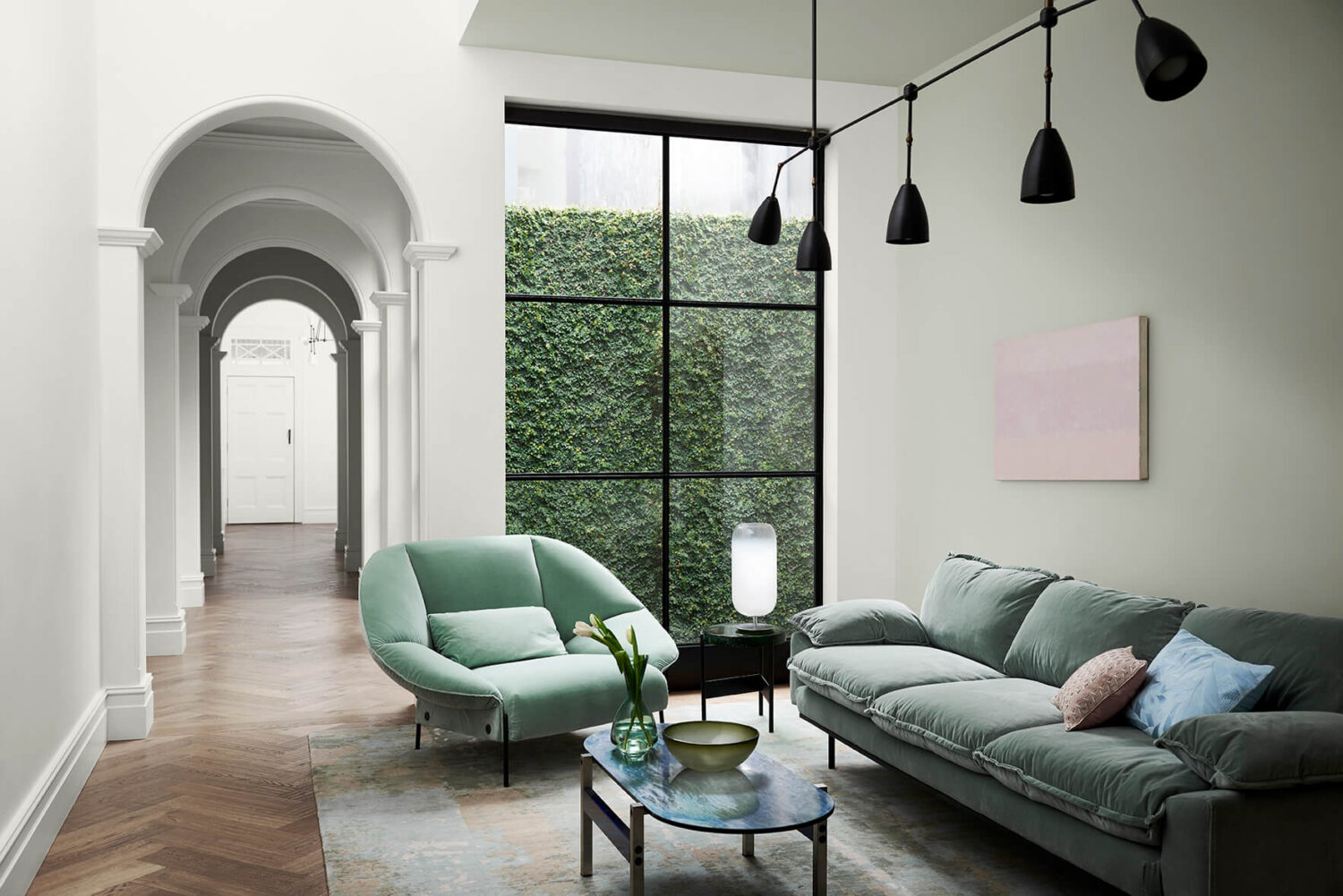
Balance is a color palette of serene oceanic blues and weathered pastels that create a still and calm atmosphere in your home.


Connect
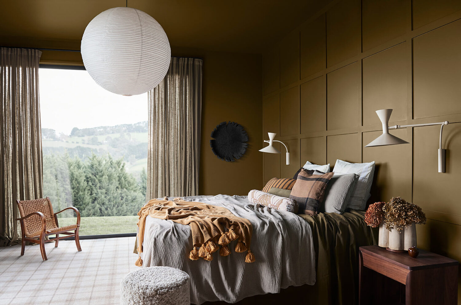
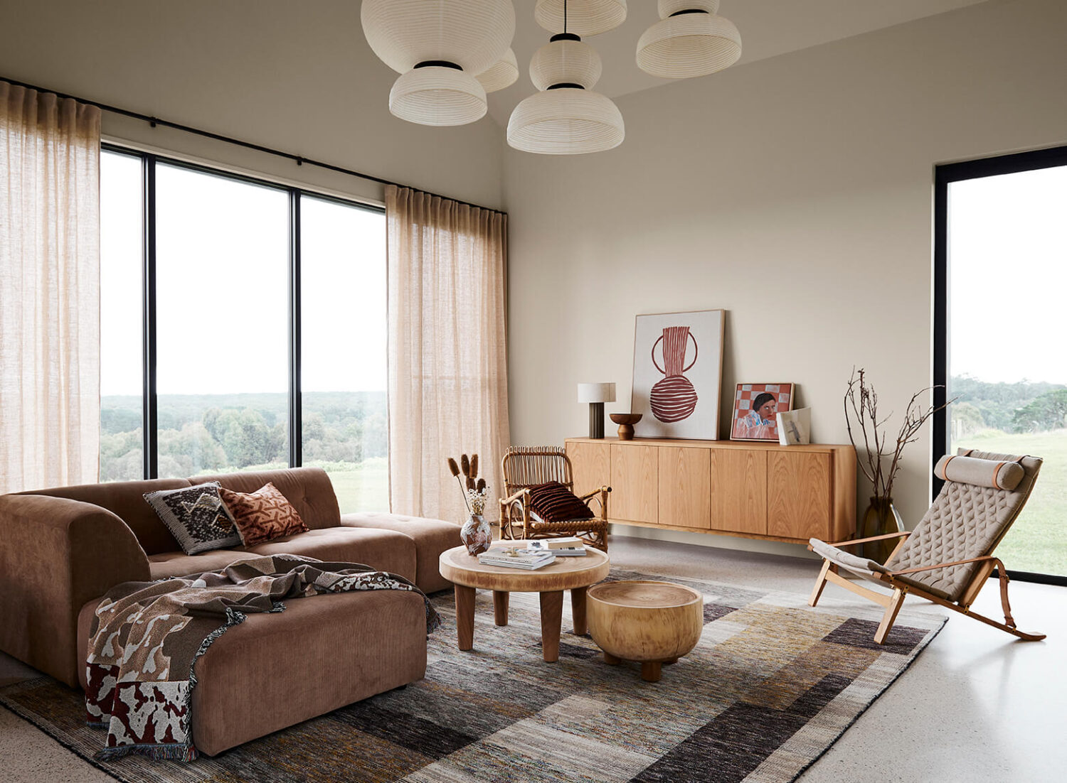
The connect palette consists of colors with a great connection to nature. These earth based hues reflect a simpler lifestyle.


Revive
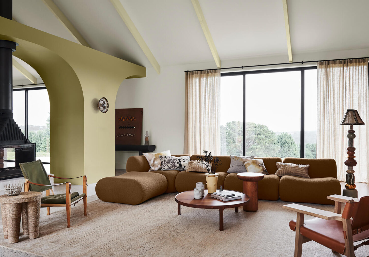
Add joy to your home with the Revive color palette filled with eclectic bright hues that mixes nostalgic elements.


Behr: Blank Canvas
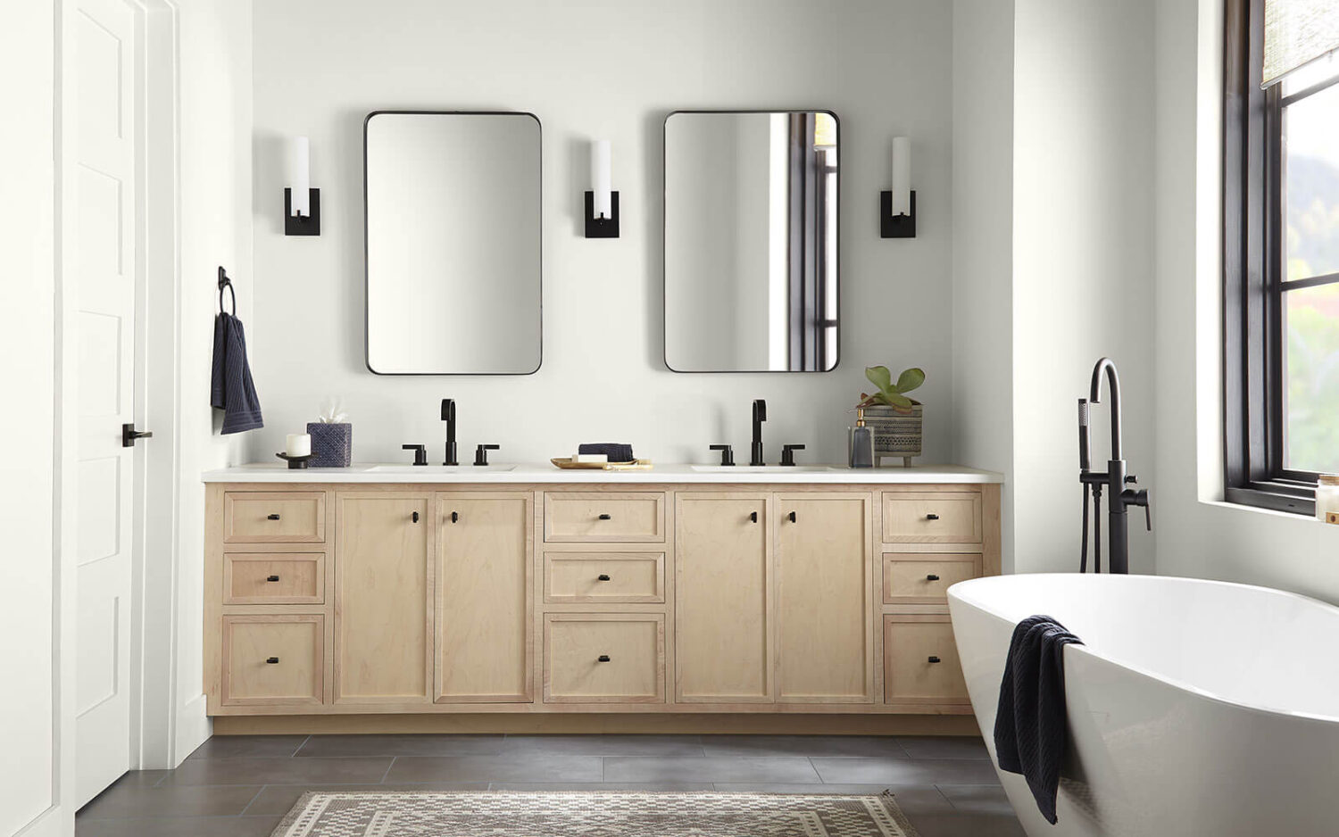
Behr Paint Company have announced Blank Canvas as their Color of the Year. Blank Canvas is a warm white shade that offers endless design and decor opportunities.

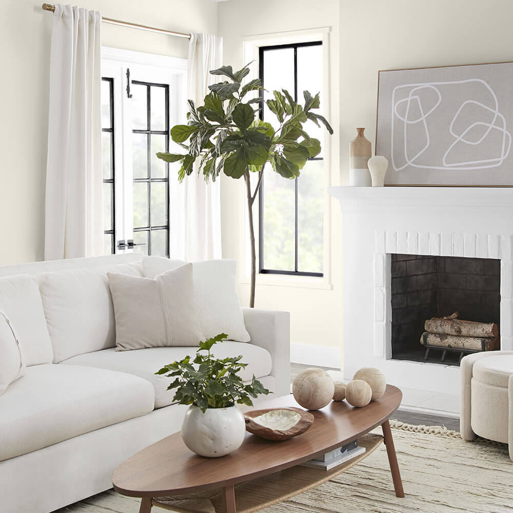
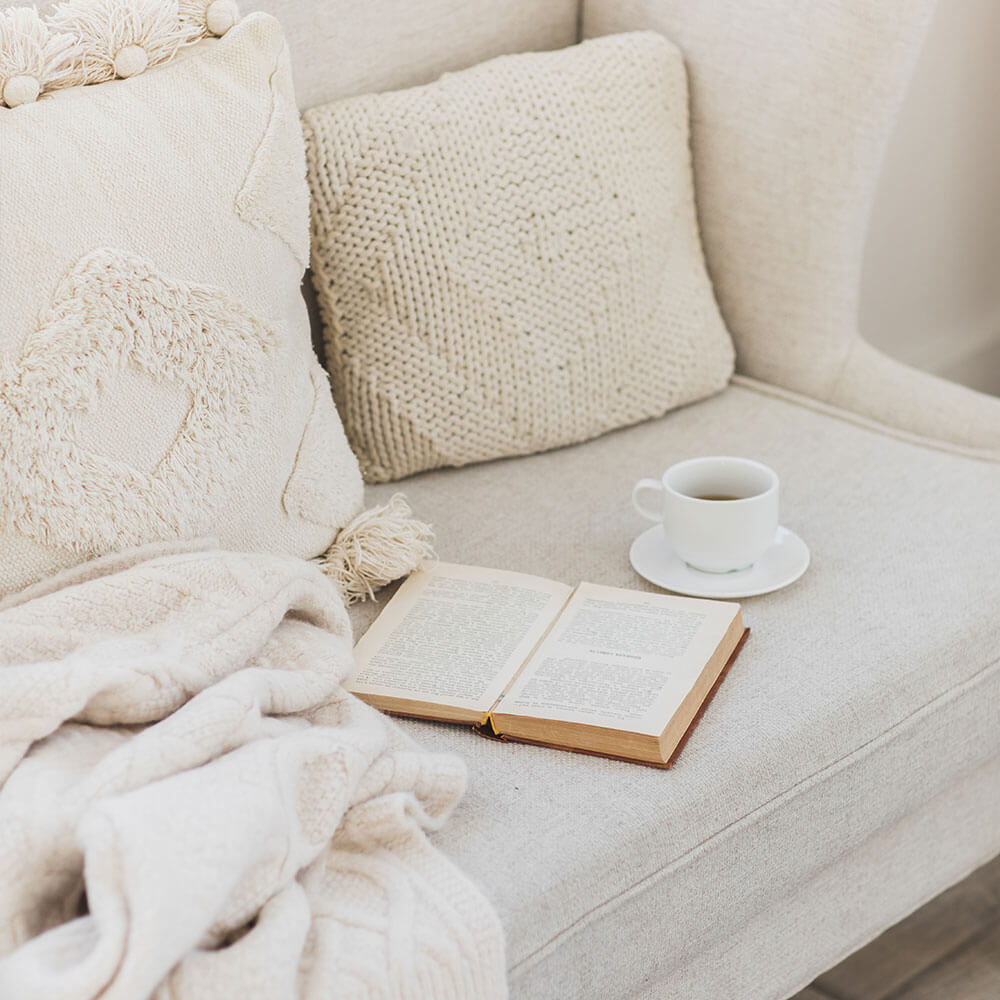
Research conducted by Behr Paint has shown that homeowners want their home to be a place where they can unwind and that the home feels like an escape from everyday stress.
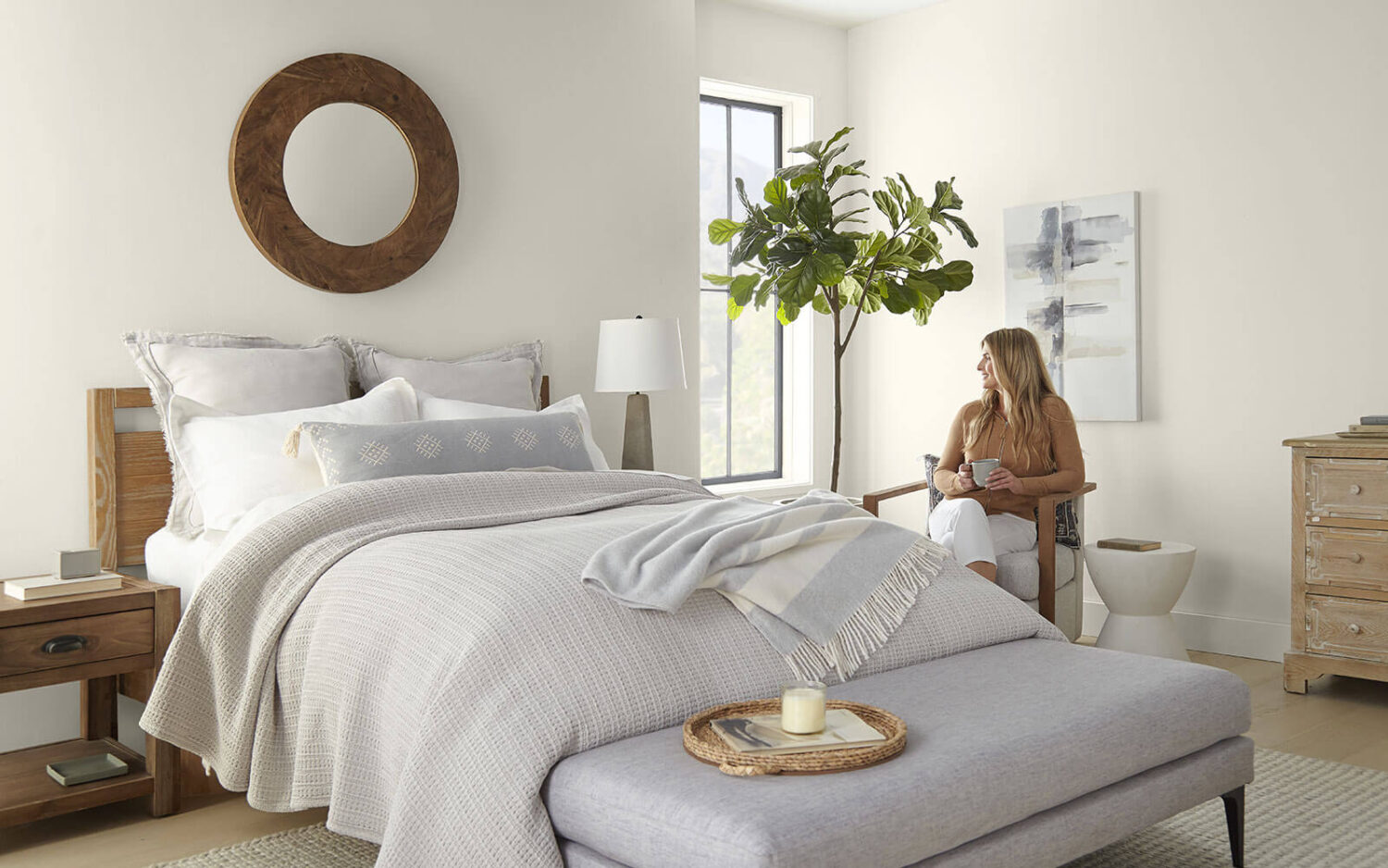
The choice for Blank Canvas as the 2023 COTY is a direct response to this research. The color white makes people feel positive and lowers stress levels. The color white also promotes relaxation, creates a sense of calm and renewal, and makes people feel focused.

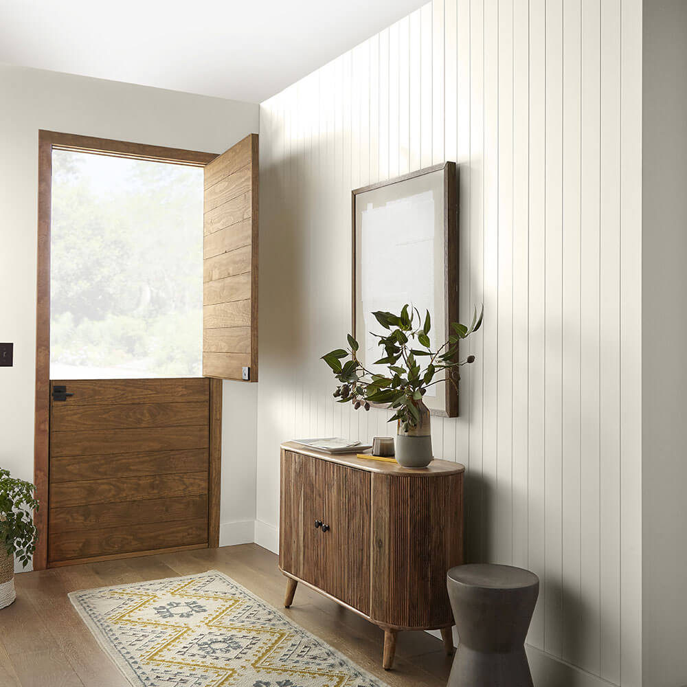
This rich and versatile shade of white can be used as a timeless foundation for your home.
Graham & Brown: Alizarin
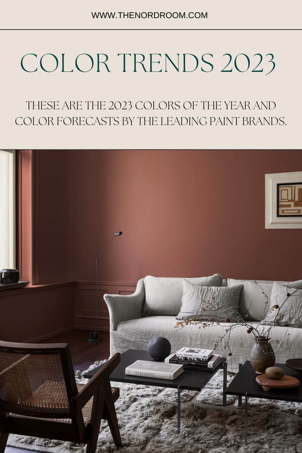
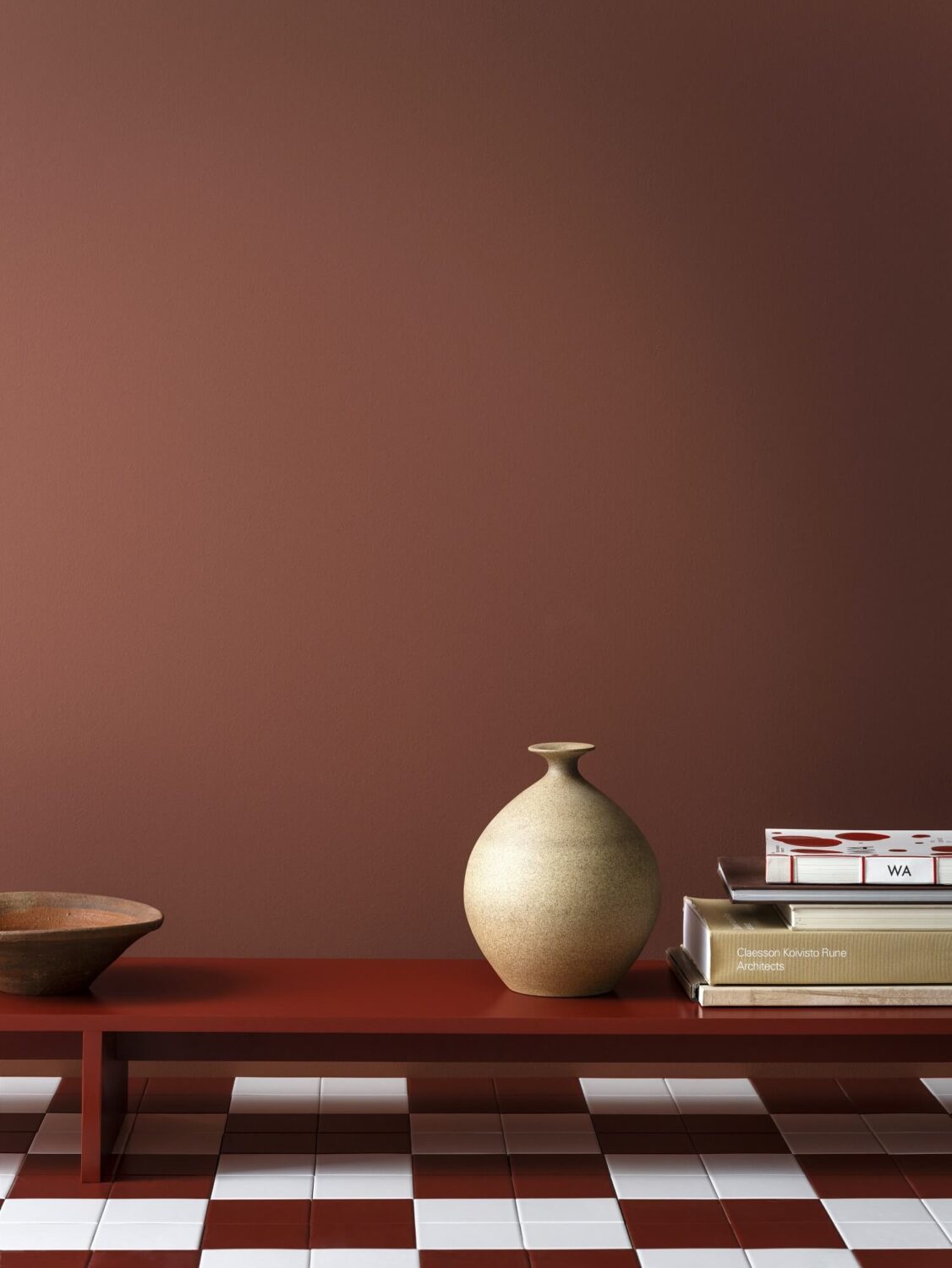
Graham & Brown have chosen Alizarin as their Color of the Year. Alizarin is an auburn red shade that will add warmth and depth to your room. This rich red will do wonders for any room, whether it’s big or small. In a small room, you can create a cozy cocoon while in larger spaces you add a luxe touch.


In addition, Graham & Brown also choose a Design of the Year. Florenzia Dusk is a classic floral that symbolizes the restoration of historical beauty and celebrates bringing new life and color into an artwork. And of course, this design can be combined with the 2023 color Alizarin.


Jotun LADY
The colors we surround ourselves with mean more than ever. Not only in how they enrich the atmosphere of our homes but also in what they tell us about ourselves.
Jotun LADY has created a color palette for 2023 called: “STORIES – Color Design by LADY”. This collection of 21 timeless, expressive, and hopeful shades will help you to create a new mood in your home.
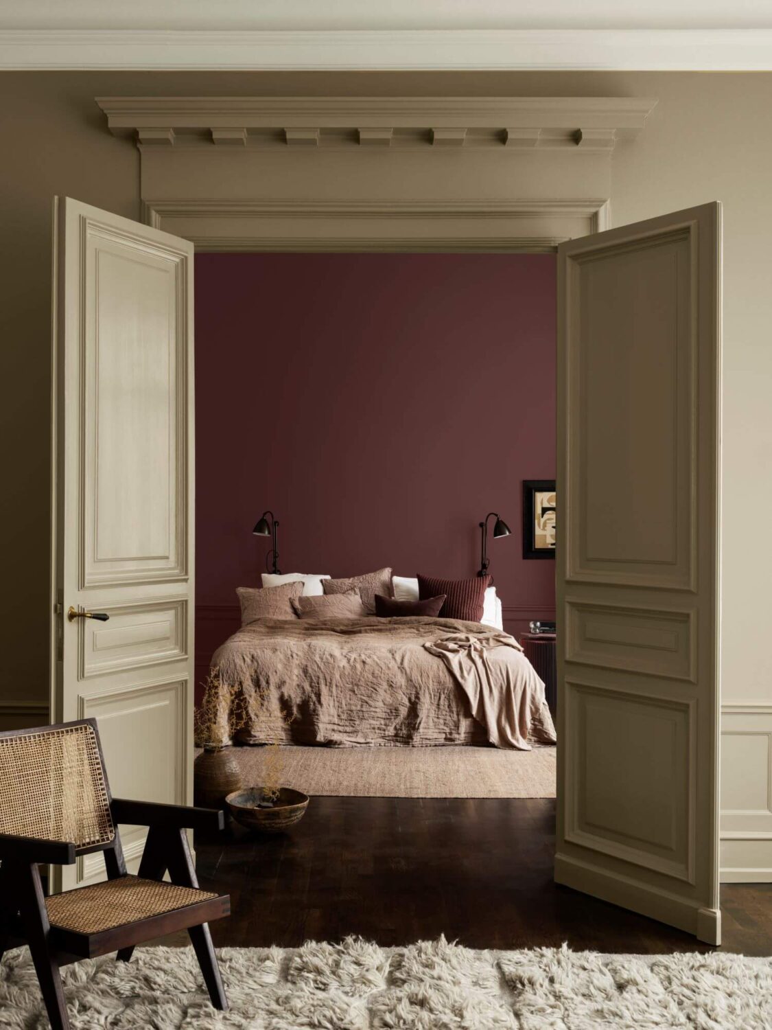
There are 9 new colors in this color palette including modern warming neutrals, cool greens, classic blues, and beautiful, powerful reds. The collection is divided into three color palettes that make it easy to choose good color combinations that convey a stylish atmosphere and shades that enrich each other.
Serene Presence
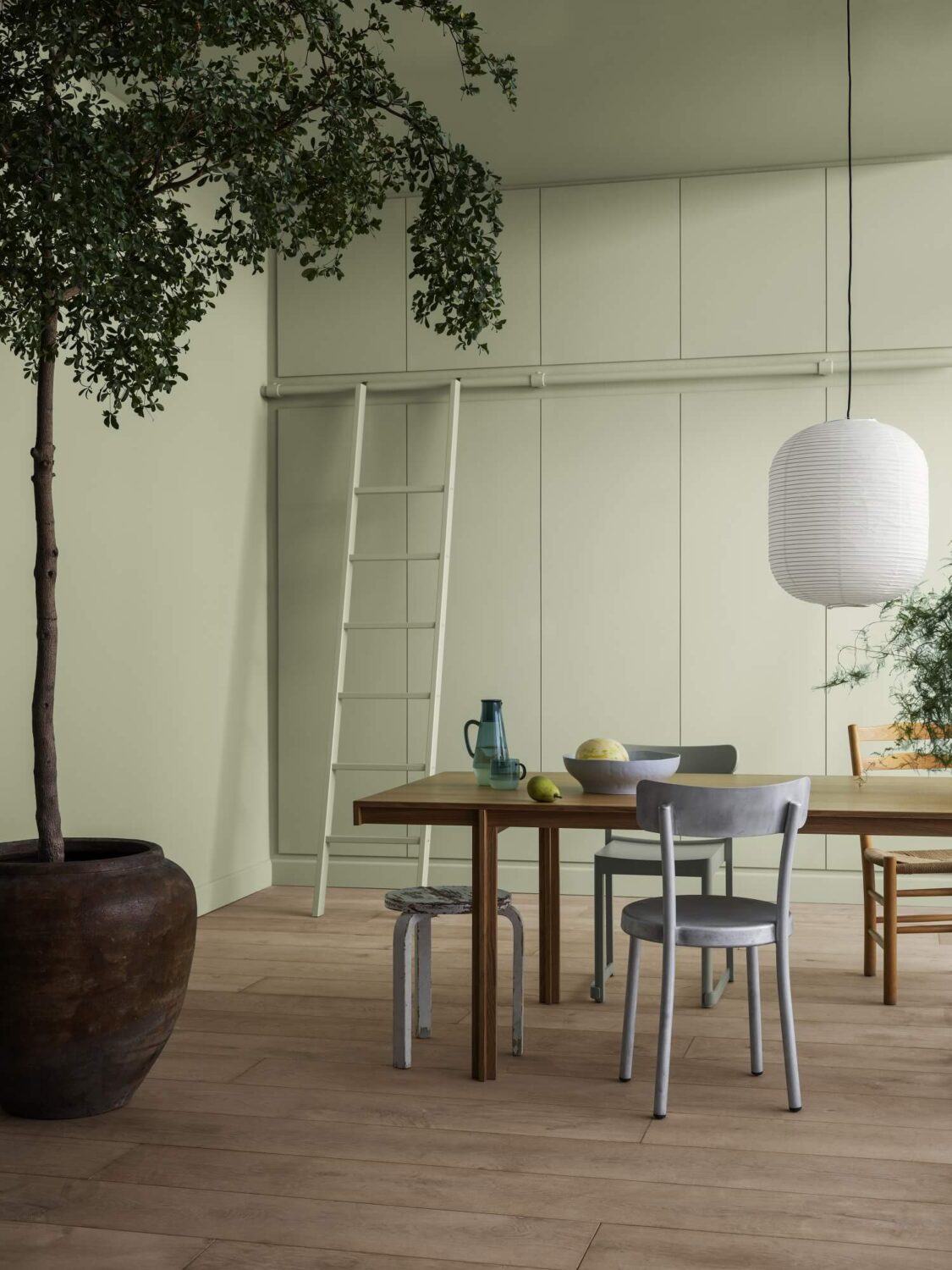
This color palette is designed for a lifestyle of minimalism and simplicity. The palette consists of soft, muted pastels and healing green tones.



Naturally Grounded
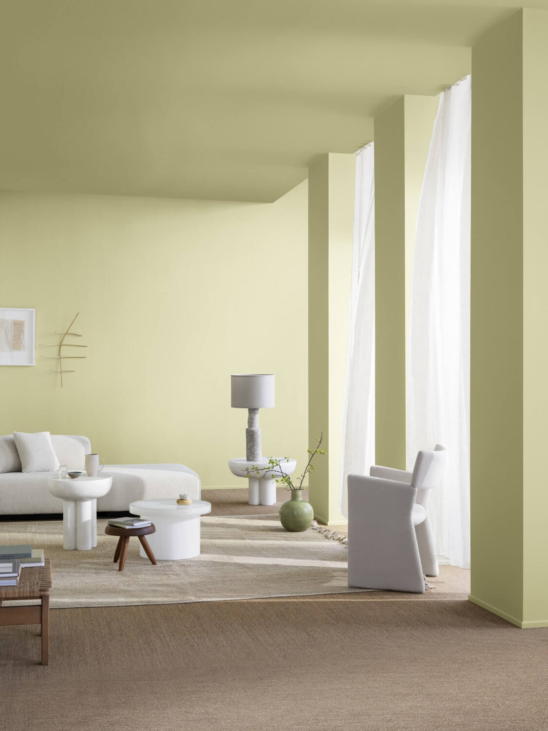
The naturally grounded palette pays tribute to earthly life. The palette consists of warm earth colours, muted green and soft, yellow and orange tones.

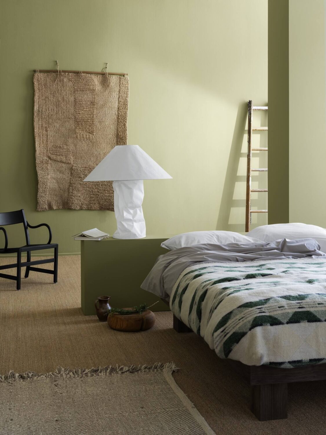
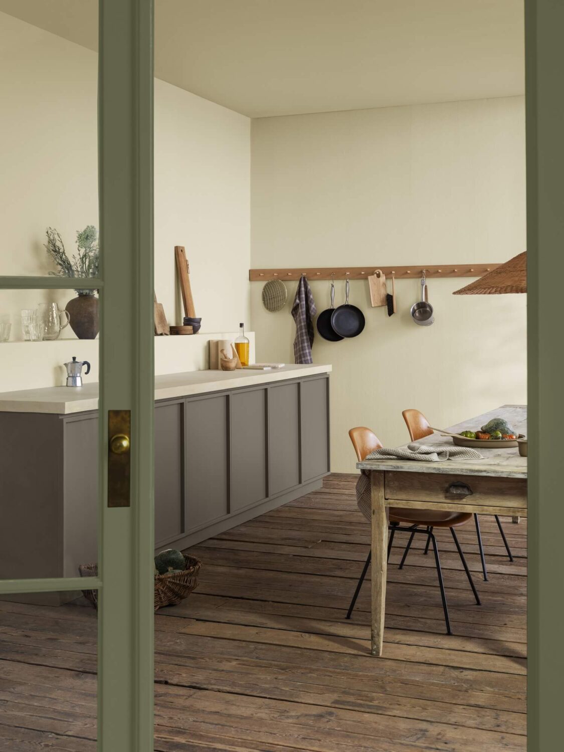

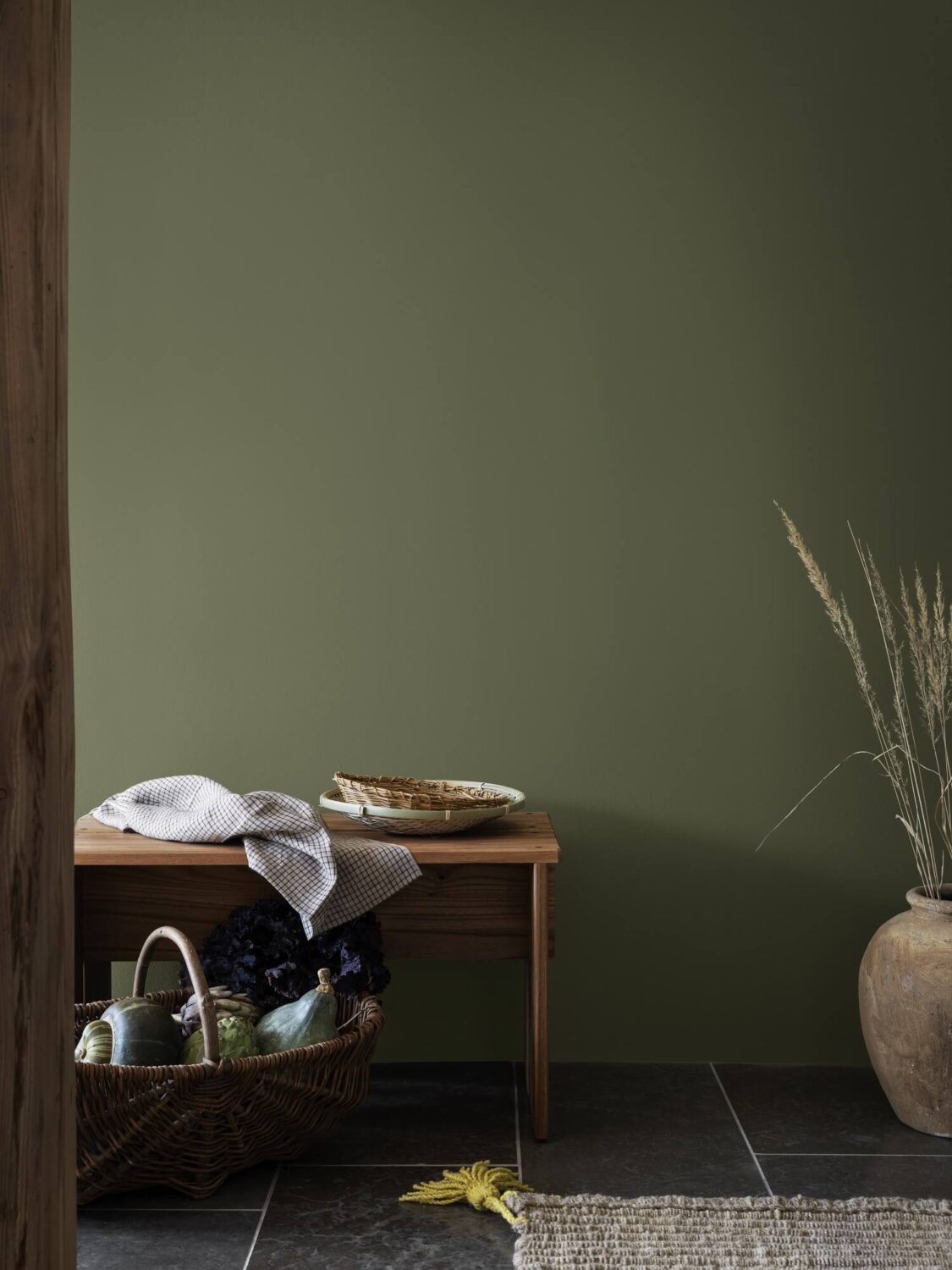
Curated Living
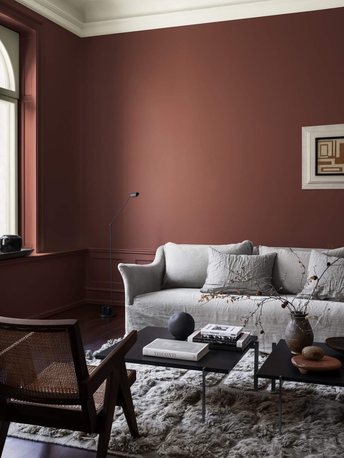
This color palette is the perfect starting point for a curated interior. The palette of sophisticated reds, muted neutrals, and blue accents makes this a balanced combination of nostalgic shades and contemporary colors.



Dunn-Edwards
Dunn-Edwards have chosen four color palettes for their color and design trends for 2023. “We are approaching a time of peak post-modernism where fear, strength, compassion, distrust, and community inspire us to surround ourselves with elements from the past, present, and future as we attempt to find our bearing and create safe and multi-purposeful spaces.”
Live in Joy
Take optimism to its extreme. This winter sports-influenced trend incorporates bold colors, innovative materials, and playful eighties and mod vibes to create celebratory, energetic spaces.
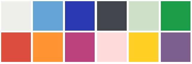
Vermilion – Energy Orange – Razzle Dazzle – Strawberry Blonde – Lemon Punch – Plum Power
Liberated Nomads
Reinvent the past and travel across worlds and decades. This complex aesthetic combines arts, folklore, Baroque, and Industrial influences to realign fragments of style in provocative ways.
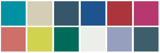
Crushing on Coral – Limelight – Malachite Green – Sugar Swizzle – Midnight Blush – LA at Night
Well Intentions
This trend reflects a new duality: the desire for earth-friendly living and extraterrestrial pursuits. Look for innovative materials and organic shapes that blend the natural and artificial.

Ashen Plum – Mink – Bourbon Sweet Tea – Clean Slate – Country Air – Grassy Knoll
Life in Poetry
Step into a vacation that lasts all year long. Embrace your relaxed summertime vibe and cherish imperfections, DIY, and bric-a-brac craftwork to create a cheerful, nostalgic retreat.

Grapevine – Pink Glamour – Aloe Plant – Lemon Gelato – Thundercloud – Singing the Blue
Valspar
Valspar chose not one but twelve trend-worthy, forward-thinking, beautiful, and livable colors of the year. These designer-inspired colors are matched to a specific facet or emotion of life, all relating to what people may find helpful to complement their space.
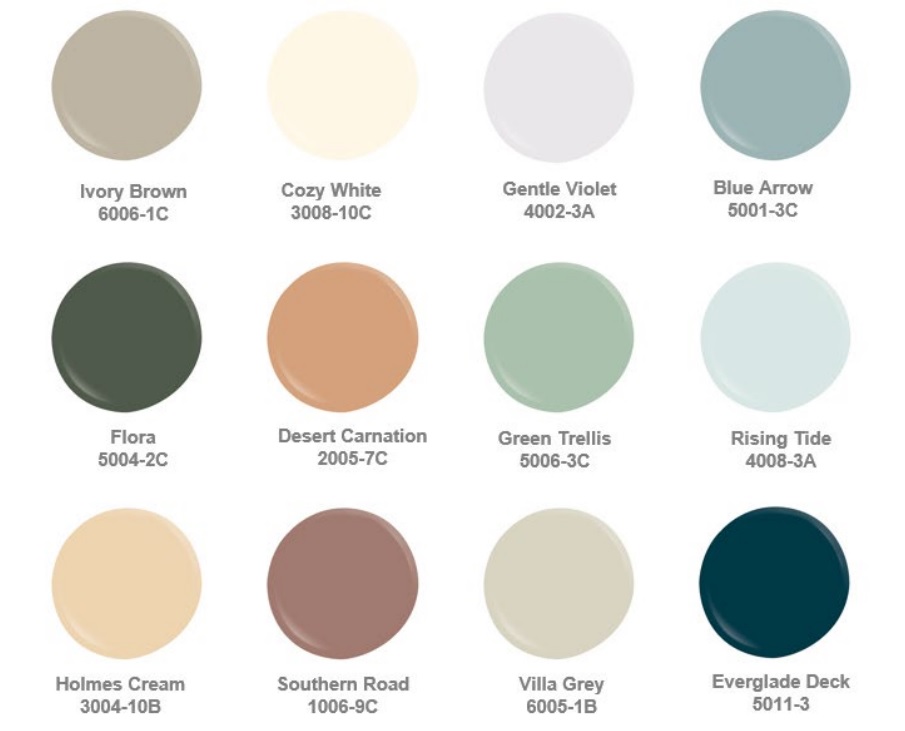
Homeowners are prioritizing areas of the home with paint to update their well-used spaces. By turning to nature-inspired design, this year’s collection is all about finding new comfort, embracing a flexible lifestyle, rediscovering joy, and leaning into the growing DIY movement.
What do you think of the year’s color trends? Is there a color that caught your eye and are going to use it in your own home?
