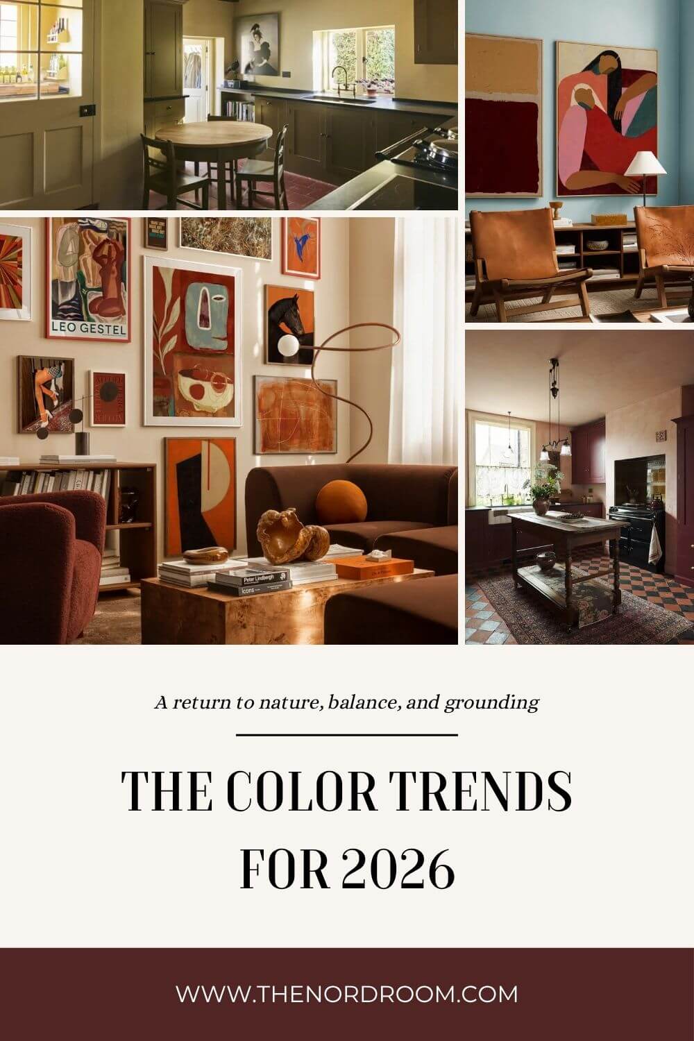
The Color Trends for 2026: A Return to Nature, Balance, and Grounding
The world’s leading paint brands, from Sherwin-Williams and Behr to Benjamin Moore and PPG, have revealed their Colors of the Year and trending color palettes for 2026. Now, we can reveal the color trends for 2026.
If 2025 was the year we rediscovered color confidence, with bold hues like Behr’s Rumors, Dulux’s True Joy, and PPG’s Purple Basil, 2026 is the year we slow down and simplify.
With the top paint brands revealing their color forecasts, a clear story emerges: 2026 is the year of grounded calm, natural warmth, and quiet sophistication.
Across the board, color experts are turning away from bold brights and leaning into earthy neutrals, organic greens, and rich, restorative hues, intending to create spaces that feel balanced, soulful, and deeply connected to the natural world.
Let’s dive into the 2026 home color trends in depth!
The New Neutrals in Home Design
Neutrals are getting a significant upgrade in 2026. Gone are the cool grays and stark whites, but in their place we’re seeing earth-drenched tones inspired by stone, sand, and sunlit soil.
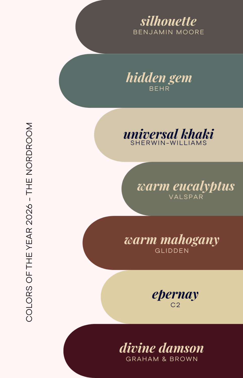
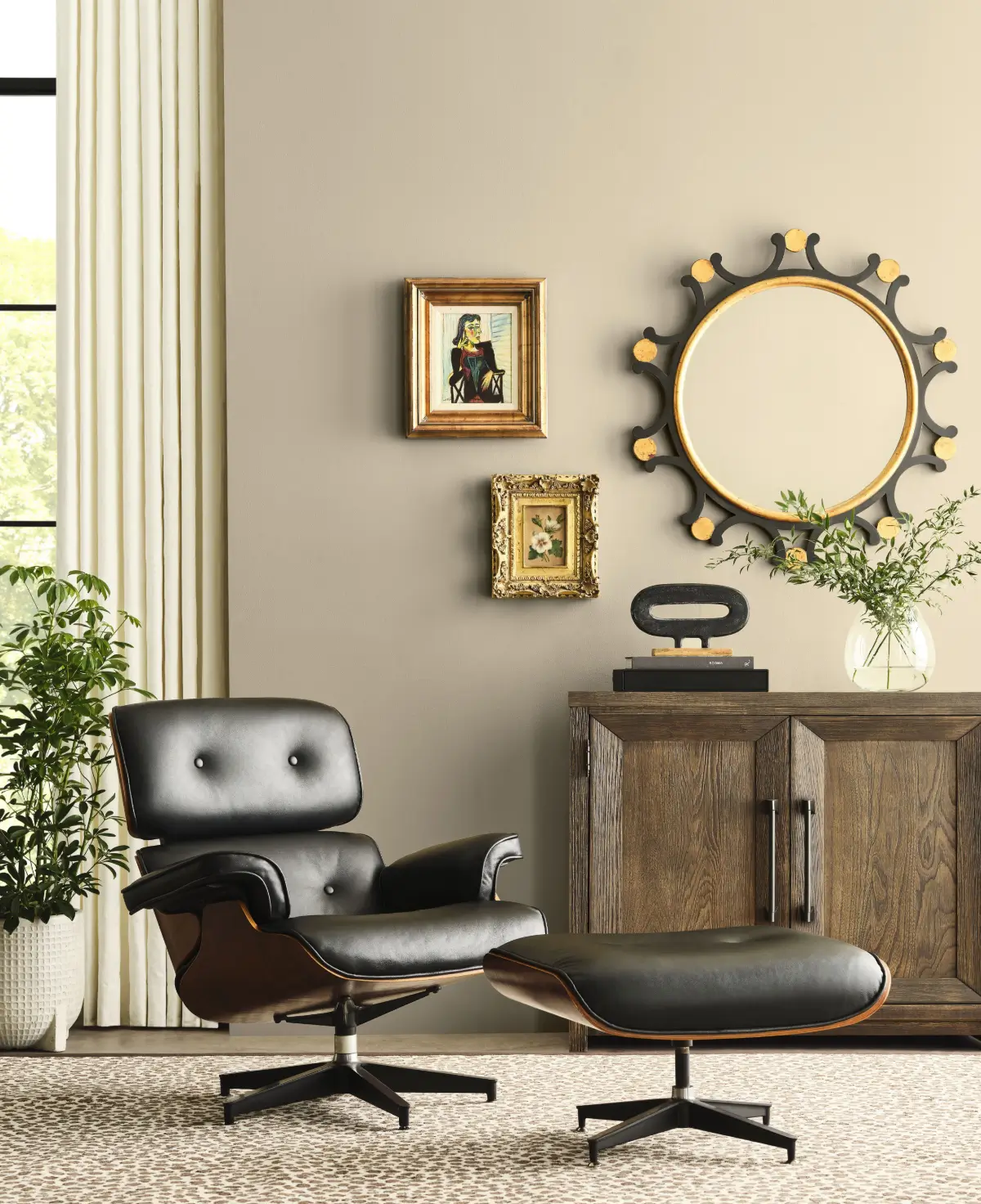
Sherwin-Williams’ 2026 Color of the Year, Universal Khaki, leads the charge. It is a warm, timeless neutral that captures simplicity and quiet strength. It is “the color of a well-loved jacket or the soft earth beneath our feet”, as the paint brand describes it.
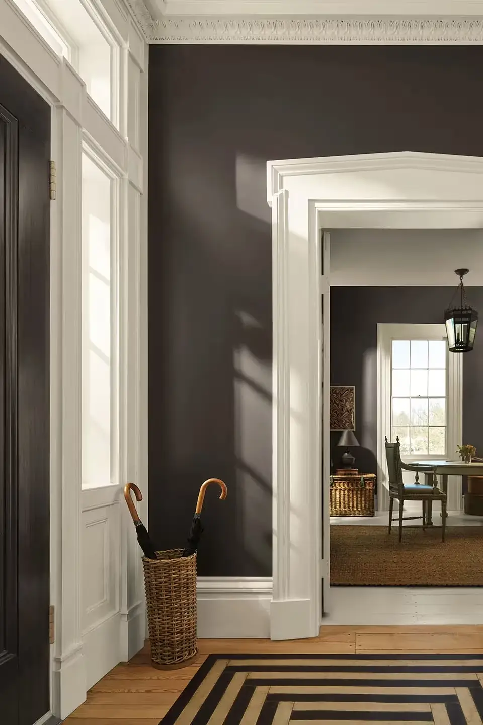
Benjamin Moore has opted for an elegant and moody shade as its 2026 color. Benjamin Moore’s Charcoal is a rich espresso tone infused with delicate notes of charcoal. It’s not your usual gray, nor is it really brown. The shade is refined, elegant, and modern.
Also, C2’s Epernay, a soft ochre with mineral undertones, redefines what a neutral paint color can be. It is refined, luminous, and luxurious in a quiet way.
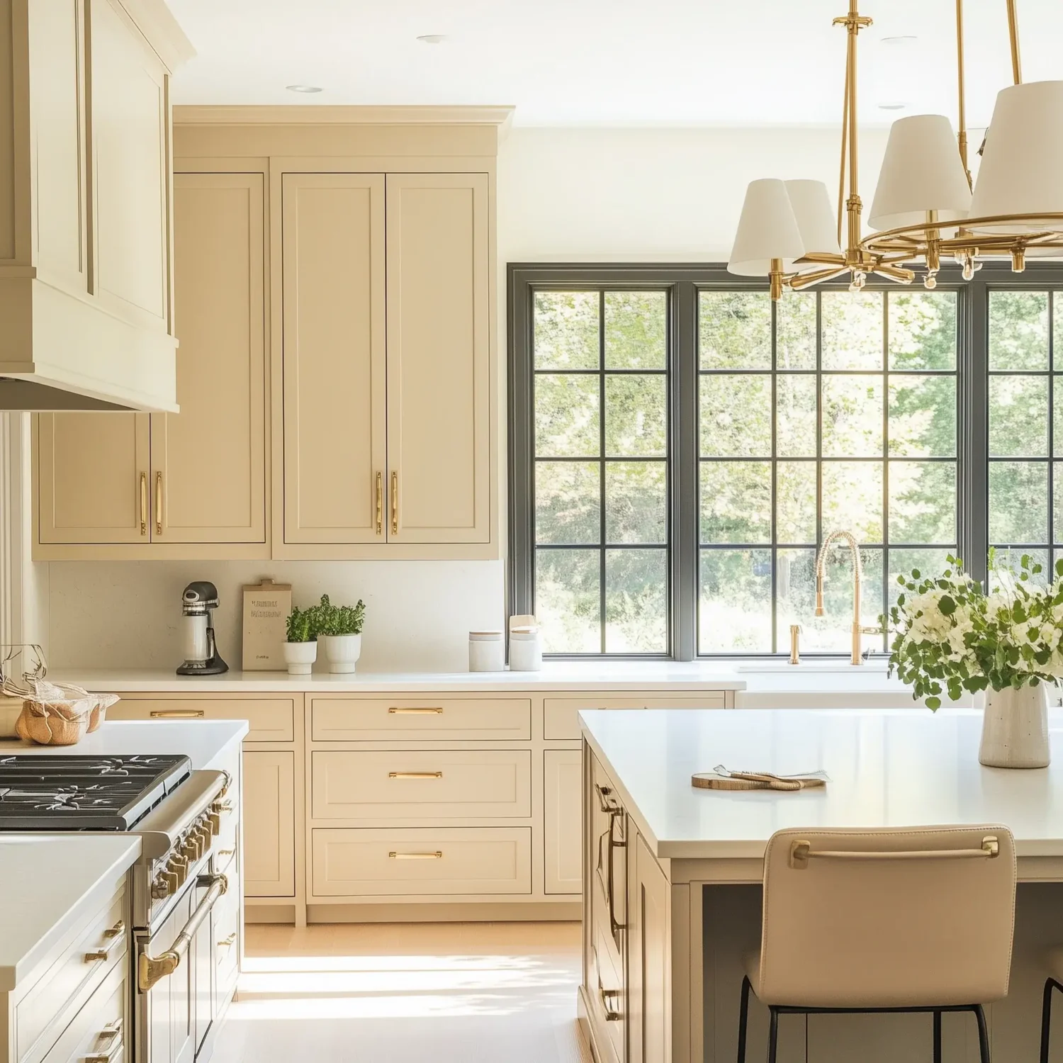
Valspar’s Warm Eucalyptus introduces a green-based neutral that feels both serene and modern, bridging the indoors and the outdoors.
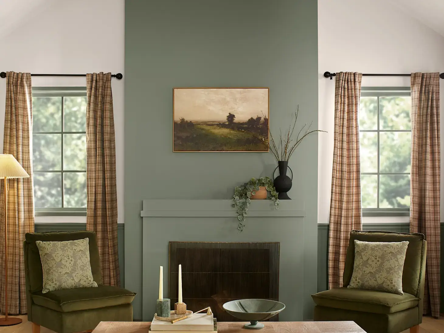
Adding these new neutrals to your home is all about creating a sense of calm stability in your interior spaces. They are foundational colors that soothe without fading into the background.
Nature as the No. 1 Paint Color Inspiration
All the paint brands agree on one thing: nature is still the number one source of inspiration for the color palettes of 2026.
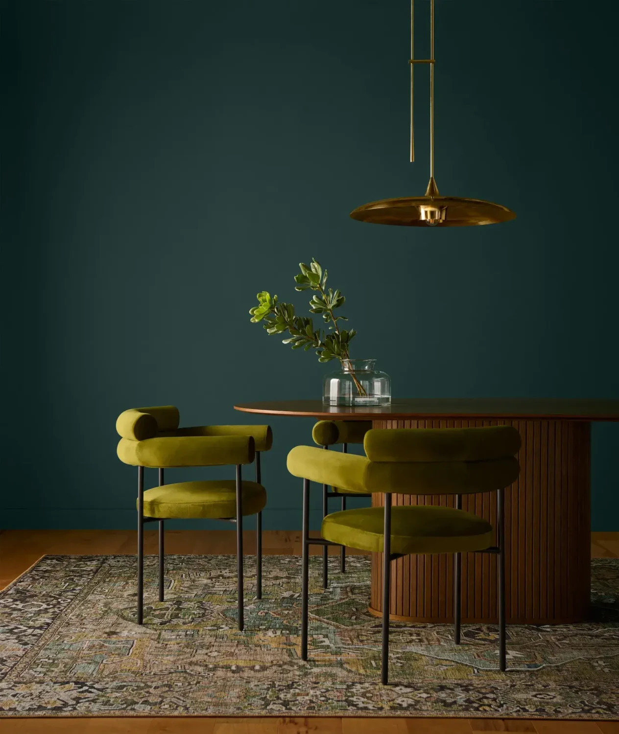
From PPG’s Secret Safari, a balanced yellow-green, to Behr’s Hidden Gem, a smoky jade, shows that we are craving colors that root us in the organic world.
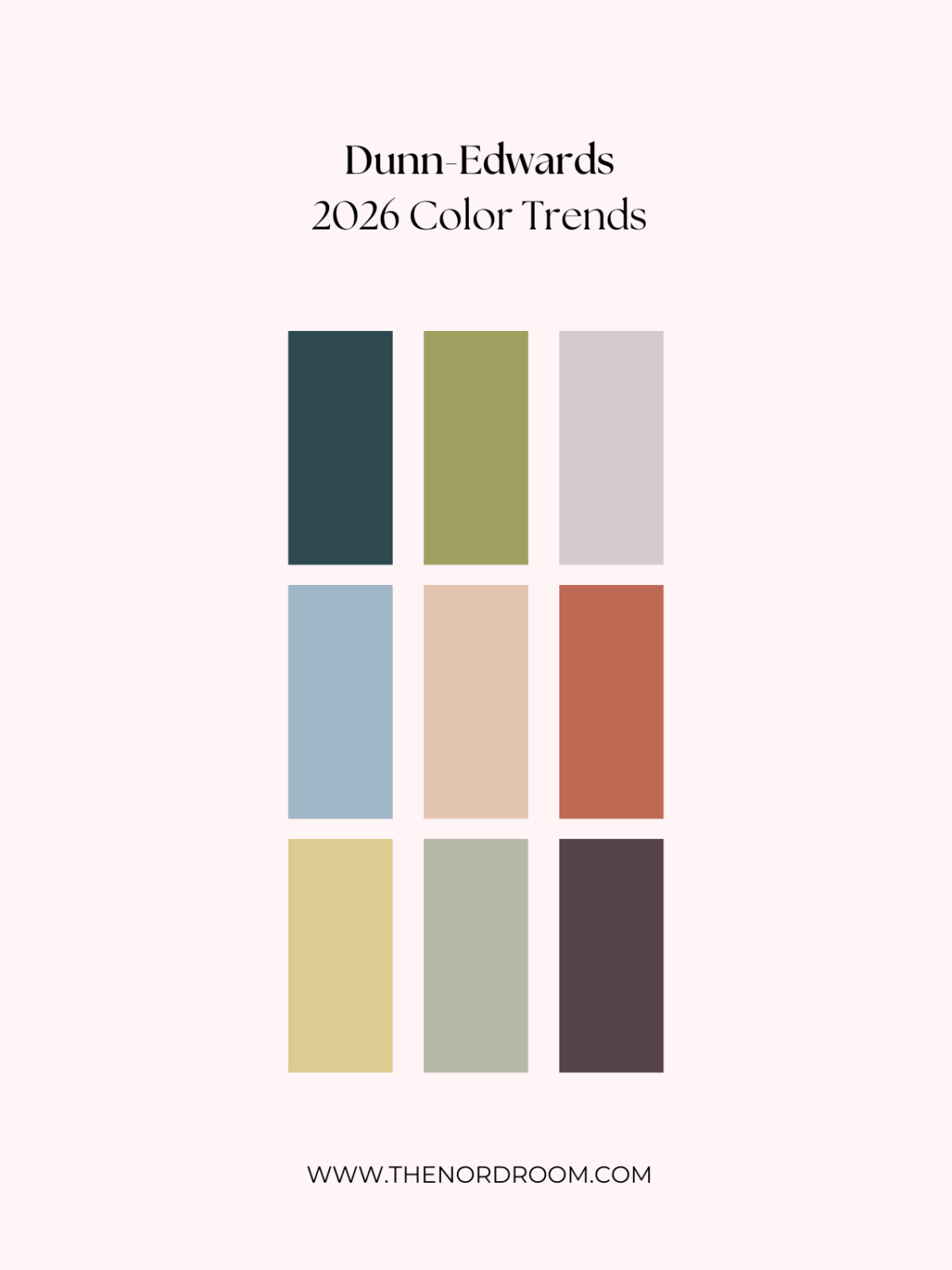
Dunn-Edwards created a color forecast palette for 2026, which they described as “a flourishing botanical garden,” filled with soft blues, leafy greens, and gentle purples that reflect life’s simple pleasures.
The AkzoNobel paint brand Dulux (Flexa in some countries) also looked to nature as its source of inspiration. They named three shades of blue as the Color Family of the Year 2026 for its versatility and emotional balance, echoing sky, water, and calm reflection.
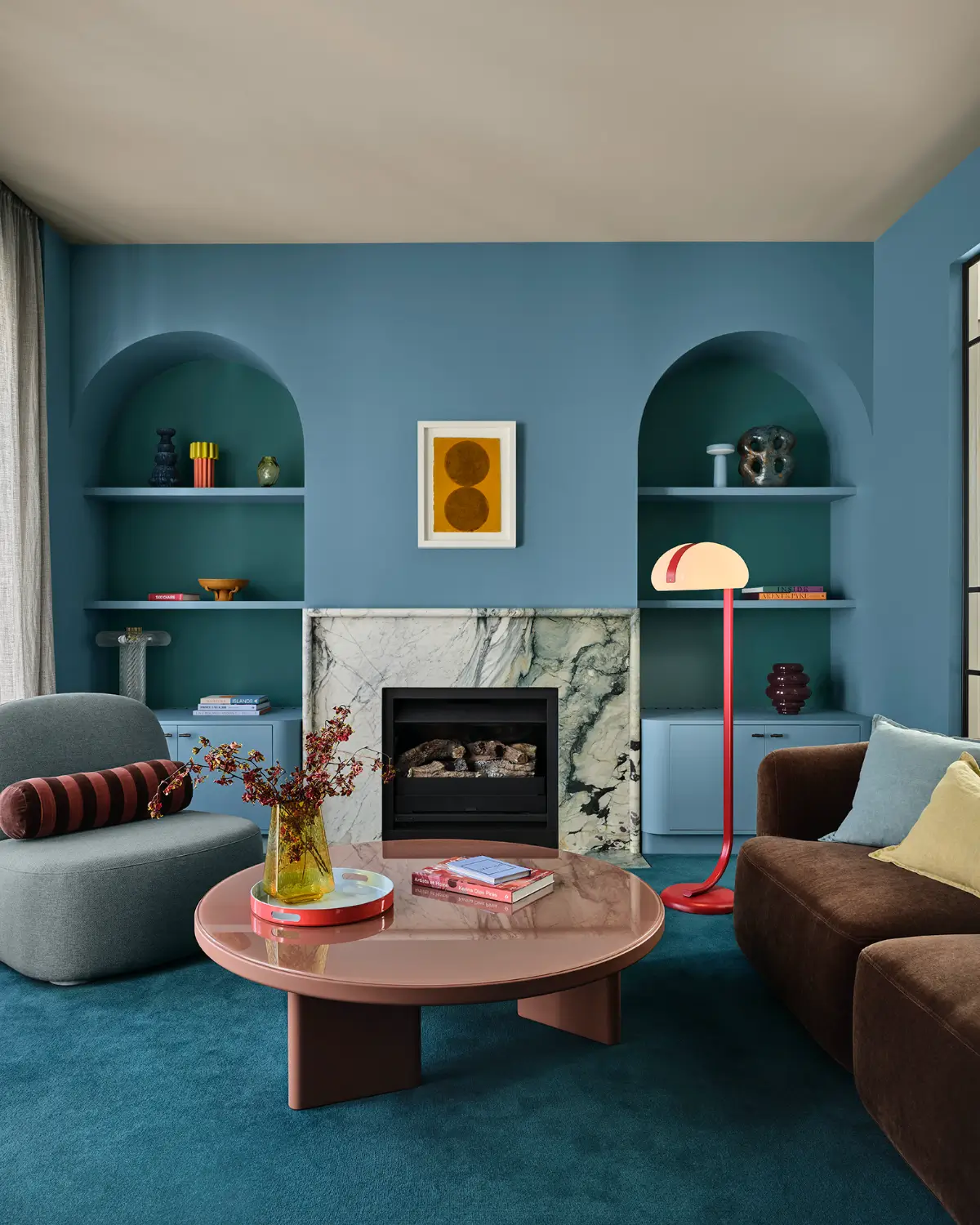
These natural palettes demonstrate that people continue to seek restorative shades, and these nature-inspired colors serve as a counterbalance to the digital noise of modern life.
Warm over Cool Color Tones
Gone are the days of crisp whites and gray. In 2026, we are looking at warm and tactile shades to decorate our homes.

Glidden’s Warm Mahogany is a deep, comforting red that brings personality and richness to a living space. At the same time, Graham & Brown’s Divine Damson, a lush plum tone, adds drama and intimacy.
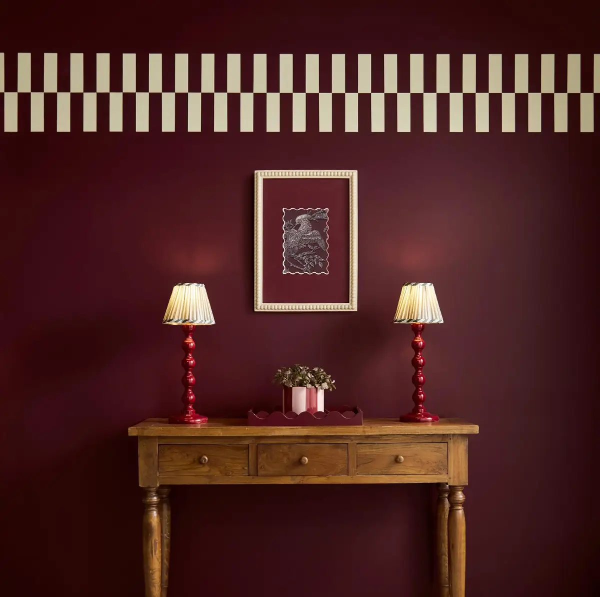
Even cooler shades like Dulux’s tranquil blues and Behr’s jade green are infused with warm undertones, ensuring they feel inviting instead of austere.
Mindful Living and Emotional Design
One key takeaway from the color palettes and thought processes of the paint brands behind these picks is that the 2026 color trends are deeply emotional. This year’s palettes are built on the idea that color can heal, center, and restore.
Sherwin-Williams’ Honest Essential color collection, Benjamin Moore’s Color Trends Palette, and C2’s En Terre color palette all reflect this ethos, celebrating craftsmanship, texture, and the beauty of imperfection.
Valspar’s Warm Eucalyptus palette extends this mindfulness to multifunctional spaces with hues designed to balance energy and calm, perfect for homes that double as work and lounge spaces.
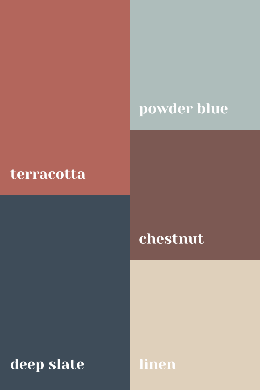
Besides the Color of the Year 2026, some additional colors are visible in almost every color palette from the world’s paint brands. These colors continue the desire for warm and grounded spaces with hues like terracotta, teal, and beige tones.
Quiet Sophistication: Layered and Timeless
The 2026 color trends aren’t flashy; they are layered, textural, and enduring. Meaning in your interior, you can pair handwoven fabrics, sun-warmed stone, and softly aged wood with a nuanced color.
C2’s Epernay evokes the elegance of champagne limestone, while Behr’s Hidden Gem, Benjamin Moore’s Silhouette, and Sherwin-Williams’ Universal Khaki serve as beautiful bases for tonal layering. Graham and Brown’s Divine Damson adds a romantic edge, a reminder that even subtle designs can have emotional depth.
This movement of sophistication values longevity over trendiness, celebrating materials and colors that feel both familiar and fresh.
|
Color Family |
Style Mood |
Standout Shades |
|---|---|---|
|
Earthy Neutrals |
Grounded, calm, and timeless |
Universal Khaki (Sherwin-Williams), Epernay (C2), Warm Eucalyptus (Valspar), Silhouette (Benjamin Moore) |
|
Greens |
Renewal, serenity, balance |
Hidden Gem (Behr), Secret Safari (PPG), Warm Eucalyptus (Valspar) |
|
Blues |
Reflection, creativity, calm |
Blue (Dulux), Soft Botanical Blues (Dunn-Edwards) |
|
Warm Reds & Plums |
Comfort, personality, depth |
Warm Mahogany (Glidden), Divine Damson (Graham & Brown) |
|
Ochres & Browns |
Warmth, authenticity, craftsmanship |
Epernay (C2), Groundbreaking (Valspar), Henna Shade (Sherwin-Williams) |
Earthy Neutrals Interior Inspiration
The new neutrals are warm, soft, and calming. They are perfect shades for any room in the house, from a bedroom to a bathroom.
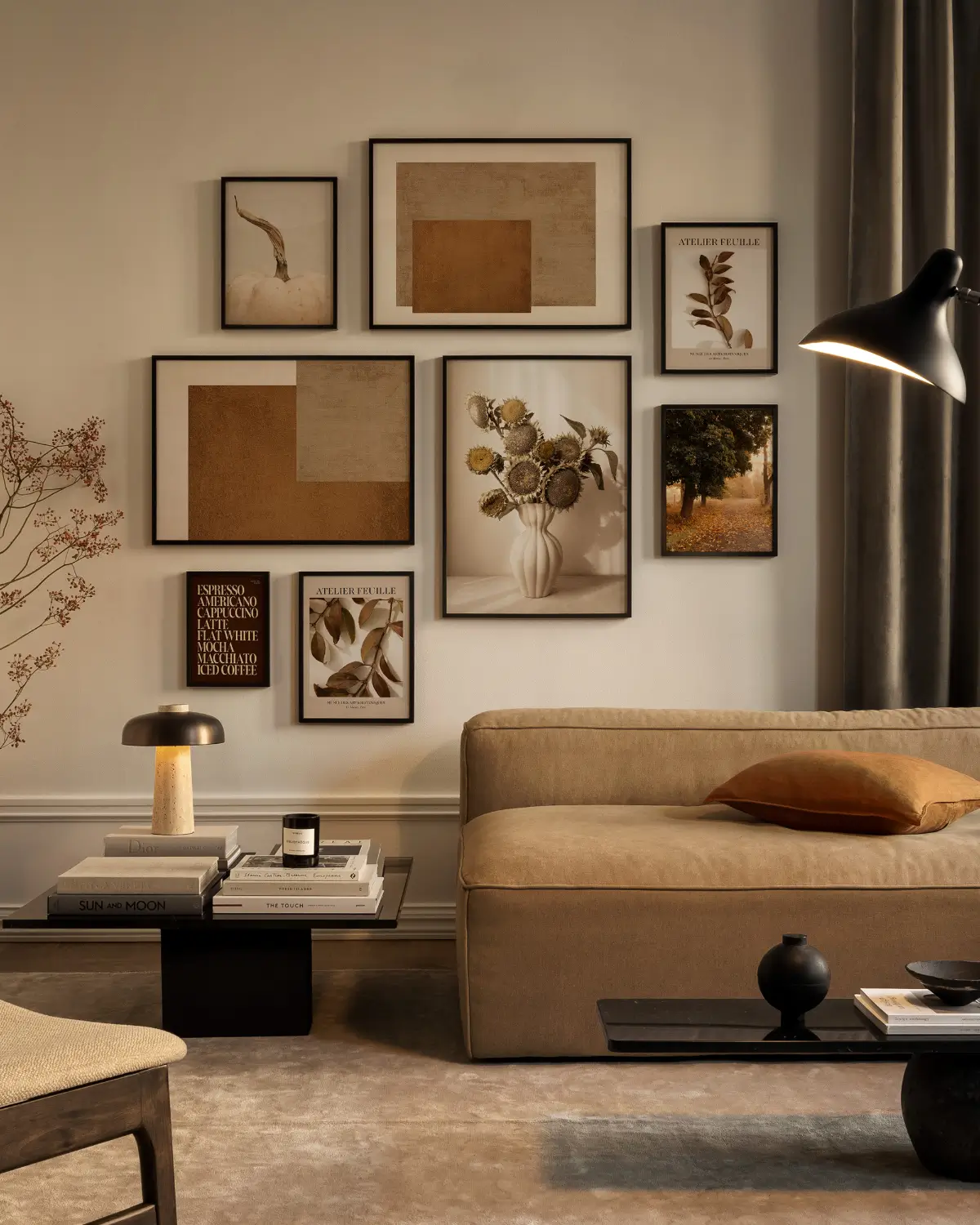
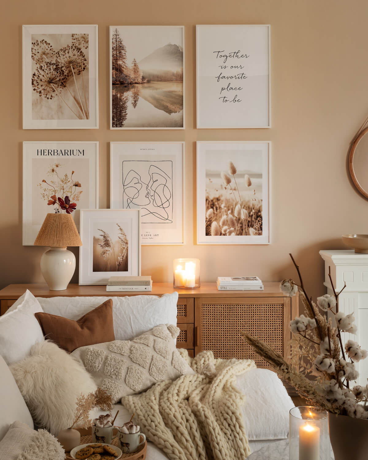
The easiest way to bring new colors to any interior space is by changing art and decorations. This living room perfectly adds earthy neutrals to the room using artworks and a rug.

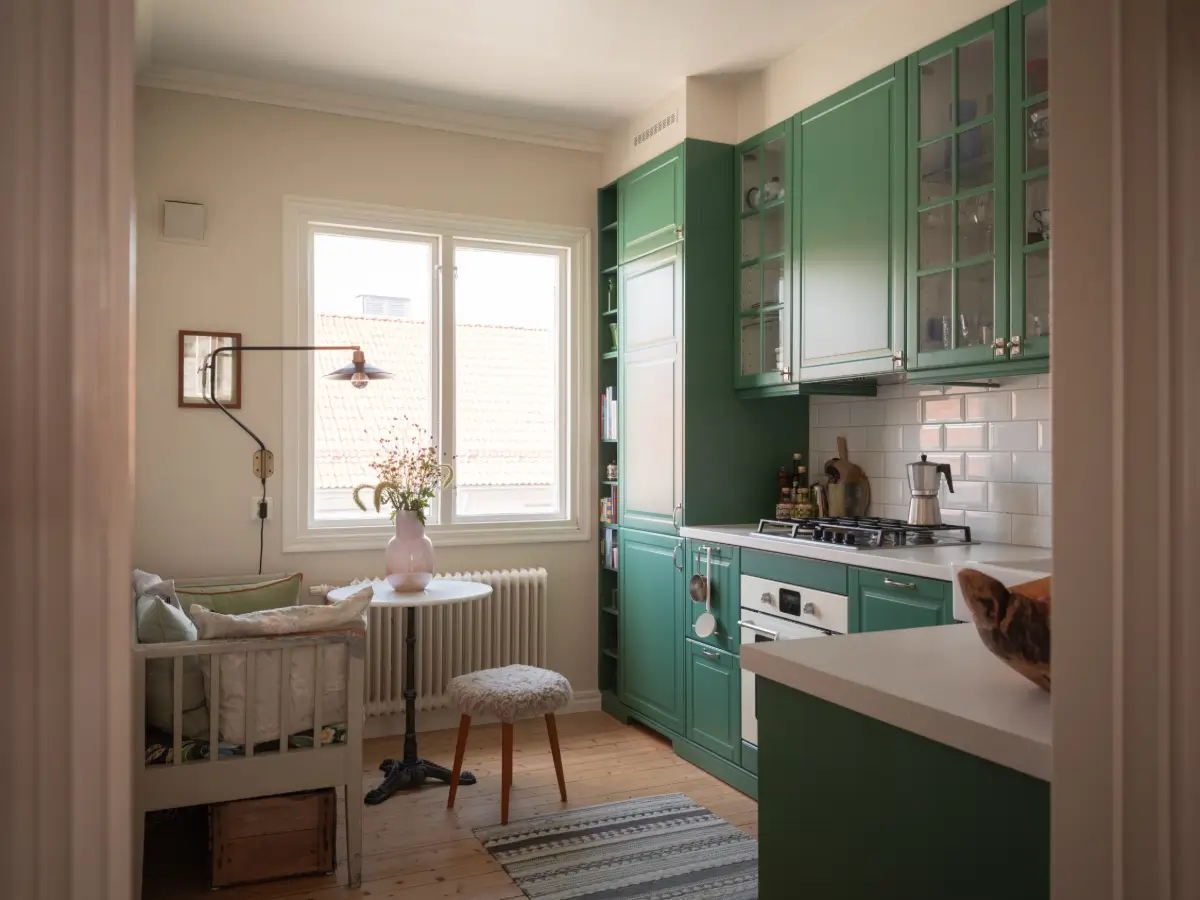
A kitchen space using a timeless and neutral shade like Warm Eucalyptus on the cabinets and the paneled walls (the bathroom also has deep red tilework, which is another trend for this year).
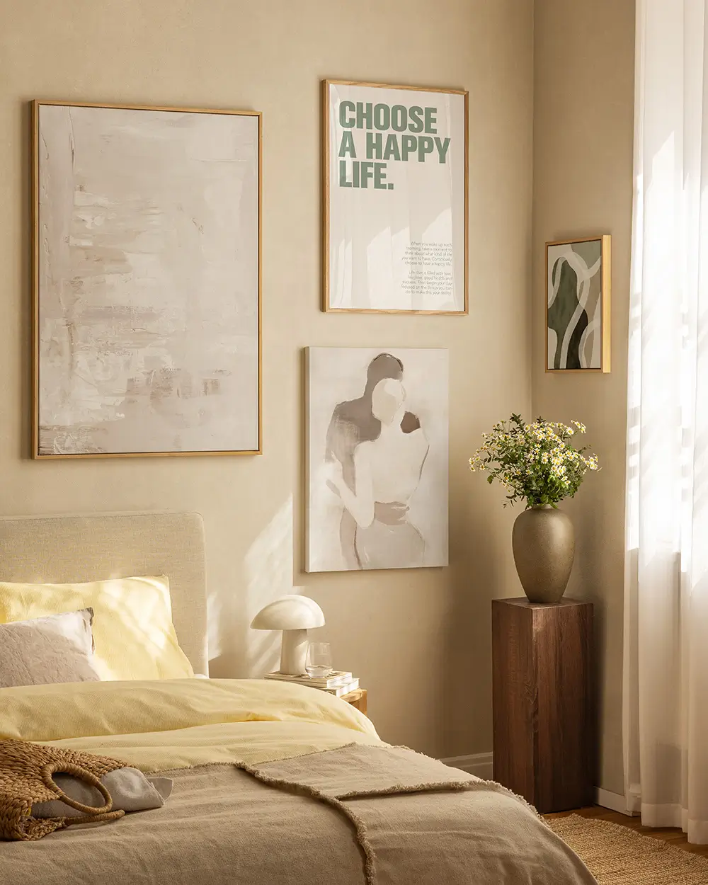
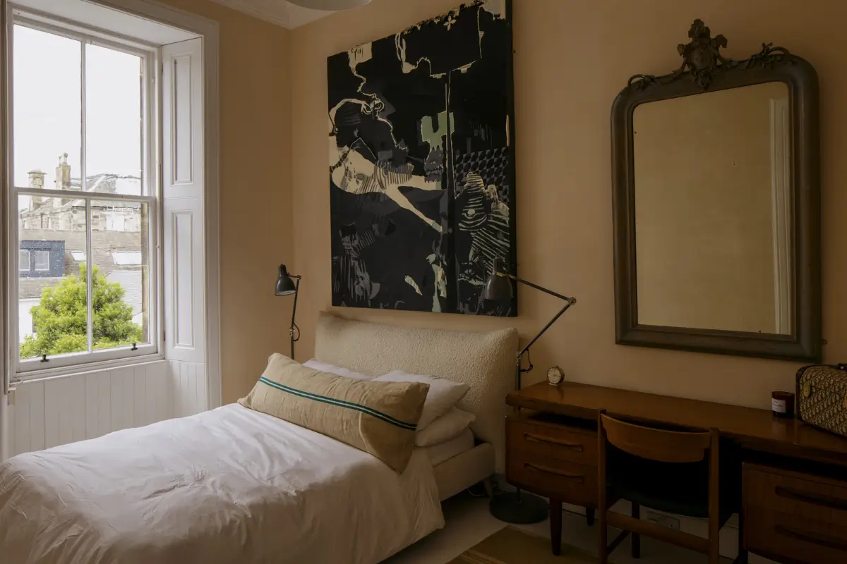
Warm beige and yellow, like C2’s Epernay, pair beautifully together as is displayed in this bedroom.
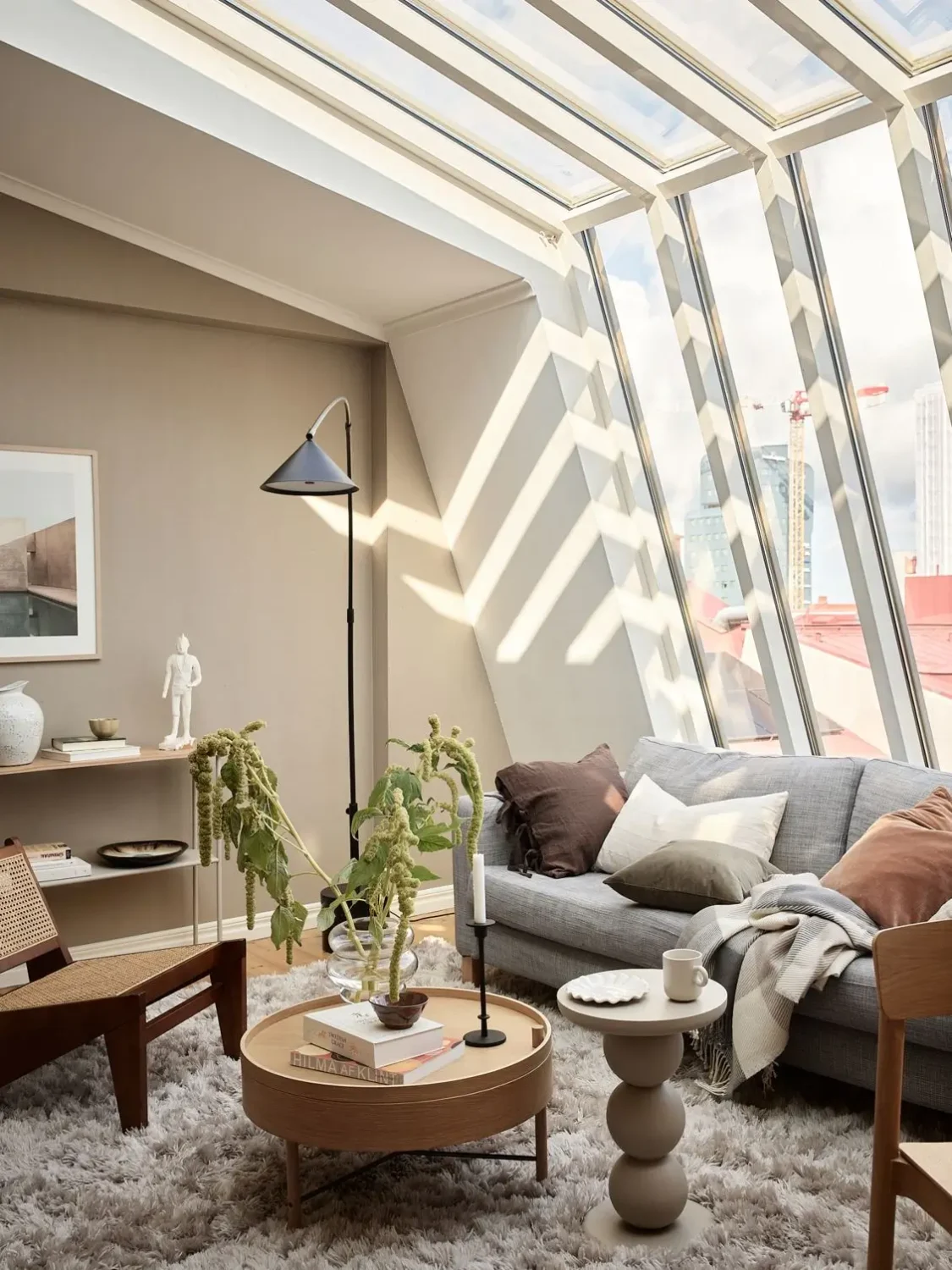
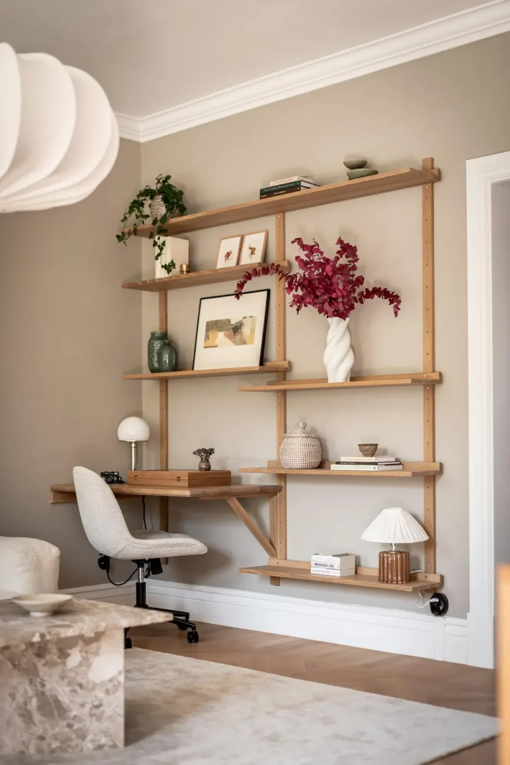
Scandinavian homes have also evolved from crisp white and gray to more natural hues. As always, the Scandi homes are decorated with natural materials and layered textiles, creating a warm atmosphere.
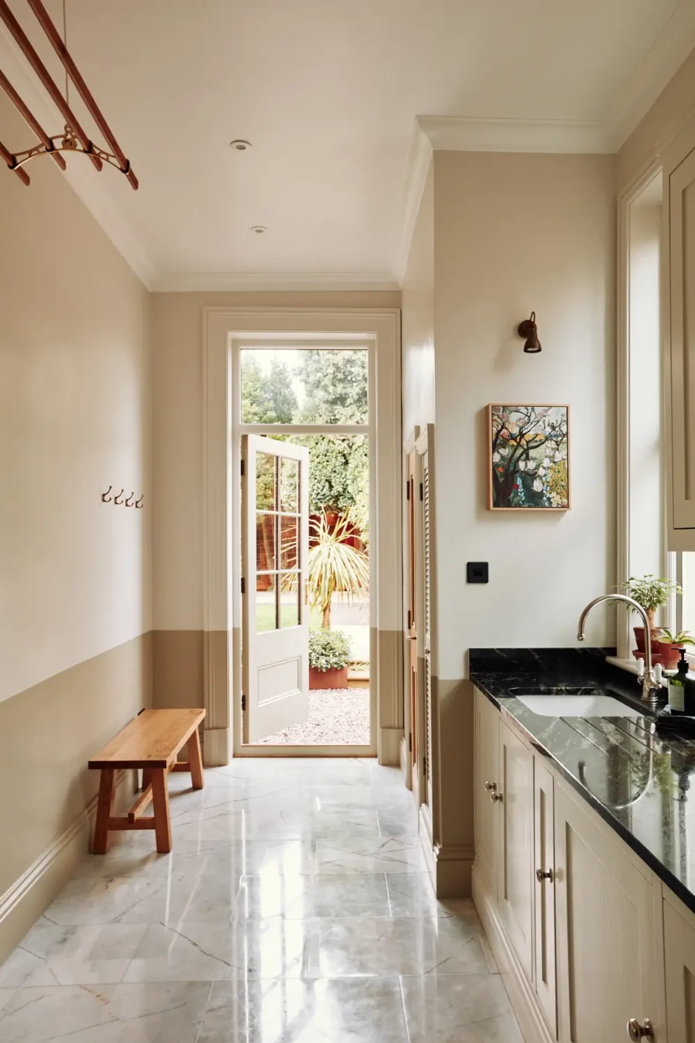
If you find these ‘new neutrals’ too boring, consider adding two shades of a calming neutral to the walls, as seen in this kitchen space.


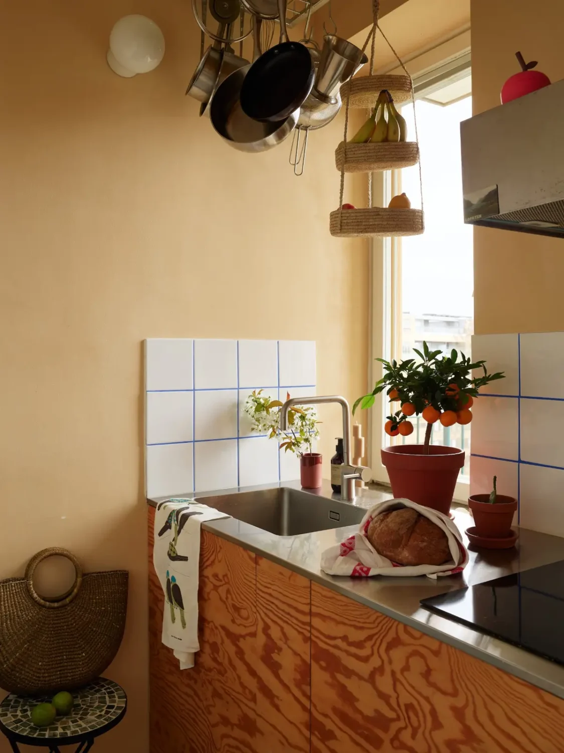
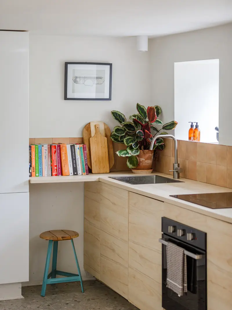
Colors don’t limit themselves to paint; you can also add tile or brickwork in a color of your choice, like the brick tiles in this bathroom or the earthy-shade backsplash tiles paired with plywood cabinets in the kitchen below.
Green Interior Inspiration
The most versatile color of the 2026 color palette is green, ranging from a bold yellow-green hue to a calm and neutral hue. Green has been a staple in color trends for years and is here to stay, whether you’re looking for a quiet space or a bold color pop.


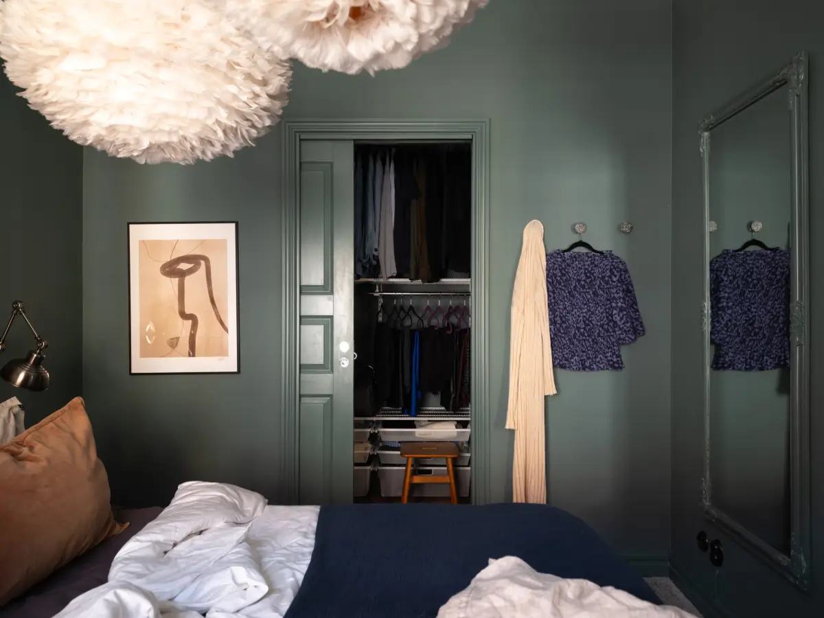
Color-drench your bedroom in a deep green shade like Behr’s Hidden Gem, creating a rich look.
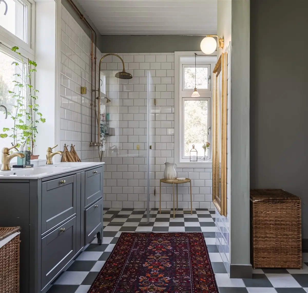
A neutral green shade like Warm Eucalyptus looks beautiful in a bathroom paired with classic materials, like this room with a checkered floor, brass fittings, and a gray vanity cabinet.
Blue Interior Inspiration
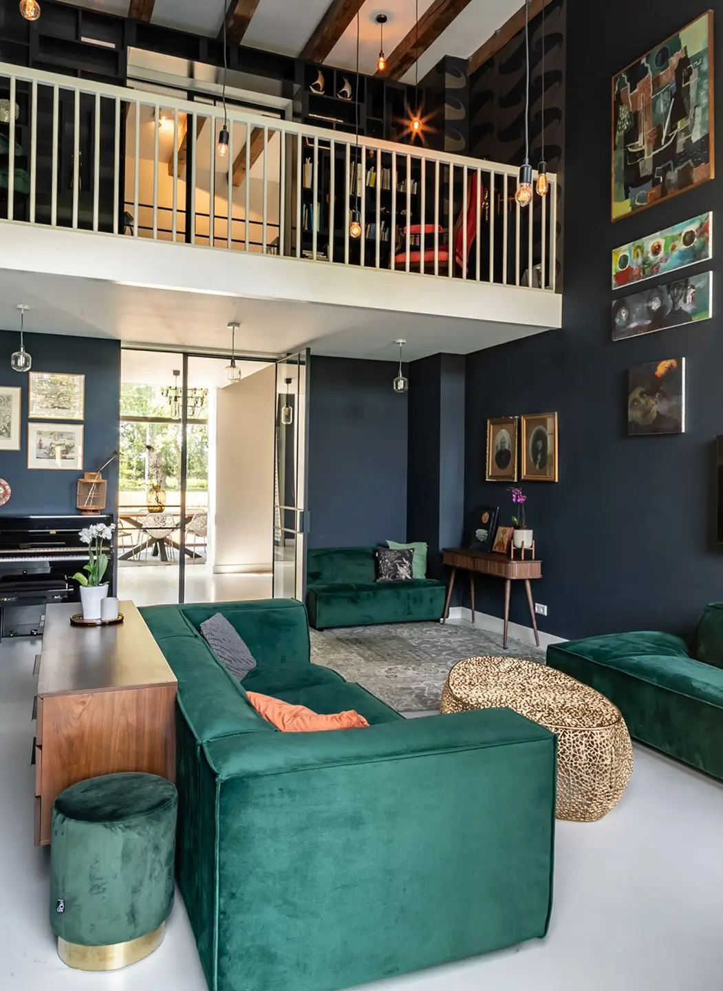
Just as green hues, blue shades are timeless in interior design. Blue adds a fresh, calm, and natural base to any space. Why not go all out and create a color-drenched blue room or go for ton-sur-ton and use several blue shades in one space?

Dulux has chosen a color family of the year, and in this London living room, they combined two blue shades.
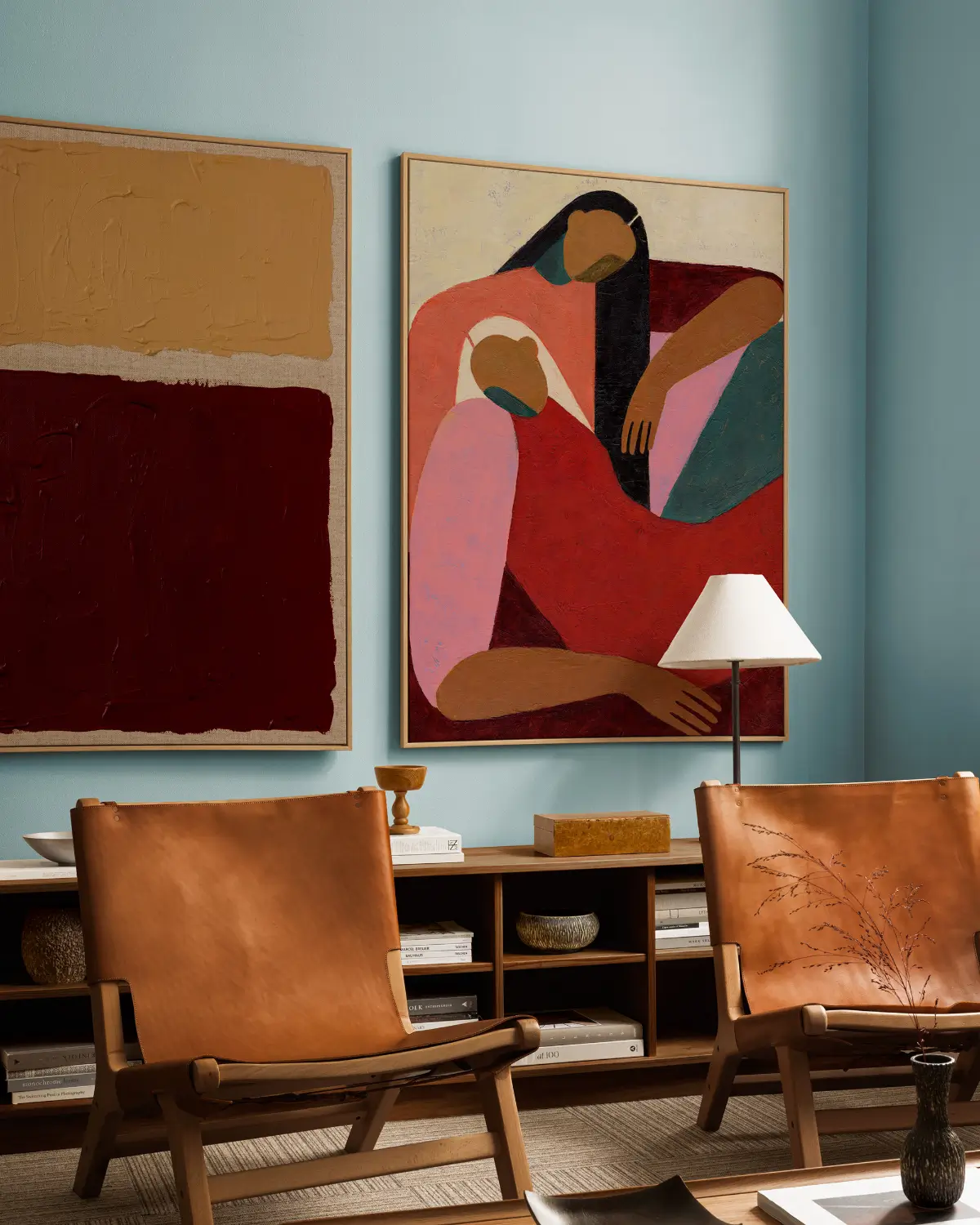
This living room perfectly pairs the blue trend with the earth and red tones that are also trending. The blue shades on the walls add freshness, while the art, leather chairs, and wooden furniture add warmth.

This tiny bedroom pairs trending blue tones with layered textiles in ochre, pink, and green shades.

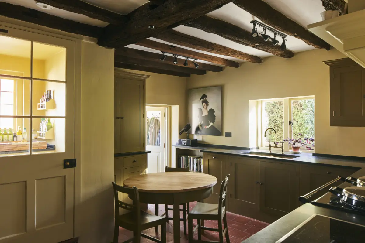
A country kitchen pairing two shades of blue with natural materials like a rustic wooden dining table.
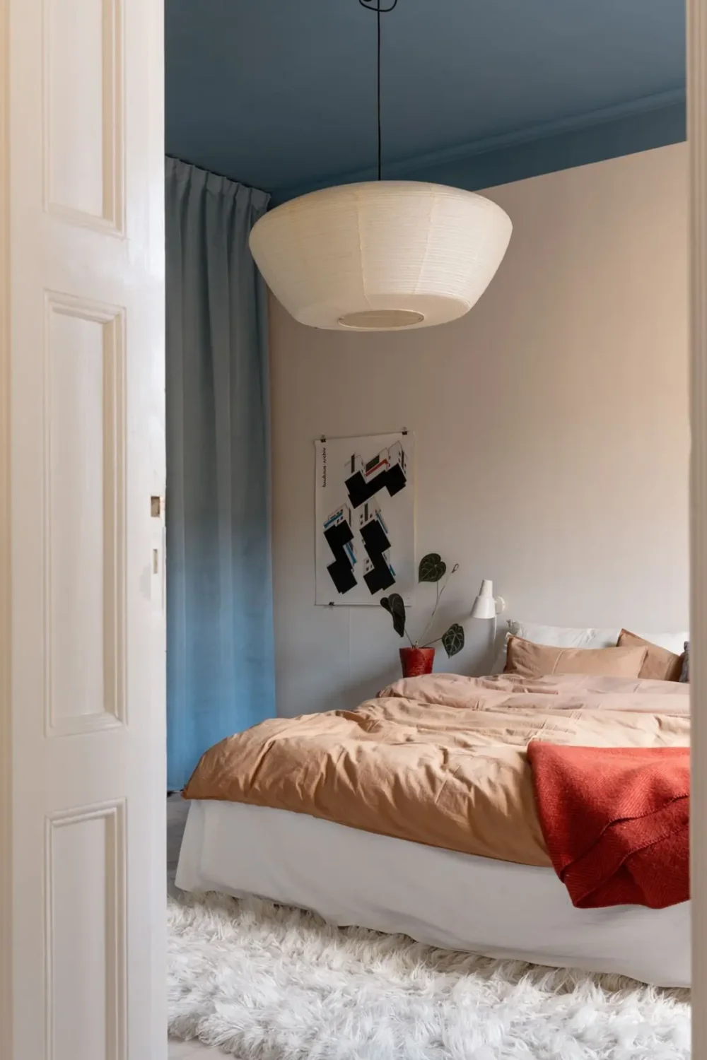
This Swedish bedroom pairs two color trends: shades of blue on the ceiling and the curtains, and a warm neutral color on the walls and the bedding.
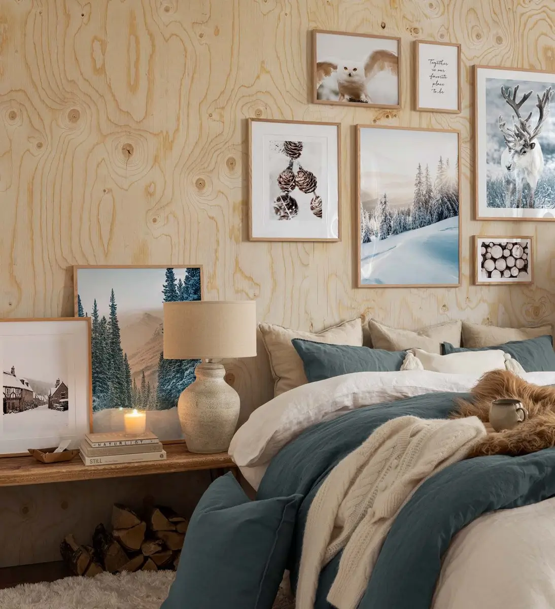
Pair natural shades with natural materials, like in this charming bedroom, to submerge yourself in a calm, natural room.

Warm Reds & Plums Interior Inspiration
Terracotta shades have been trending for a couple of years, and now we can add even deeper red hues to our homes, creating warm and deep spaces that can be combined with natural materials.

Pair a dark red with a fresher pink tone for a warm, deep, and rich look, like in this smart hallway with a tiny home office.

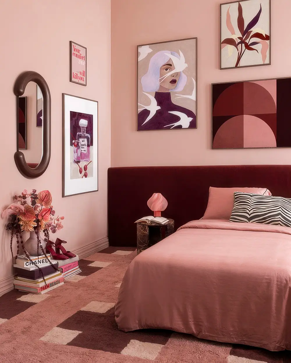
Add extra depth to a pink room by adding a velvet headboard in a dark red shade or by adding a new rug.
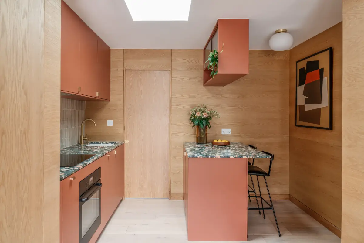
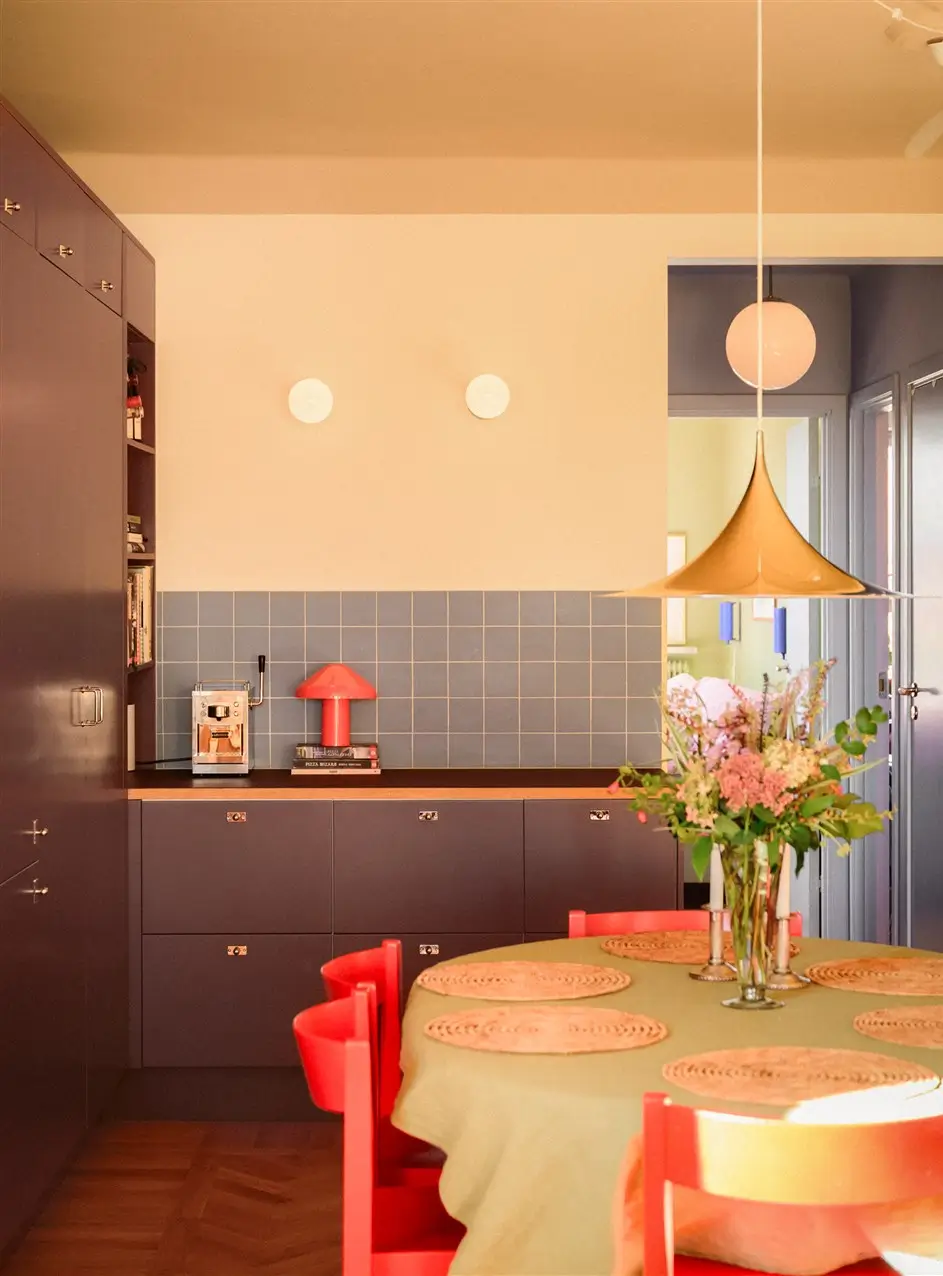
A plum-colored kitchen in a Scandinavian apartment where every color trend for 2026 is visible, from warm, neutral walls to a green bedroom and blue tiles.

DeVOL Kitchens has created a warm paint color, Refectory Red, which suits the current color trends beautifully. In the kitchen above, it is paired with a timeless green shade, but it can also be paired with ochre yellow or a plaster pink.


A rich-colored bedroom using the Evoke color palette from the Dulux Color Trends 2026.
Ochres & Browns Interior Inspiration
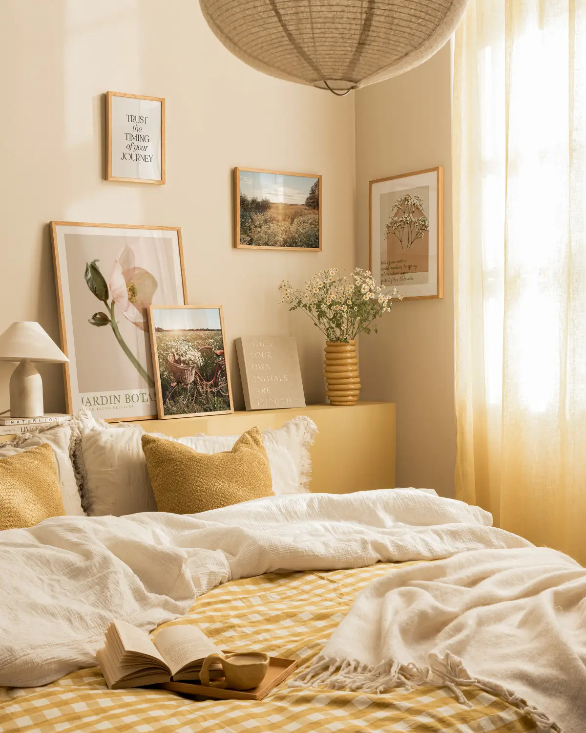
While 2025 was the year of butter-yellow, for 2026, we are heading towards a deeper yellow shade to style our homes with. Ochres and browns add a warm, sunny, and rich look to your interior space.
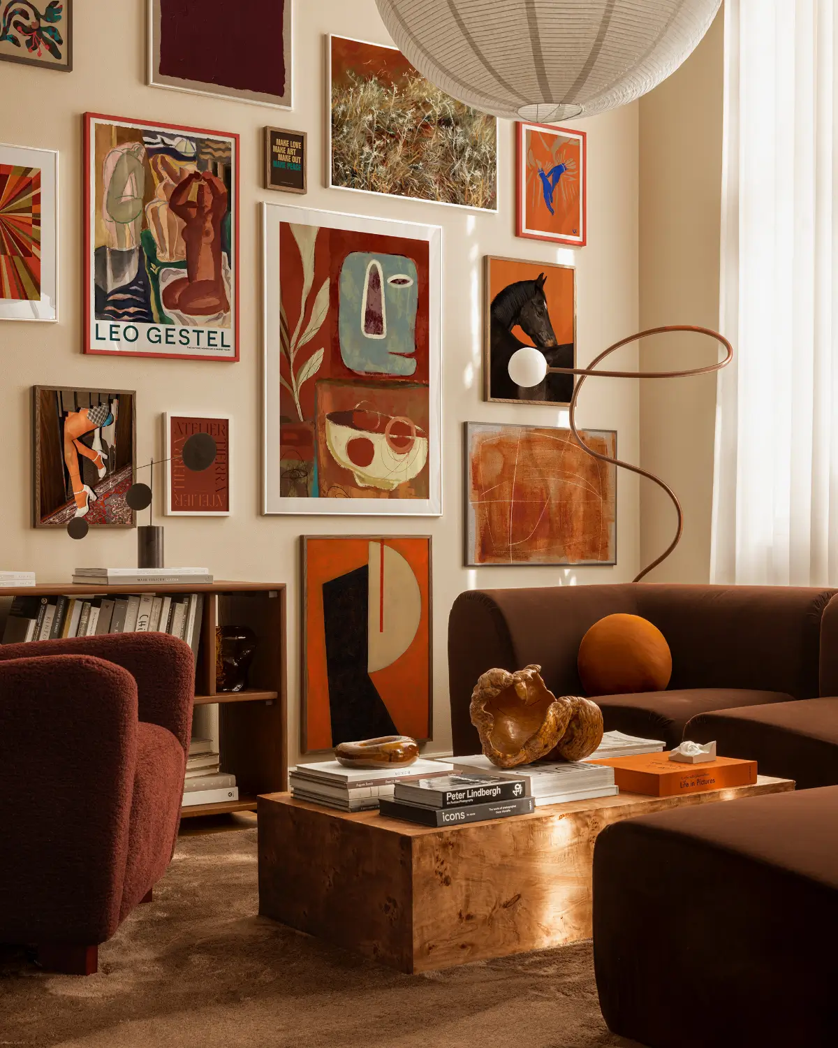
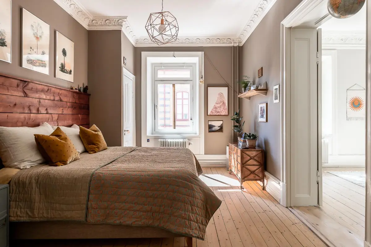
Brown furniture and a brown rug are paired with artwork in warm terracotta shades and beige walls in this living room that perfectly displays the color trends for 2026.

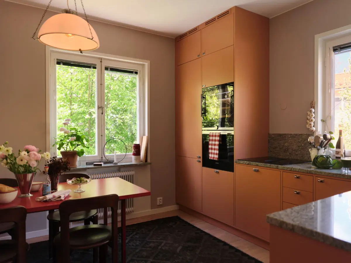

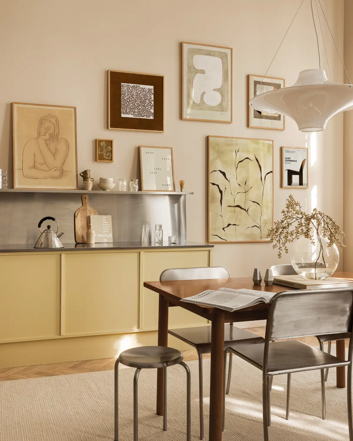
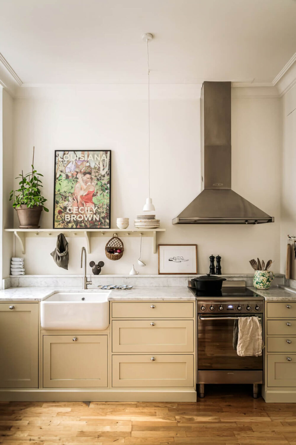
This kitchen pairs light ochre yellow cabinets with beige walls. The stainless steel worktop adds a cool freshness to the space.
The 2026 Prediction vs. The Actual Color Trends
Every year, The Nordroom creates a color trends prediction showing the hues that, according to us, will enter our interior spaces in the new year. This prediction is broadly based on fashion trends, as there is a significant overlap between fashion and the interior world.
Our prediction was more diverse than the actual Colors of the Year, including more pink hues; however, the trend for warmer and richer tones was predicted.

The Color Trends for 2026
As the world speeds up, our homes are slowing down. The colors of 2026 are gentle yet expressive, natural yet refined, and designed not to impress but restore.
From khaki and eucalyptus to damson and jade, these hues tell a shared story of balance and belonging. Whether you’re painting a cozy nook or an entire home, 2026 invites you to design with intention, to create spaces that nurture, inspire, and breathe.
