


Sherwin-Williams Names “Celery” Its 2027 Color of the Year
Sherwin-Williams has selected Celery SW 6421 as its Color of the Year 2027, choosing a soft, muted green that reflects a growing desire for freshness, balance, and a stronger connection to nature.
With its subtle yellow undertones, Celery sits somewhere between an airy pastel and a grounded herbal green. It feels light and uplifting without becoming overly sweet, while its natural warmth makes it comfortable enough for everyday interiors.
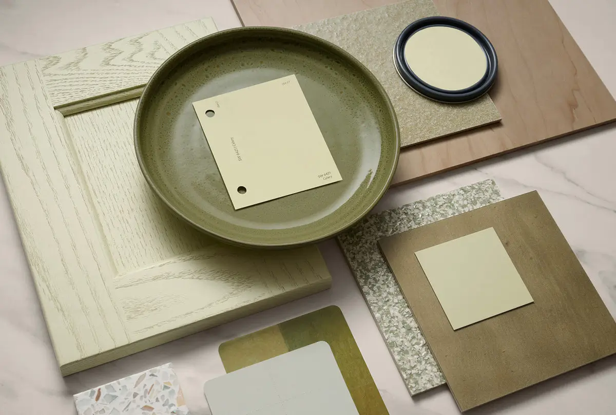
It is a color that quietly catches the eye but does not overpower a room.
According to Sherwin-Williams Color Marketing Manager Ashley Banbury, Celery stood out early in the forecasting process. The shade captures several recurring themes appearing across fashion, interiors, and wider cultural trends, particularly the search for colors that feel calming, restorative, and approachable.
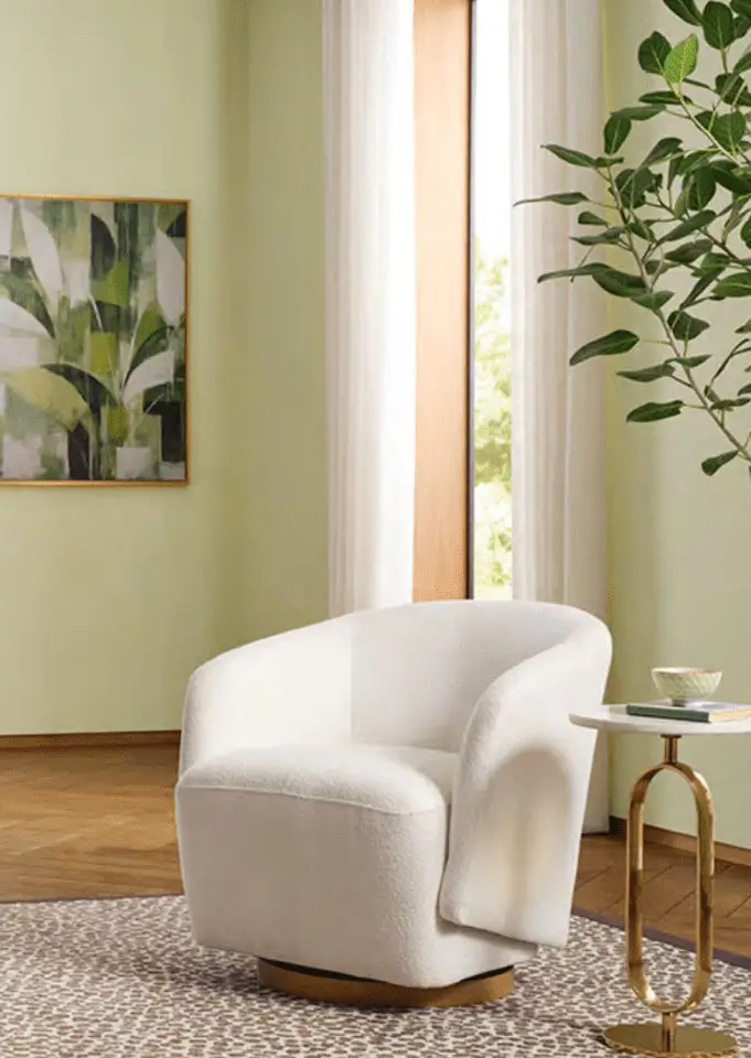
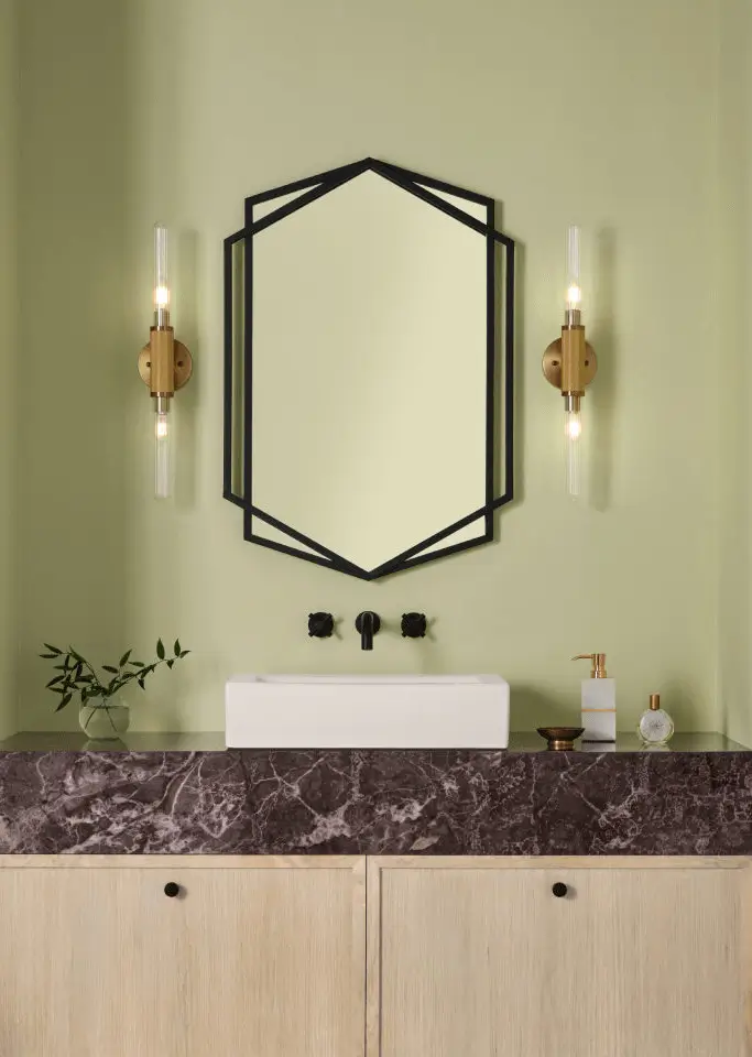

Green has steadily gained ground in interior design, but Celery offers a lighter take on the trend. Rather than leaning dark, dramatic, or forest-inspired, this shade has a gentle freshness that can brighten a room while retaining a sense of warmth.
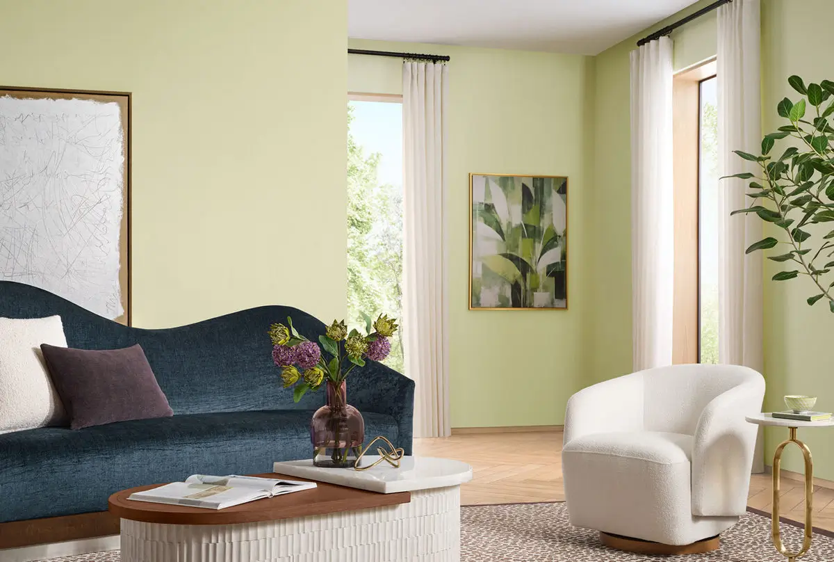
Its selection also reflects the changing role of the home. Interiors are no longer designed only to look beautiful or provide basic comfort. More and more, people want rooms that actively support their well-being and help them feel more relaxed, grounded, and connected.
Celery responds to that desire with a color inspired by nature. Its softness reduces visual intensity, while its yellow undertones prevent it from feeling cold. The result is a green that can bring warmth and calm to rooms.
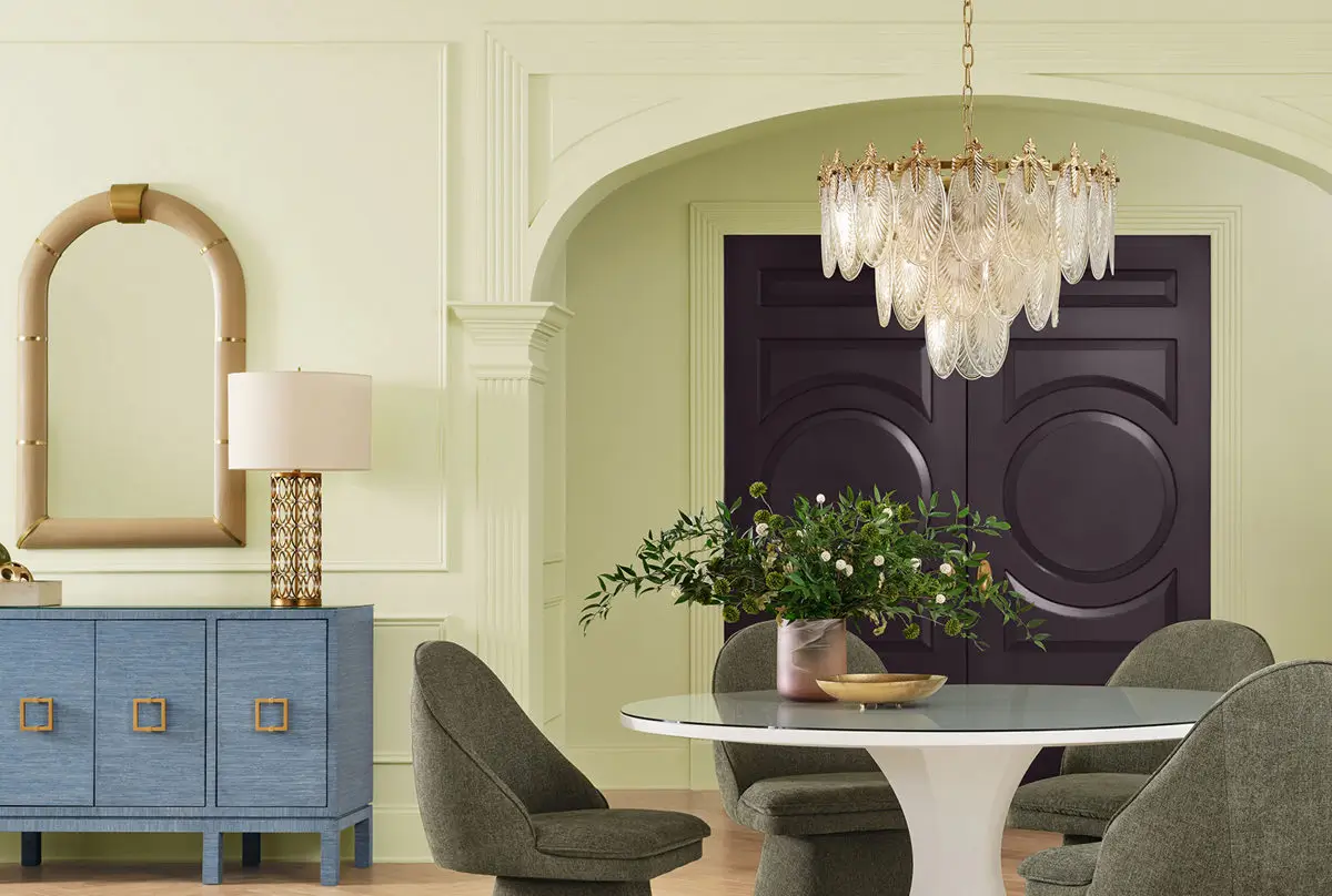
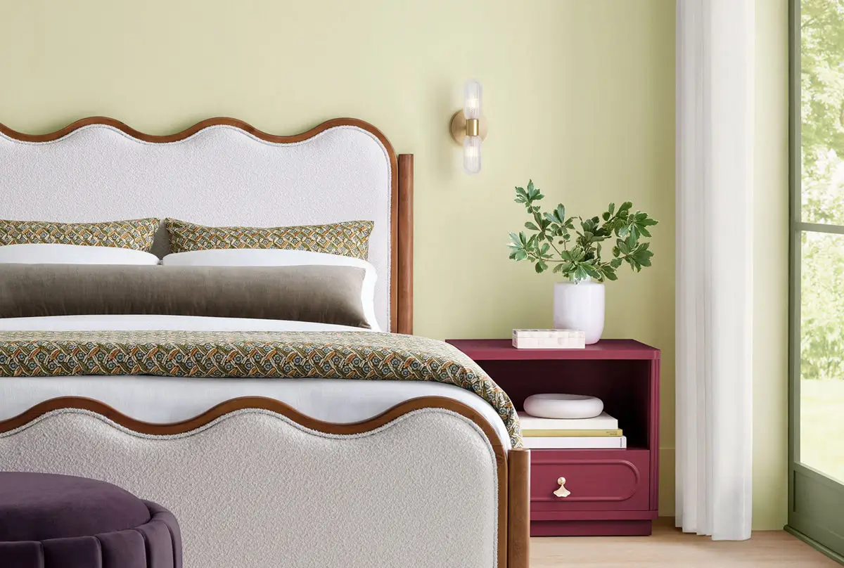
This adaptability matters in contemporary homes, where a single room may serve several purposes throughout the day. Celery has enough energy to suit productive areas such as kitchens and home offices, yet it is quiet enough for bedrooms, reading corners, and other relaxing spaces.
How to Decorate with Celery
You can use celery across an entire room or introduce it in smaller, more focused ways. On the walls, it creates a fresh and balanced backdrop that feels more expressive than a neutral one but remains easy to live with.
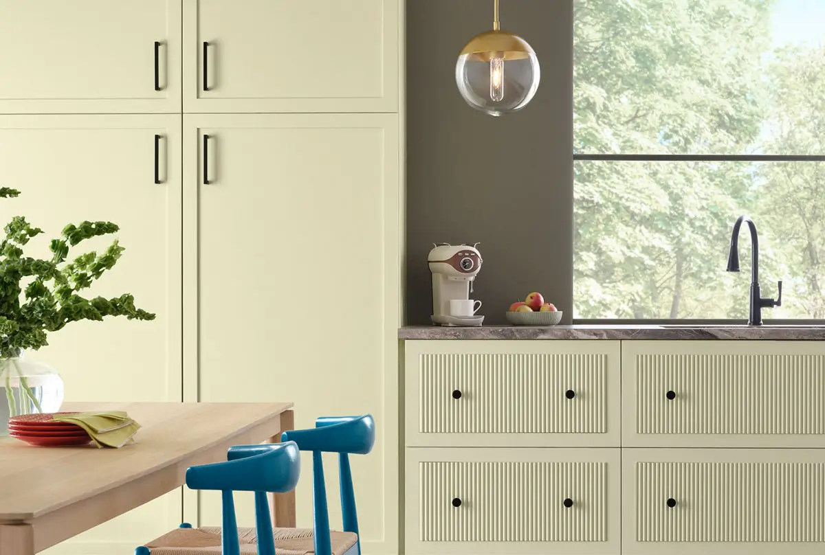
It is also a natural choice for kitchen cabinetry. Paired with marble worktops, brushed brass hardware, or warm timber, Celery can give a kitchen a welcoming, relaxed appearance. Its subtle warmth makes it especially effective in rooms with natural light.
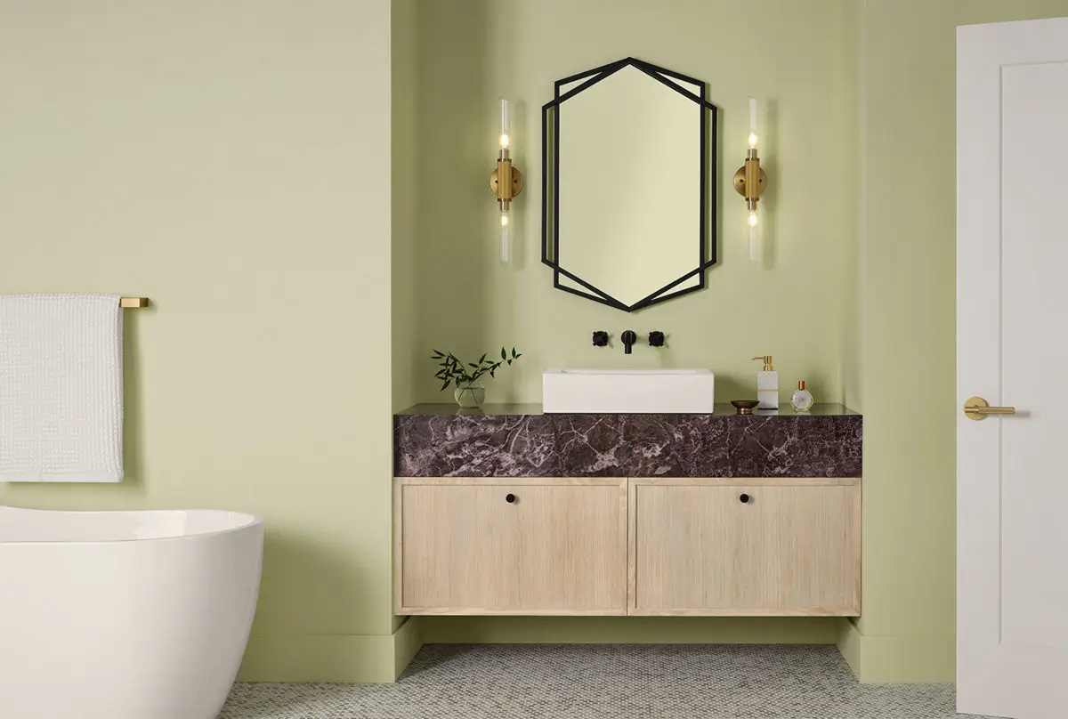
For a quieter application, use the color on built-in shelving, window frames, doors, paneling, or a kitchen island. These smaller areas allow the shade to add definition without changing the atmosphere of the entire room.
Celery also works well on furniture, textiles, and decorative finishes. An upholstered chair, painted side table, patterned curtain, or collection of green ceramics can introduce the color more flexibly.

Sherwin-Williams “Curated Harmony” 2027 Color Palette
Sherwin-Williams has created a coordinating palette that demonstrates just how versatile this soft green can be.
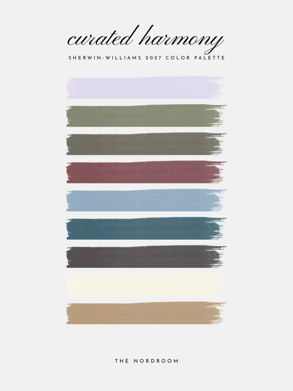
Kirsch Red provides a rich and energetic contrast, while Potentially Purple introduces a playful accent. Cosmos, a blue with violet undertones, can be combined with the deeper Georgian Bay for a cooler and more serene scheme.
For warmer interiors, Woven Wicker, Plum Brown, and Artichoke add earthy depth. These grounded shades bring out Celery’s organic qualities and work particularly well with natural woods, aged leather, and woven fabrics.
White Flour offers a soft, airy contrast, while Cocoon creates a warmer neutral foundation. The accompanying Minwax Pickled Oak wood stain adds a light, desaturated timber finish that can give traditional interiors a more contemporary character.
Together, the colors form a palette that feels rooted in nature but not predictable. Celery can be calm and restrained when surrounded by creamy neutrals, richer and more traditional alongside brown and oak, or playful when combined with red, purple, and blue.