Farrow & Ball Add 11 New Colors to their Collection – 2023
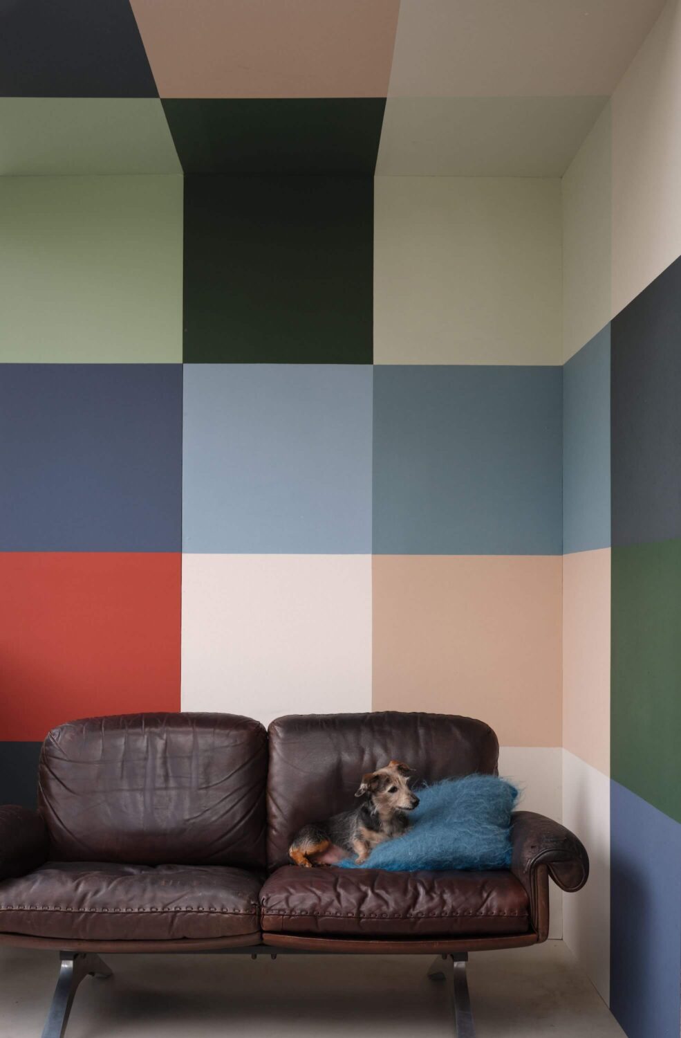
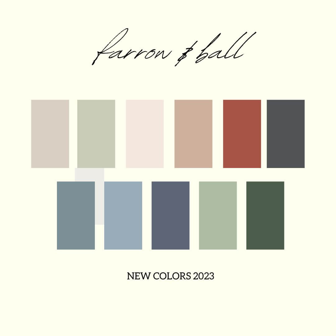
Paint company Farrow & Ball has released 11 new colors to their extensive paint collection. The new colors by Farrow & Ball are inspired by moments of joy, comfort and refreshment to bring delight to your decorating.
It’s the first time in four years that Farrow & Ball have added new colors to their color card. The new colors range from subtle neutral shades to a lively, flaming red.
Each color has a richness, depth and an extraordinary response to light as we are used to from the paints by Farrow and Ball. Let’s take a look at the new colors and see which colors are perfectly complementing these new hues.
The New Farrow & Ball Colors
Every paint family is represented in the 11 new colors from Farrow and Ball. From subtle neutral shades in beige and pink to bolder shades in the red and blue color family. You can use these new colors in every room of the house.
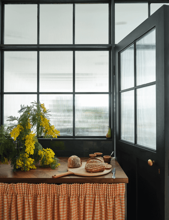
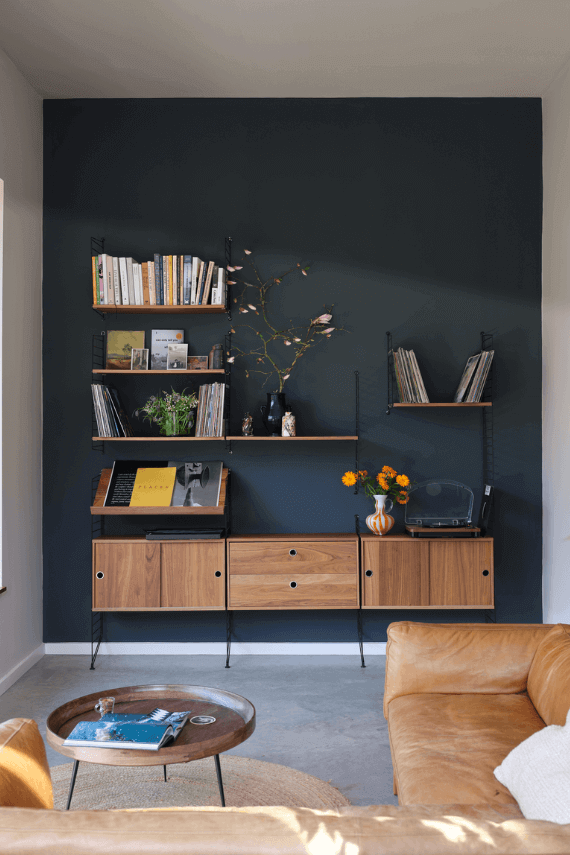
Selvedge – Kittiwake – Wine Dark – Whirlybird – Beverly
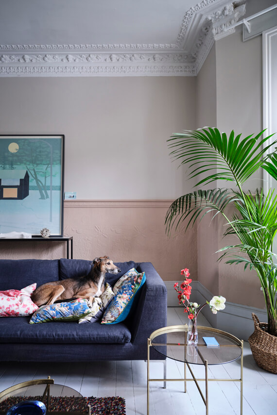
Stirabout
Stirabout is an earthy tone with a gray undertone. The color is inspired by the nurturing porridge which has been a favorite breakfast meal in Ireland for centuries. The color adds a relaxed and warm tone to your room. When you pair it with other neutral hues in the trimming and decor, you can create a natural laid back space.
Stirabout’s complimentary white shade is Pointing. For a neutral palette you can combine Stirabout with Dimity or London Stone. If you prefer a darker accent color, you can combine it with a deep purple like Pelt.
Eddy
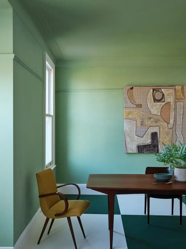
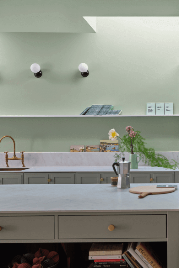
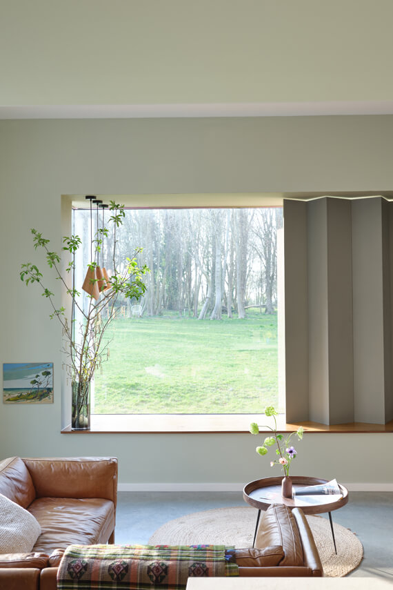
Eddy is a calm and soft green shade that is named after the circular currents enjoyed by wild water swimmers as a natural jacuzzi. This gentle green adds a natural tone to your room especially when you combine it with furnishings in natural materials. Eddy is a delicate tone that creates a relaxing atmosphere.
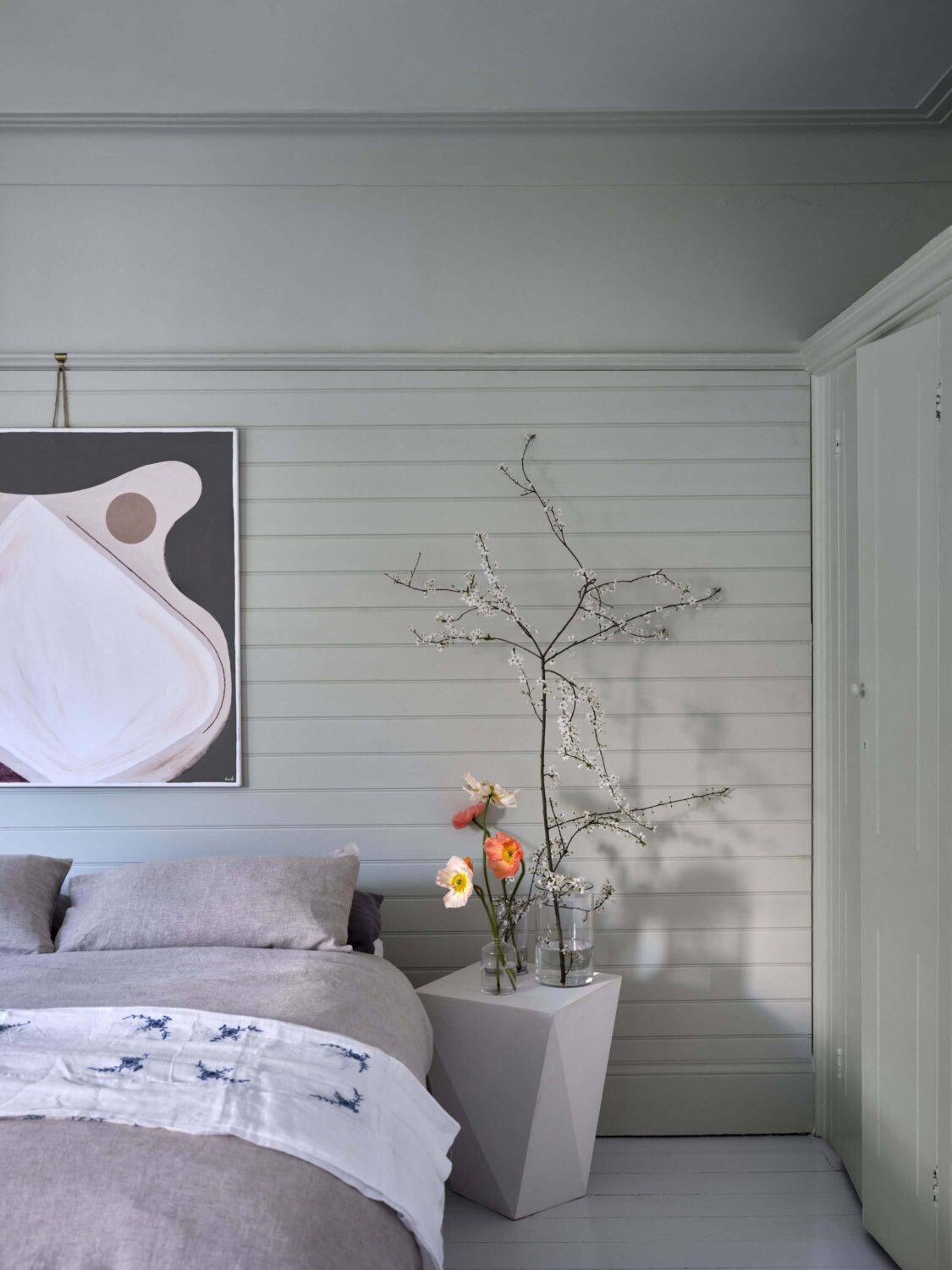
Eddy’s complimentary white shade is School House White. For a neutral look you can combine Eddy with Blanc de Chine or Treron. But it also looks great with the deep green Beverly which is also one of the new colors.
Tailor Tack
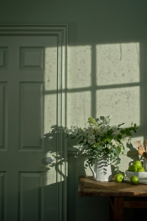
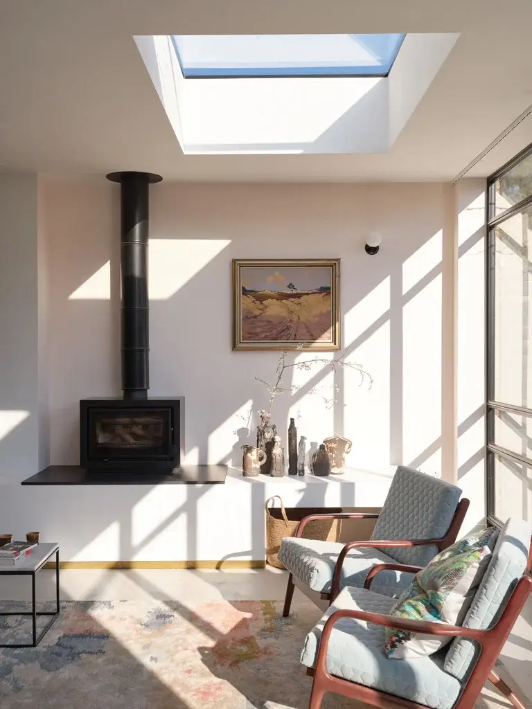
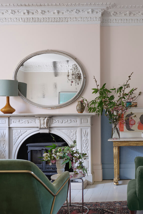
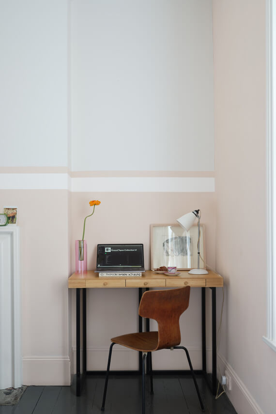
Tailor Tack is the lightest and most delicate pink shade in the Farrow and Ball collection. The name comes fofrom the fashion world as this is the color that is used as the tacking thread in Haute Couture ateliers.
Despite the delicate shade it is strong enough to contrast white and it works great in both modern and classic interiors You can pair it with vintage finds or go for more contrast by pairing it with industrial design.
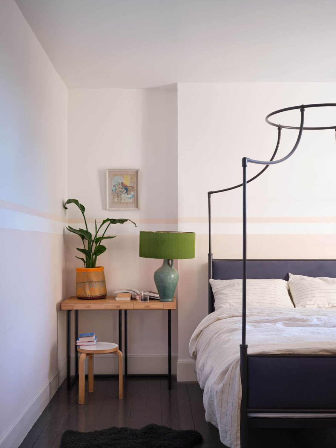
Tailor Tack’s complimentary white shade is Wimborne White. You can also pair it with All White and Skimming Stone. For an all pink look you can combine it with Pink Ground and Setting Plaster.
Templeton Pink
Templeton Pink is a warm historic feeling pink that was designed to use in the dining room at Templeton House to offset the magnificent Wedgwood plaques made to commemorate the former owner.
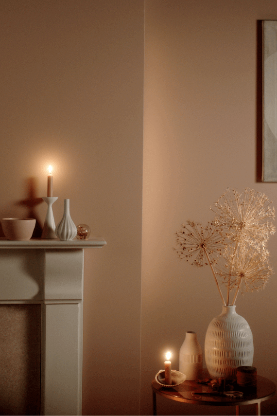
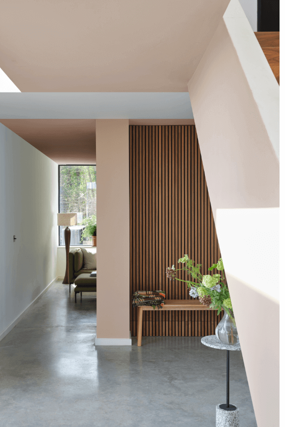
Despite the historic feeling it also works very well in a modern setting as it is a deeper version of Setting Plaster or Pink Ground. With Templeton Pink you can create a warm space, especially in low light when the color gets even deeper.
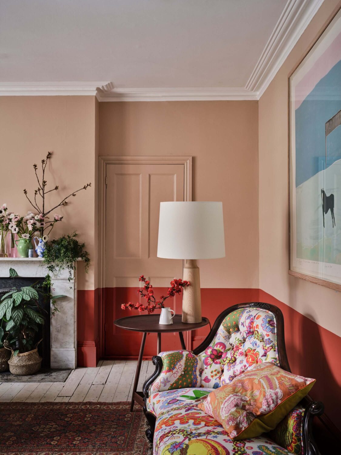
Templeton Pink’s complimentary white is Stirabout. For a lighter neutral look you can combine it with Pointing, Dead Salmon, or Pink Ground. For a stronger look you can combine Templeton Pink with Green Smoke and Terre D’Egypte or as you can see in the image above with the new color Bamboozle.
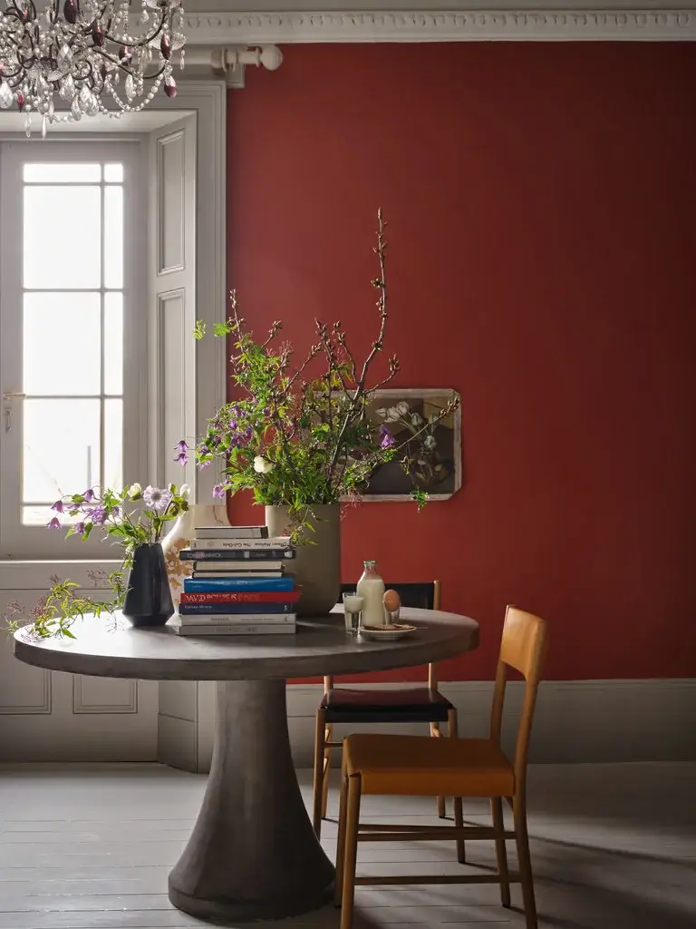
Bamboozle
Bamboozle is a spirited red whose name was originally used to describe the deceit of pirates. The color brings warmth and joy to any room and it can be used in traditional and modern homes.
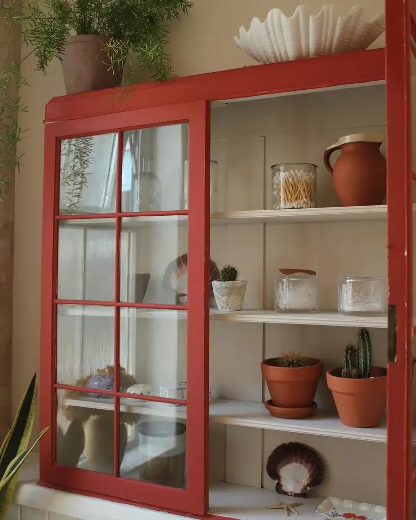
Bamboozle’s complimentary white shade is Slipper Satin. To make Bamboozle the strong accent color you can combine it with Bone, Lime White, or Whirlybird. But you can also pair it with other strong colors like Beverly, Hague Blue, and Wine Dark
Hopper Head
Hopper Head is a classic charcoal color that sits between Railings and Down Pipe. The color is inspired by the attractively designed iron containers used to catch rainwater at the top of a downpipe. The color can be used exclusively across walls, woodwork and the ceiling for a dramatic space.
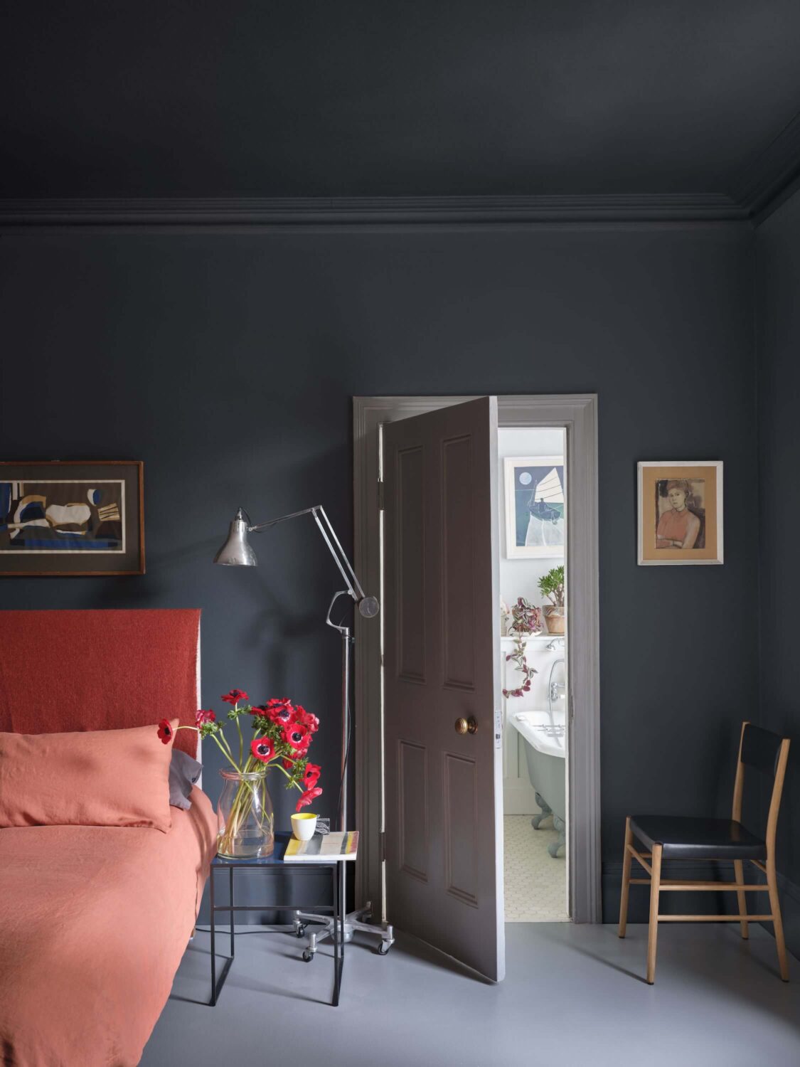
Hopper Head’s complimentary white shade is Blackened. For a softer color shade you can pair it with Sulking Room Pink but can also pair it with gray tones like Plummett and Pavilion Gray or you can go even darker and pair it with Pitch Black and Wine Dark.
Selvedge
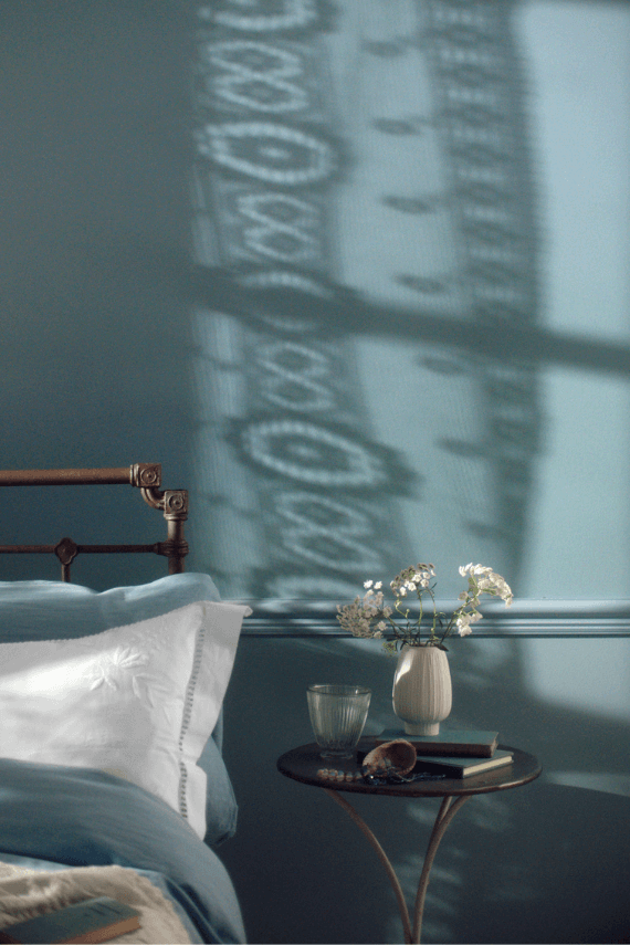
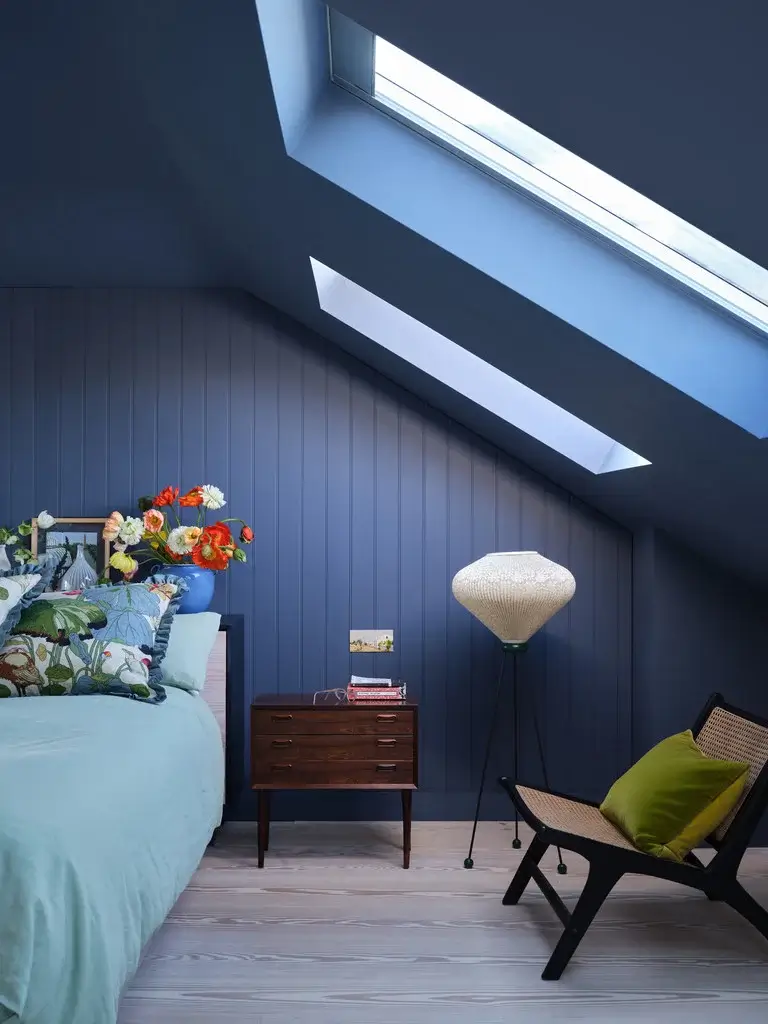
Selvedge is a lighter and less gray version of Farrow and Ball’s De Nimes. The color is named after the highly prized denim woven on a shuttle loom to produce closed edges. The color creates a familiar and friendly atmosphere especially in low light spaces. It is therefor perfect for a bedroom or a room that’s often used in the evening.
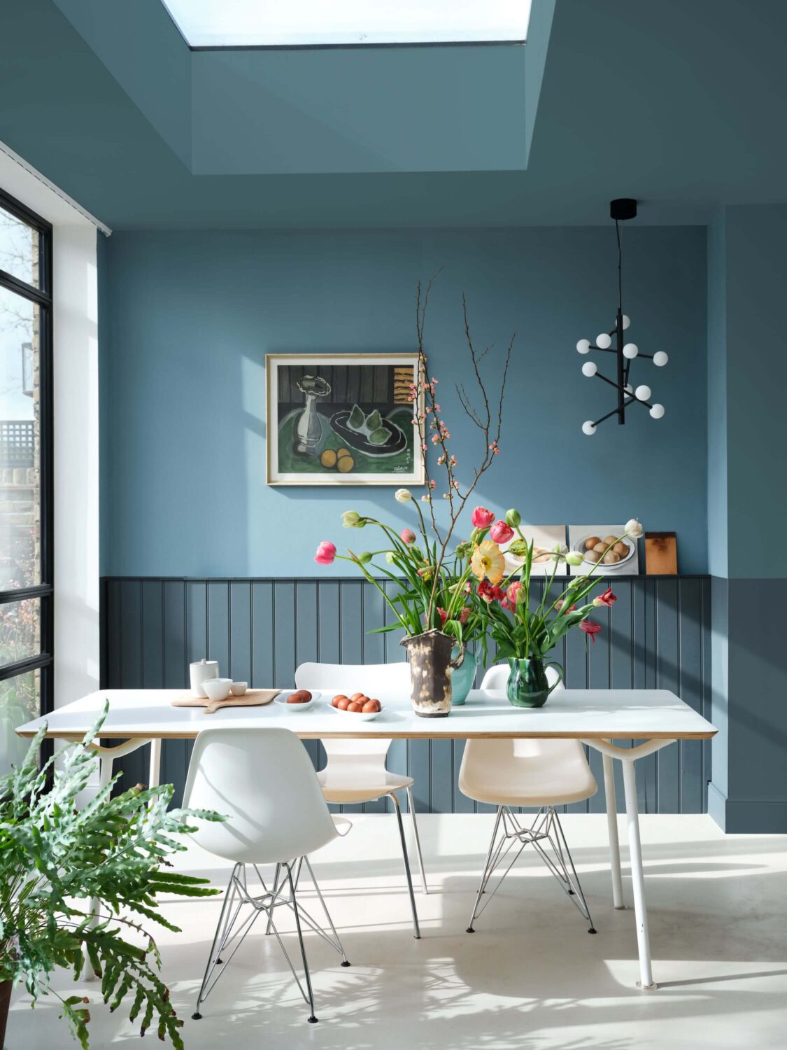
Selvedge’s complimentary white shade is Shadow White. You can pair Selvedge with neutral shades like School House White and Worsted. For a bolder look you can pair it with Inchyra Blue and De Nimes.
Kittiwake
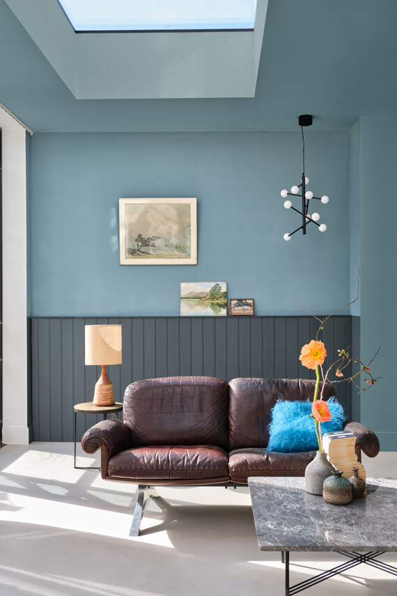
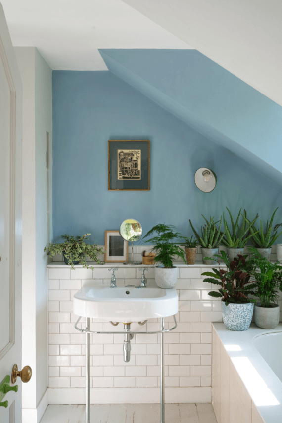
Kittiwake is a cool blue shade that is inspired by the wings of seabirds when seen in bright sunlight. It has a black pigment which creates a warmer and more relaxed feeling. This blue shade stays truly blue in all lights and it also pairs well with stainless steel, making it an ideal shade for the kitchen.
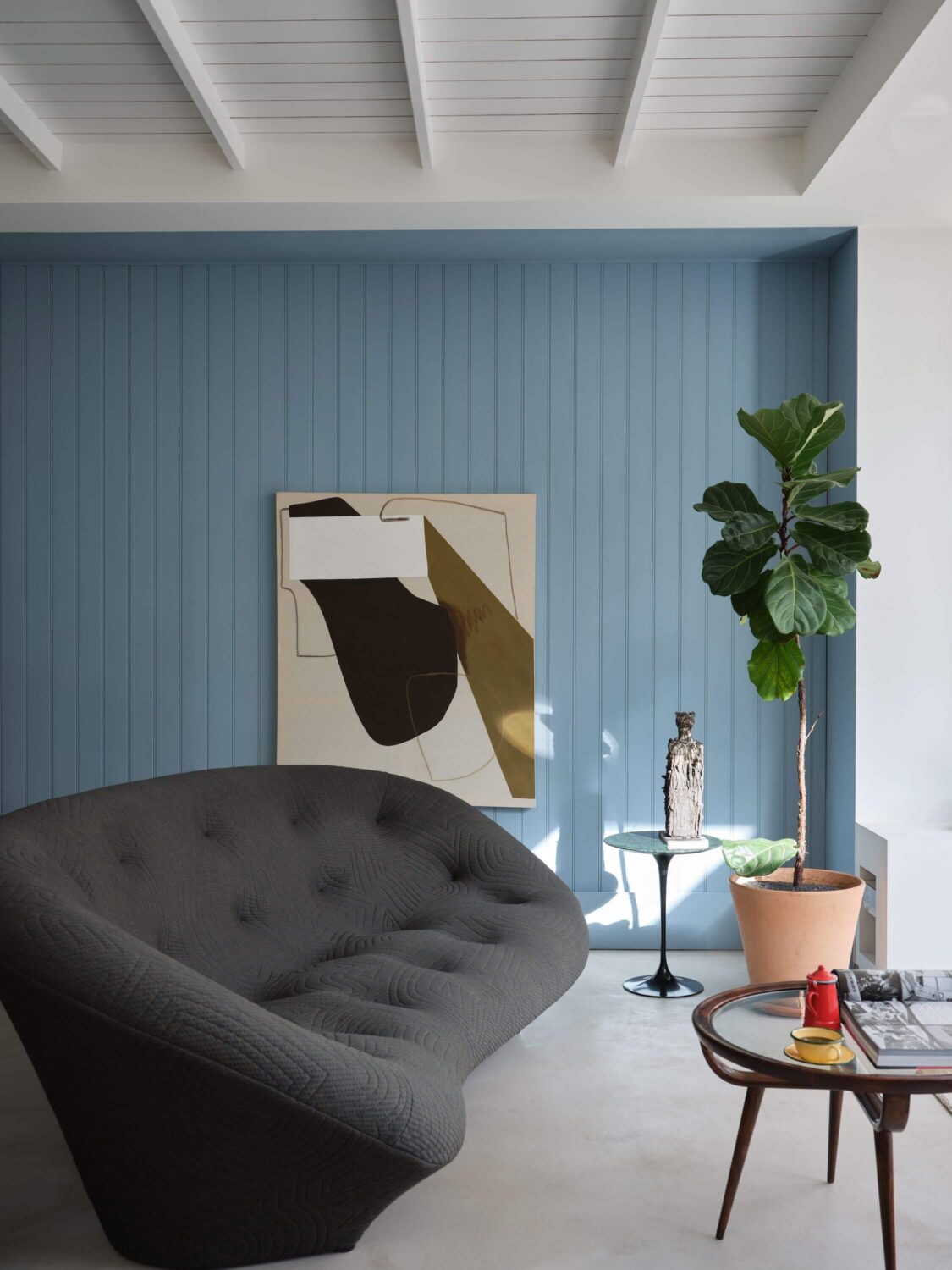
Kittiwake’s complimentary white shade is Strong White. It can also be paired with another neutral shade like Blackened. To add a warm touch you can pair it with Sulking Room Pink and Calamine. But when you want to stay in a colder color palette you can pair it with Cornforth White and Wine Dark.
Wine Dark
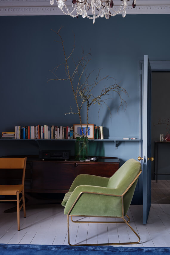
Wine Dark is a rich dark blue that is inspired by midnight skies. The color is named after the term Homer used to describe the sea. Wine Dark is Farrow and Ball’s richest blue, t is more sophisticated than Stiffkey Blue and more upbeat than Hague Blue.
With Wine Dark you can create intimate spaces as the color gets even richer in low light.
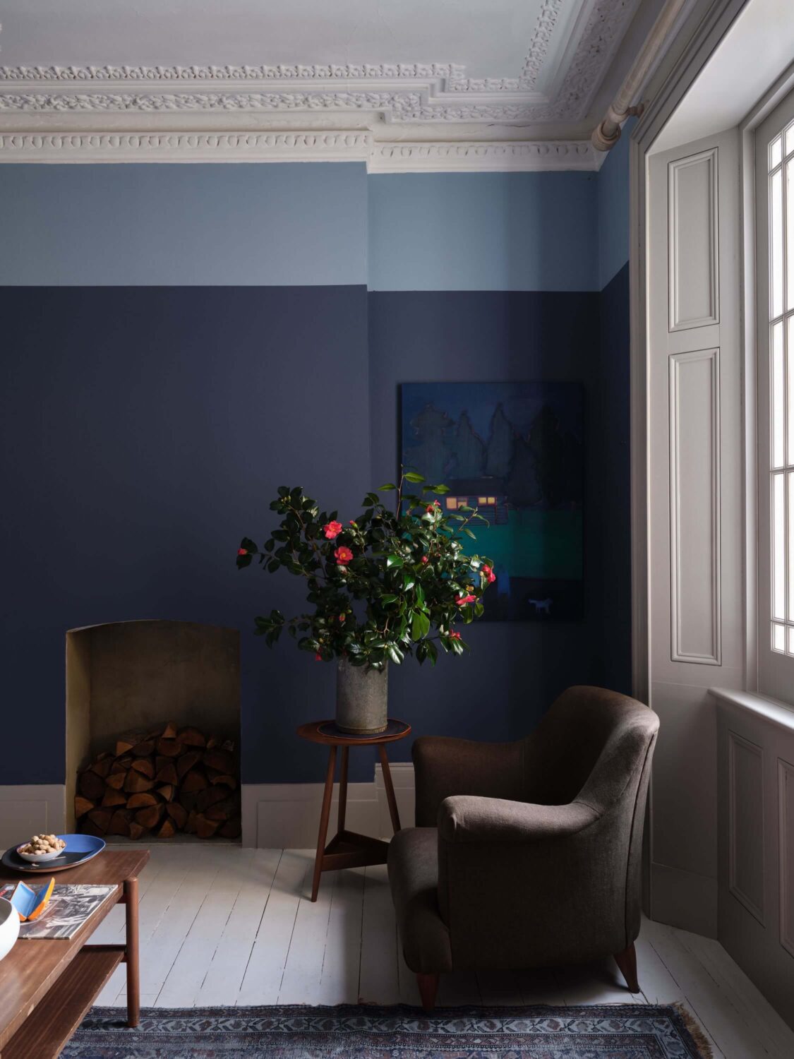
Wine Dark’s complimentary white shade is Ammonite. You can pair it with lighter tones as Wevet, Worsted, and Cornforth White. Or you can create a strong look by pairing it with a dark gray like Railings or for an all blue look with Lulworth Blue.
Whirlybird
Whirlybird is a lively green shade that creates an upbeat look to any space. Whirlybird is a lighter version of Breakfast Room Green and it is inspired by the papery winged seeds beloved by many playful young gardeners and nature lovers. the color looks especially good in morning light.
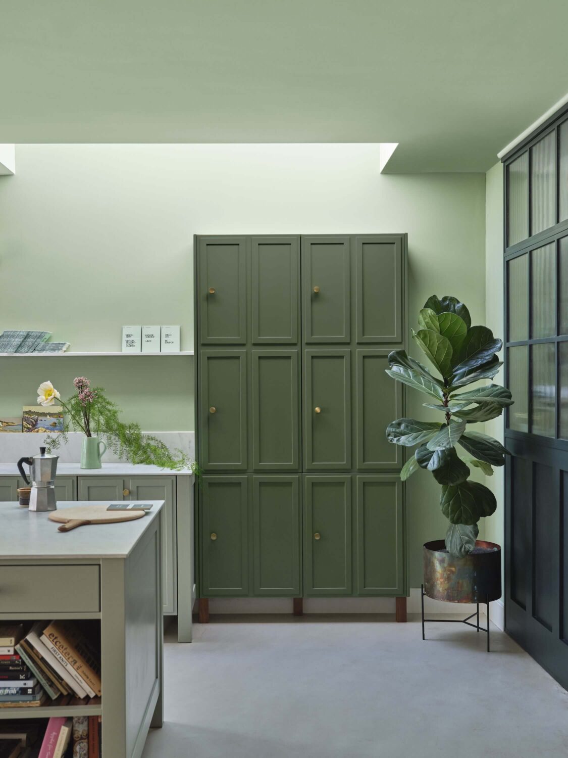
Whirlybird’s complimentary white shade is James White. You can pair the color with white and gray neutrals like All White, Middleton Pink, and Skylight. For more color you can pair it with a blue shade like Oval Room Blue and to create an all green room you can pair it with Breakfast Room Green and Beverly.
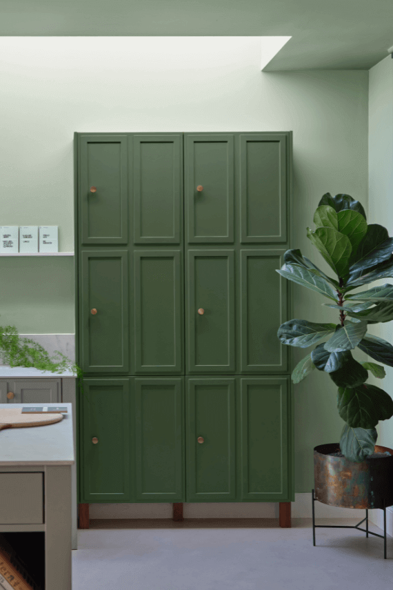
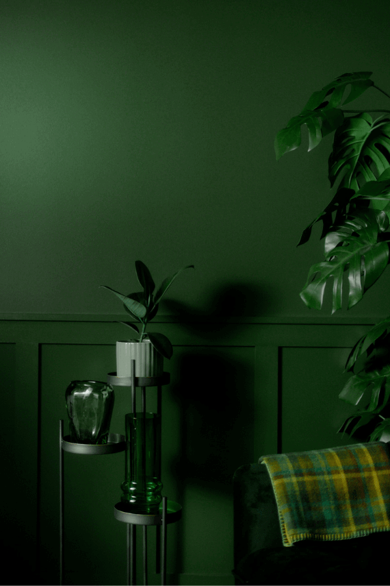
Beverly
Beverly is a clean mid green that is a beautiful addition to any home. The uncomplicated color feels even greener in bright daylight and more conservative in lower light.
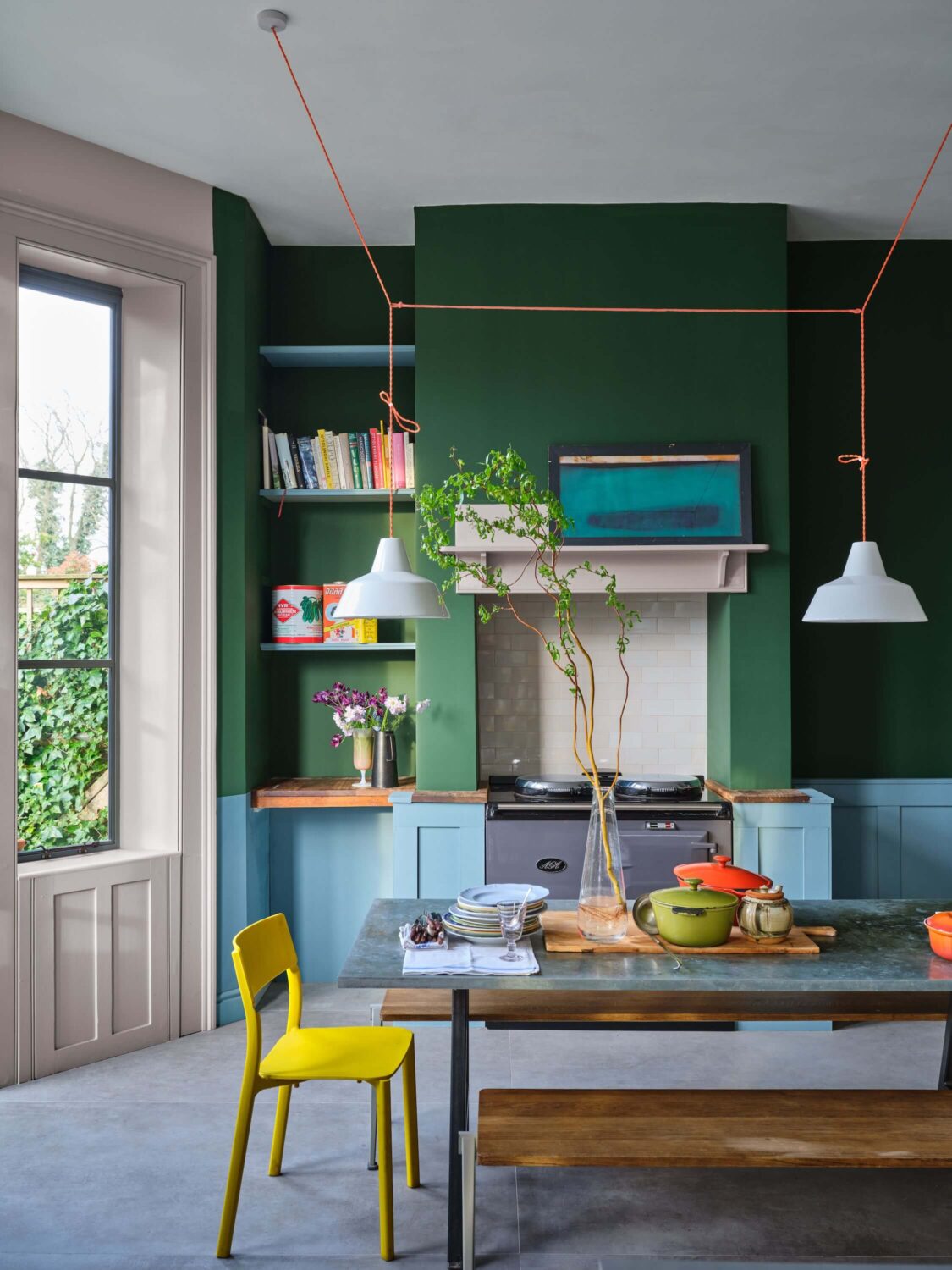
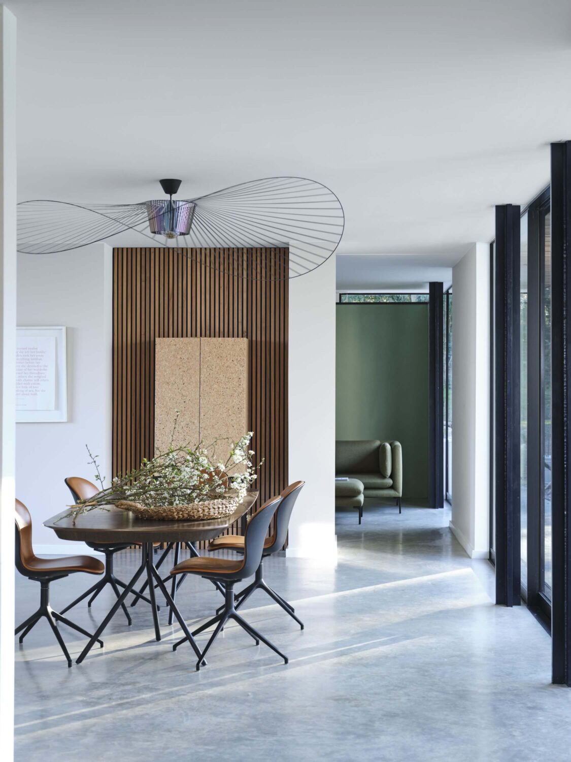
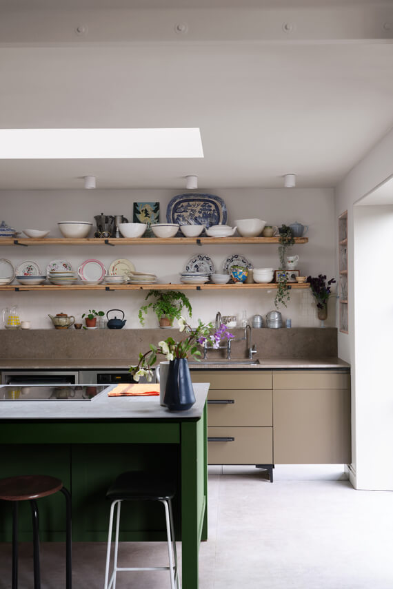
Beverly’s complimentary white shade is Shaded White. To make it stand out you can combine it with neutrals like Drop Cloth, School House White, and Stirabout. For an all green look you can pair it with Calke Green or go bolder and pair it with Selvedge as you can see in the image above.
