C2 Color of the Year 2026: Epernay
As we step into 2026, design takes a reflective turn, looking back to move forward. This year, C2 Paint invites us to honor the legacies that shape how we live today by choosing a beautiful Color of the Year 2026.
From the intricate details of architectural ornamentation to the enduring allure of natural materials, artistry, ritual, and craftsmanship return to the forefront. It’s a season for design that nourishes the soul, rich with depth, purpose, and beauty.

C2’s Color of the Year 2026: A Return to Heritage, Craft, and Soulful Design
At the heart of this movement is C2’s Epernay, the 2026 Color of the Year. A refined, earthy soft ochre with hushed mineral undertones, Epernay feels both rediscovered and eternal. Timeless, grounded, and inherently elegant, it embodies a desire for interiors that are as meaningful as they are beautiful.
Named after the French village celebrated for its rolling vineyards and sunlit limestone architecture, Epernay channels the warmth of golden stone, the muted richness of vintage textiles, and the celebratory sparkle of champagne. It is at once opulent and understated, a color that brings a sense of quiet luxury to any space.
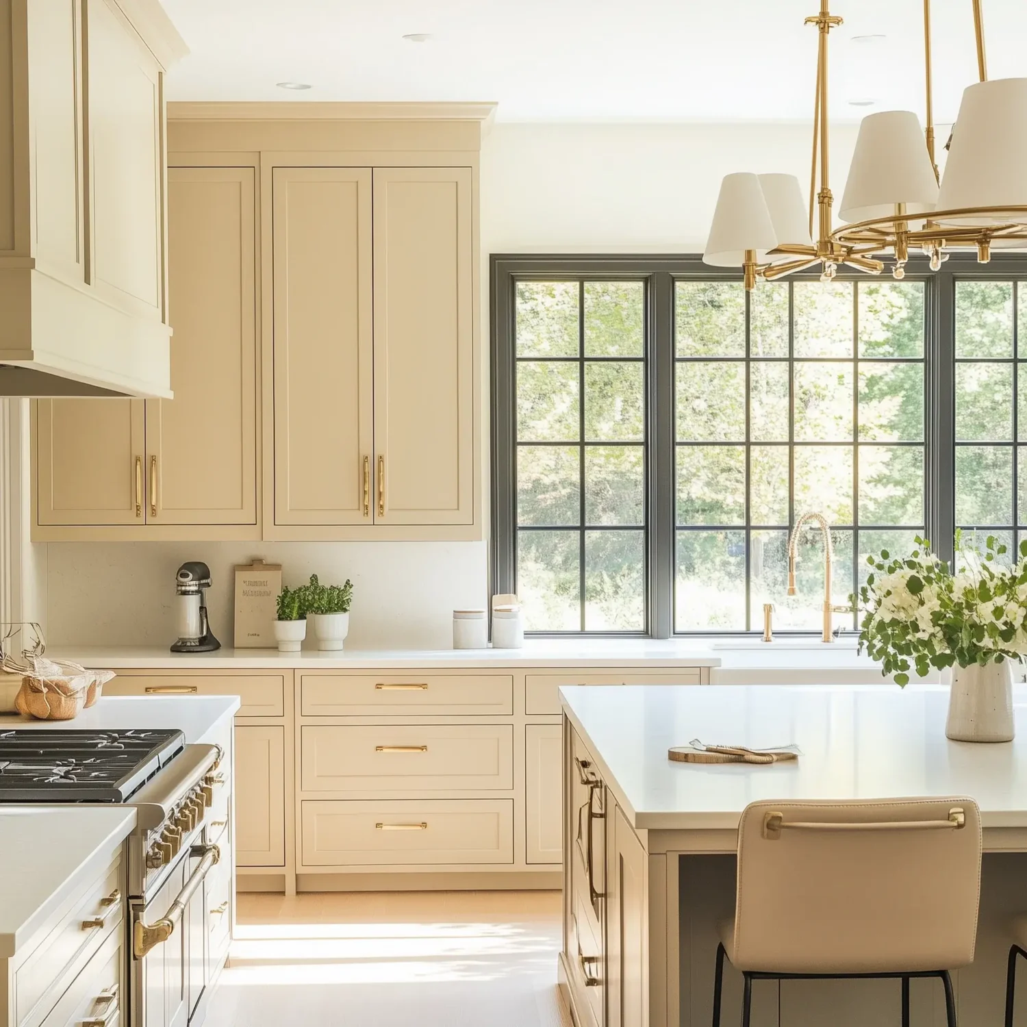
Historically celebrated across Europe during the Beaux-Arts and Neoclassical periods, this pale yet sophisticated yellow once graced grand salons and intimate parlors alike.
Admired for its warmth, versatility, and connection to the natural world, it provided a luminous backdrop for art, conversation, and everyday life.
Today, C2 Epernay reemerges as a modern classic. Its quiet sophistication recalls life’s essential luxuries: the tactile surface of a handmade bowl, the hand-carved lines of ornamental millwork, and the grounding presence of nature.
Whether layered in a contemporary loft or accenting a historic home, Epernay infuses spaces with an enduring elegance that feels both familiar and fresh.
“Color helps us tell our stories without words. As a brand built on quality and craftsmanship, we sense a collective craving to rediscover beauty in everyday moments and surround ourselves with meaningful color that brings depth to our homes and lives.
We are thrilled to have designer Barry Dixon as part of our 2026 En Terre palette; his penchant for color, attention to detail, and appreciation of the natural world authentically align with our brand.” – Tia Clarida, C2’s Marketing Director
C2’s 2026 En Terre Color Palette
C2’s En Terre 2026 color palette celebrates nature as mentor and muse. Inspired by the lived-in tones of generational gardens, weathered facades, and natural fibers warmed by sunlight, this collection reflects a growing desire to reconnect with design details that are rooted and meaningful.

spearmint – blueberry – snow sky
Each shade reinterprets timeless elements through a modern lens, an homage to heritage, craftsmanship, and the subtle stories embedded in everyday spaces.
Featuring selections from Barry Dixon’s “The Naturals” Palette, En Terre honors the beauty of the handmade and the imperfect: colors that feel as though they’ve been passed down through time, softened by touch and memory.
Together, they create a grounded yet uplifting aesthetic that speaks to the human need for connection in a world that moves too fast.
Epernay
Epernay evokes the serene charm of the French countryside, where delicate champagne hues dance in the sunlight and warm stone walls absorb the golden glow of dusk. This refined color, with subtle, balanced undertones, brings an air of understated elegance.
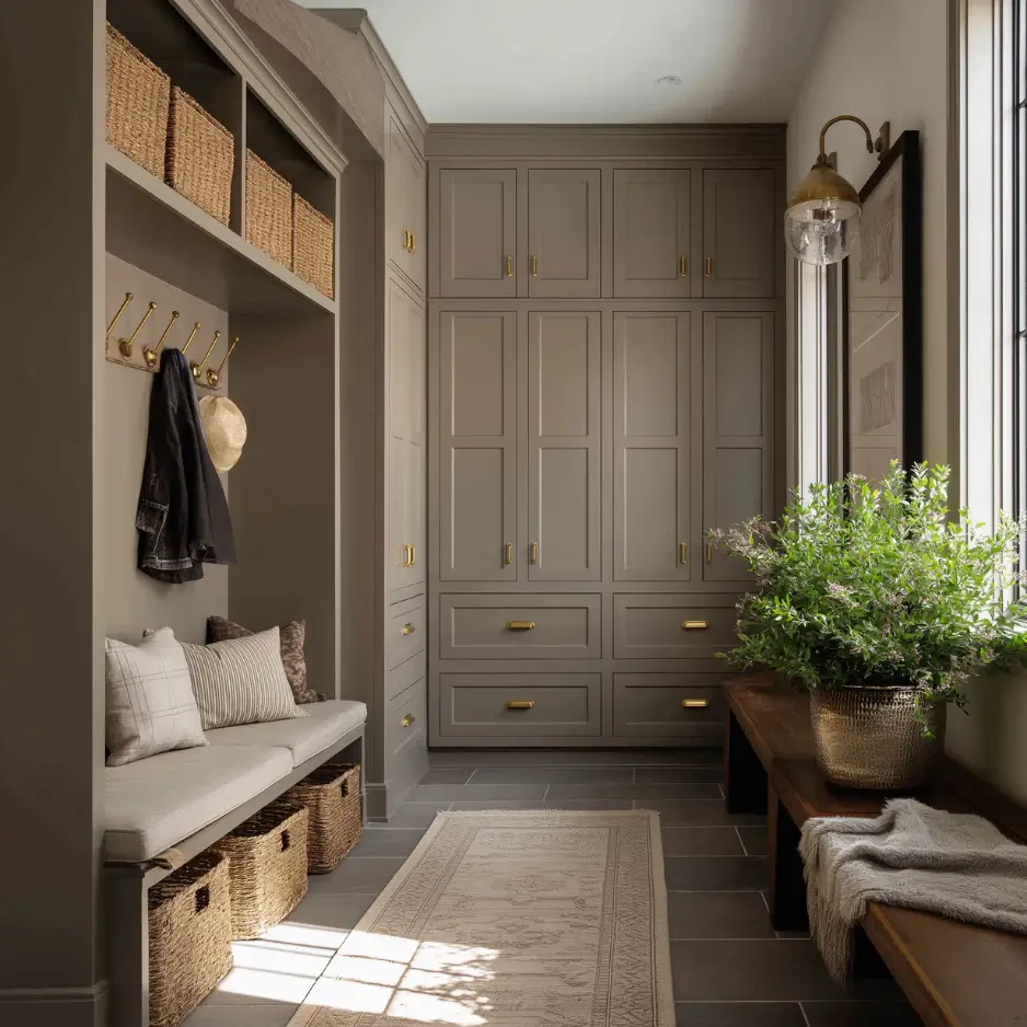
Parador
Parador blends the richness of weathered stone with the softness of earthen clay. Softened by olive and mushroom undertones, it’s a warm, sophisticated choice for interiors that call for depth without darkness.
Named after the historic Spanish inns known for their rustic elegance and rooted sense of place, Parador exudes heritage and restraint.
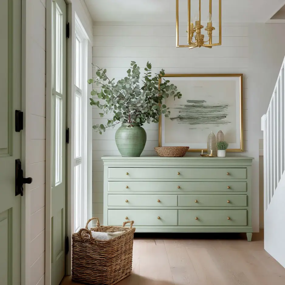
Spearmint
A soft, mineral-washed green that lives between mint and sage; it’s fresh without feeling sugary. Hushed gray undertones keep it calm and sophisticated, while just enough clarity lifts a room like a cool breeze.
In warm light, it leans a touch sage and cozy; in cooler or north light, it reads cleaner and fresher.
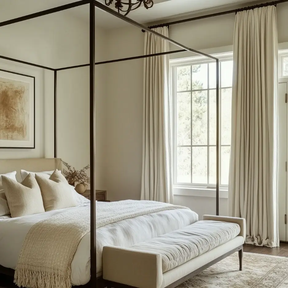
Potato Leek
A soft, herbal-toned neutral with quiet complexity. With a whisper of green and a velvety beige base, it’s both fresh and grounded, blending the subtle beauty of organic ingredients and simple pleasures. Elegant yet understated, it offers spaces a warm, restorative feel.
Blueberry
A cultivated, inky blue with blackcurrant depth; it reads velvet-rich under lamplight and brings tailored drama to paneling, doors, and bookcases.
Snow Sky
A porcelain off-white with a whisper of sky; it’s an elegant field color for walls and ceilings and a calming companion for trim.
How to Use C2’s Epernay in Your Home
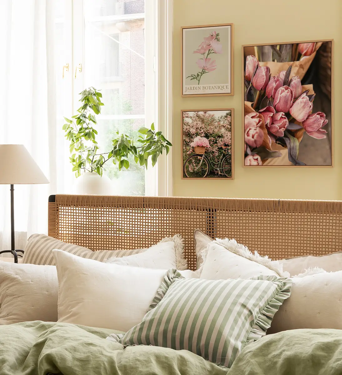
Whether paired with deep charcoals and mineral greens for dramatic contrast, or layered with creams, linens, and warm woods for a softer effect, C2 Epernay invites designers and homeowners alike to embrace the elegance of the past while creating spaces that feel beautifully present.
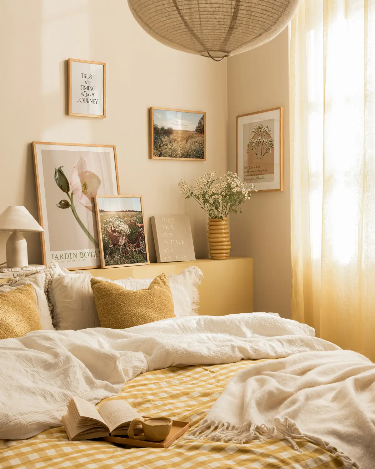
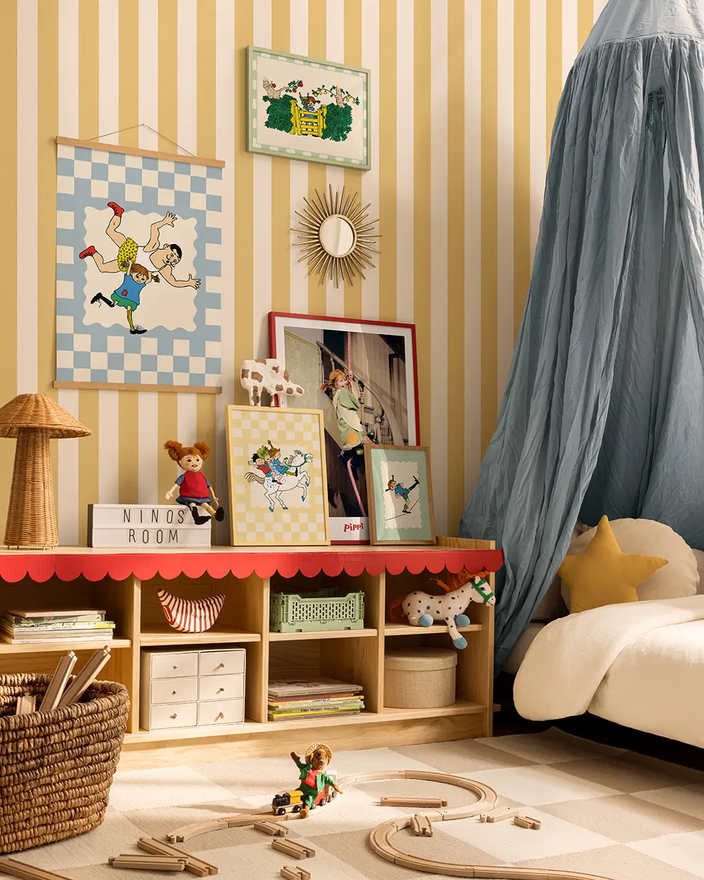
Use two shades of yellow to create a charming striped pattern in a children’s room.
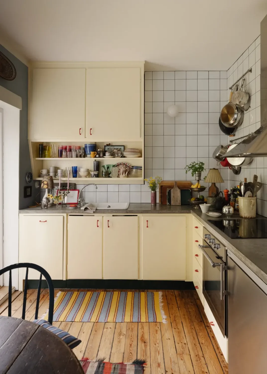
The beautiful light ochre shade Epernay is the perfect color for kitchen cabinets in every style, from midcentury to modern designs. The kitchen above pairs it with a poured concrete countertop and a warm wooden floor.

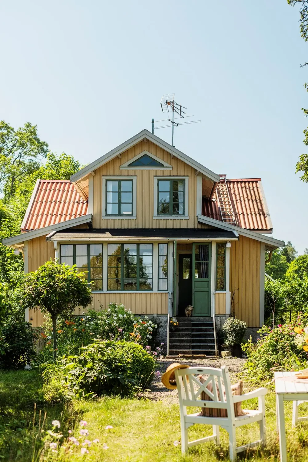
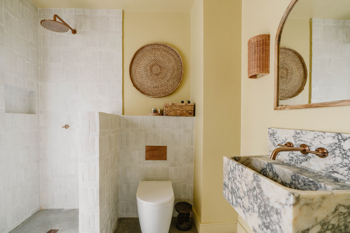
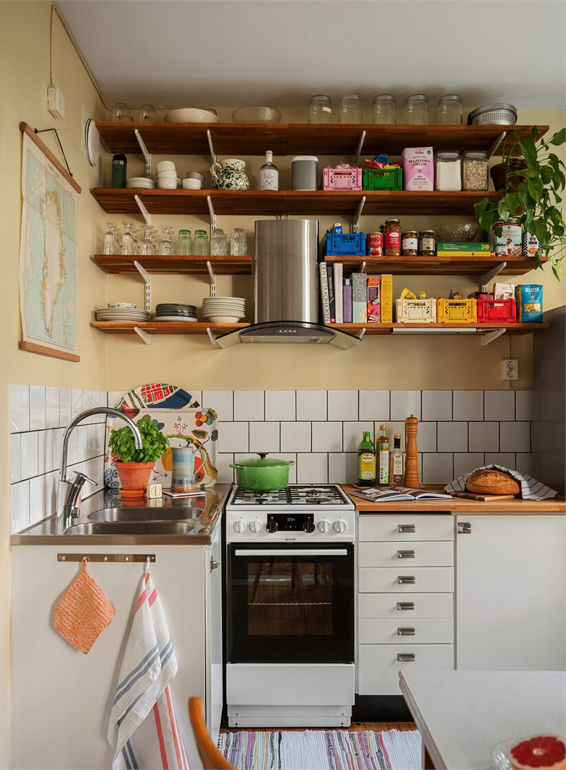
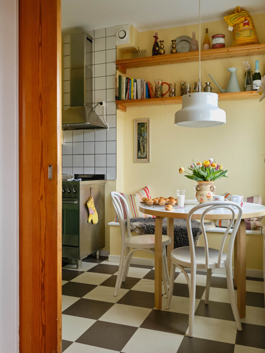

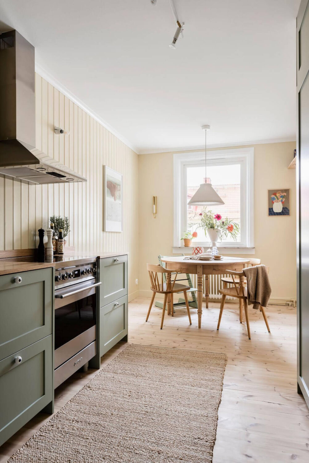
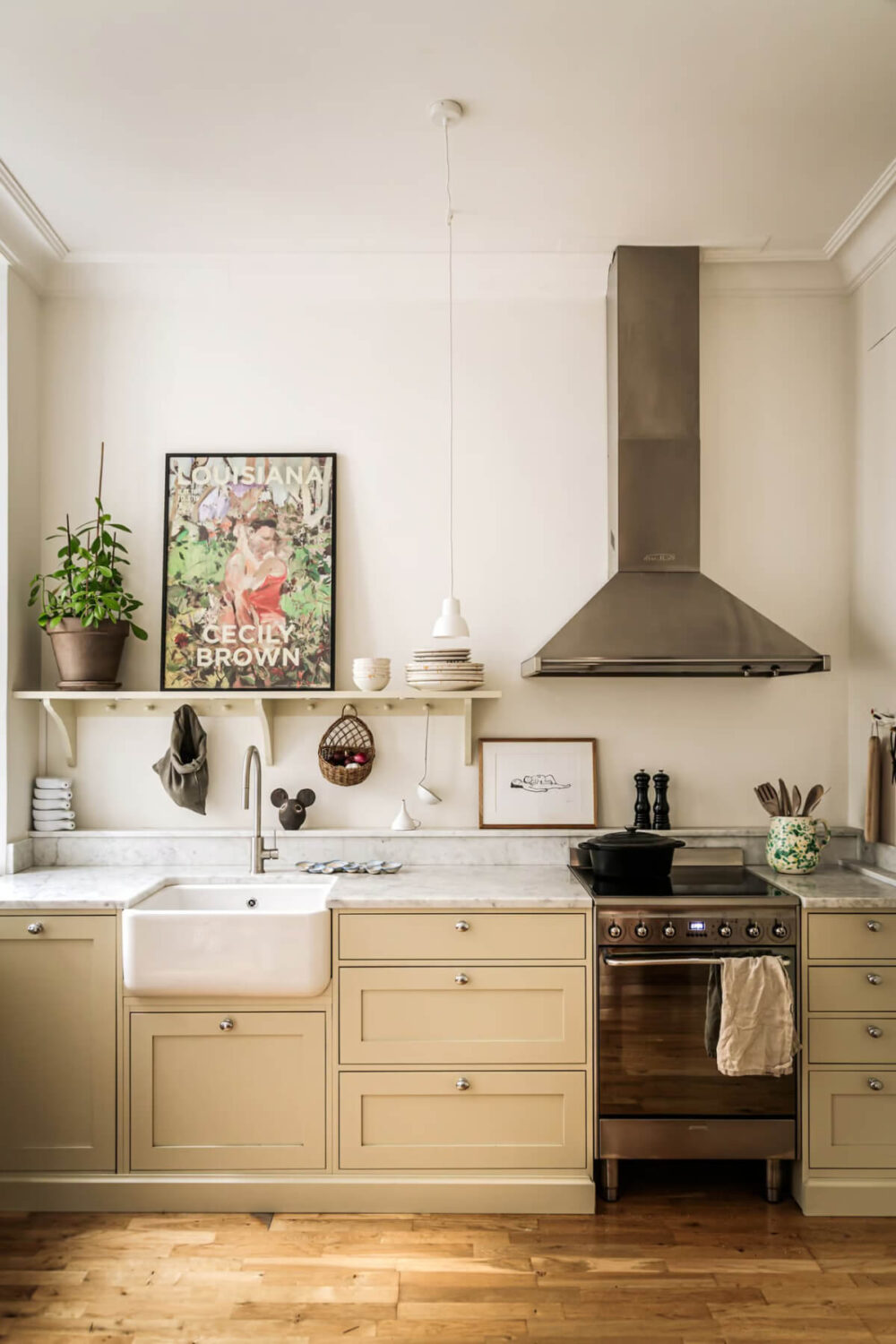
In 2026, design is not just about what we see, but what we feel. C2 Epernay captures this ethos perfectly, a hue that honors craftsmanship, celebrates natural beauty, and offers a timeless foundation for modern living.
As we continue to seek balance, meaning, and beauty in our surroundings, Epernay reminds us that the most enduring design is the one that feeds the soul.
