Home Decor Color Trends 2022: Natural Hues with Bright Pops
What are the color trends for 2022? In this post you will read all about the home decor colors trends for 2022 and every color of the year 2022 picks from the major paint companies.
When you want to spruce up your interior, a nice lick of paint can do wonders. And these paint color trends 2022 will give you fresh color inspiration that you need to give your interior a new look.
Home decor color trends 2022
The trend I’m seeing in these color of the year 2022 choices, is that we’re craving for a new beginning with deep and vibrant color tones. But also that we’re looking for soothing and familiar shades, like green tones, to make our home a comfortable haven.
This post will show a collection of the leading paint brands 2022 color of the year picks. But also the color forecast for 2022 that are released by paint companies such as Farrow & Ball, Dulux, Benjamin Moore and many more. And that means double interior color trends for 2022.
See also: Interior Design Trends 2022: Styles, Decor & Color
What is the color of the year 2022?
Now that every paint company released their 2022 Color of the Year, we can see a clear trend in the home decor colors of 2022. Every color of the year 2022 is either a green or a blue shade.
Pantone, Behr & Dulux chose a blue 2022 color of the year. With Pantone opting for the most vibrant blue (and almost purple) shade. And Benjamin Moore, Sherwin-Williams and PPG chose a green color of the year 2022.
Most of these shades can be used a neutral colorful base in your interior. But they are also perfect colors for statements walls, kitchens and home decor.
Green and blue are wonderful natural and calming color tones, that can be added in every room of the house. Read on to see how you can incorporate these 2022 Color of the Year picks in your home. And you will find complimenting color palettes for these trending colors of 2022.
See also: Color Trends 2023 – Rich & Warm Natural Hues
Pantone Color of the Year 2022
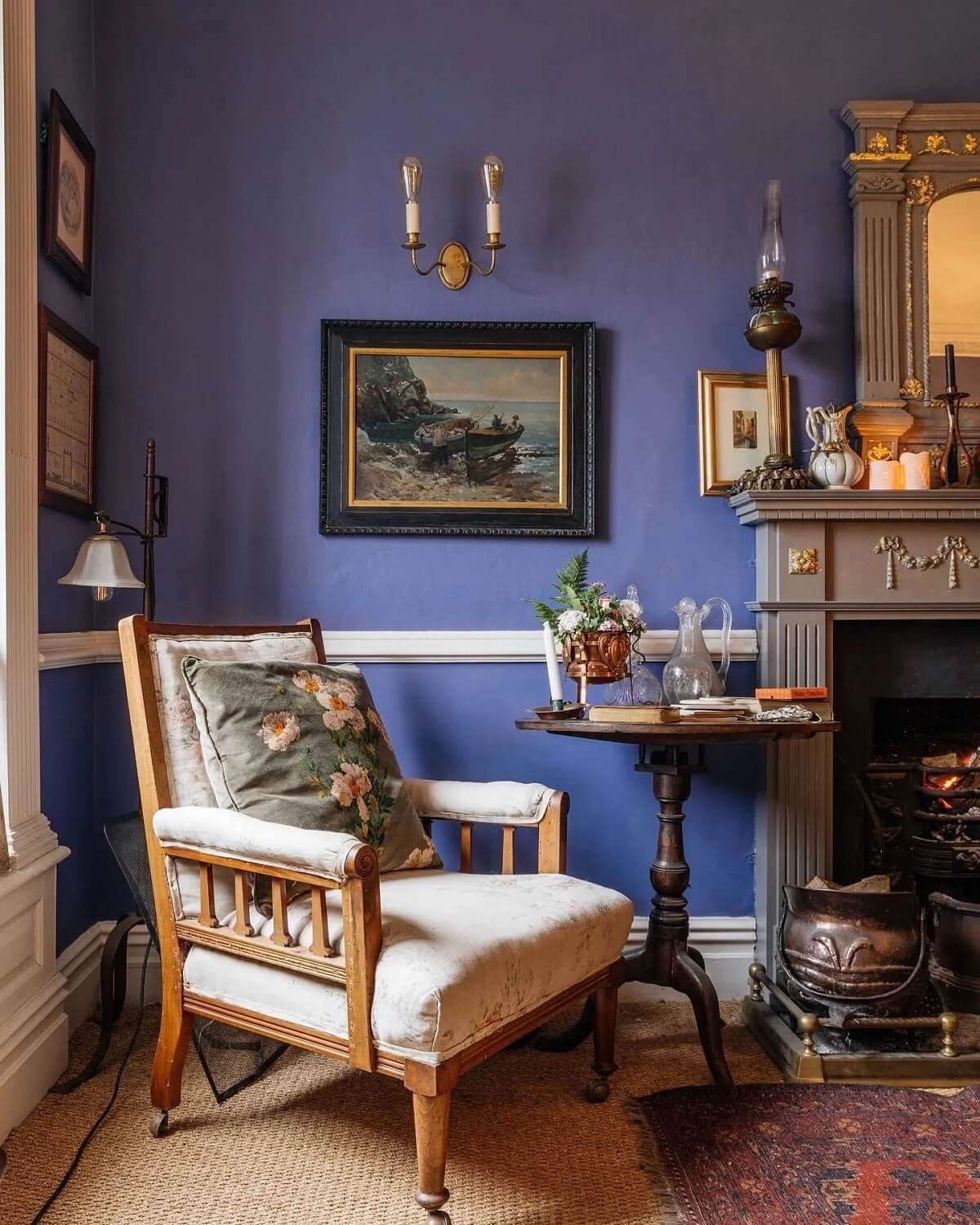
Pantone have chosen Very Peri as their color of the year 2022. Very Peri is a blue shade with violet red undertone. And it is the first time in the Pantone history that they have chosen a new color as their color of the year.
Displaying a carefree confidence and a daring curiosity that animates our creative spirit, inquisitive and intriguing PANTONE Very Peri helps us to embrace this altered landscape of possibilities. Opening us up to a new vision as we rewrite our lives.
Read more: How to style Pantone Color of the Year “Very Peri”
Farrow & Ball Color Trends 2022
Farrow and Ball have chosen five colors as their 2022 color trends. These five trending paint colors are familiar hues that give your home a comforting look.
“There is something inherently human in the colors that we are attracted to for 2022 as well as in the way we use them. They are an eclectic mix of the pure and the humble that evokes the warmth and harmony of a more innocent age while celebrating life today”. – Joa Studholme, Farrow & Ball Colour Curator
Babouche No. 233
This lovely yellow color hue will bring the sunshine into your home. Even though it’s a bright and bold color, it won’t overpower your home. And it is a perfect color for a larger room.
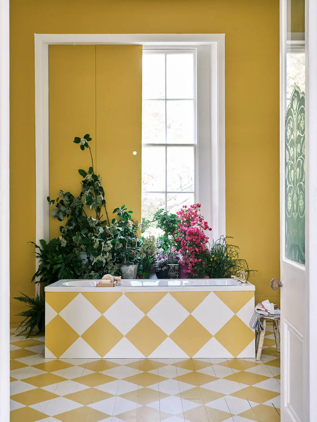
Rooms that feature Babouche appear to be full of sunshine, especially when combined with understated School House White. The palette itself has a simple, folksy feel, but its use across the walls, bath panel and floor creates an overall look that is incredibly striking.
School House White No. 291
There is something so familiar and comforting about a painted floor – this chequerboard pattern in Stone Blue and School House White Modern Eggshell instantly transports you to the past.
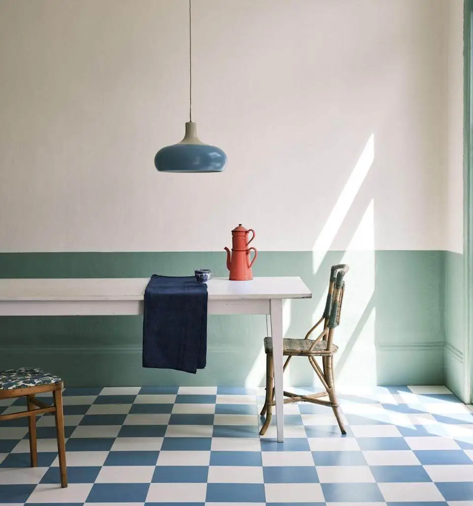
The nostalgia continues with Breakfast Room Green (in washable modern emulsion) on the lower walls, and School House White (in the flatter estate emulsion) on the upper walls and ceiling.
This age-old form of decorating introduces colour just below eye level to retain a light and airy atmosphere above, while also providing durability.
Breakfast Room Green No. 81
Using one colour on both walls and woodwork, such as lively Breakfast Room Green, can make a room look bigger by disguising the limits of the space.
The bold use of this one colour also creates an exceptional background for art, or for furniture which can be upcycled with a lick of Modern Eggshell.
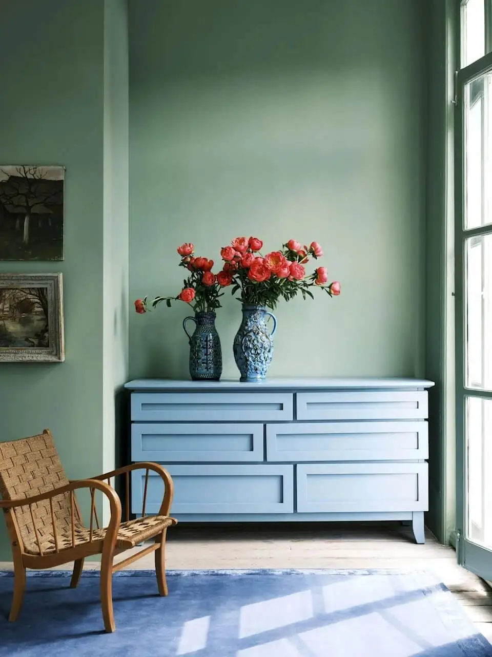
The combination here of Breakfast Room Green and Stone Blue feels both arresting and familiar, while the chalky matt finish of Farrow & Ball’s signature Estate Emulsion on the walls shows these colours at their very best as the light changes through the day.’
Stone Blue No. 86
School House White is a pared back, timeless and familiar color. But it has a subtle sophistication that makes it the perfect foil for stronger hues like the lively tones of Stone Blue. As you an see here on the door in Full Gloss.
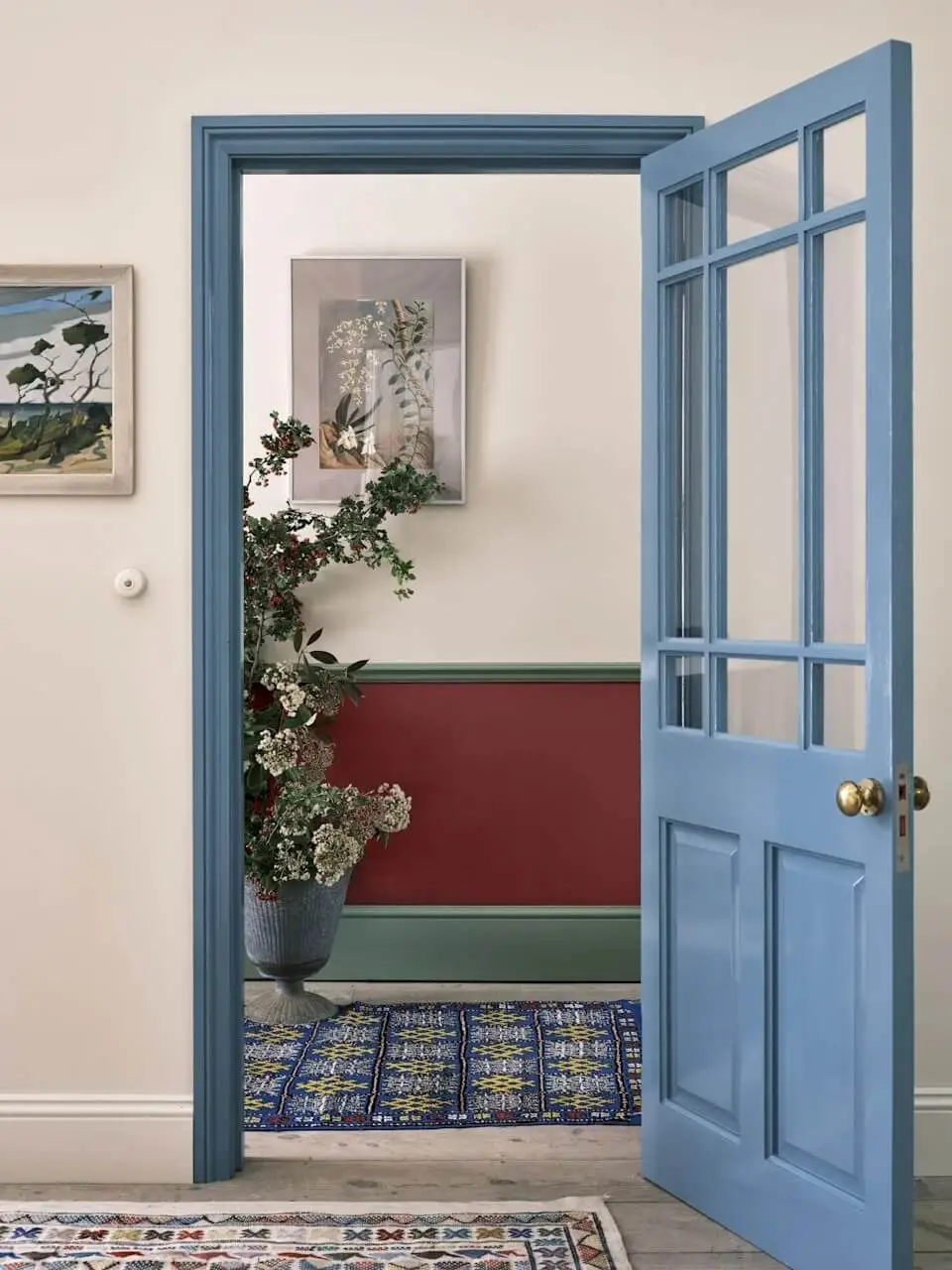
The traditional values of Full Gloss are perfect to use in the home in 2022. They can be introduced sparingly and in surprising ways (perhaps on a door or a kitchen unit) to add a modern feel with a suitably vintage flavour.
The strong classic tones of Incarnadine below the dado rail also introduce some excitement while retaining an element of modesty.
Incarnadine No. 248
‘It is so heartening to see an eclectic mix of styles and colours, chosen not only for pure pleasure but as part of a great decorative hack – in this room, the overall effect is happy and bold.
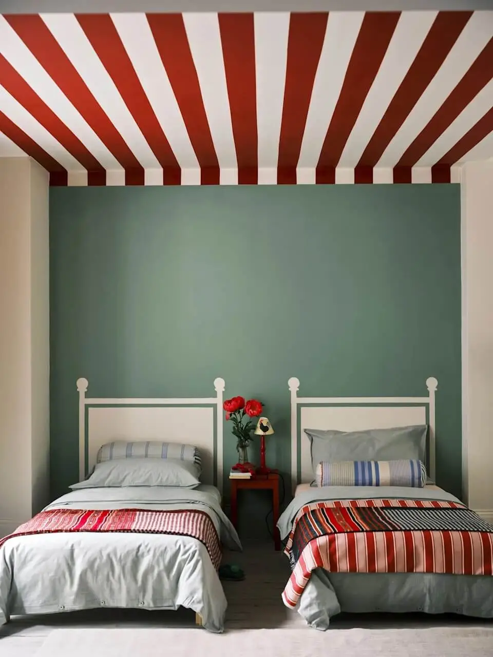
The headboard shapes are painted in School House White. Which are painted directly onto the Breakfast Room Green walls. While bold stripes are on the ceiling in rich, clean Incarnadine.
Very clever is that the ceiling stripes have been brought down onto the walls a short way. This creates an intimate tent-like feel and softens the join between wall and ceiling.
Farrow & Ball has also teamed up with Liberty. For a collection of 15 paint colors with complementary Liberty interior fabrics. Read more about this collection
Benjamin Moore Color of the Year 2022: October Mist
Benjamin Moore has chosen October Mist as their 2022 Color of the Year. The gentle sage hue is a calming and harmonious color which is a perfect base to get creative with color.
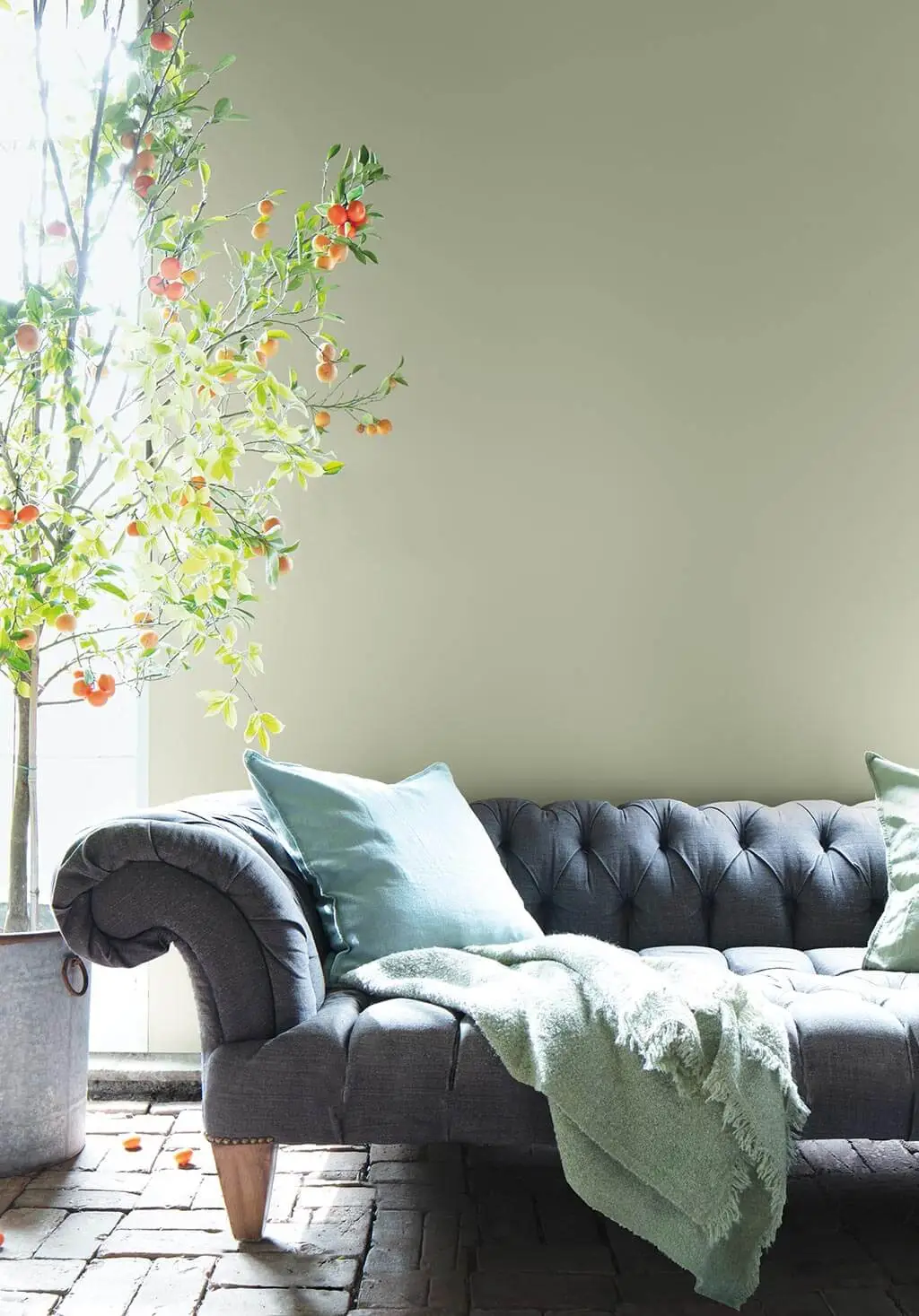
Benjamin Moore Color Trends 2022 Palette
Benjamin Moore’s October Mist is one of 14 hues from Benjamin Moore’s Color Trends 2022 palette. The diverse, but harmonious color palette ranges from primary colors to natural hues. And you can combine these colors in endless ways to create a fresh new home look for 2022.

Drawing from everyday observations, hobbies, personal rituals and cultural influences, the Color Trends 2022 palette features 14 Benjamin Moore colors that encourage experimentation and make room for any design style.
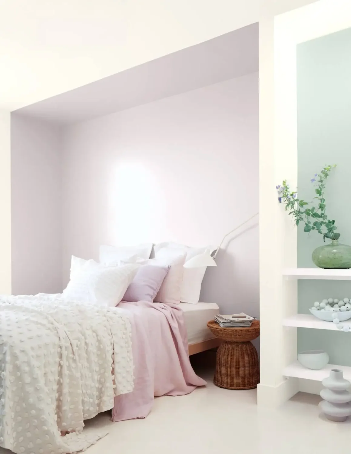
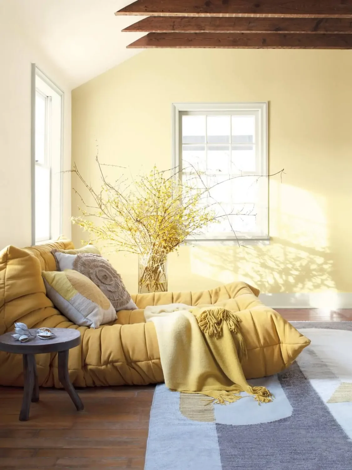
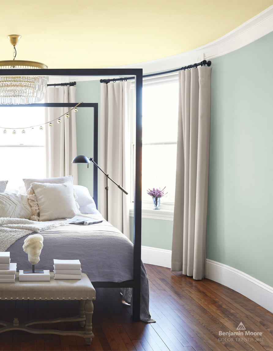
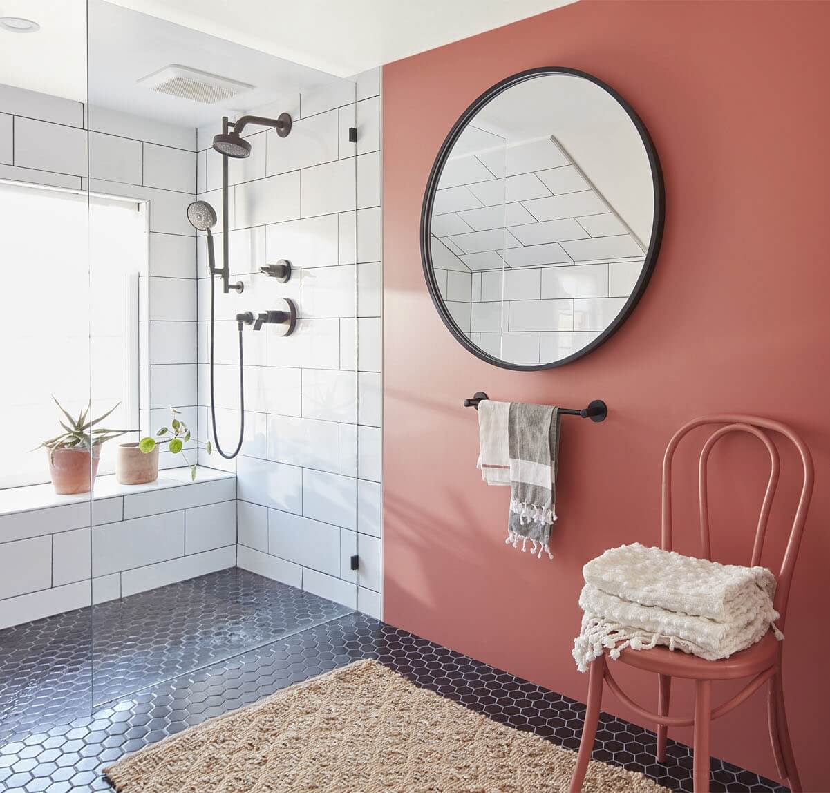
See also: how to decorate your home with October Mist: Benjamin Moore’s sage green color of the year.
Dulux Colour of the Year 2022: Bright Skies
The light blue paint color Bright Skies has been chosen as Dulux Colour of the Year 2022. Dulux asked international design experts wanted to understand the mood of this moment. The themes that came up are: “open skies” and “a breath of fresh air”.
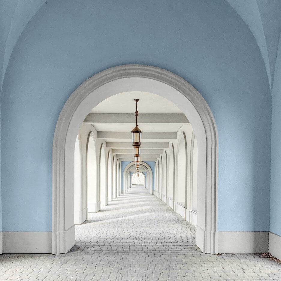
From there, Dulux chose the 2022 Colour of the Year. Bright Skies reflects these current moods and brings a light, fresh note to your home.
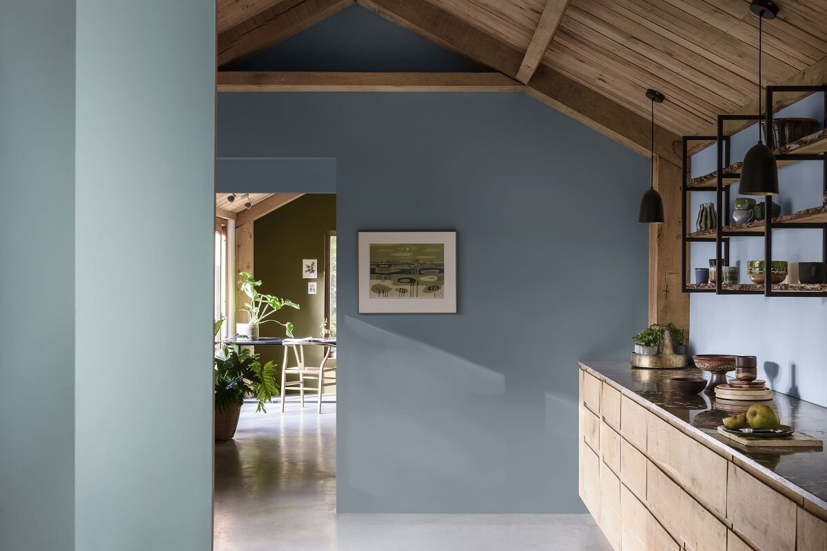
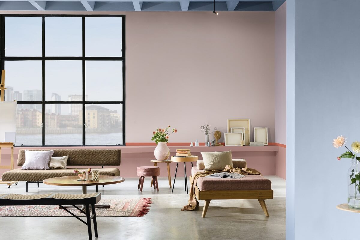
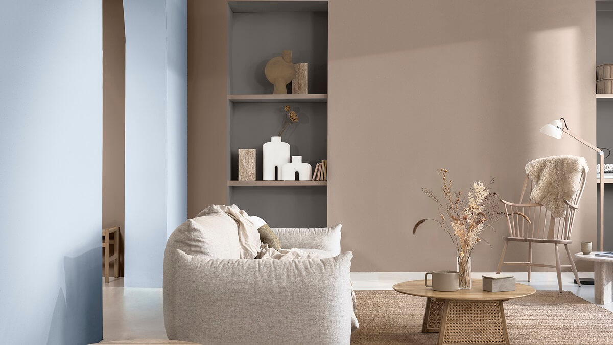
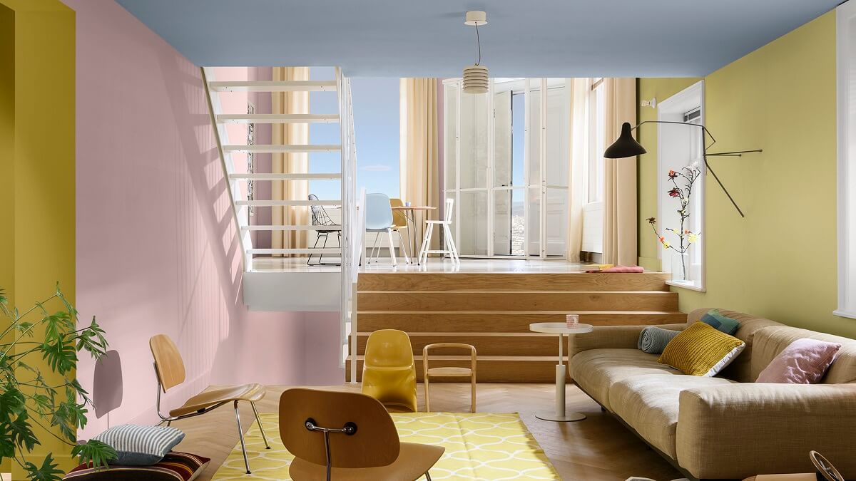
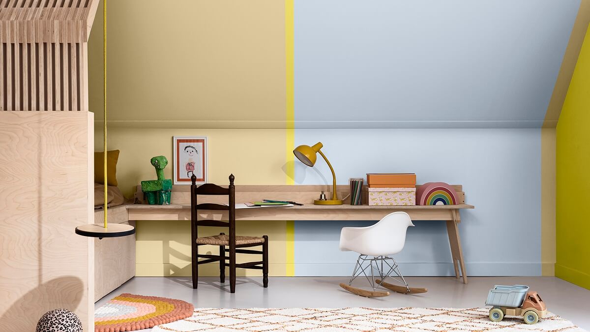
Bright Skies is a light, airy and optimistic blue that’s good for the soul. It promises to open up and revitalise your home. Around it, Dulux have created four easy-to-use colour palettes, so you can refresh your spaces with different colour combinations.
The Greenhouse Color Palette
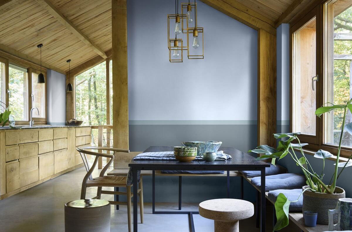
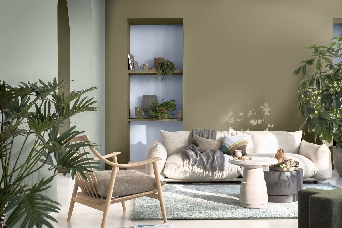

The Studio Colour Palette
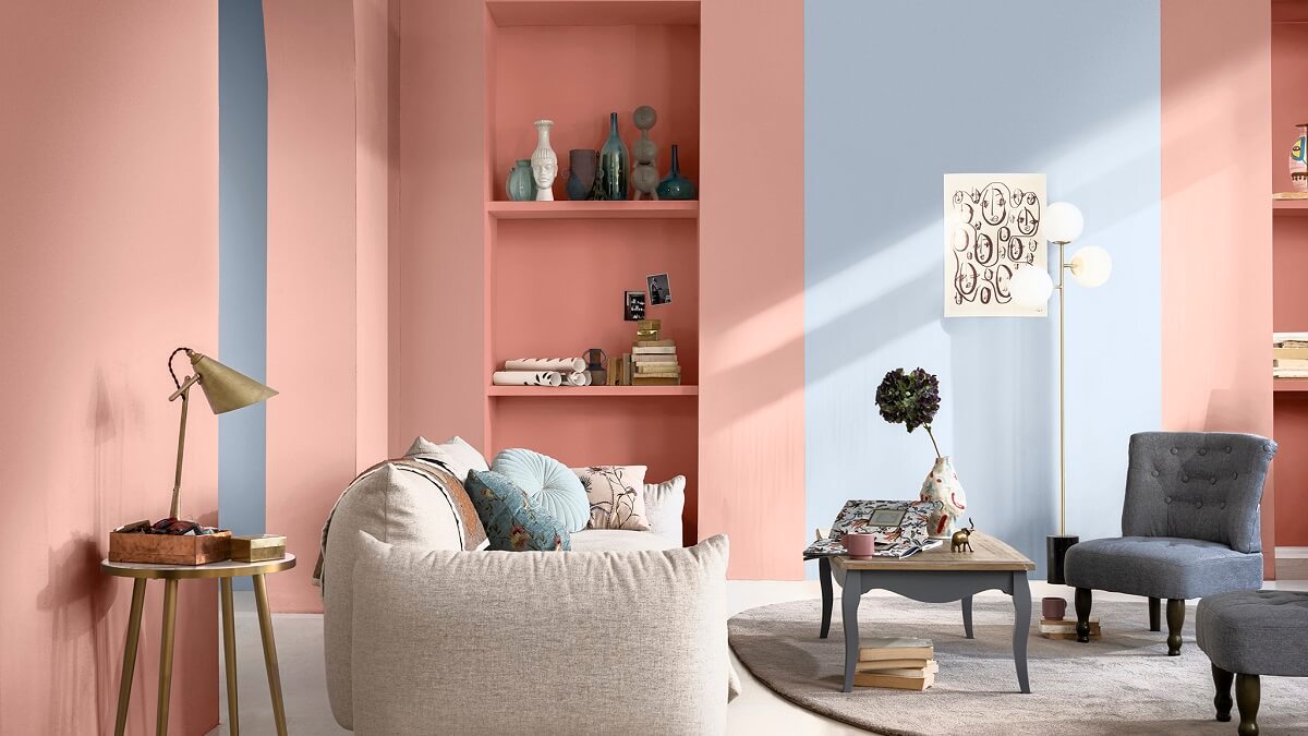

The Salon Colour Palette
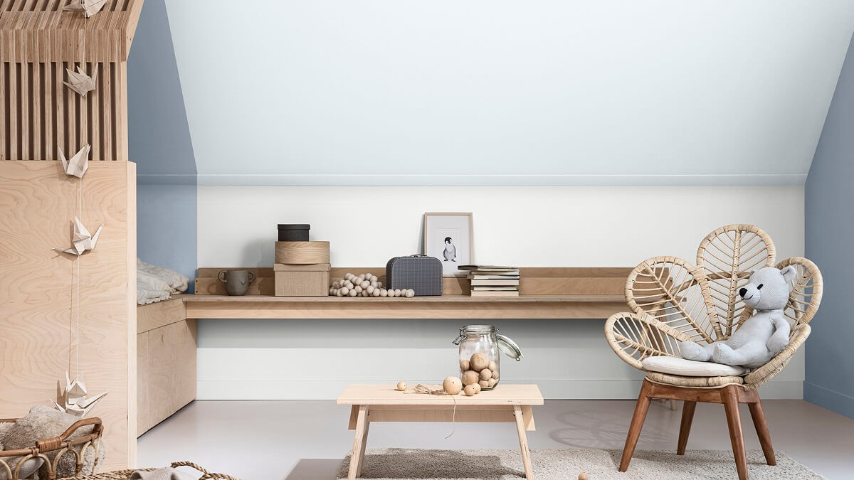

The Workshop Colour Palette

Dulux Color Trends 2022
The Dulux color forecast 2022 consists of three color palettes: Flourish, Restore and Wonder.
Flourish Color Palette
Breaking away from the past brings with it a sense of liberation. Awakening a desire to experience everything life has to offer. The Flourish color palette allows you to be inventive and rewrite design rules. Your interiors can be layered, expressive, and unapologetically individual.
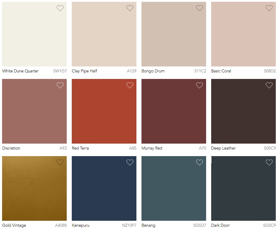
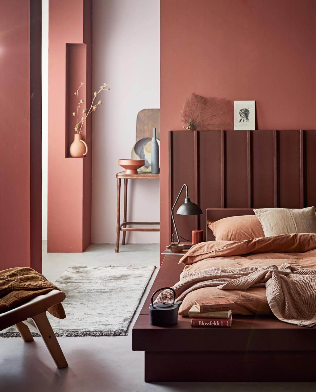
The flourish palette consists of a mix of sensual hues such as petrol blue, desert red and dusty rose alongside warm neutrals and a pop of vintage gold.
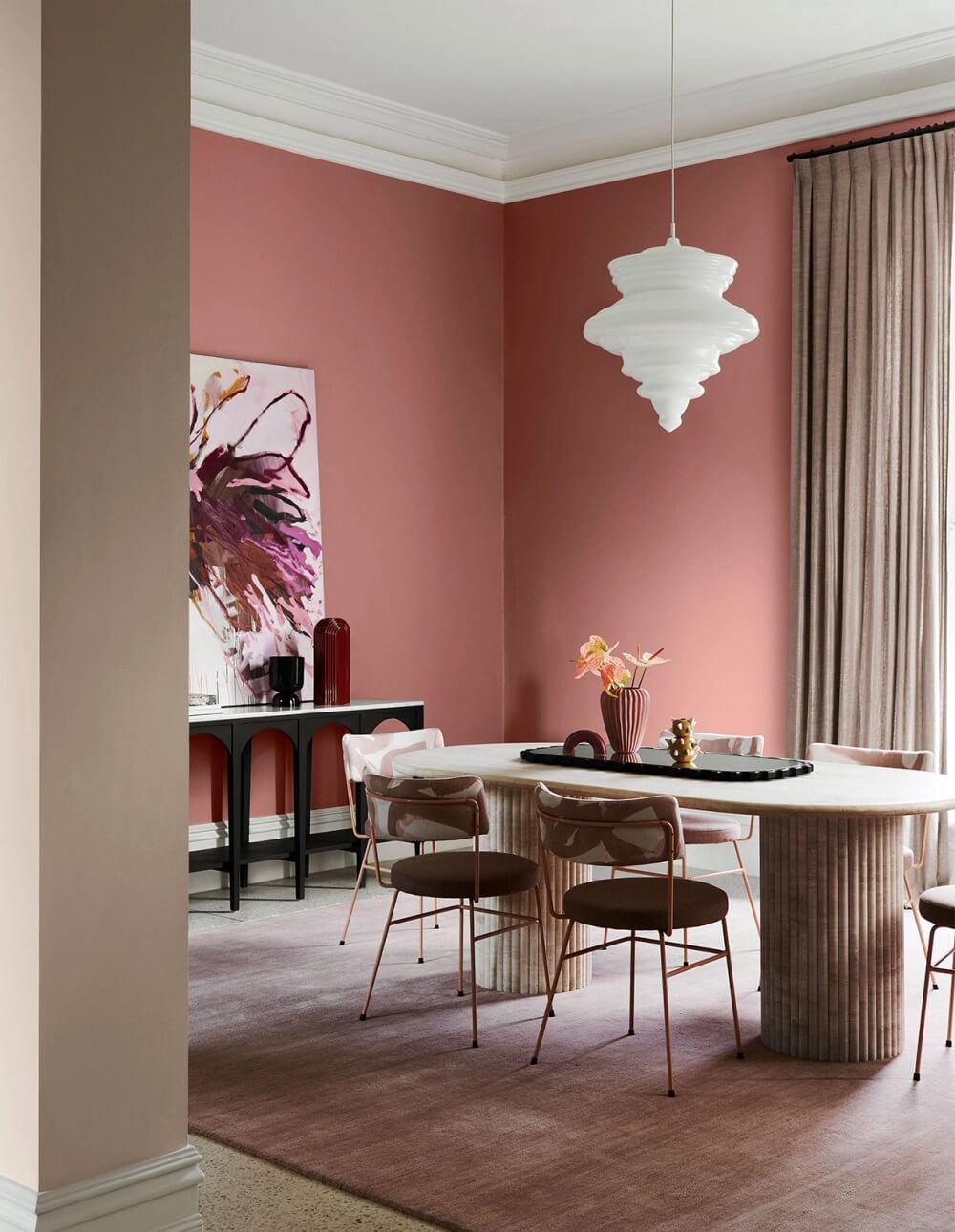
Live more boldly
These colours create a feeling of warmth and intimacy. And remind us of the rich and fascinating traditions found in different cultures around the globe.
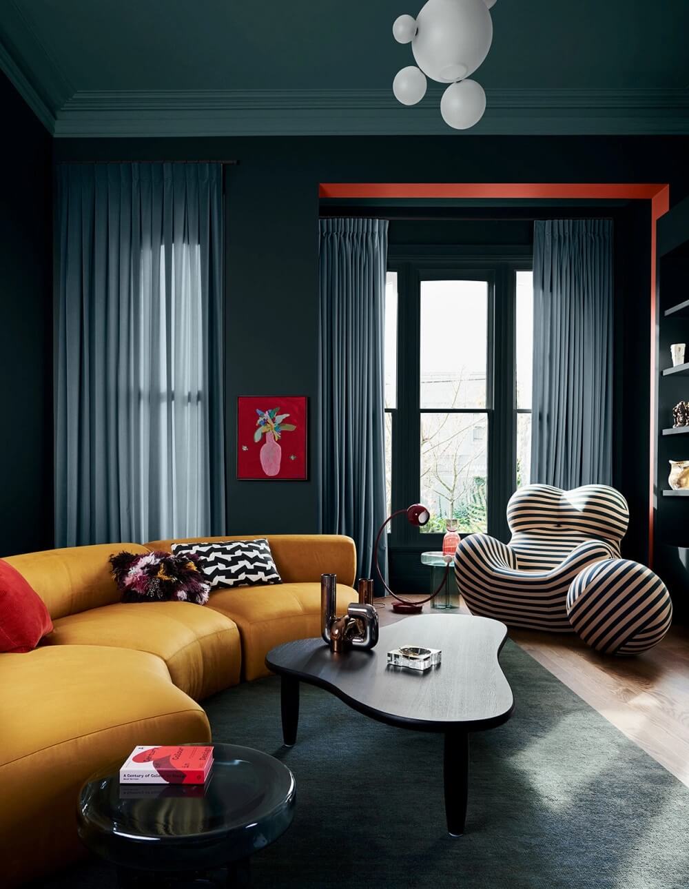
A sense of libaration
Decadent fabrics such as velvet, silk and natural leather can be paired with one-off vintage finds, such as a quirky 1960s lamp or an authentic 1940s mirror.
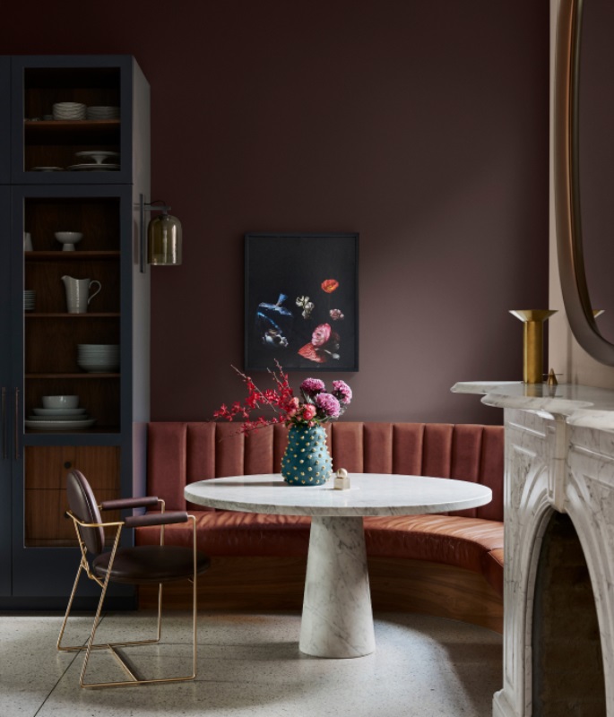
Exaggerated curves in sofas and general seating evokes a ‘70s disco vibe. Additions such as marble and oxidised metallics add a luxurious and modern edge.
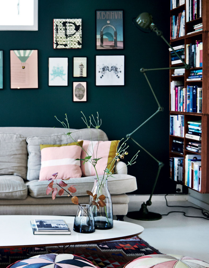
A new adventure awaits
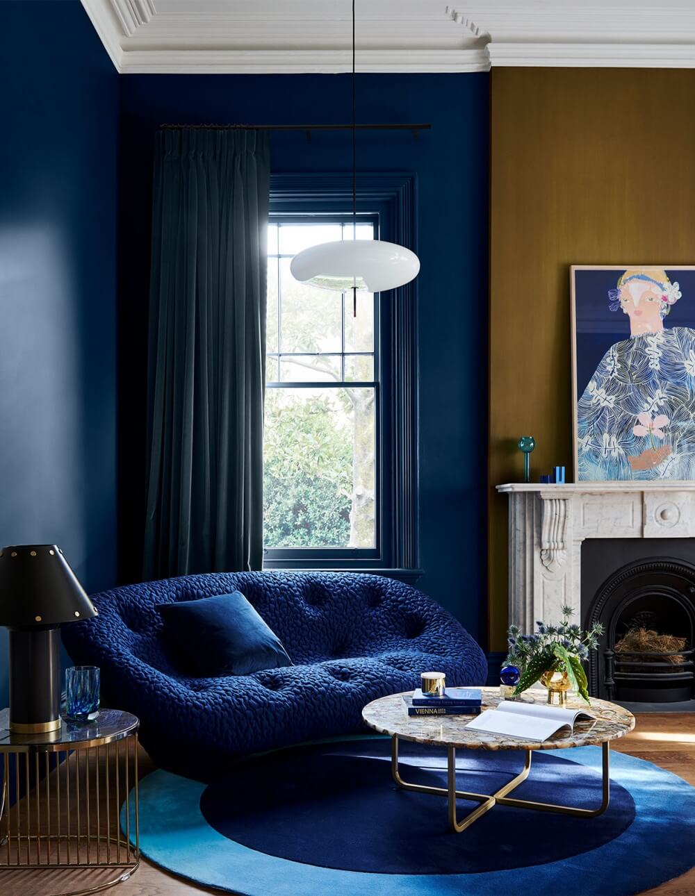
Deep, dark hues combined with bright splashes of colour give this palette a rich and sophisticated feel.
Warm and welcoming
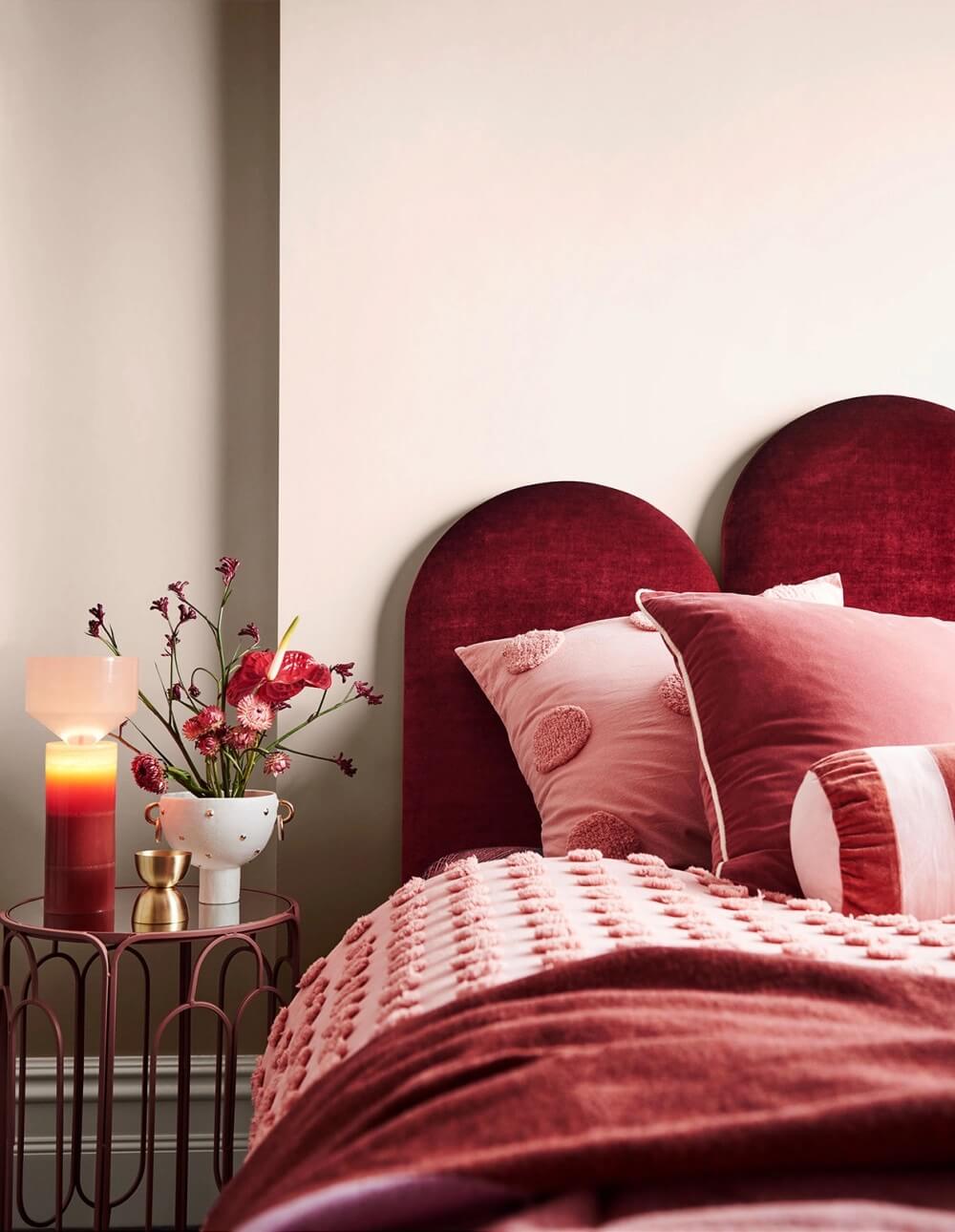
The Flourish palette introduces Dulux Basic Coral, a light, dusty rose colour that gives this bedroom an inviting feel. This warm look is completed with Dulux White Dune Quarter on the ceiling and trims.
Why not use this subtle pink shade in an unusual spot? Below you can see a front door painted in this lovely hue. Giving it a true special look.
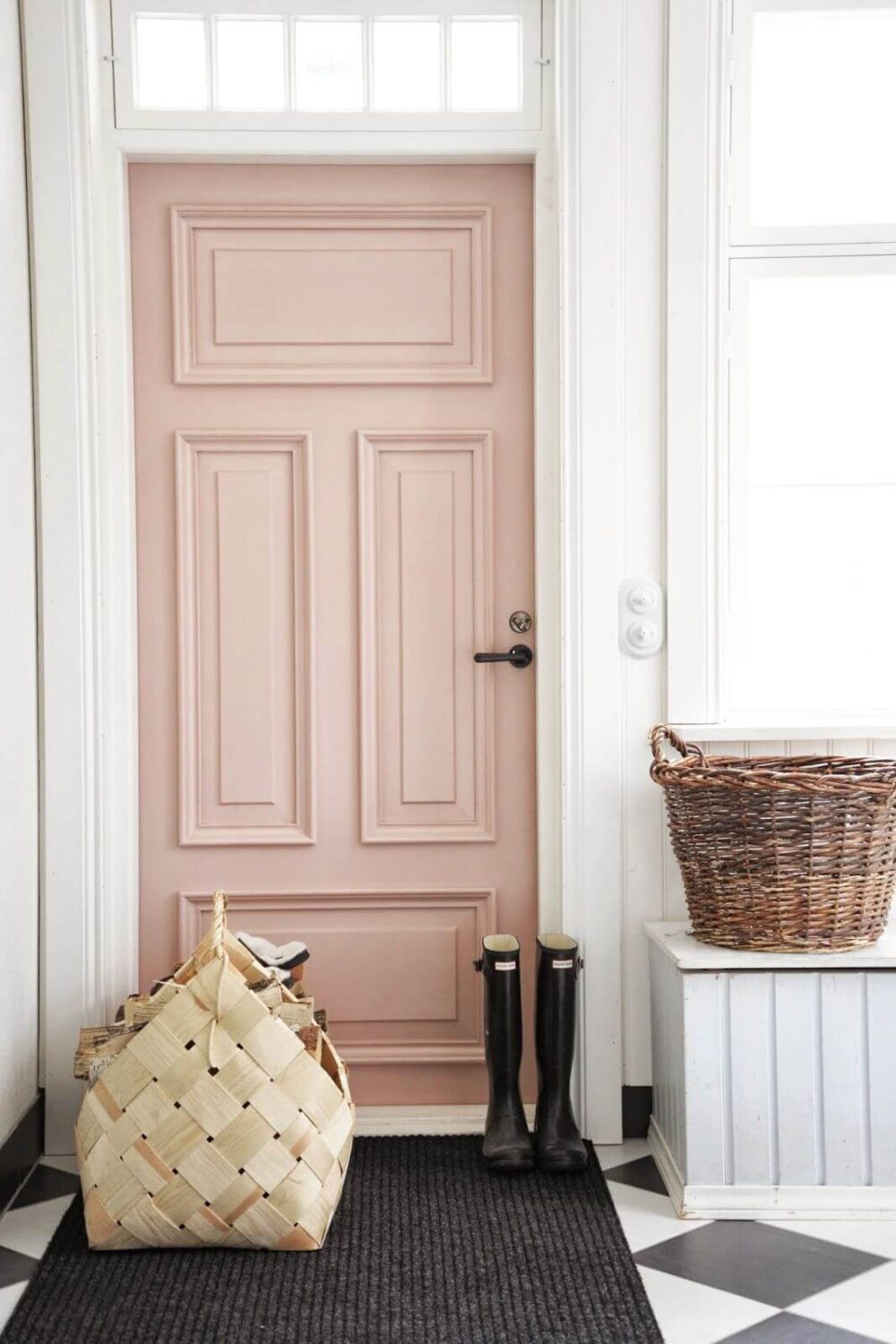
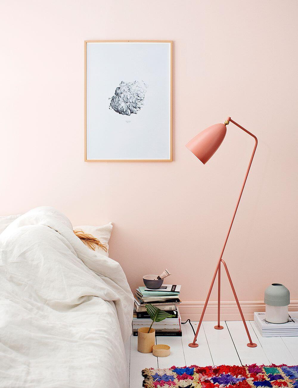
A light pink color is such a lovely shade for a bedroom. In the image above it’s combined with white painted floor boards and a vibrant colorful rug (photo: Finnish Design Shop)
Restore Color Palette
Comfort is the priority when it comes to decorating our homes. We want to surround ourselves with cosy and cocooning pieces to help us relax and process the events of the past year.
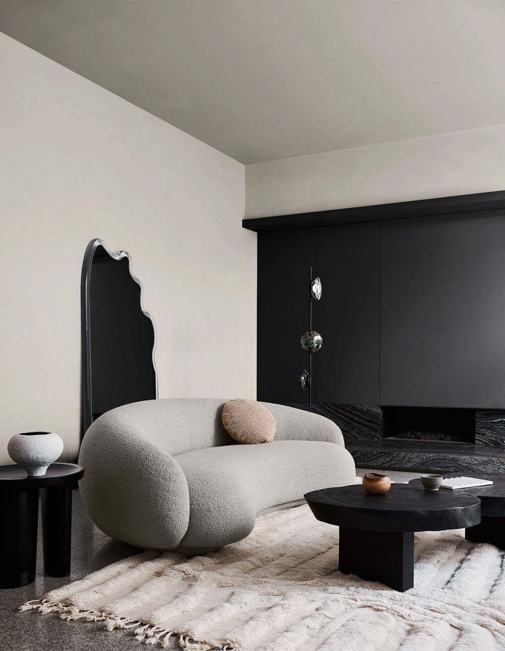
With the Restore Color Palette you will create a reassuring backdrop that allows you to readjust to constant change.
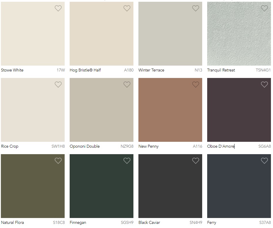
The Restore Color Palette consists of a calming mix of buttercream, pumice, clay, rich forest green, moss and charcoal-purple.
Relaxation in every room
Comfort is the priority when it comes to decorating our homes. We want to surround ourselves with cosy and cocooning pieces to help us relax and process the events of the past year.
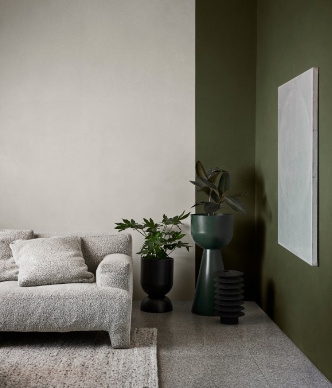
The sense of touch we’ve been deprived of is at the forefront of considered design. Having spent so much time on our devices, there’s a desire for a connection with the natural world.
A calming touch
The desire for tactile experiences is reflected in design, with the use of natural fibres and materials, such as raw timber, unstructured linen and textured stone.
Furniture is chunky and comforting, with curves that follow the lines of the body. These are accessorised with simple handmade and crafted décor pieces in interesting, and often imperfect shapes. Detailing throughout is kept to a minimum with the focus on form and function.
Create a space for clarity & nourish your senses
Soft neutrals and muted tones have a naturally calming effect and are a perfect way to bring a sense of mindfulness and clarity into your home.
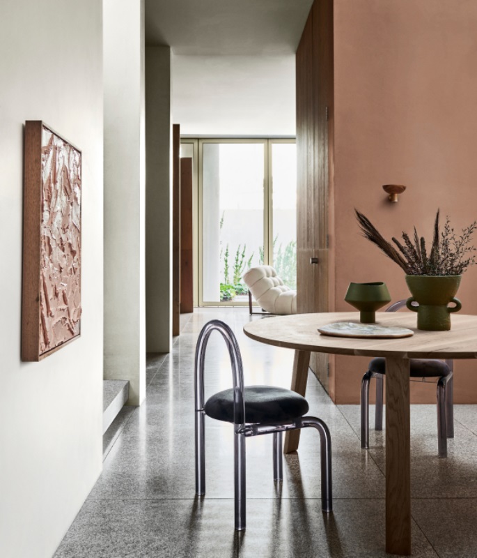
The Restore palette brings together a harmonious mix of gentle neutrals and rugged, earthy tones to create a relaxed and reassuring dining room space.
Wonder Color Palette
There’s a sense of reawakening and celebration as we prepare to connect with friends, family and our everyday lives. The wonder palette allows us to introduce colours that bring joy and optimism back into our homes.
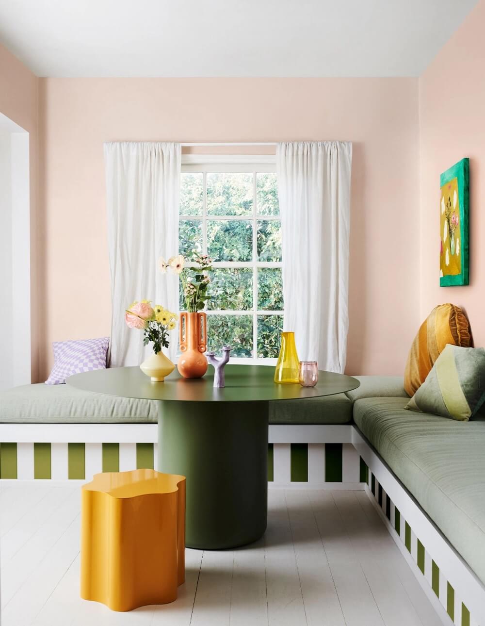
Wonder is a new celebration and acknowledgement of what joy and inspiration we can discover.
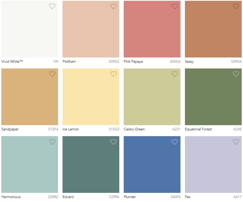
The wonder color palette consists of a playful mix of cornflower blue, lilac, lemon, green quartz and rose gold.
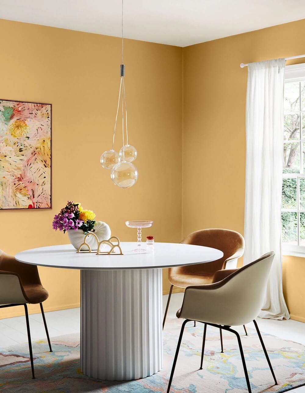
A world of excitement
The bright colours evoke memories of carefree days and help us imagine possibilities going forward. The Wonder palette is a celebration and acknowledgement of what joy and inspiration we can discover.
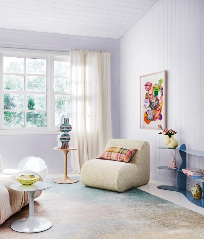
Mix and Match
Don’t be afraid to match your colours with different patterns and textures. Think quaint florals with eclectic colour and checks paired with sleek, contemporary furniture.
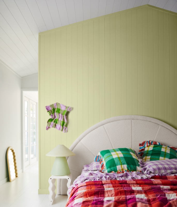
Needlepoint cushions and ribbed glass. Woven rattan furniture set against a wall of candy stripes. The furniture is sustainably sourced, handed down or made from recycled materials.
Beautifully Playful
The Wonder palette combines the deep turquoise green of Dulux Edvard with the clean Dulux Vivid White to create a stunning backdrop.
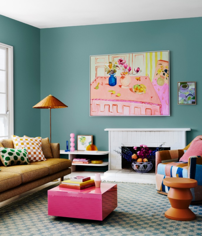
The patterned furniture and cushions provide a wonderful contrast and absolutely pop with fun and excitement.
Memories of carefree days
Tranquil colours can also be added outside the home. A colourful exterior backdrop can help us view the world with a child-like enthusiasm.
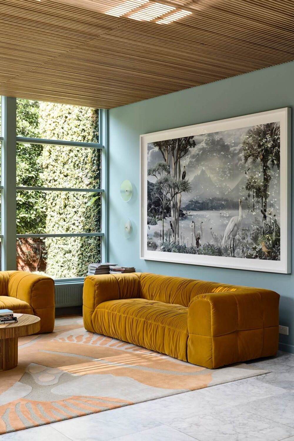
Sherwin-Williams Color of the Year 2022: Evergreen Fog
Sherwin-Williams have chosen Evergreen Fog as the color of the year 2022. Evergreen Fog is a nourishing and sophisticated gray-green hue which is perfect indoors and outdoors.
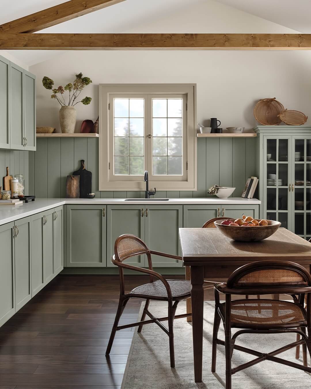
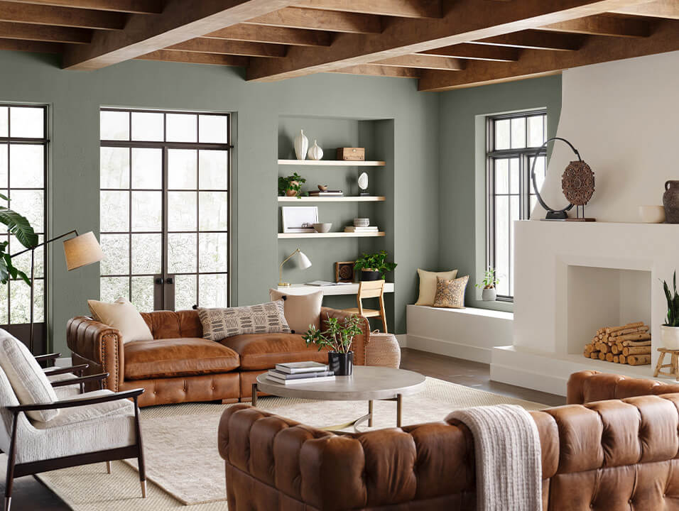
The familiar, comfortable nature of Evergreen Fog shines as a reassuring backdrop and freshens up any space. Create depth and texture with a mix of natural-looking textiles. Add a little gleam with a fusion of metals — champagne gold, warm brass, or inky black.
Evergreen Fog is a sophisticated wash of color for spaces that crave a subtle yet stunning statement shade. Evergreen Fog inspires us to begin again and is a great choice for modern interiors and exteriors.
Sherwin-Williams Color Trend Forecast 2022
Sherwin-Williams have announced their Color Forecast 2022 called MODE. MODE consists of a collection of trend-forward hues that embrace creativity, intention and discovery.
The 2022 color forecast welcomes a new MODE of treasuring each transition and experiencing a new way of being in beautiful, living color across 40 hues and four curated palettes.
“We told a story of balance and rhythm through color last year as we transitioned into a time of stillness. We are holding that balance in one hand and embracing growth and adaptability in the other as we move toward a new vision and discovery of our world.
Embracing the idea of MODE in design inspires a new way of being as we explore beyond what has been the familiar.” – Sue Wadden, director of color marketing at Sherwin-Williams
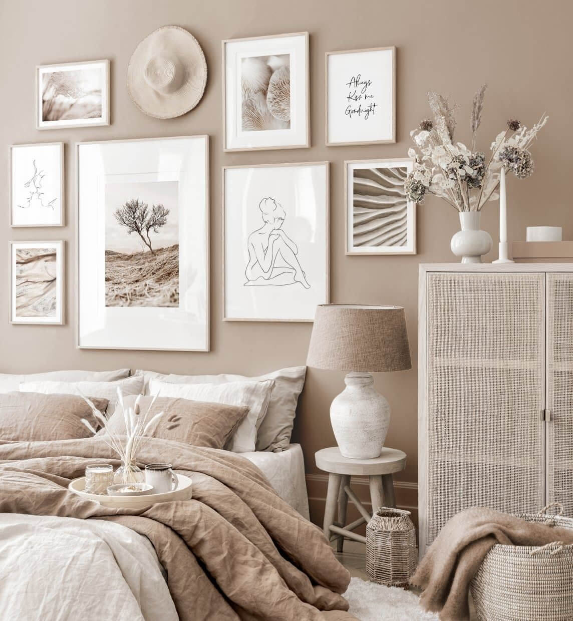
Method Palette
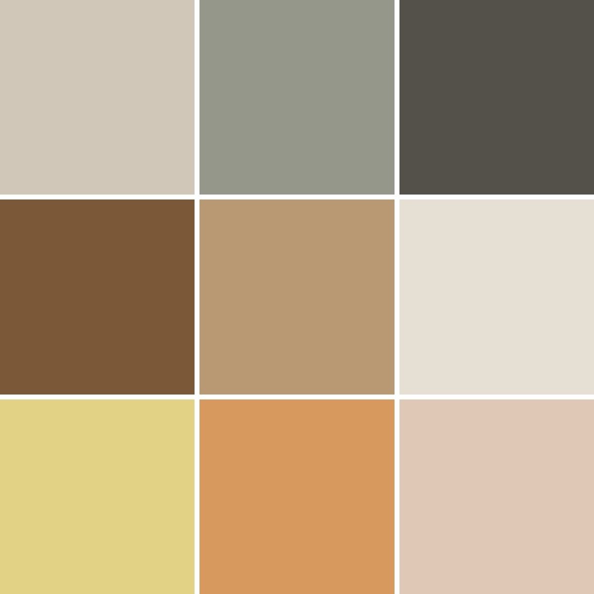
Drawing on nature’s processes, the Method palette celebrates natural order and the balance between organic neutrals and tonal luxury. This palette finds its inspiration in art deco, modern organics and 1980s postmodernism.
Opus Palette
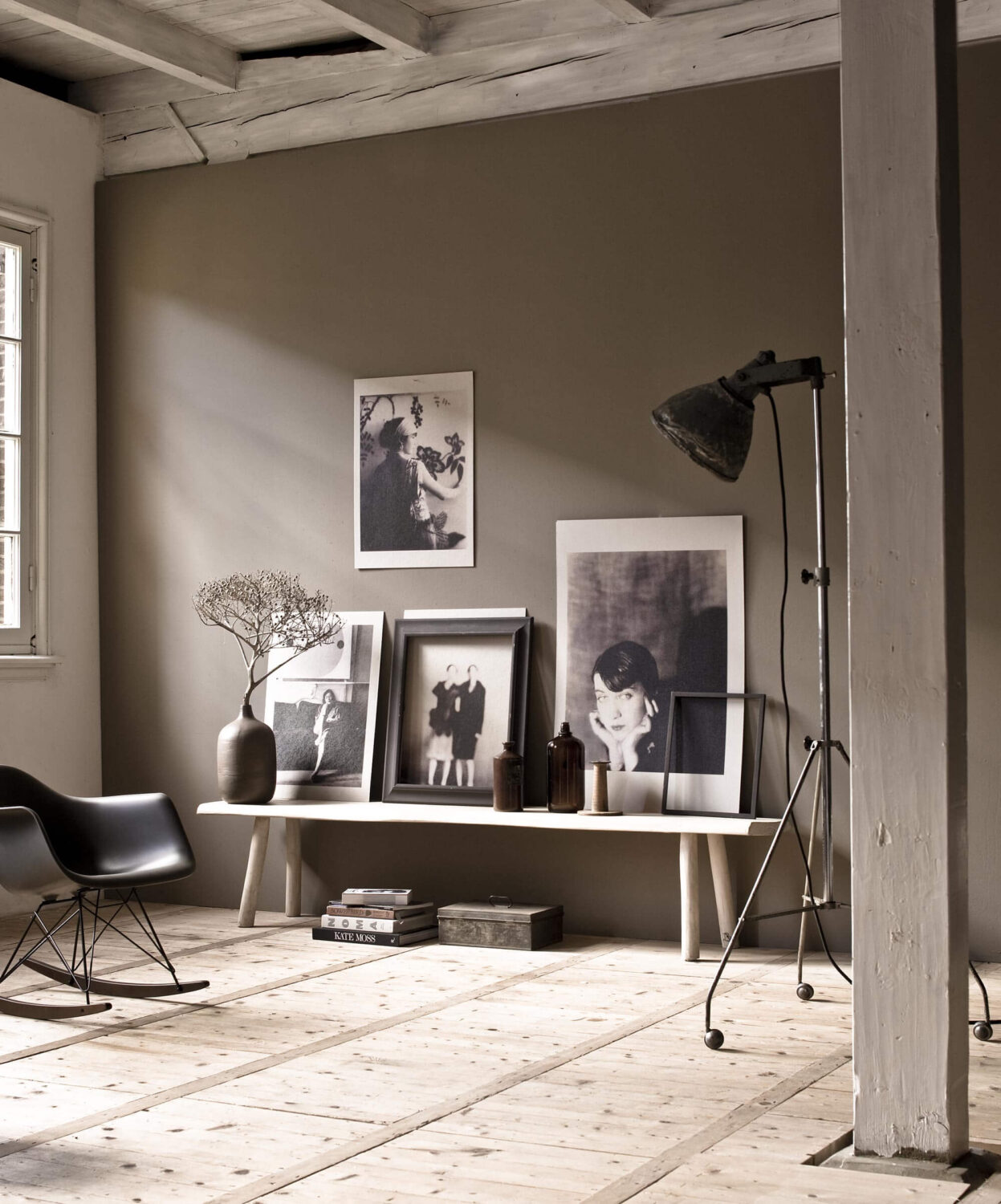
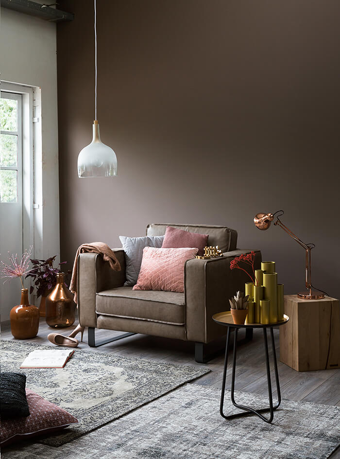
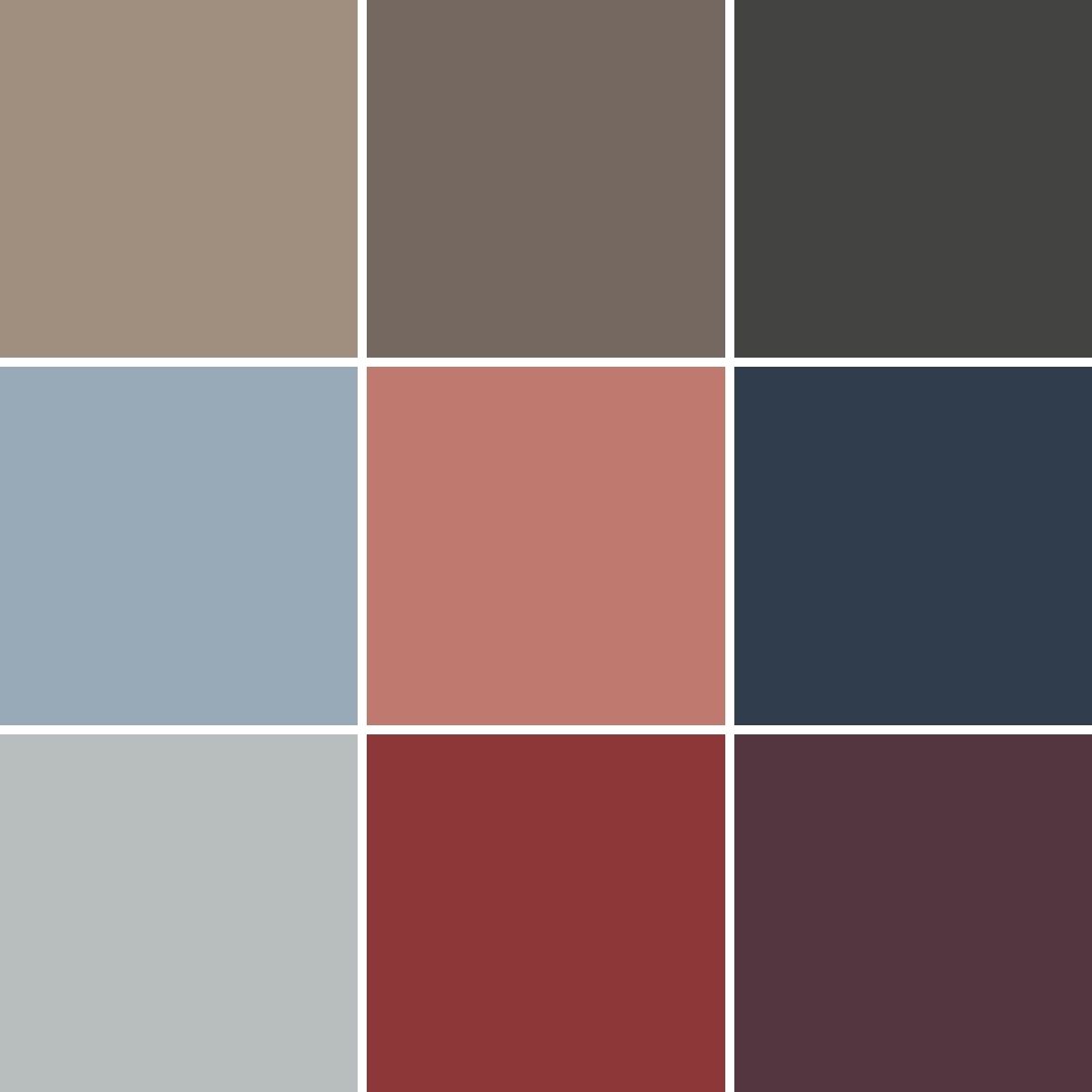
Mysterious and deeply opulent, the Opus palette composes a unique masterwork of stirring rhythms resulting in a masterpiece. Grounded in modern maximalism, this palette takes its cues from dark luxury and bold metallics.
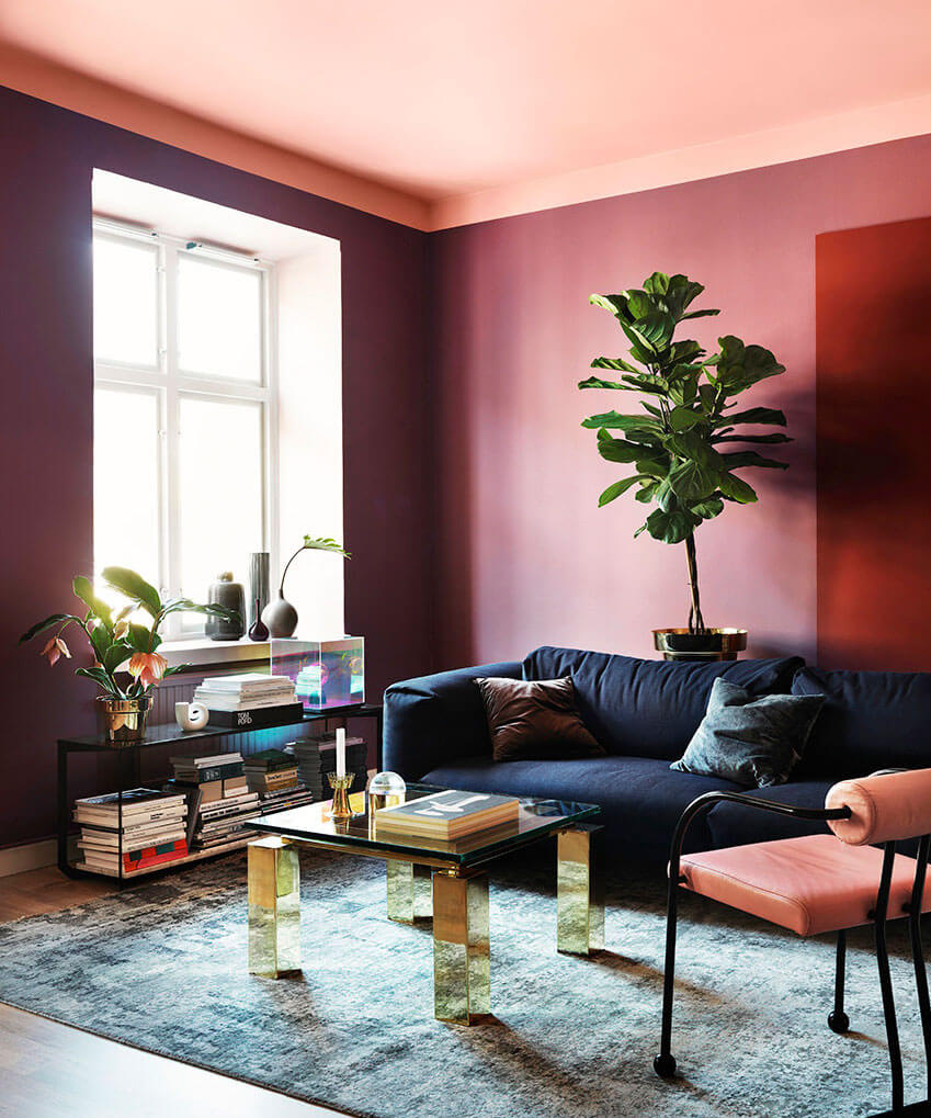
Dreamland Palette
Inspired by the fullness of living well, the Dreamland palette effortlessly fuses soft forms and modern Scandinavian minimalism to create a fresh, life-giving fantasy realm.
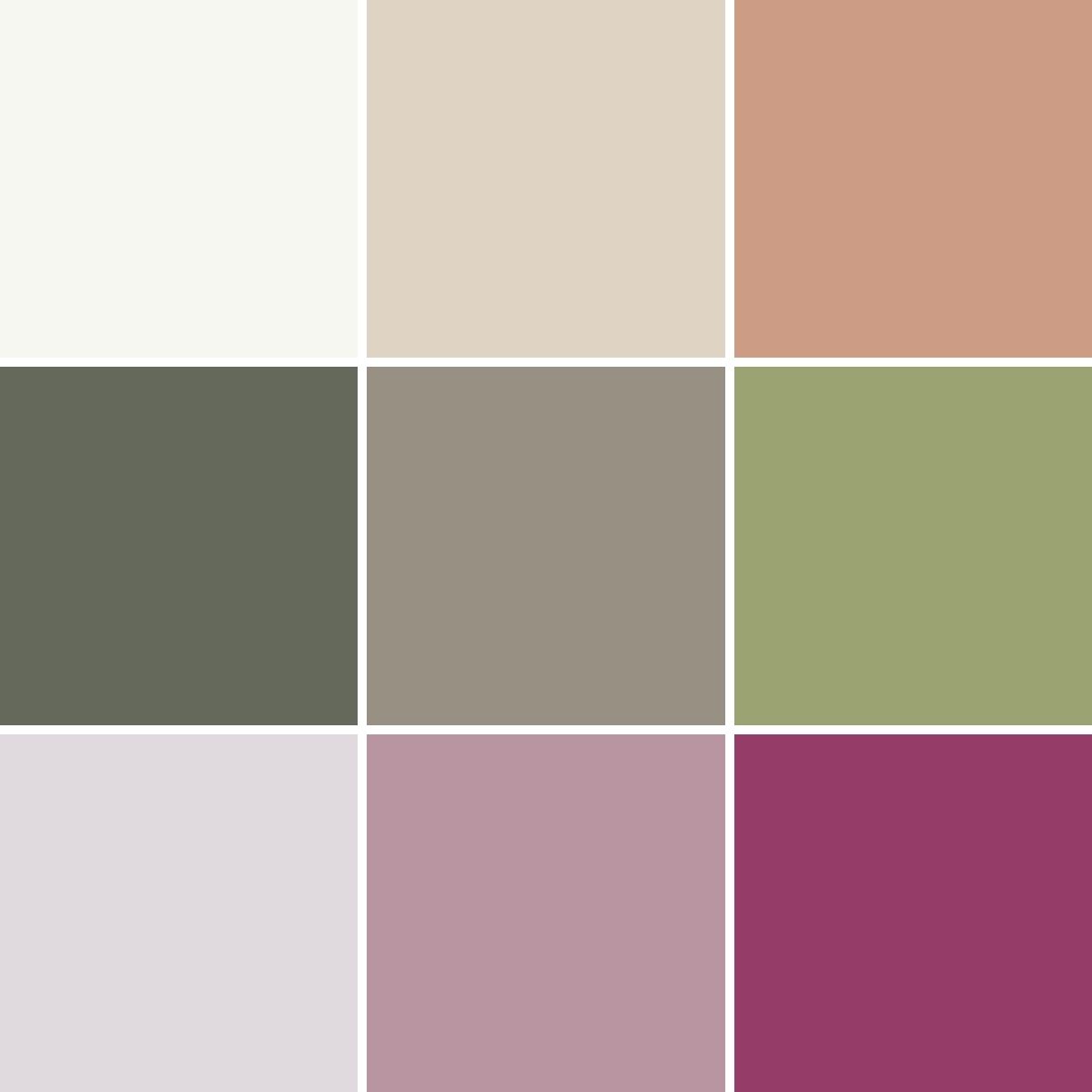
Influenced by biomimicry and sustainability, Dreamland incorporates berry tones and organic greens, which highlight balance and the vernal sweetness of bud and bloom.
Ephemera Palette
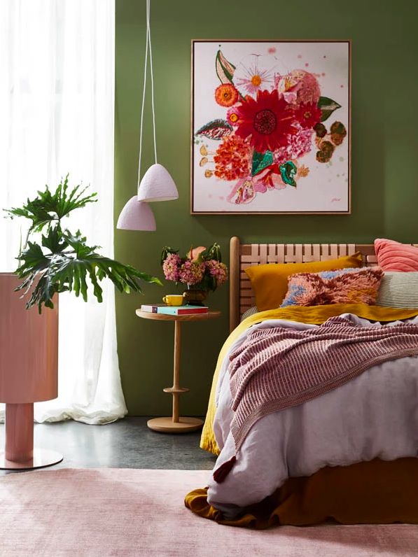
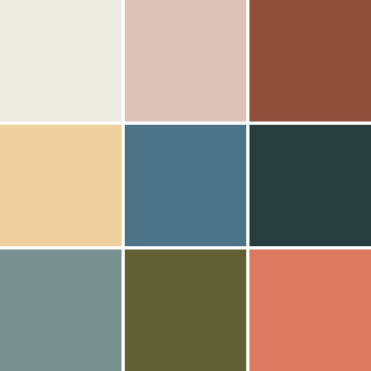
The Ephemera palette evokes a warm nostalgia and unwavering optimism as we fondly remember the past and look to the possibility of the future by blending old and new. Unifying retro-futurism, meaning and memory, the Ephemera palette merges colors reminiscent of bygone basics
Behr Color of the Year 2022: Breezeway
Behr has chosen “Breezeway” as their Color of the Year 2022. The silvery green color is inspired by the earth’s beauty. And mimics the naturally stunning sea glass found on the shore of salty beaches.
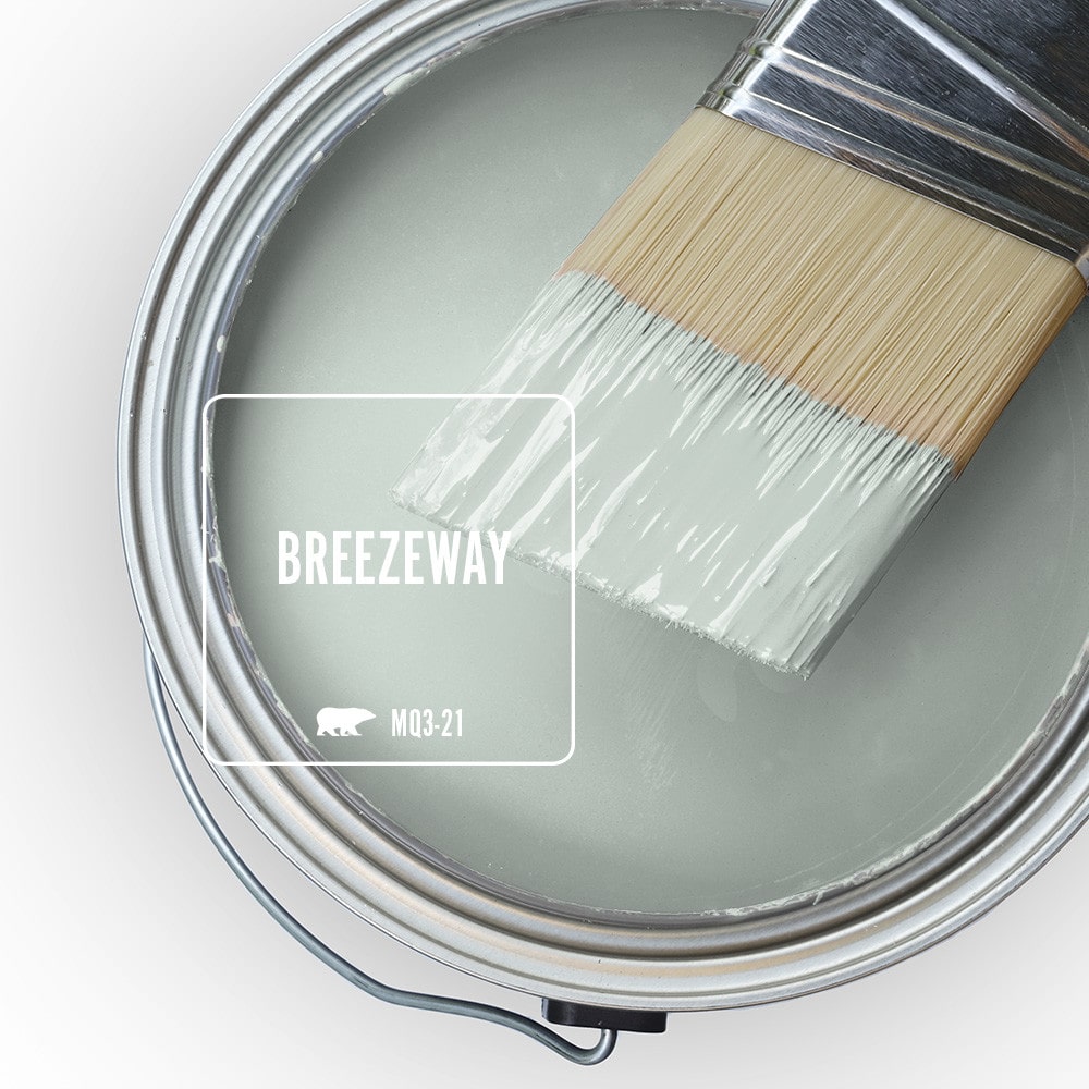
Breezeway is part of the Behr Color Trends Palette 2022. And it is a color hue that feels cool and peaceful at the same time. While also representing a desire to move forward and discover newfound passions.
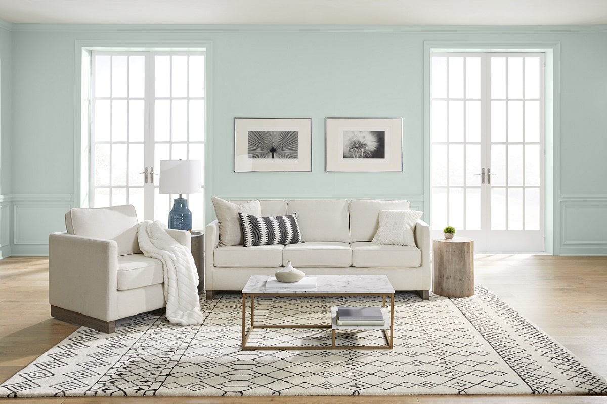
“A new year brings the opportunity to embrace a sense of renewal and pursue untapped passions. Whether it’s lacing up our hiking boots, or breaking out the gardening tools, Breezeway inspires us to fully embrace the hobbies or adventures, both near and far, that excite us.
We look forward to a color that welcomes a hopeful sense of renewal, restoration and healing.” – Erika Woelfel, vice president of color and creative services at Behr Paint Company.
Breezeway is a color hue that you can easily combine with other colors. Such as the color shades in the BEHR color palette 2022.
Behr Color Trends Palette 2022
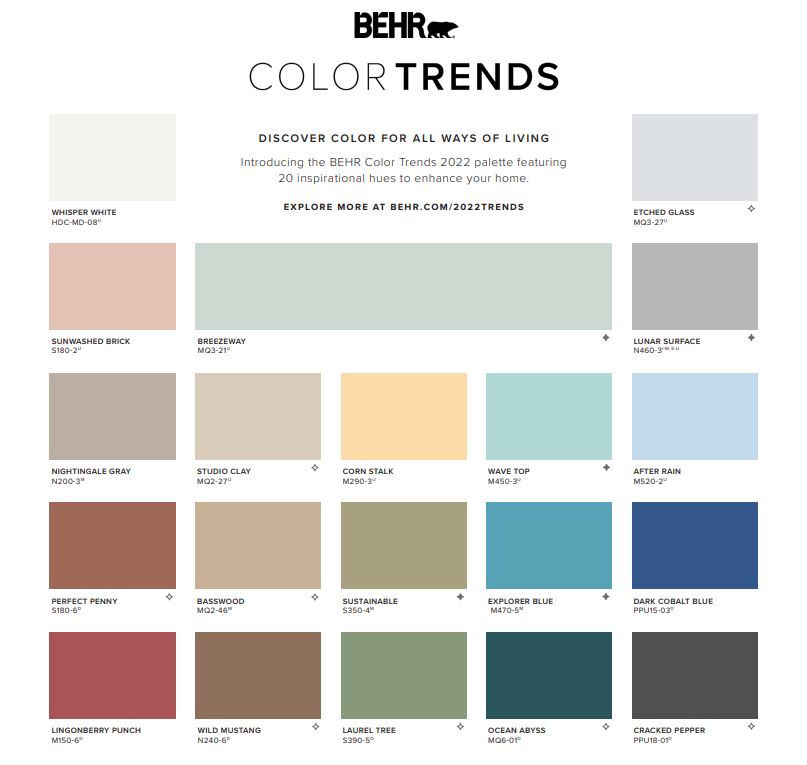
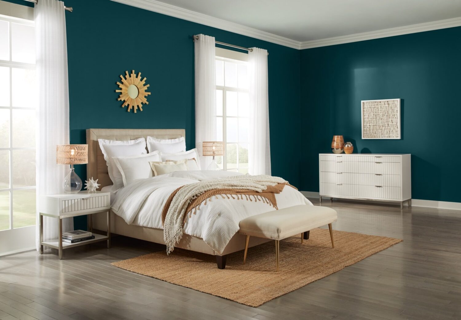
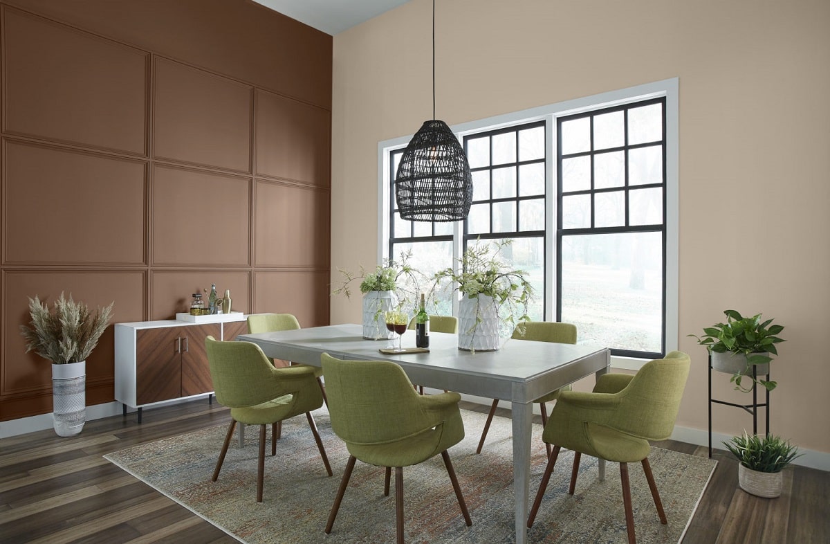
Behr’s 2022 Color of the Year “Breezeway” is one of 20 colors that are found in Behr’s Color Trends Palette 2022. The 20-color collection consists of soothing shades and warmer tones that inspire us to enter the new year on a hopeful note, while still centering the home as an ultimate oasis.
Graham & Brown – Color & Wallpaper of the Year
British wallpaper and paint brand not only chose a Color of the Year 2022. But also a Wallpaper of the Year 2022. And both are absolutely stunning.
Wallpaper of the Year: Restore
Graham and Brown’s Wallpaper of the Year comes in three color shades, named: Mignight, Sky & Emerald.
Restore: Midnight
“Born from our reflection of the past years, Restore Midnight is designed with healing, rejuvenation, and reconnection with nature all in mind – Just a few of the things we will need for the year ahead.”
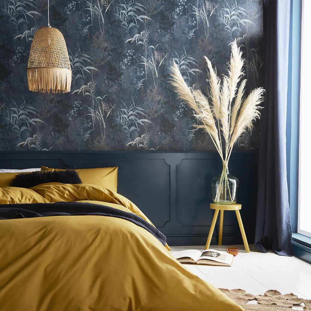
This elegant design is reminiscent of a wild yet calming concrete jungle. The design features wild trails of exotic botanicals taking over a soothing, smoky blue backdrop. Full of nature, peace and tranquility
Restore: Sky
Cool and refreshing, Restore Sky is the lighter colorway of the wallpaper of the year 2022. This design is sure to welcome nature and peace within your home.
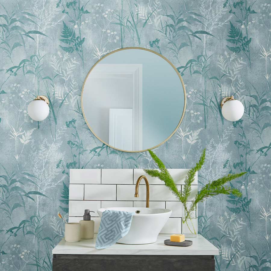
Featuring a calming color palette of icy whites and sky blues, it will brighten even the smallest of rooms. The beautiful, botanical trails sit on a tranquil mid blue backdrop which perfectly partners with our color of the year, Breathe, creating the perfect full room solution for your home.
Restore: Emerald
Travel to the depths of a misty, tropical rainforest with the rich green colorway of Graham & Brown’s wallpaper of the year 2022. Restore Emerald is a tranquil yet refreshing design, created to bring the outdoors into your home.
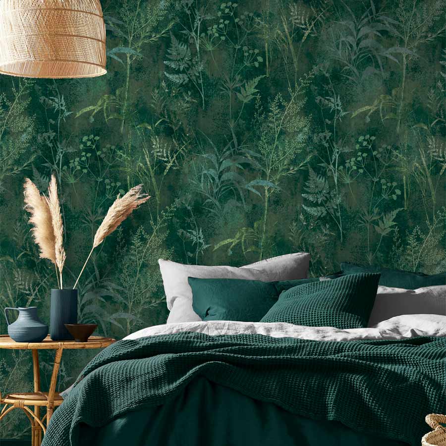
Featuring crisp green, botanical trails meandering through the depths of the emerald green backdrop, Restore Emerald is both striking and calming and is the perfect addition for any home!
Color of the Year 2022: Breathe
Breathe is a soothing mid blue, perfect for creating calm and peaceful spaces which is exactly what we all need for the year ahead. Dark enough to add color and depth but light enough to remain refreshing, you can use this tranquil shade anywhere in your home.
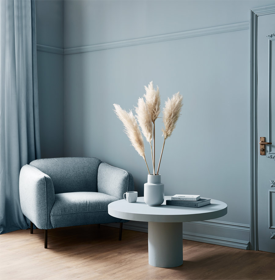
Pair with crisp whites and cool greys for an airy feel or try partnering with deeper blues to create a moody hideaway.
PPG 2022 Color of the Year: Olive Sprig
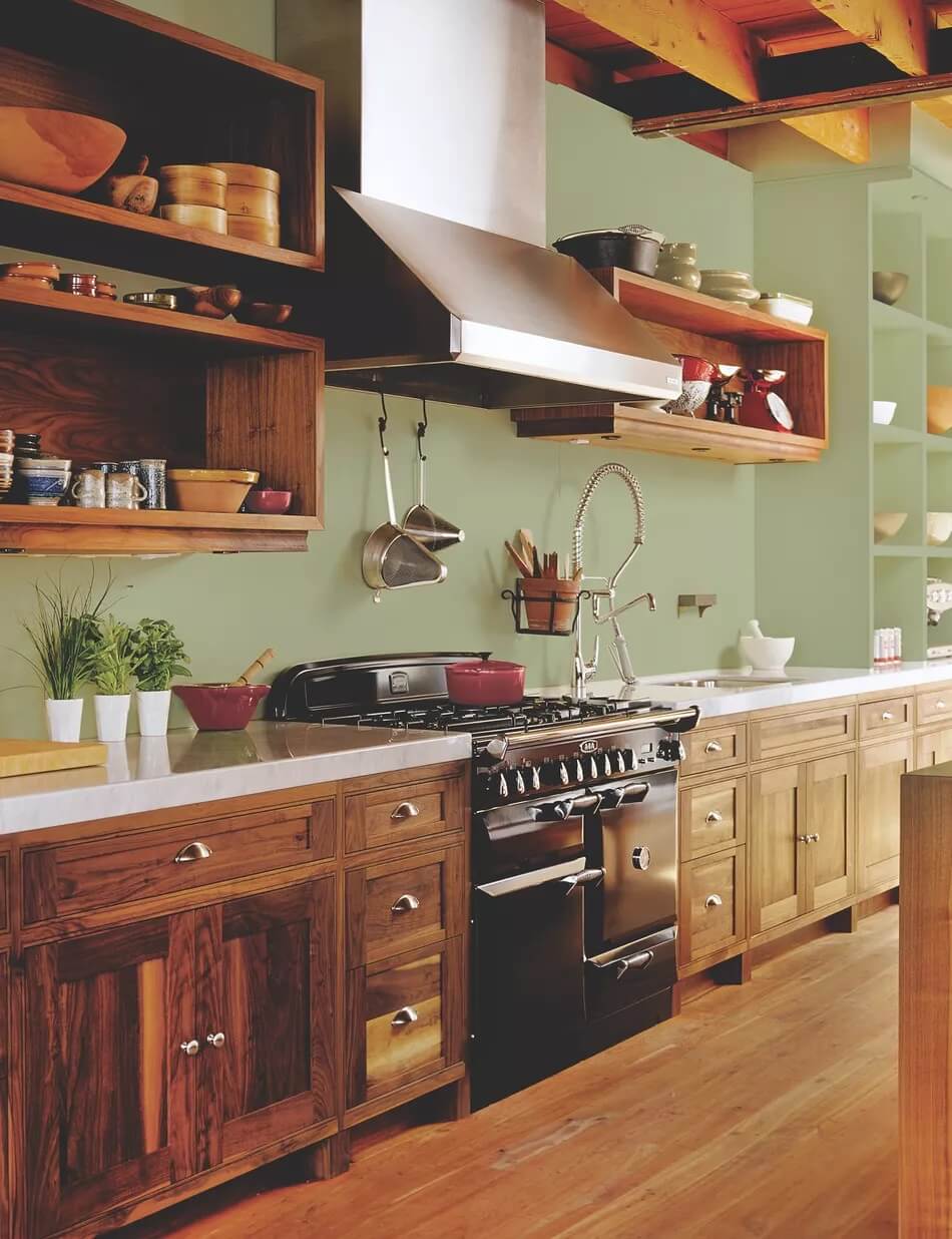
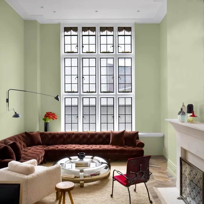
PPG has announced that the green/grey color “Olive Sprig” as their Color of the Year 2022. Olive Sprig is a relaxed and enticing color shade that is instantly soothing.
“As many of us know following a year of lockdown, the easiest way to shift your mindset is to change your environment. While we begin to trade sweatpants for strappy shoes, recipes for reservations, and a night in for a night out. Our paint color preferences are shifting too, in both residential and commercial spaces.
DIYers, property managers, designers and architects are shifting away from the stark, neutral palettes of yesterday and opting for color in all forms. Call it rebellion, but we are certainly here for the resurgence of optimistic colors to guide us into a new era of home design.” – Amy Donato, senior color marketing manager, PPG paint
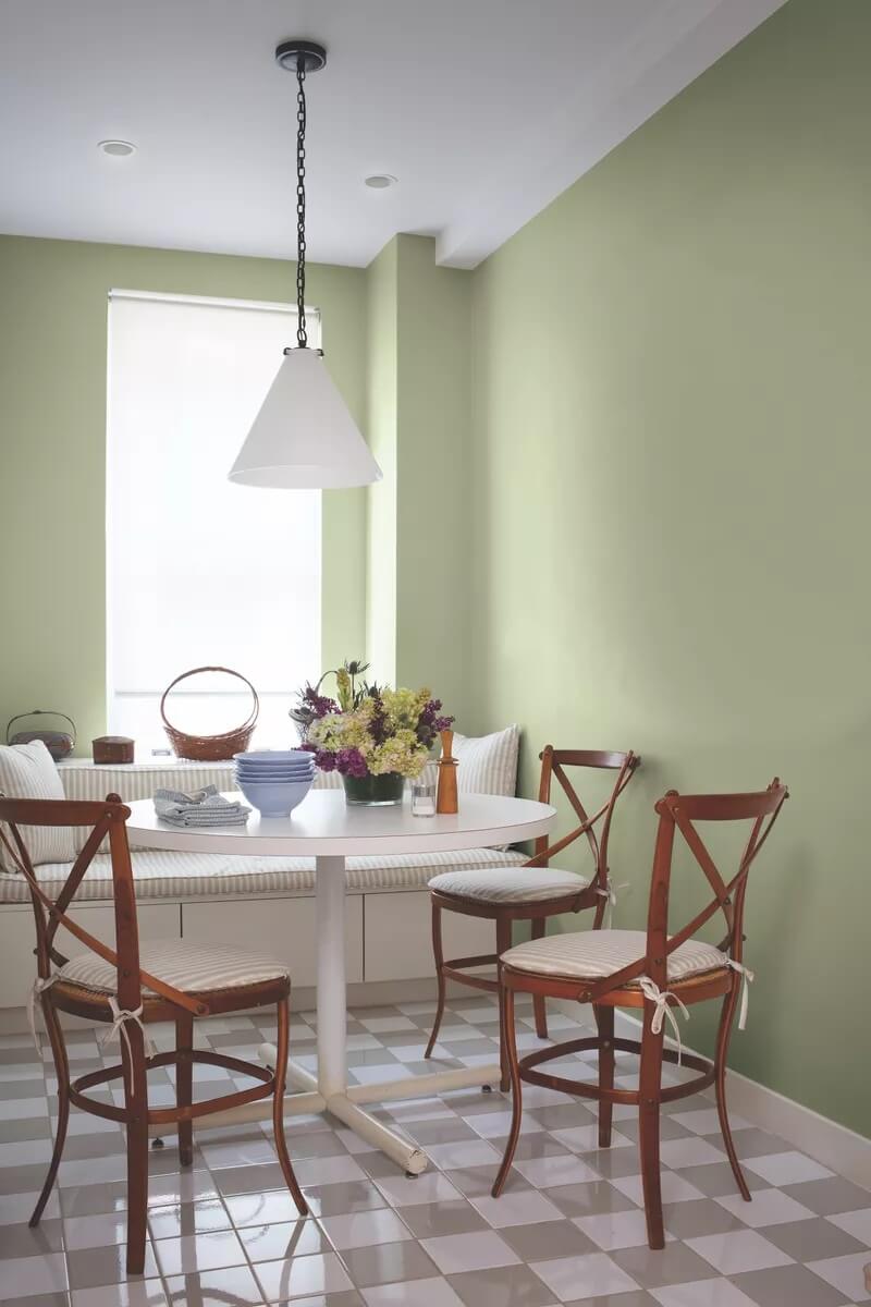
This soothing and natural color is easily used throughout the home. From a calming bedroom, to a home office or as a kitchen color. When you combine this color with natural materials, you crete a true natural look in your home.
PPG Color Stories
Complimenting PPG’s Color of the Year “Olive Sprig” they have created 3 color palettes representing our current state of hope, reflection and new beginnings in the post-pandemic era.
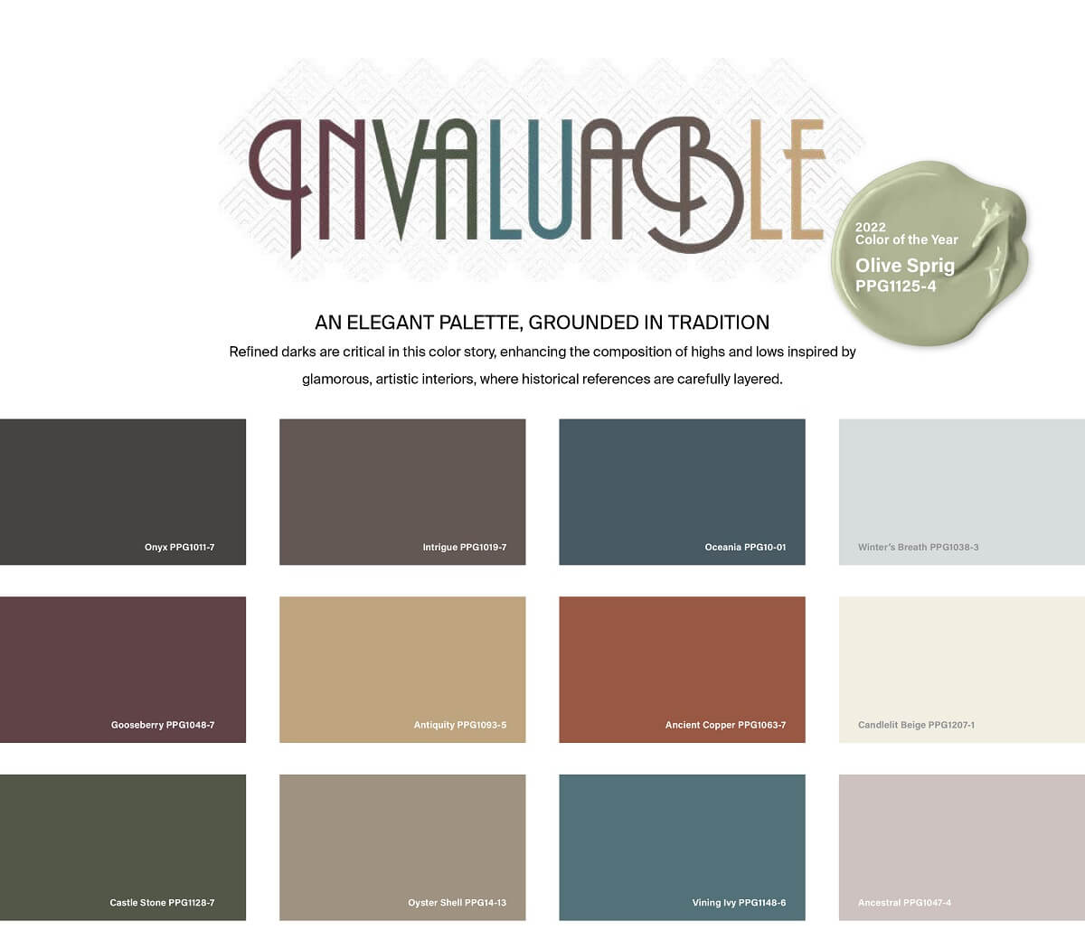
Invaluable
The Invaluable palette culminates a rich library of cultural references to imagine its perfect place in today’s world. Drawing Gatsby-esque inspiration from the past to create the go-to glamourous palette of the present. This color story is not afraid to be bold.
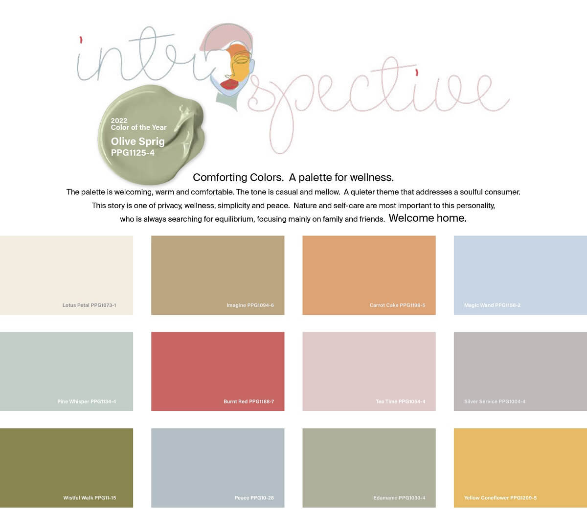
Introspective
The Introspective color story is for those that prioritize self-care and appreciate life’s simple pleasures. These hues are perfect for the private yet soulful consumer looking to create an ethereal bedroom retreat, a thoughtful office space, or add a hint of color to an otherwise neutral-toned kitchen.
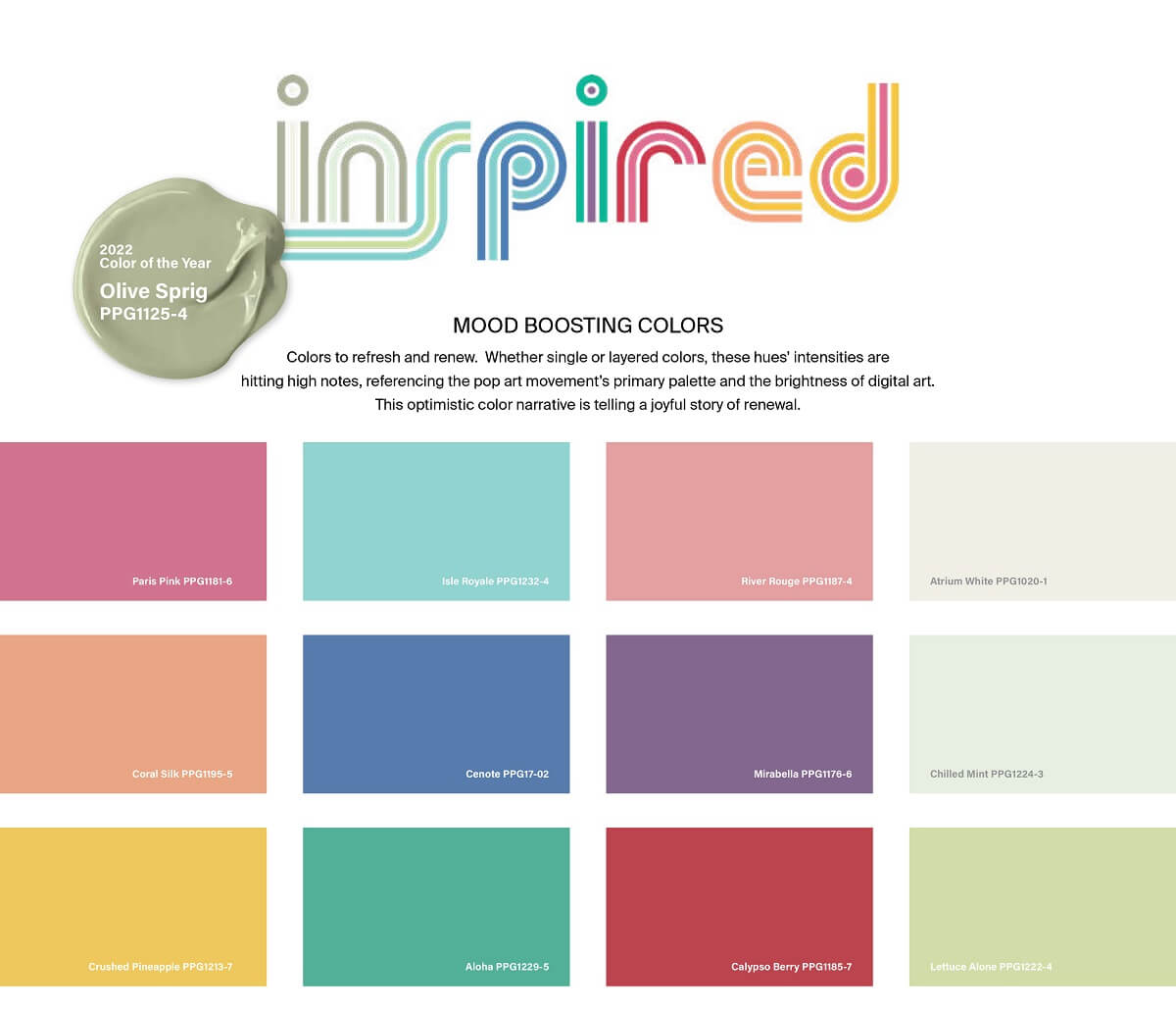
Inspired
Those drawn to the Inspired color palette cannot be pinned down! These mood-boosting shades are sure to turn up the volume in any space. And add an optimistic jolt of energy for spaces that need it most.
Glidden Paint by PPG Color of the Year 2022: Guacamole
Just like their big brother, Glidden Paint by PPG have opted for a green shade as their color of they year 2022. “Guacamole” is the green hue that they have chosen which they describe as a spirited and soothing green, which brings energy to a space.
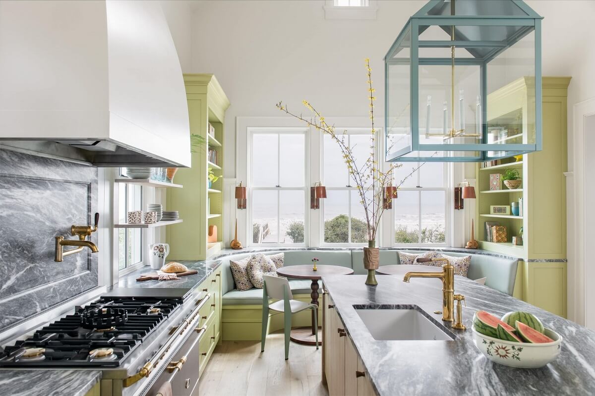
According to research, online searches for green paint have grown spectacularly the last year. Which is not surprising. Because green adds a lovely natural touch to your home.
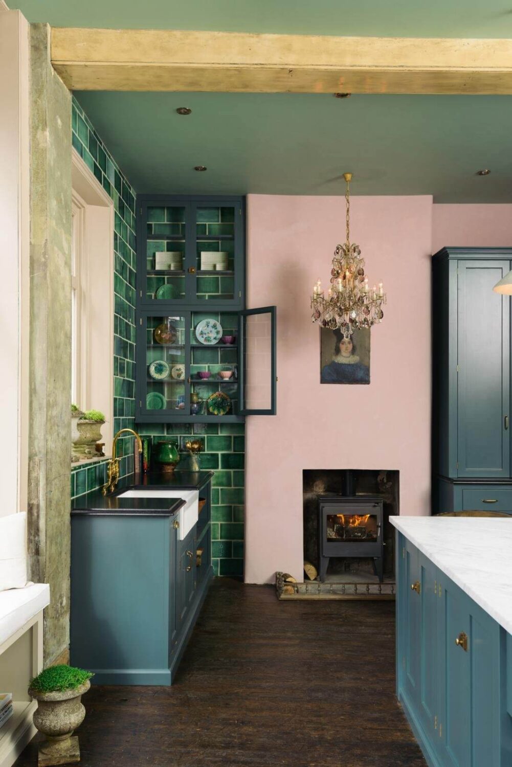
The Guacamole shade can be used in many ways. From wall colors, to kitchen cabinets and home decor items. By adding this color to your home you bring a soothing natural color into your home.
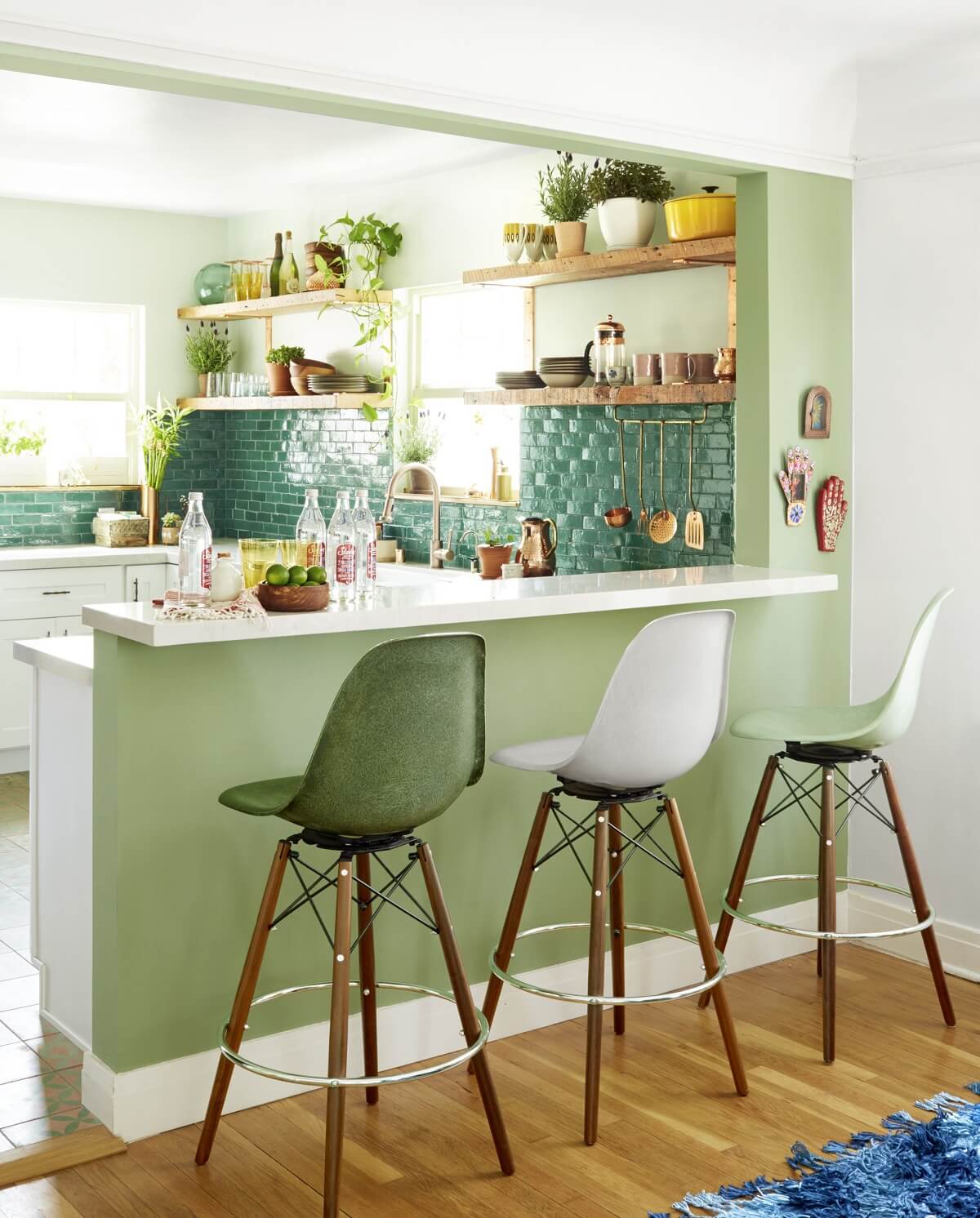
See also: green kitchen design inspiration
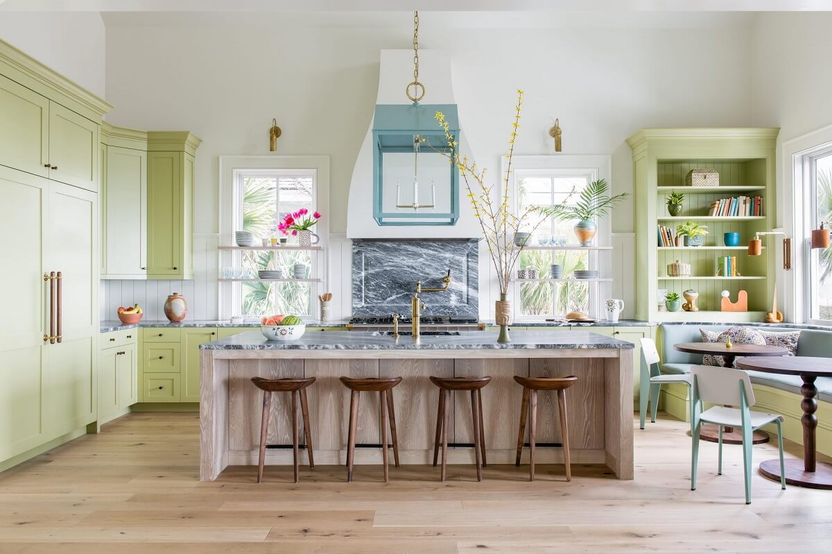
What do you think of the 2022 color trends? Are you inspired to start painting your home? I really like this sense of a new beginnen we see in these 2022 color of the year picks. We need that, don’t we?
