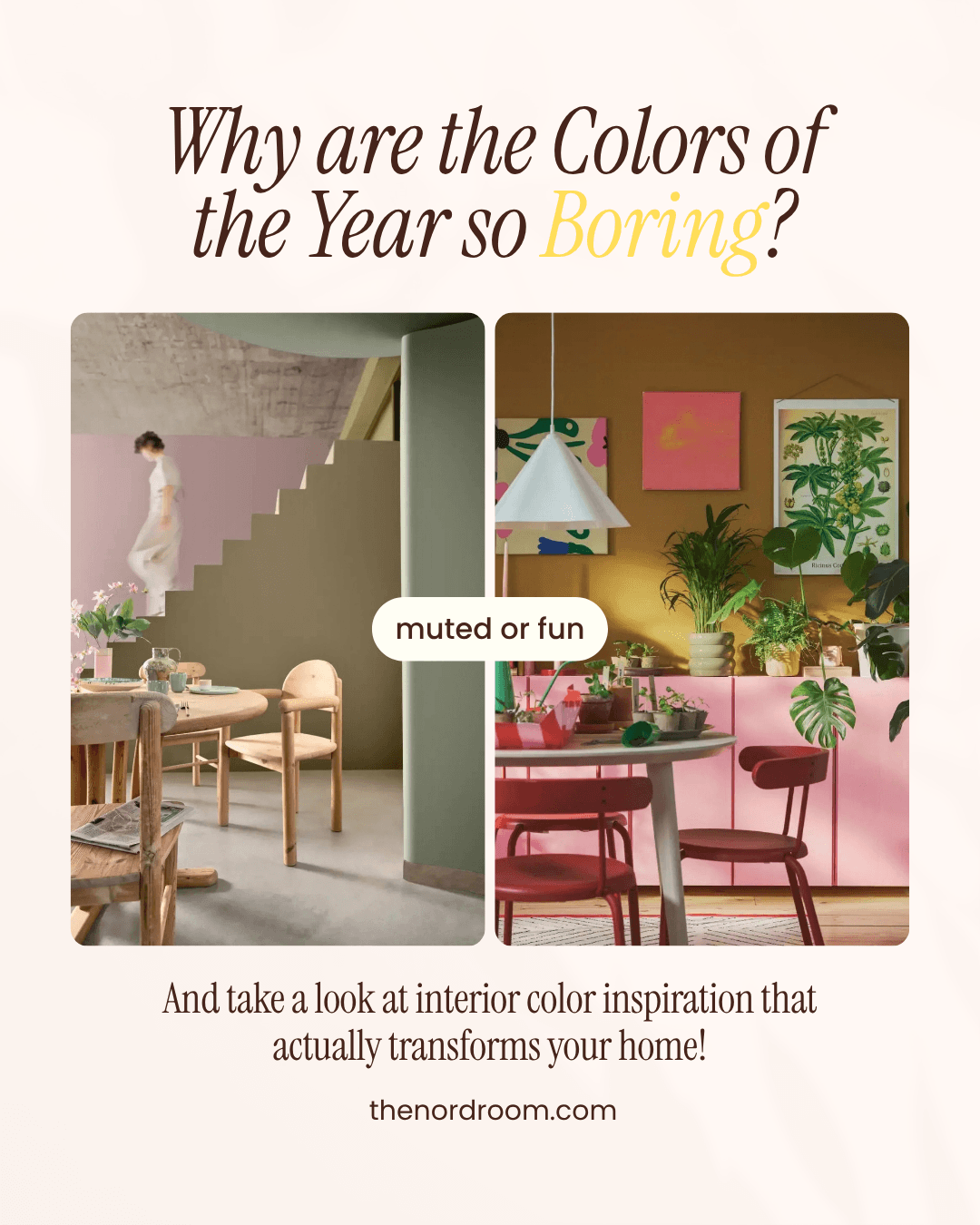


Why Are the Colors of the Year 2027 So Boring? And What Can You Use Instead
In the fall, paint brands and color institutes reveal their Color of the Year 2027. Usually, I look forward to this, but the last couple of years we’ve seen more of the same, and this year seems no different (unfortunately).
Ever since 2020 (we all know what happened there), the trending paint colors have become more neutral, calmer, and safer (with last year’s Cloud Dancer by Pantone as the lowest point). And for a while, this seemed to be something people were really longing for.
But it’s been almost six years, and I think I can speak for many when I say we’re longing for more color and happiness in our lives. Are these muted natural tones really what we’re gravitating towards?
When I look at the homes published on The Nordroom, the most positive reactions are for interiors where people take more risks with color.
These calm colors are a reaction to the uncertain world we live in. And while I understand the desire for a calm home life, I don’t think the colors we use in our homes have to reflect the world’s uncertainty, and expressive colors don’t have to be overwhelming.
Let’s do the opposite and add joy to our spaces!
I think I may scream if I have to read one more time that people are longing for grounding colors and ‘a return to nature.’ Because nature is more than just blue and green tones. Nature is also pink and orange in the evening sky, or the vibrant purple of a dahlia in bloom.
In the last couple of years, we’ve seen only sporadic glimpses of hope and joy in color choices (such as Behr’s Rumors, Dulux’s True Joy, and PPG’s Purple Basil in 2025, or Benjamin Moore’s Raspberry Blush in 2023), only to return to safe and grounded tones the next year.
The 2027 Colors of the Year
For 2027, most paint brands and color institutes have opted for another year of safe and neutral beige, greens, and blues.
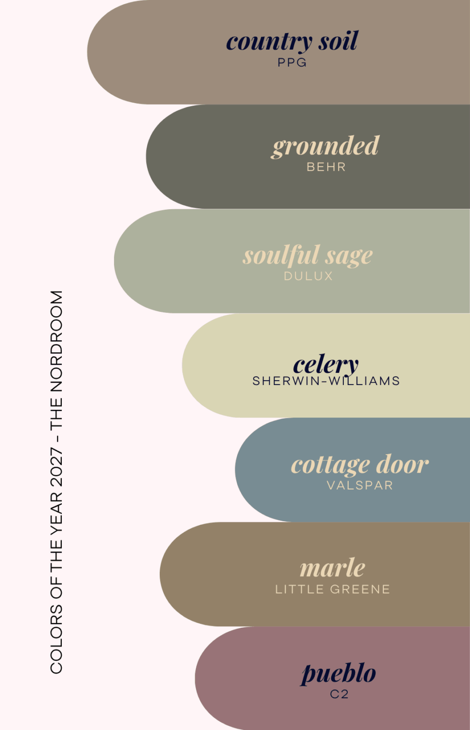
And while we’re still waiting for Benjamin Moore and Pantone, the only exception seems to be C2, which has chosen Pueblo, a rosy, romantic pink that feels deeper and warmer in the evenings. But even that color falls under a warm, earthy, terracotta-ish shade.
There is nothing particularly wrong with the colors that are chosen. They are nice hues, richer or deeper than a regular shade, and they do work well as a base color instead of white, gray, or beige. But it’s simply so much of the same, for so many years now.
It also doesn’t reflect what I see in homes right now. Many people are gravitating toward bolder, richer shades. Even in Scandinavian design, which for years influenced how homes were designed with monochrome palettes and natural materials, I see far more expressive color than these Colors of the Year predict.
So in this article, I want to share some opposite ideas, away from the muted natural tones, so you know you can embrace fun and cheerful colors without making your home feel like Pippi Longstocking’s home (but if you want that, please go for it!).
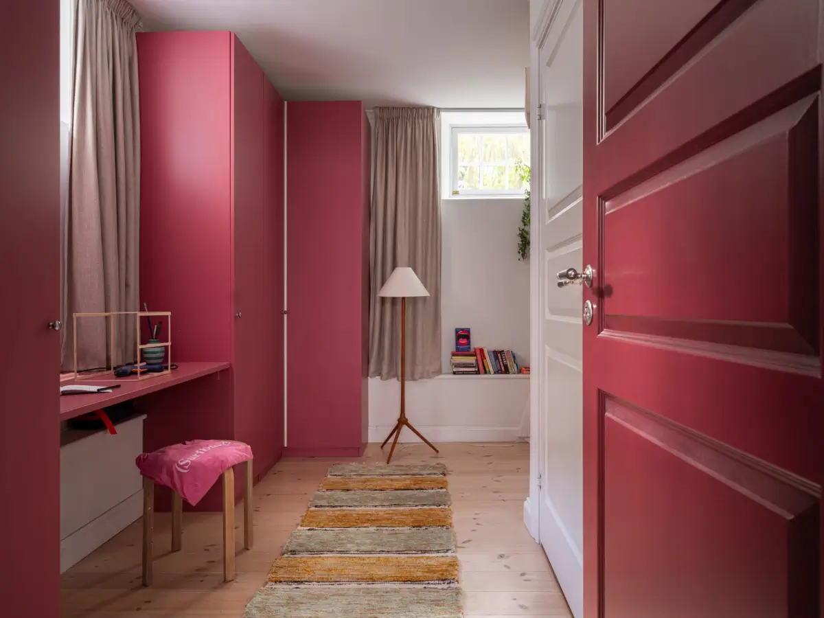
Raspberry pink wardrobes, door, and vanity table in a small basement apartment in Stockholm.
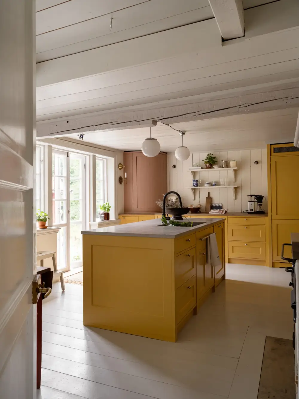
A bold yellow kitchen in a 19th-century Swedish country house. The home features more color, like green paneling and dusty blue joinery, without making it feel overwhelming.
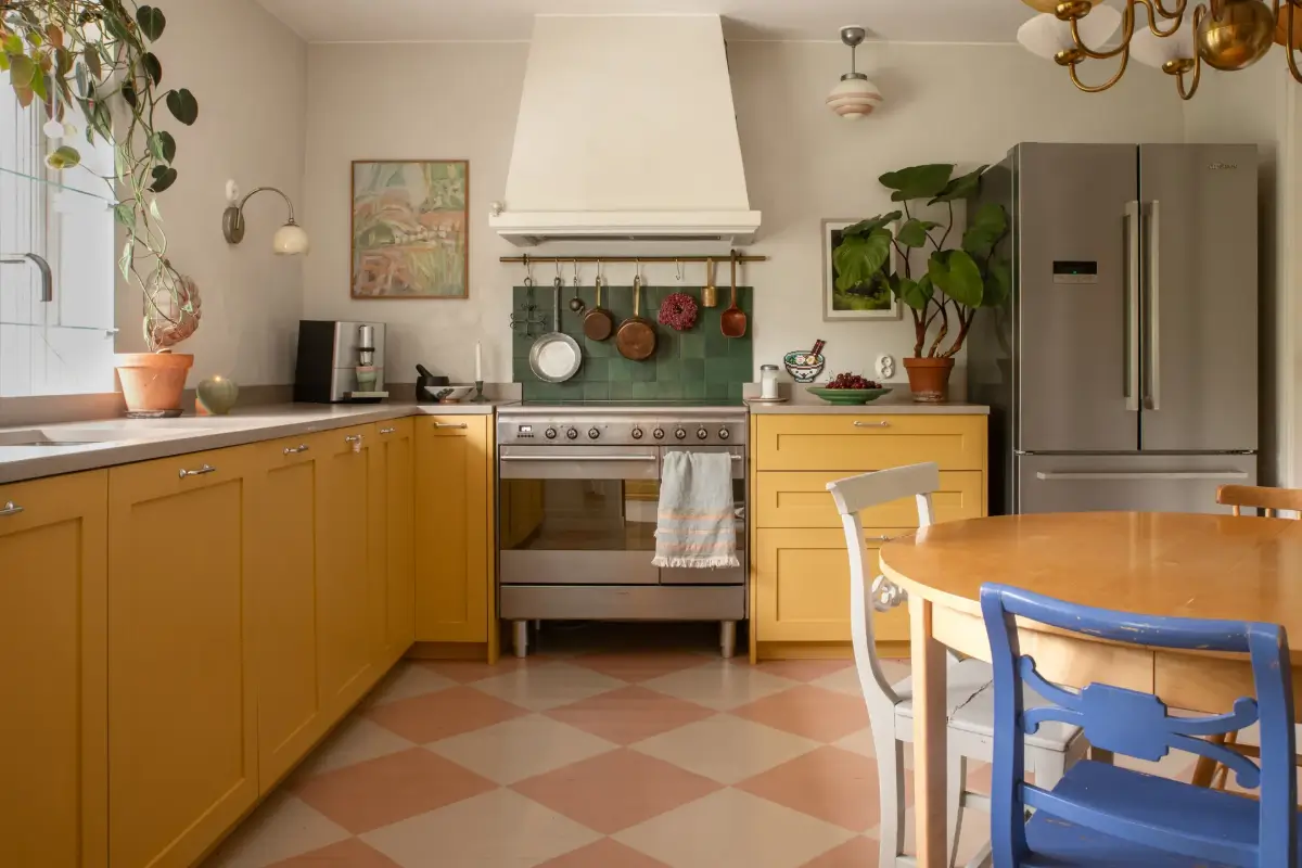
Yellow is becoming a more and more popular kitchen color. This Swedish family home pairs yellow cabinets with a pink and white checkered floor, green backsplash tiles, and a blue dining chair. Colorful, cheerful, but not too much.
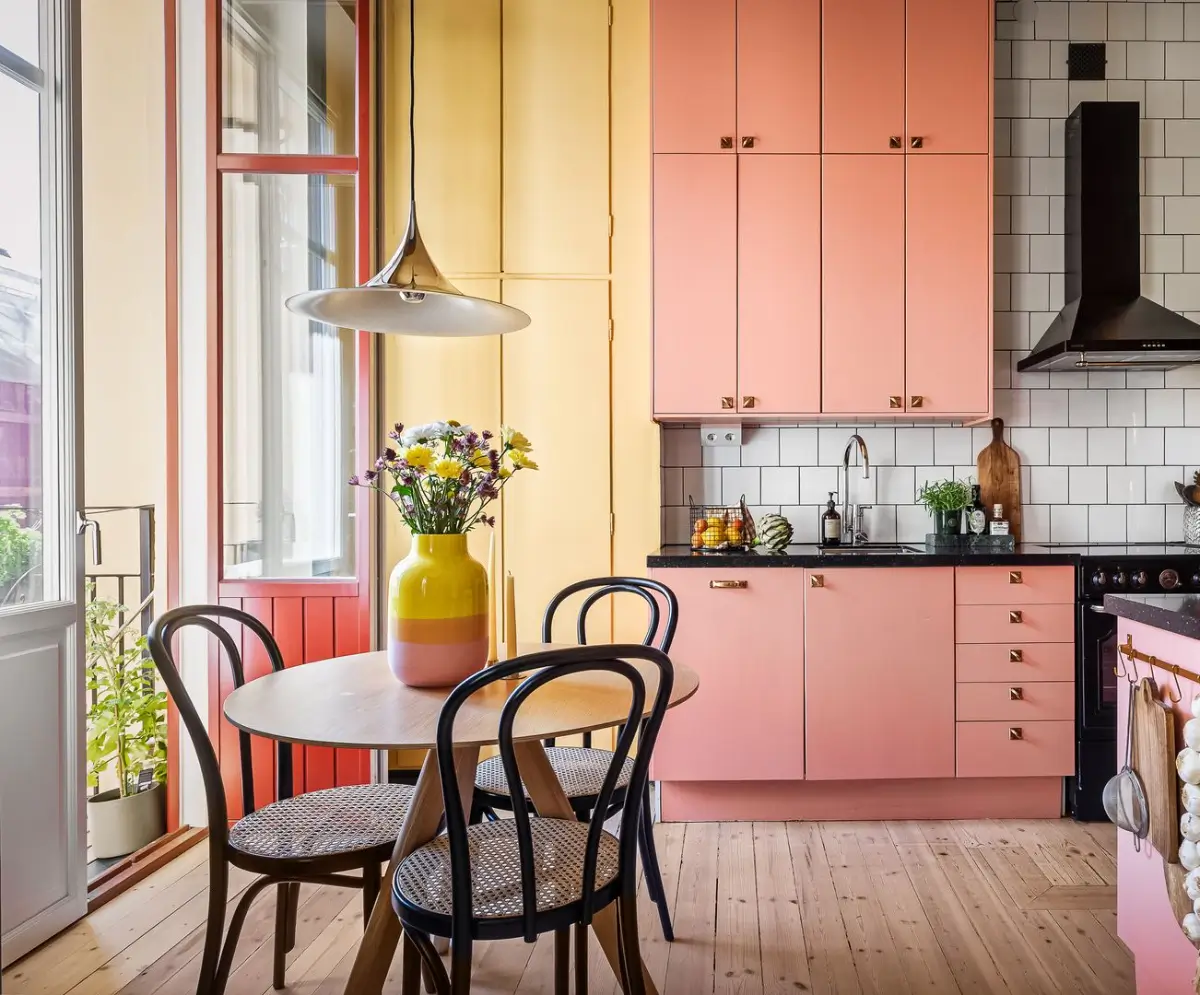
Pink, yellow, and green (hard to see in this picture, but the joinery around the balcony doors is green) are paired in a lovely way in this Swedish studio apartment.
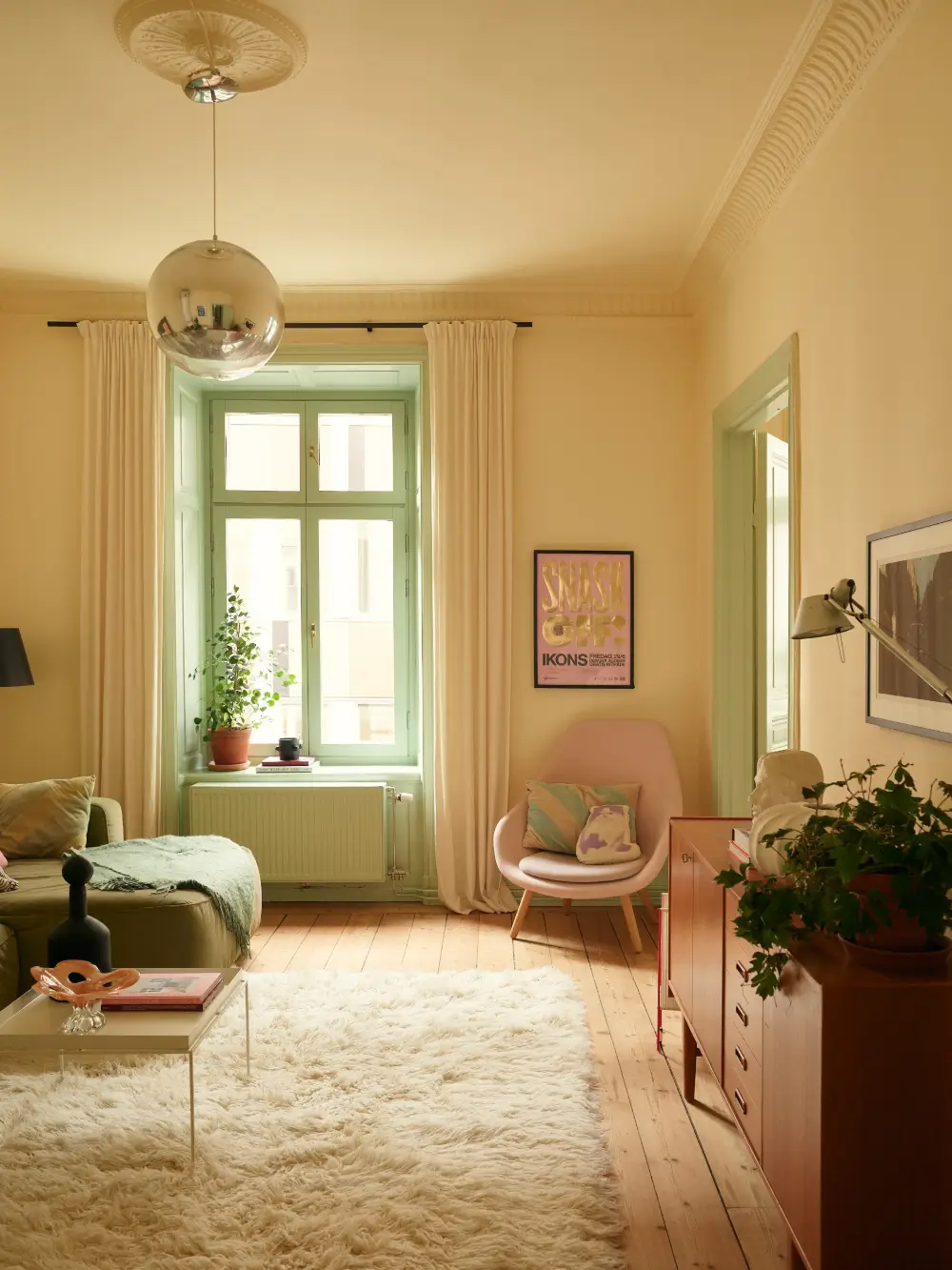
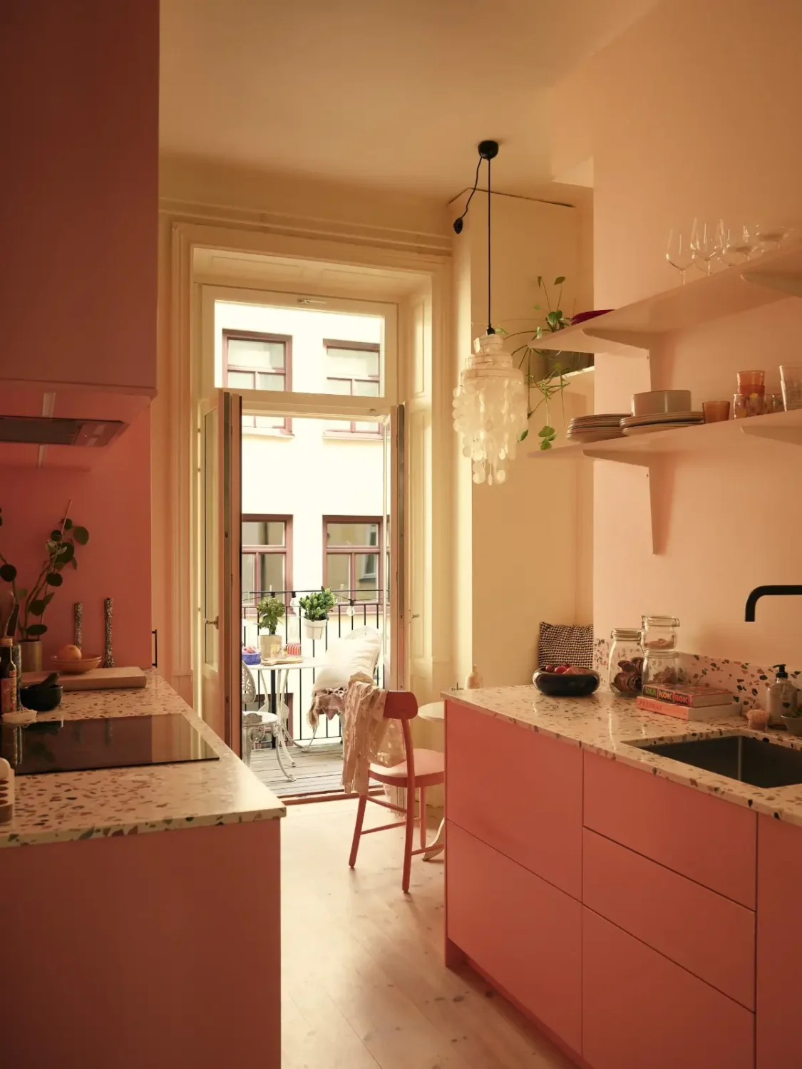
I love how the Scandinavians are embracing color these days. Yellow, green, and pink are combined in an effortless manner in this renovated apartment. The pink kitchen cabinets are also topped with terrazzo, adding even more color.
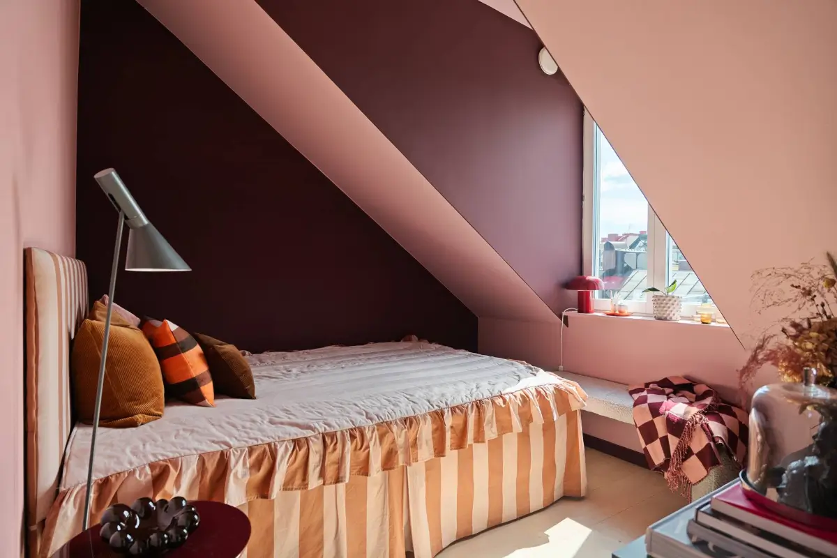
This bedroom is small and awkward with the slanted ceiling, yet the owners didn’t hold back on color. Pink and purple pair beautifully, and the striped bed completes the look.
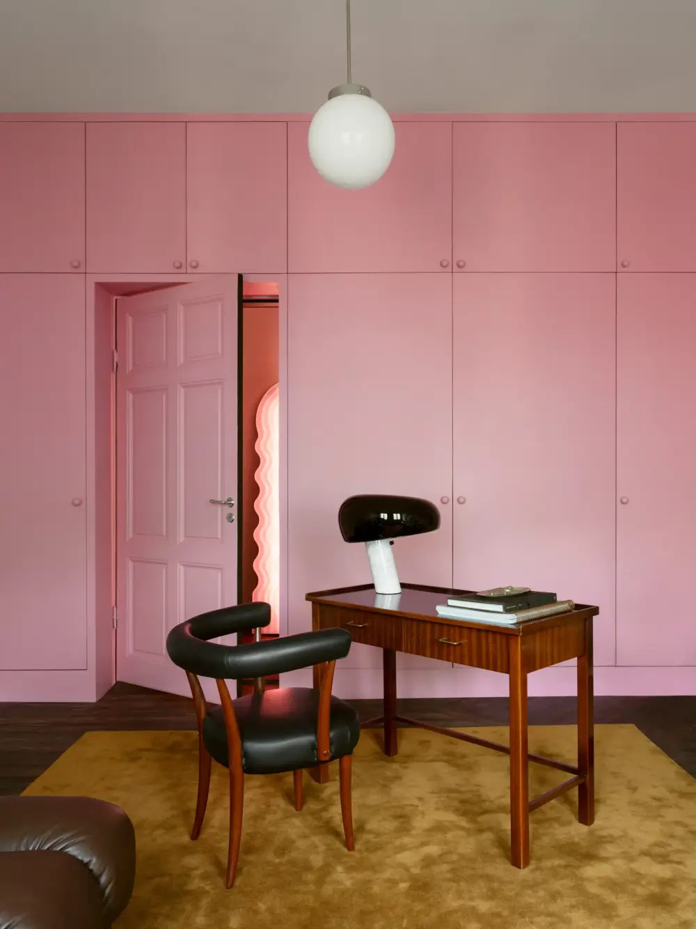
This Swedish bedroom didn’t hold back when it comes to fun color. The built-in wardrobes and the door are painted in a vibrant pink shade, paired with a dark wooden floor topped with an ochre rug that adds warmth to the playfulness.

This color-drenched pink entry hall welcomes you into the home in a spectacular fashion. The panterprint staircase runner makes the look complete.
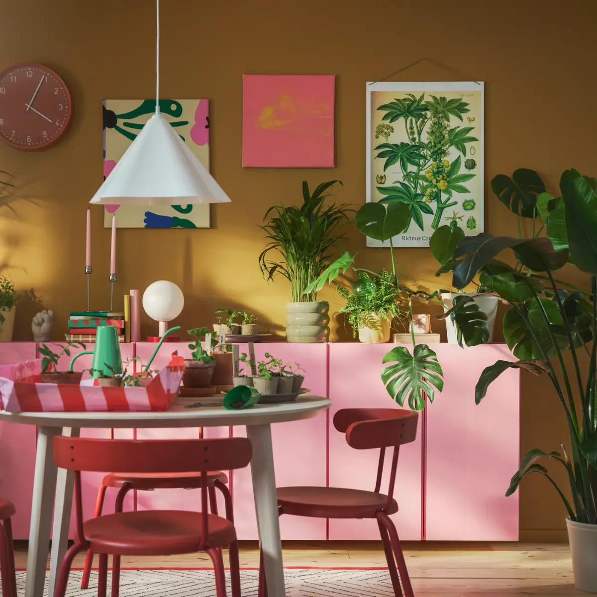
This IKEA dining room embraces color that feels playful as well as warm. The ochre-yellow walls are a great base color, and the pink-painted Ivar cabinets and red dining chairs add color-pop statements. The plants complete the look by adding some green and the much-loved nature inside the home.
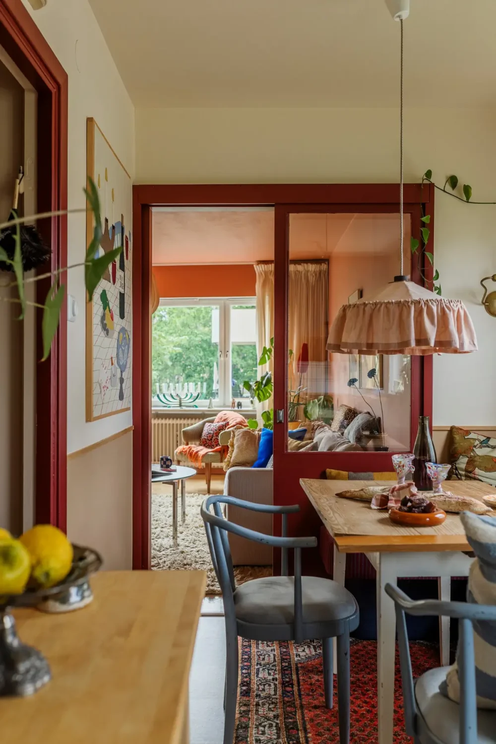
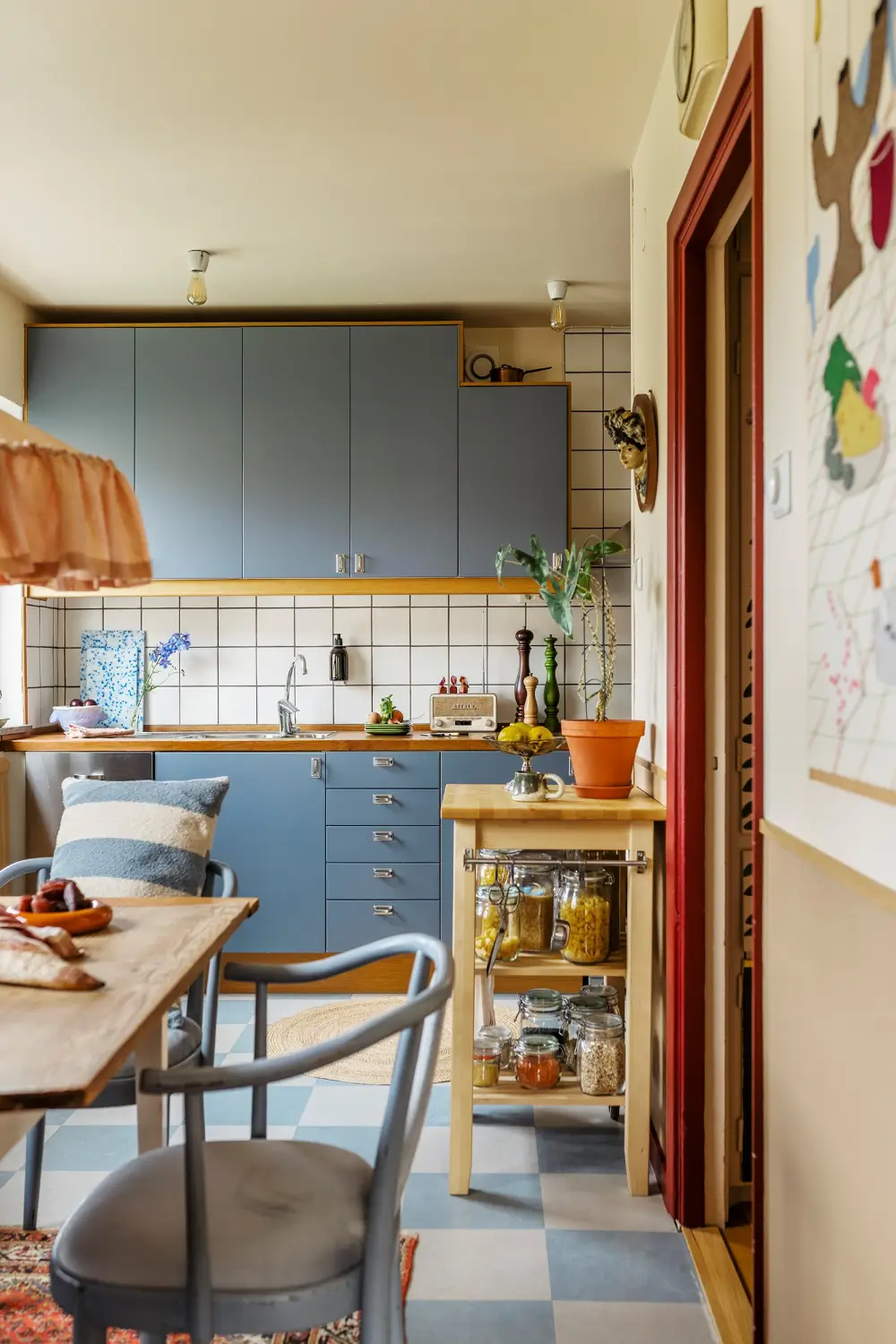
This entire Swedish apartment is decorated in nature-inspired hues. From terracotta to blue, the colors are combined effortlessly, creating a unique and warm home.
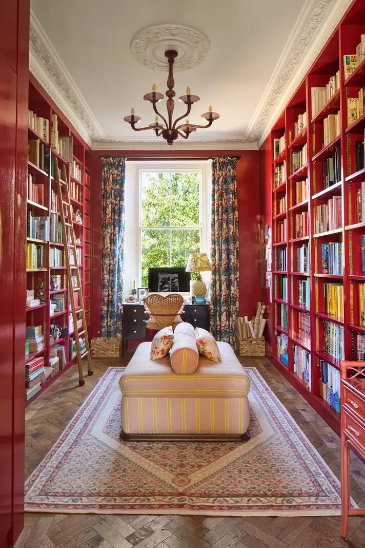
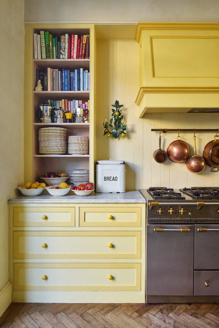
Skye McAlpine’s London townhouse features plenty of color, from a red library room to a sunny yellow kitchen.
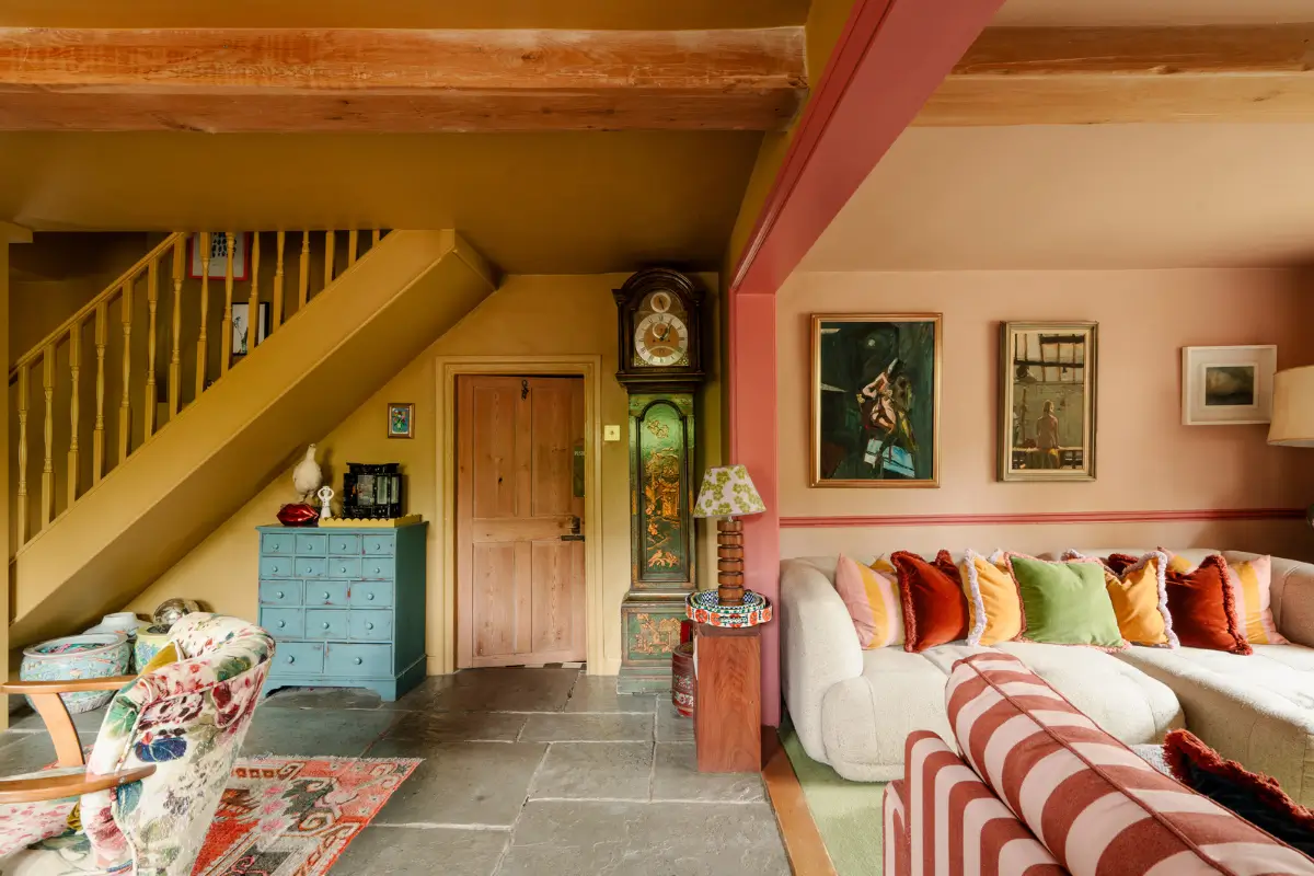
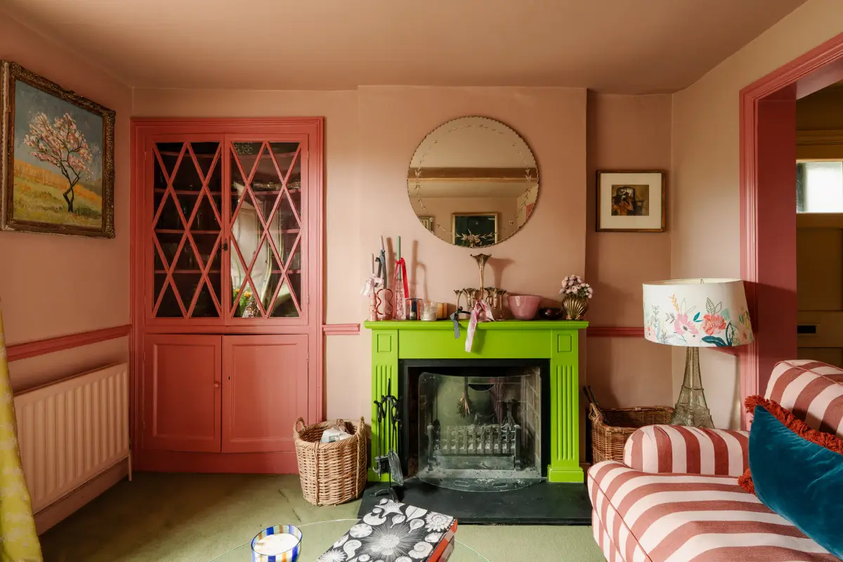
This traditional stone cottage in England is bursting with color, from pink walls, a vibrant green fireplace mantel, and red shutters.
Every year, I look at the fashion color trends for the upcoming year to see if one of these hues will be the newest statement color in our homes.
For a couple of years now, these palettes often showcase more expressive colors than what we’re seeing in our homes, and I think that’s a shame. If you want to see what I predicted for 2027, you can click here.
I hope these examples gave you a little push to choose more expressive colors in your home. You now know it will look amazing! What color do you hope to see more in the interior design world?