The Color Trends for 2025: Warm, Natural Shades and a Cheerful Accent
Now that every paint brand has released its color of the year 2025 and the accompanying color palettes, it’s time to reflect on these colors and look at the overall color trends for 2025. And personally, I’m delighted with the color direction for the new year.
While the color palette of 2025 consists of several diverse hues, it is cohesive, which we will explore in this article. Plenty of beautiful interiors, at the end of the article, will inspire a new color story in your home. Let’s take a look at the 2025 color trends.
The Colors of the Year 2025
The Color Trends are partially determined by the Colors of the Year. Pantone is the biggest name that chooses a 2025 color, but most leading paint brands in the world also pick their own 2025 color of the year.
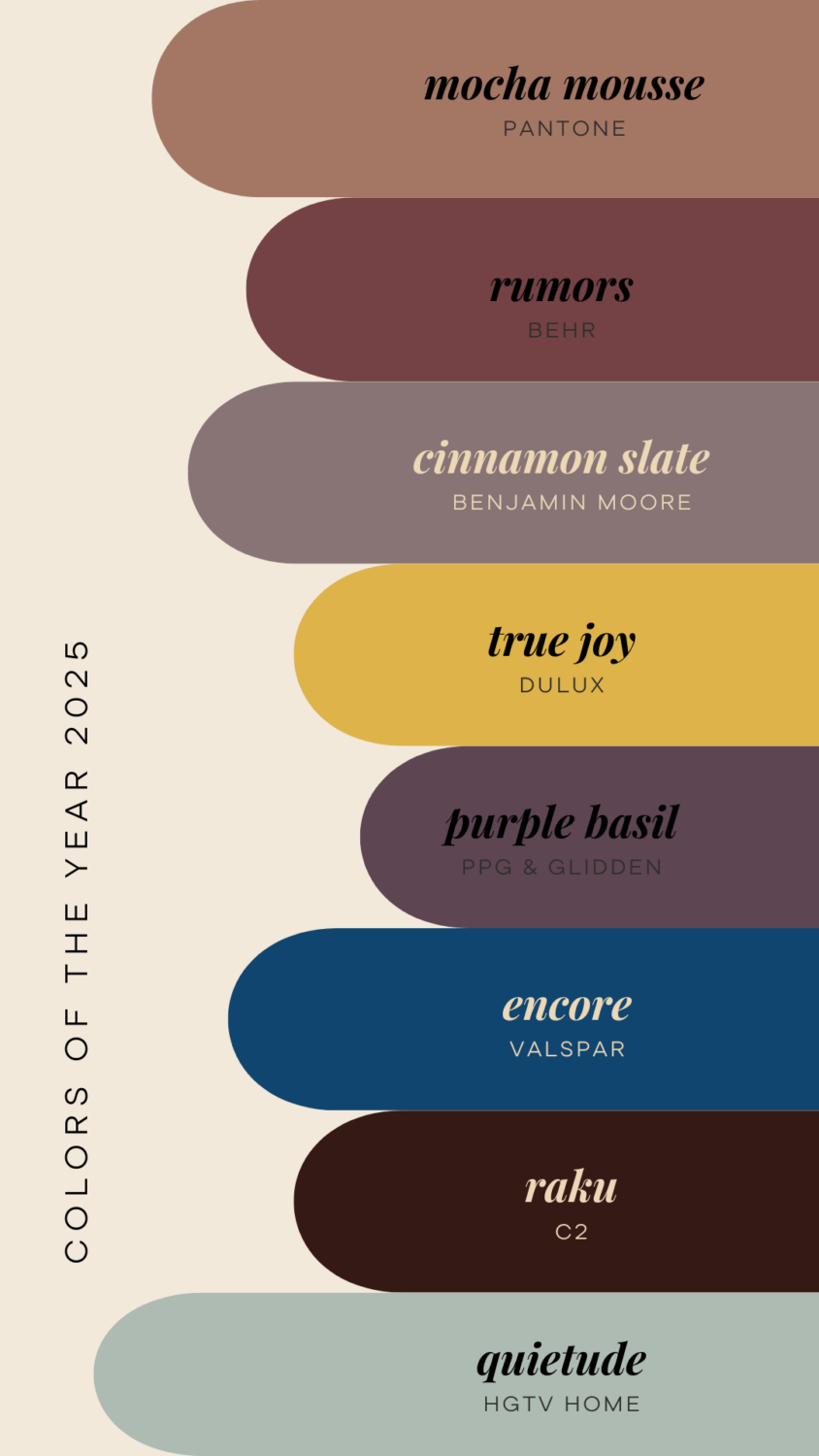
This image gives you a nice overview of the colors chosen by the largest paint companies in the world. Some paint companies, like Sherwin-Williams and the Norwegian brand Jotun, have not released one color but a color palette, so they are not visible in this picture.
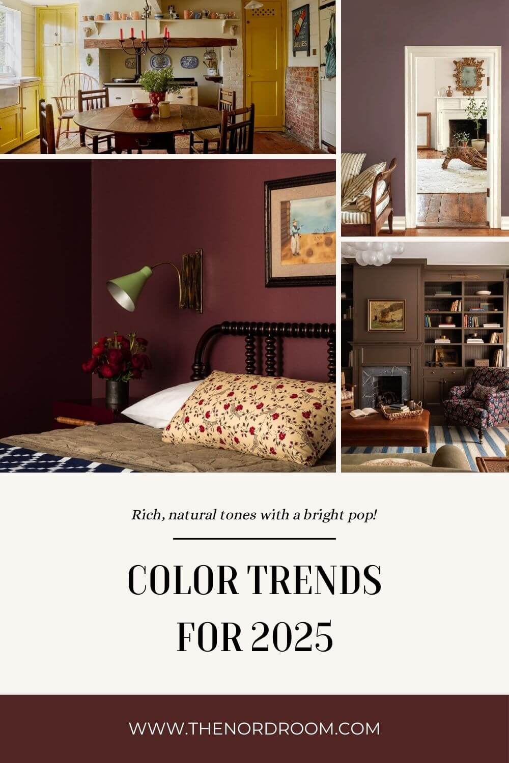
The color palette shows a selection of muted, earthy tones and rich, vintage-inspired shades, meaning that the color world is shifting towards a balance of warm, natural, and sophisticated shades that evoke comfort, stability, and a grounded connection to the natural world around us.
Red and Purple Tones
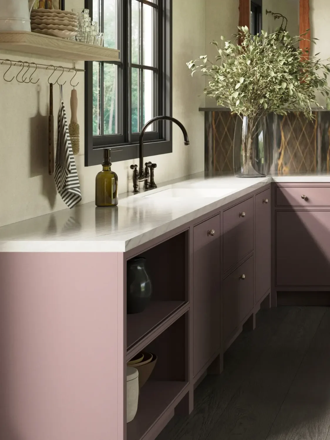
Benjamin Moore, Behr, and PPG/Glidden have opted for colors in red and purple tones. Benjamin Moore opted for a dusty plum called ‘Cinnamon Slate,’ a timeless yet modern hue that adds depth and richness to a room. PPG/Glidden opted for a bolder take on purple with their ‘Purple Basil,’ an elegant yet dramatic shade that will surely make a statement in your home.
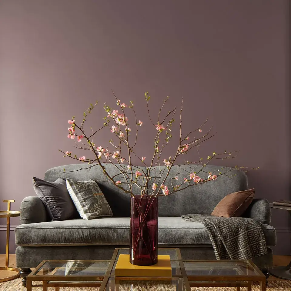
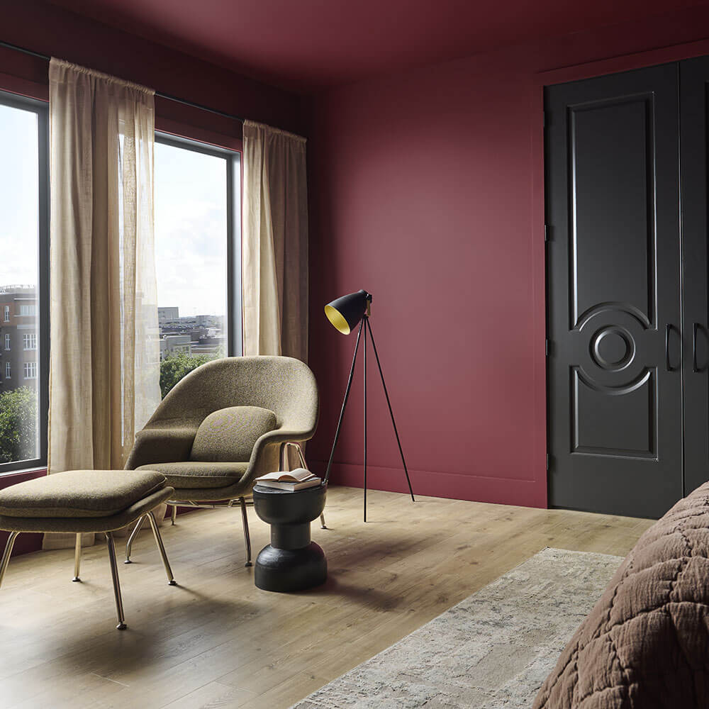
Behr chooses a color in the red color family. Their 2025 color ‘Rumors’ is a dusty burgundy shade that is rich and deep but not overpowering. The color is perfect for those who want to add warmth and depth to their interior spaces, which creates the perfect balance between nostalgic and contemporary.
Warm Yellow
Yellow is having a renaissance, whether it’s a light, buttery tone, a pastel yellow, or, as the Dulux Color of the Year 2025, ‘True Joy,’ a warm, almost mustard yellow shade. A color like True Joy adds a vibrant energy to your space; it’s not called joy for no reason, after all. This yellow shade is optimistic and bright but grounded and connected to the natural world.
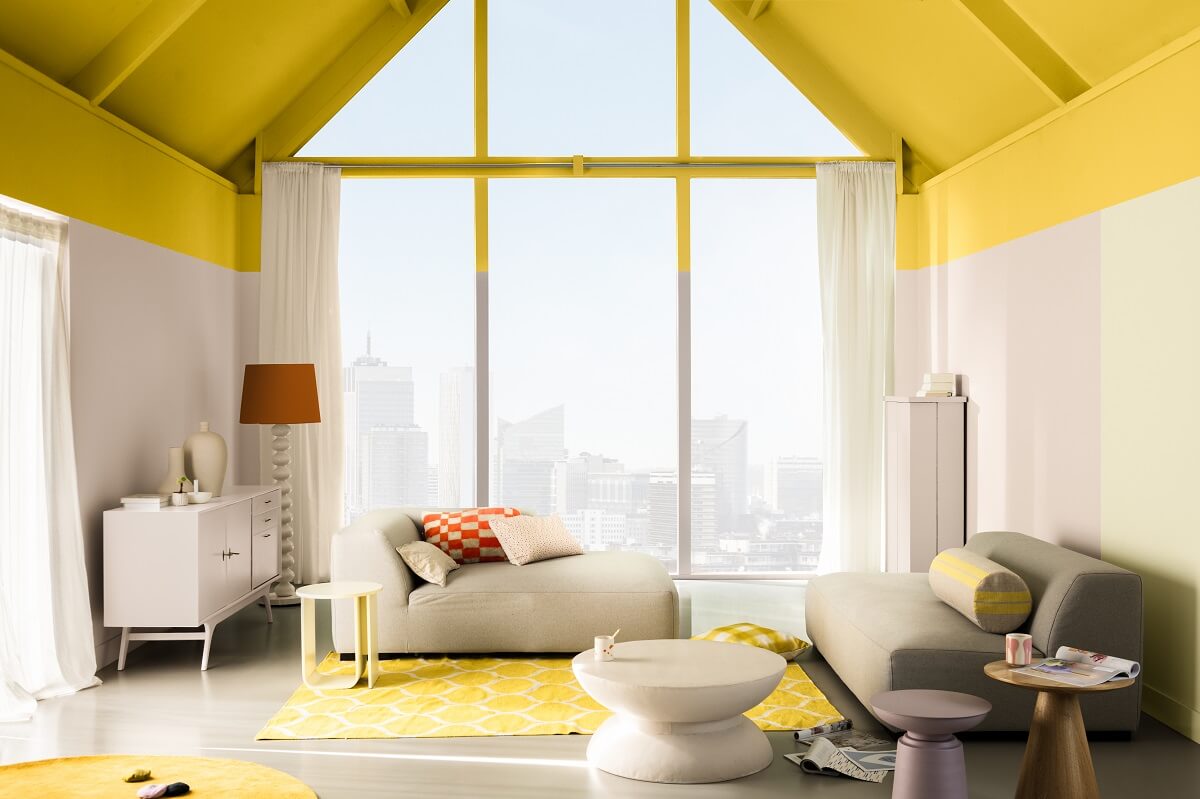

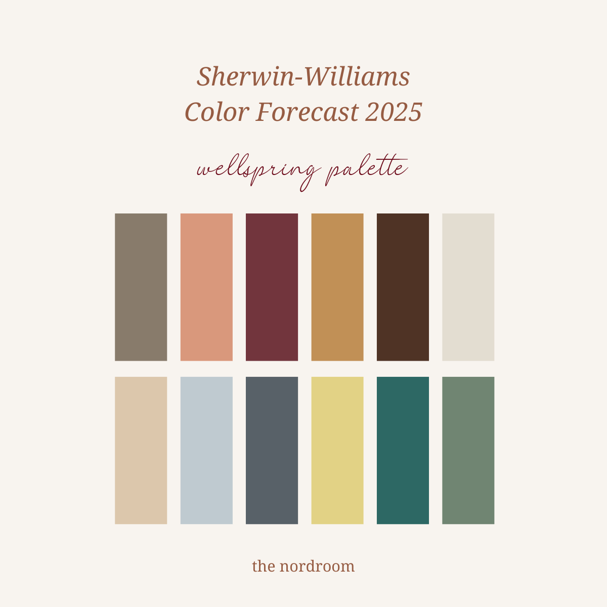
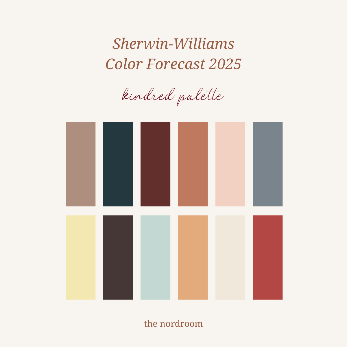
A warm yellow shade is also one of nine colors on the Sherwin-Williams Color Capsule for 2025.
Brown Tones
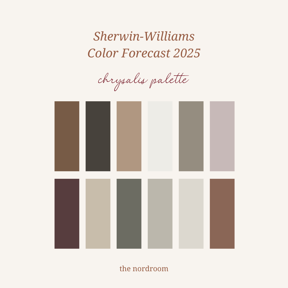
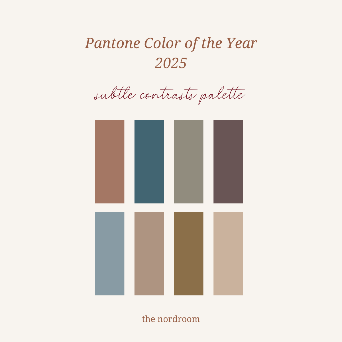
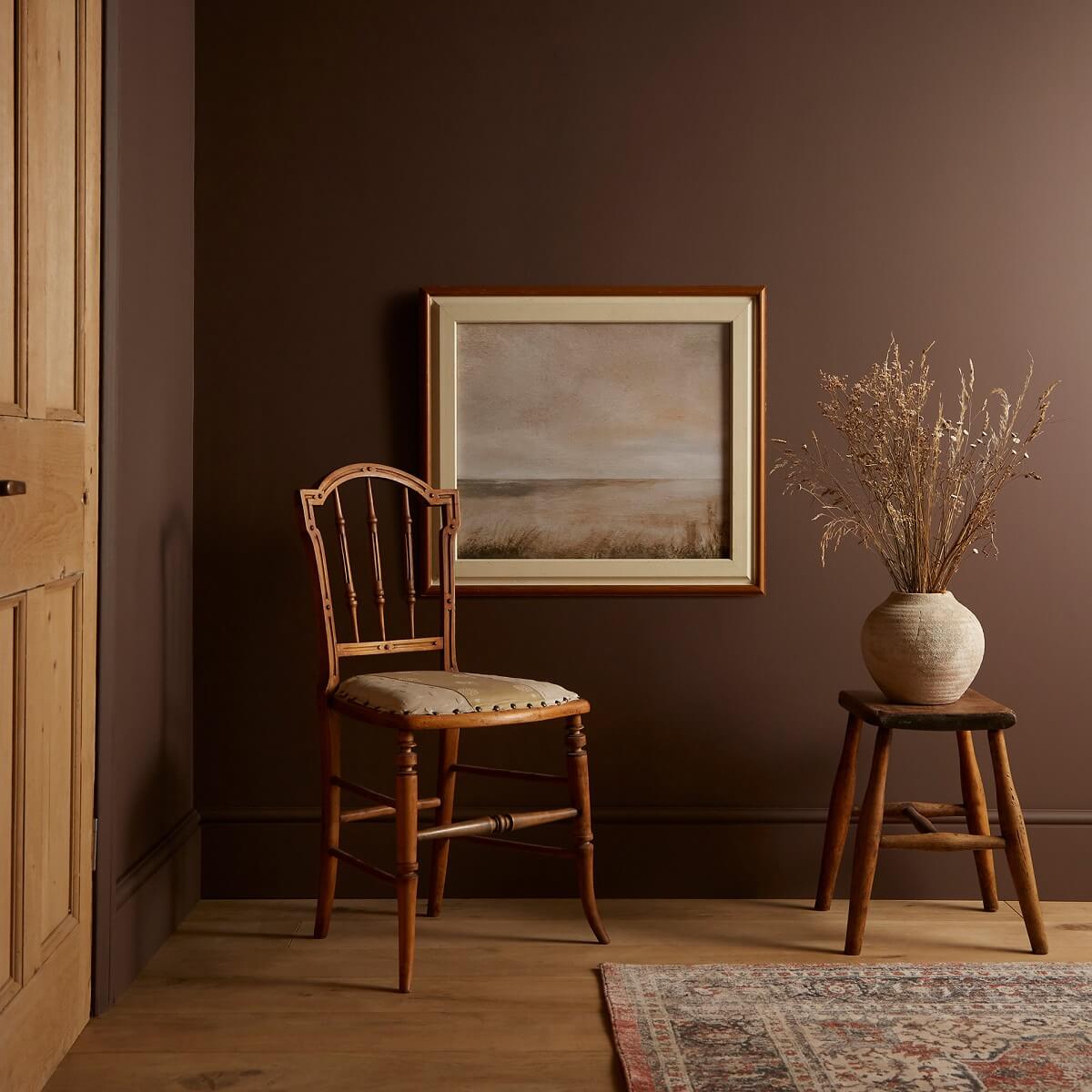
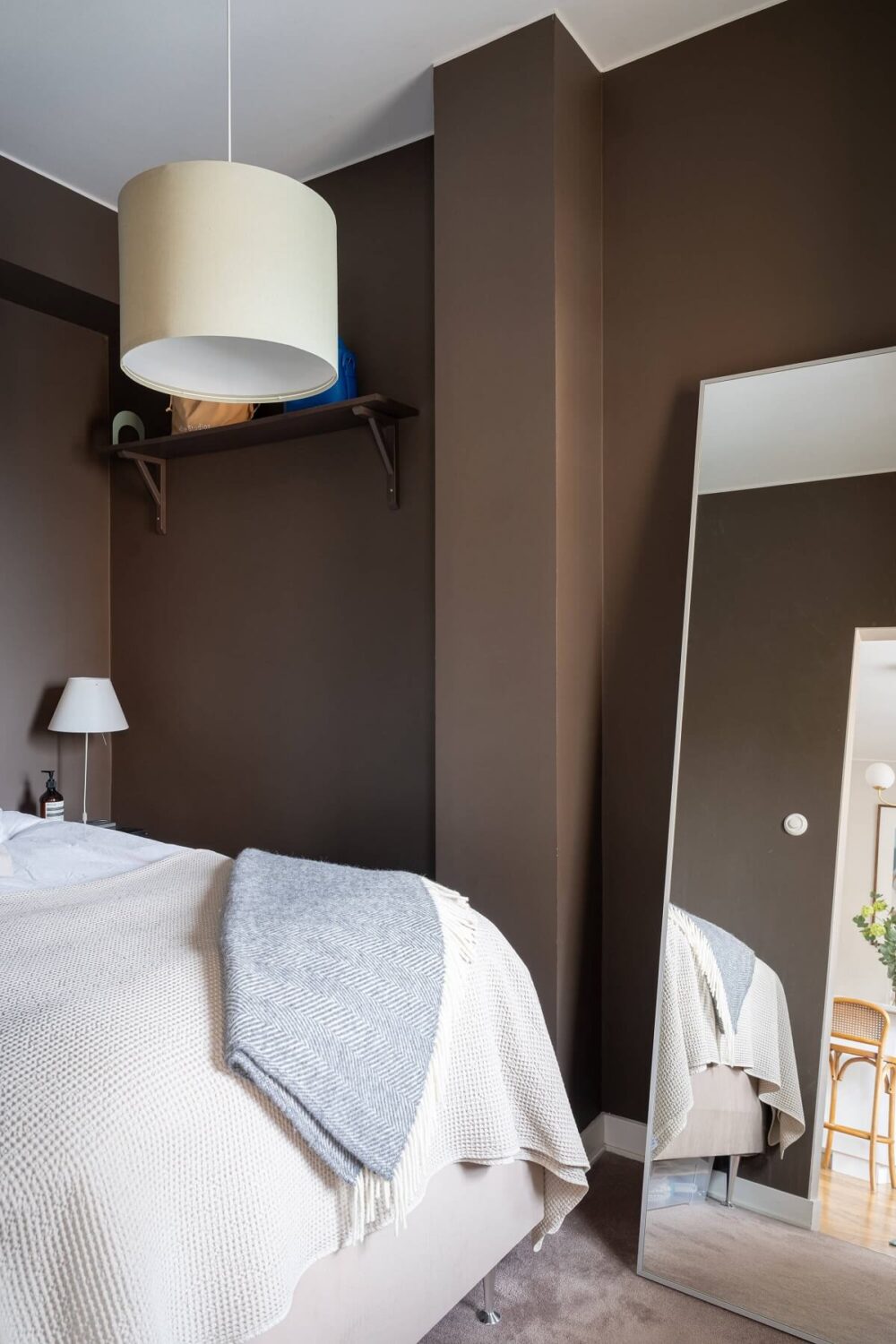
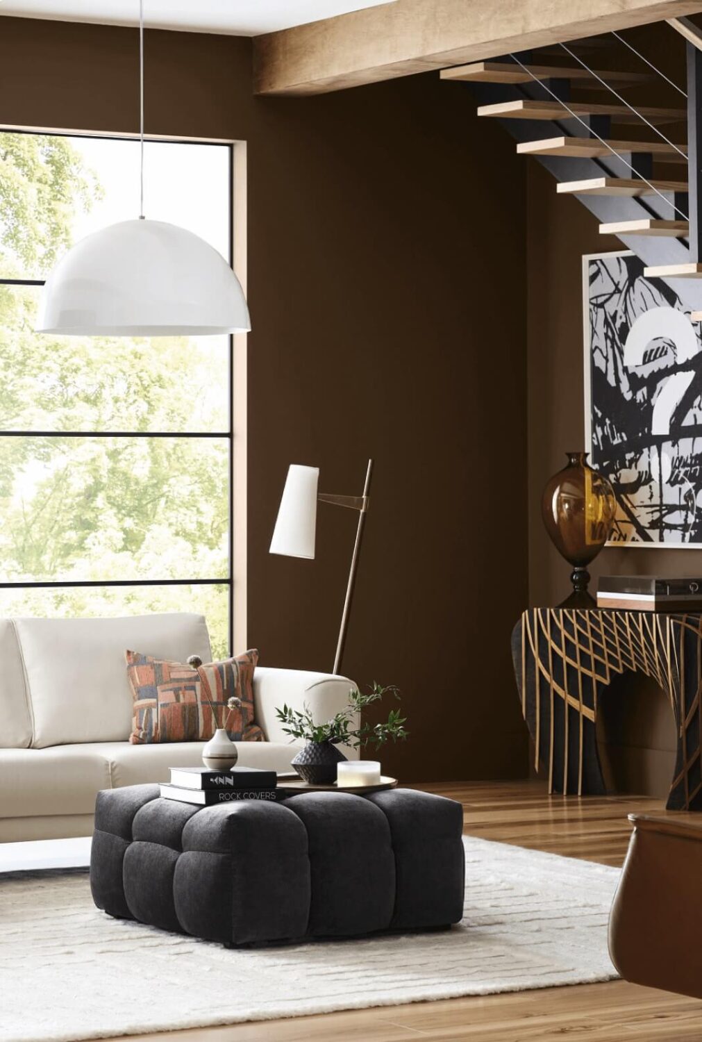
Pantone Color Institute and paint companies C2 and Graham and Brown (not pictured in the image above) opted for a brown shade as their 2025 color. These colors are perfect for those who want to create contrast and drama in their spaces while staying in the comforting earthy tone palette. Brown is also one of Sherwin-Williams’ trending colors.

Blue Tones
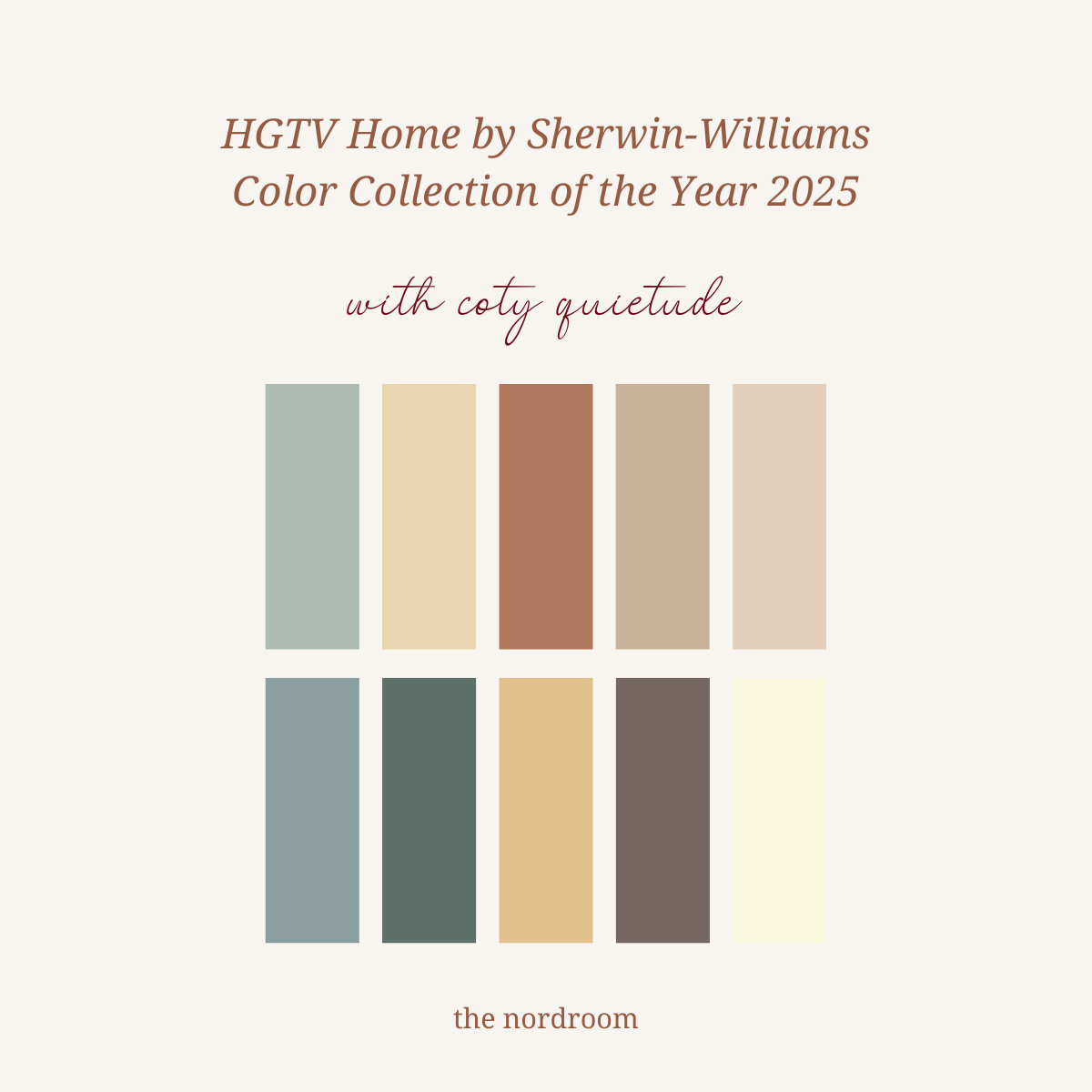
Blue shades never go out of style, but unlike a couple of years ago, blue (and green) no longer dominates the interior design world. The blue tones in the 2025 color palette, chosen by HGTV Home, Valspar, and Dutch Boy, range from a saturated blue to a light blue with gray undertones.
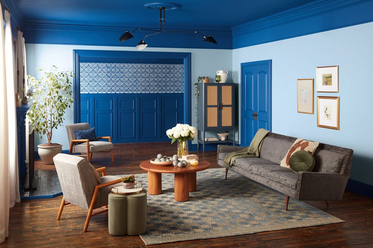
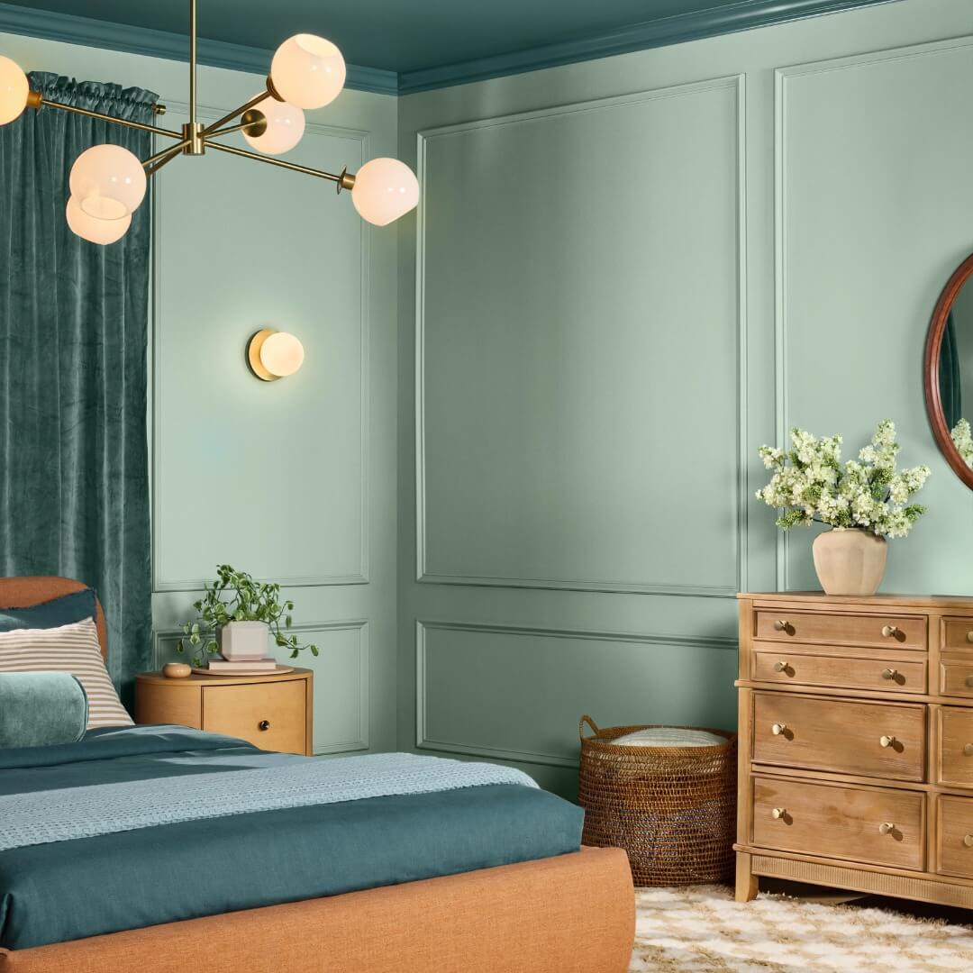
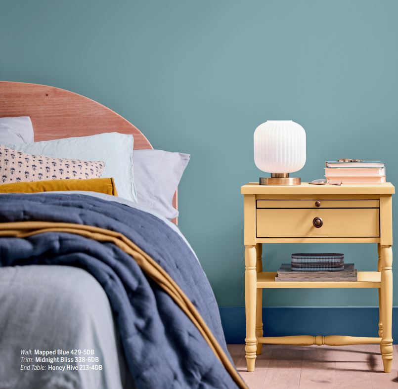
Blue tones are a safe choice for any interior, although the trending blue colors from Valspar (Encore) and HGTV Home (Quietude) are more interesting than regular blue. Our love for blue is an antidote to our busy and sometimes unconnected lives. Instead of a technological connection, we’re craving a natural connection that adds a calming vibe to our interiors.
The Color Trends for 2025
The color trends for 2025 reveal a strong inclination towards earthy, muted tones that offer a sense of grounding and stability. Colors like Benjamin Moore’s Cinnamon Slate and brown tones like Pantone’s Mocha Mousse reflect a desire for warmth and comfort, while a soft sage like HGTV Home’s Quietude brings nature’s calming influence indoors.
At the same time, richer colors such as golden mustard and Behr’s deep ruby red ‘Rumors’ provide contrast, adding depth and a touch of boldness without overwhelming the senses.
This palette reflects our collective need for spaces that feel timeless, comfortable, and connected to nature. As we move through 2025, expect to see these colors embraced in both interior design and fashion, offering a perfect balance between the past and present, luxury and simplicity.
The 2025 Color Palettes
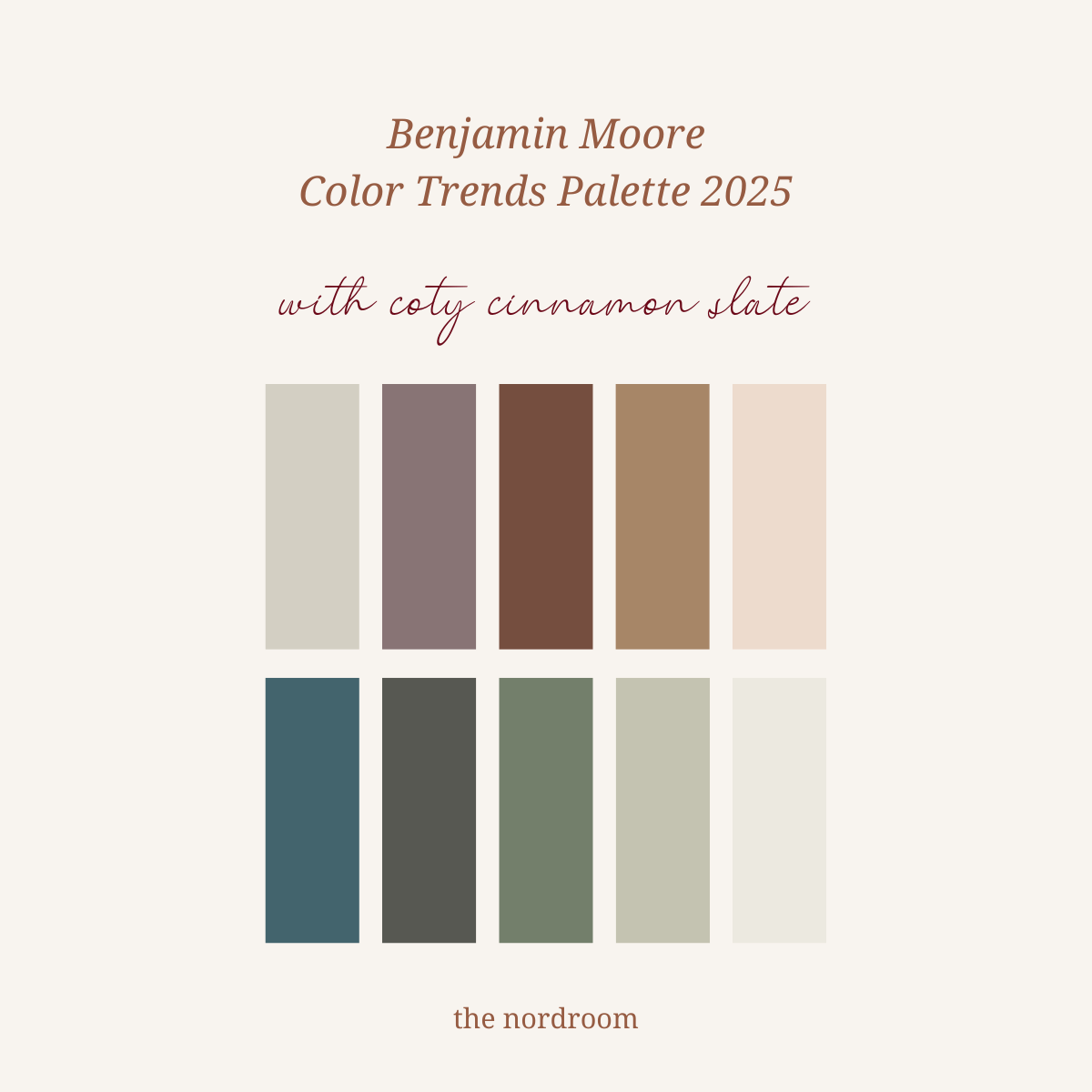
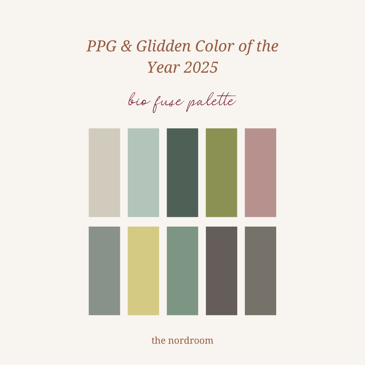
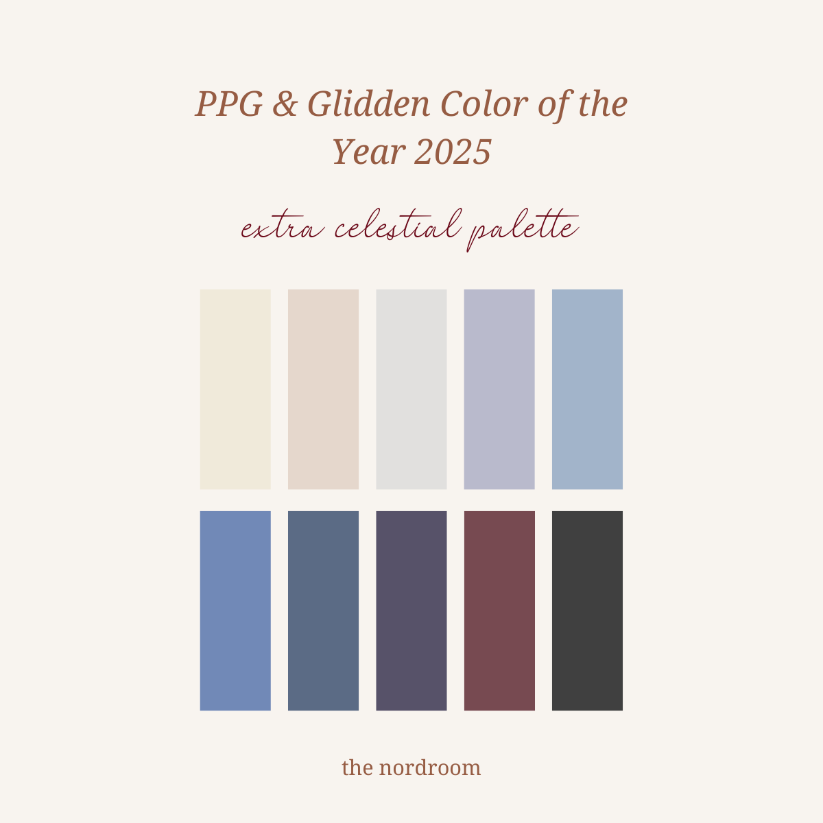
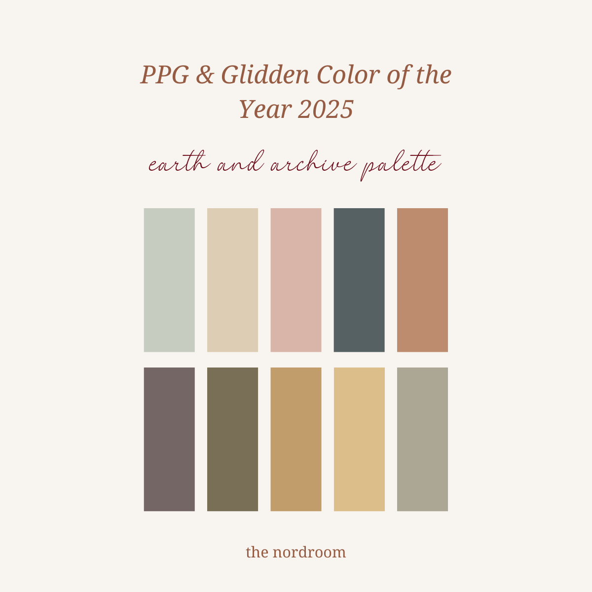
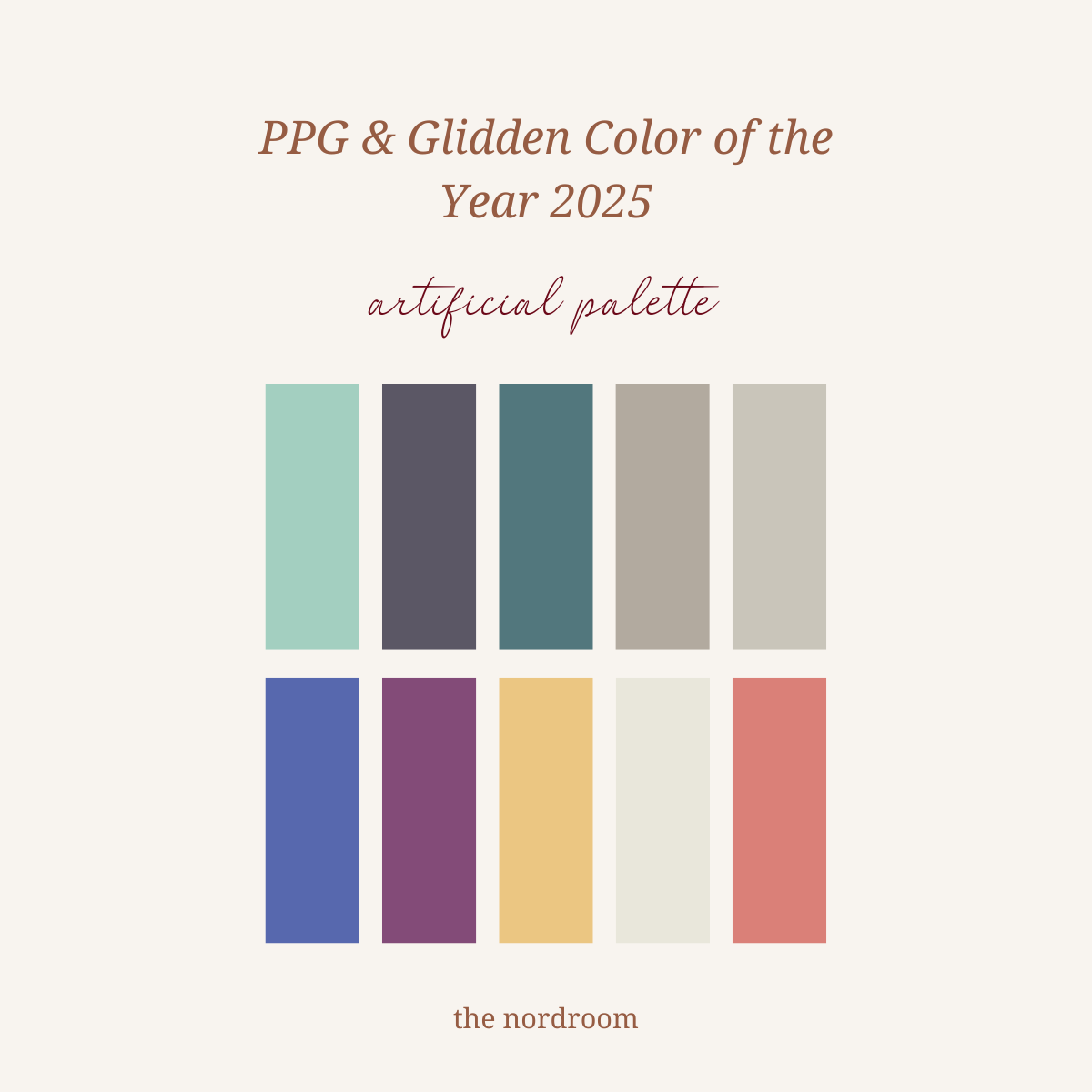
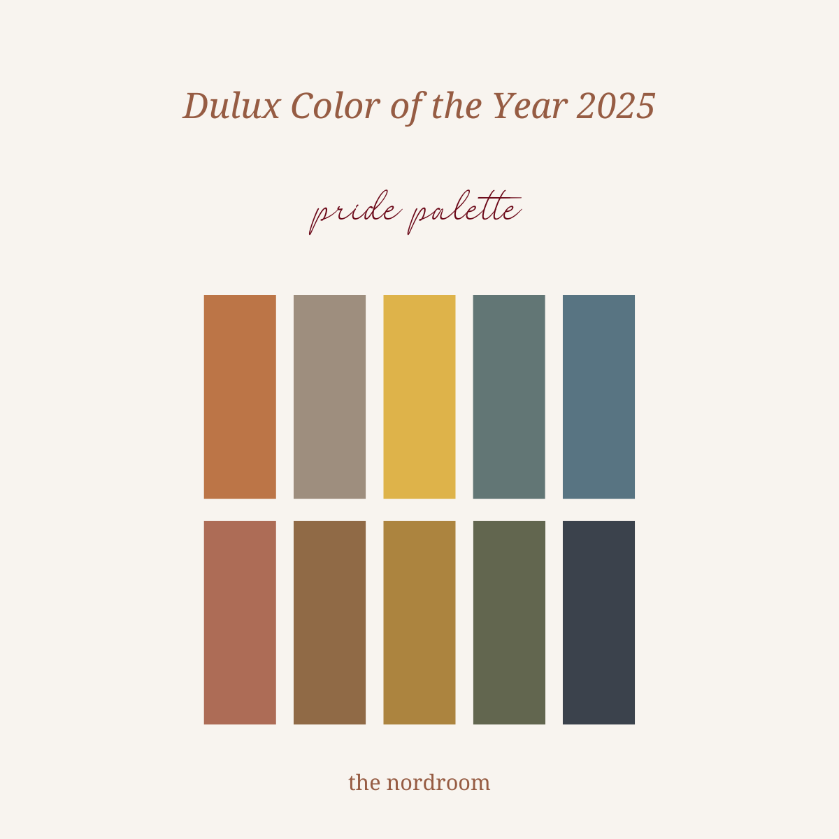
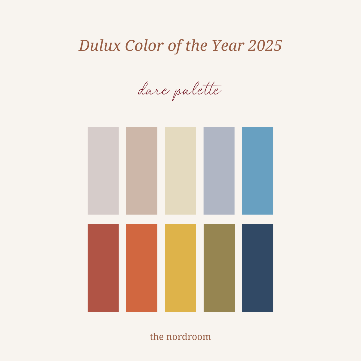
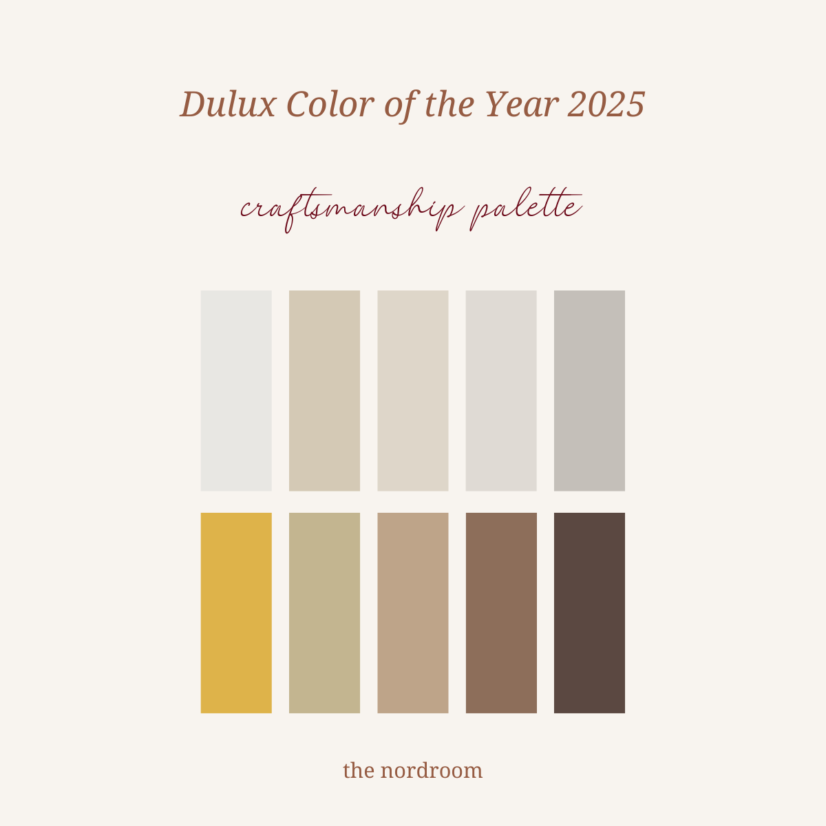
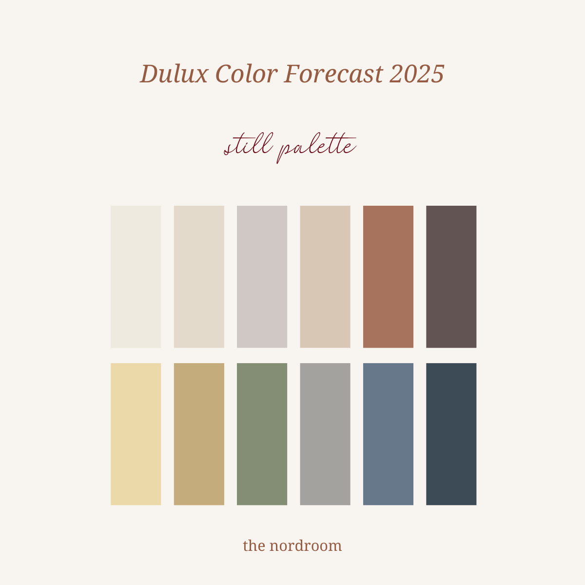
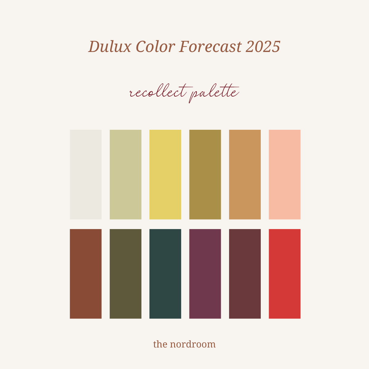
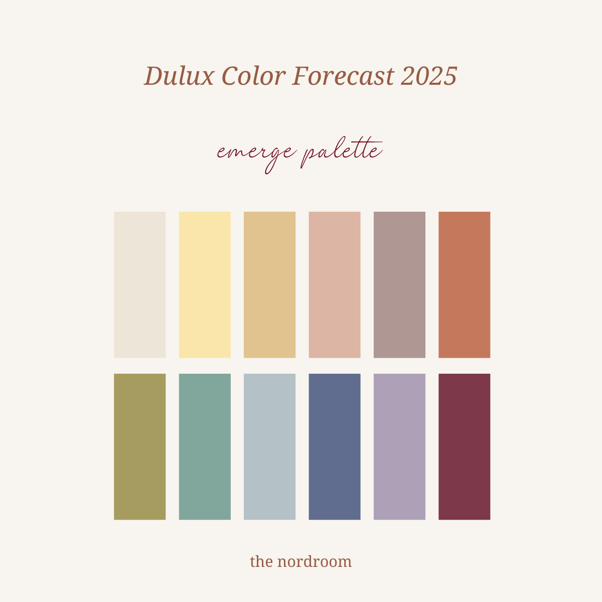
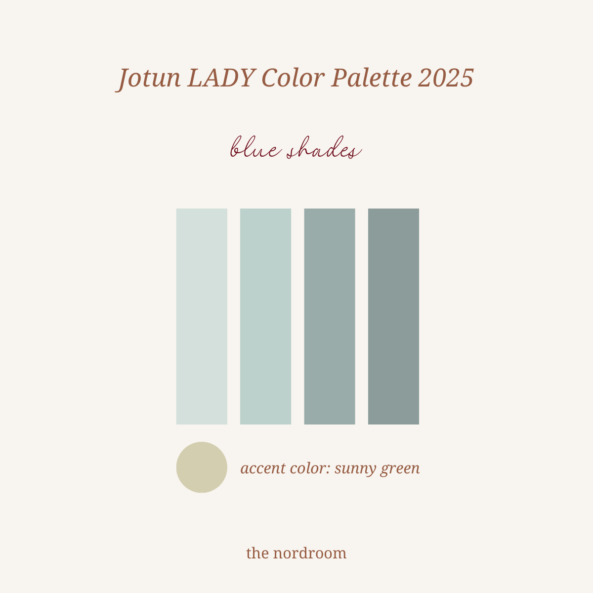
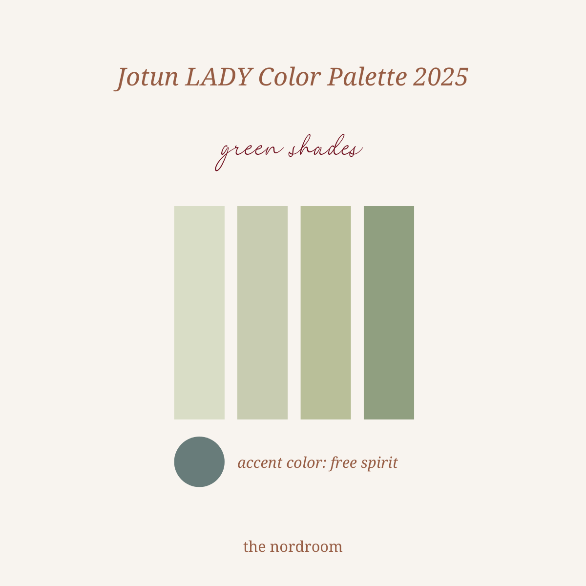
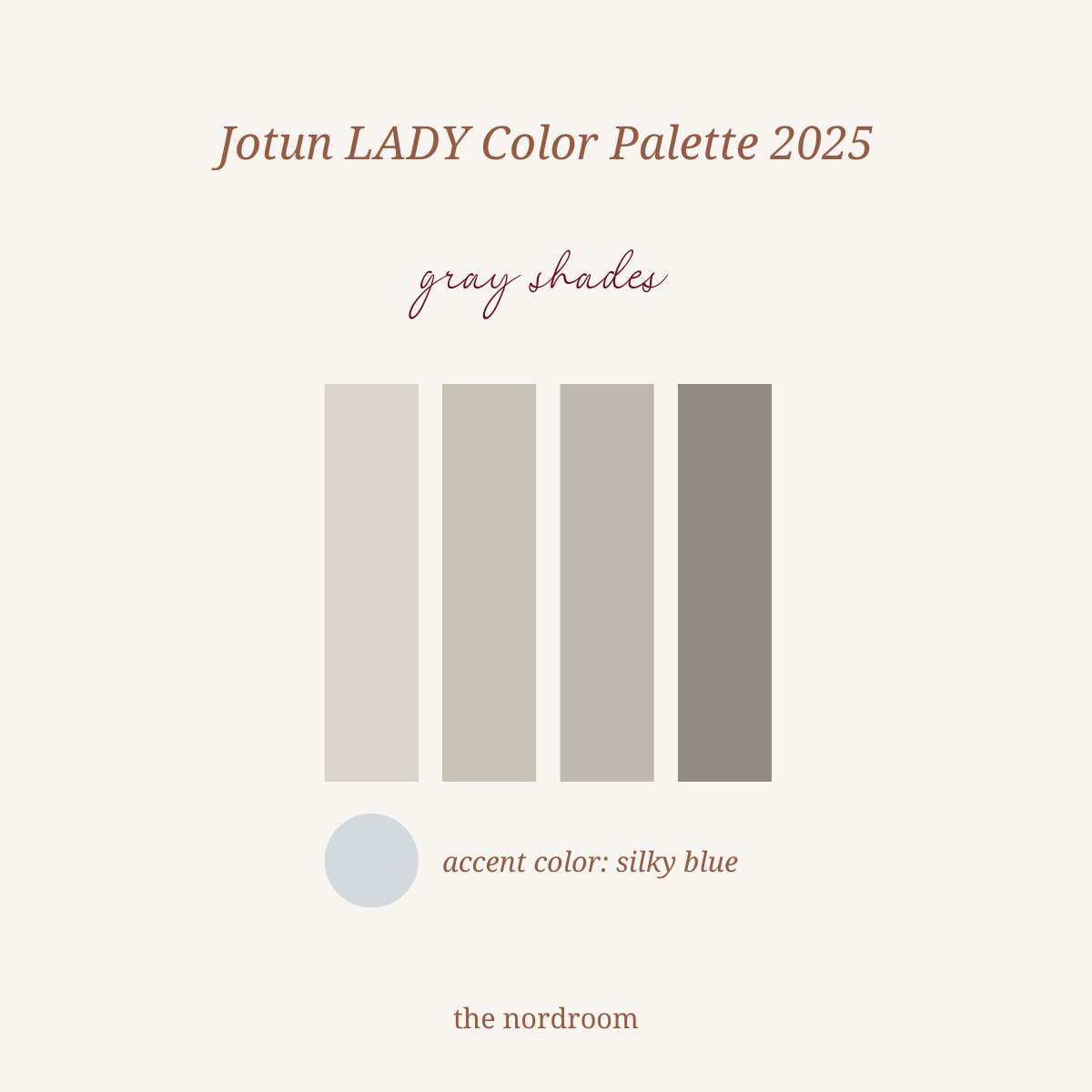
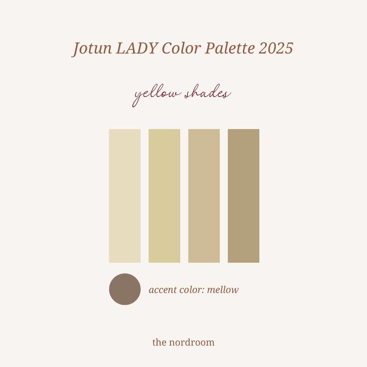
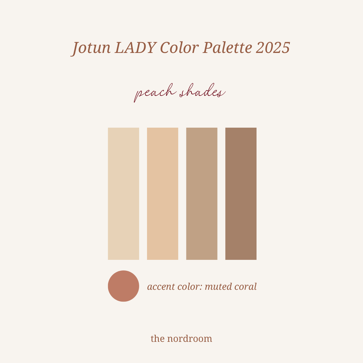
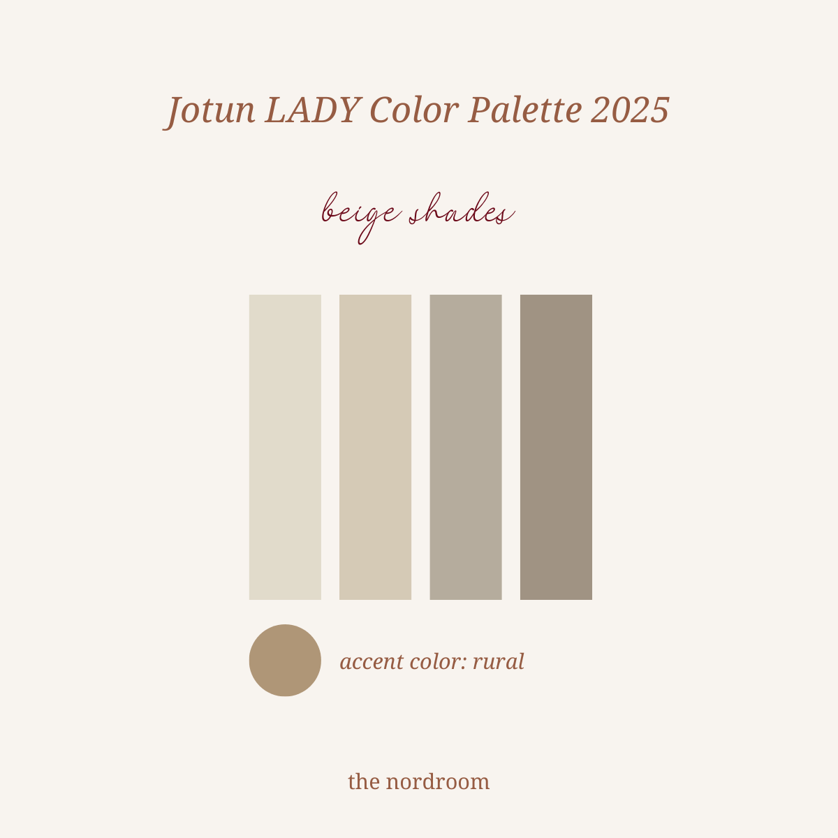
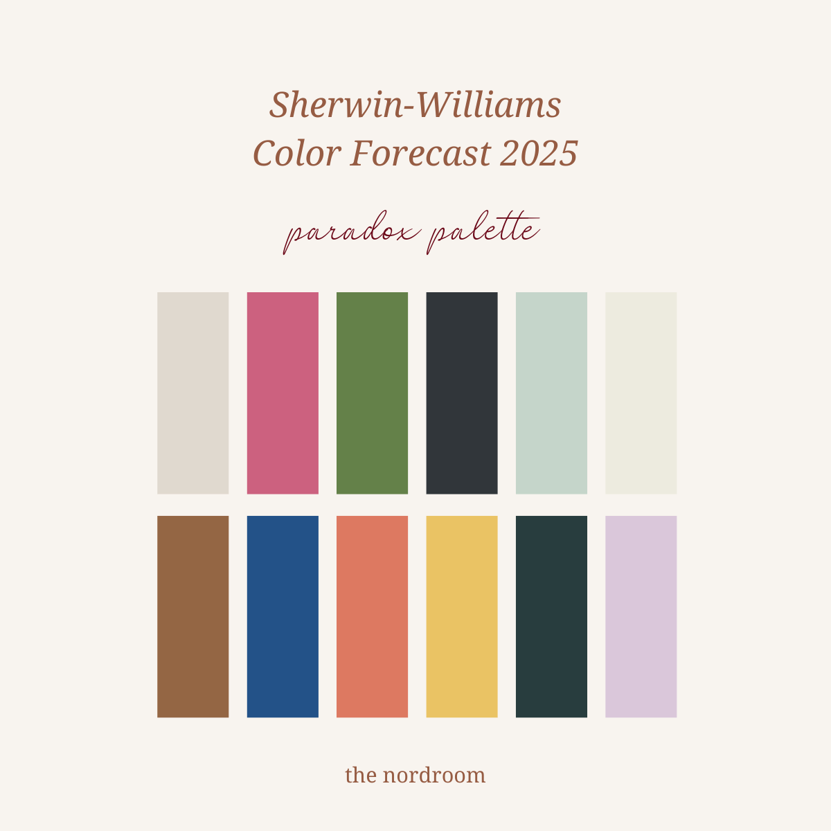
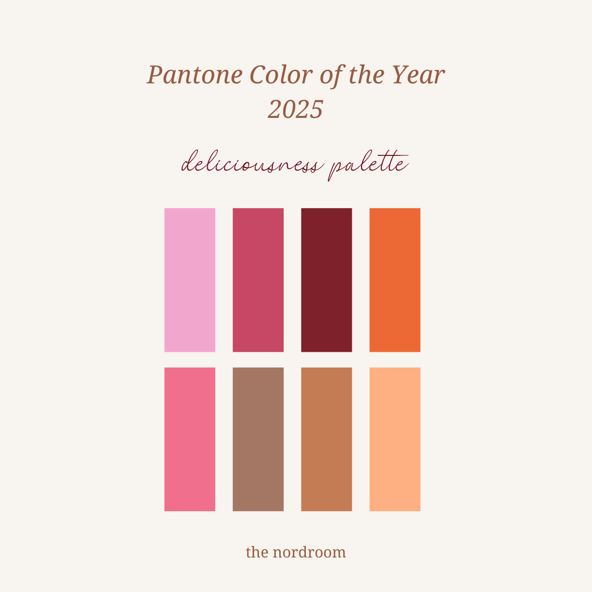
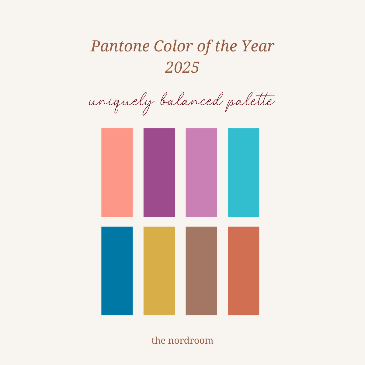
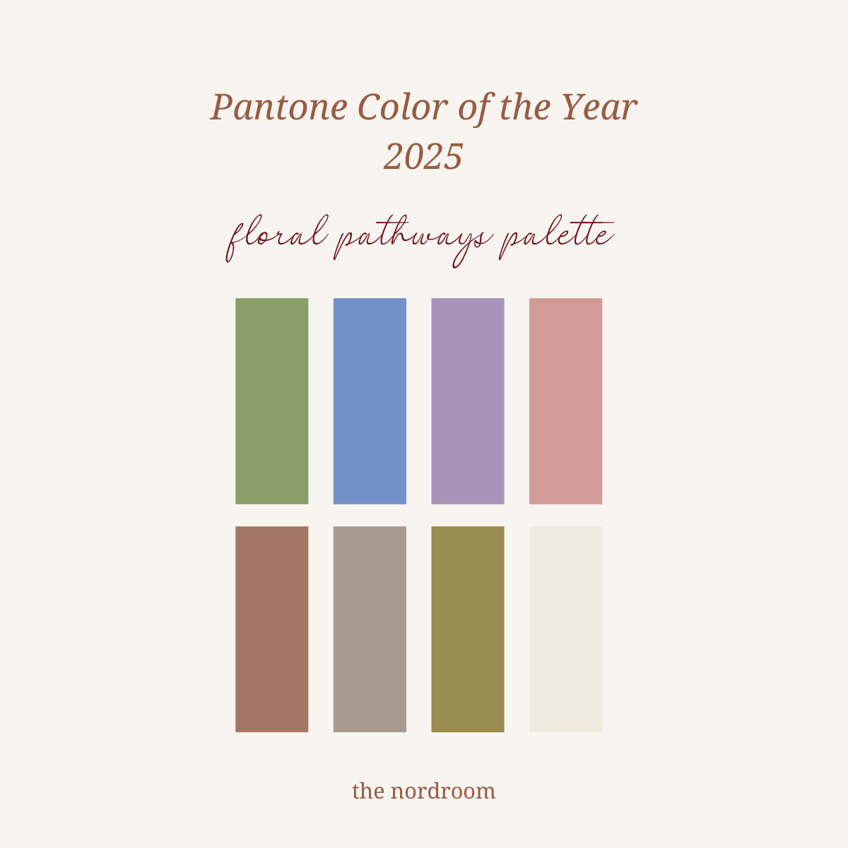
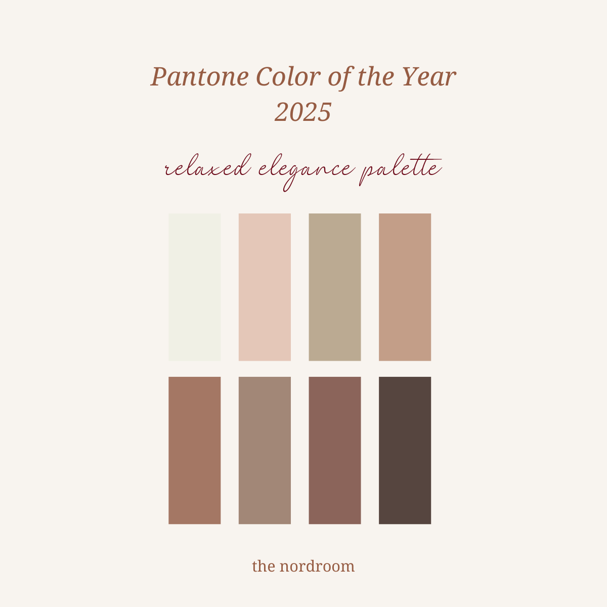
Besides a color of the year, paint companies release trending color palettes to help you combine trending hues in a cohesive color scheme. These stunning palettes were created for 2025.
The Nordroom’s Color of the Year Prediction
In early 2024, The Nordroom created a Color of the Year 2025 prediction article based on the color trends from New York and London Fashion Week. Now that the leading paint brands in the world have released their Colors of the Year for 2025, we can see that there is indeed a big correlation between fashion and the interior design world.
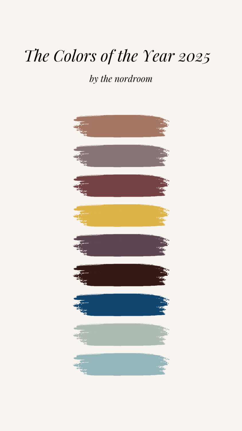
Many colors from the Fashion Week color palettes are also found in the Colors of the Year and their accompanying trending color palettes. Let’s take a look at the two color palettes and their corresponding paint Colors of the Year 2025.
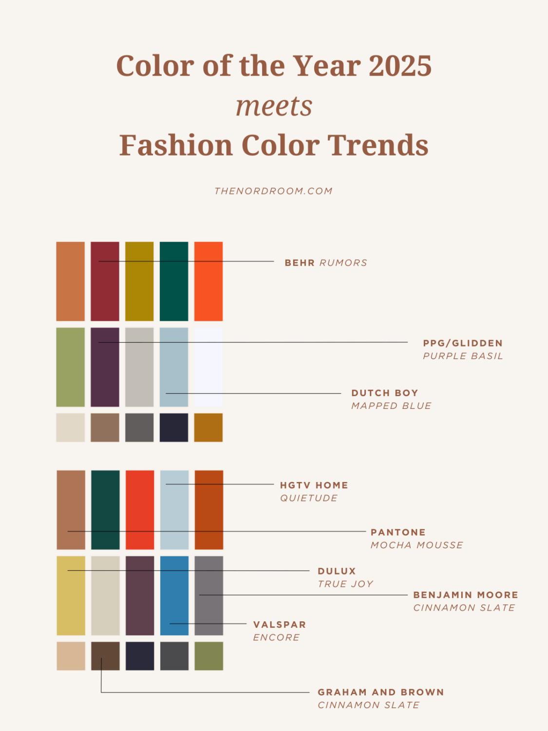
Almost all Colors of the Year 2025 also appear in these color palettes. Pantone’s Mocha Mousse, Benjamin Moore’s Cinnamon Slate,’ Behr’s Rumors,’ Dulux’s True Joy,’ PPG’s ‘Purple Basil,’ and the blue tones from HGTV Home, Dutch Boy, and Valspar.
In 2025, design is all about finding harmony between comfort and sophistication. The colors of the year reflect this trend by leaning into muted, nature-inspired tones that promote serenity while also offering bold, vintage-inspired hues that create depth and interest.
Let’s see how we can incorporate these trending 2025 colors into our homes.
Home Decor Color Trends 2025 Inspiration
I strive to give you as much interior inspiration as possible using the trending 2025 colors. Please note that the colors used in these inspirational images are not always exactly the same as the chosen colors of the year, but they give you an idea of how to style these hues in your home.
Red and Purple Interior Inspiration
Red and purple hues are often strong shades that you might find scary to decorate with, but these images will show you the beauty of red and purple shades, like Behr’s Rumors, Benjamin Moore’s Cinnamon Slate, and PPG/Glidden’s Purple Basil, in your house.
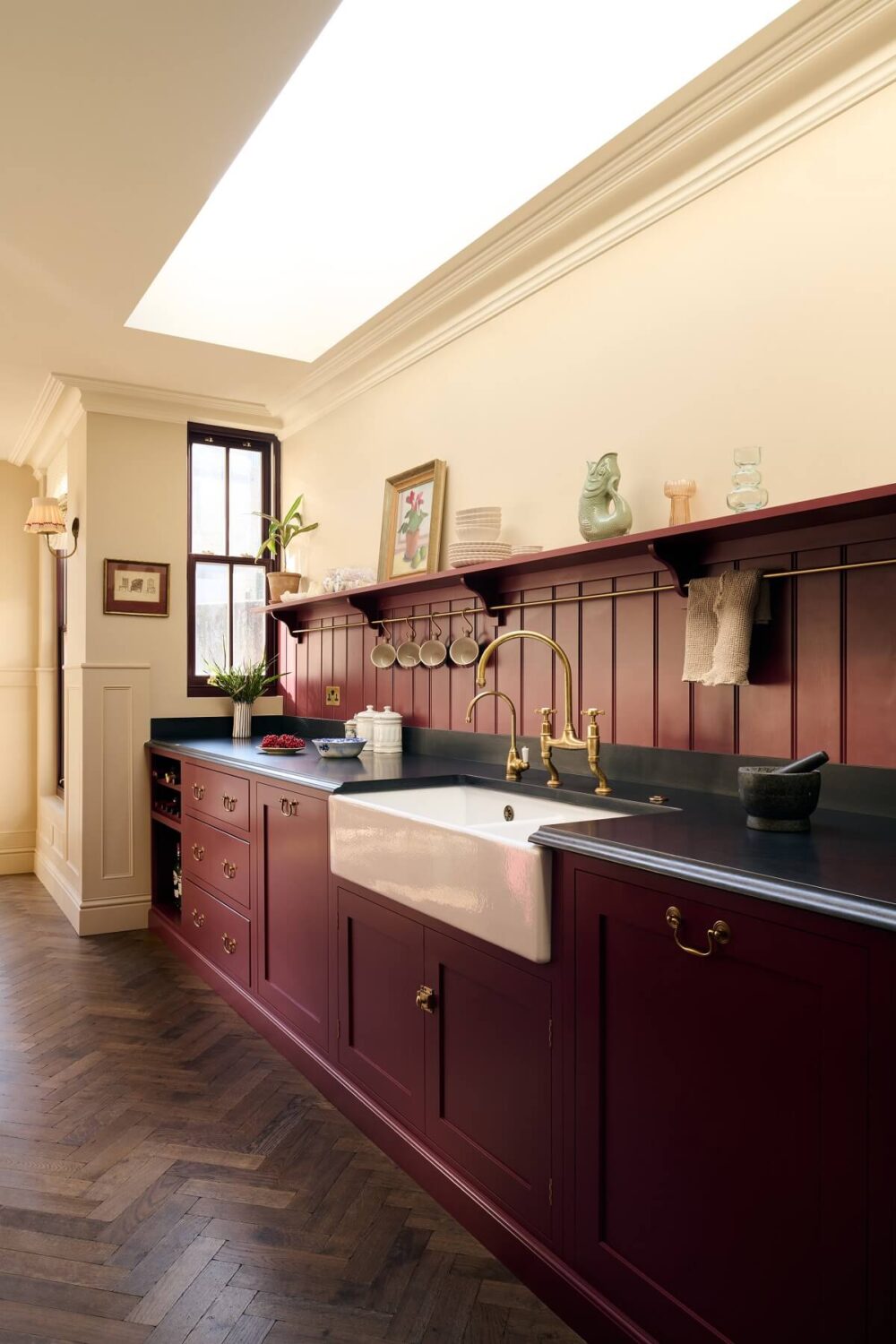
deVOL Kitchens knows the strength of a deep red hue, which is why they have their own red shade called ‘Refectory Red.’ This kitchen, designed by Uns Hobbs and deVOL, shows the beauty of this color.
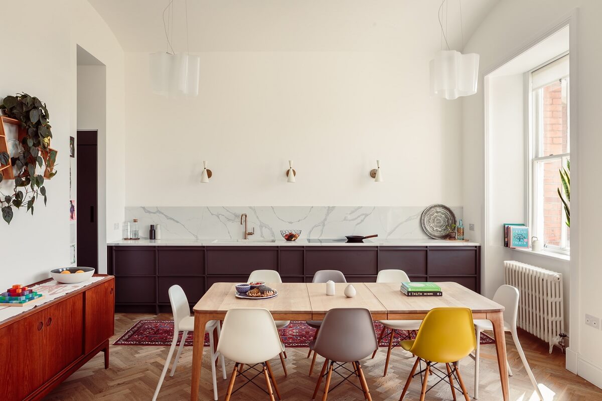
A purple kitchen is not something you see every day, but this modern example in a London duplex apartment shows that a warm purple hue is a perfect warm neutral for the kitchen.

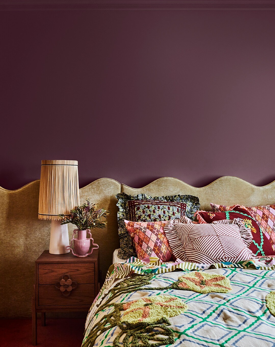
There is a shift from light tones to darker hues in the bedroom, and this purple is warm, calm, and inviting. Perfect for a bedroom.
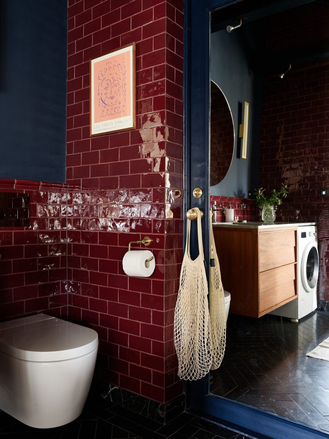
Surround yourself with warmth and luxury in the bathroom with deep red tiles paired with a moody dark blue shade on the walls. Beautiful, as you can see in this bathroom from a Scandinavian duplex.
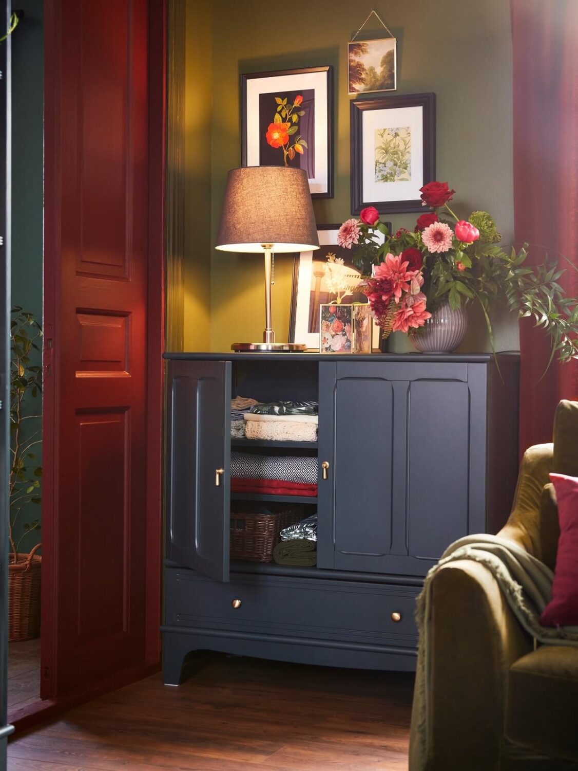
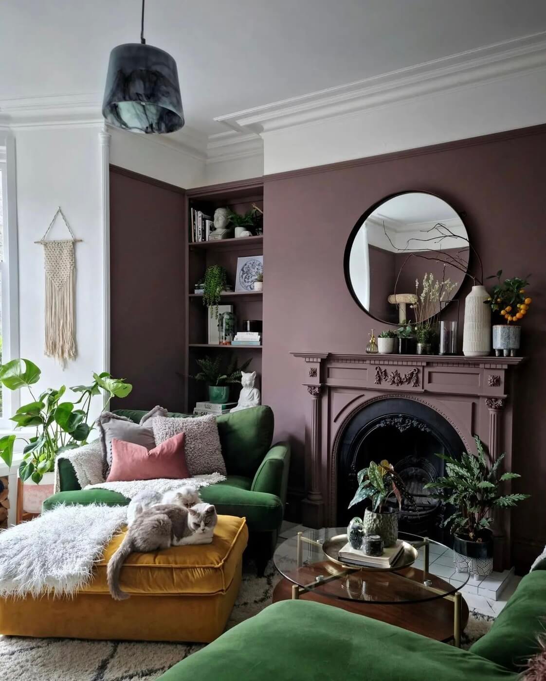
Heather’s Scottish home is packed with color. In the living room, she paired a deep purple shade with natural green and ochre yellow, combining two trend colors.
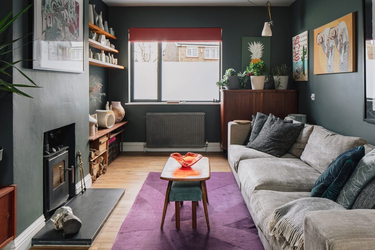
You don’t have to paint walls; trend colors can also be added to home decorations like textiles, vases, or prints. In this moody living room, a purple rug adds a nice color pop to the room.
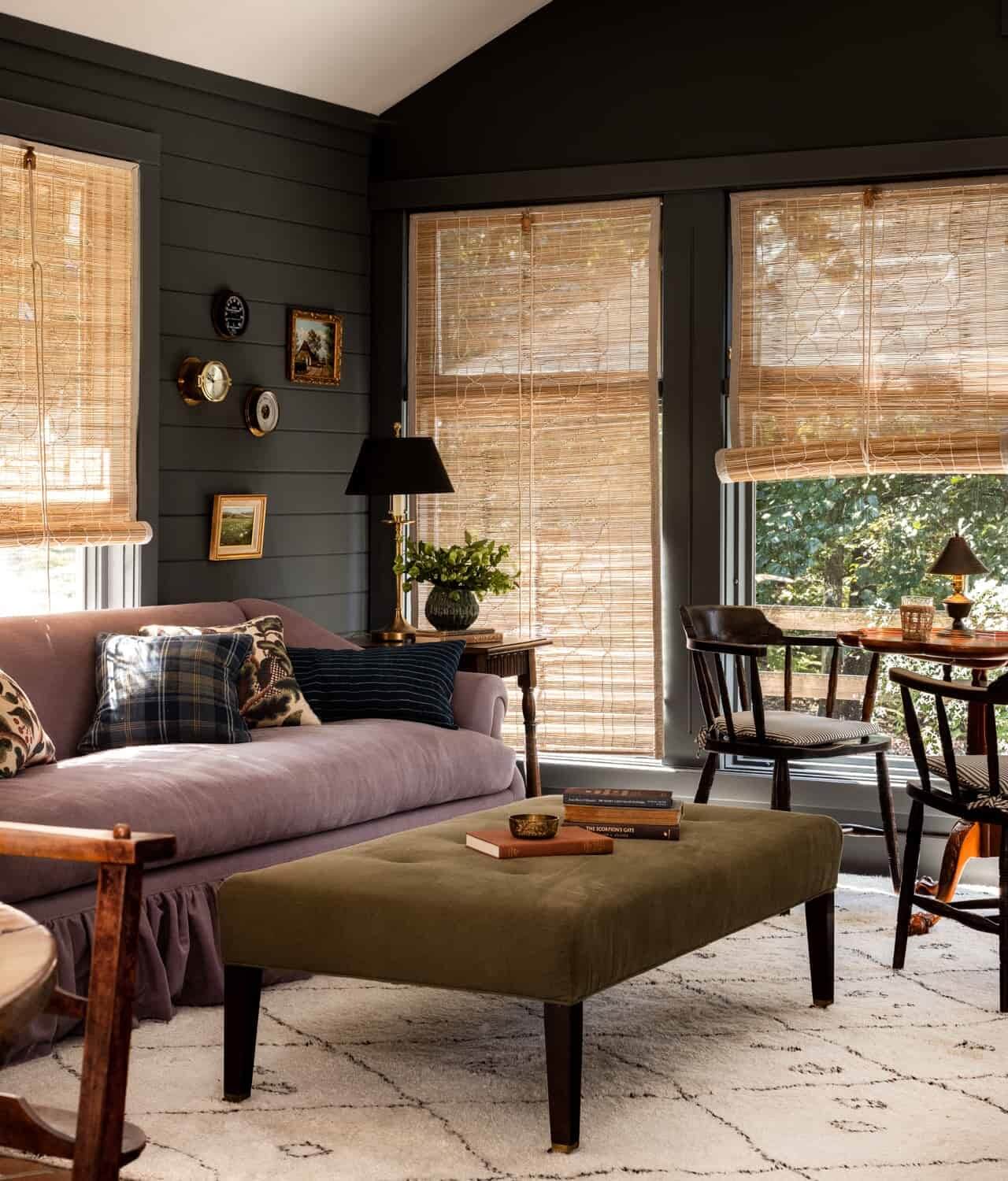
You can also add color through furniture. Interior designer Heidi Caillier opted for a purple sofa in a dark-painted sitting room in a Dutchess County country house.
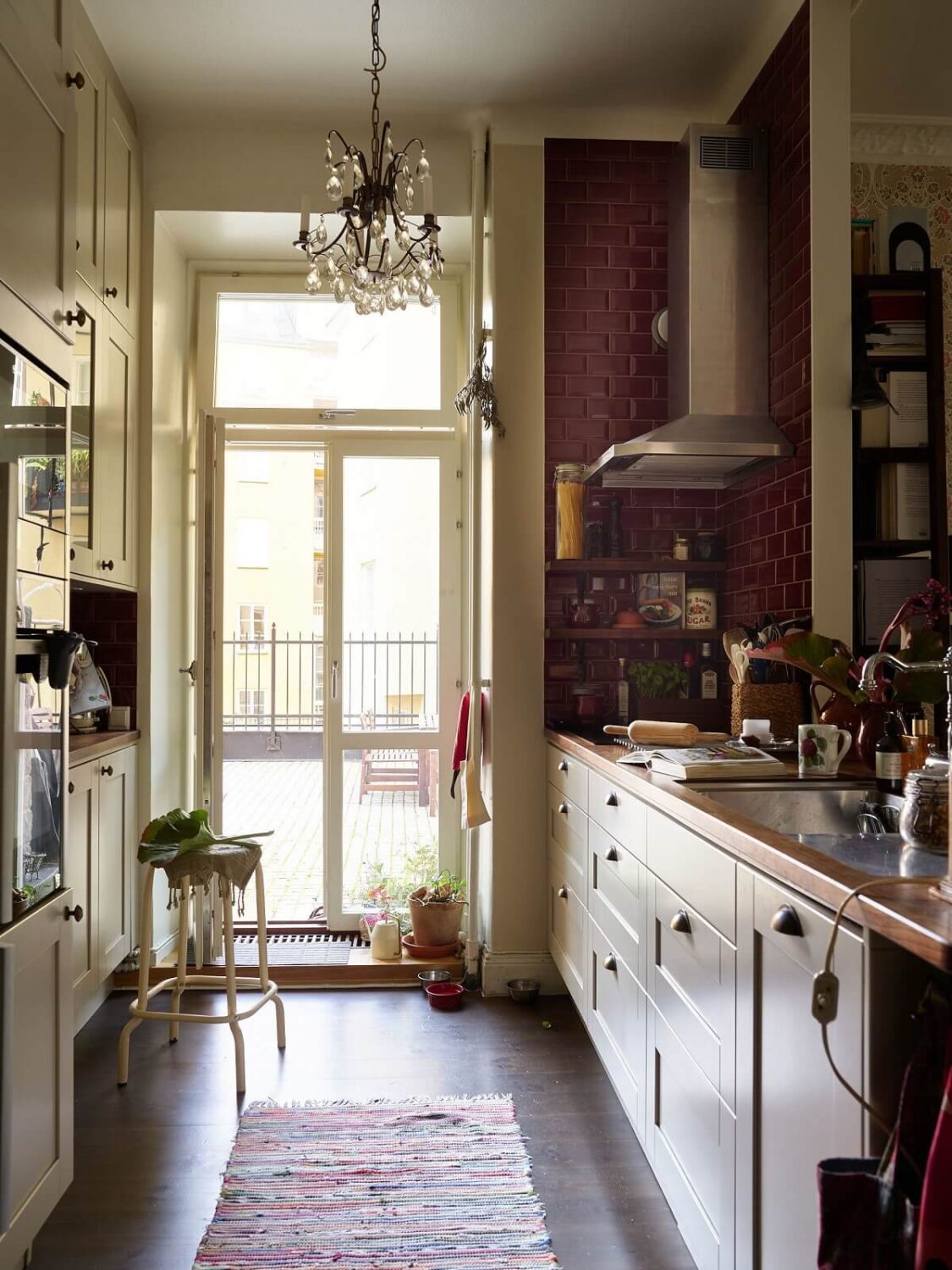
Deep red tiles add an instant warmth to your space, like in a kitchen with white cabinets, as you can see in this warm vintage apartment.
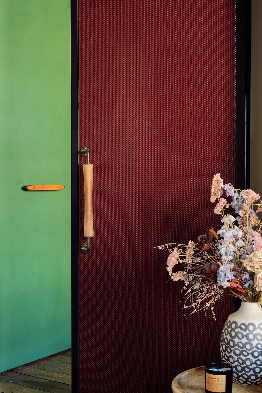
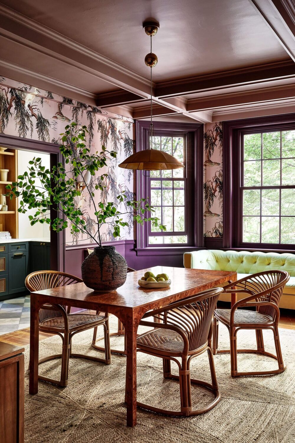
Let’s go bold and paint the woodwork instead of the walls. In this dining room, designed by Zoe Feldman, it is paired with a colorful House of Hackney wallpaper and natural furniture and decor.
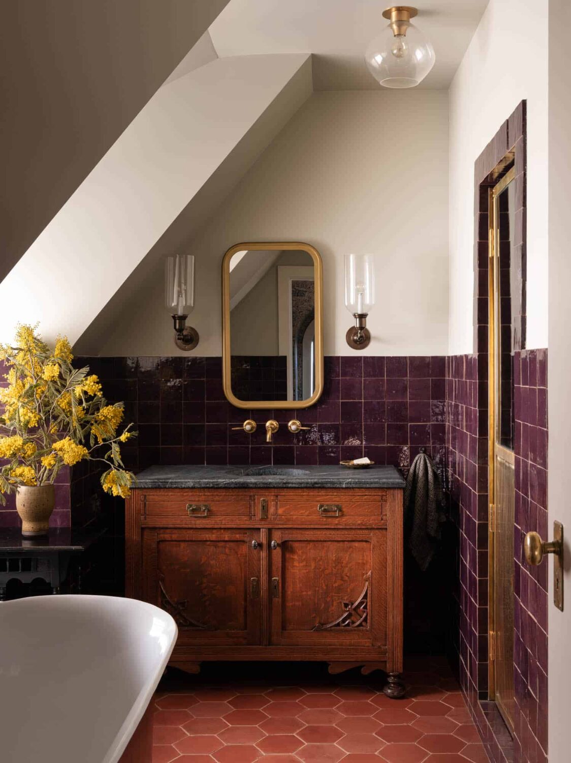
Purple looks beautiful in combination with natural materials like terracotta and wood, as you can see in this bathroom designed by Heidi Caillier. It adds such a warm, luxurious touch to the room.
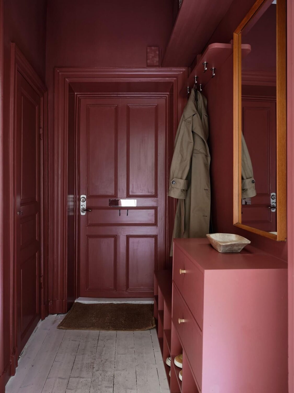
A small entry with a wow factor. This hallway in a Nordic maisonette has been completely painted in a deep red shade, from the door to the ceiling and the cabinets. How good does it look?
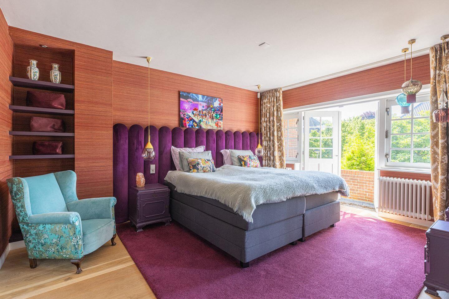
Another terracotta and purple combination, this time in the form of a purple velvet headboard, a purple rug, and terracotta-colored wallpaper. This is a bold look in a bedroom, but it is also very beautiful.
Warm Yellow Interior Inspiration
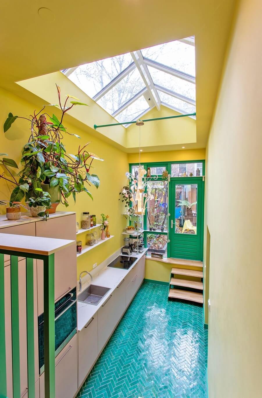
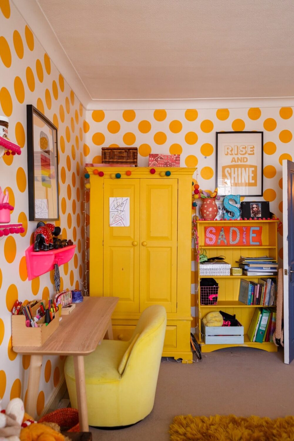
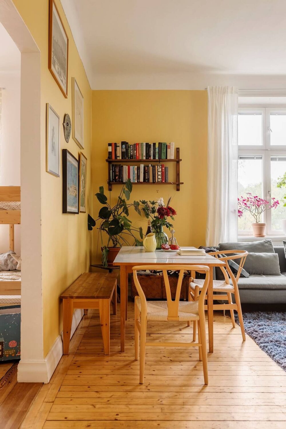
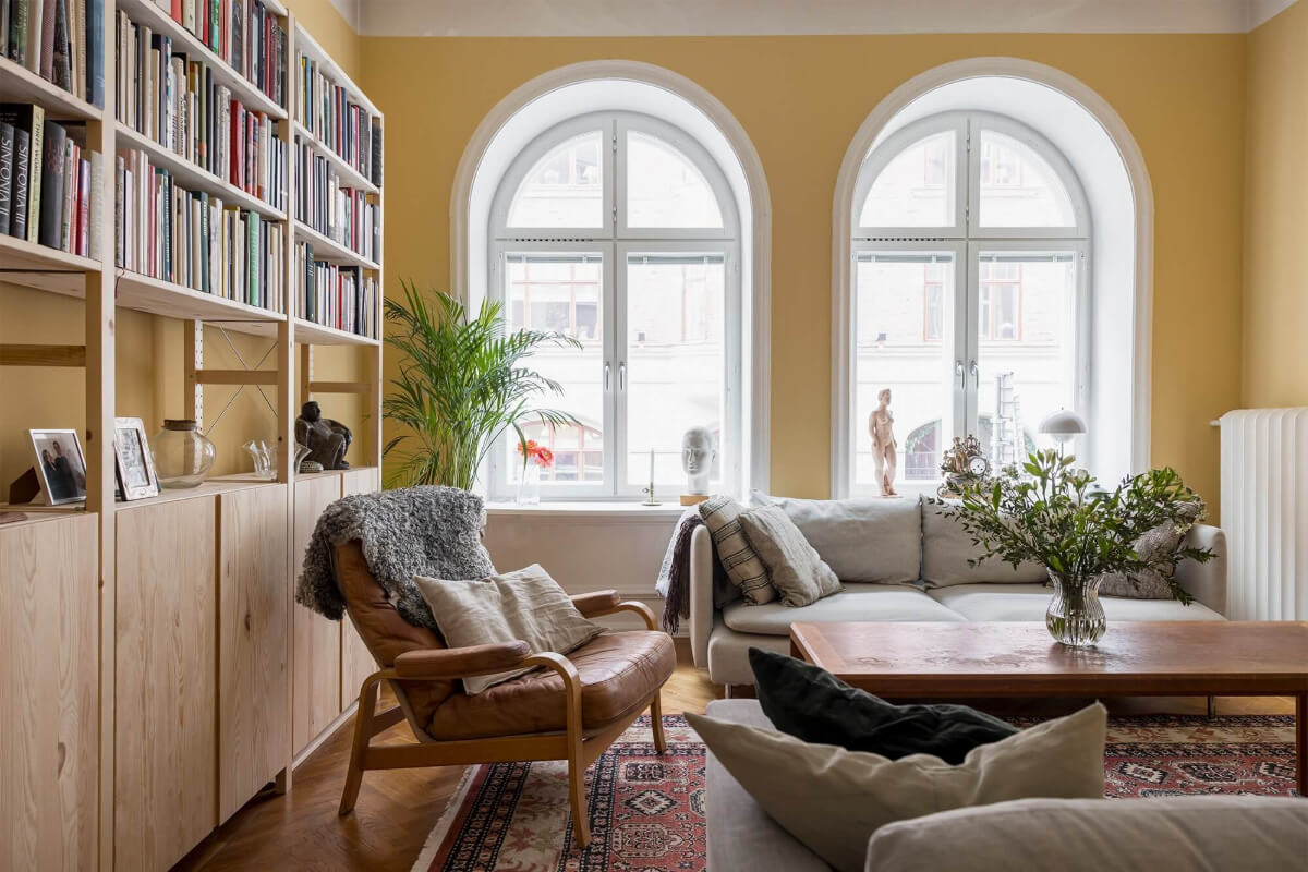
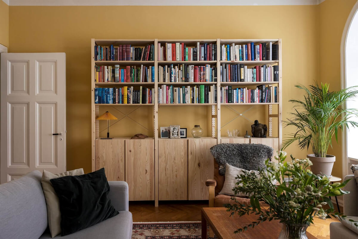
Only paint company Dulux has chosen yellow as its color of the year, but almost every paint company features yellow tones in their 2025 color palettes, from light yellow to ochre yellow. Besides True Joy inspiration, I will also add some yellow inspo in other shades.
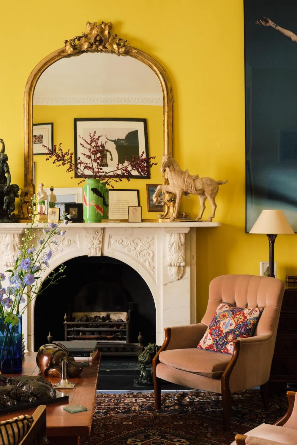
To me, a bright yellow like True Joy feels very modern, but this living room shows how amazing this color looks in a period home.
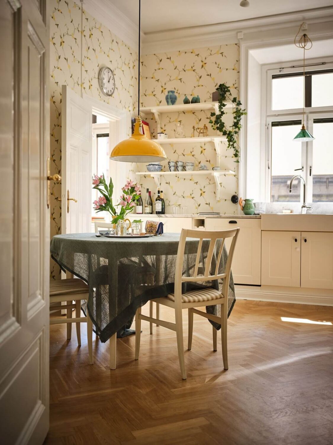
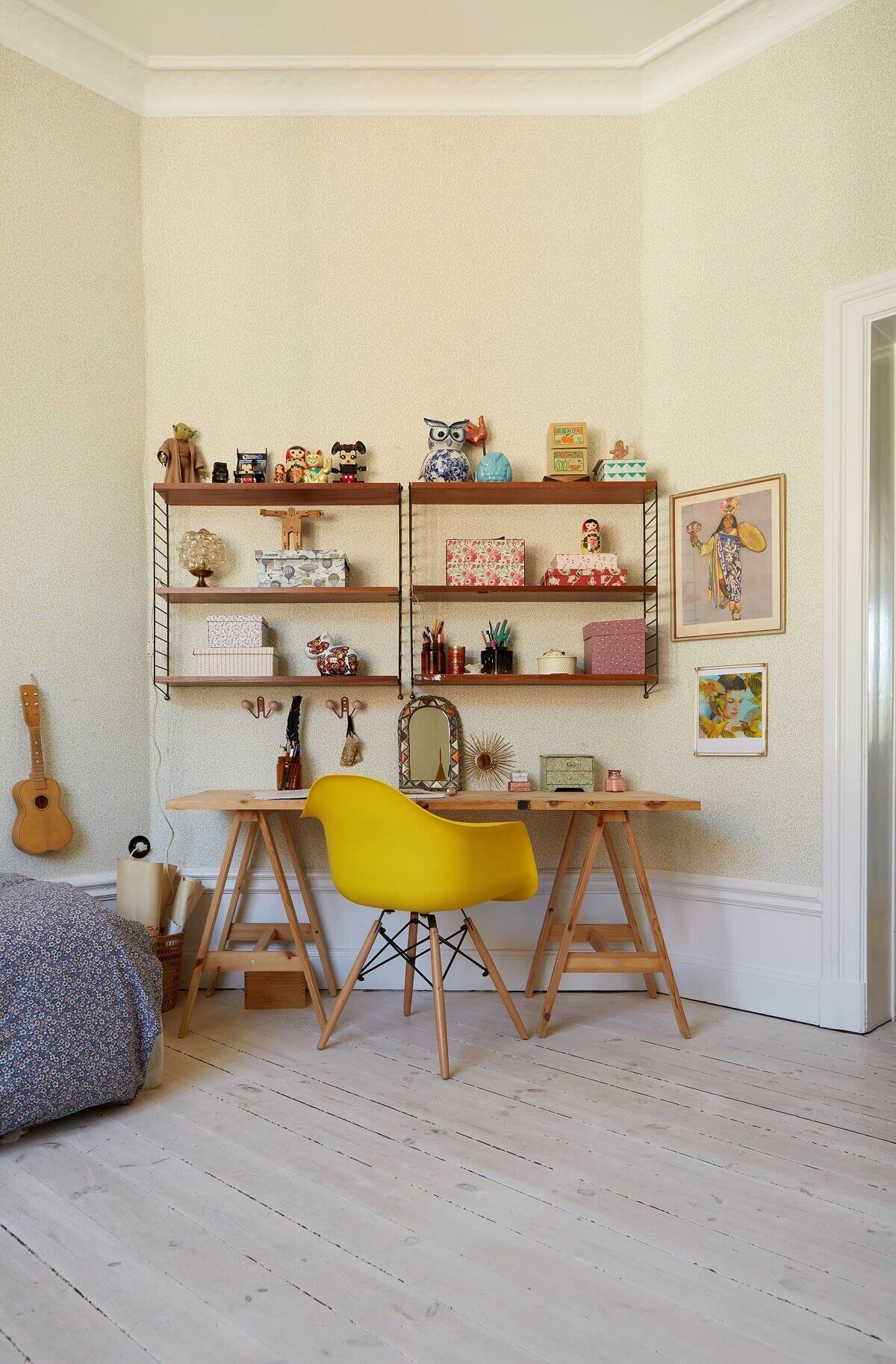
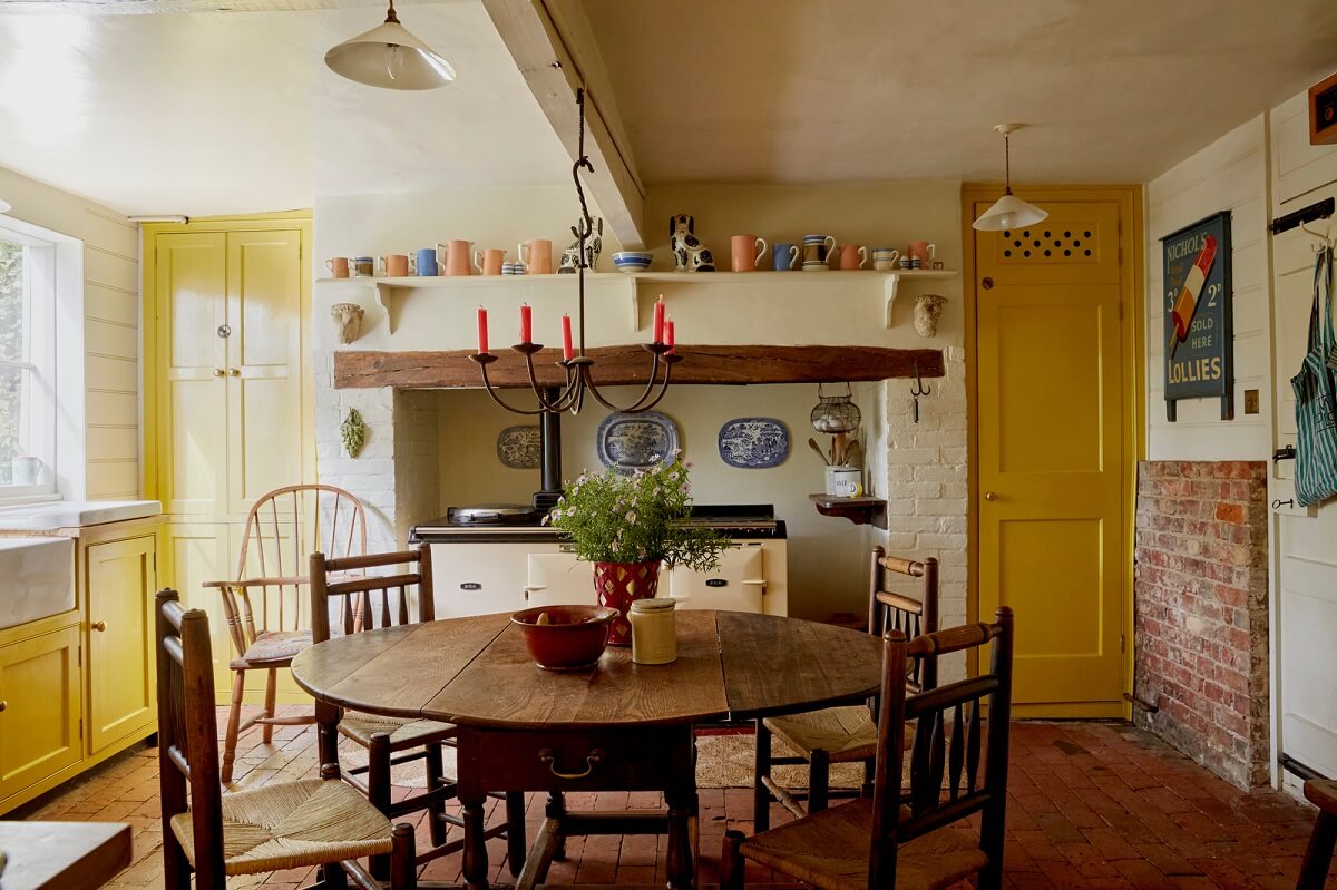
The farmhouse kitchen of Mrs. Trufflepig has bright yellow kitchen cabinets paired with a brick floor and a rustic dining table.

Create a sunny entrance to your home by painting the doorframes a sunny yellow, as in this London home.
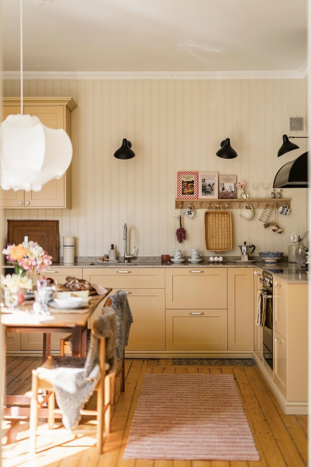
The Instagram famous home of influencer Hannes Mauritzson features a buttery yellow kitchen (as well as pale yellow walls in the living room); it looks very hygge.


Blue Interior Inspiration
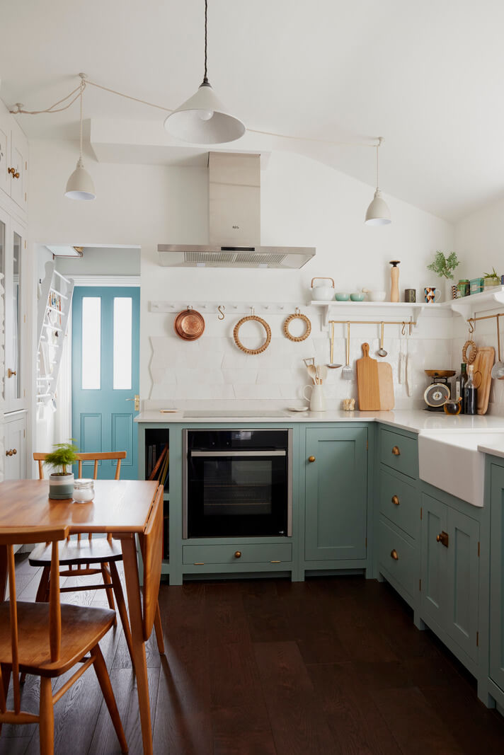
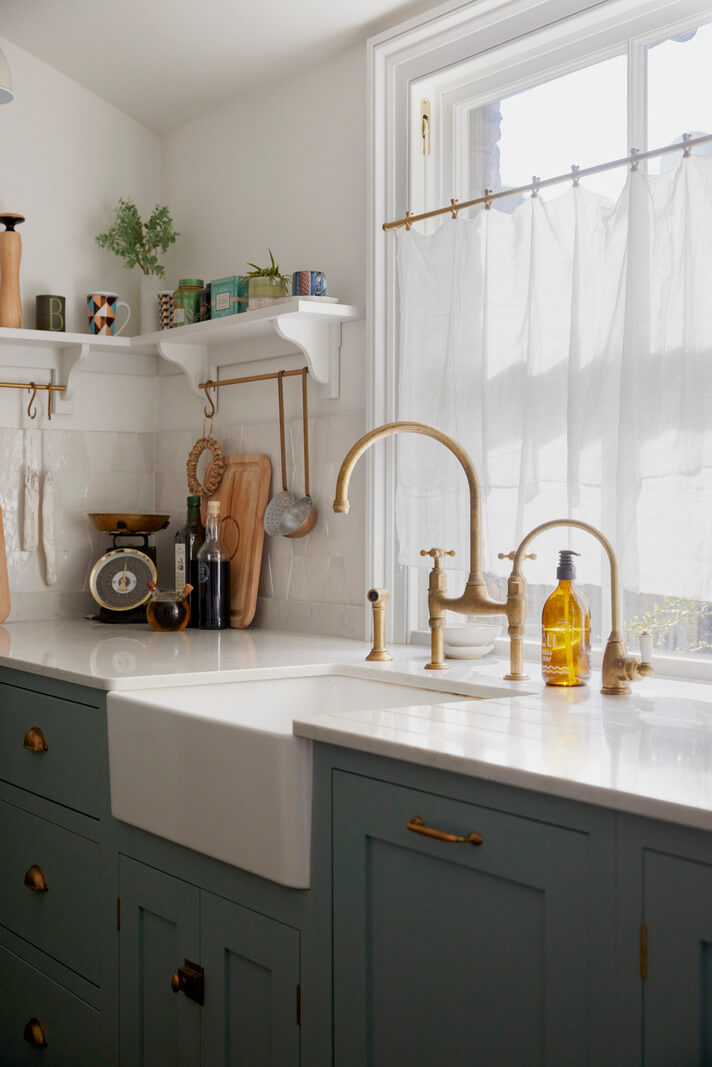
You can hardly go wrong with blue in your home. Only a couple of years ago, almost every paint company chose blue as their Color of the Year. This year, three paint companies chose blue, from a silvery blue by HGTV Home to a bold blue from Valspar. Let’s see how these shades look in a home interior.
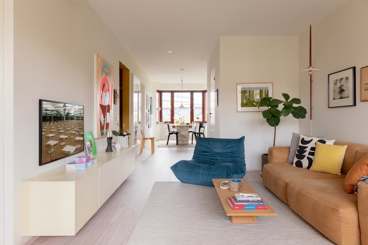
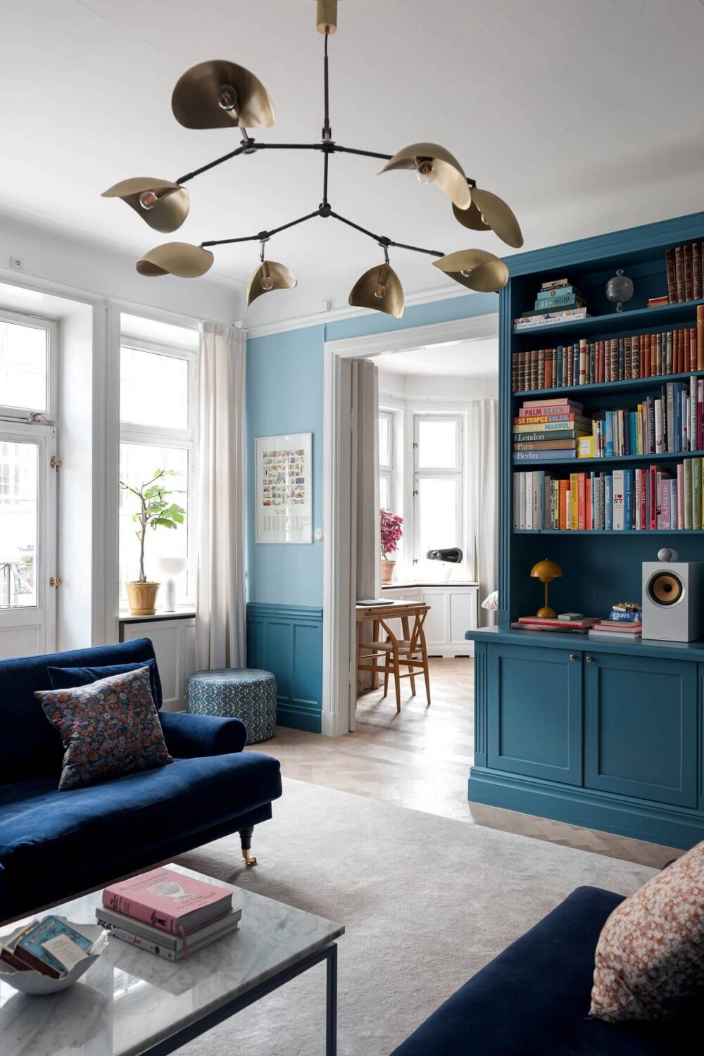
You can pair two of the three blue colors in one room. This living room in a classic apartment features colors similar to Valspar’s Encore and Dutch Boy’s Mapped Blue.
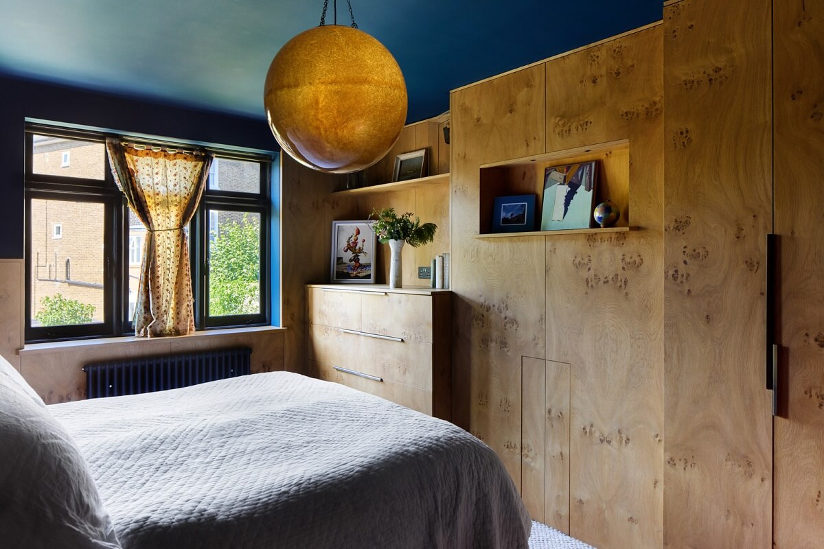
Paint the ceiling in a bold blue hue and pair it with wood for a warm look. Via Stained Glass Doors and Terrazzo in a London Home.

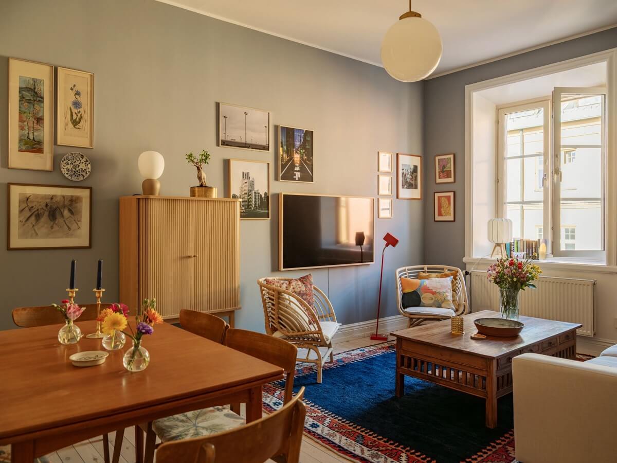
Pair the silvery blue of HGTV Home’s Quietude with a bold blue color accent like this rug in a muted blue living room.

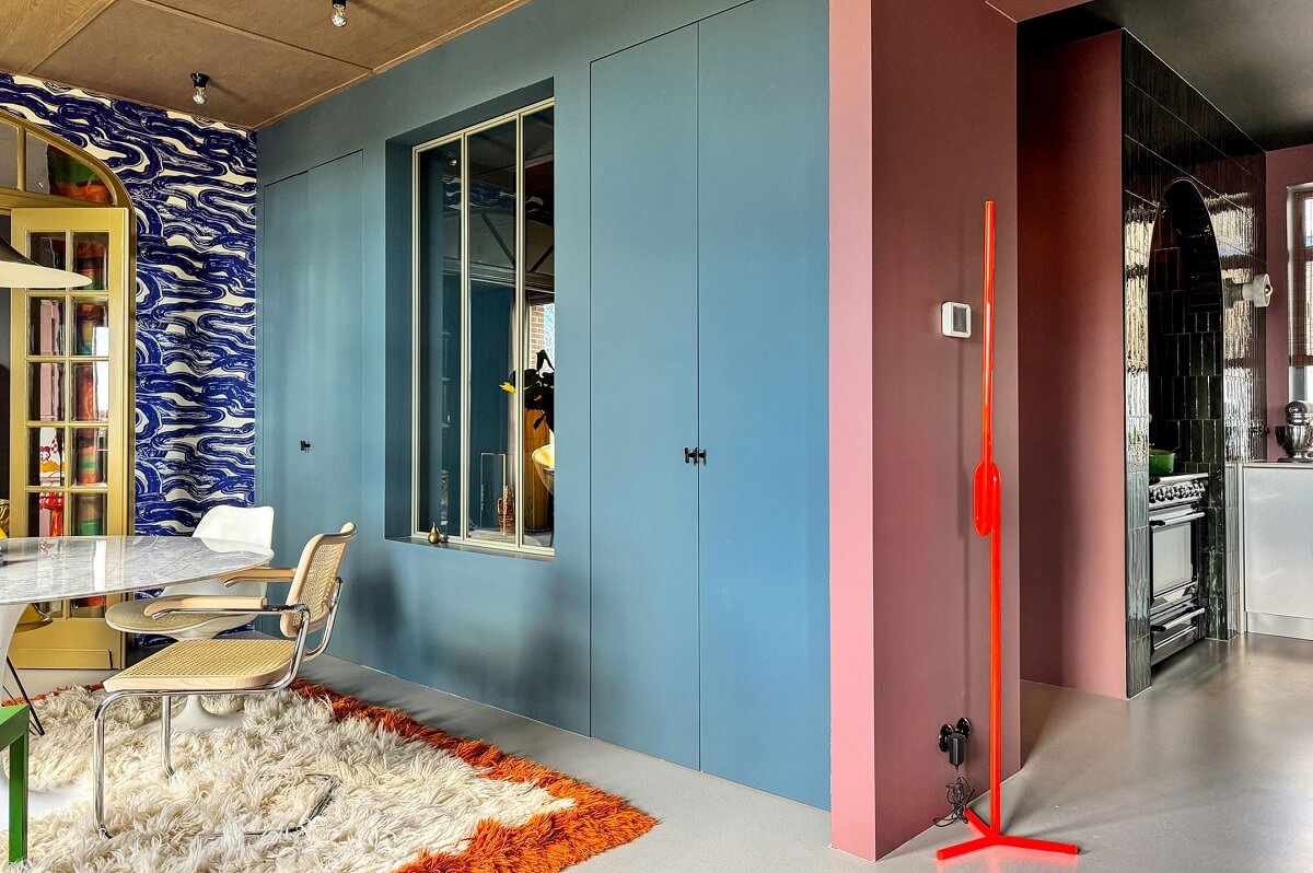
Interior stylist Theo-Bert Pot painted built-in cabinets in a blue shade similar to Mapped Blue, which he paired with bold blue wallpaper and pink.
Brown Interior Inspiration
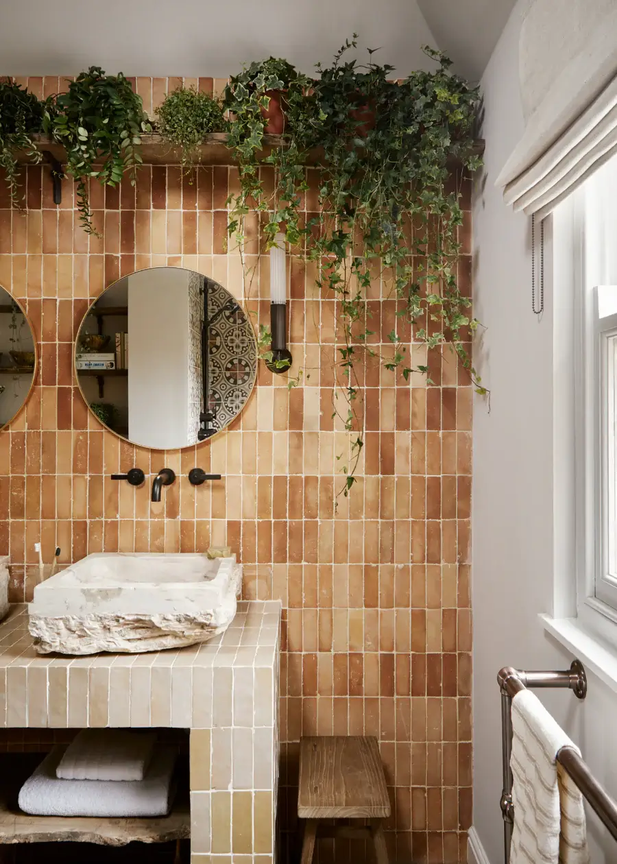
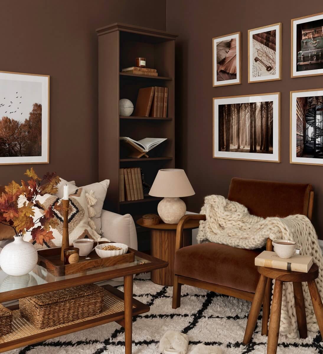
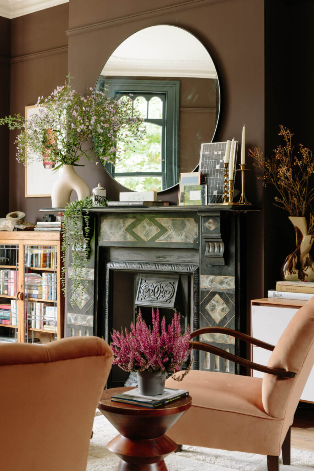
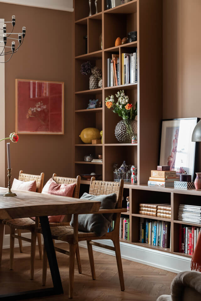
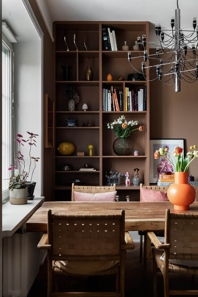
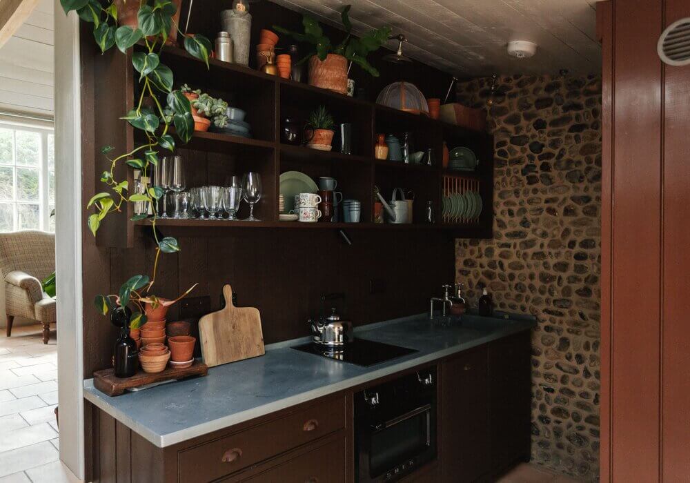
Brown boring? No way! Paint companies Graham and Brown and C2 opted for a deep brown shade as their trending color. Brown adds lots of warmth to any space, from the living room to the bedroom.


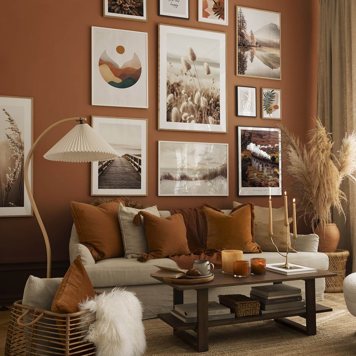
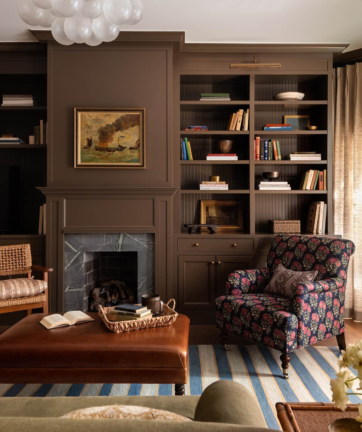
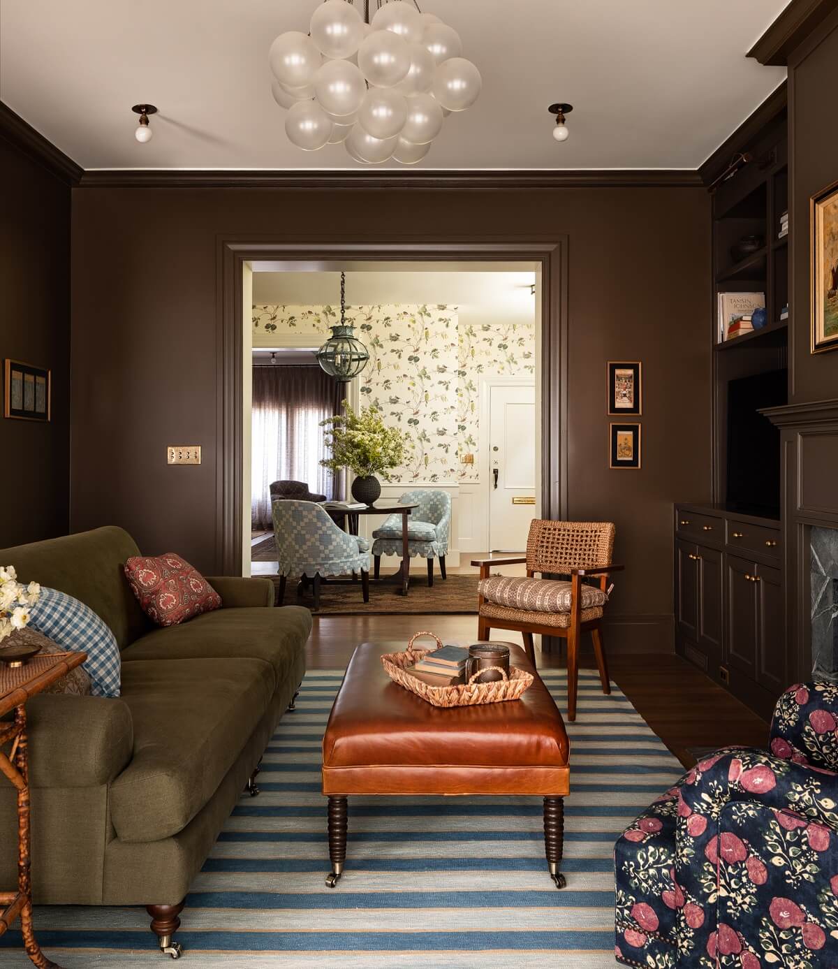
Interior designer Heidi Caillier makes any color look amazing, and she shows how you can combine it with other colors and patterns, like in this brown living room in a San Francisco family home.
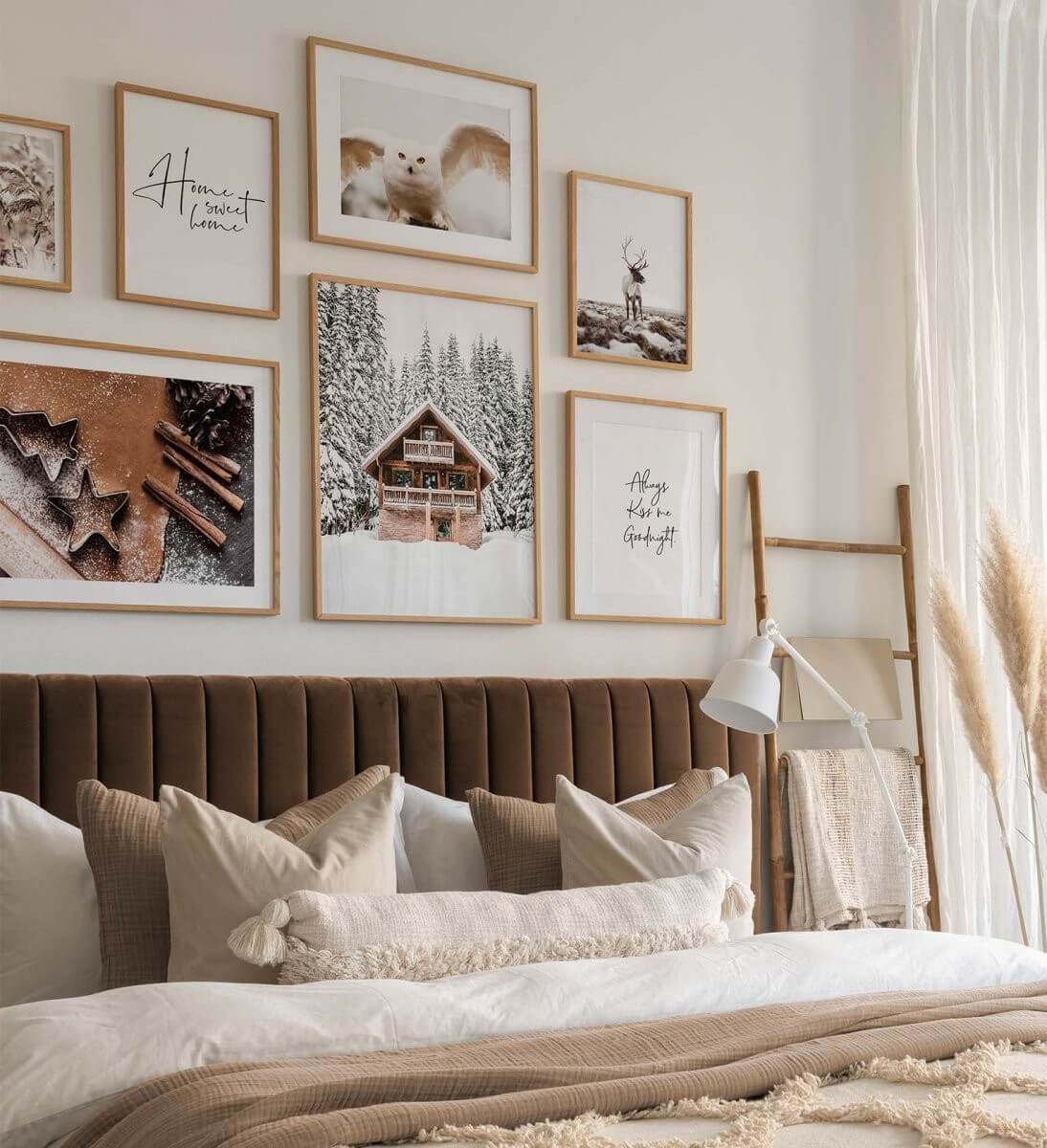
This brown velvet headboard adds an instant warm vibe to the otherwise light-colored bedroom. Pair it with layered textiles and art, and you create a warm abode.
How do you feel about the 2025 Color Trends? Are there colors you will implement in your home?
